


With Product Category List, you can display your categories in a more attractive way to let your customers know the types of products you offer and also help them navigate to different categories easily.
Product Category List is a general widget of ShopEngine, so you can use this in any of the ShopEngine templates.
Let’s learn how you can use Product Category List Widgets on your wooCommerce site
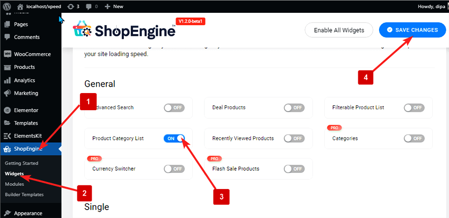
Step 1: Enable The Product Category Listwidget #
To enable the widget,
- Go to ShopEngine > Widgets > Product Category List
- Turn on Product Category List under the general section
- Save changes
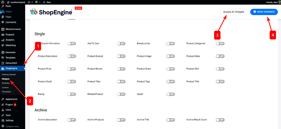
Note: You can also turn on Product Category List with a global setting that turns on all the widgets of ShopEngine. To turn on all the widgets
- Go to ShopEngine > Widgets
- Click on Enable All Widgets
- Save changes
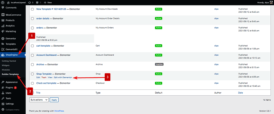
Step 2: Add Product Category List #
To add Product Category List:
- Go to ShopEngine > Templates > Any ShopEngine Template
- Click on Edit with Elementor
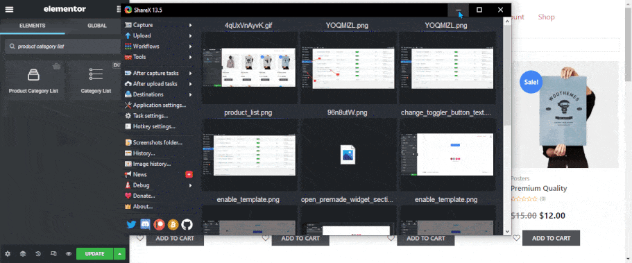
- Search for Product Category List on Elements Search option
- Drag and drop the widget where you want it to appear
- Click on Update to save changes.
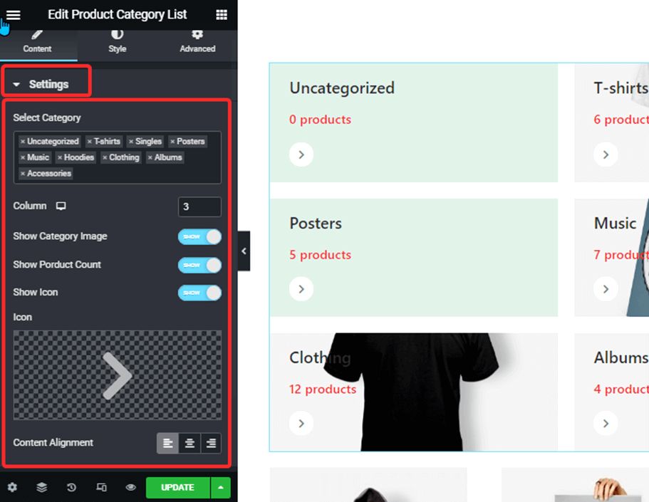
Step 3: Configure Widget Settings #
You can customize the following settings for the product category list:
Step 4: Style Settings #
You can change the following style settings:
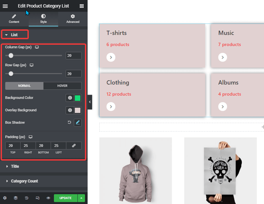
List: #
Here you can change all the settings related to the category list:
- Column Gap: Set the gap between two columns in pixels.
- Row Gap: Set the gap between two rows in pixels.
- Normal: Set the background color, overlay color, and box-shadow for the normal view.
- Hover: Set background color, overlay color, and box-shadow you want to show when someone hovers.
- Padding: Set the left, right, top, and bottom padding for each of the categories in pixels.
Title: #
Here you can set the style for the title:
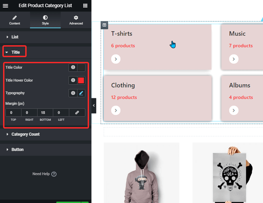
- Title color: Set the title color of the category.
- Title Hover Color: Set the title color will show up when someone hovers.
- Typography: Set the font family, font size, weight, line height and choose how the text should be transformed.
- Margin: Set the top, bottom, left and right margin.
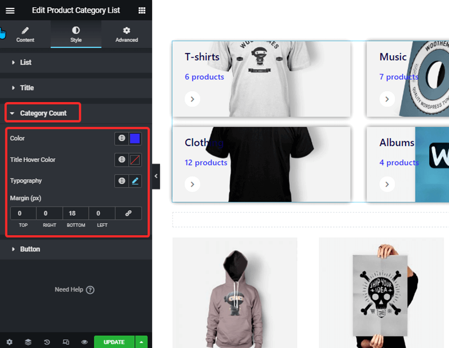
Category Count: #
Here you can set the style for category count:
:
- Color: Change color for the category number.
- Title Hover Color: Set the title color will show up when someone hovers.
- Typography: Set the font family, font size, weight, line height and choose how the text should be transformed.
- Margin: Set the top, bottom, left and right margin.
Button: #
Here you can set the style for the Button:
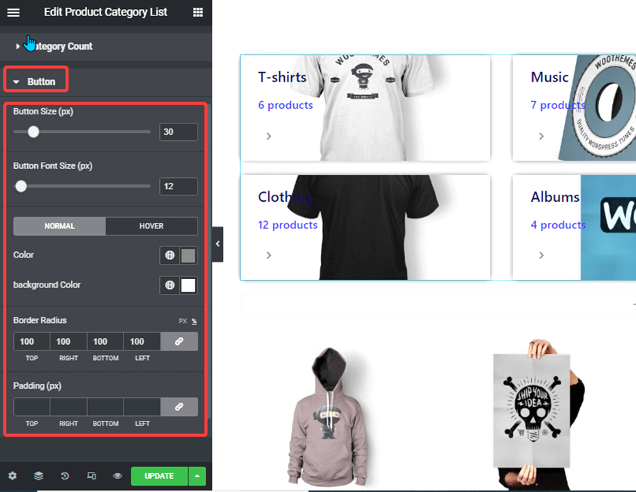
- Button Size: Set the size for the button section.
- Button Font Size: Set the font size for the button icon.
- Color: Set the color of the button.
- Background-color: Set the background color of the button section.
- Border-radius: Set the border radius of the background section of the icon.
- Padding: Set the top, right, left, and bottom padding values for the icon section.
After you make all the changes click on update to save.


