 English
  German
  Spanish
  Italian
  French
  Danish
  Portuguese
  Swedish
  Polish
  Korean
  Japanese
 The WooCommerce product carousel widget of ShopEngine allows you to display products in a visually appealing way on your website. With this feature, customers can scroll through a range of products without navigating to individual product pages.
Also, the showcase of multiple products in a small space on your WooCommerce website helps them to find what they’re looking for.
You can add this brand new widget of ShopEngine to your WooCommece website simply in 2 steps. Besides, you will get tons of customization options to match your website’s branding and style.
✨✨ Requirements
✅ ShopEngine Lite – Download ShopEngine Lite
✅ ShopEngine Pro – Get ShopEngine Pro
✅ Elementor – Download Elementor
✅ WooCommerce – Download WooCommerce
How to Display WooCoomerce Product Carousel with ShopEngine #
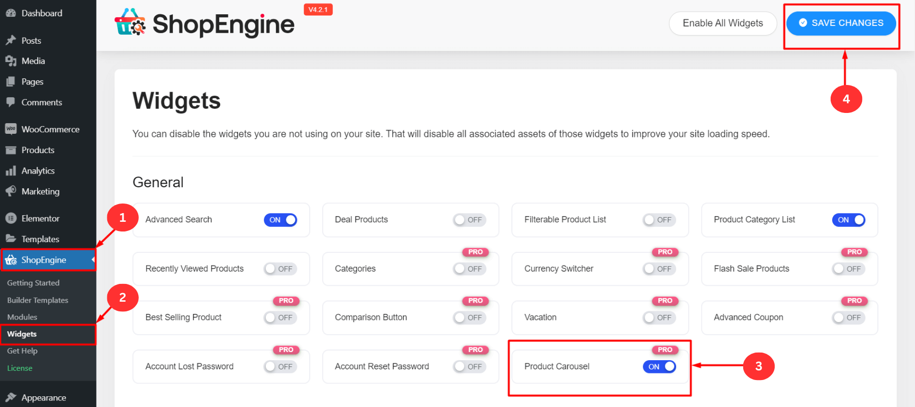
Step 1: Enable the WooCommerce Product Carousel Widget #
- First, log in to your WordPress dashboard
- Click on ShopEngine ⇒ Widgets
- Turn on the “Product Carousel (Pro)” widget
- Click on “Save Changes”
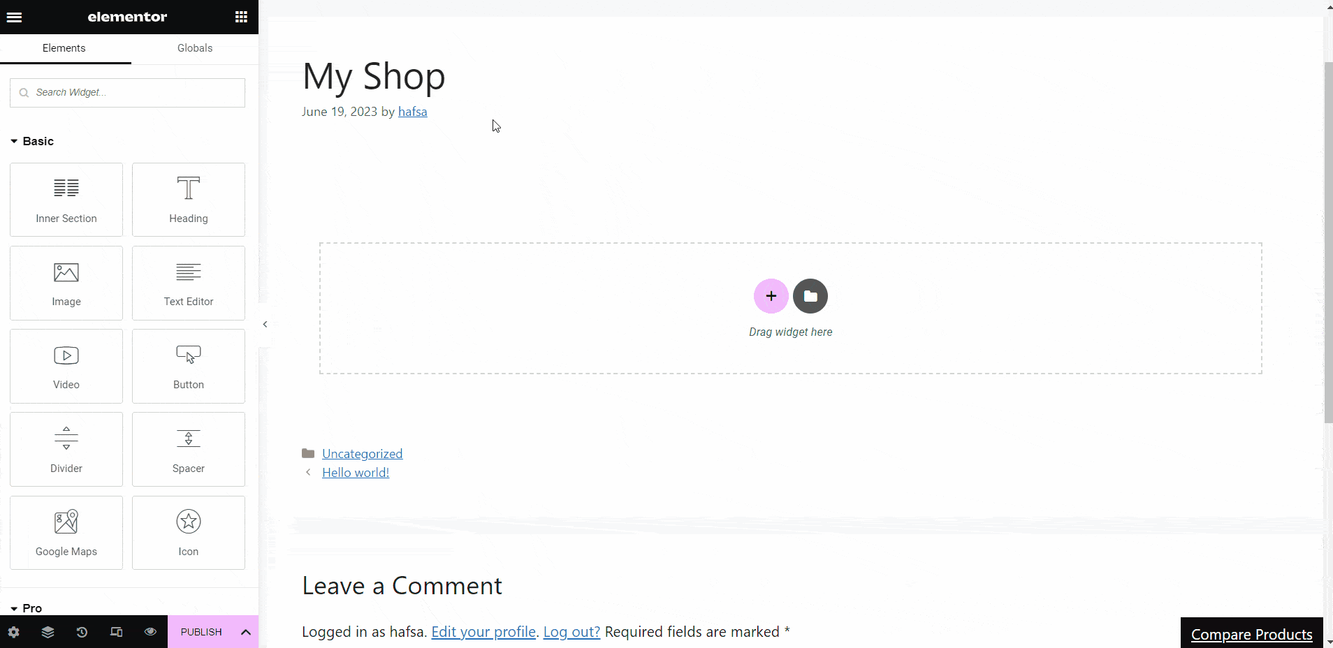
Step 2: Drag and Drop the Product Carousel Widget #
- Open an existing page with Elementor
- Or, create a new page and then open it with “Edit with Elementor”
- Select an Elementor block where you want to show the product carousel/slider
- Search for the “Product Carousel” widget in the search bar
- Drag and drop the product carousel widget to the selected Elementor block
- The carousel/slider with your store’s products with appear here
- It will slide automatically after a certain time period (you can adjust the time)
- You can see the product image, name, category, rating, etc
- Hover over any product to add to in wishlist, or cart
- It will show the product quick view as well as compare product features
- You can see the in-stock, out-of-stock, sale batch, discount percentage, etc along with products
- You can also customize the properties or keep the default features
- After all the customization, click on “Publish”
Customize the WooCommerce Product Carousel with ShopEngine #
The product carousel widget of ShopEngine is fully customizable. You can customize the slider content, display styles, color, background, position, and number of products you want to display. You can also add motion effects, custom CSS, and other parameters to fit your specific needs.
Content Customization #
You can customize the content of the WooCommerce product carousel of ShopEngine using the following settings:
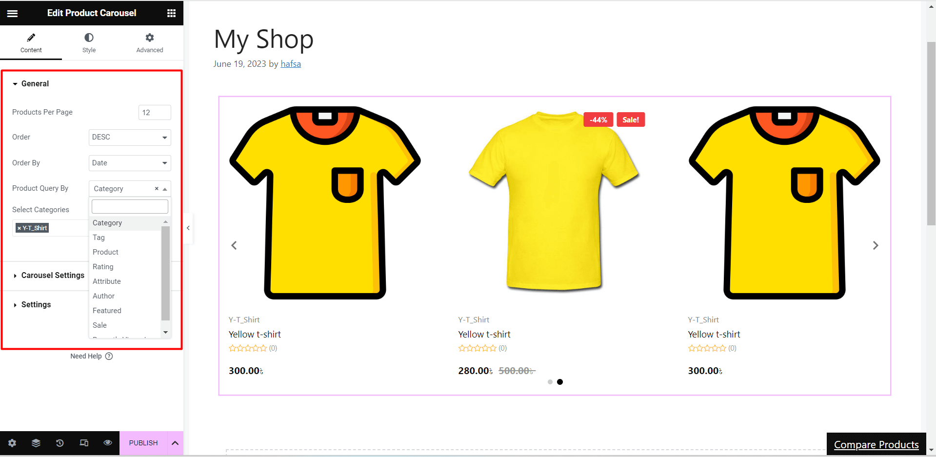
General #
- Product per Page: Set the number of products you want to display per page in the slider
- Order: Arrange the products in ASC (ascending) or DESC(descending) order
- Order by: Display the order of the carousel products by ID, title, name, date, popular, modified, price, sales, top-rated, random, SKU, or stock status
- Product Query by: Filter products by category, tags, products, attributes, Author, featured, sale, and recently viewed
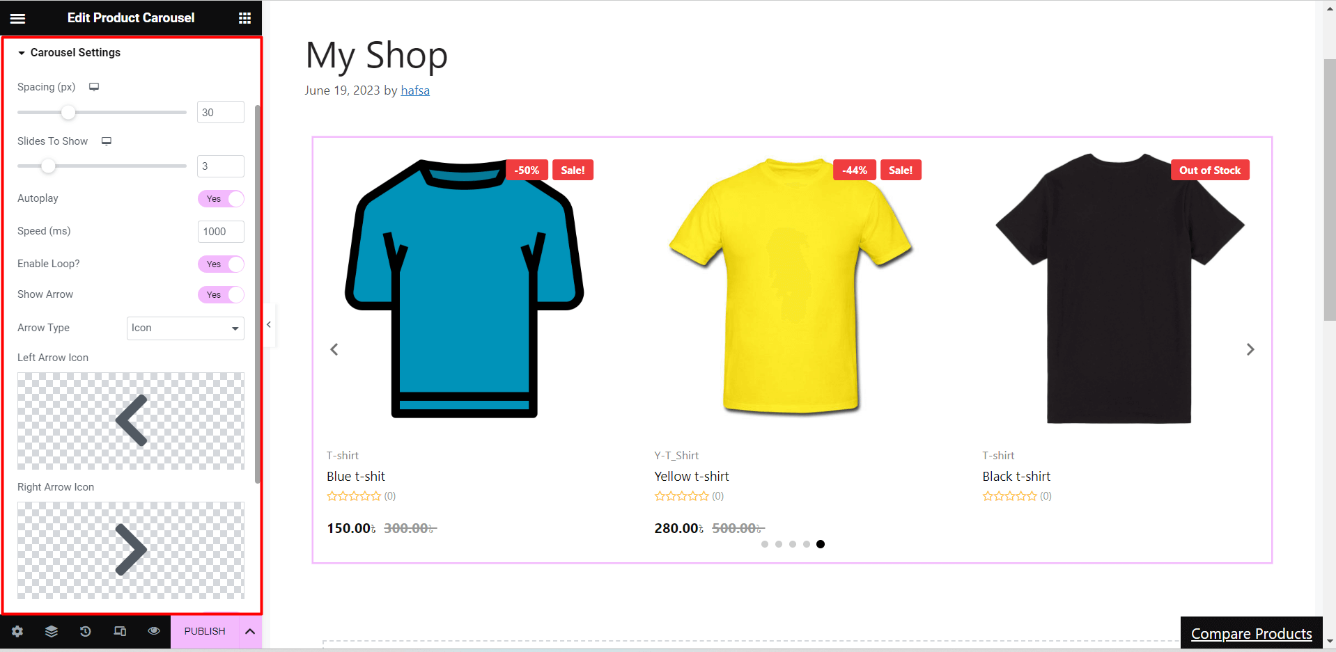
Carousel Settings #
- Spacing: Adjust the space between products
- Slides to Show: Set a number(1,2,3….n) to show that amount products at a time
- Autoplay: Turn on for slider autoplay
- Speed(ms): Set the time in milliseconds(1s =1000ms) for autoplay
- Enable Loop: Enable or disable the slider loop
- Show Arrow: Enable or disable the arrow for the next/previous options
- Icon Type: Select the icon type such as icon, text, or icon with text for next/previous options
- Show Dot: Tune on to indicate how many images are in the slider.
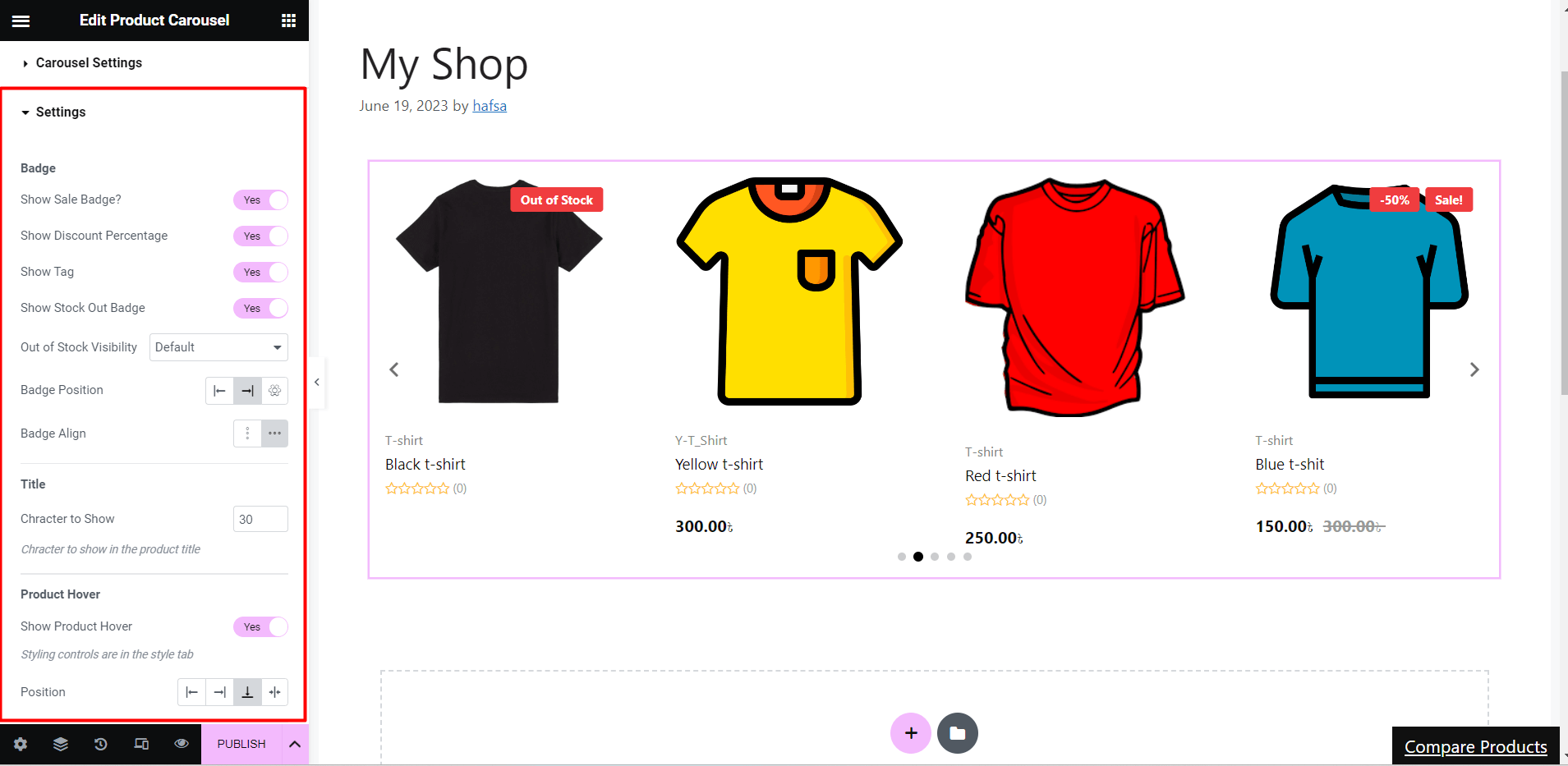
Settings #
- Badge
- Turn on/off the show sale badge, show discount percentage, show tag, and show stock out badge
- Show or hide Out of Stock Visibility
- Adjust badge position and alignment (e.g. left, center, right)
- Title
- Set the values for the character to show in the product carousel
- Product Hover
- Enable or disable the show product hover option
- Set the hover position on the left, right, center, or bottom
- Price
- Set the price tag alignment to start, center, or end
- Enable/disable the show-off tag
- Category
- Turn on/off the show category option
- Set the number for category limit to show with the product carousel
- Show Rating
- Turn on the show rating option to show user rating along with products or keep it off if you don’t want to show the ratings
Style Customization #
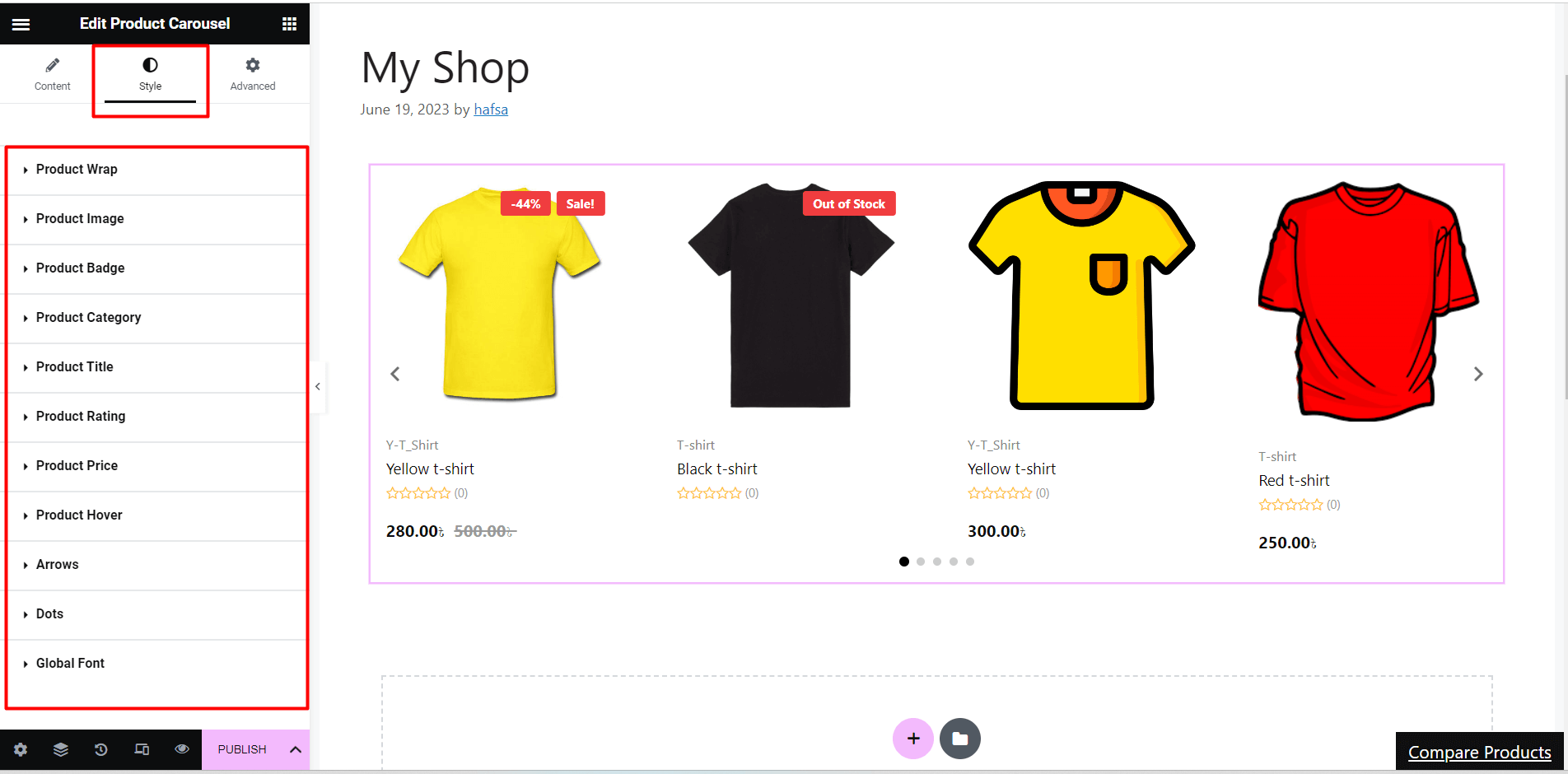
Product Wrap #
- Content Alignment: Adjust the carousel content alignment to left, right, or center
- Background Color: Customize the carousel background color
- Column Gap: Set e value(px) to define the gap between products
- Padding: Set custom padding values for left, right, top, and bottom
- Border: Add solid, double, dotted, dashed, groove border or keep it default
Product Image #
- Image Background: Customize the image background color
- Margin: Set custom values for the top, bottom, left, and right margin
Product Badge #
- Typography: Select custom font, font size, font weight, transform, line height, and word spacing
- Color: Customize the product badge color, background color, percentage badge background, and tag badge background
- Other Properties: Set a space-in-between gap value(px), custom padding, margin, border and border type
Product Category #
- Typography: Customize font, font size, font weight, transform, line height, and word spacing for category
- Color: Set custom color normal and category hover properties
- Padding: Adjust left, right, top, and bottom padding values
Product Title #
- Typography: Select title type (normal/hover), add a custom font, and customize related properties with font
Product Rating #
- Rating Star Size: Adjust the rating star size for the product carousel
- Star Color: Customize the color for empty and filled star color
- Others: Set custom typography and color for star count, adjust left, right, top, and bottom padding
Product Price #
- Color: Set a custom color for price text and sale price color
- Typography: Select a custom font and space between the prices
Product Hover #
- Color: Select text and background color for hover
- Font size: Adjust the carousel font size while hovering
- Space In-between Items: Set space in-between items
- Border: Select border type(e.g. solid, double, dashed), border-radius and wrap margin
Arrows #
- Arrow Position: Set the x and y-axis for the left and right arrow icon/text position
- Color: Customize the arrow color and background
- Border: Set a border(solid, double, dashed, dotted or none) and custom border-radius
- Padding: Adjust padding for arrow icon, text or text-icon
Dot #
- Space between: Adjust the space between the dots
- Opacity: Increase or decrease the dot opacity/transparency
- Hight-Width: Set custom height and width for carousel dots
- Border: Set border around dots and border-radius
- Active: Set the active dot and its background, position, height, widget, and border type
Global Font #
- Font Family: Apply global font (e.g. Arial, Tahoma, Times New Roman, etc) for the entire product carousel
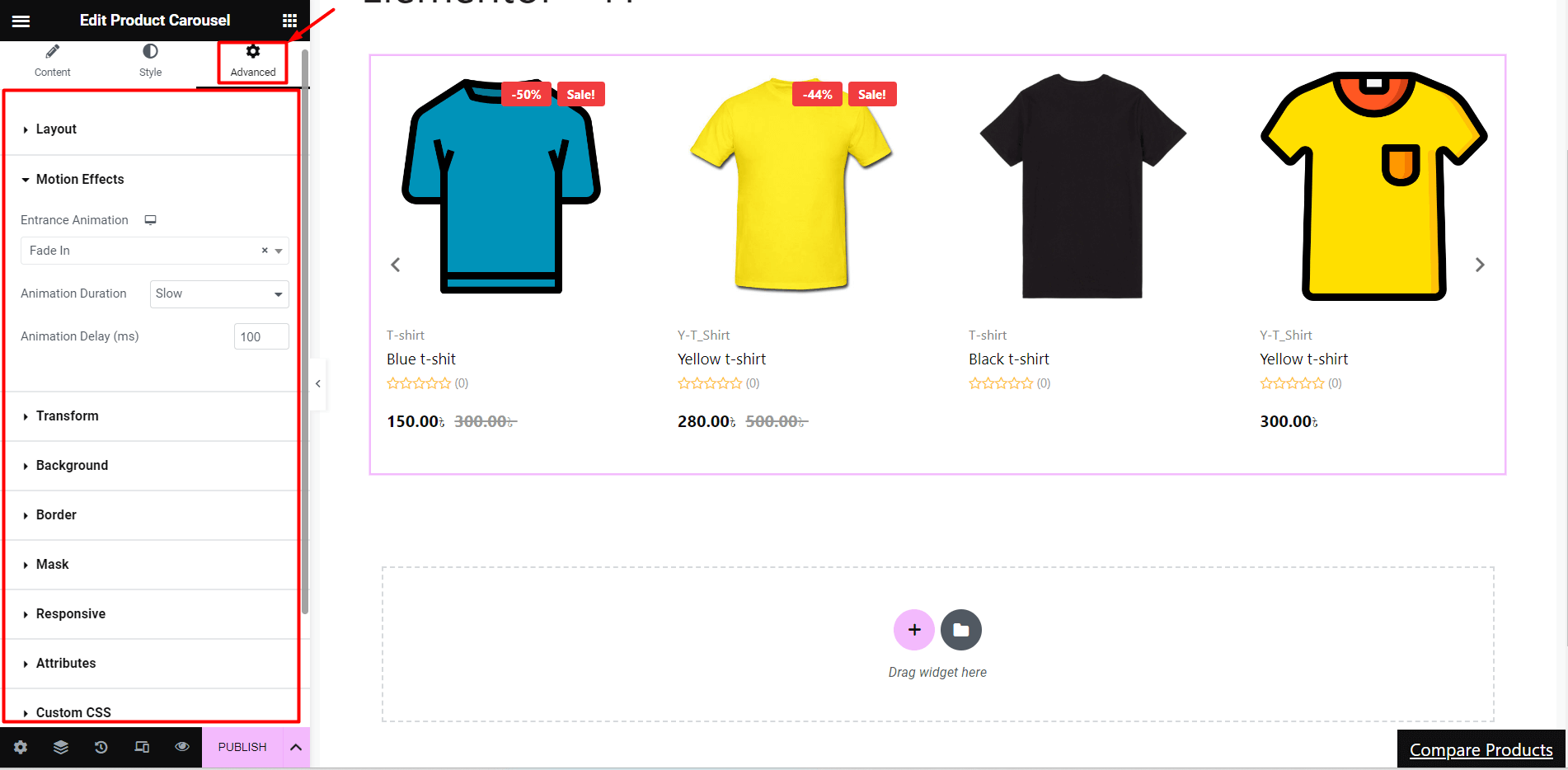
Advanced Customization #
- Set custom width, margin, padding, position, and z-index of the entire layout
- Add various motion effects(e.g. fade in, fade out, zoom in) to input fields
- Customize the properties for animation duration(slow, normal, or fast) and delay(ms)
- Customize the background type and color of the layout
- Select the border, mask, and device responsiveness
- Add attributes and custom CSS for extra functionalities
By showcasing various products in a visually appealing and interactive way, the product slider feature of ShopEngine’s Product Carousel widget can improve the user experience and increase sales of your WooCommerce website.


