 English
  German
  Spanish
  Italian
  French
  Danish
  Portuguese
  Swedish
  Polish
  Korean
  Japanese
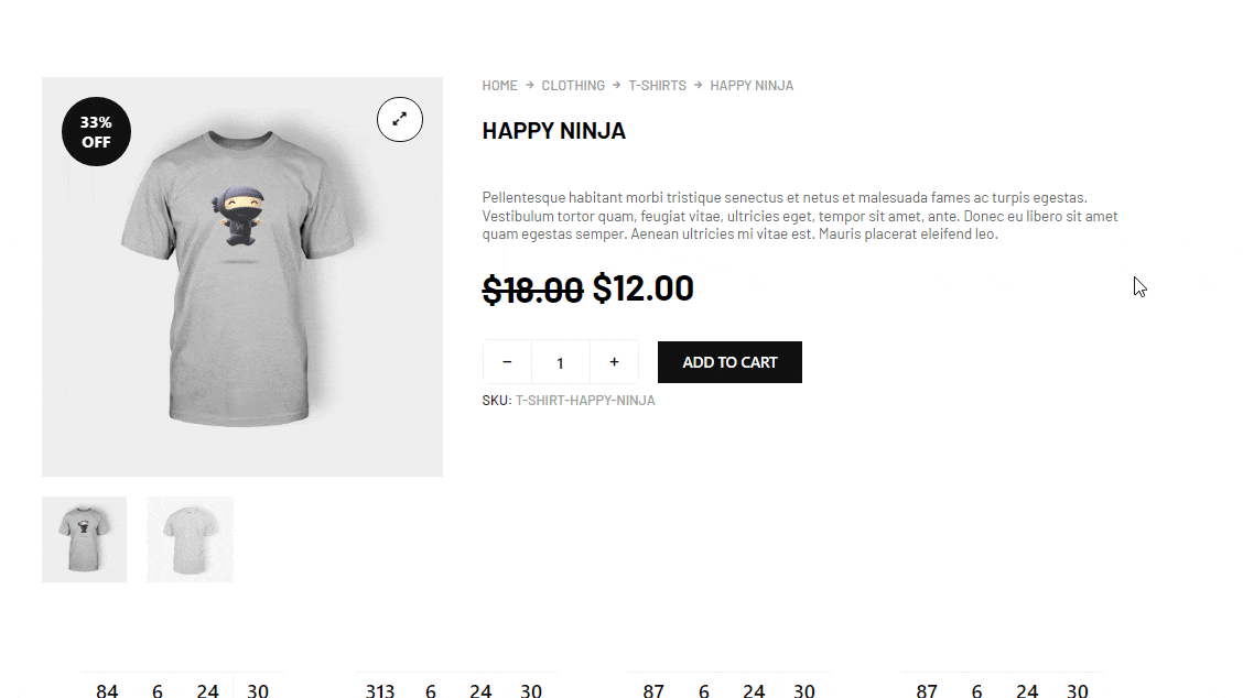
 Deal Products is a general widget of ShopEngine that you can use in any of the wooCommerce Templates. This widget highlights the products that are on sale with a sale start and end schedule, available products, the total number of sold items, and many more options.
Note: This widget only shows products that are on sale with a schedule. Sale products without schedules will not show up in this widget.
Let’s learn how you can use Deal Products Widgets on your wooCommerce site:
Step 1: Enable the Deal Products Widget #
To enable the widget,
- Go to ShopEngine > Widgets > Deal Products
- Turn on Deal Products under General section
- Save changes
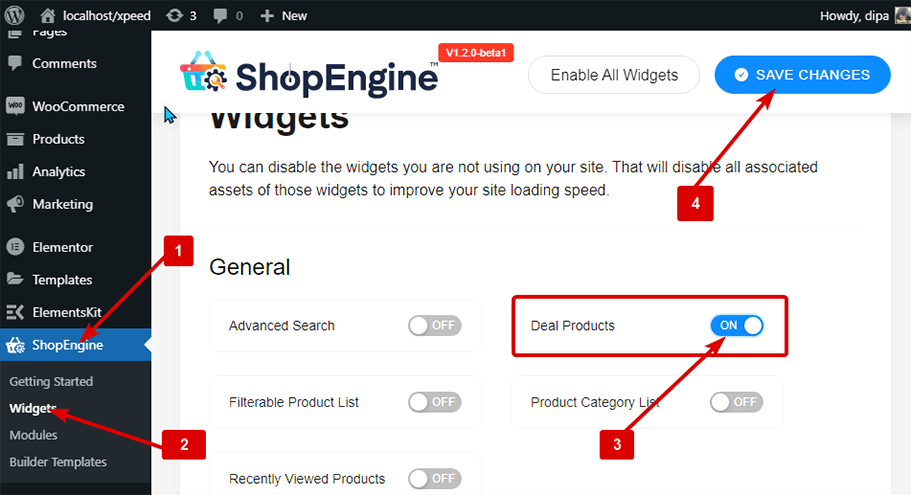
Note: You can also turn on Deal Products with a global setting that turns on all the widgets of ShopEngine.
Step 2: Add Deal Products #
Before you can add the widget you need create a ShopEngine WooCommerce Template first. Check out the documentation on how to create a template.
To add Deal Products:
- Go to ShopEngine > Templates > Any ShopEngine Template
- Click on Edit with Elementor
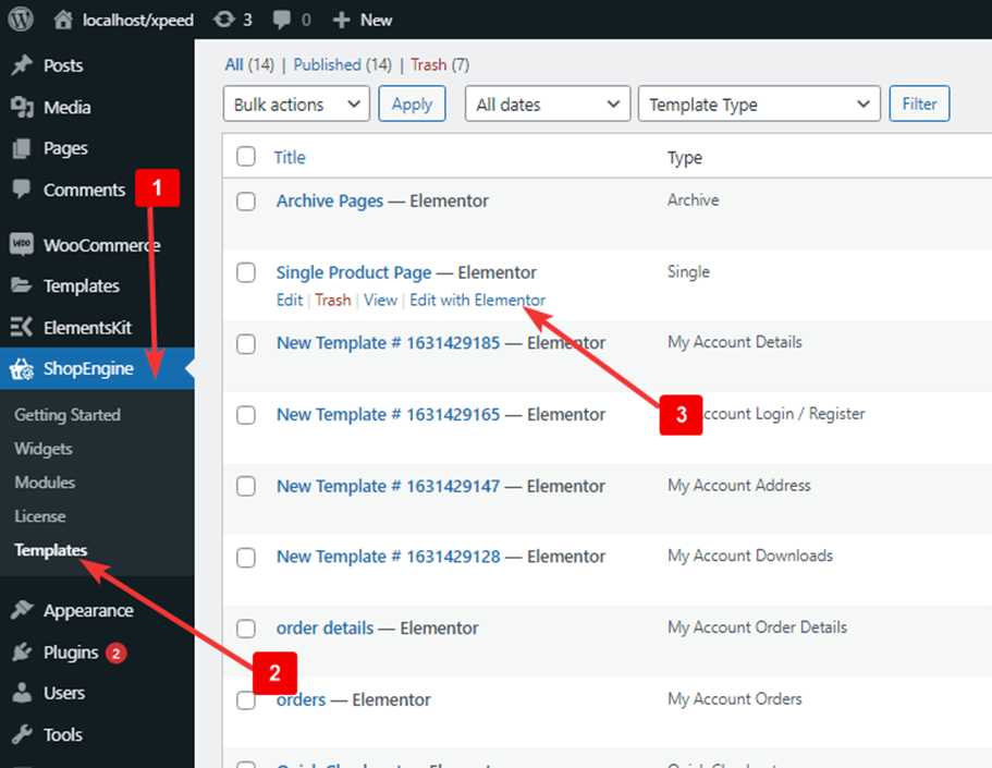
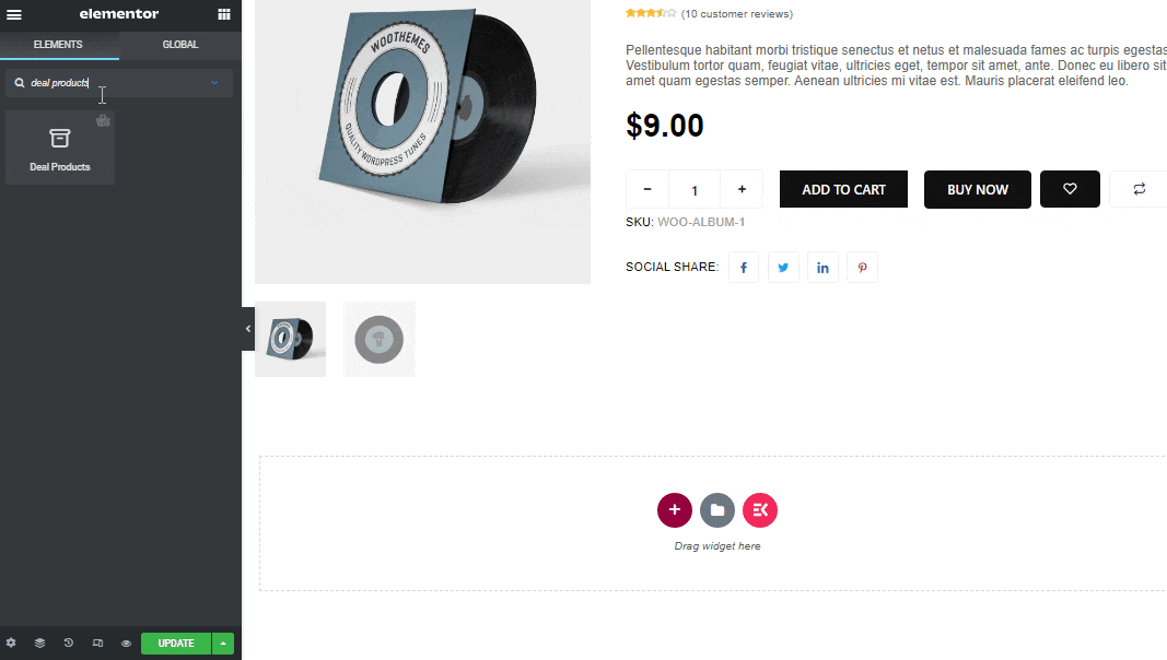
- Search for Deal Products on Elements Search option
- Drag and drop the widget
- Click on Update to save changes.
Step 3: Content Settings of Deal Products #
Click on the edit icon and go to the Content tab to customize the following settings:
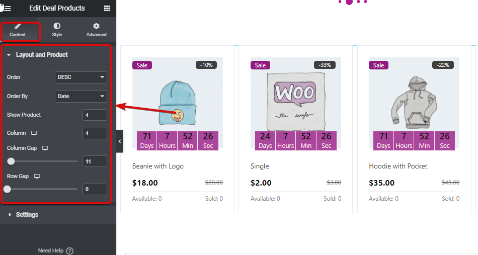
Expand Layout and Product option to edit:
- Order: You can set the order to ascending or descending.
- Order By: Choose from orde by options including ID, Title, Name, Date, and Popularity.
- Show Product: Set how many products you want to show in this deal products widget.
- Column: Choose the number the product you want to show per column.
- Column Gap: Select the gap you want between columns.
- Row Gap: Here you can select the gap between each column.
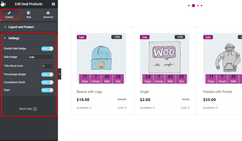
Expand the Settings option to edit:
- Enable Sale Badge: You can choose to show or hide the sale badge.
- Title Word Limit: Customize the title of the sale badge.
- Percentage Badge: You can use turn this option to show the sale percentage.
- Countdown Clock: Turn this option on to show the countdown clock.
- Days: If you are giving for less than one day, then you can use this option to hide the day option from the countdown clock.
Step 4: Style Settings of Deal Products #
Go to the Style tab to customize the following style settings:
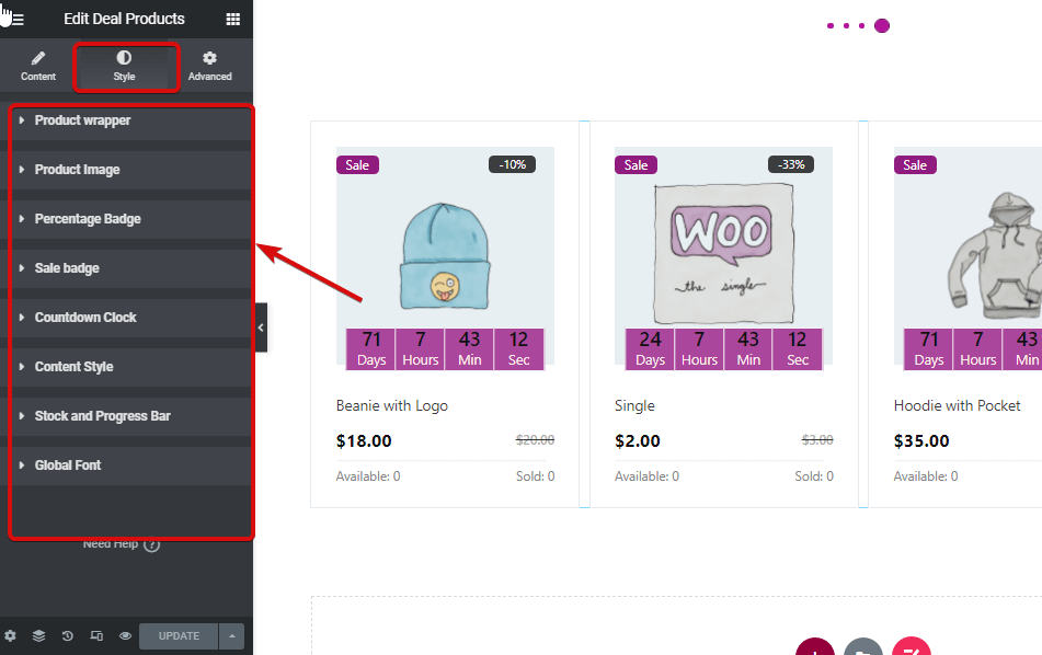
- Product wrapper
- Padding: Adjust the top, right, bottom, and left padding.
- Background Color: Change the background color for the widget.
- Border WIdth: Select the border width you want around each of the product sections.
- Border Color: Choose a color for the border.
- Product Image
- Height: Select the height of the product image for the widget.
- Size: You can select the image size as either content or cover.
- Position: If you decide to choose a cover, then you will get another option to choose the position. Here you can choose the position to be top, center, or bottom.
- Percentage Badge:
- Padding: Adjust the top, right, bottom, and left padding.
- Border radius: CHoose the top, right, bottom, and left values for the border radius.
- Position left: Here you can adjust the horizontal position of the percentage badge.
- Position top: Adjust the vertical position of the percentage badge.
- Color: Pick the color for the percentage text.
- Background: Choose a background color for the percentage badge background.
- Typography: Click on edit typography to choose the font color and weight.
- Sale badge:
- Padding: Adjust the top, right, bottom, and left padding.
- Border radius: Choose the top, right, bottom, and left values for the border-radius.
- Position left: Here you can adjust the horizontal position of the sale badge.
- Position top: Adjust the vertical position of the sale badge.
- Color: Pick the color for the sale text.
- Background: Choose a background color for the sale badge background.
- Typography: Click on edit typography to choose the font color and weight.
- Countdown Clock:
- Number Color: Pick a color for the numbers in the countdown clock.
- Number Typography: Here you can choose the font size, weight, and transform style.
- Label Color: Choose the color for the label day, hour, min, and sec.
- Label Typography: Here you can choose the font size, weight, transform style, and line-height for the labels.
- Background: Change the background color for the labels.
- Border Color: Choose the border color.
- Border Width: Select the width size of the border.
- Padding: Adjust the top, right, bottom, and left padding
- Space Bottom: Here you can choose the bottom space.
- Countdown Wrapper Width: Choose the width for the whole countdown section.
- Content Style:
- Title Color: Change the title color of the product.
- Title Hover Color: Pick a hover color for the title.
- Title typography: Here you can change the font size, weight, transform and line height for the title.
- Title margin: Choose the top, right, bottom, and left margin for the title.
- Price row margin: Select the top, right, bottom, and left margin for the price row.
- Regular price color: Choose a color for the regular price.
- Regular price typography: Here you can select the font size, weight, and transform it for the regular price.
- Sale price color: Choose a color for the sale price.
- Sale price typography: Here you can select the font size, weight, and transform it for the sale price.
- Stock and Progress Bar
- Text color: Change the color for the available and sold options.
- Text typography: Here you can select the font size, weight, transform, and line height for the available and sold option.
- Line Cap Style: You can choose the round cap style to be round or square.
- Normal line color: Chose the color of the border of each stock section.
- Normal line height: Select the line-height.
- Active line color: Change the active line color here.
- Active line-height: Here you can chose the active line height.
- Global Font
- Font family: Here you can change the font family for the whole widget.
After making all the changes click update to save. Now Deal Products should be visible on the storefront with all the customization and styling.
Here is the preview of how Deal Products Widget looks like