


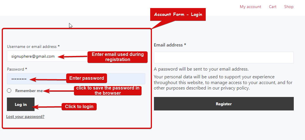
Account Form – Login widget provides a login form for the customers which they can use to log in and access their account information. This is a My Account Template widget.
Let’s learn how you can use Account Form – Login Widgets on your wooCommerce site:
Note: Customers need to register before they can log in, so make sure you add that widget too. Check out the Account Form Register documentation.
Step 1: Enable the widget #
To enable the widget,
- Go to ShopEngine > Widgets > Account Form – Login
- Turn on
- Save changes
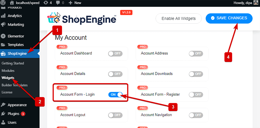
Note: You can also turn on Account Form – Login with a global setting that turns on all the widgets of ShopEngine.
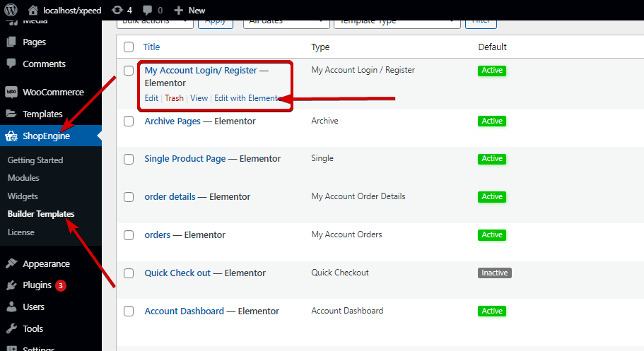
Step 2: Add Account Form – Login Widget #
Before you can add the widget you need to create a My Account Login / Register Template first. Check out the documentation on how to create a My Account Login / Register template.
To add Account Form – Login:
- Go to ShopEngine > Templates > My Account Login / Register
- Click on Edit with Elementor
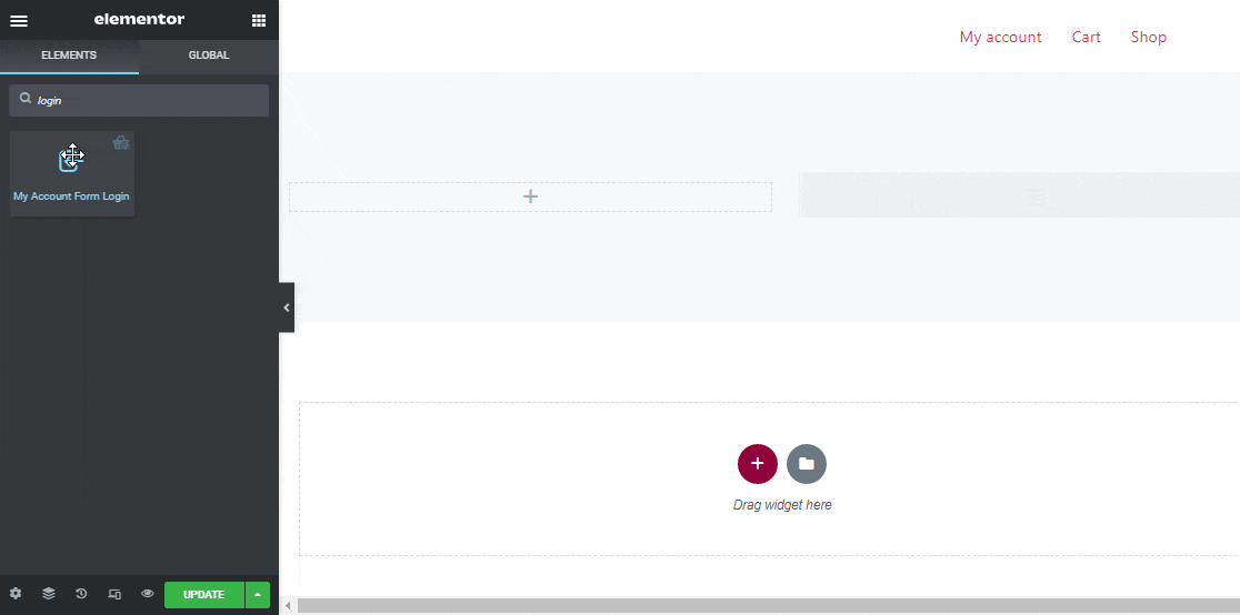
- Search for Account Form – Login on Elements Search option
- Drag and drop the widget
- Click on Update to save changes.
Step 3: Style Settings #
Click on the edit option to go to the Style Tab to customize the following styles of this widget:
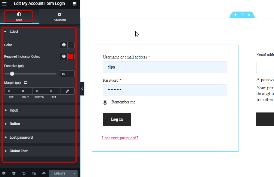
Label: #
- Color: Pick a color for the label.
- Required Indicator Color: Choose a color for the label.
- Font size (px): Here you can set the font size for the label.
- Margin (px): Adjust the top, left, right, and bottom margin around the label.
Input: #
- Font size (px): Choose a font size for the input.
- Normal/ Focus: Chose the color and background color for the input field for both normal and focus mode.
- Color: Pick a color for the label.
- Border: You can choose the border type as solid, double, dotted, dashed groove. Choose none if you do not want any border.
- Width: Select the top, right, bottom, and left width values.
- Color: Pick a border color.
Button: #
- Color: Pick a color for the button.
- Background Color: Choose the background color.
- Background Color Hover: Selec a background color for the hover mode.
- Font size (px): Chose a font size for the button text/
- Padding: Adjust the top, right, bottom, and left padding for the button.
- Margin: Select the top, right, bottom, and left margins.
- Border Radius: Here you can adjust the border-radius values.
Lost Password: #
- Color: Pick a color for the lost password link.
- Hover Color: Chose a hover color.
- Font size (px): Here you can choose the font size for the lost password.
Global Font: #
- Font family: Here you can change the font family for the whole widget.
Finally, click on Update to save all the changes.
Here is how the Account Form – Login widget will look on the website