


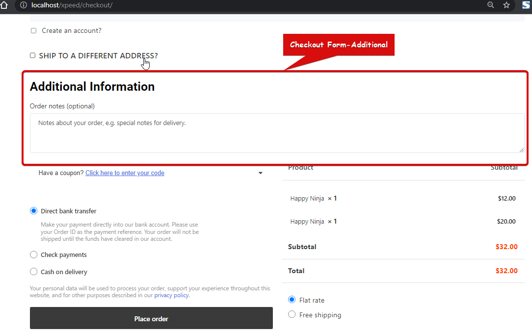
Checkout Form-Additional widget lets customers add any additional notes regarding order or delivery while checking out. This is a checkout template widget of ShopEngine.
Note: You can add a custom input field to this widget using the Checkout Additional Field Module.
Let’s learn how you can use Checkout Form-Additional Widgets on your wooCommerce site:
Step 1: Enable the Checkout Form-Additional Widget #
Before you can add the widget you need to create a Checkout Template first. Check out the documentation on how to create a Check out Template.
To enable the widget:
- Go to ShopEngine > Widgets > Checkout Form-Additional
- Turn on
- Save changes
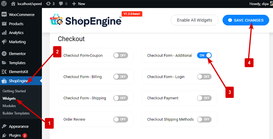
Note: You can also turn on Checkout Form-Additional with a global setting that turns on all the widgets of ShopEngine. Check out how you can turn on all the modules at once.
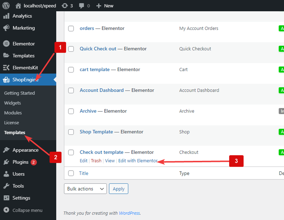
Step 2: Add Checkout Form-Additional Widget #
To add Checkout Form-Additional:
- Go to ShopEngine > Templates > Checkout Template
- Click on Edit with Elementor
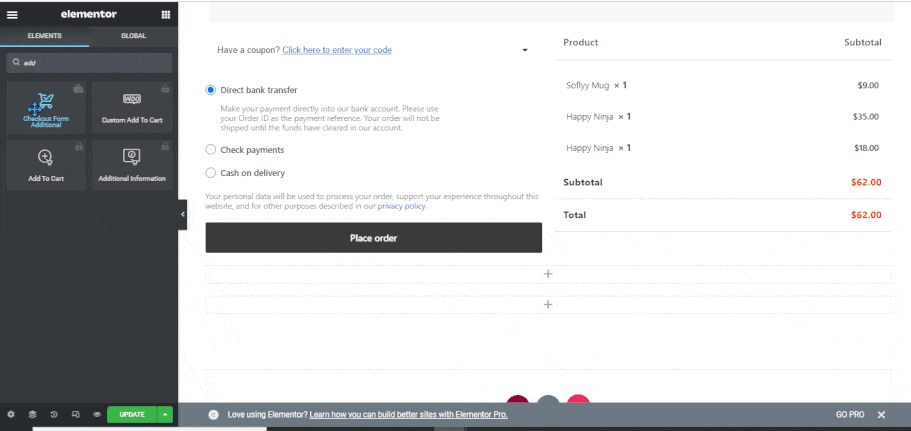
- Search for Checkout Form Additional on Elements Search option
- Drag and drop the widget
Click on Update to save changes.
Step 3: Style Settings of Checkout Form-Additional #
Click on the edit option to go to the Style Tab to customize the following styles of this widget:
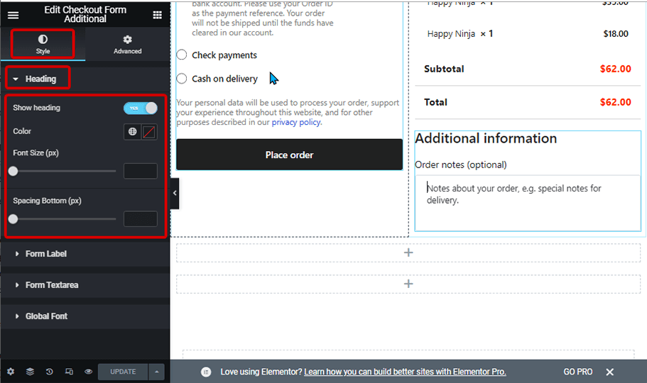
Heading: #
- Show Heading: Turn this option on to show the widget heading.
- Color: Pick a color for the title.
- Font Size (px): Change the font size of the title.
- Spacing Bottom(px): Select how much bottom space you want for the title.
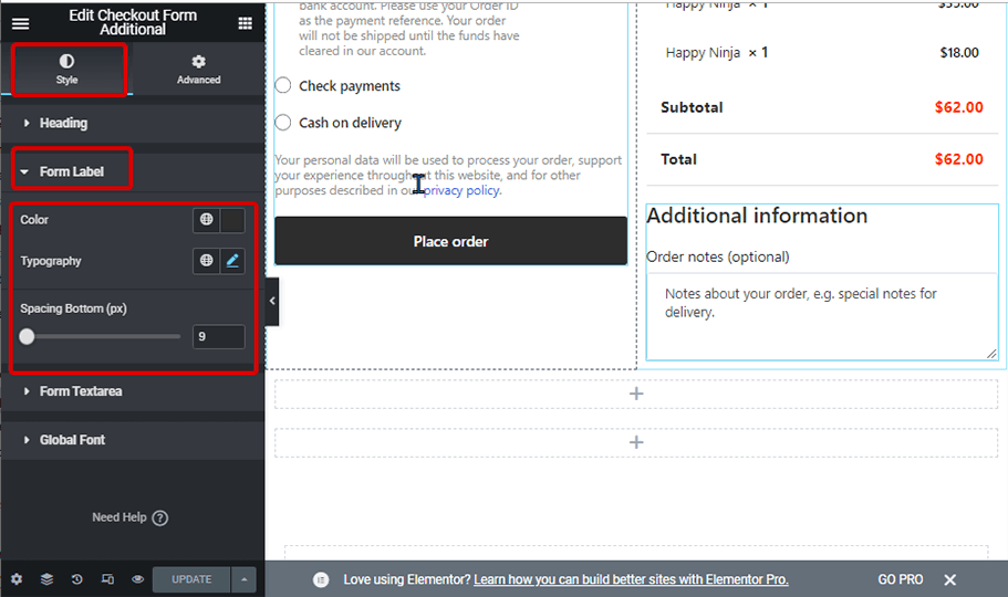
Form Label: #
- Color: Pick a color for the label.
- Font Size (px): Change the font size of the label.
- Spacing Bottom(px): Select how much bottom space you want for the label.
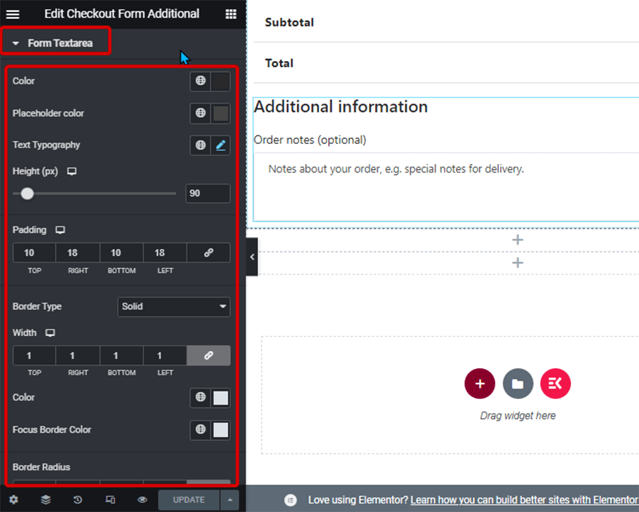
Form Textarea: #
- Color: Change the color of the text input.
- Placeholder color: Here you can change the color of the placeholder text.
- Text Typography: Change the font size of the form textarea.
- Height (px): Chose the height of the form field.
- Padding: Adjust the top, left, right, and bottom padding.
- Border Type: You can choose the border type as solid, double, dotted, dashed groove. Choose none if you do not want any border.
- Color: Pick a border color.
- Focus Border Color: Chose a color for the border when someone starts typing or put the cursor on the text area.
- Border Radius: Adjust the top, left, right, and bottom values for the border-radius.
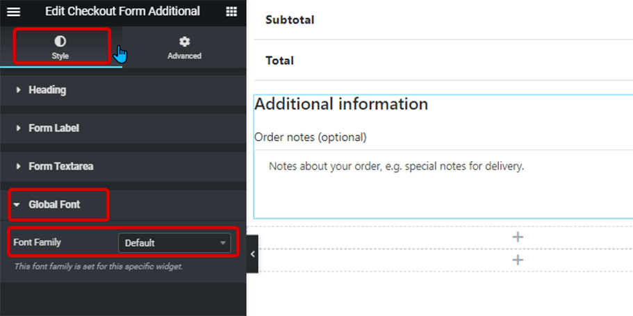
Global Font: #
- Font family: Here you can change the font family for the whole widget.
Finally, click on Update to save all the changes.
Here is how Checkout Form-Additional widget looks like on the Checkout page: