


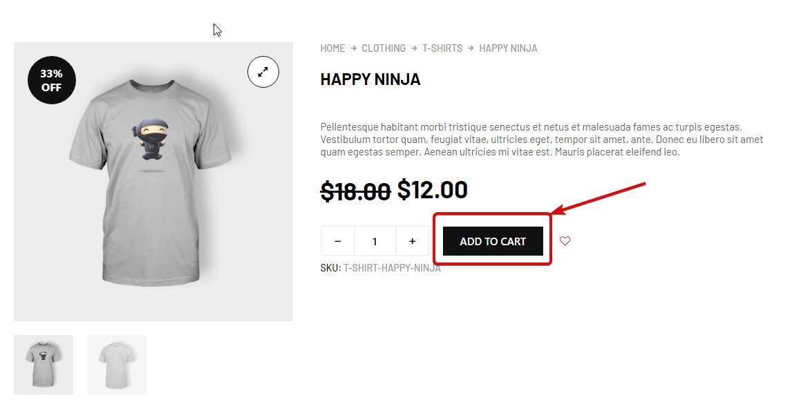
Add To Cart Widget allows customers to add products to their virtual shopping cart. This is a single product template widget. You can add this widget to design your single product page using ShopEngine.
Let’s learn how you can use Add To Cart Widget on your wooCommerce site:
Step 1: Enable the widget #
To enable the widget,
- Go to: ShopEngine > Widgets > Add To Cart
- Turn on
- Save changes
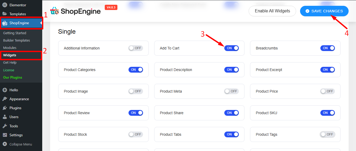
Note: You can also turn on Product Stock with a global setting that turns on all the widgets of ShopEngine at the same time.
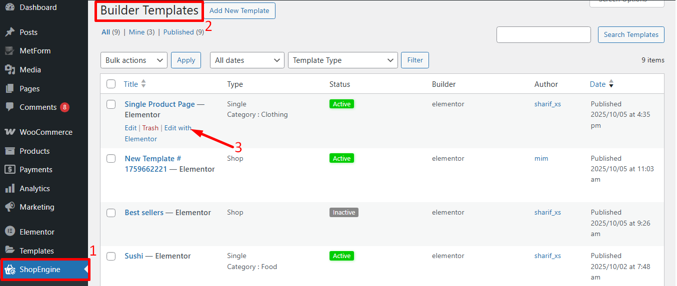
Step 2: Add Add To Cart Widget #
Before you can add the widget you need to create a Single Product Template first. Check out the documentation on how to create a Single Product Template.
To add Add To Cart:
- Go to ShopEngine > Templates > Single Product Page Template
- Click on Edit with Elementor
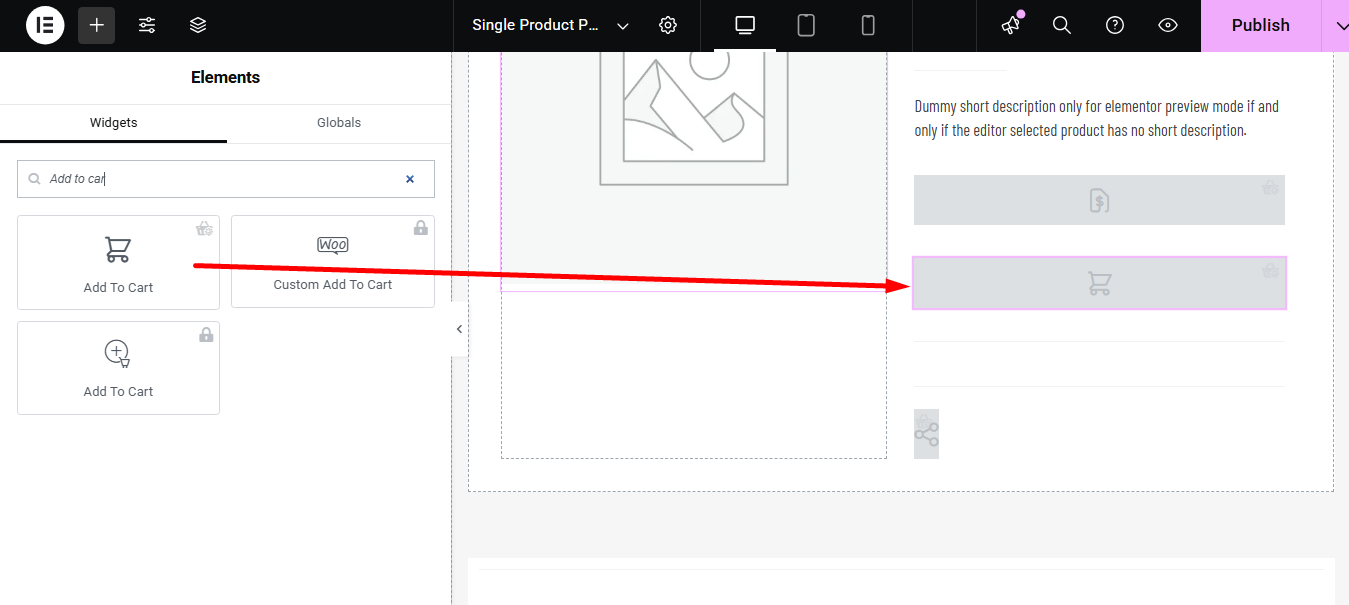
- Search for Add To Cart on Elements Search option
- Drag and drop the widget
- Click on Update to save changes.
Step 3: Settings of Add To Cart #
Go to Content > Settings to customize the following options:
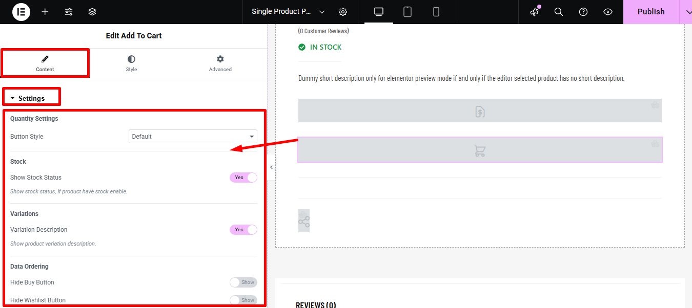
- Quantity Settings:
- Button Style: You can change the button style. You can set the increase (+) and decrease (-) buttons on both sides, both left, both right or you can leave it as default. You also have the option to choose custom Plus Icon(+) and Minus Icon(-).
- Stock:
- Show Stock Status: You can show the stock status by turning this option on.
- Variation:
- Variation Description: Turn this option on to show product variation description.
- Data Ordering:
- Hide Buy Button – Removes the main purchase button; users can’t buy directly.
- Hide Wishlist Button – Removes Add to Wishlist; users can’t save the item.
- Hide Add to Cart – Removes Add to Cart; item can’t be added to the cart.
- Hide Compare Button – Removes Compare; users can’t compare products.
- Hide Quantity Button – Removes quantity selector; users can’t change order amount.
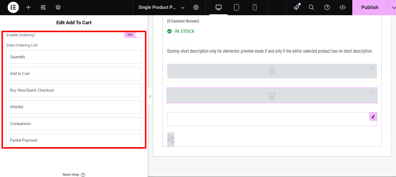
- Enable Ordering: Enable this option to customize the Data Ordering List such as:
- Quantify: Choose the number of items to buy.
- Add to Cart: Puts the product into the shopping cart.
- Buy Now/Quick Checkout: Skips the cart to go straight to payment.
- Wishlist: Saves the product for later.
- Comparison: Compares features of multiple products.
- Partial Payment: Allows paying a deposit or installment now.
Step 4: Style Settings of Add To Cart #
Switch to the Style tab to get access to all the style options.
Expand Stock Status and edit the following settings:
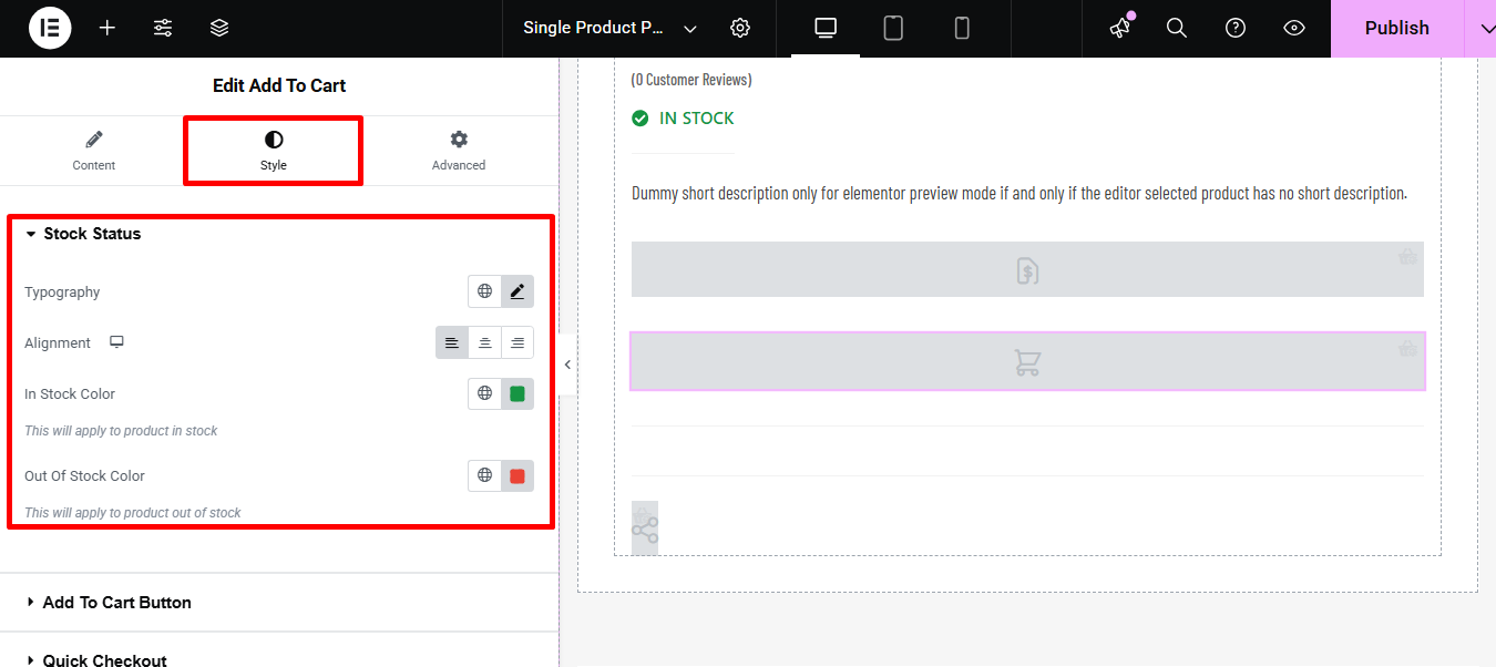
- Typography: You can change the font family, font size, font weight, transform, and line height for the stock status text here.
- Alignment: You can choose the alignment to be left, right, or center.
- In stock color: Choose the text color when the product is in stock.
- Out of Stock Color: Pick the color for the text when the product is out of stock.
Expand Add to Cart Button to edit the following style options:
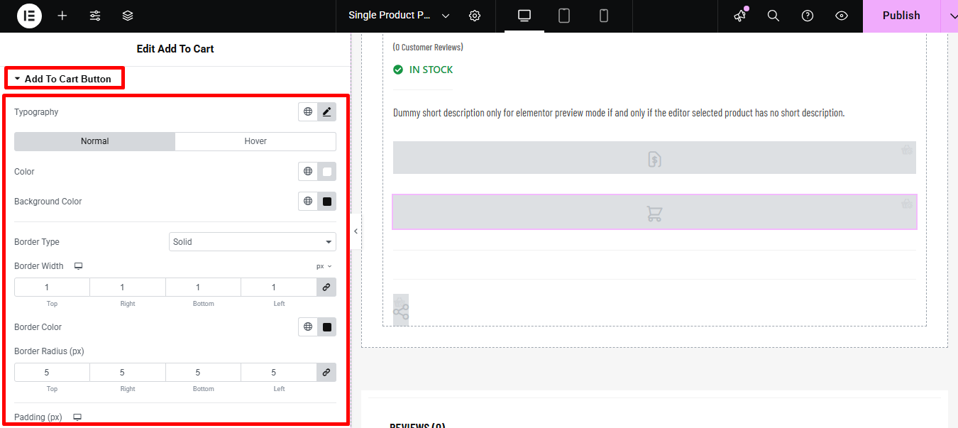
- Typography: You can change the font family, font size, font weight, transform, and line-height for Add to Cart Button here.
- Normal/ Hover: Change the color and background color for both normal and hover views.
- Border type: you can choose the border type to be solid, dotted, doubled dashed, or none.
- Width: Select the top, left, right, and bottom width of the border.
- Color: Pick a color for the border.
- Border-radius: Put the top, right, bottom, and left values for the radius.
- Padding: Adjust the top, left, right, and bottom padding.
- Margin: Give a margin to the top, left, right, and bottom if you want.
Expand Quantity Input to edit the following style options:
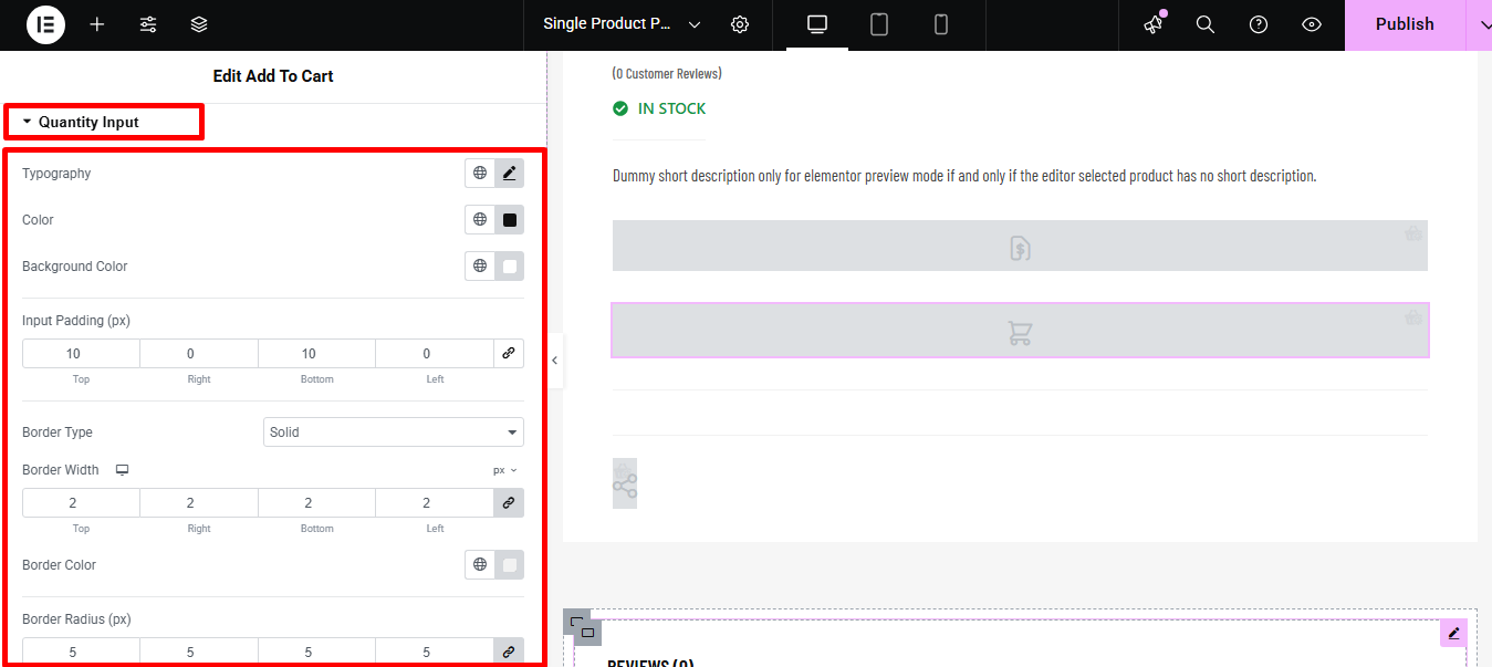
- Typography: You can change the font family, font size, font weight, transform, and line-height for the quantity input option.
- Color: Pick a color for quantity text.
- Background Color: You can change the background color from here if you want.
- Plus Minus Button:
- Icon Size: Select the size of the plus-minus button.
- Color and Background: Change the color and background color for both the normal and hover view.
- Buttons Padding: Provide a padding value around the button.
- Input Padding: Give a padding value around the input field.
- Border Type: you can choose the border type to be solid, dotted, doubled dashed, or none.
- Width: Select the top, left, right, and bottom width of the border.
- Color: Pick a color for the border.
- Border-radius: Put the top, right, bottom, and left values for the radius.
- Wrap margin: Provide a top, right, left, and bottom value for the margin.
Expand Variations to edit the following style options:
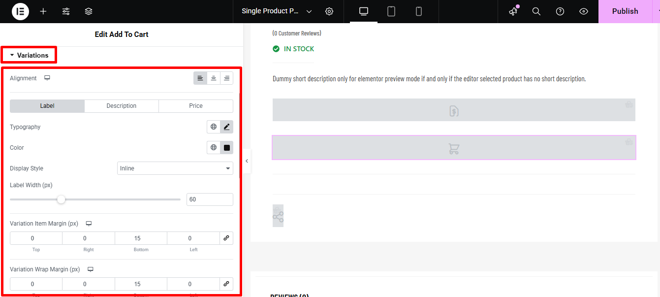
- Alignment: You can choose the alignment to be left, right, or center.
- Label/ Description/ Price: Change the tabs and edit the typography, color, display style of label, description, and price.
- Label Width: Select the width of the label in pixels here.
- Variation Item Margin (px): Select the margin between variation items here.
- Variation Wrap Margin: Provide the top, left, right, and bottom values for variation wrap margin.
- Variation Dropdown: Chose the dropdown color here.
- Border Type: you can choose the border type to be solid, dotted, doubled dashed, or none.
- Width: Select the top, left, right, and bottom width of the border.
- Color: Pick a color for the border.
- Border-radius: Put the top, right, bottom, and left values for the radius.
Expand Variation Swatches to edit the following style options related to variation swatches:
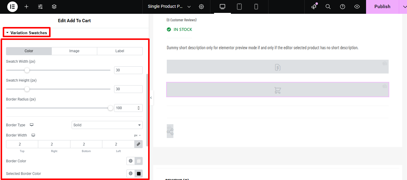
- Color/Image/Label: Switch to each tab to set the swatch width, swatch height, and border radius for color, image, and label.
- Border type: can choose the border type to be solid, dotted, doubled dashed, or none.
- Width: Select the top, left, right, and bottom width of the border.
- Color: Pick a color for the border.
- Selected Border color: Choose a border color for the selected items.
Expand Wishlist to edit the following style options related to wishlists:
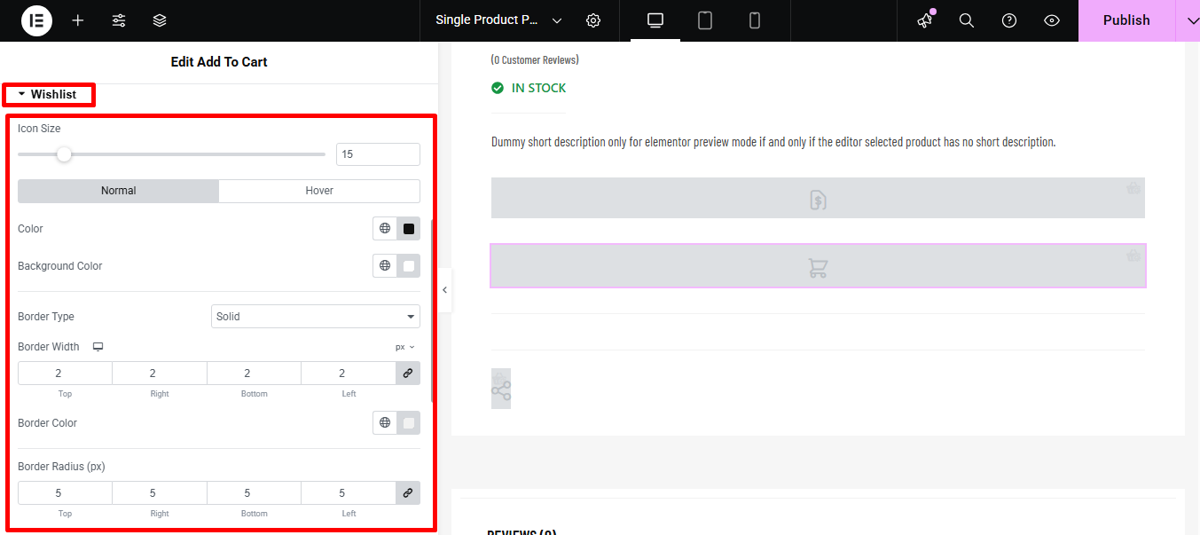
- Icon size: Select the icon size for the wishlist.
- Normal/Hover: Choose the color and background color for both the normal and hover view.
- Border type: can choose the border type to be solid, dotted, doubled dashed, or none.
- Width: Select the top, left, right, and bottom width of the border.
- Color: Pick a color for the border.
- Border-radius: Put the top, right, bottom, and left values for the radius.
- Padding: Adjust the top, left, right, and bottom padding.
- Margin: Give a margin to the top, left, right, and bottom if you want.
Expand Compare to edit the following style options:
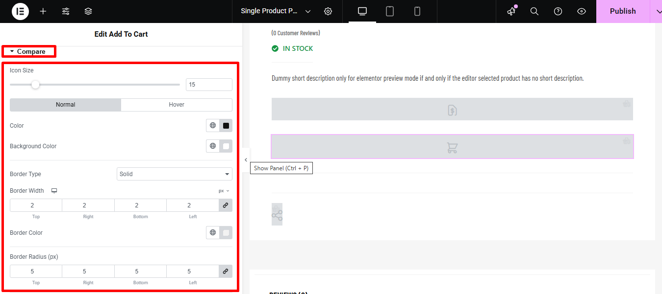
- Icon size: The physical dimensions (width and height) of the comparison icon.
- Color: The color of the icon itself (e.g., the actual image or symbol).
- Background color: The color behind the icon or button area.
- Border type: The style of the line around the button (e.g., solid, dashed, dotted).
- Border Width: The thickness of the line around the button.
- Border Color: The color of the line around the button.
- Border-radius: How rounded the corners of the button/border are.
- Padding: Inner spacing between the icon/text and the border.
- Margin: Outer spacing between the button and other elements on the page.
Click on Update to save all the changes you made.
Here is a Preview of Add to Cart widget: