
 English
  German
  Spanish
  Italian
  French
  Danish
  Portuguese
  Swedish
  Polish
  Korean
  Japanese
 To triggering actions, or navigating users to different sections through nicely designed circular layouts, you can use ElementsKit Circular Menu widget.
Let’s see how you can use the widget.
How to use ElementsKit Circle Menu widget? #
To use the widget, you must upgrade to ElementsKit Pro.
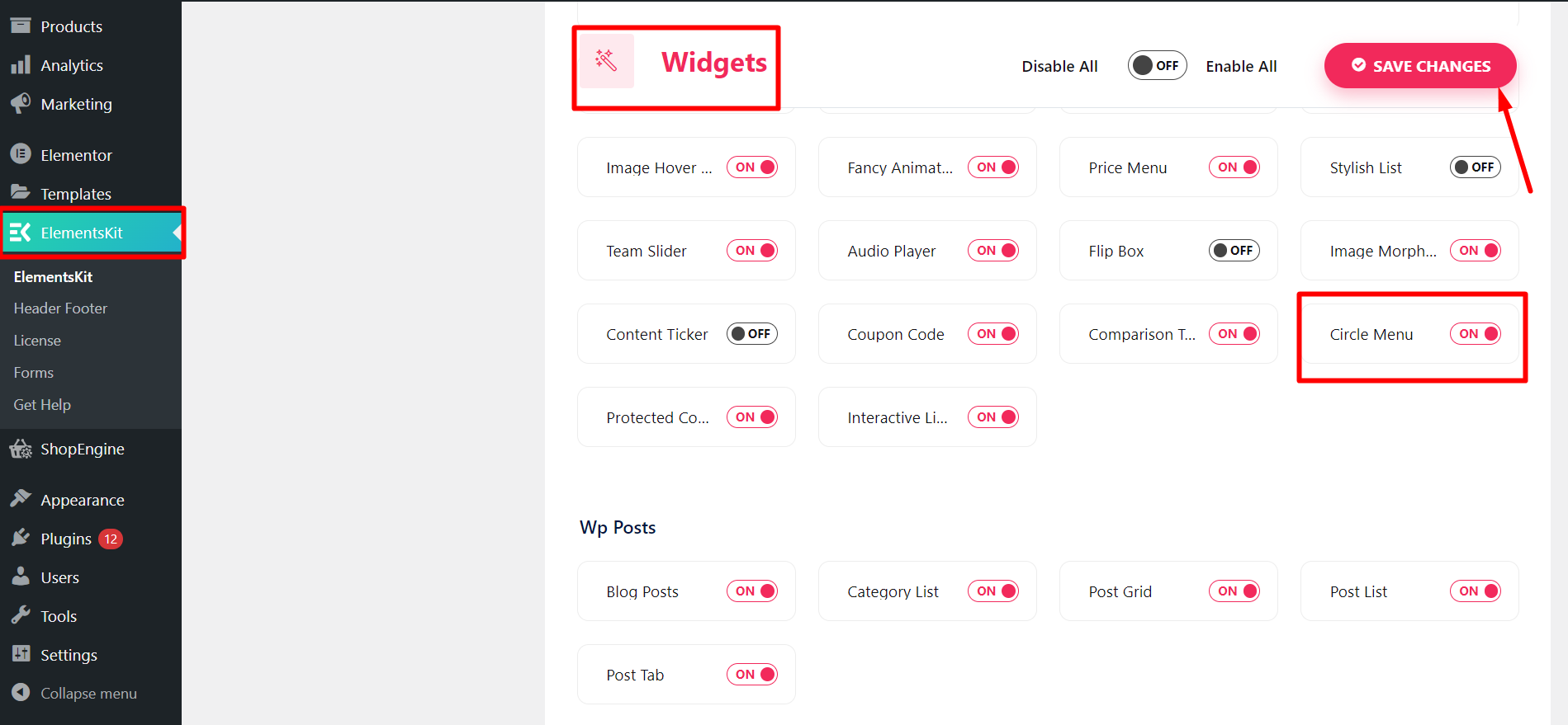
After that, from your WordPress dashboard > Find ElementsKit > Go to Widgets > Circle Menu > Turn ON the widget and click save changes.
Customizing Circle Menu #
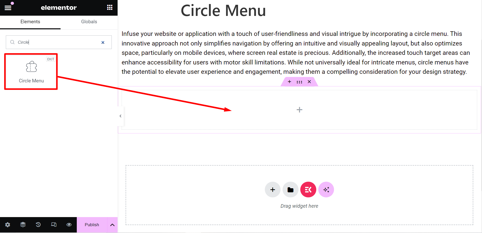
Now, you have to open the page or post where you want to use the circle menu.
- Start with any new or old post and edit with Elementor
- Find the ElementsKit Circle Menu widget
- Drag and drop the widget
Content part #
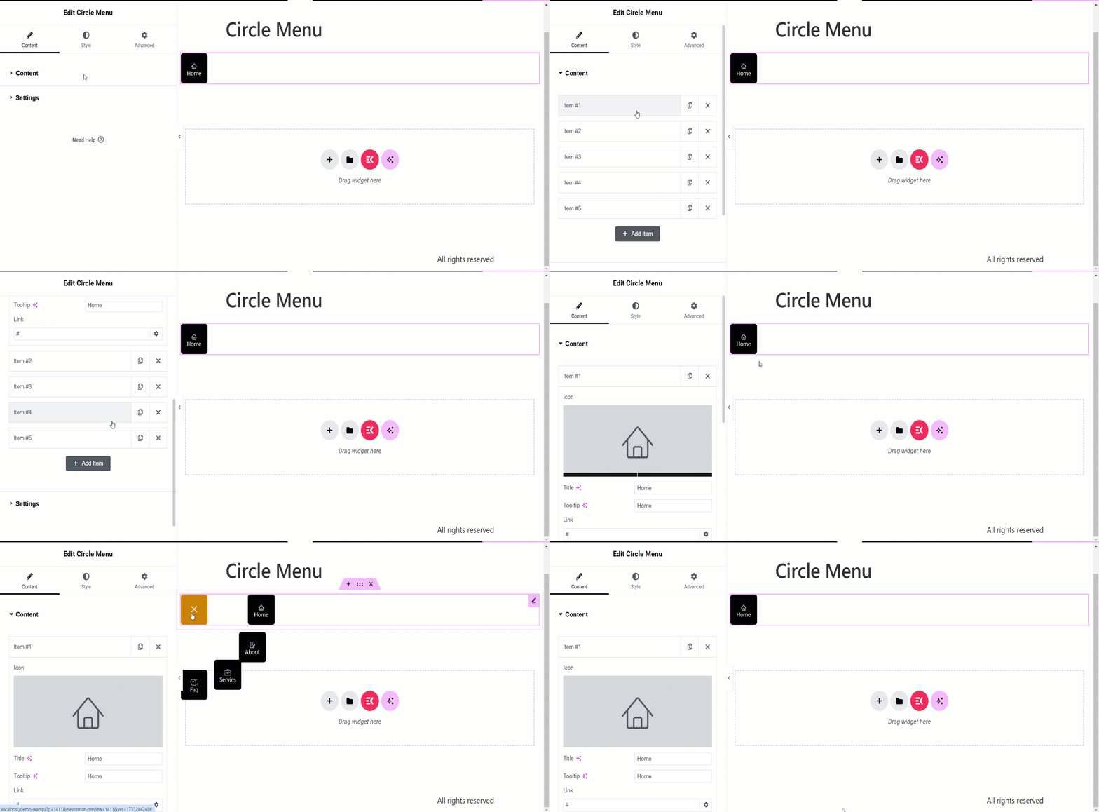
Here, you will get two option –
Content: This option is for arranging the content you want to show through circles. You can add items as many as you want.
With each item, you can:
✔️ Customize titles, set tooltips, and icons, and insert a link.
✔️ Moreover, you can see a Cancel/Close option when you click or hover the widget.
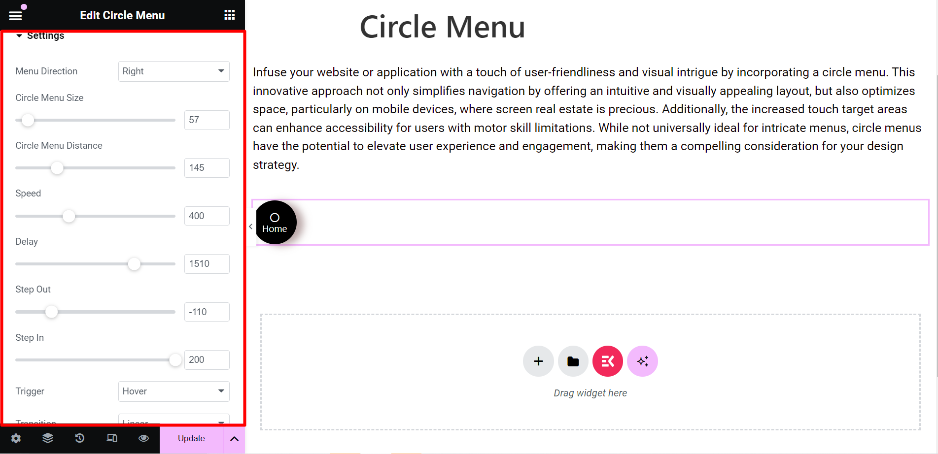
Settings: In this section, you can adjust the circle with various features including –
- Menu Direction: From the drop down menu, you can choose the direction of the circles, such as, Top, Left, Right, etc.
- Circle Menu Size: It lets you control the size of the circle menu.
- Circle Menu Distance: By utilizing this option, you can adjust the distance of the circles while they will spread.
- Speed: This option is to control the speed of the menu.
- Delay: From this bar, you can control the step out and step in time of the circle menus.
- Step Out: It defines when the circle menus expand onwards.
- Step In: It defines when the circle menus expand inwards.
- Trigger: You can set the trigger at click or hover.
- Transition: It refers to the visual effect of the menu items, when they change the state. You can choose any option from the drop down menu.
Style #
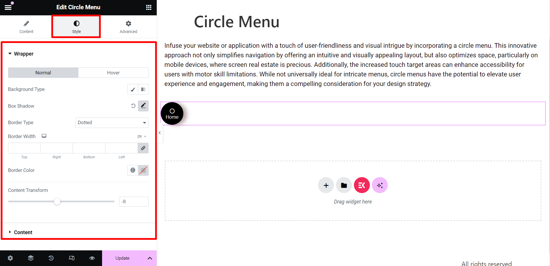
- Wrapper: To style the wrapper of the circle menu, you can change the background type, box shadow, border type, border width, border color, and content transform.
- Content: Here, you can change the text color, typography, size, etc.
Final output #
This is an example, have a look –
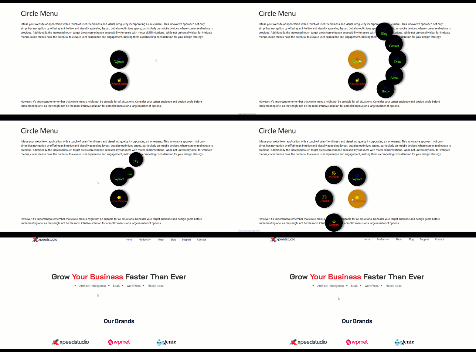
To simplify navigation, save space, and give an appealing look to your posts, you can pick this flexible widget and get your tasks done.


