


 English
  German
  Spanish
  Italian
  French
  Danish
  Portuguese
  Swedish
  Polish
  Korean
  Japanese
 ElementsKit’s Content Ticker widget for Elementor lets you display recent posts, latest news, and more in a stylish way. The widget gives you the option to show either the website posts or custom content on the ticker.
Read this documentation to learn how to use the Elementor Content Ticker widget of ElementsKit.
Step 1: Get Content Ticker in Elementor #
To get the content ticker on your WordPress website, first, enable the ElementsKit Content Ticker widget, then open the Elementor editor and drag & drop the widget to the design area.
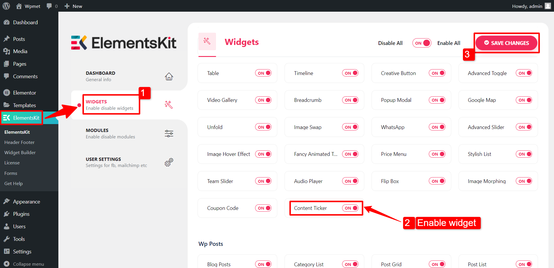
Enable Content Ticker widget #
To enable the Content Ticker widget:
- Navigate to ElementsKit > Widgets.
- Find the Content Ticker from the list and enable the widget.
- Click on the SAVE CHANGES.
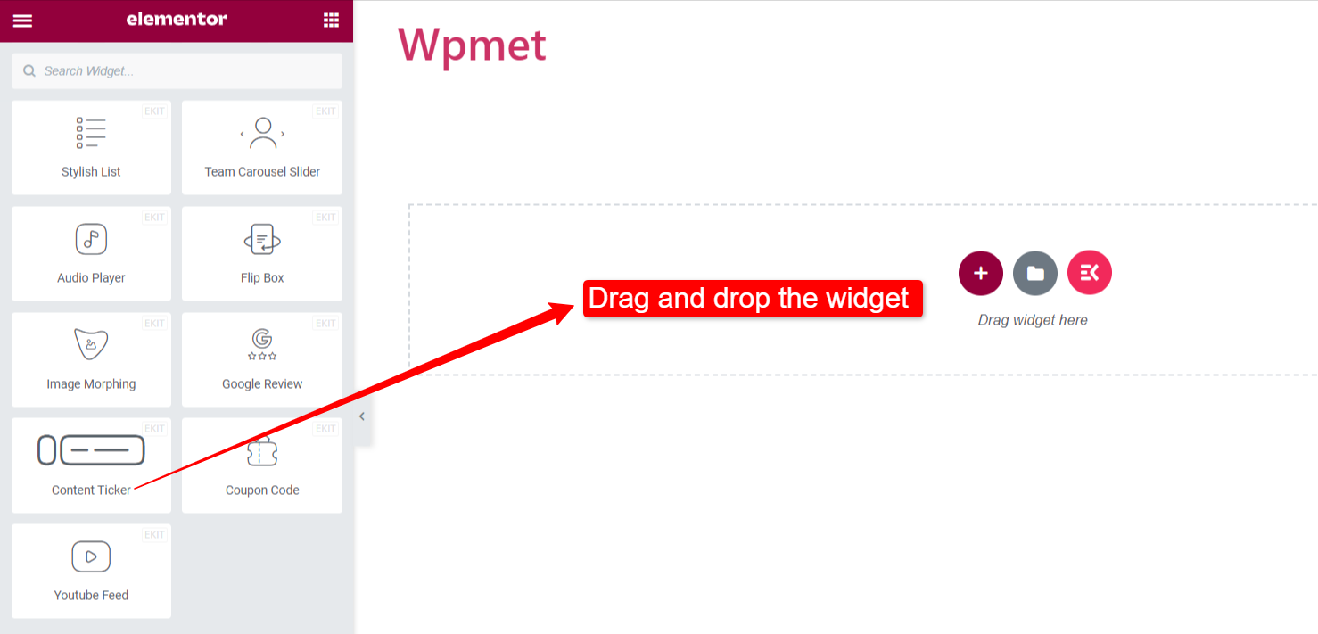
Drag and Drop the widget #
After that, drag and drop the ElementsKit Content Ticker widget into the Elementor editor.
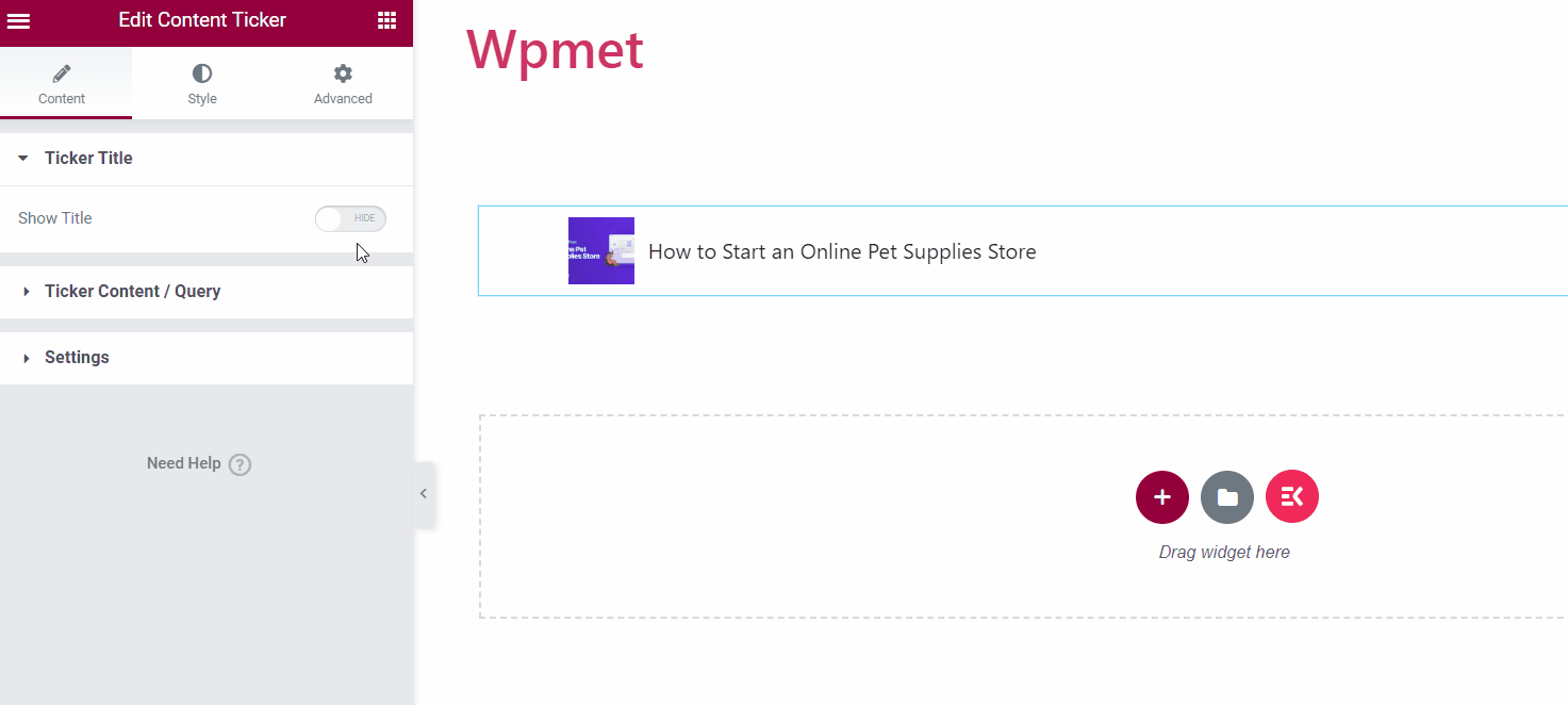
Step 2: Configure the content ticker in Elementor #
Now you can configure the ticker title, content, and ticker settings of the widget.
Ticket Title #
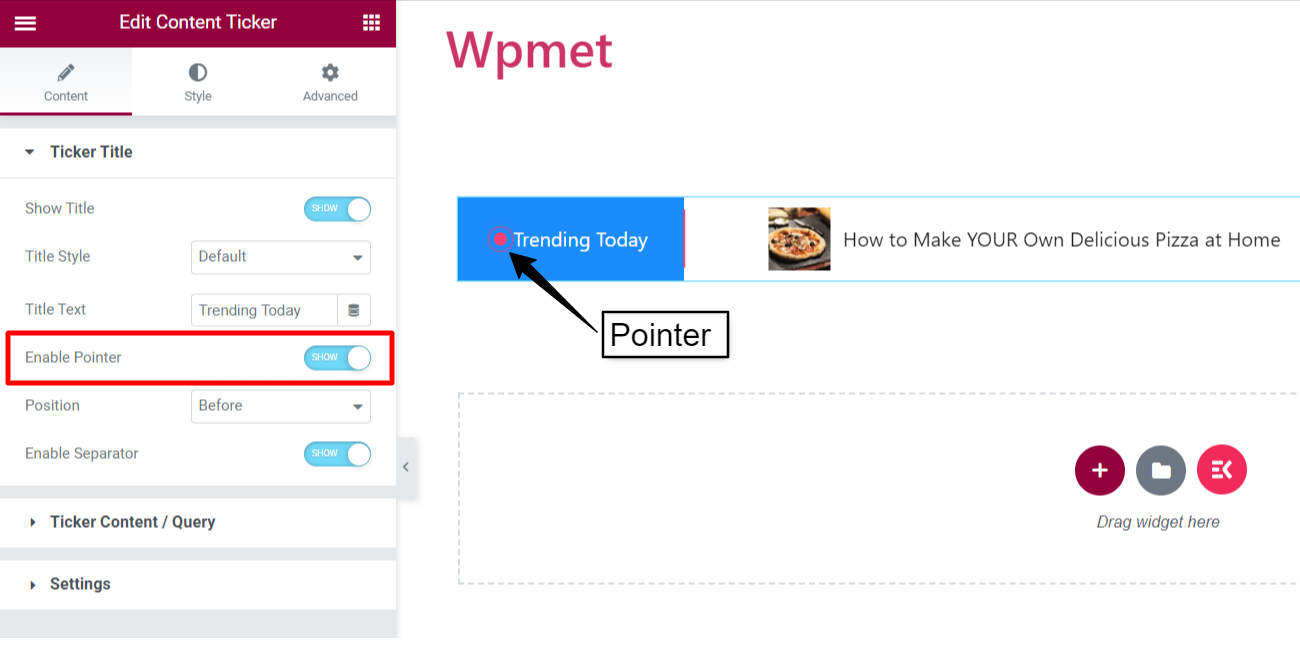
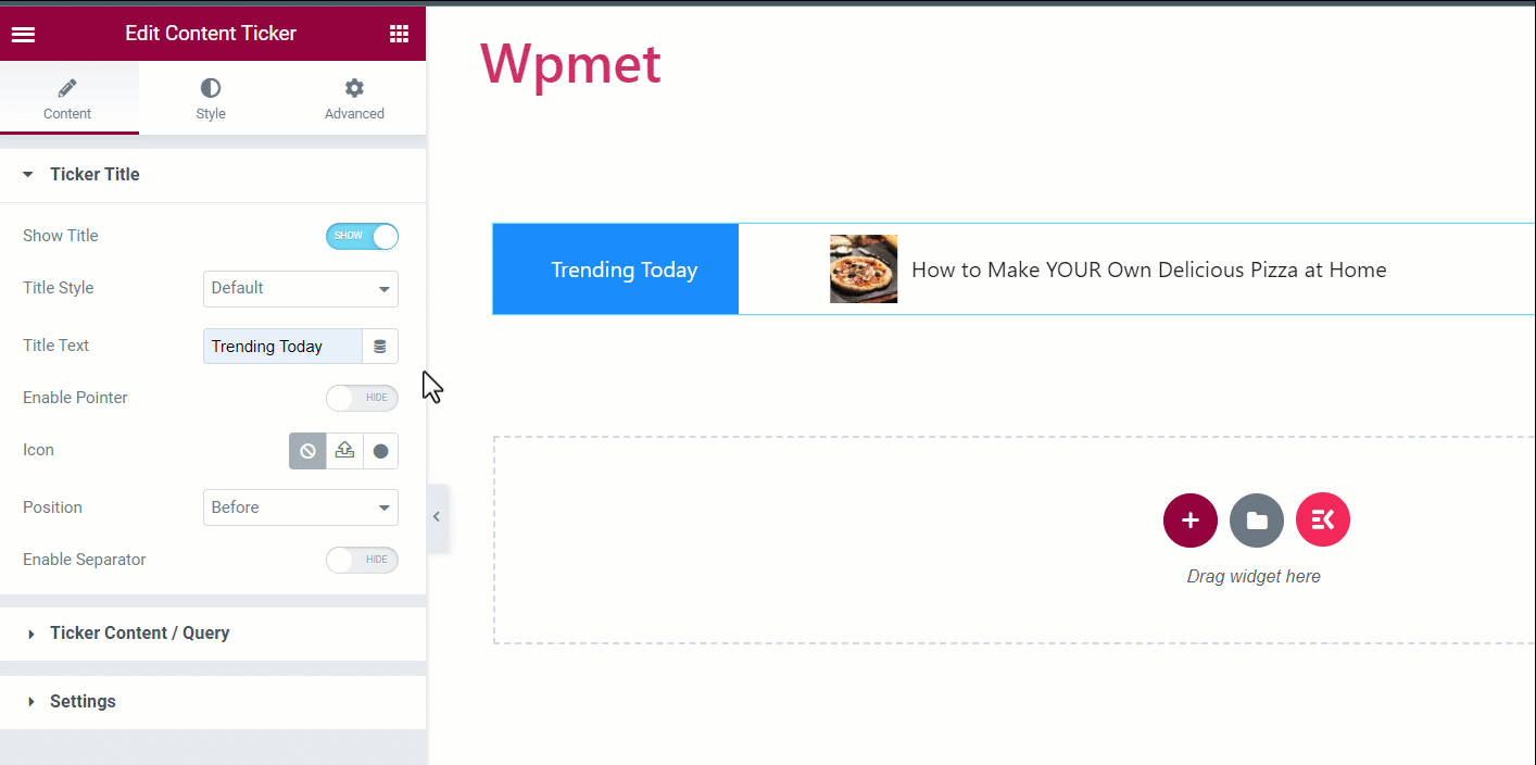
- Show Title: First, enable the ticker title. Then you’ll have other options available to customize the title.
- Title Style: Choose a style for the ticker title from the given options.
- Title Text: Enter a text for the title.
- Enable Pointer: You can show a pointer along with the ticker title.
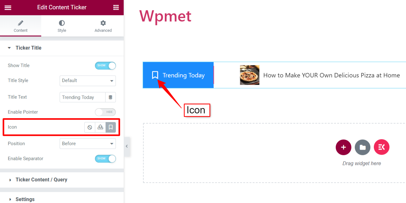
- Icon: Or, you can show an icon alongside the title.
[Note: Pointer and Icon are alternative options. When you enable the pointer, the icon won’t be available, and vice versa.]
- Position: Set the position of the pointer/icon. You can set the position to “Before” or “After” the pointer/icon.
- Enable Separator: You can also show a separator with the ticker title.
Ticker Content / Query #
In this section, you get to Select Content type.
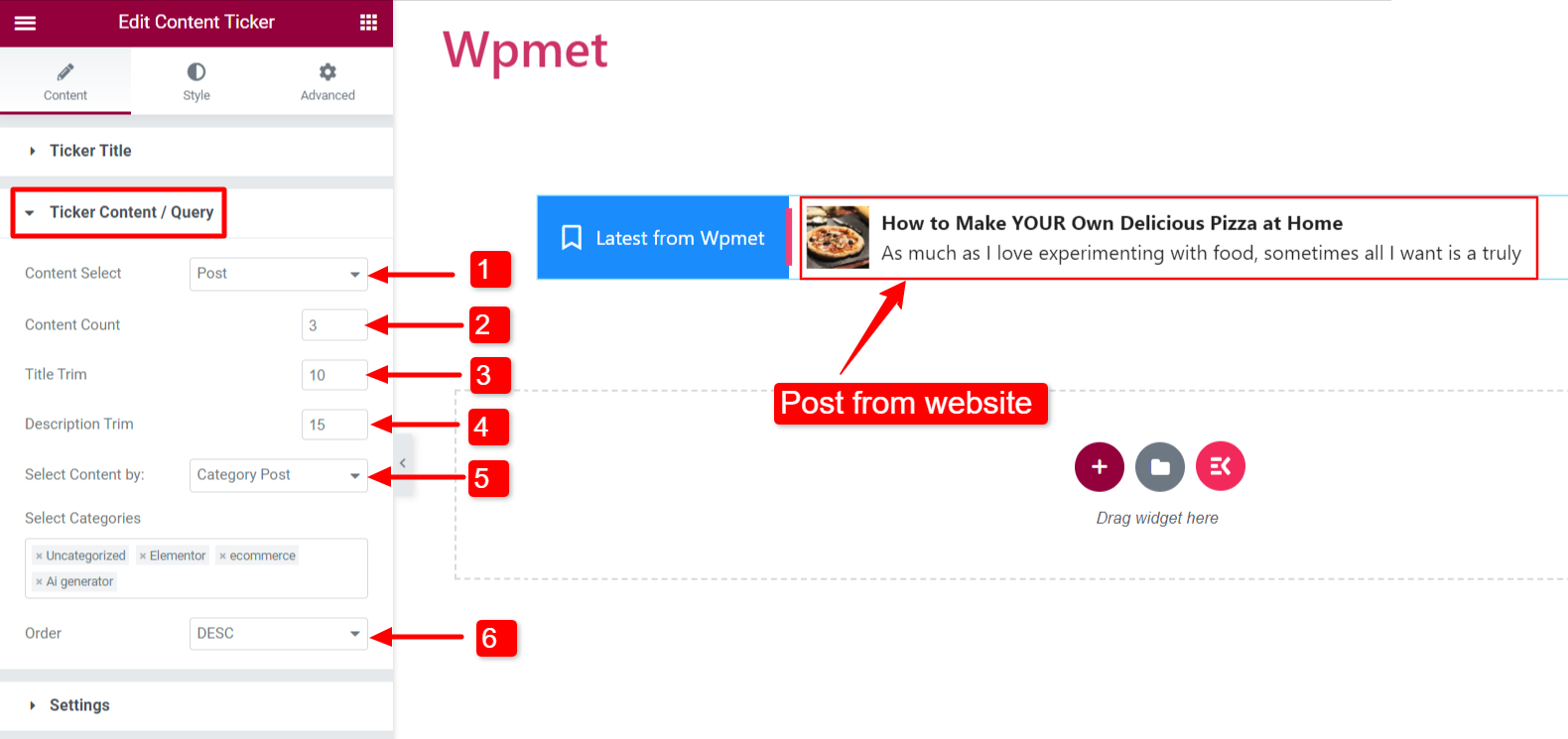
- Content-Type: Post
To show your website posts on the ticker.
- Content Select: Set to “Post”.
- Content Count: Set the number of posts to show.
- Title Trim: Limit the text character number for the post title displayed in the ticker.
- Description Trim: Limit the text character number for the post description displayed in the ticker. (description can be enabled from Settings).
- Select Content by: You can choose to show the post in the following ways:
- Recent Post: Show the recent posts on your website.
- Selected Post: Show the selected post. You can select the posts in the “Search & Select” field.
- Category Post: Show posts by category. Add categories in the “Select Categories” field.
- Order: Set the order of the content to descending order (DESC) or ascending order (ASC).
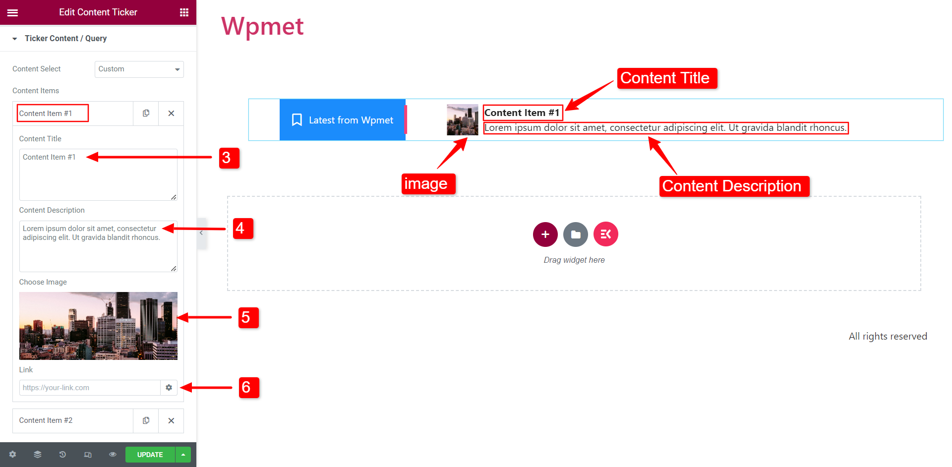
- Content-Type: Custom
To show custom content on the ticker.
- Content Select: Set to “Custom”.
- ADD ITEM: You can add content items.
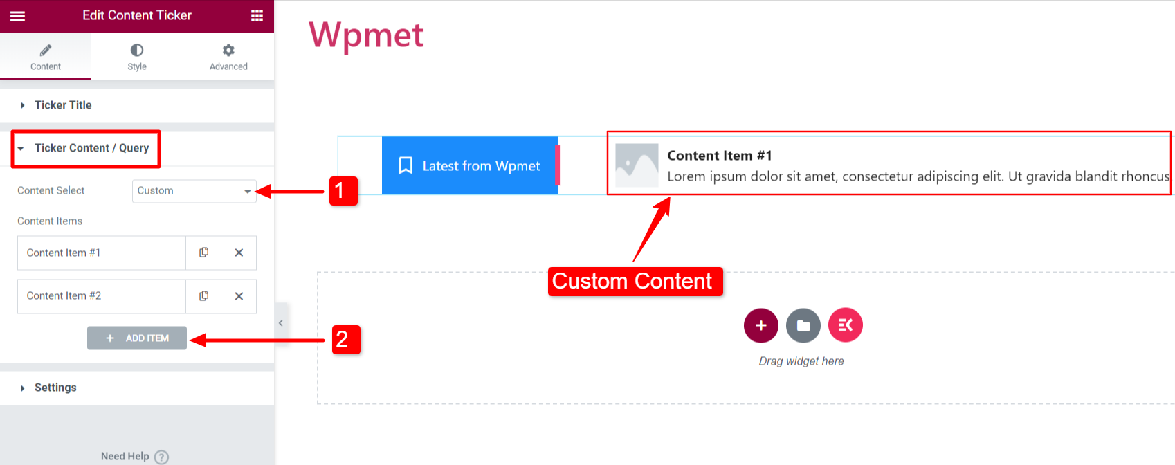
- Content Title: Enter the content title for the ticker.
- Content Description: Add a description for the ticker content.
- Choose Image: Add an image to show on the ticker content.
- Link: Enter a URL to link any web page to the content.
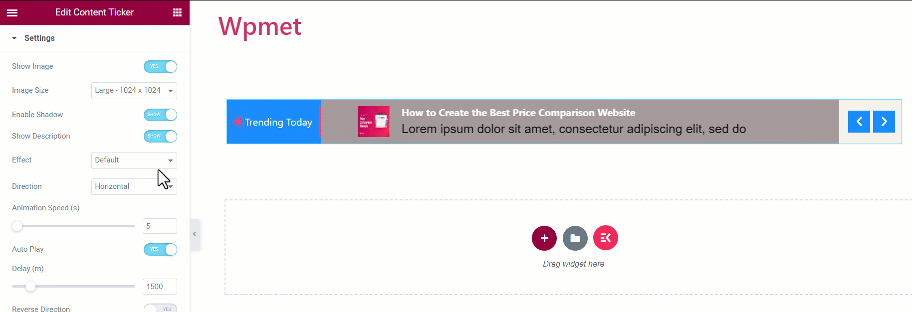
Settings #
You can configure the ticker settings in this section.
- Show Image: Decide whether you want to show the feature image of the content on the ticker.
- Image Size: You can change the image size on the ticker content.
- Enable Shadow: You can enable the shadow that appears on the left and right end of the ticker content.
- Show Description: You can show the description of the content in the ticker.
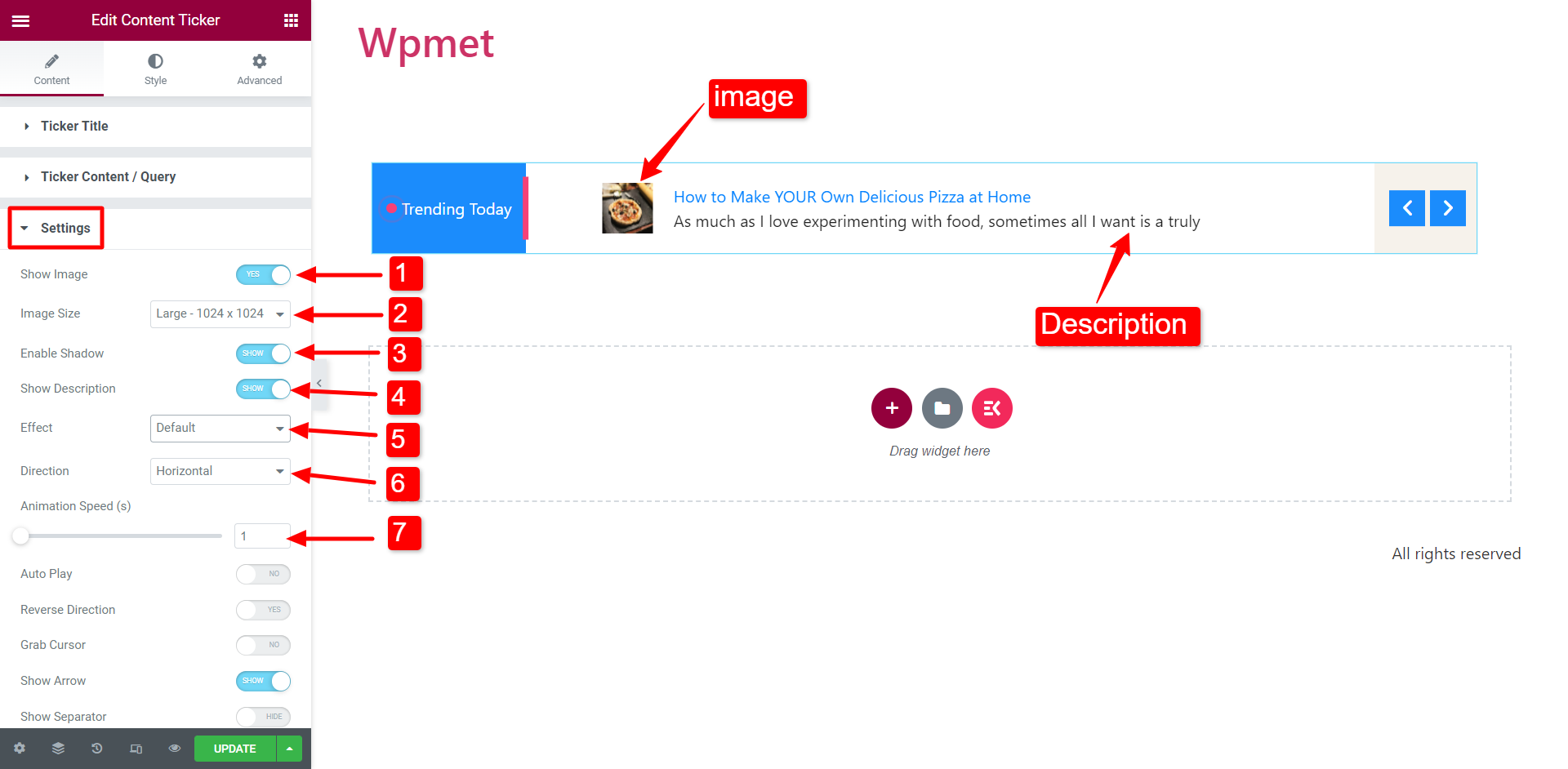
- Effect: Choose the animation effect style from the following options: Default, Fade, Marquee, and Typing.
When you select the Marquee effect, we recommend you increase the Animation Speed for better visibility.
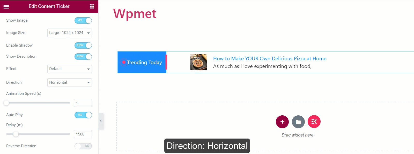
- Direction: Set the direction to i. Horizontal scrolling or ii. Vertical scrolling.
[Note: Direction is Not Available for Marquee effect]
- Animation Speed: You can change and adjust the speed of the animation effect.
[Note: Animation Speed is Not Available for Typing effect]
- Autoplay: You can enable the autoplay for content ticker.
If enabled, set the Dealy time (interval between to change the content).
[Note: Autoplay is Not Available for Marquee effect]
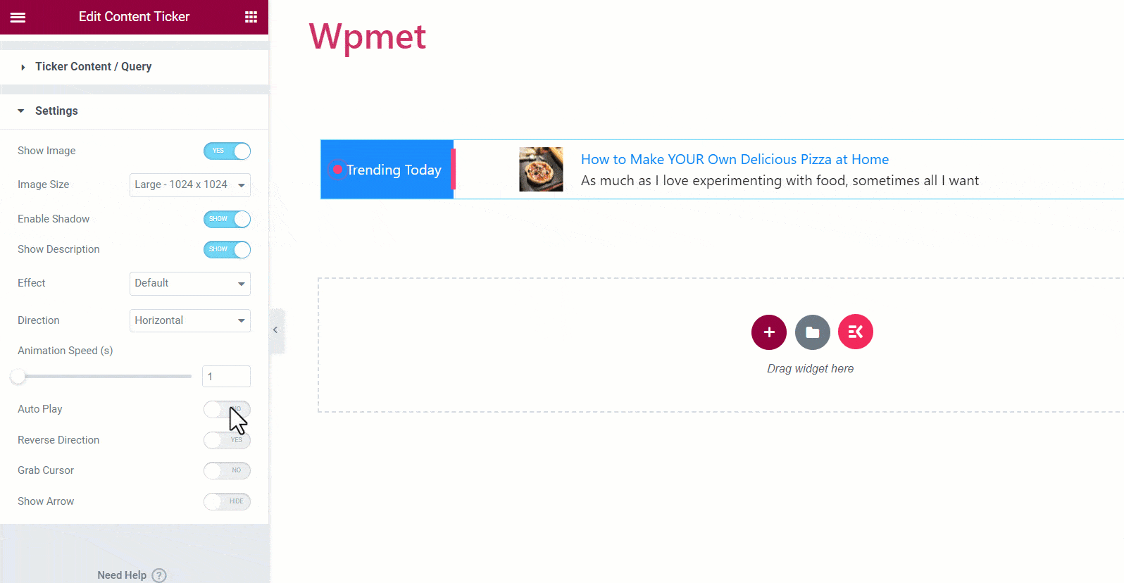
- Reverse Direction: If you enable this option, the ticker will scroll in the Left To Right direction. Otherwise, the ticker direction is Right To Left.
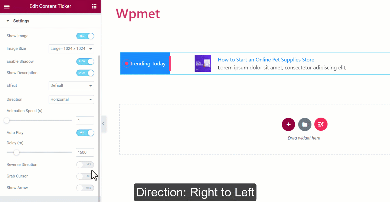
- Grab Cursor: Users can slide the ticker content by grabbing them with their mouse cursor.
[Note: Grab Cursor is Not Available for Marquee effect]
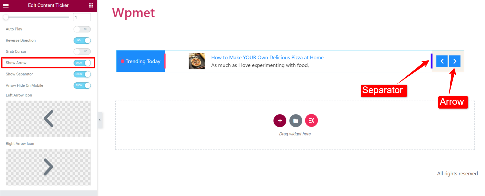
- Show Arrow: Enable the arrow to navigate the ticker content manually. If you show the arrows, choose a Left Arrow Icon and a Right Arrow Icon.
Step 3: Customize the content ticker style #
You can customize the Elementor content ticker under the style tab.
Wrapper #
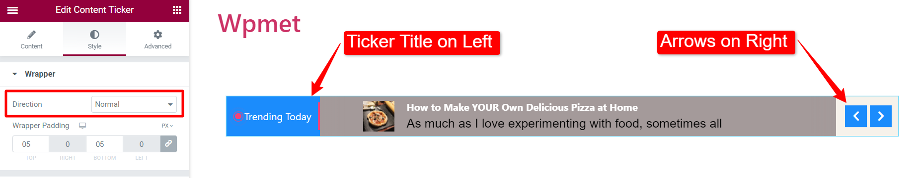
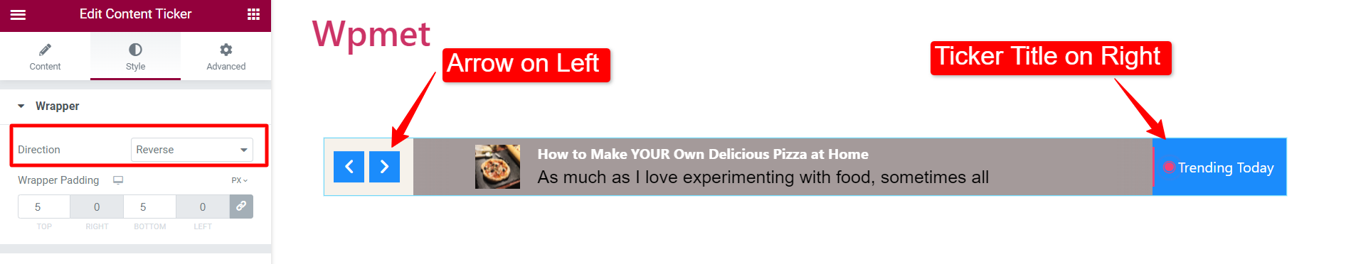
- Direction: Choose the position of the ticker title and arrows.
- Normal: Ticker title is on the left and arrow on the right.
- Reverse: Ticker title is on the right and arrow on the left.
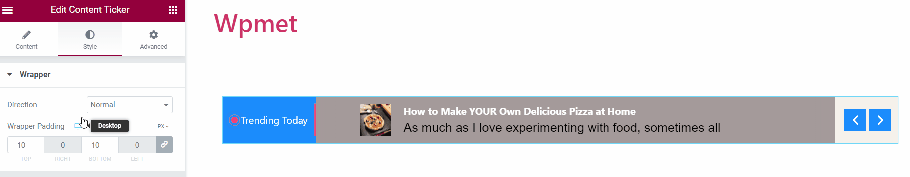
- Wrapper Padding: You can adjust the top and bottom padding for the entire content ticker section.
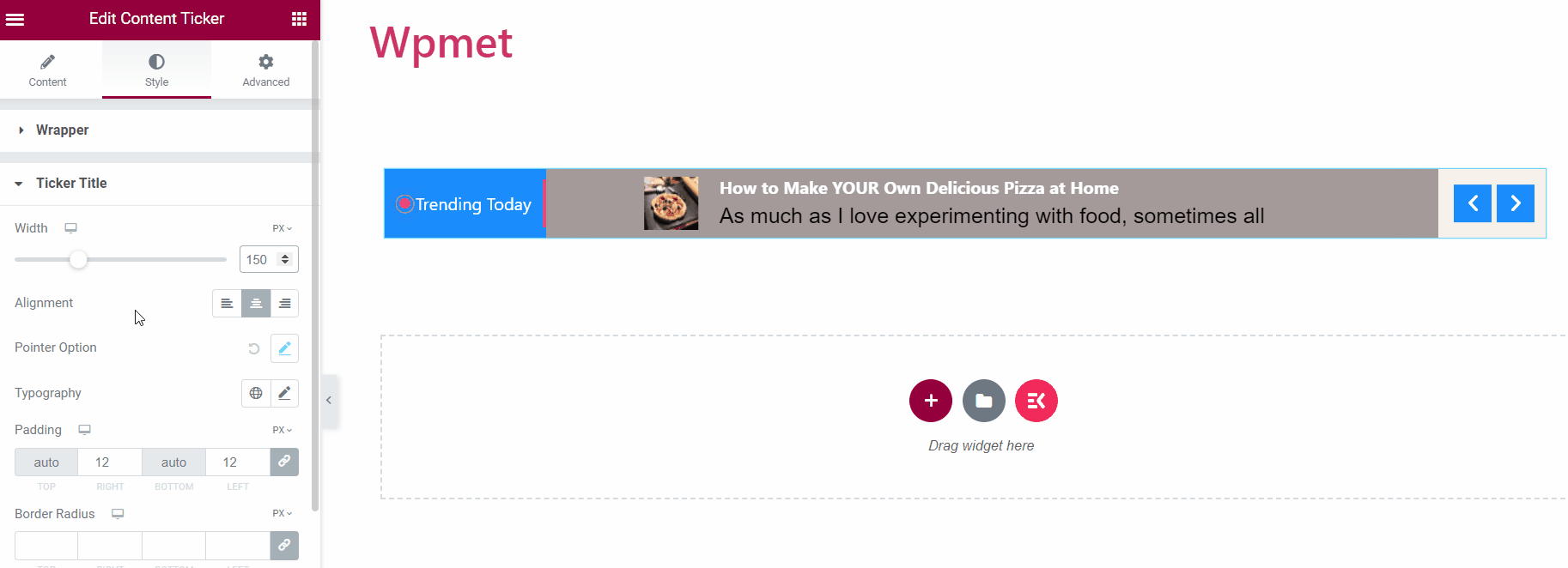
Ticker Title #
- Width: Adjust the Width of the ticker title section.
- Alignment: Select the Alignment of the icon and text in the ticker title.
- Pointer Options/ Icon Option: You can change the Size, Space between the title and pointer/icon, and the color of the pointer/icon.
- Typography: Choose the Typography for the title text.
- Padding: Adjust the Padding of the ticker title.
- Border Radius: Adjust the Border Radius of the ticker title.
- Text Color: Choose the Text Color.
- Background: Choose the ticker title Background.
- Icon: Choose an Icon of the ticker title.
[Note: You can choose separate Text colors, Background colors, and Icon colors for Normal and Hover states.]
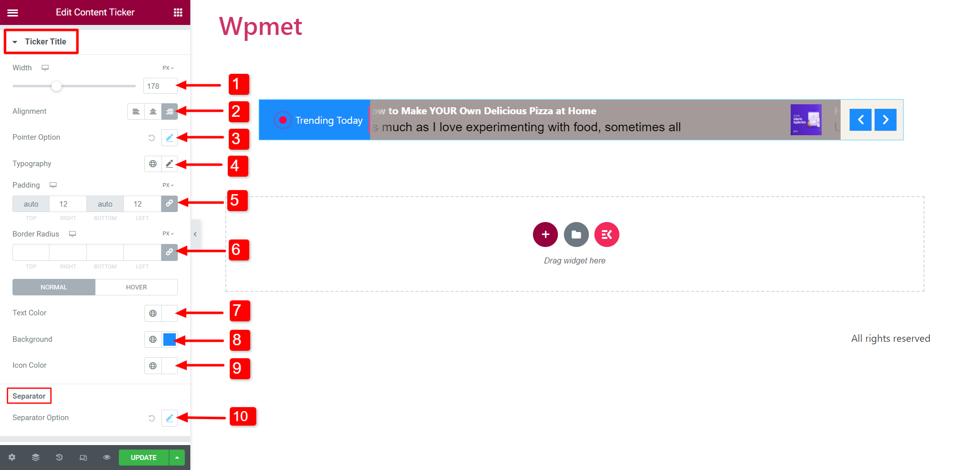
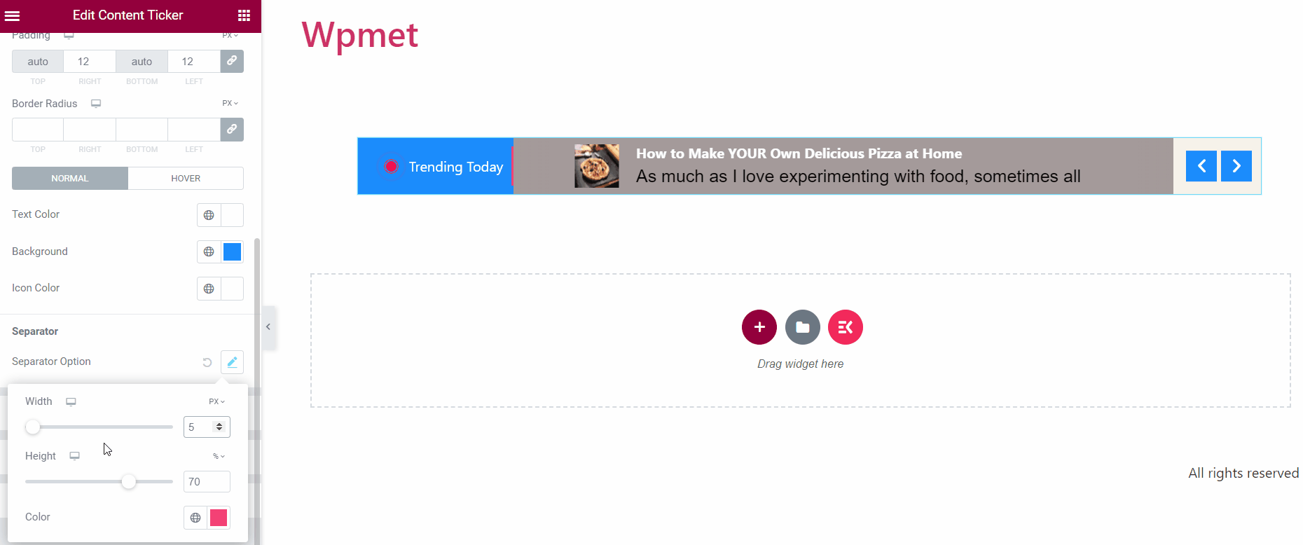
- Separator Option: If you enable the separator for the ticker title, you can change its style like Width, Height, and Color.
Ticker Content #
- Alignment: Select the Alignment of the ticker content.
- Margin: Adjust the right and left margins of the ticker content.
- Padding: Adjust the padding of the content.
- Title Color: Choose a Title Color for the ticker content.
- Title Hover Color: Select a color to appear when the content title has hovered.
- Title Typography: Set the Typography of the content title text.
- Description Color: You change the color of the content description.
- Description Typography: Set the typography of the description text.
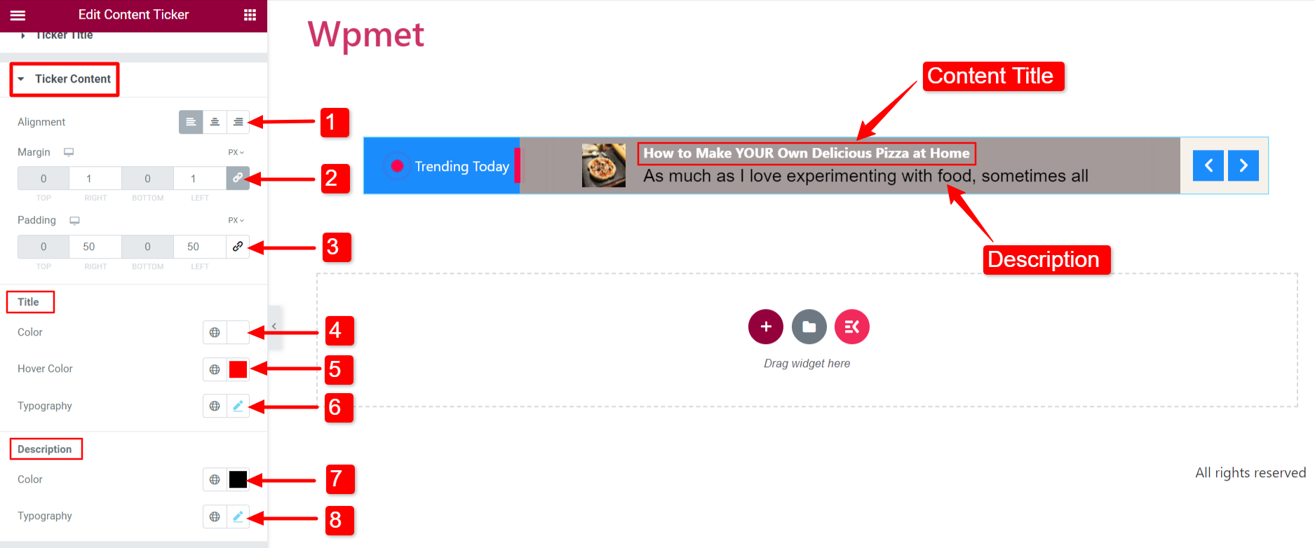
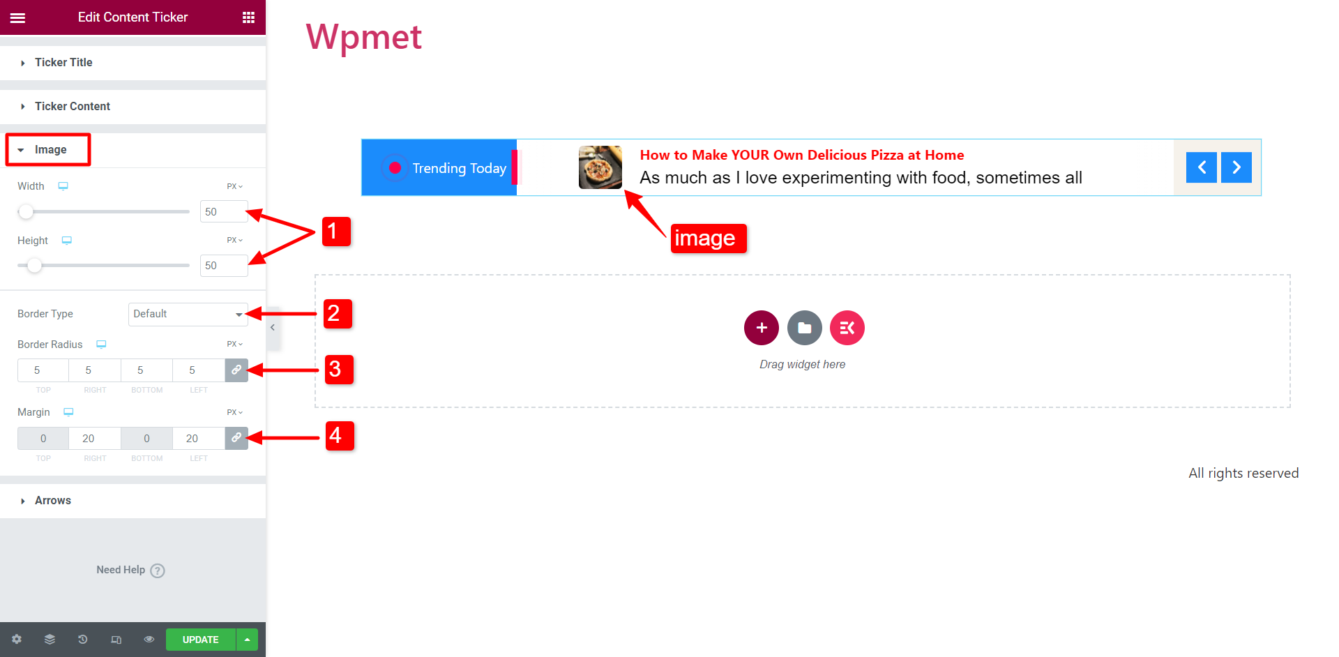
Image #
If you enable the “Show Image” option in the Settings section, then the image will appear with content.
- Adjust the Width and Height of the image.
- Select a Border Type for the image.
- Adjust the Border Radius.
- Set the Margin for the content image.
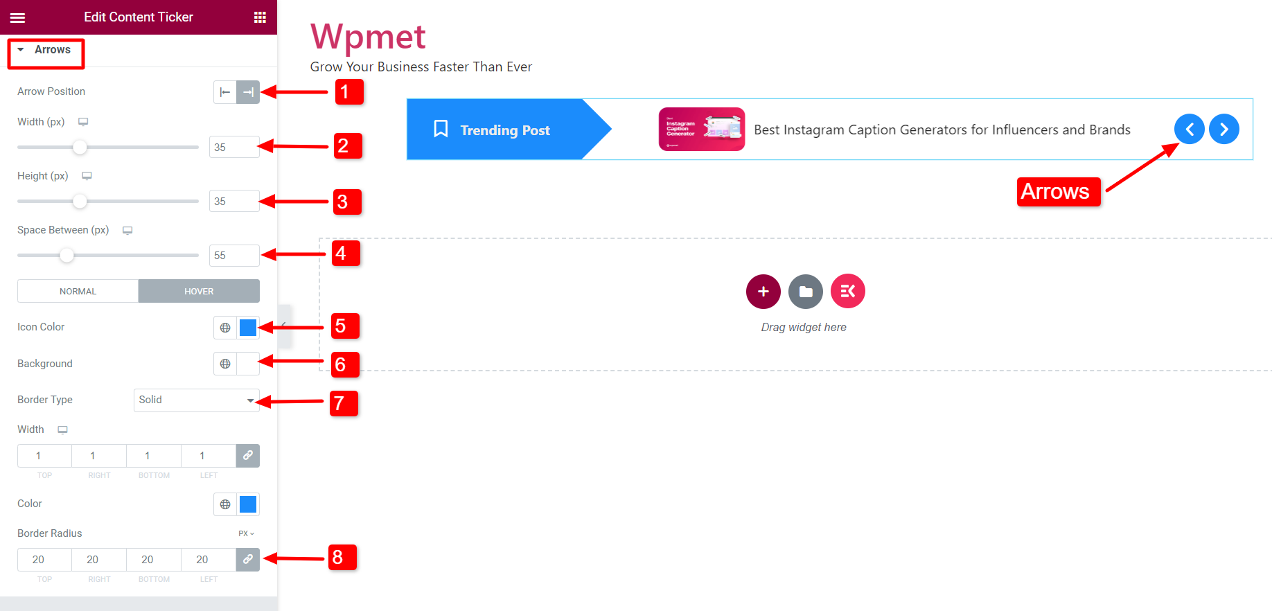
Arrow #
If you enable the “Show Arrows” feature, arrows will appear on the ticker.
- Arrow Position: Set the arrow position to the left or right of the ticker.
- Width: Adjust the Width of the arrows.
- Height: Adjust the Height of the arrows.
- Space Between: Adjust the space between the two arrows.
- Icon Color: You can choose the arrow icon color.
- Background Color: Choose an arrow background color.
- Border Type: Select a border type. Also can select the width and color of the border.
- Border Radius: Adjust the Border Radius for the arrows.
Like the Content Ticker widget, ElementsKit comes with hundreds of advanced elements for Elementor. Get ElementsKit and use those elements to build WordPress websites with full of features.


