 English
  German
  Spanish
  Italian
  French
  Danish
  Portuguese
  Swedish
  Polish
  Korean
  Japanese
 ElementsKit is an all-in-one Elementor addon that gives you the ultimate ability to build websites with WordPress. With 85+ highly customizable widgets and extensions, this one plugin covers almost everything you need for designing sophisticated WordPress websites and eliminates the need for individual plugins.
The Elementor Image Hover Effect widget from ElementsKit is an interactive feature that makes your web design lively. You can add hover animations to the static images and make them interactive and engaging for the users.
When you use image hover effects, animations will appear when users hover their mouse pointer over the image. The widget also supports overlay texts, therefore you can show text on images in a stylish way using the Elementor image hover effect widget.
Step-1: Configure the Elementor image hover effect widget #
First, open the Elementor editor and drag the ElementsKit image hover effects widget into your design. Then configure the image hover effect settings of the widget under the content tab.
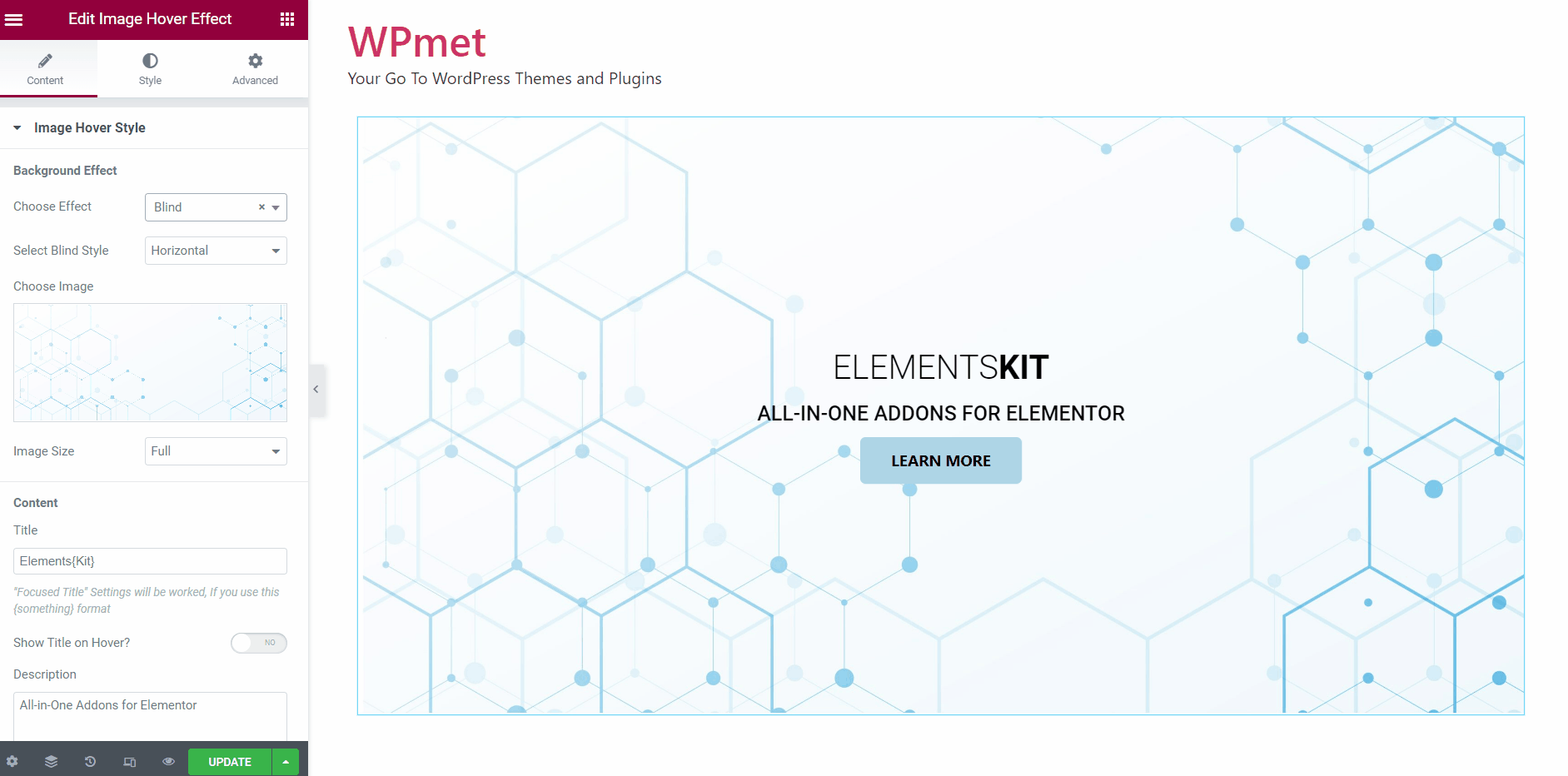
1.1 Image hover styles #
In the Image Hover Style section, you can set up the Background Effect styles and Content styles.
To set up Background Effect styles:
- First, choose an image you want to add hover effects on.
- Then select the Image Size.
- Finally, Choose Effect from the given options on the drop-down.
Note: For some of the hover effects, there are additional options. Like, for the blind effect, you can Select Blind Style to Horizontal or Vertical. Similarly, for the Grayscale effect, a couple of styling options are available, they are Grayscale to Color and Color to Grayscale.
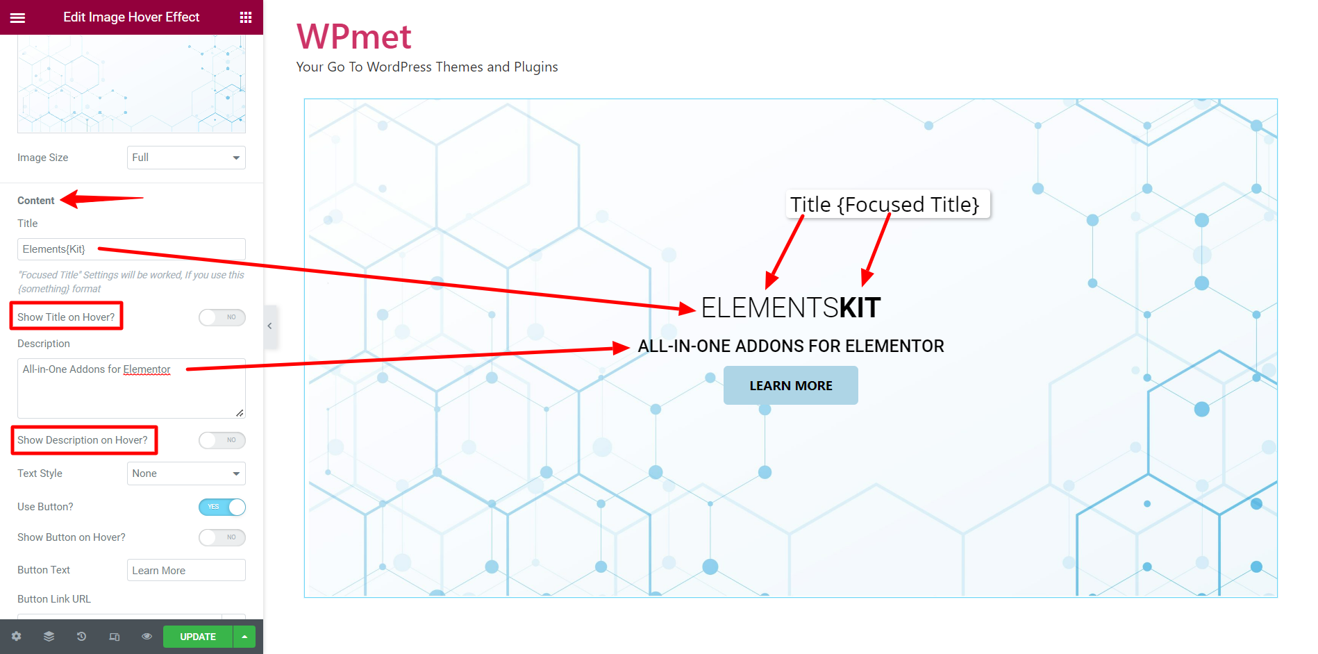
After that, you can add text on top of the image on Elementor. To set up Content for hover:
- Enter a Title. You can use a different format for a certain part of the title (Focused Title) by putting them in curly brackets {}.
- Decide to Show Title on Hover or to make it always visible.
When you turn on the option, the title will only be visible when hovered. Otherwise, the title will always be visible on the image.
- Enter a Description.
- Decide to Show Description on Hover or to make it always visible.
When you turn on the option, the description will only be visible when hovered. Otherwise, the description will always be visible on the image.
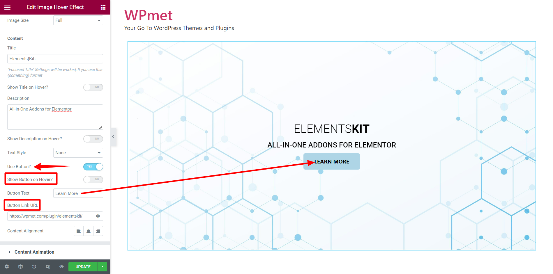
- You have the option to Use Button along with content. If you decide to show a button, then enter the Button Text and Button Link URL. Also can decide to Show Button on Hover or make it always visible.
[Note: Button is not available for Diagonal Text Style.]
- After that, you can set the Content Alignment and Text Style for the image content.
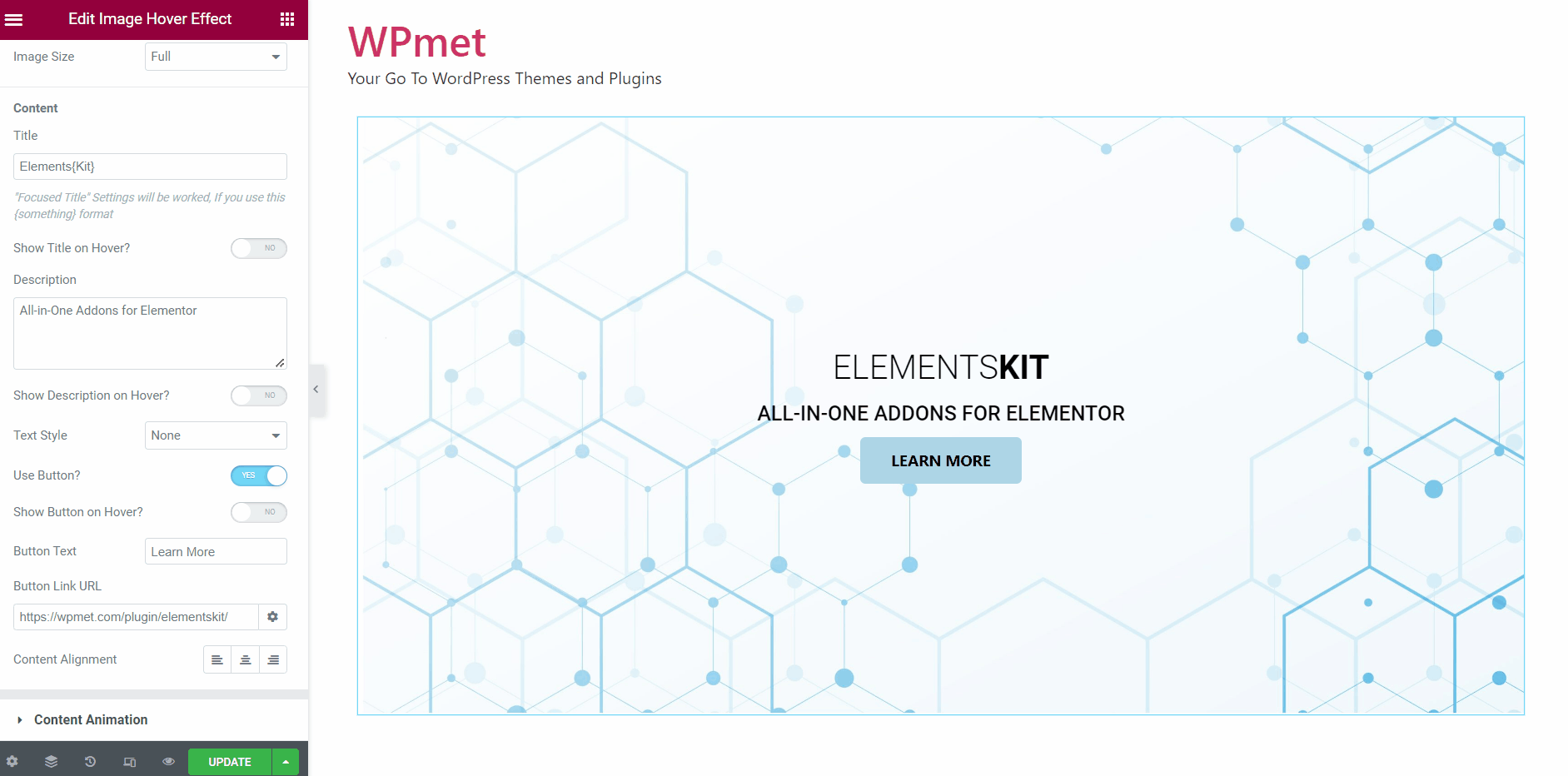
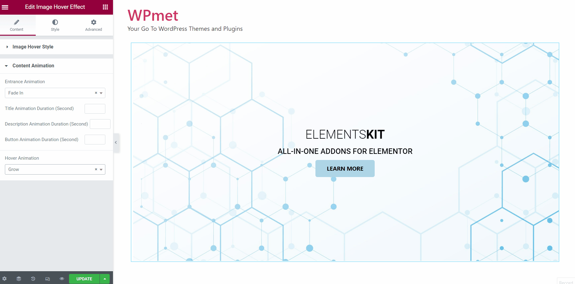
1.2 Content animation #
Under this section, you can set content entrance animation, hover animation, and animation durations.
- Choose Entrance Animation style from the given option on the drop-down.
- Set Title Animation Duration in seconds.
- Set Description Animation Duration in seconds.
- Set Button Animation Duration in seconds.
- Choose the Hover Animation style from the given option on the drop-down.
- For Hover Animations like Pulse, Push, Pop, and Hang, you can decide to show animation in an infinity loop by enabling the Use Animation Count Infinite option.
Step-2: Customize image hover effect styles #
You have the option to customize image hover styles under the Style tab.
2.1 Customize Title style #
To customize the Title style for image hover effects:
- Set the Title Typography.
- Set the Focused Title Typography.
- Adjust the Margin for the title.
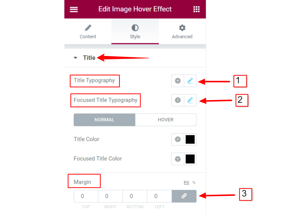
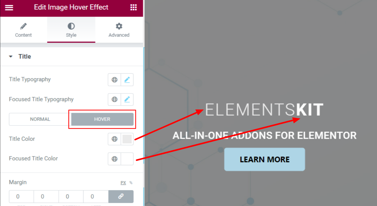
- Choose Title Color and Focused Title Color. You can set normal color and on-hover color for both of the titles.

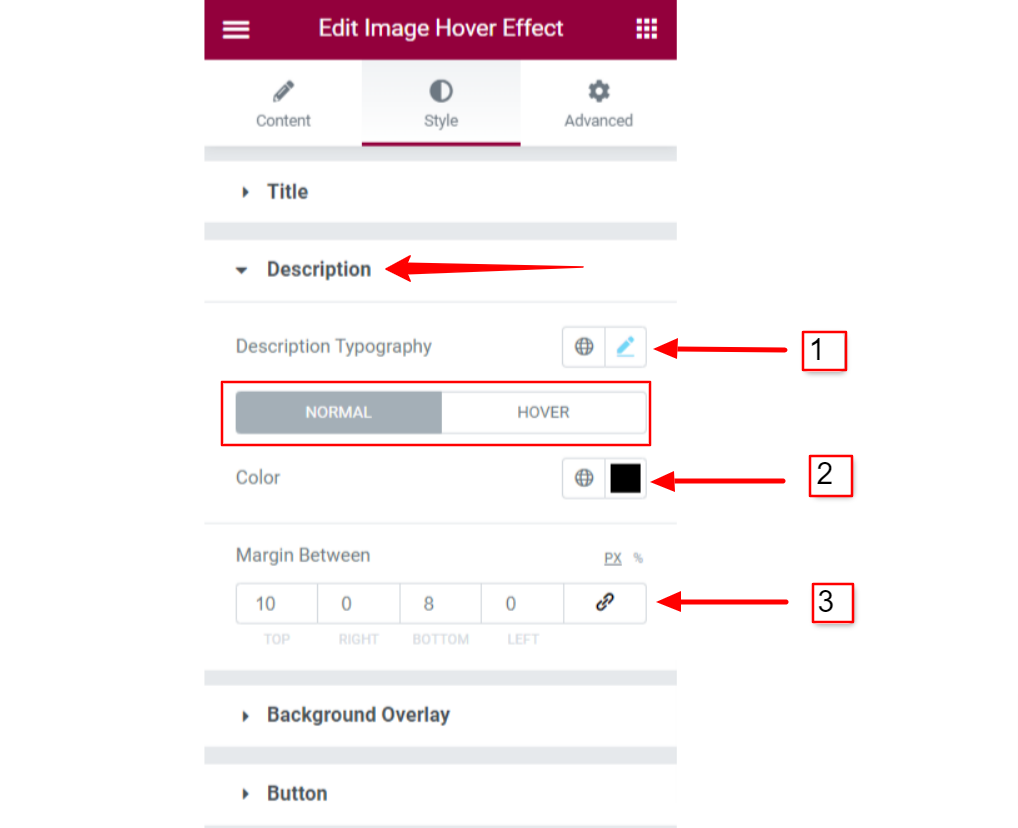
2.2 Customize Description style #
To customize the Description style for image hover effects:
- Set the Description Typography.
- Set individual Colors for Normal and Hover states.
- Adjust the Margin Between the content.
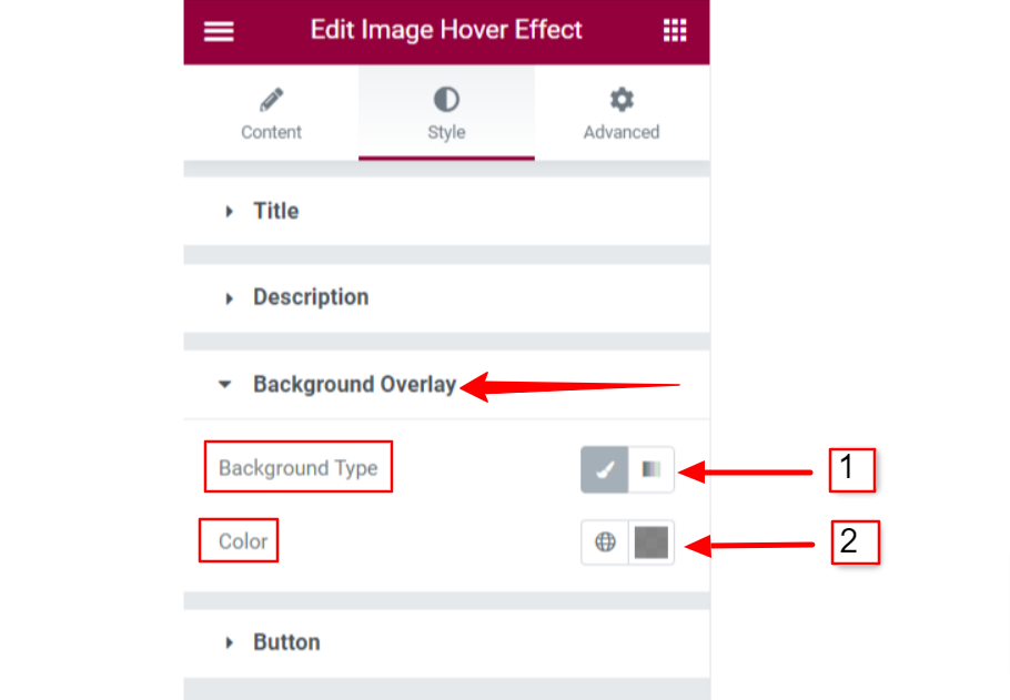
2.3 Background Overlay #
For Background overlay of image hover effect:
- Choose the Background Type between classic color or gradient color.
- Set Background Colors for background overlay.
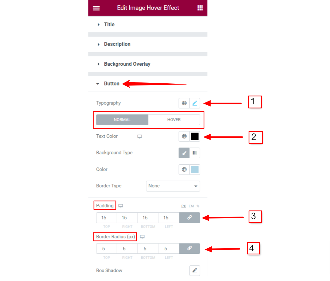
2.4 Customize Button styles #
If you use the button in the hover image content, you have options to customize Button styles. To tailor the button styles:
- Set button Typography.
- Set individual Text colors for normal and on hover state.
- Choose different Background Types and Colors for normal and hover states.
- Adjust the Padding and Border Radius for the button.
Finally, you will be able to add a stylish hover effect on an image using ElementsKit’s Elementor Image Hover Effect widget.


