

 English
  German
  Spanish
  Italian
  French
  Danish
  Portuguese
  Swedish
  Polish
  Korean
  Japanese
 You can include WhatsApp contact support on your website with the ElementsKit WhatsApp widget. Just drag and drop the widget into the Elementor design editor and get WhatsApp button on website seamlessly.
WhatsApp is one of the most popular secure messaging options today. People prefer it as instant messaging media. So, this widget is helpful to hear immediate queries, interests, and requests from customers.
Read this documentation to learn how to use the Elementor WhatsApp button widget of ElementsKit.
Step 1: Get Elementor WhatsApp Button on Website- ElementsKit #
To get the WhatsApp button on your website, first, enable the ElementsKit WhatsApp widget, then open the Elementor editor and drag & drop the widget to the design area.
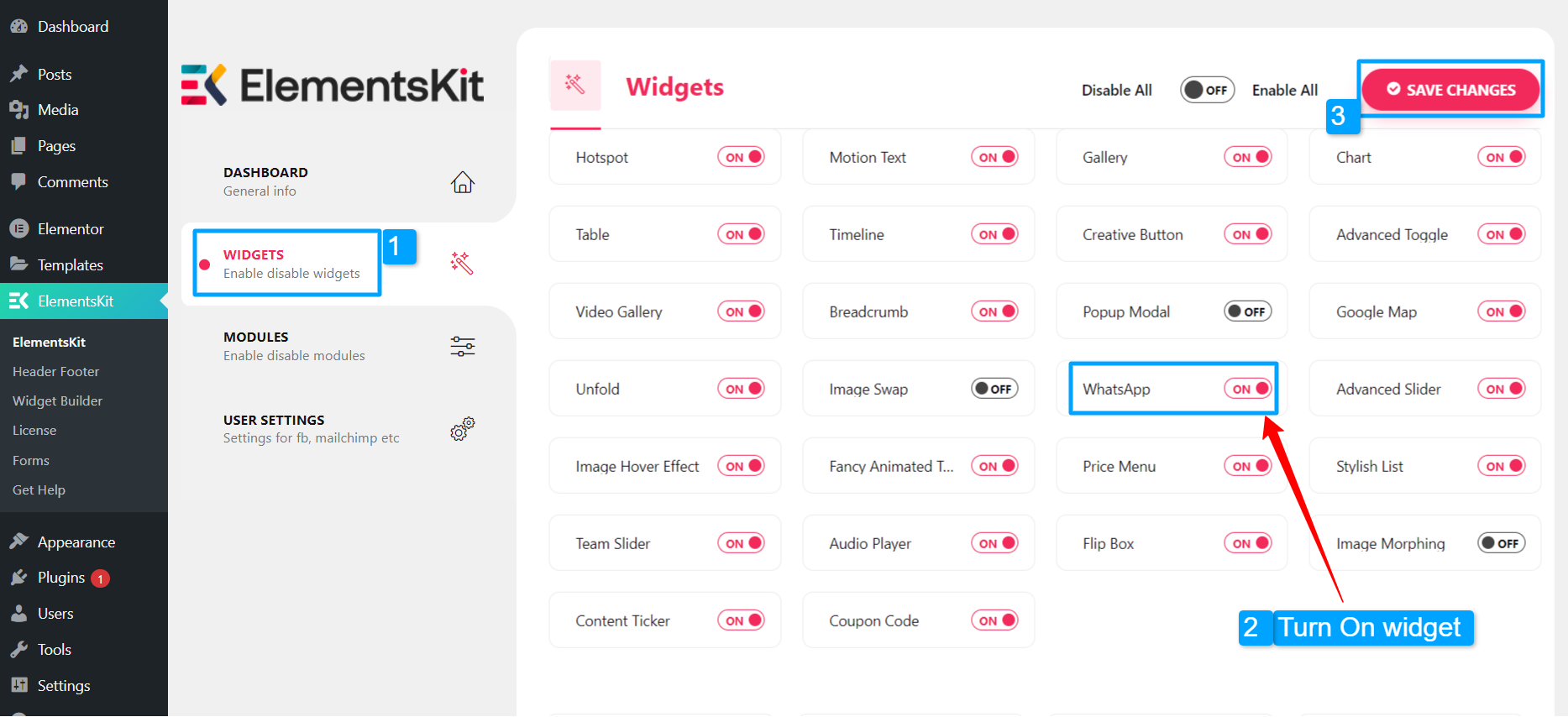
Enable WhatsApp widget: #
In order to enable the widget:
- Navigate to ElementsKit > Widgets.
- Find the Coupon Code and enable the widget.
- Click on the SAVE CHANGES.
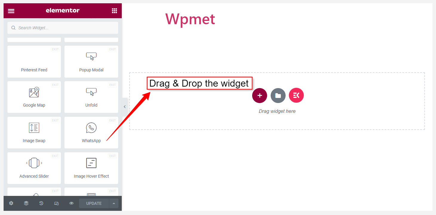
Drag and drop the widget: #
After that, drag and drop the ElementsKit Content Ticker widget into the design area of the Elementor editor.
Step 2: Configure WhatsApp widget #
You can configure the header, body, footer, button, and settings of the ElementsKit WhatsApp widget.
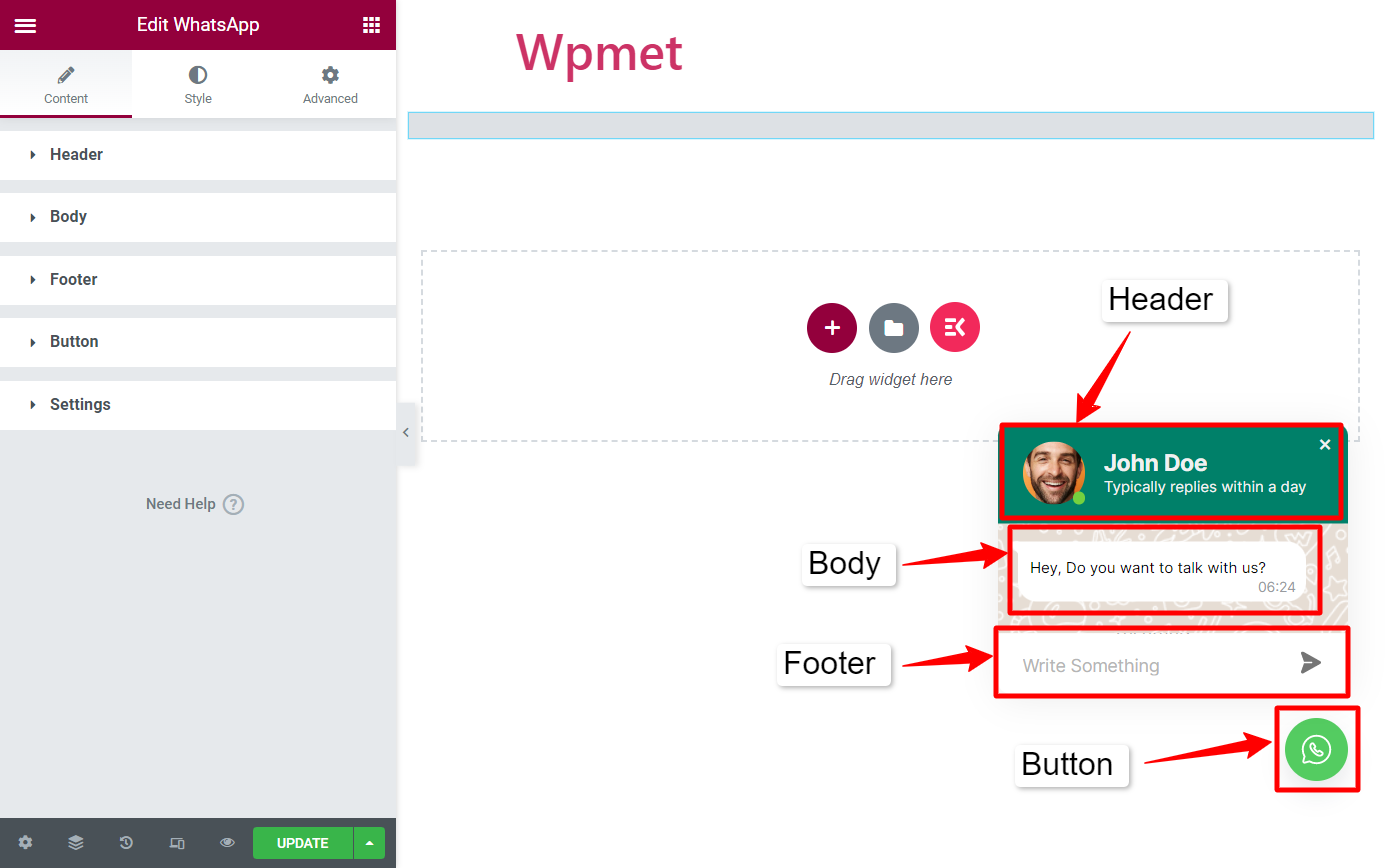
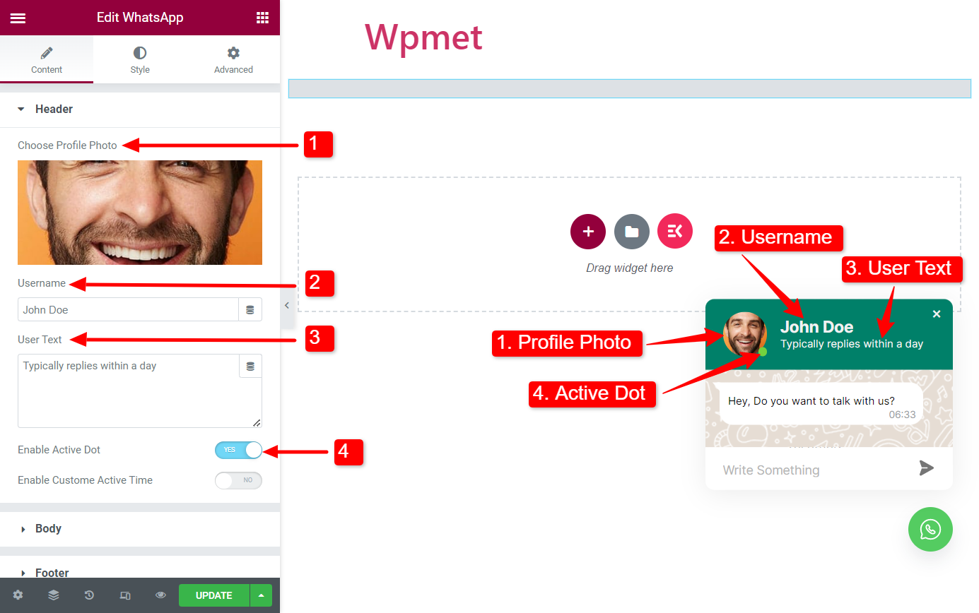
Header #
- Choose Profile Photo: You can add a profile photo on the WhatsApp chatbox. Upload a photo or choose one from the WordPress media library.
- Username: Enter your name in the username field.
- User Text: You can enter a short text that appears under the username.
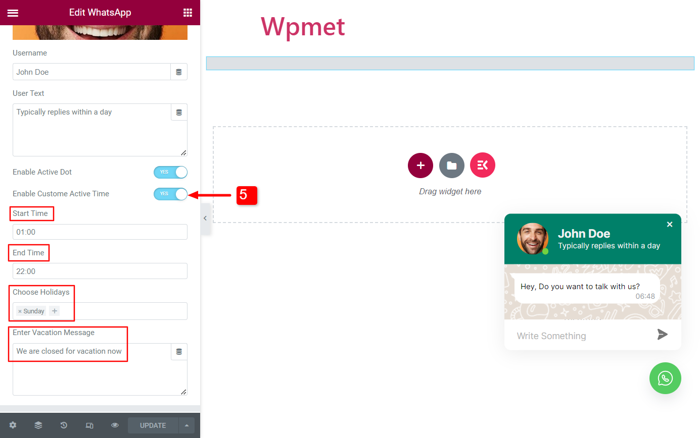
- Enable Active Dot: Show your active status by enabling the active dot.
- Enable Custom Active Time(Available when Active Dot is enabled): You can show active status for a certain time of the day by enabling this feature. When enabled the following options will be available:
- Start Time: Set a time of the day when you will be online.
- End Time: Set a time of the day when you will no longer be available online.
- Choose Holidays: Choose the off days.
- Enter the Vacation Message: You can set a message for the customers when you are away on vacation.
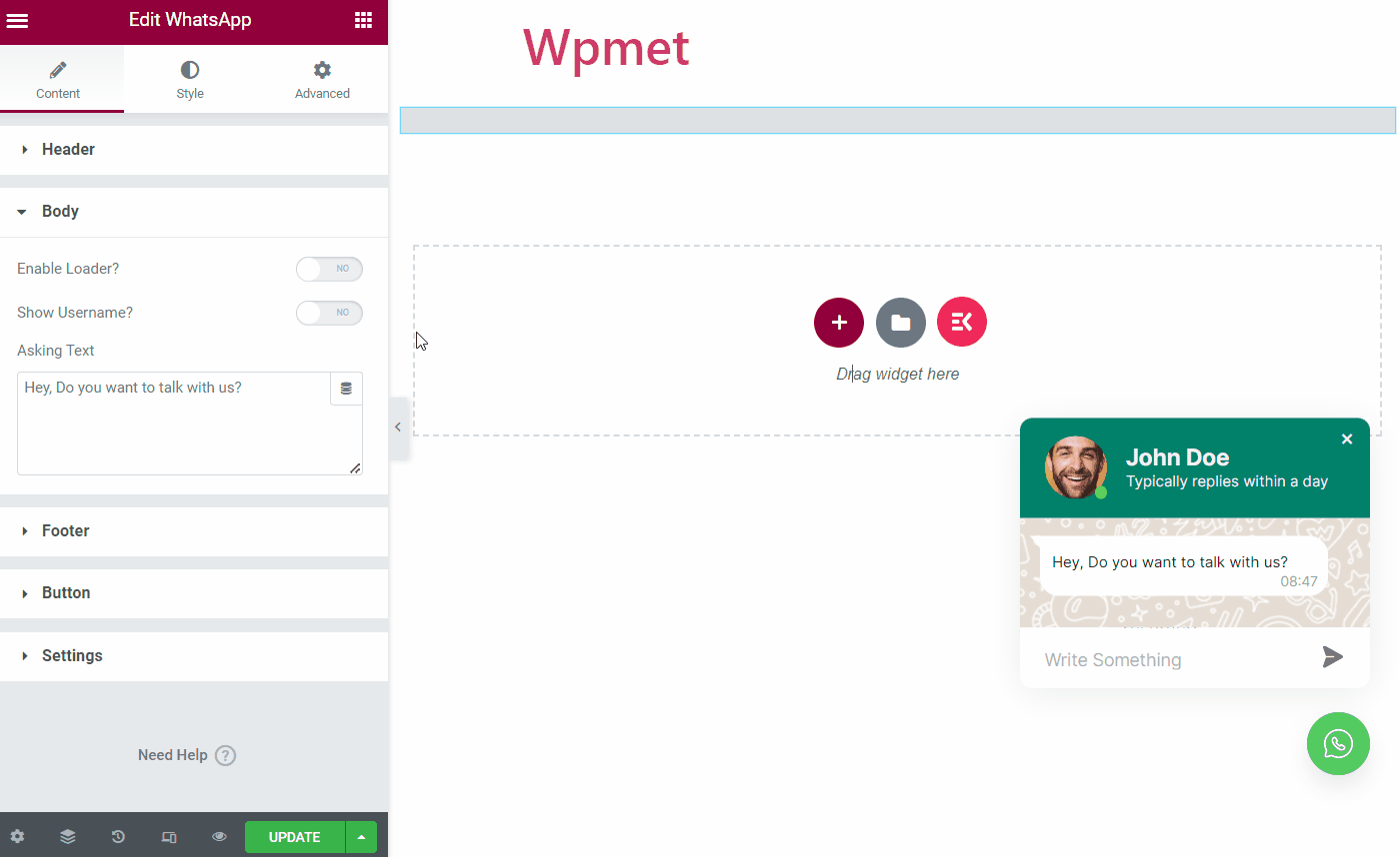
Body #
- Enable Loader: When enabled, a typing animation will appear on user’s screen when you are typing.
- Show Username: You can show the username with the message if you enable this option.
- Asking text: This text will appear on default when a user clicks on the WhatsApp button.
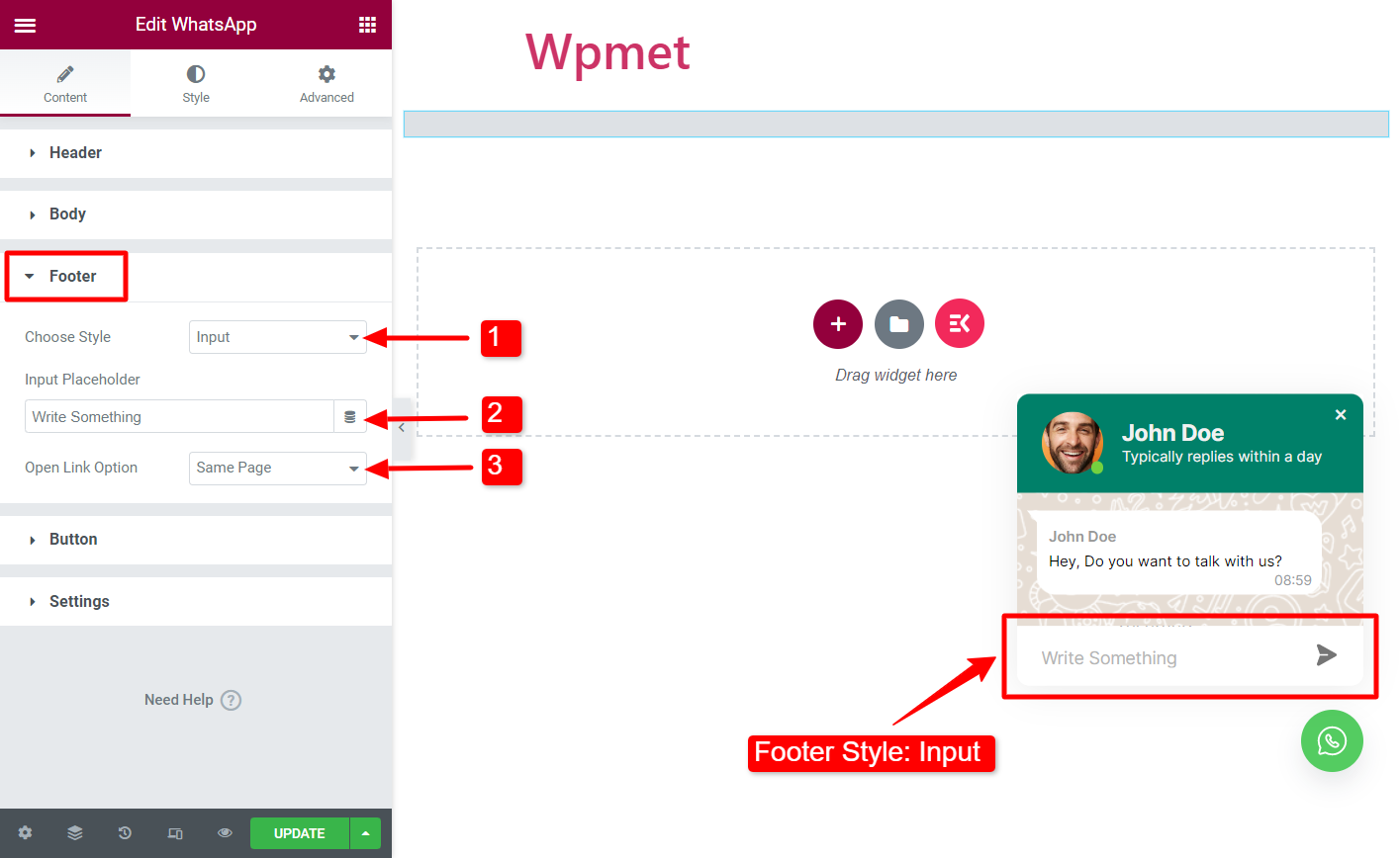
Footer #
ElementsKit WhatsApp widget comes with three different styles for the footer section.
Style: Input
A simple chat field where users can write a message and send it.
- Choose Style: Select the style “Input”.
- Input Placeholder: Enter a placeholder text.
- Open Link Option: When the user clicks on the send button, select where they will be redirected to. There are three options available: 1. Same Page, 2. New Tab, and 3. Popup.
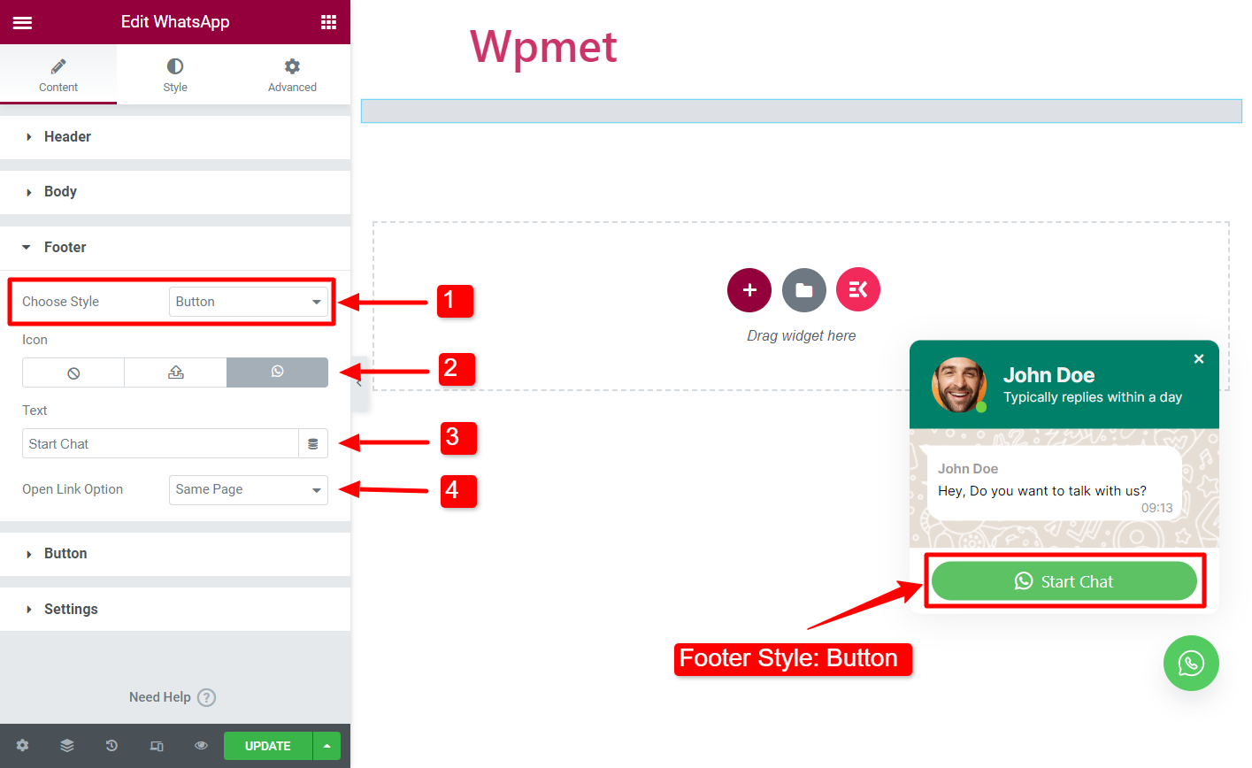
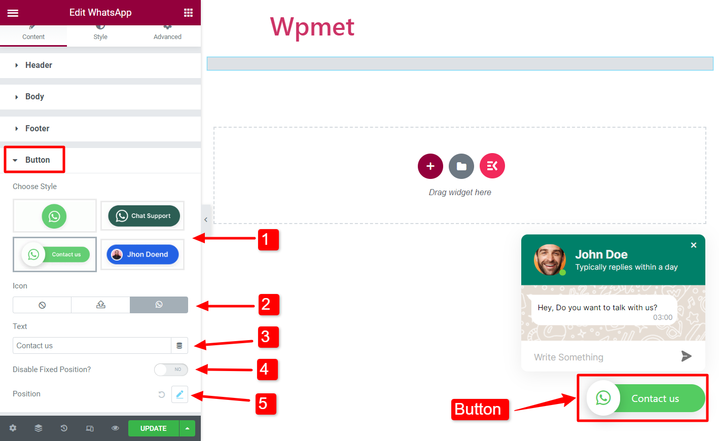
Style: Button
In this style, a button will appear. By clicking on the button users can send you messages using WhatsApp web.
- Choose Style: Select the style “Button”.
- Icon: You can add an icon on the message button. Upload an icon as SVG or choose one from Elementor icon library.
- Text: Enter a button text.
- Open Link Option: When the user clicks on the send button, users can be redirected to one of the followings: 1. Same Page, 2. New Tab, and 3. Popup.
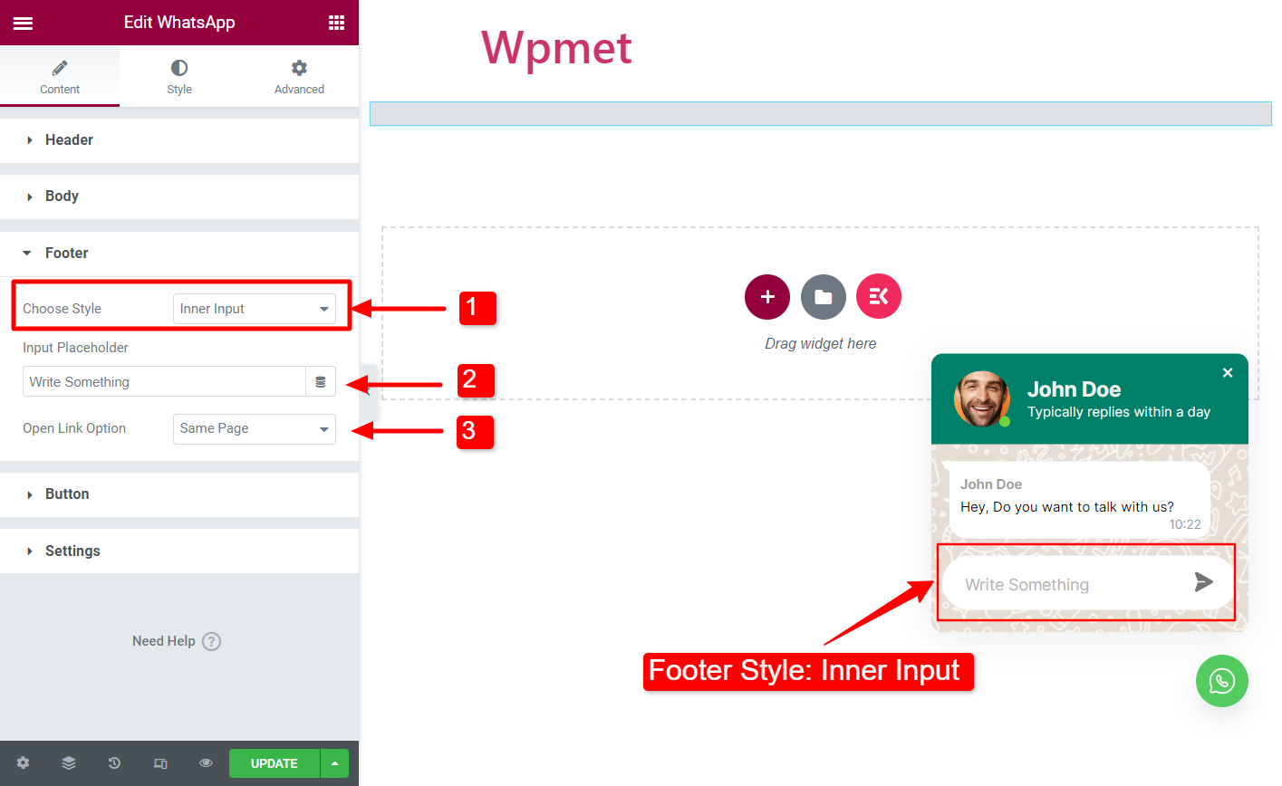
Style: Inner Input
A simple chat field but the field is folded inside the WhatsApp window.
- Choose Style: Select the style “Inner Input“.
- Input Placeholder: Enter a placeholder text.
- Open Link Option: When the user clicks on the send button, select where they will be redirected to. There are three options available: 1. Same Page, 2. New Tab, and 3. Popup.
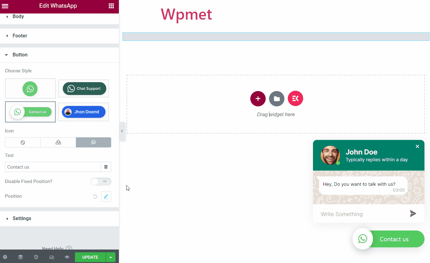
Button #
- Choose Style: Select button style from the given options.
- Icon: You can add an icon for the Elementor WhatsApp button (if the style you choose has an icon option available).
- Text: Add an on-the-button text (if the style you choose has an icon option available).
- Disable Fixed Position: When OFF, the button position will be fixed. Otherwise, you can change the button position.
- Position (custom): You can change the button position if the fixed position is disabled.
Settings #
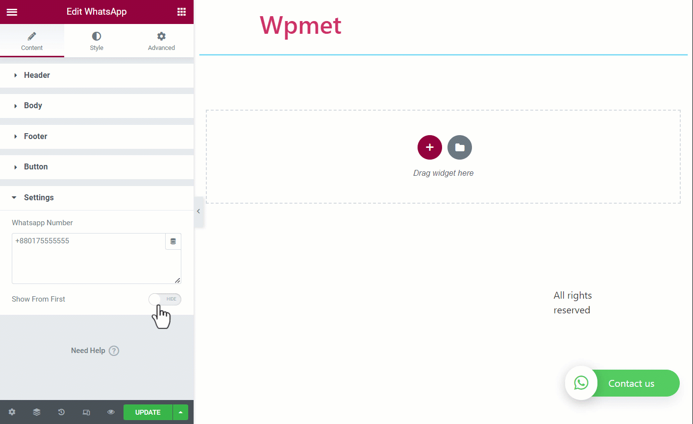
- WhatsApp Number: Here you can put your WhatsApp service contact number. This is the number for which you have set the WhatsApp widget for users.
- Show From First: If you set Show then the chat box will appear from the beginning a visitor visits your website. And if you set Hide then they will see the icon only and have to click it to start a chat.
Step 3: Customize Elementor WhatsApp button #
You can change the style and appearance of the WhatsApp button and chatbox with ElementsKit.
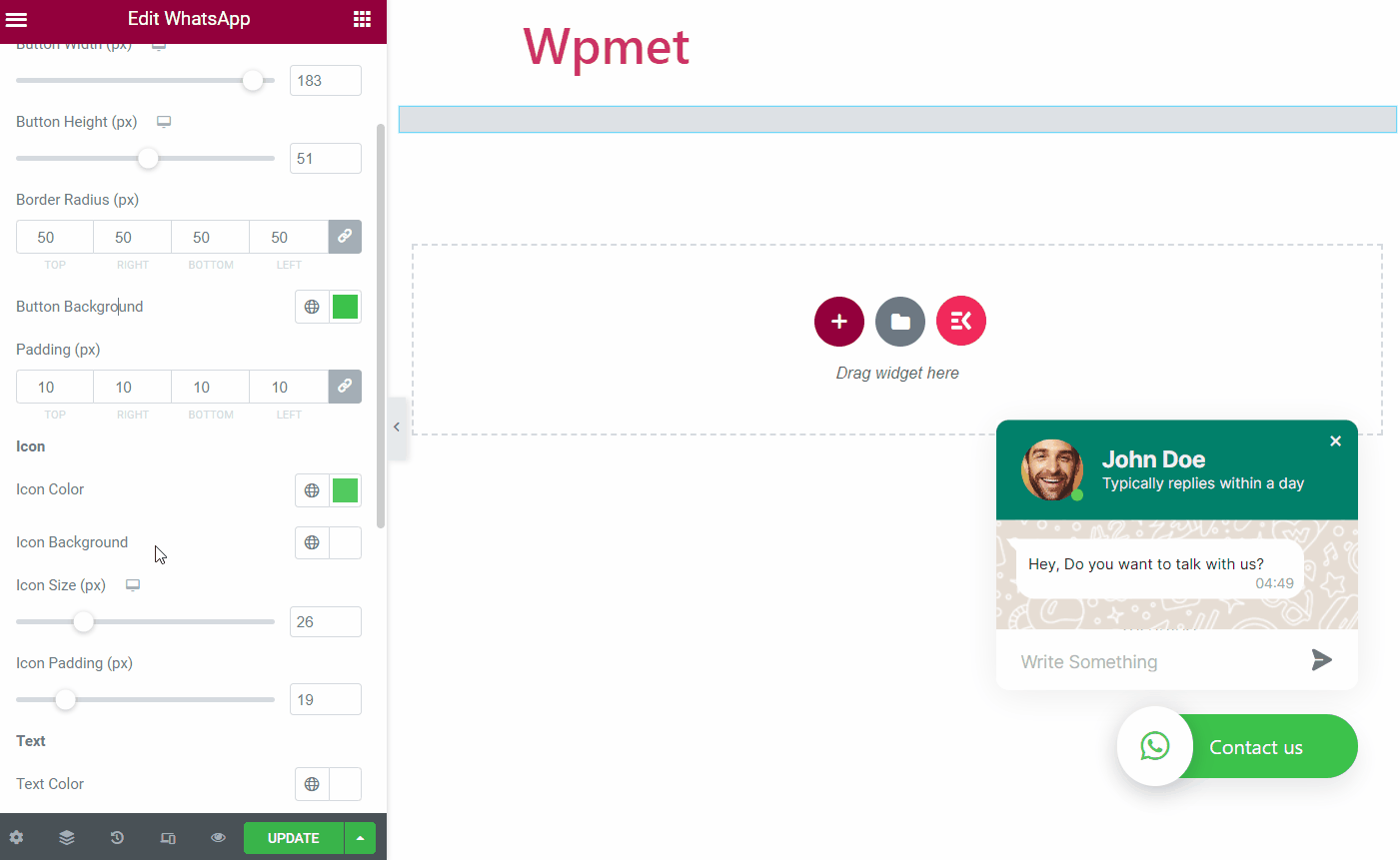
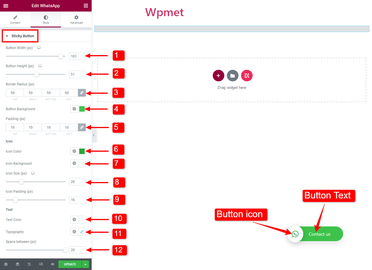
Sticky Button #
- Button Width: You can adjust the Width of the WhatsApp contact button.
- Button Height: You can also adjust the Height of the WhatsApp contact button.
- Border Radius: Change the shape of the button using border-radius.
- Button Background: Choose a color for the WhatsApp button.
- Padding: Adjust the padding of the button.
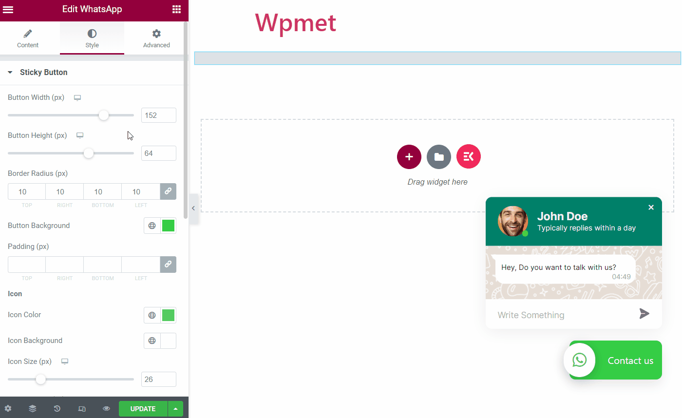
- Icon Color: Choose a color for the WhatsApp icon with the button.
- Icon Background: Choose a background color for the icon.
- Icon Size: Adjust the icon size.
- Icon Padding: You can adjust the padding for the button icon.
- Text Color: Select a color for the button text.
- Typography: Set the typography of the button text.
- Space between: Adjust the space between the button text and the icon.
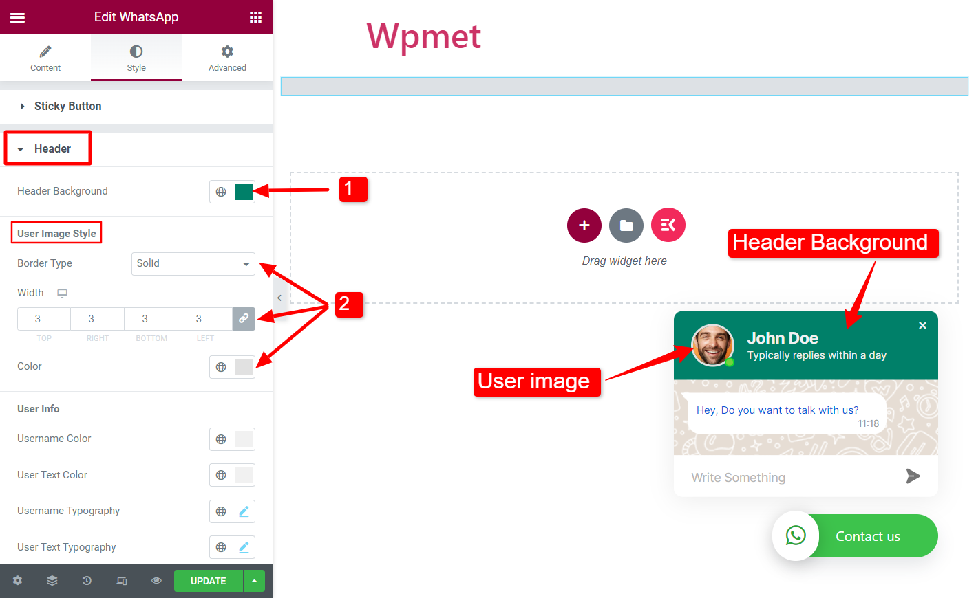
Header #
- Header Background: Choose a color for the header background of the WhatsApp chatbox.
- User Image Style – Border Type, Width, and Color: You can select a border type for the user image, set the border width, and choose a border color.
- Username Color: Choose a color for the username in the header.
- User Text Color: Choose a color for the text under the user name.
- User Typography: Set the typography for the username in the header.
- User Text Typography: Set the typography for the text under the user name.
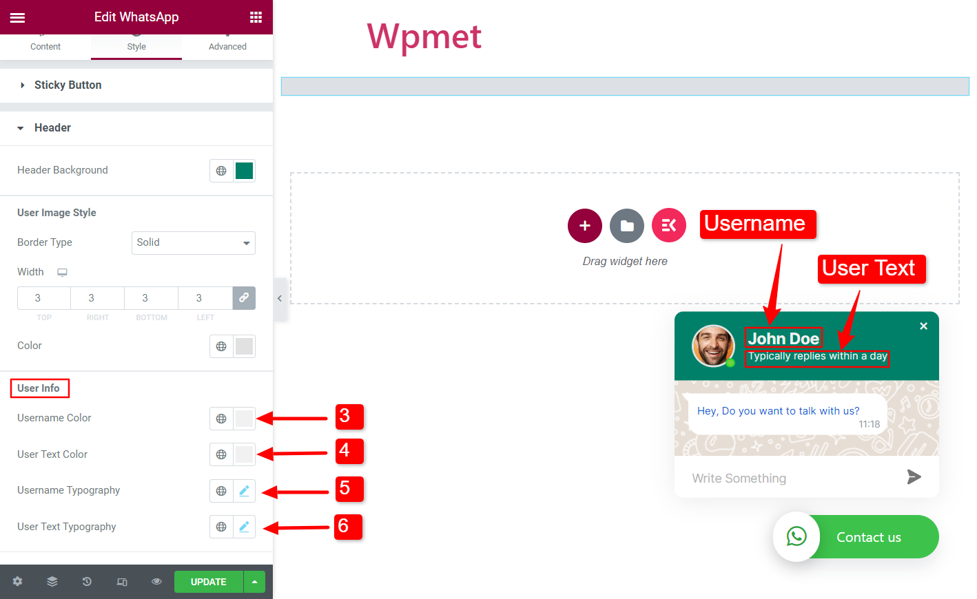
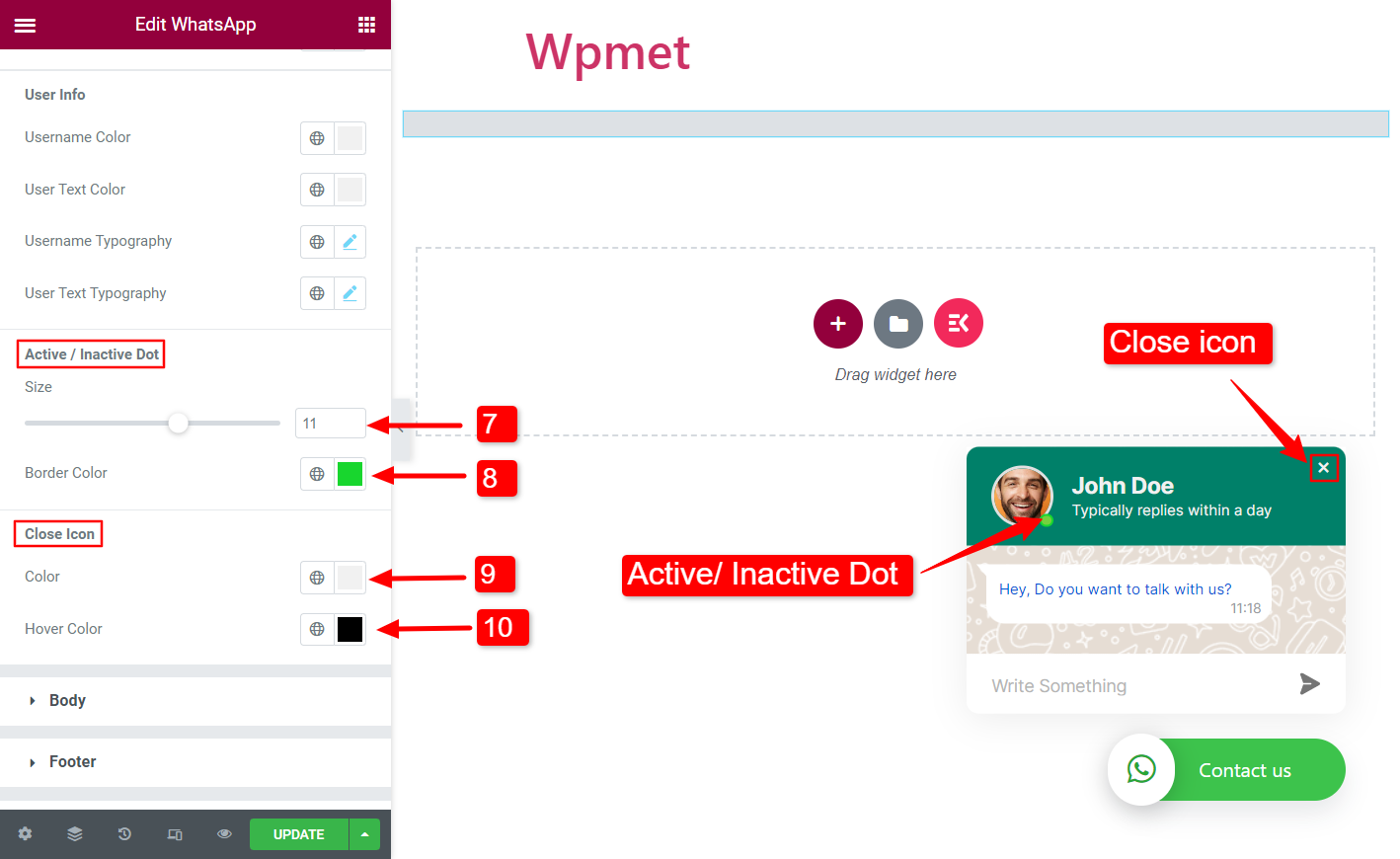
- Active / Inactive Dot – Size: Adjust the size of the active/ inactive dot.
- Active / Inactive Dot – Border Color: Choose a border color for the active/ inactive dot.
- Close Icon – Color: Set a color for the chatbox close icon.
- Close Icon – Hover Color: Choose a color for the chatbox close icon when hovered.
Body #
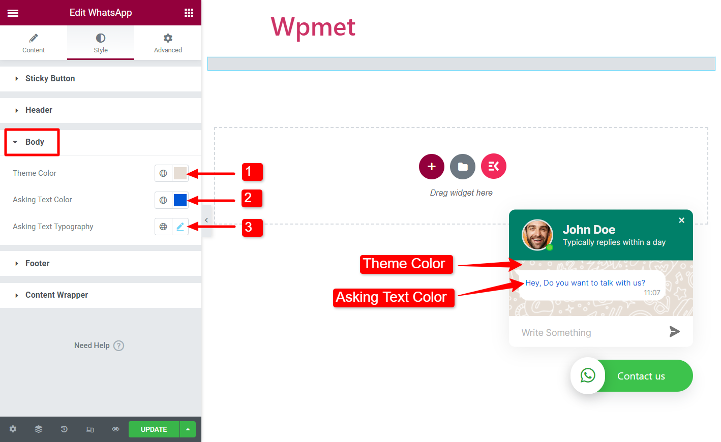
- Theme Color: Choose a color for the body section.
- Asking Text Color: Select a message text color.
- Asking Text Typography: Set the typography of the message text.
Footer #
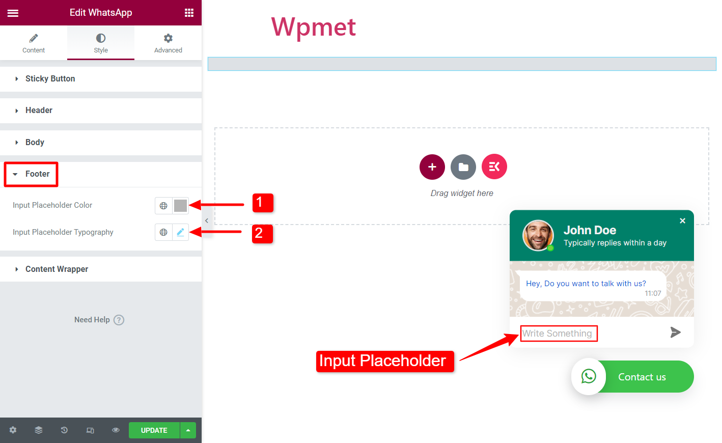
- Input Placeholder Color: Choose a color for the placeholder text of the input field.
- Input Placeholder Typography: Set the typography for the placeholder text of input field.
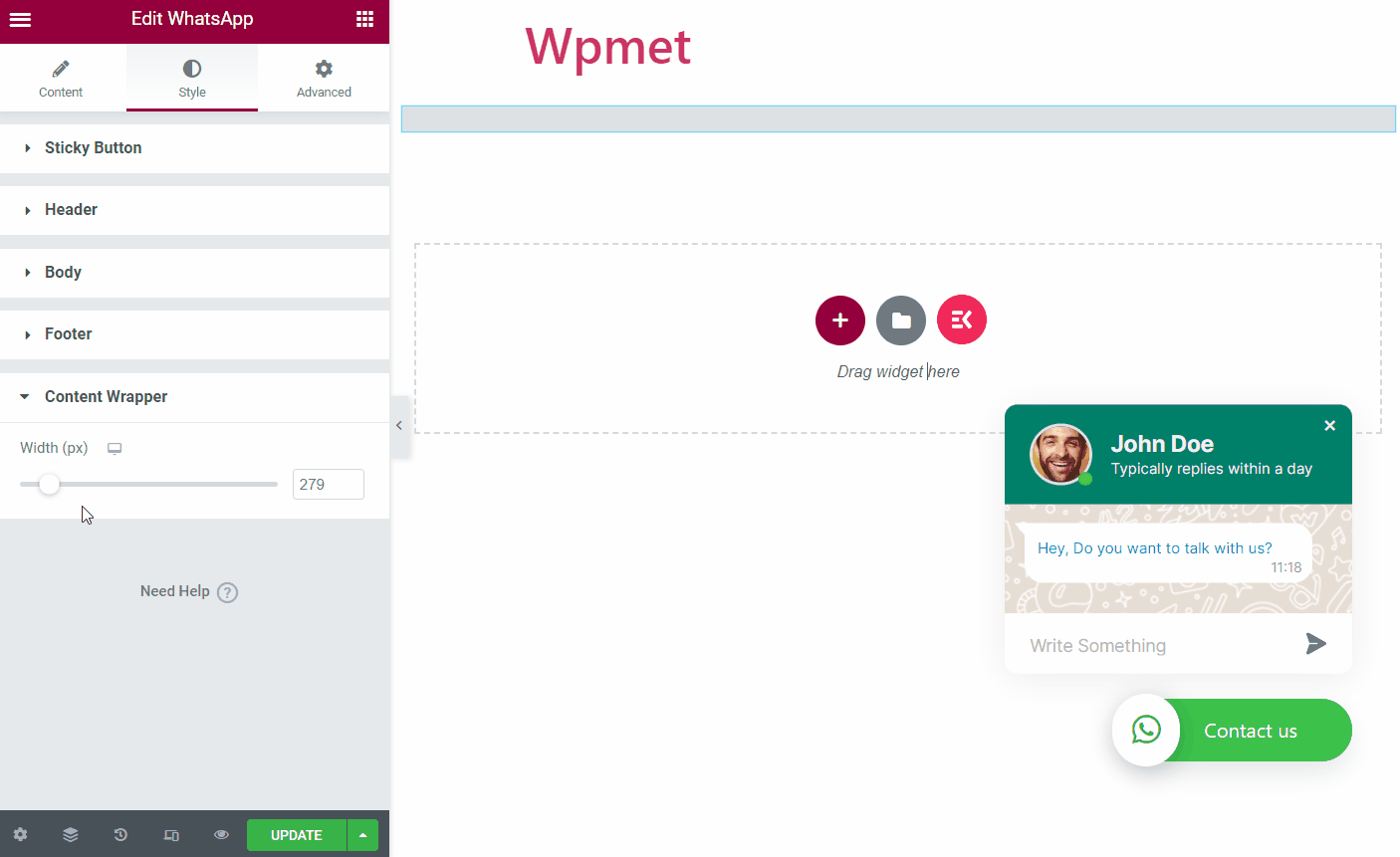
Content Wrapper #
In this section, you can adjust the width of the WhatsApp chat box.
Like the WhatsApp widget, ElementsKit comes with hundreds of advanced elements for Elementor. Get ElementsKit and use those elements to build WordPress websites with full of features.


