Do you want to display data by bar, line, rudder, doughnut, pie, and polar area? This type of interactive graphical representation of data allows you to turn boring data into easy-to-digest information.
The Elementor Advanced Chart widget lets you easily embed charts on your WordPress websites. It also offers different chart types with various customizing features.
In this documentation, you will learn how to create advanced charts using Elementor for your website.
How to Create Advanced Charts Using Elementor #
Go through the following step-by-step guide to create a chart on your Elementor website.
Step 1- Add Advanced Chart Widget #
Simple enough! Go to an existing page or insert a new one and enable the Elementor. Use the search box in the widgets sidebar to find the “Advanced Chart” widget. Drag and drop the widget.
Step 2- Add Data to Charts #
In the Advanced Chart widget settings panel, you will use the “Categories” and “Set Data” options under the “Data” features to add your data. The “Categories” settings let you categorize the data through a name. And from the “Set Data” settings, you will define the proportion of the data.
For this, go through the following settings:
Categories:
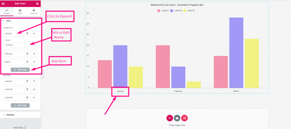
- These settings automatically loads with 3 categories. Keep or delete them as you want.
- Expand the category settings to edit its name.
- Hit the “Add Item” button to add a new category. Or, you can use the copy button to add another one.
- To delete one click the “X” cross button.
Set Data:
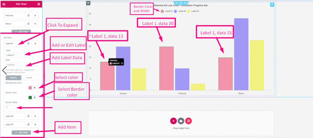
- Like the previous one, you’ll see three automatically loaded items.
- Keep or delete them as per preference.
- For a new item. Click the “Add Item” or copy button.
- Now, expand an item settings:
- Label: Edit or change the item label’s name.
- Data: Enter the number of your data. Put a comma for multiple numbers.
- Background: Give color to the graphical structure of the data item background.
- Border Color: Add color to the border of that structure.
- Border Width: Define the width of the border.
Step 3- Choose Chart Types #
Now you will set the chart types. The available options are Bar(Vertical), Bar(Horizontal), Line, Rudder, Doughnut, Pie, and Polar Area.
To do this, go under the Settings feature and set the following features. Note that the settings of this feature can be changed according to your chosen chart style.
Settings:
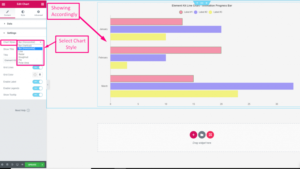
- Chart Styles: Choose a chart style from the dropdown. Show Title: Toggle the button to show or hide the title in the chart.
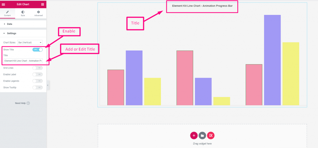
- Title: Add a title for your chart.
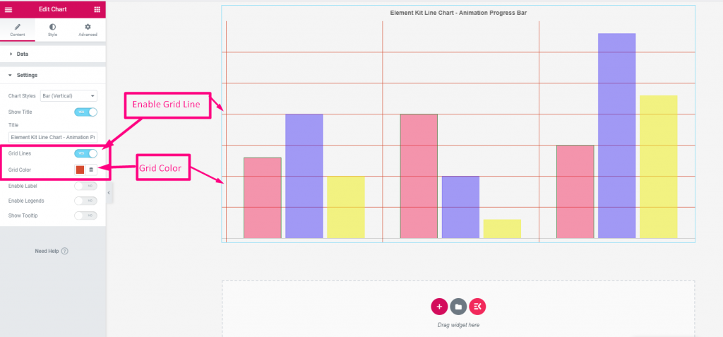
- Grid Line: Click the toggle button to show grid lines.
- Grid Color: Select a color for the grid lines.
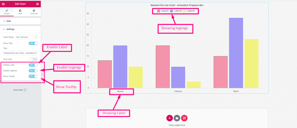
- Enable Label: Click to show the charts’ data category label or name.
- Enable Legends: Enable it to show the data category label or name above the chart with a circle icon.
- Show Tooltip: When the mouse cursor hovers over any bar or portion of the chart it shows the category and proportion of the data.
Step 4- Customize Charts Style #
Once you are done with chart styles, head to the Style tab of the widget settings panel. Under this tab, you will see customizing settings to style the chart category, legend, tooltip, title, animation, etc.
Here are the uses of the customizing features of the advanced chart.
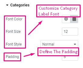
Categories: Define the data category’s font and its color & size. Then, set the padding.
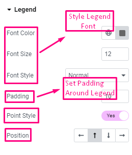
Legend: Choose the font’s color, size, style and set the padding. Also, you can show a stylish point style for legends and set its position (Left/Top/Bottom/Right).
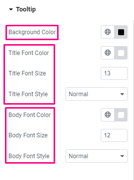
Tooltip: The following settings give control of tooltip customization.
- Background Color: Select a background color for the tooltip.
- Title Font: Choose font color, size, and style.
- Body Font: From here, you can manage body font color, size, and style.
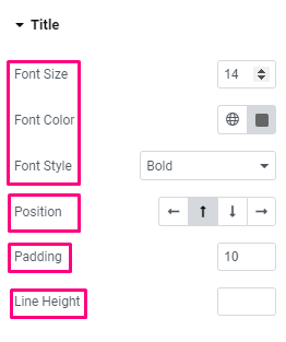
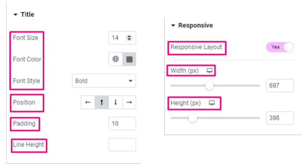
Title:
- Font Customization: The first three options let you change the size, color, and style of the font.
- Position: Set the position of the chart title (Left/Top/Bottom/Right).
- Padding: Set space around the title.
- Line Height: Define the line height for the title.
Animation:
- Duration: Define the duration for animation effects.
- Style: Choose a style for the animation.
Responsive:
- Responsive Layout: Click the toggle button to enable responsive layout. You will set the width and height of your chart layout in pixels.
That’s it! You’ve learned about all the features of Advanced chart settings. Now, you can easily create a chart and style it effortlessly on your Elementor website.


