 English
  German
  Spanish
  Italian
  French
  Danish
  Portuguese
  Swedish
  Polish
  Korean
  Japanese
 With ElementsKit, you can introduce your team members to your website with a stylish sliding carousel. Using the Elementor Team Carousel Slider widget you can show team member’s cards with photos, names, designations, descriptions, link social profiles, and more.
Read this documentation to learn how to use the Elementor Team Carousel Slider widget of ElementsKit.
Plugins Required: #
- Elementor: Download plugin.
- ElementsKit Lite: Download plugin.
- ElementsKit Pro: Get the plugin.
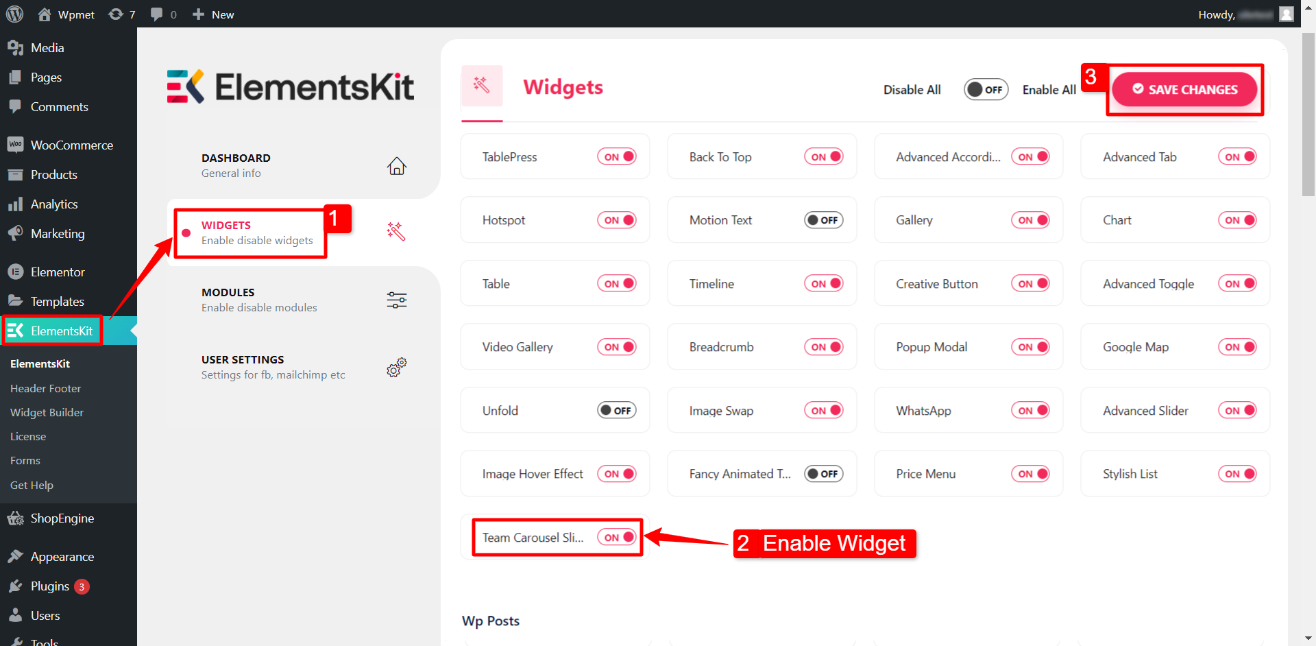
Step 1: Enable Team Carousel Slider Widget #
Firstly, you need to enable the widget from WordPress dashboard. To enable the Team Carousel Slider widget:
- Navigate to ElementsKit > Widgets.
- Find the Team Slider from the list and enable the widget.
- Click on the SAVE CHANGES.
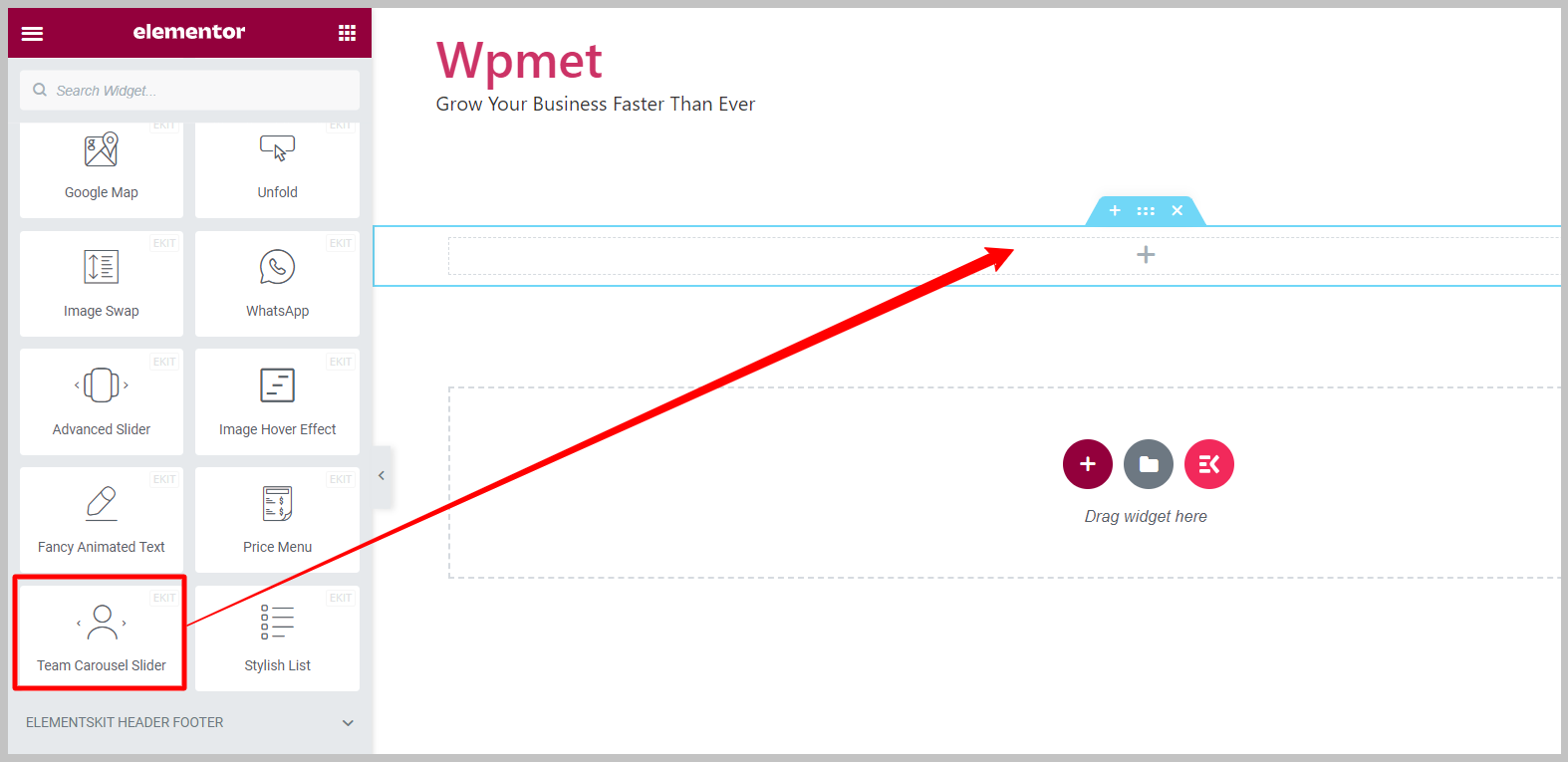
Step 2: Drag and Drop the widget #
After that, drag and drop the ElementsKit Team Carousel Slider widget into the Elementor editor.
Step 3: Configure Elementor Team Carousel Widget #
The Content tab lets you configure team member content and slider settings of the team carousel slider.
3.1 Team Content #
Team slider widget has the following features:
- Style: The widget comes with 12 different styles including default, overlay, hover on social, overlay with details, and so on.
Note: Different styles comes with individual options and settings. The options the discussed in the later part of this documentation.
- Enable Popup: Details of the team member will appear on a popup when clicked on the name.
- Display Social Profiles: To link the social media profile on the team member details.
- Display Description: To show a short description of the team member.
- Display Button: To add a button that may link to member’s profile or portfolio.
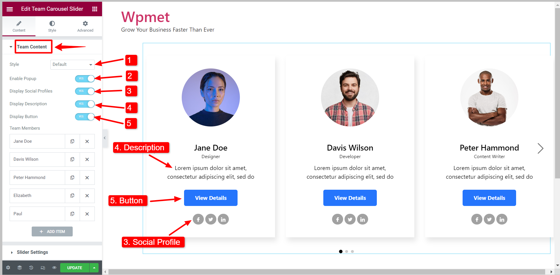
Team member details #
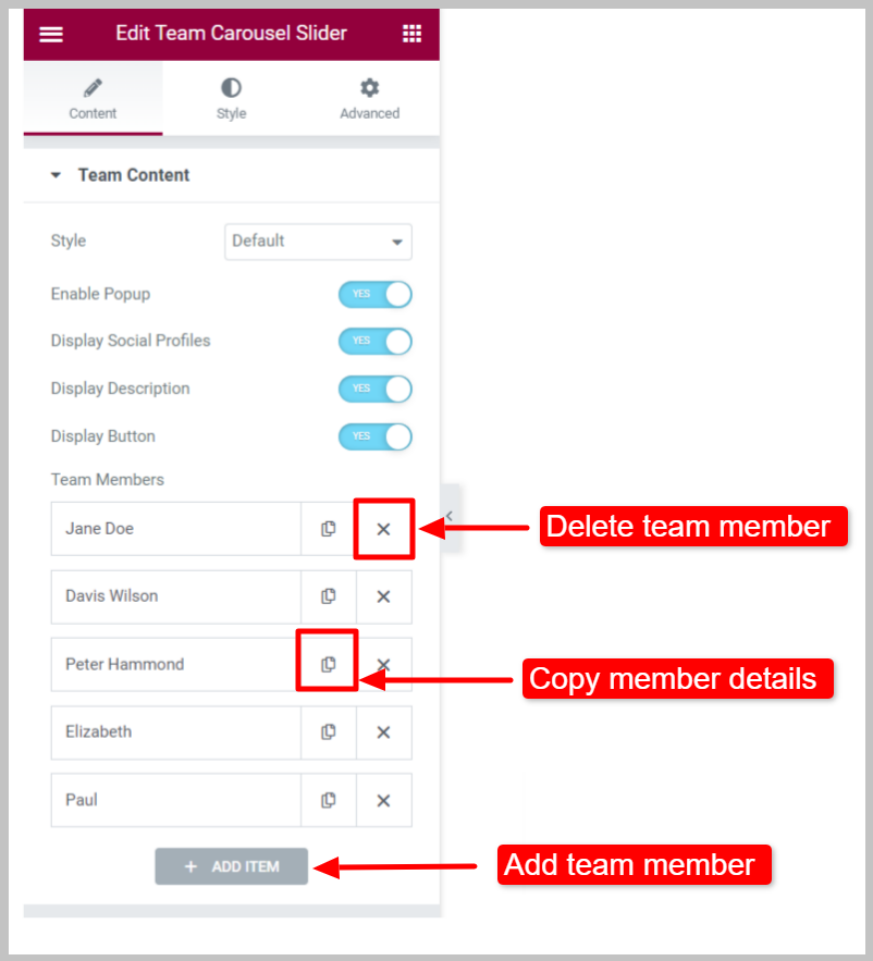
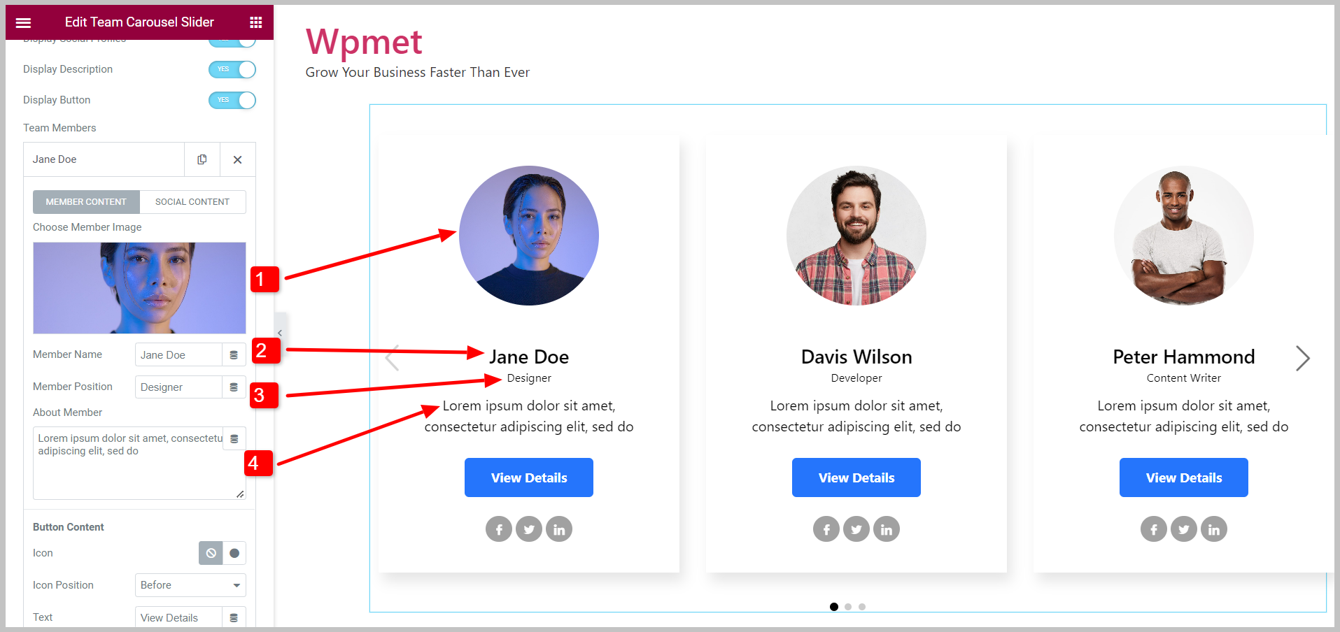
You can add team members to the slider by clicking on the ADD ITEM button and delete an existing member with the ✖ button. Also, can copy the team member’s details.
Under the Member Content:
- Choose Member Image: Add the photo of the team member.
- Member Name: Enter the name of the team member.
- Member Position: Mention the team member’s designation.
- About Member: Add a short description of the team member.
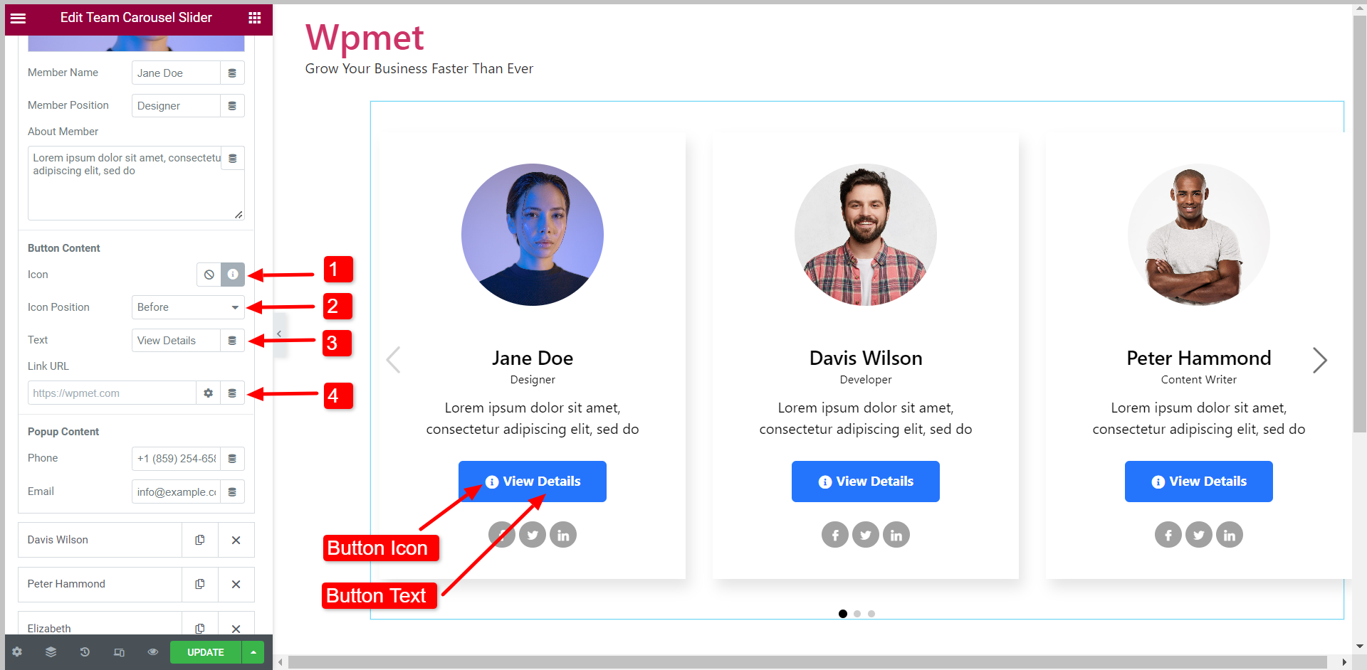
Button Content:
- Icon: Decide whether to show the button icon and choose an icon.
- Icon Position: Set the icon position to before or after the text.
- Text: Enter a button text.
- Link URL: Add an URL to link the button with a page.
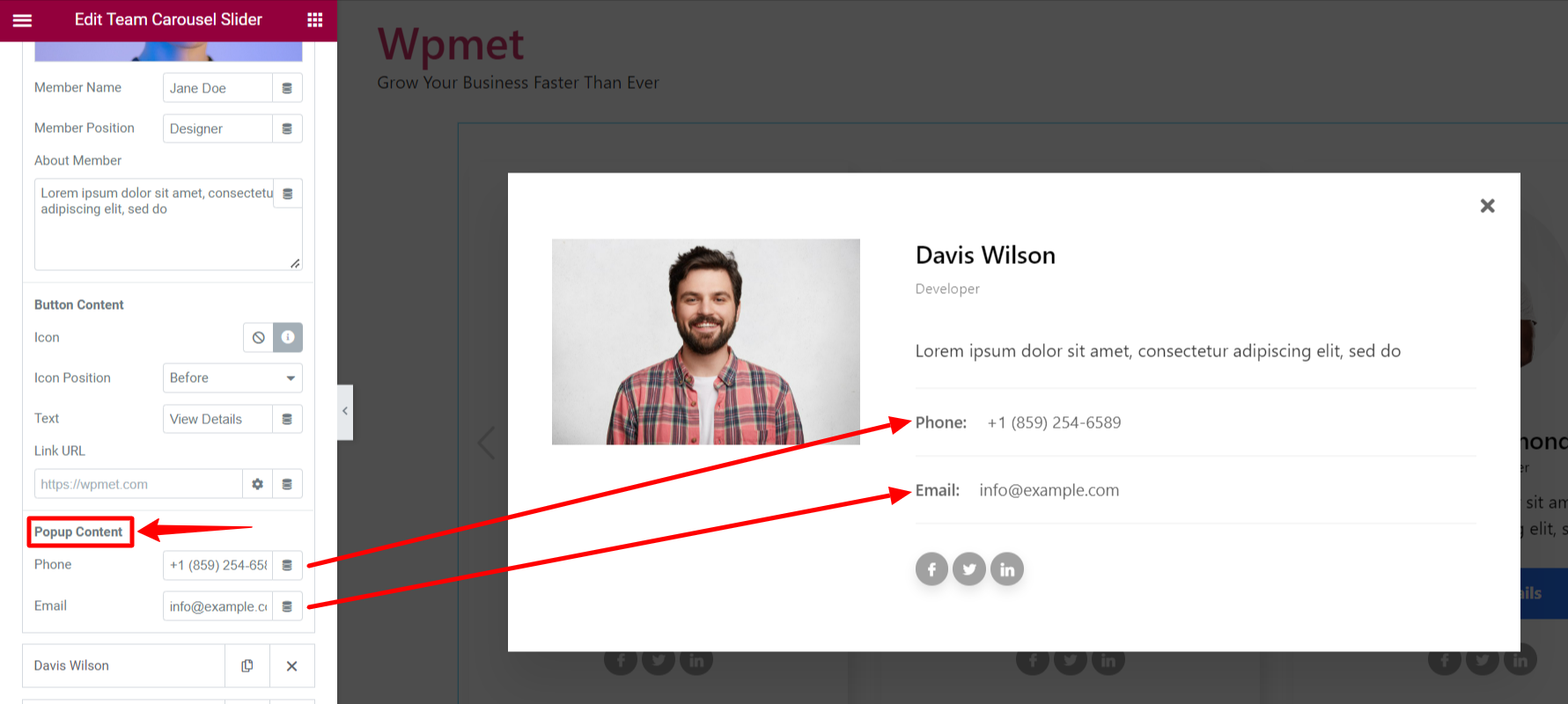
Popup Content:
In the popup content, you can add the Phone number and Email of the team member.
Under the Social Content:
You can link up to 5 social media accounts. For each social profile, you can add a Profile URL, and use individual Icons for each social media.
3.2 Slider Settings #
Following options are available under the Slider Settings of the Elementor Team Carousel widget:
- Spacing: Adjust the space between each slide.
- Slides To Show: Set the number of slides to show on a single viewport.
- Slides To Scroll: Decide how many slides to scroll at a time.
- Autoplay: Enable the Autoplay to scroll the slides automatically.
- Speed: When Autoplay is enabled, set the Speed of scrolling in milliseconds (ms).
- Pause On Hover: Autoplay will pause when the user hovers on the slider.
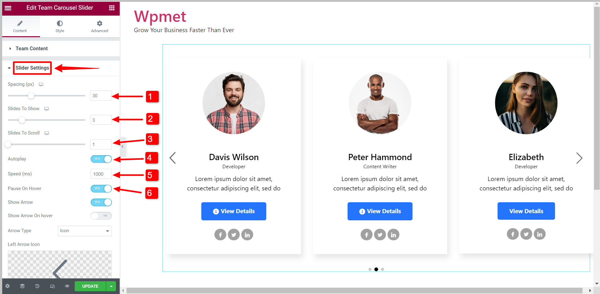
- Show Arrow: To enable the arrow navigation for the slider.
- Show Arrow On hover: Arrows are only visible when hovered.
- Arrow Type: Choose arrow type from the given options- Arrow, Text, and Text with Arrow.
- Left Arrow Icon: You can choose an icon for the left arrow from the icon library.
- Right Arrow Icon: You can choose an icon for the left arrow from the icon library.
- Show Dots: To enable the dots navigation for the slider.
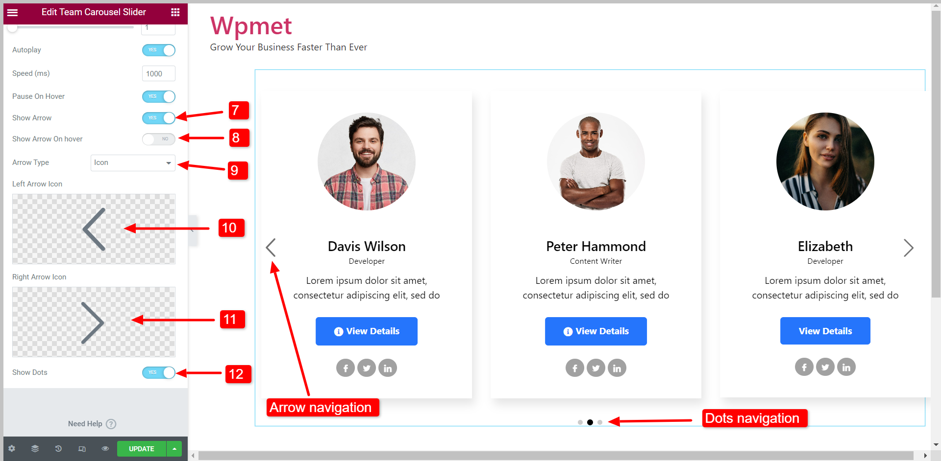
- Speed and Pause Hover options only appear when Autoplay is enabled.
- Show Arros On Hover, Arrow Type, Left Arrow Icon, and Right Arrow Icon options only appear when “Show Arrow” is enabled.
Step 4: Customize Elementor Team Carousel Widget styles #
You can customize every aspect of the team carousel slider and create a style that matches your brand.
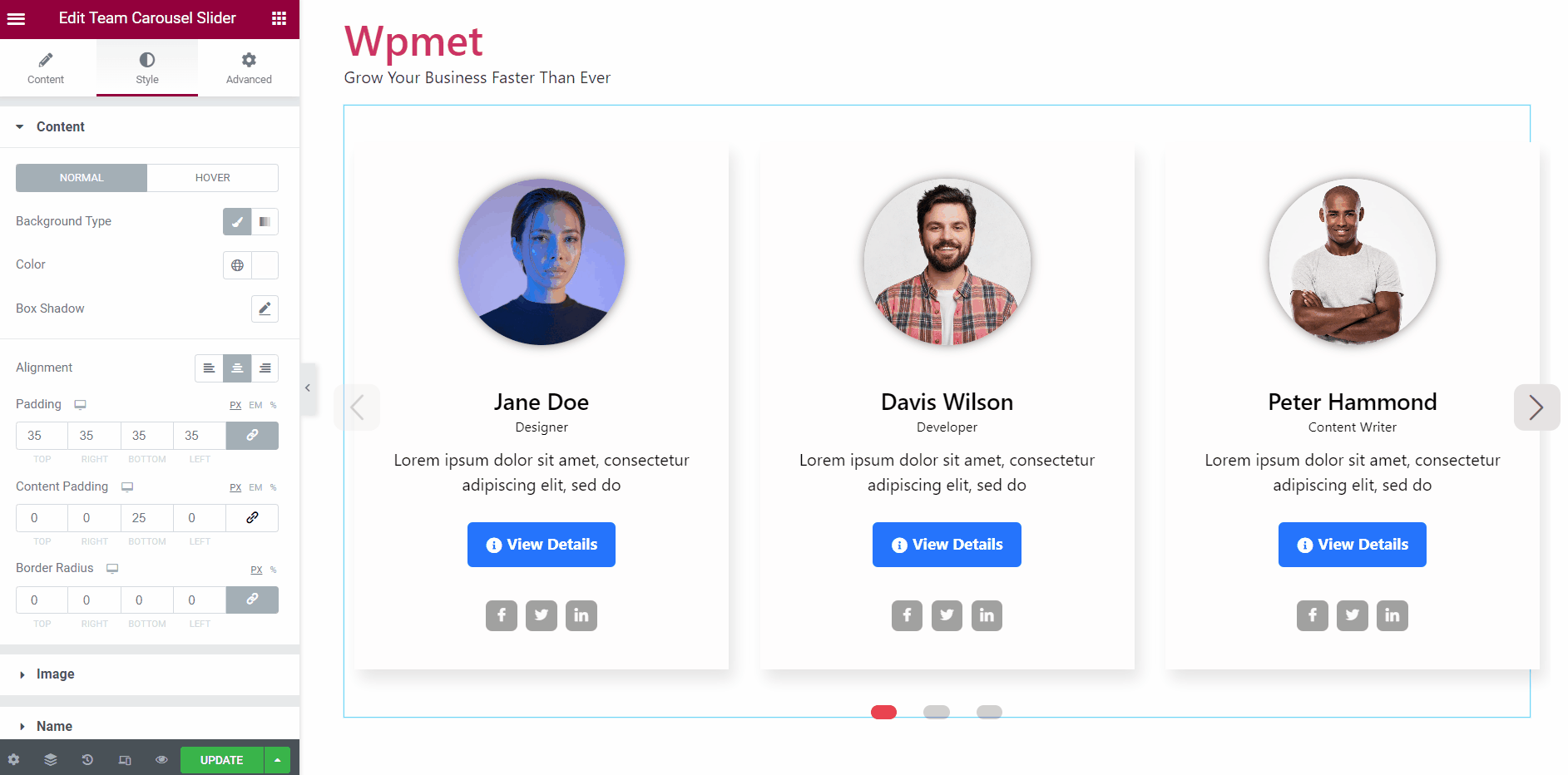
4.1 Content #
To customize the content area of the slider:
- Choose the Background Type and Background Color for the “Normal” state and “Hover” state.
- Select a Hover Animation from the given options.
- Set the Alignment for the content to left, or right, or center.
- Adjust the Padding, Content Padding, and Border Radius for the content area.
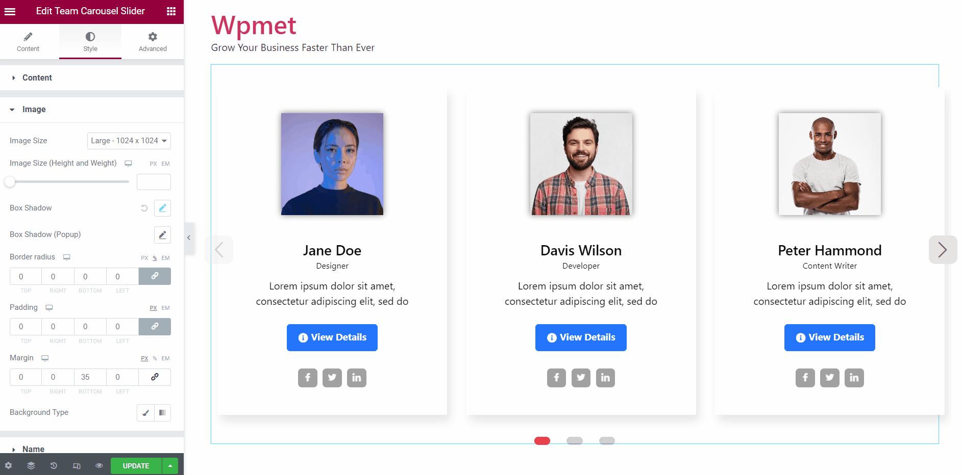
4.2 Image #
To customize the image styles in the Elementor team carousel slider,
- Set the Image Size to display.
- Adjust the Image Height and Width.
- Set a Box Shadow for the image on display.
- Set a Box Shadow for the image on the popup.
- Adjust Border Radius, Padding, and Margin for the team member image.
- Change the Background Type and Background Color.
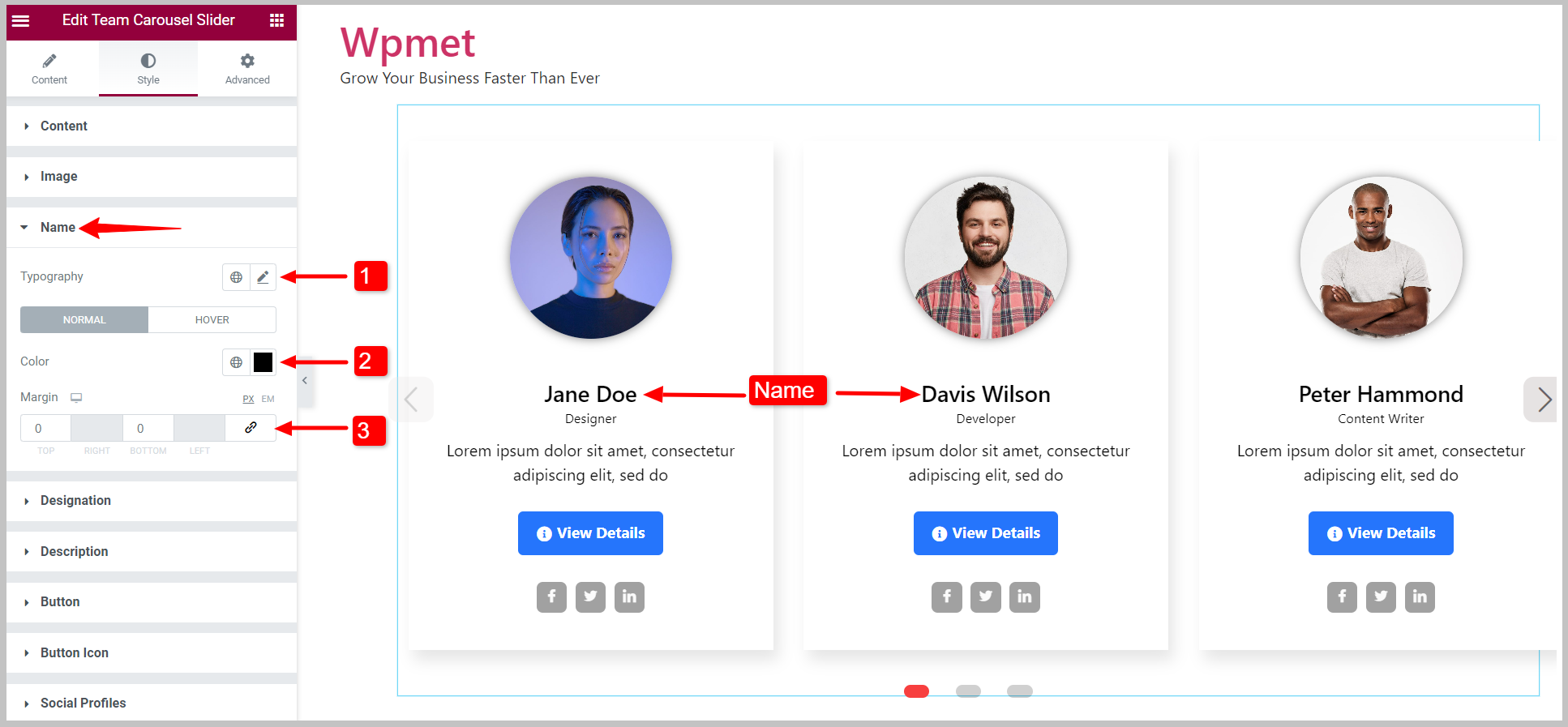
4.3 Name #
You can change the styles of team member names.
- Set the Typography of the name.
- Choose Colors for the “Normal” and “Hover” state.
- Adjust the Margin top and Margin bottom for member name.
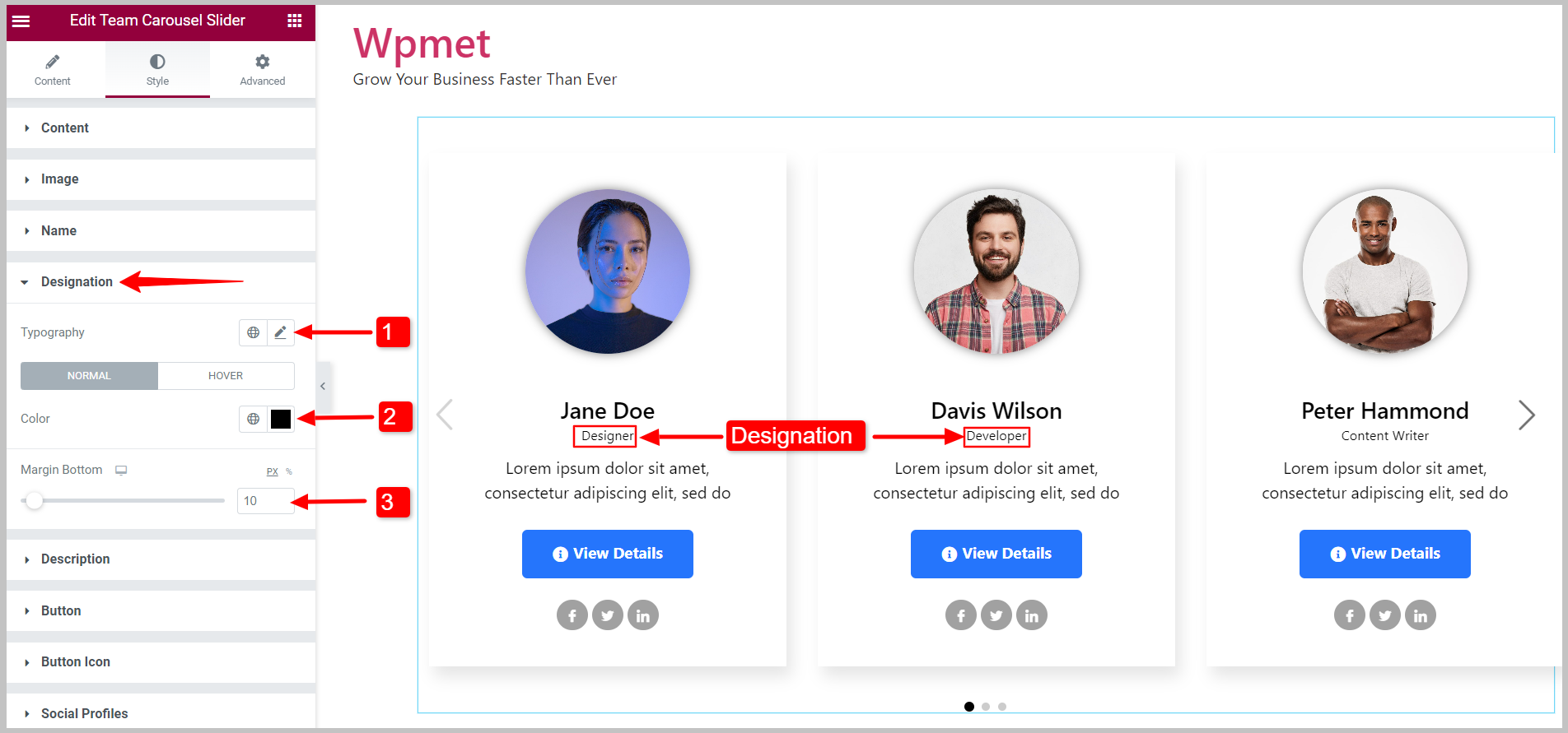
4.4 Designation #
You can change the styles of team member designation.
- Set the Typography of the designation.
- Choose Colors for the “Normal” and “Hover” state.
- Adjust the Margin Bottom.
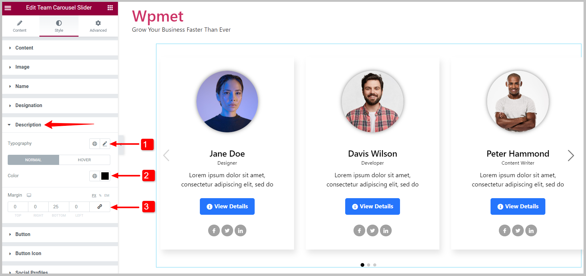
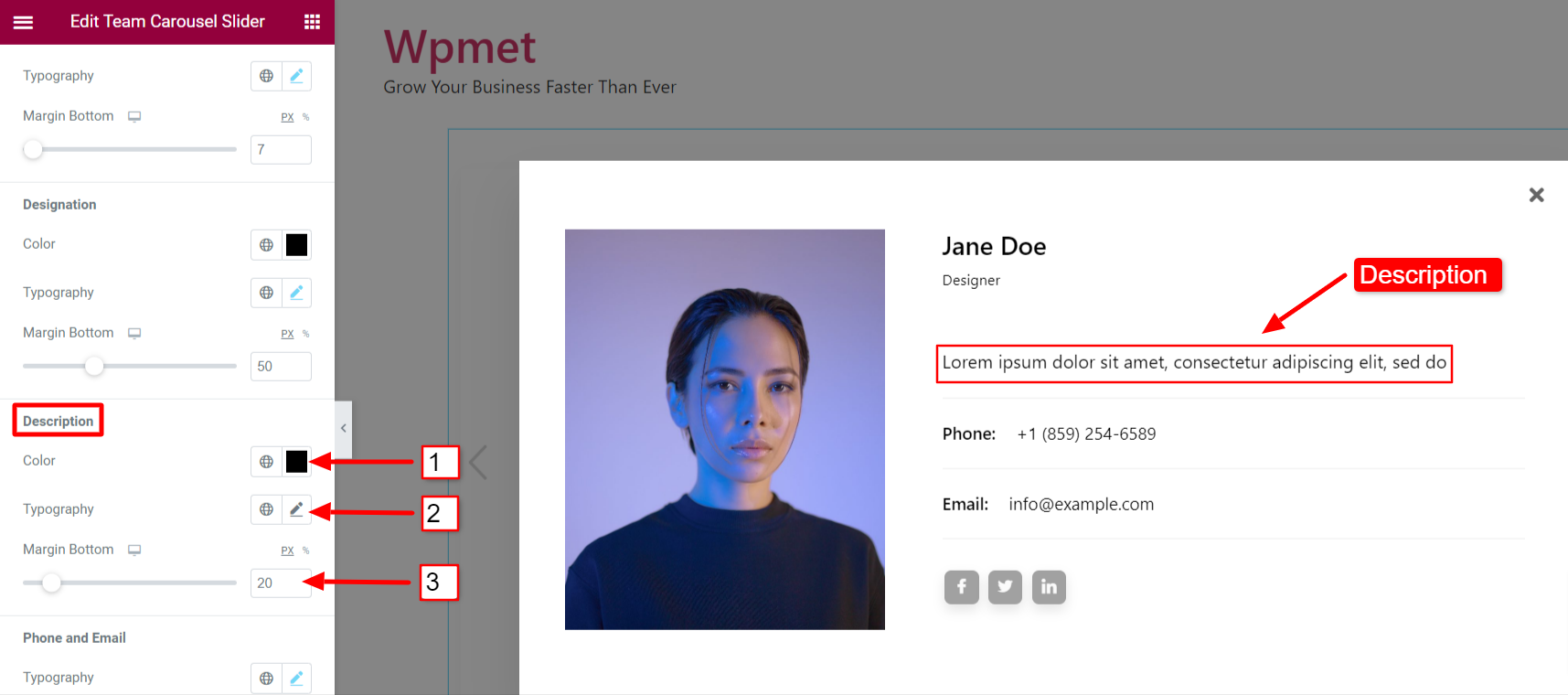
4.5 Description #
You can customize the styles of team members’ descriptions.
- Set the Typography of the description.
- Choose Colors for the “Normal” and “Hover” state.
- Adjust the Margin around the description.
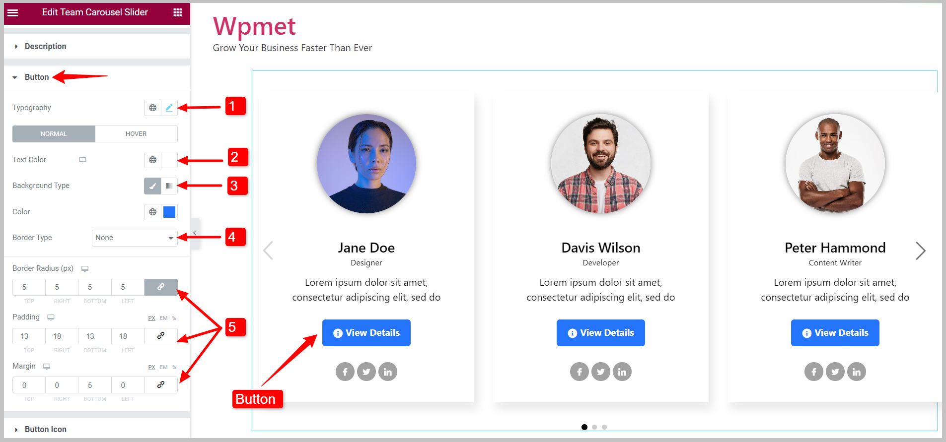
4.6 Button #
To customize the button styles,
- Set the Typography of the button text.
- Choose the button Text Color.
- Select Background Type and Background Color.
- Choose the Border Type for the button.
- Set the Border Radius, Padding, and Margin for the button.
You can set individual Text Colors, Background Colors, and Border Colors for the “Normal” state and “Hover” state.
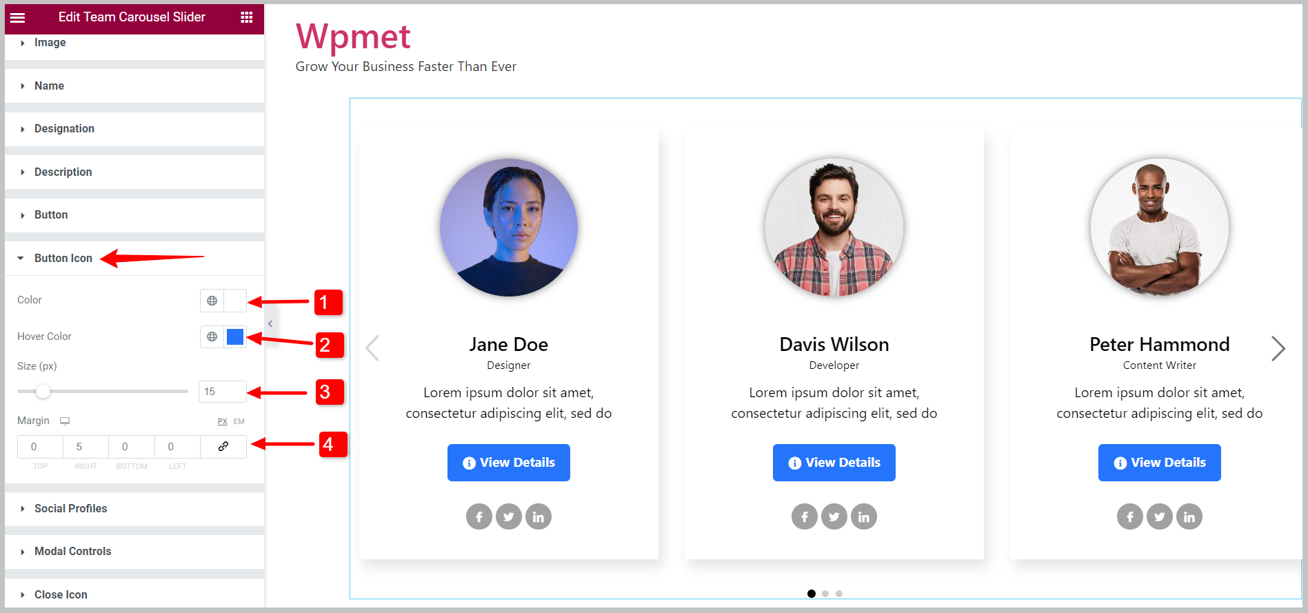
4.7 Button Icon #
If you use a button icon, you can customize its styles,
- Choose the Color for button icon.
- Select a Hover Color for the button icon.
- Adjust the icon Size.
- Set Margin around the button icon.
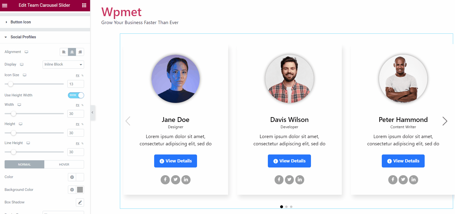
4.8 Social Profiles #
You can customize the social profile icons with the Elementor team carousel widget,
- Change the Alignment of the social icons.
- You can select the Display layout of social profile icons from the given options: Inline Block and Block.
- Adjust the overall Icon Size.
- Enable the Use Height Width feature to adjust Width, Height, and Line Height individually.
- You can choose the icon Color, Background Color, and Border Type.
- Set the Border Radius, Padding, and Margin for social profile icons.
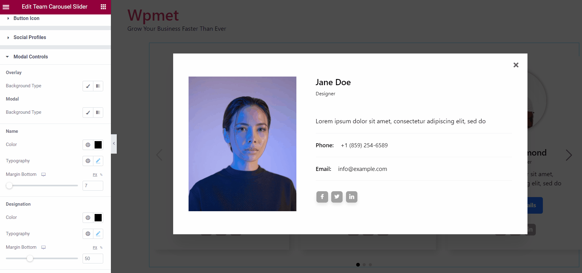
4.9 Modal Controls #
When you Enable Popup, this Modal Controls option is available. The following modal controls are available with the widget,
Overlay:
- Choose the overlay Background Type.
- Based on the background type, choose the Background Color for overlay.
Modal:
- Choose the modal Background Type.
- Based on the background type, choose the Background Color for the modal.
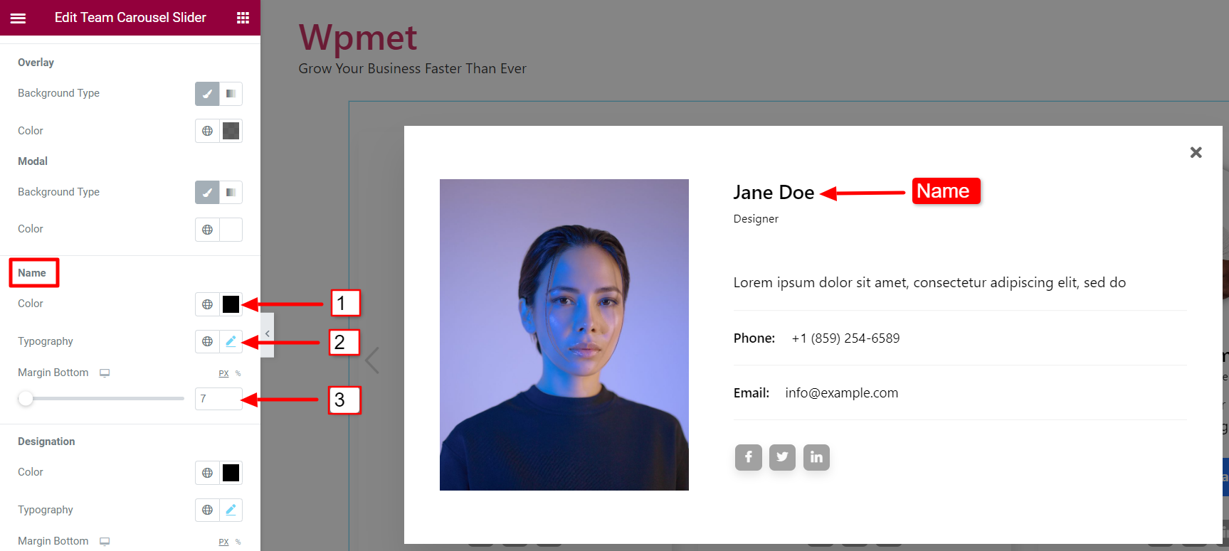
Name:
- Choose a color for member Name.
- Set the Typography for name text.
- Adjust the Bottom Margin for the name.
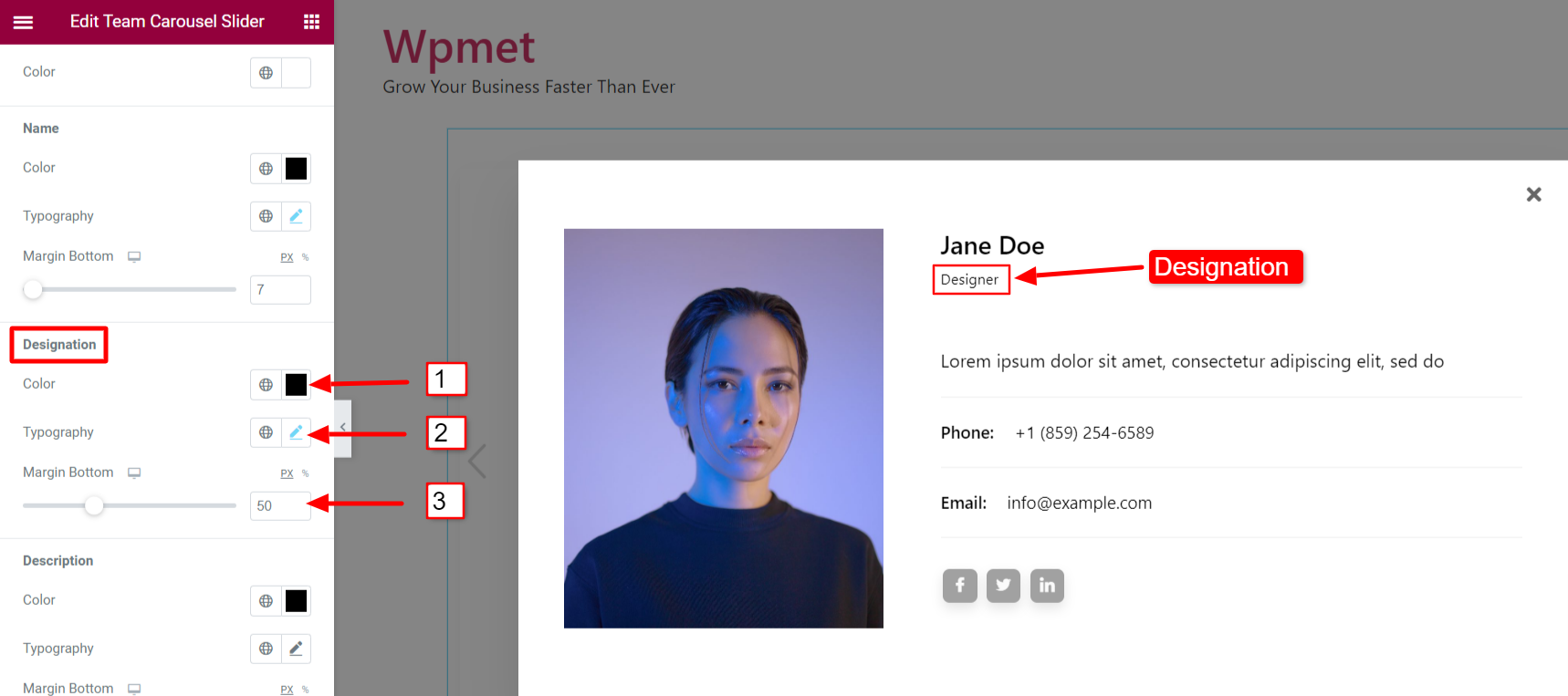
Designation:
- Choose a color for member’s Designation.
- Set the Typography for the designation text.
- Adjust the Bottom Margin for the designation.
Description:
- Choose a color for Description of the team member.
- Set the Typography for the description text.
- Adjust the Bottom Margin for the description.
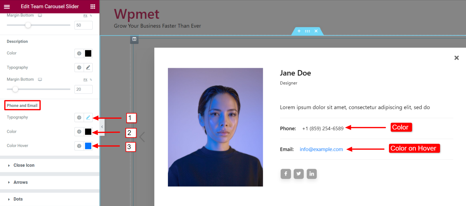
Phone and Email:
- Set the Typography for the Phone and Email text.
- Choose a text Color for the Phone and Email.
- Add a Hover Color for the Phone and Email.
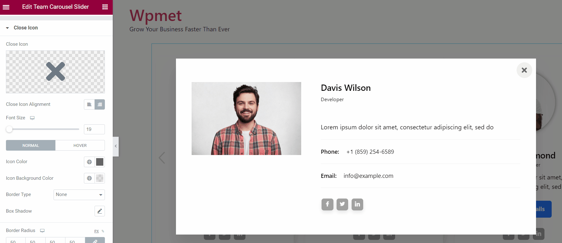
4.10 Close Icon #
For the Popup, you can customize the Close icon.
- Select a Close Icon from the Elementor icon library.
- Set the Close Icon Alignment to right or left.
- You can choose Icon Color, Icon Background Color, and Border Type.
- Also, set the Border Radius and Padding for the close icon.
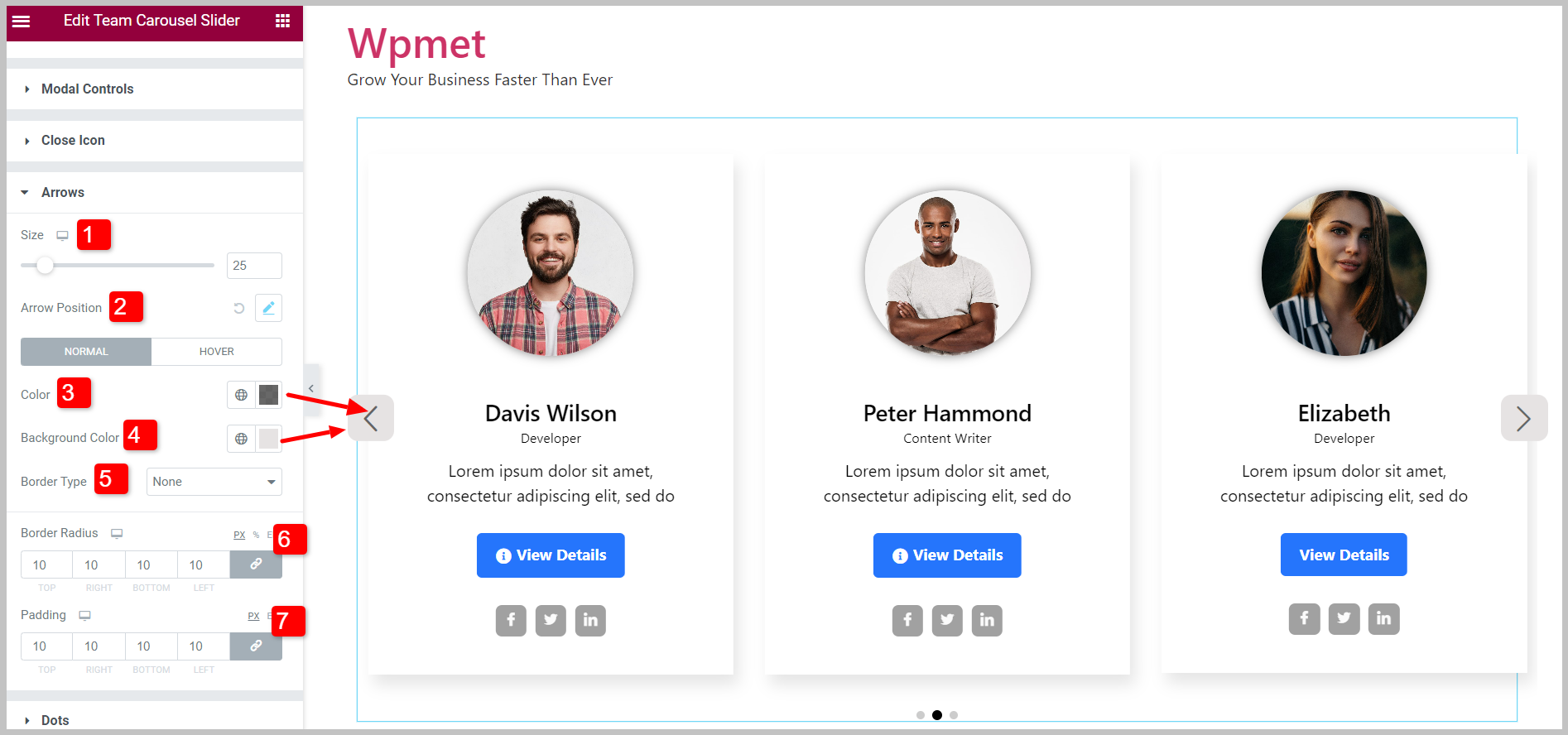
4.11 Arrows #
If you enable Arrow navigation, you can customize its styles.
- Adjust the Size of the Arrows on the carousel.
- You can set the Arrow Position. The Left Arrow position and Right Arrow position can be adjusted individually.
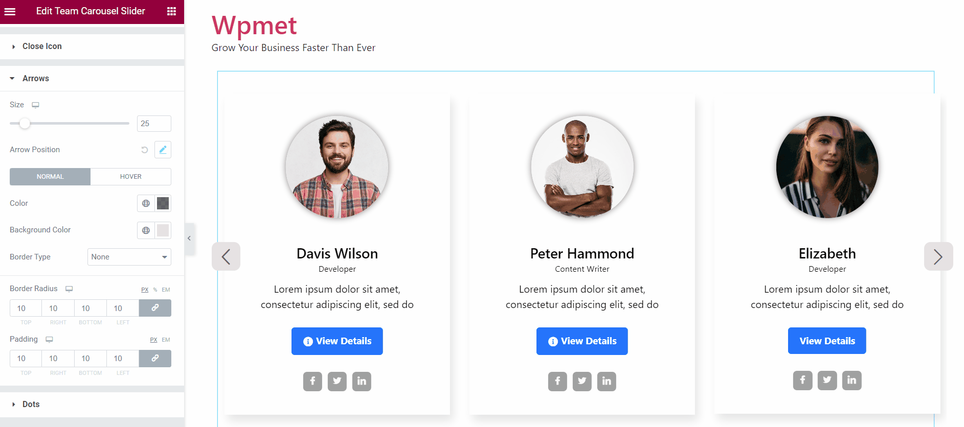
- Select an Arrow Color.
- Choose an arrow Background Color.
- Select the Border Type for the arrows.
- Set the Border Radius for the arrows.
- Adjust the Padding.
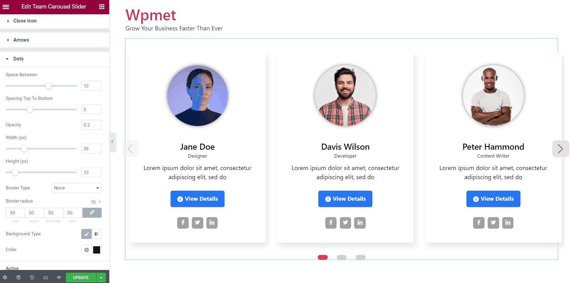
4.12 Dots #
If the Dots are enabled, you can customize Dots styles.
- Adjust the Space Between the dots.
- Adjust the dot’s Spacing Top To Bottom.
- You can change the Opacity of the dots.
- Set the Width of the dots.
- Set the Height of the dots.
- Add a Border Radius for the dots.
- Select a Background Type and background color.
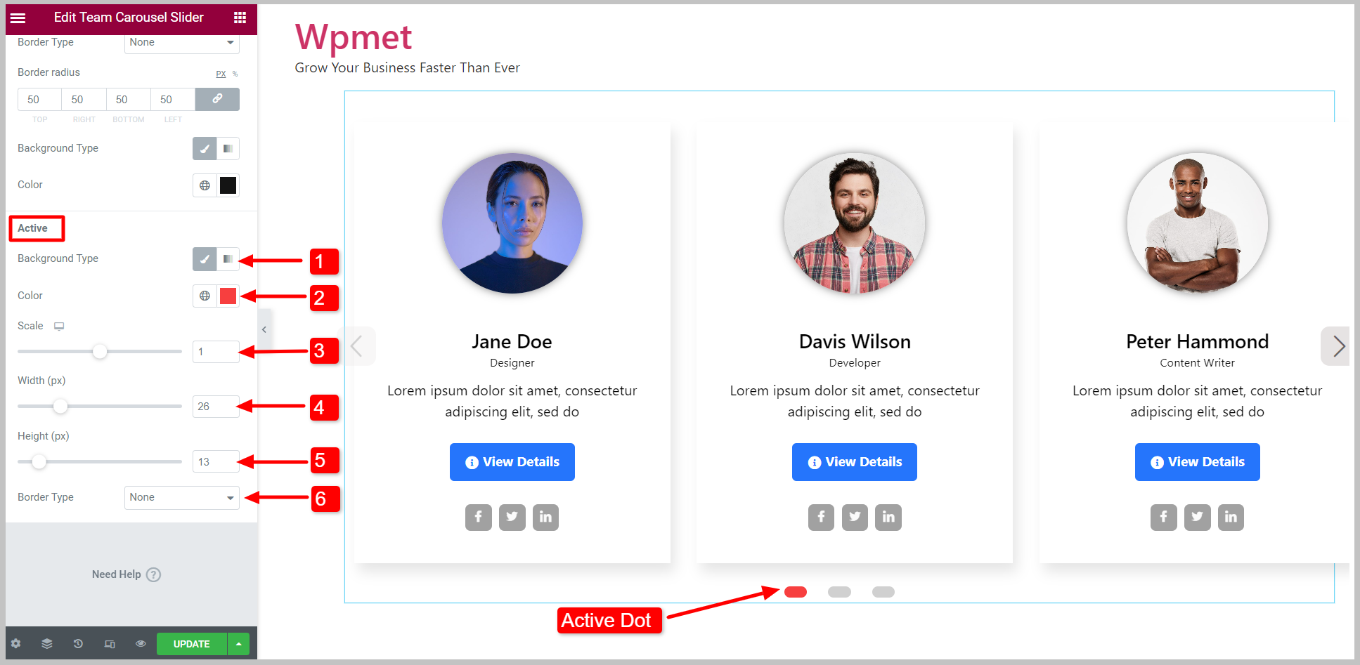
Active:
You can customize the active dot separately.
- Choose Background Type and Color for the active dot.
- Select a active dot Color.
- Adjust Scale (size) of the active dots.
- Adjust the Width of the active dots.
- Adjust the Height of the active dots.
- Select the Border Type.
Finally, the team carousel is ready for display. The Elementor Team Carousel Slider widget comes with ElementKits Pro. Get the plugin to design sophisticated websites with advanced features like Elementor Team Carousel Slider and more.


