

 English
  German
  Spanish
  Italian
  French
  Danish
  Portuguese
  Swedish
  Polish
  Korean
  Japanese
 Getting Started With ElementsKit Advanced Tooltip Module #
Elementor tooltip displays texts about an element when a user hovers over that element on a website. The advanced Tooltip Module of ElementsKit gives you the ability to add advanced-level tooltips in Elementor. For example, you can add an Elementor image tooltip where the image gets loaded once the user clicks or hover over an item.
With ElementsKit’s Advanced tooltip, you can customize the Elementor tooltip to enhance the look and functionality of your website as well as ensure a great user experience. Moreover, with this module, you can make the tooltip show up both on hover and click.
So, Let’s jump to how you can add a tooltip in Elementor using ElementsKit’s Advanced Tooltip Module.
Before the follow the process below you need to make sure you have installed Elementor and ElementsKit as your Elementor tooltip plugin.
If you need help with the installation and activation process, you can check the documentation.
How to add Elementor tooltip using Advanced Tooltip Module of ElementsKit #
Check out how you can add tooltip in Elementor using ElementsKit Advanced Tooltip Module in just 5 simple steps.
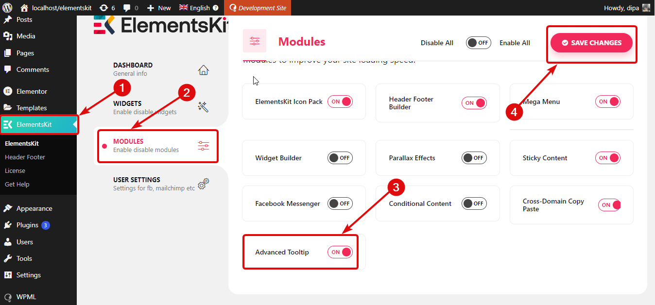
Step 1: Turn on the Advanced Tooltip Module of ElementsKit #
You must turn on the Advanced tooltip module of ElementsKit before you can add a wonderful tooltip to any element of your Elementor website.
To turn on the module, go to ElementsKit ⇒ Modules ⇒ Advanced Tooltip. Make sure the toggle option of Advanced Tooltip is turned on and click on Save Changes to update the status.
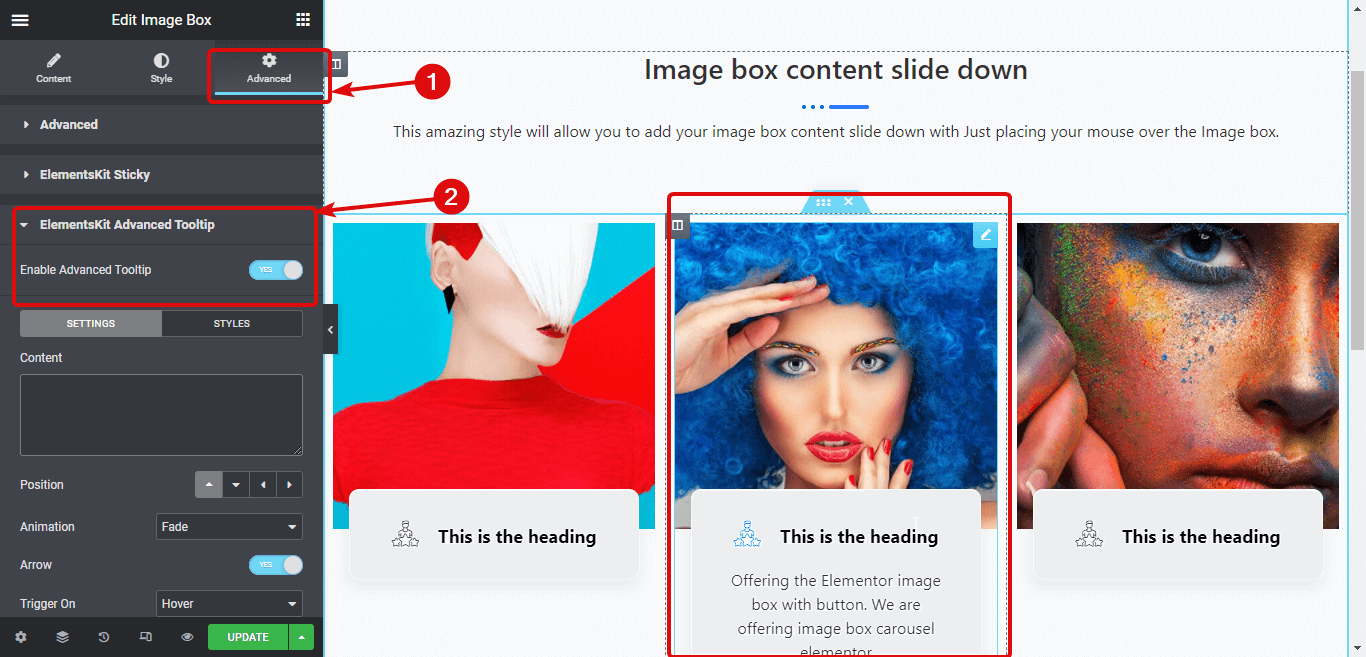
Step 2: Enable ElementsKit Advanced Tooltip for the elements you want to add a tooltip to #
The first step made the advanced tooltip option available to use any of the elements. However, it doesn’t automatically get applied to all the elements. You need to enable it separately for each element.
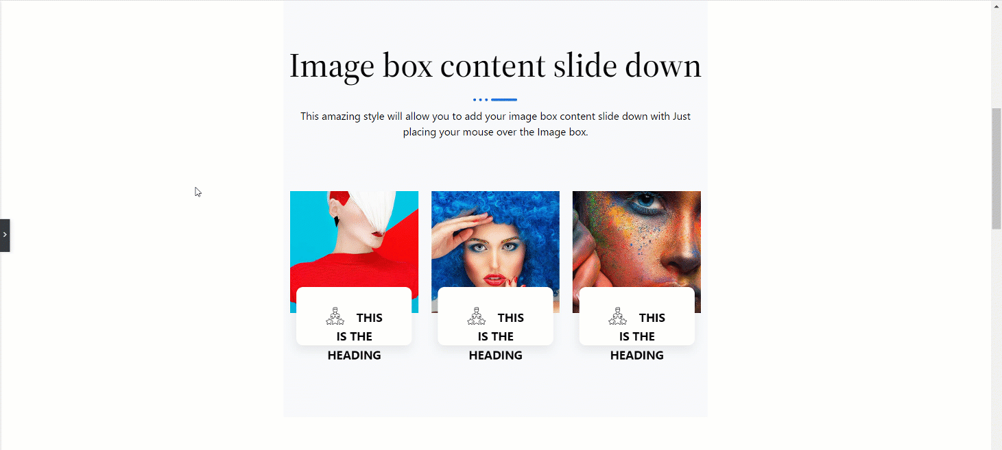
Go to the settings of the Element, and move to the Advanced tab. To show the process I am using an Image Box.
Now scroll down to the ElementsKit Advanced Tooltip menu, expand it and turn on the Enable Advanced Tooltip option.
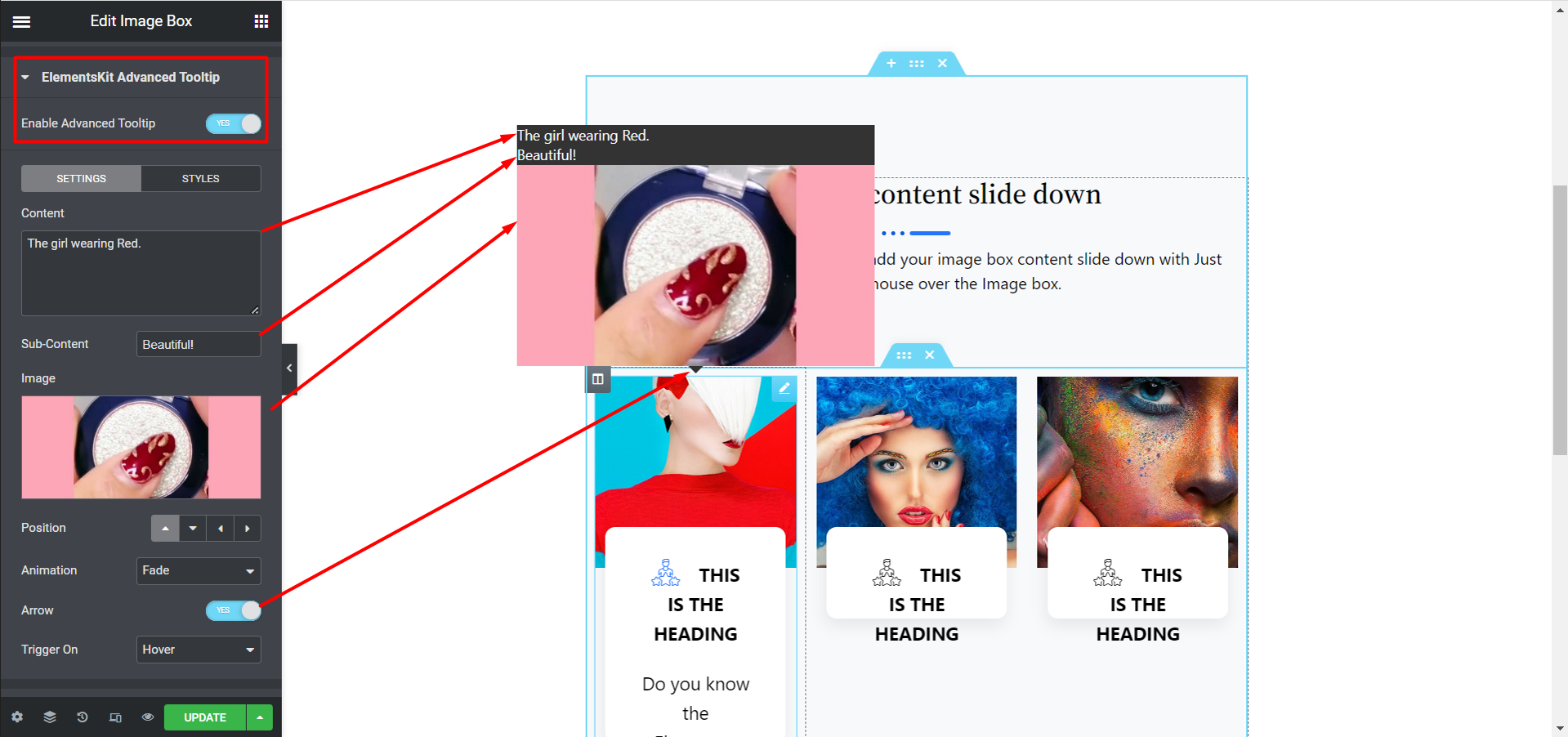
Step 3: Customize the Tooltip settings #
Click on the SETTINGS tab to customize the following options:
- Content: Provide the text content that will show up on the tooltip.
- Sub-Content: Write the sub-content or text you want to show under the main text.
- Image: Upload your chosen image.
- Position: Here you can choose whether the tooltip will show on the top, left, bottom, or right.
- Animation: You can choose animation options such as fade, perspective, scale shift away, shift toward.
- Arrow: Turn this option to add an arrow between the tooltip and the content.
- Trigger on: Here you can choose whether the tooltip will show up on hover, click, or both.
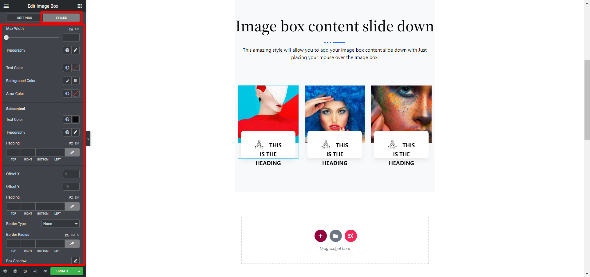
Step 4: Customize styles of Tooltip #
Once you are done with the content settings, move to the STYLES tab. Here you can adjust the following options such as Max Width, Typography, Text Color, Background Color, Arrow Color, Offset X, Offset Y, Padding, and. And, there are also options to adjust the sub-content part.
Step 5: Update and see the preview of Tooltip in Elementor #
After making all the style change, click on update to save all your changes. And that’s it, your Elementor tooltip should be working according to your settings like the demo below:
Follow this simple method and add your module easily. Actually, an advanced tooltip helps website visitors to check short and more clear product details easily. Showing these details or specific messages you can undoubtedly attract customers to your website.


