


 English
  German
  Spanish
  Italian
  French
  Danish
  Portuguese
  Swedish
  Polish
  Korean
  Japanese
 The use of Glass Morphism in design has become increasingly popular in recent years. You can use a frosted glass look to give elements an interactive look and feel. The ElementsKit Glass Morphism module lets you easily apply the glass morphism style on any Elementor-based page or website.
In this post, you will learn how to add Glass morphism effect to any Elementor widget.
How to Add Glass Morphism Effects to Any Elementor Widget #
Follow the steps below to get a complete walkthrough for bringing a glass-looking style to your Elementor website.
Step-1: Enable the Glass Morphism Module #
To get started, you need to manually enable the Glass Morphism module. For this, from your WordPress dashboard,
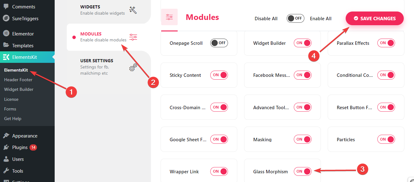
- Follow ElementsKit > MODULES.
- Find the Glass Morphism module.
- Enable the toggle button next to it.
- Then, hit the “Save Changes” button in the top right corner.
Now, you will see the Glass Morphism feature in the advanced tab of any widget or column.
Step- 2: Add the Glass Morphism Effect #
You can add Glass Morphism effects for styling product items, image galleries, pricing sections, comparisons, and many more.
To do this,
- Add any page or post and edit with Elementor.
- Then, insert a column or widget.
- Now, go to the Advanced Settings tab.
- And, open the “ElementsKit Glass Morphism” settings.
- Click the edit icon and it will reveal all the features of Glass Morphism styling.
Let’s see how this feature works 👇
Blur #
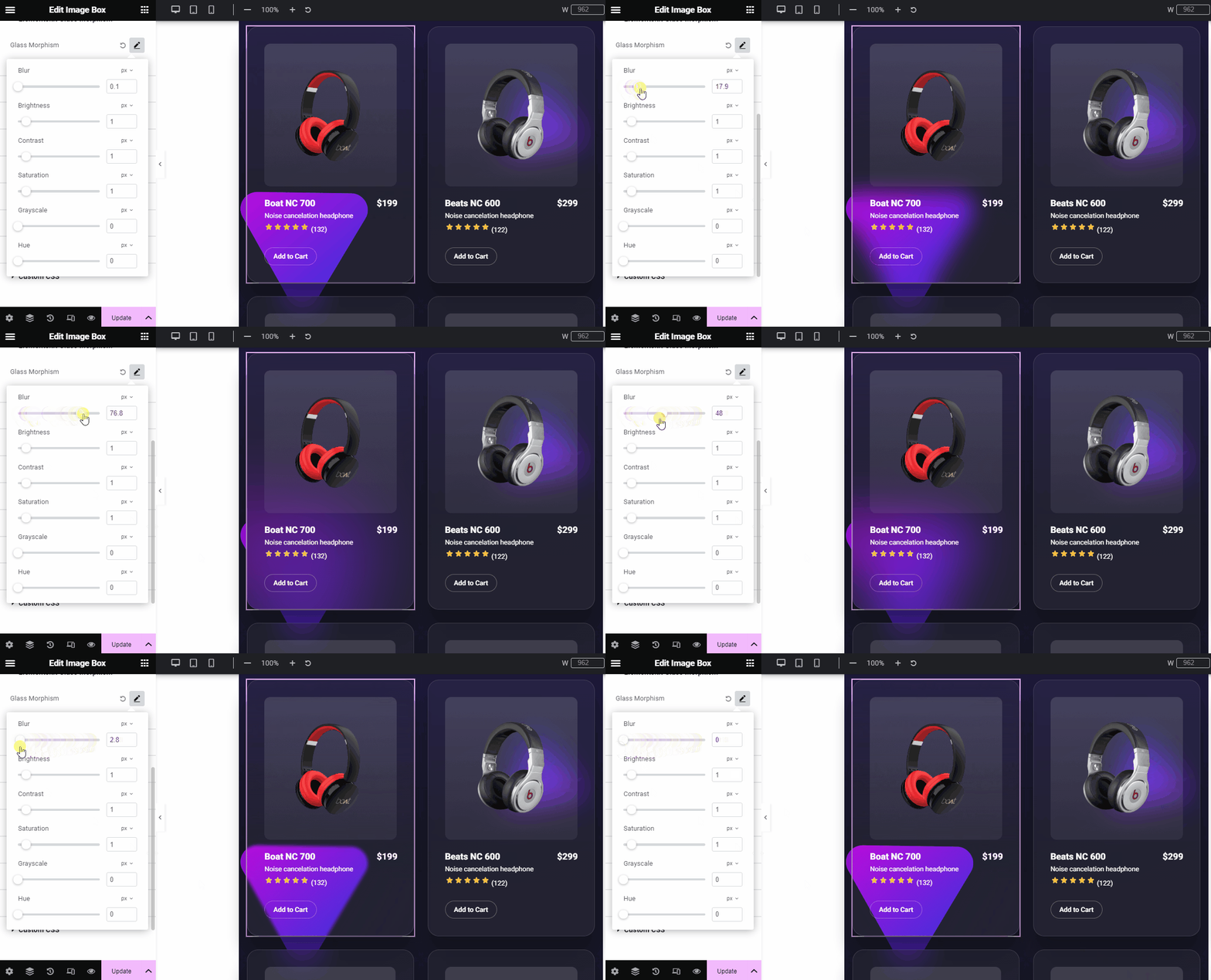
Define a blur value depending on how blurred the surface you want for the design. Blur effects bring a glass-like aesthetic to your design by adding colorful and transparent layers between design elements. Thus, it shows a multilayered appearance to the design.
Brightness #
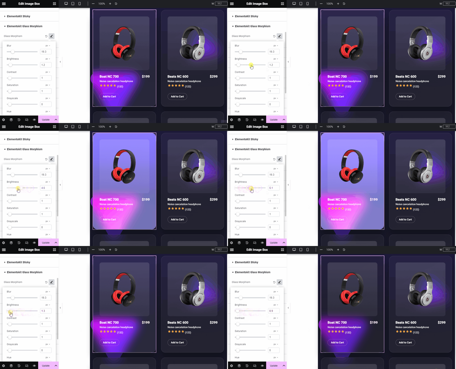
Use the slider or add a custom value to adjust the brightness of the glass morphism design.
Contrast #
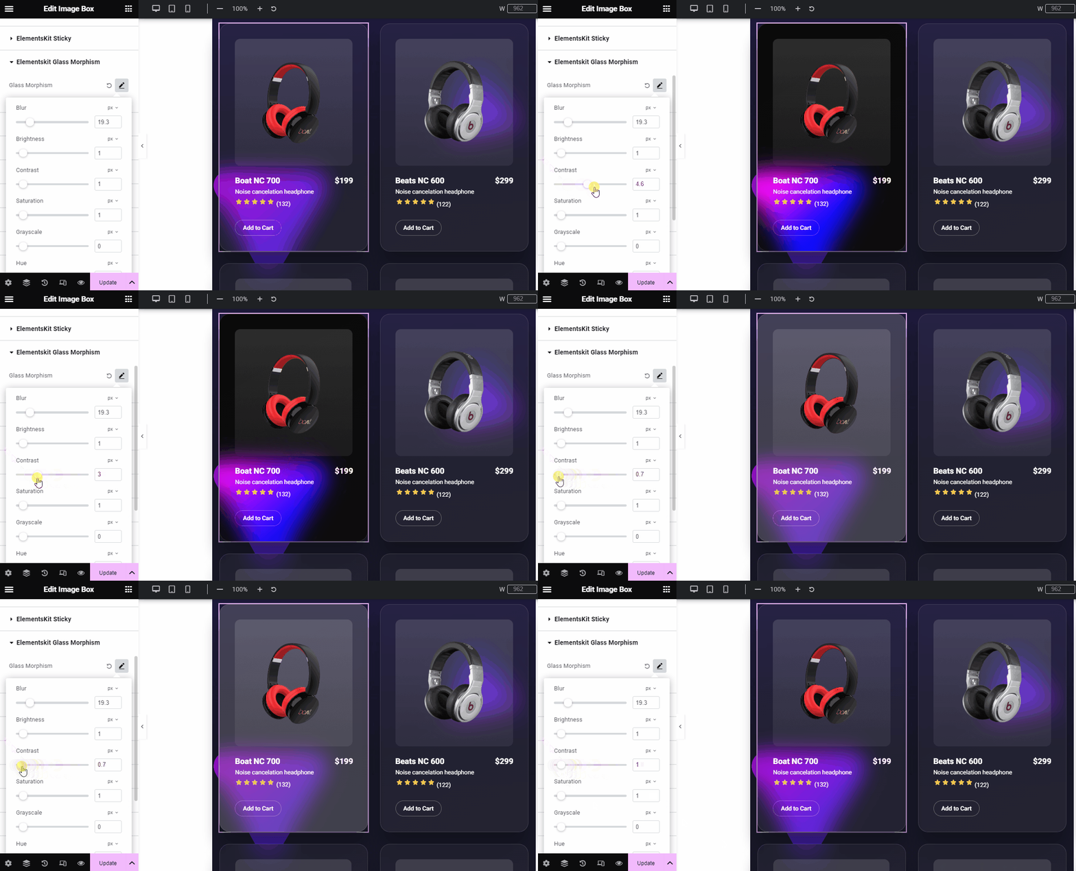
Define the degree of contrast. It will help to maintain the visual hierarchy while using multiple design elements simultaneously.
Saturation #
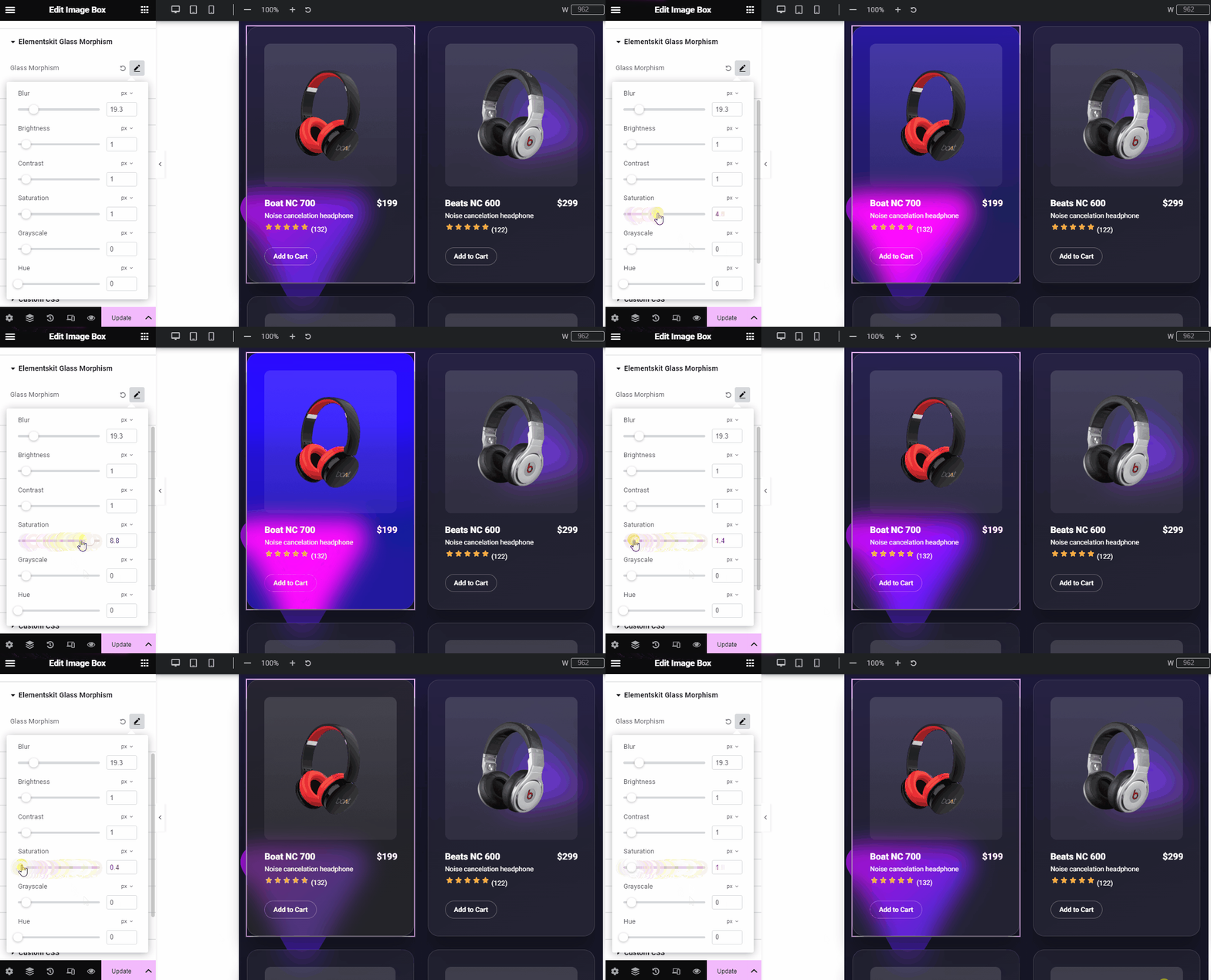
Use this slider or give a custom value to control the gray level in the element color. If you increase the saturation level, it will make your color more vibrant. Conversely, decreasing the saturation will cause the color tone to become dull.
Grayscale #
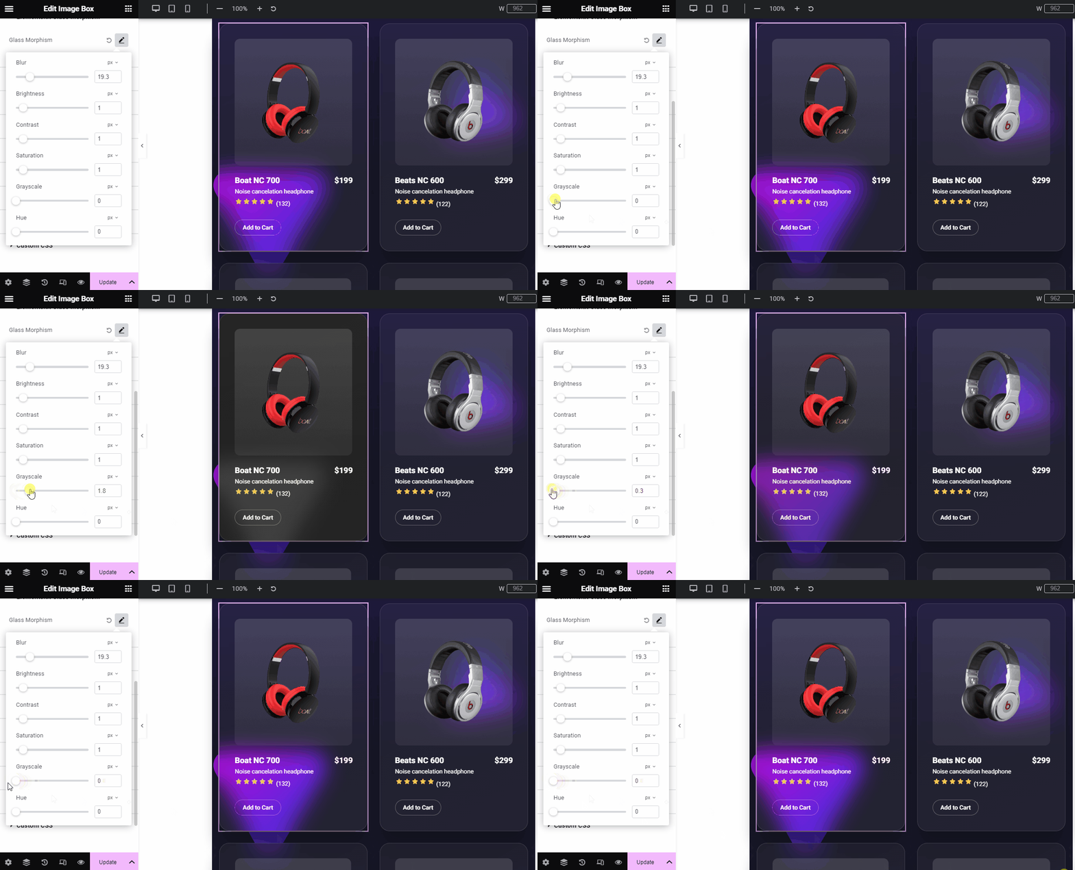
From here, you can apply gray shades to your design. You decide how light or dark the design will be in shades of gray. Selecting a higher range will bring the darkest version of the design. Whereas, entering a lower value will bring brightness to your design.
Hue #
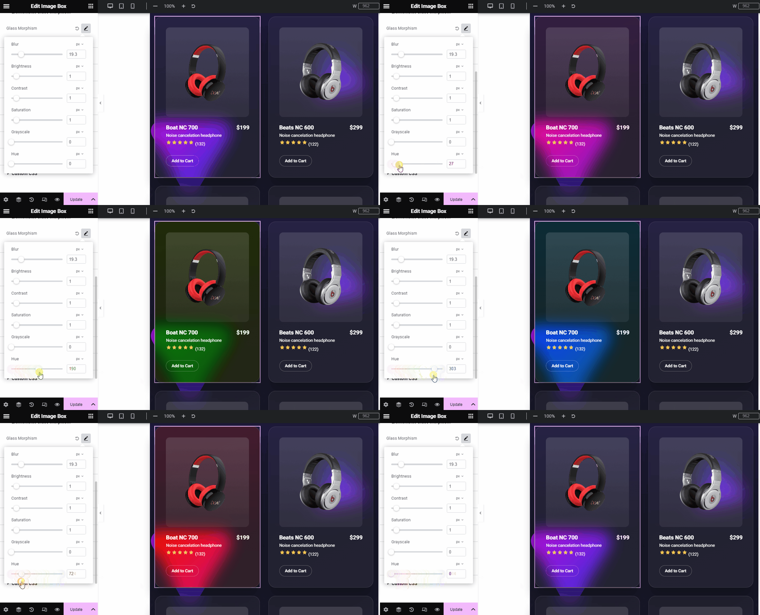
Hue is a term used to describe the intensity of the blend between two colors. Here, you’re not changing the main color, you’re just adjusting how bright it is against its corresponding color.
For example, if you add two colors like, red and pink, your design has two hues. And, the slider will let you change the intensity of both colors.
This setting is based on a color wheel from 0 to 360. Here,
- 0 refers to red.
- 120 refers to green.
- 240 refers to blue.
Now, it’s your turn. We have shown how to use all the ElelmentsKit Glass Morphism features to create an appealing frosted glass look anywhere on the Elementor website.


