


Getting Started #
Display any information or conversion-oriented messages in the form of a popup. You can show a photo, button, page, text, etc with various animation styles. Here’s a comprehensive article to explain every method in detail.
Watch our video guide:
Or, just follow the step by step process:
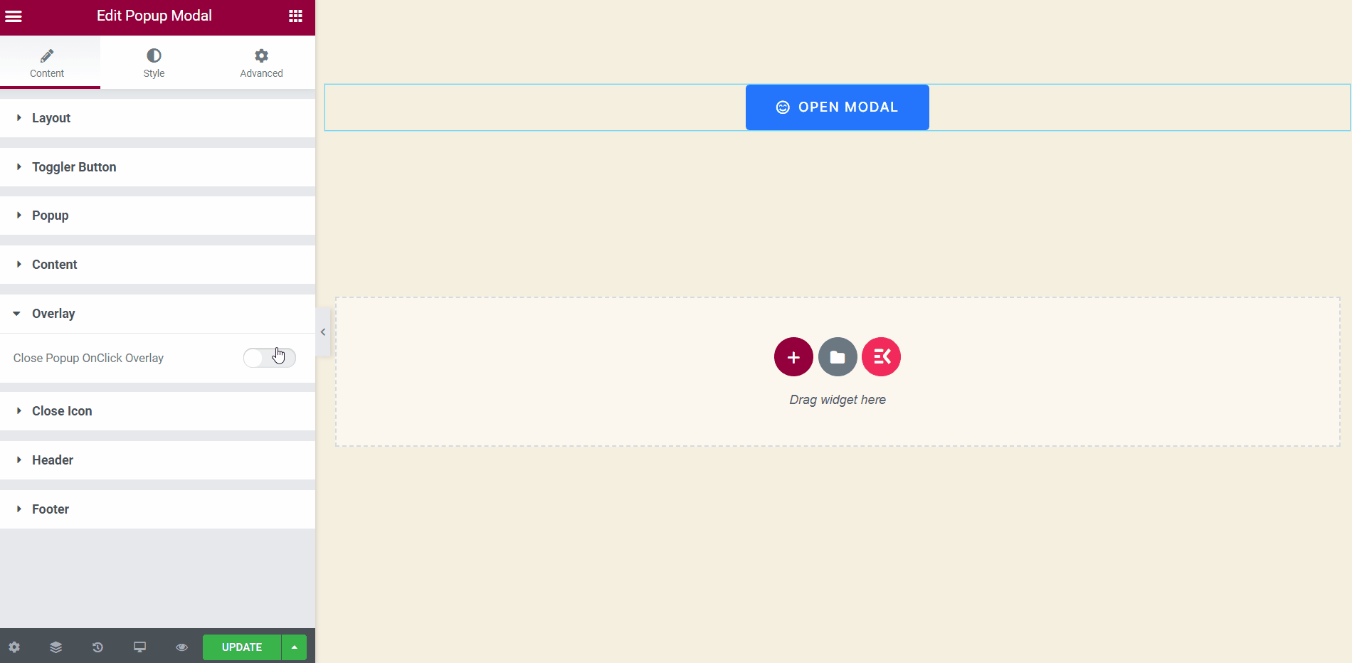
Step->1: Add Popup Modal #
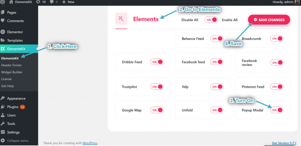
- Go to ElementsKit=> go to Elements=> Make sure to turn on Popup Modal=> Click on Save Changes.
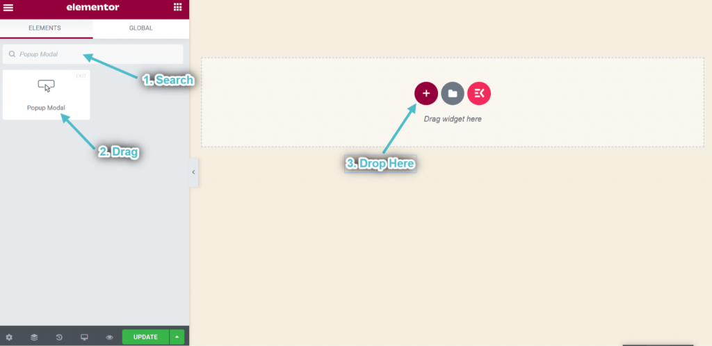
- Now search for Popup Modal.
- Drag the widget.
- Drop on the selected area.
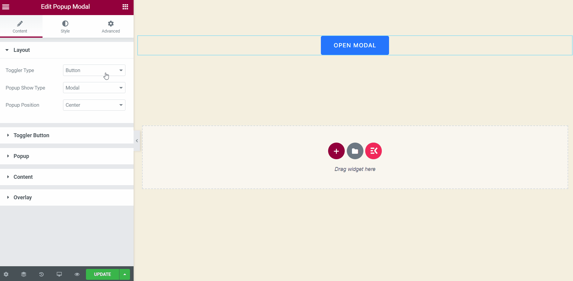
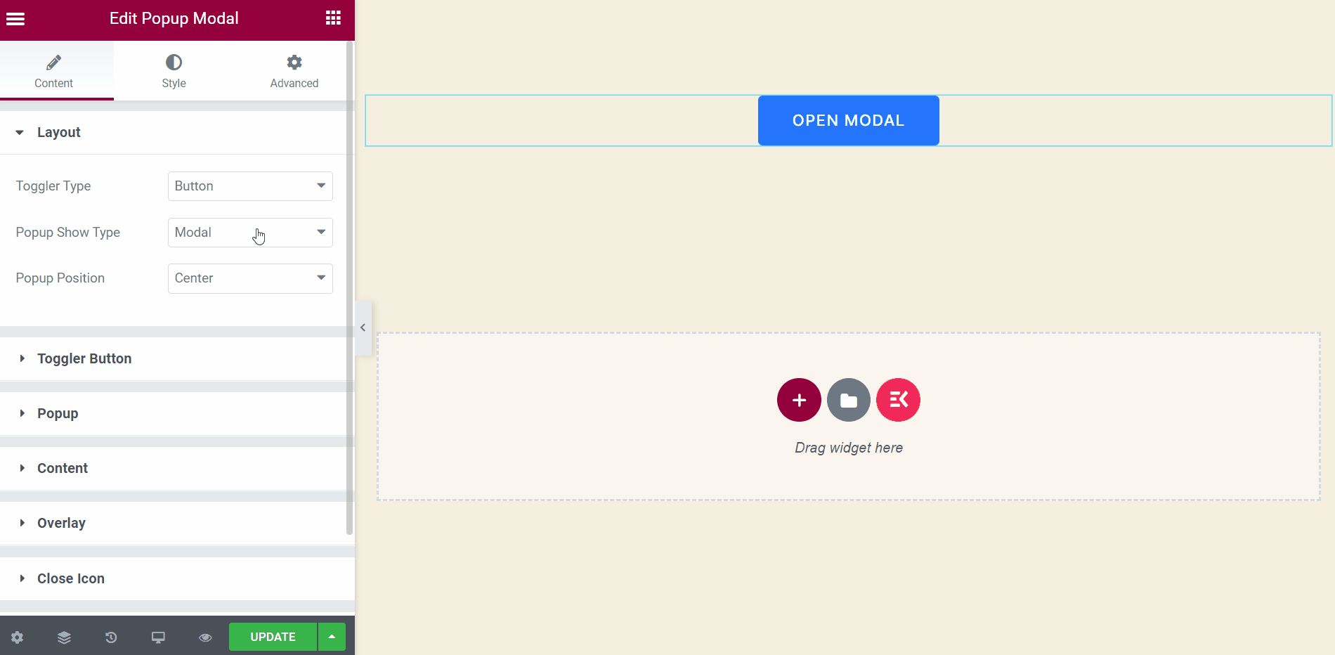
Step->2: Customize Popup Layout #
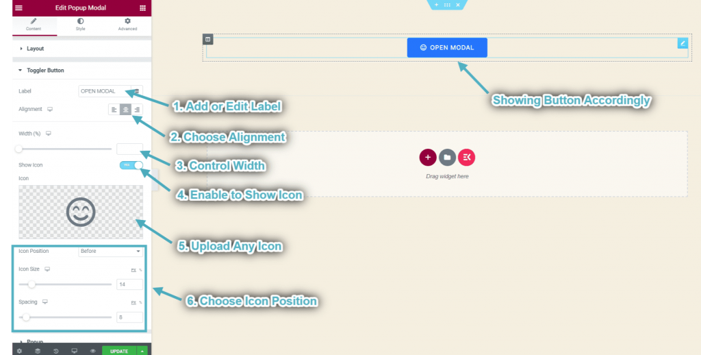
Toggle Button #
You can use this button as a trigger. Let your user click on it and a popup will display accordingly.
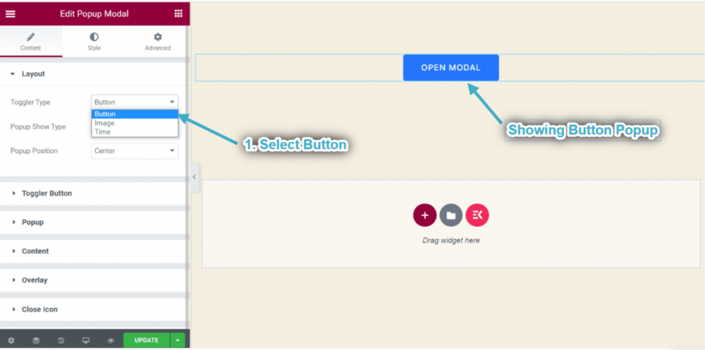
- Choose popup toggler Type: Button.
- You can see the popup toggle button showing.
- Now Expand the Popup Toggle Button: This section will appear when you choose toggle type: Button from the Layout Section.
- Add or edit the Button Label.
- Choose Alignment: Left, Center, or Right.
- Control Width.
- Enable the toggle to Show Icon.
- Upload any Icon from the selected area.
- Control Icon Positioning by simply dragging.
- You can see your popup toggler button showing accordingly.
Toggle Image #
You can use the image as a trigger as well.
- Choose popup toggler type: Image.
- Expand the Toggler Image Section: This section will appear when you choose toggle type: Image from the Layout Section.
- Upload Image.
- Choose Image Size.
- Choose Image Alignment: Left, Center, or Right.
- You can see the popup toggle image showing in the center.
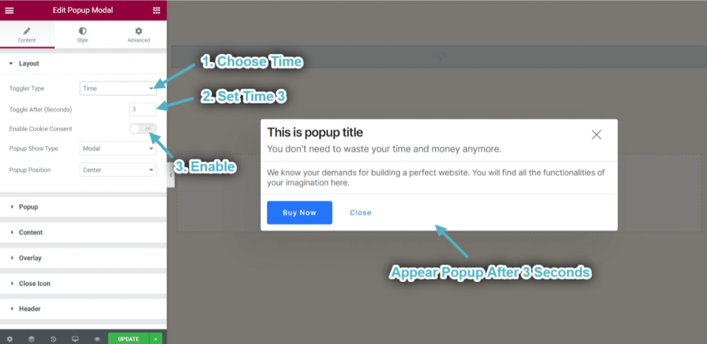
Toggle Time #
Pop-up Modal will appear automatically when a user visits the website. You can set the exact time for that.
- Choose popup type: Time.
- Set popup time: 3.
- Enable the cookie consent.
- Popup will appear automatically after 3 seconds.
Customize Popup Show Type & Position #
You can control the way of displaying your popup. Either popup will appear in a modal or a slide.
- Choose popup show type: Modal.
- Select button position: Center.
- You can see the popup appear in a modal and center in position.
- Choose popup show type: Slide.
- You can see a popup showing from the left in a slide.
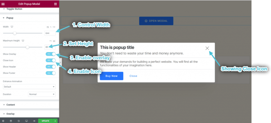
Step->4: Customize Popup #
- Control Pop-up Width.
- Set Height.
- Enable Overlay.
- Enable Close Icon.
- You can see the closed icon appeared.
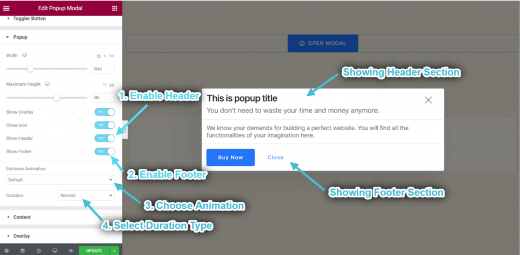
- Enable Header.
- Enable Footer.
- Choose Animation.
- Select Animation Duration Type.
- You can see the header & footer section showing accordingly.
Customize Overlay #
This section will appear when you Enable the Overlay Option From the Popup Section.
- Enable this section to close the popup just in one click.
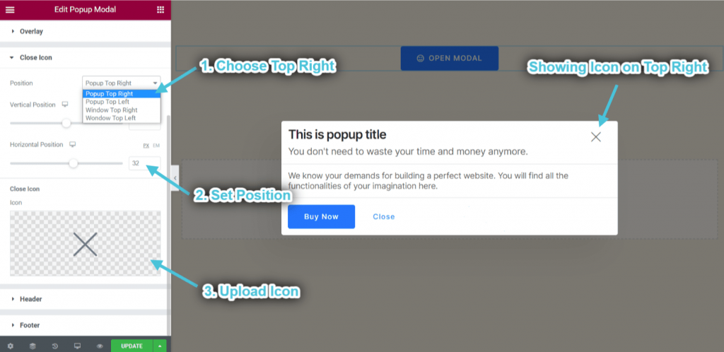
Customize Close Icon #
This section will appear when you Enable the Close Icon Option From the Popup Section.
- Select icon position: Popup Top Right. You can also select Popup Top Left, Window Top Right, Window Top Left from the drop-down.
- Control Horizontal Position.
- Upload Close Icon.
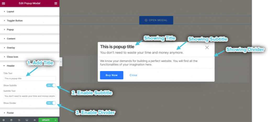
Customize Header #
This section will appear when you Enable the Header Option From the Popup Section.
- Add or edit Header title.
- Enable and edit Subtitle.
- Enable Divider.
- You can see the header title, subtitle, and divider showing accordingly.
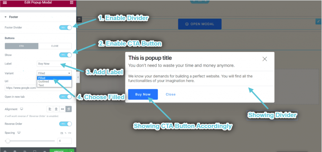
Customize Footer #
This section will appear when you Enable the Footer Option From the Popup Section.
- Enable Divider.
- Enable CTA Button.
- Add or edit Label.
- Choose Variant: Filled. You can also select Outlined or Text.
- You can see the CTA button and divider showing accordingly.
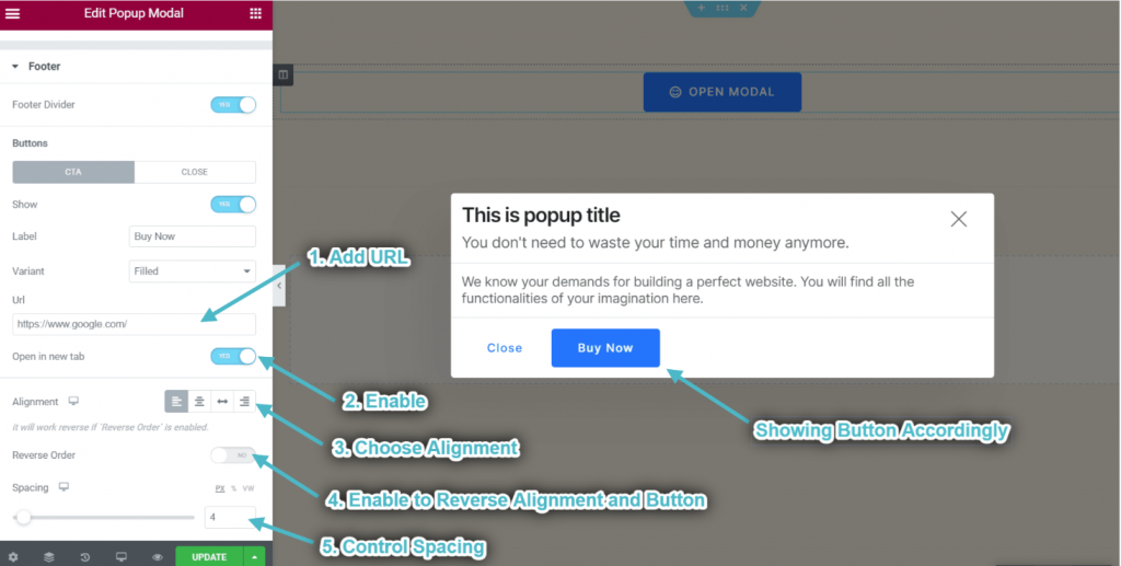
- Add URL.
- Enable to Open Link in New Tab.
- Choose Alignment.
- Enable to Reverse Alignment and Button.
- Control Spacing.
- You can see the CTA button showing accordingly.
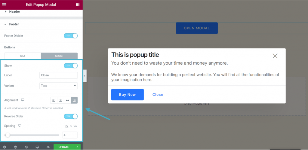
- Customize the close button in the same way.
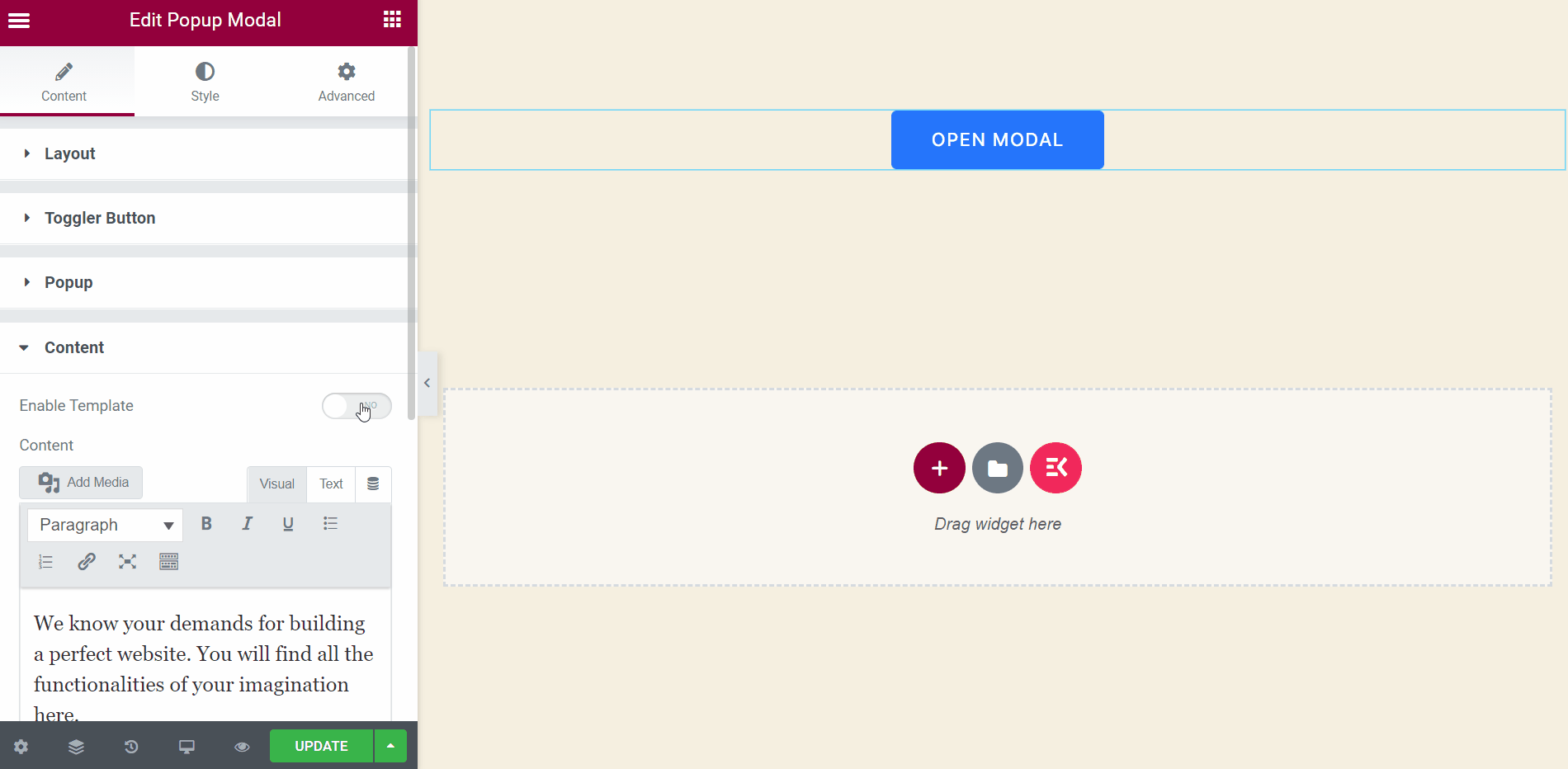
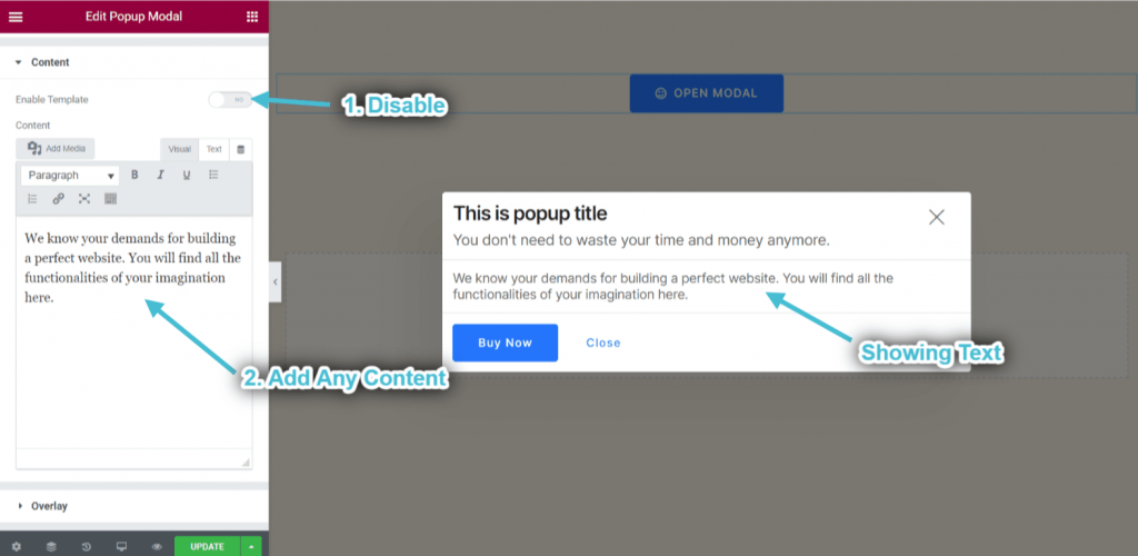
Step->5: Add Content #
- Disable the Template Area.
- Add or edit any content.
- You can see the content showing accordingly.
- Enable Template: You can select any widget from the selected area and customize your popup content area.