


The ElementsKit Nav Menu widget allows you to create fully customizable navigation menus in Elementor, including dropdowns, responsive mobile menus, and styling options. It works inside a header/footer template built with ElementsKit.
How It Works #
- Enable Header/Footer module in ElementsKit → Modules.
- Create a Header template in Header Footer and edit with Elementor.
- Drag & drop the Nav Menu widget into the header.
- Select your WordPress menu in Menu Settings.
- Configure dropdown & mobile behavior (hover/click, breakpoints, hamburger menu).
- Style your menu (fonts, colors, spacing, icons).
Key Features #
- Use existing WordPress menus.
- Dropdown & mega menu support.
- Fully responsive with mobile hamburger control.
- Custom styling for desktop and mobile menus.
Check the details here:
A navigation menu widget helps to navigate menu items. It creates drop down and gives the header a nice sorted look. ElementsKit consists of many comprehensive modules and nav menu is one of them. It is rich in features, and easy to use.
- Use existing WordPress menus.
- Dropdown & mega menu support.
- Fully responsive with mobile hamburger control.
Let’s see how it works-
ElementsKit Nav Menu #
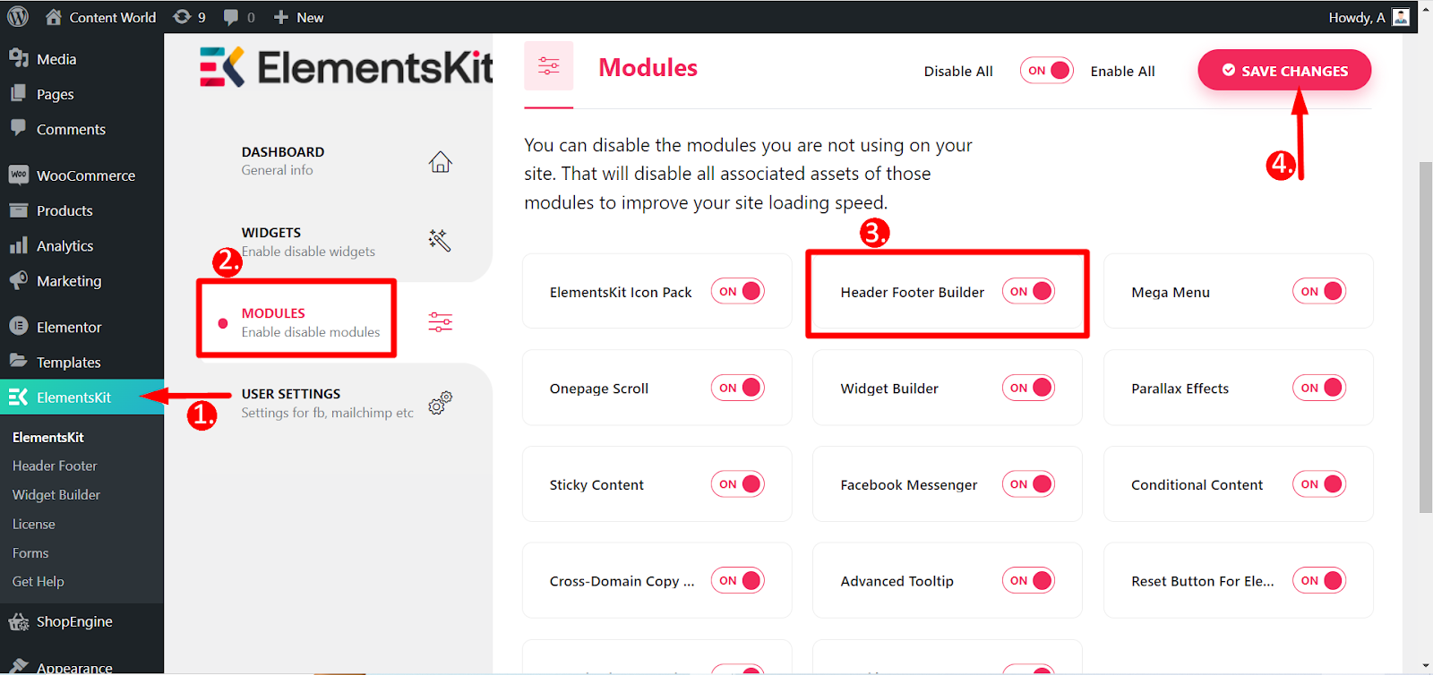
First, you have to turn On header footer builder module.
Turn On Module #
Access to Dashboard: 1. Find ElementsKit -> 2. Click Modules -> 3. Find Header Footer Builder -> 4. Save Changes
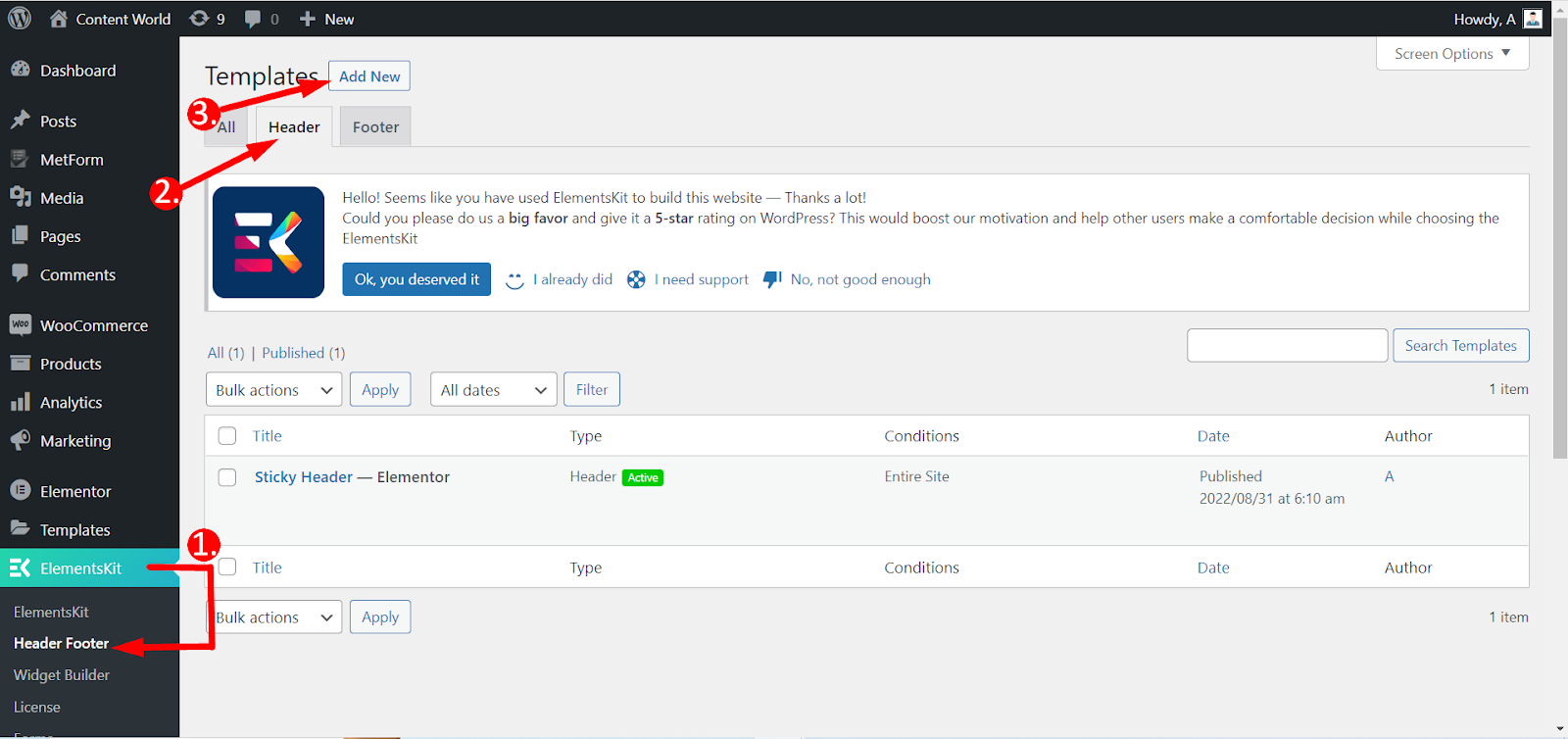
Header Footer #
1. From ElementsKit Click Header Footer -> 2. Click Header -> 3. Add New
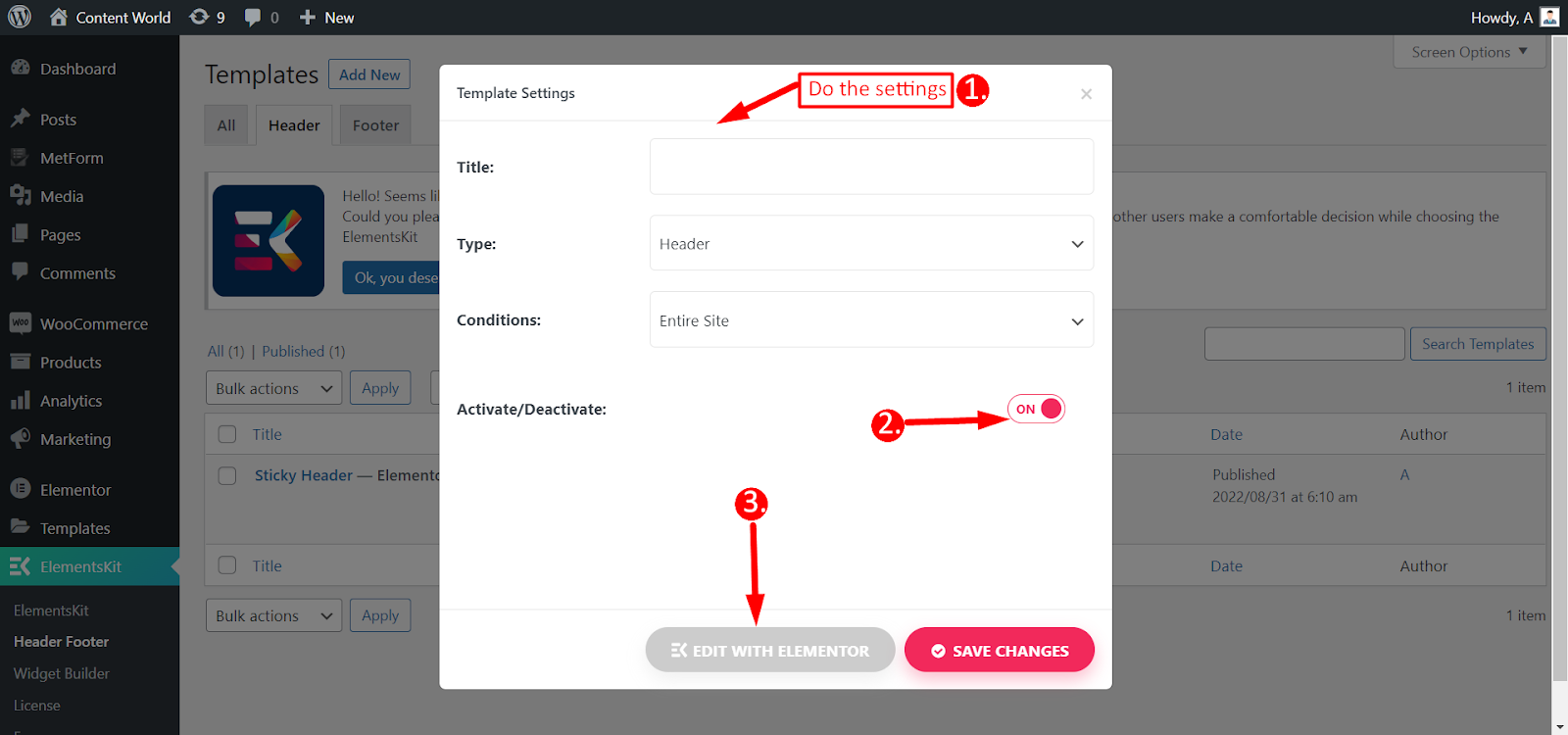
Template settings #
- Settings
- Title- Type a name for the template
- Type- Header
- Conditions- Entire Site
- Activate/Deactivate- Toggle to ON
- Click Edit with ElementsKit
Customization #
Find ElementsKit Nav Menu and drag and drop it.
Content- In the Content part you will find the below setting options.
Menu Settings #
- Select menu- Selecting Menu will show the existing menus of your website.
- Horizontal menu position- Menu position options are Left, Center, Right, and Justified.
- Dropdown open as- Keep it on Hover or Click.
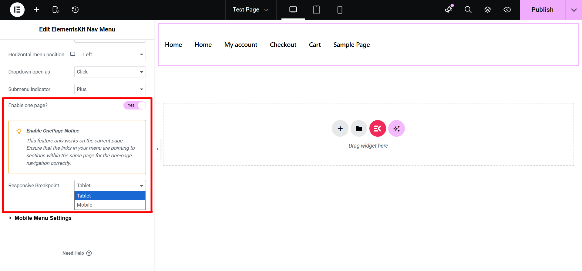
- Submenu Indicator– Choose a dropdown indicator icon (Line Arrow, Fill Arrow, Plus) that appears with the parent menu and works as a navigation key for the submenu.
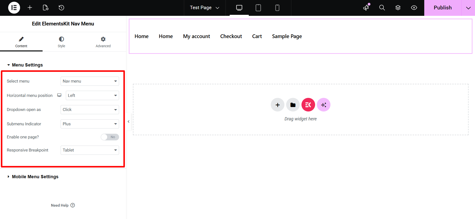
- Enable one page?: Toggle this option to “Yes” to enable smooth scrolling for a single-page website layout. Ensure your menu links are set to anchor tags that point to specific sections on the same page.
- Response Breakpoint: Select the screen size where the menu collapses into a mobile toggle. Choose between Tablet or Mobile to trigger the responsive layout.
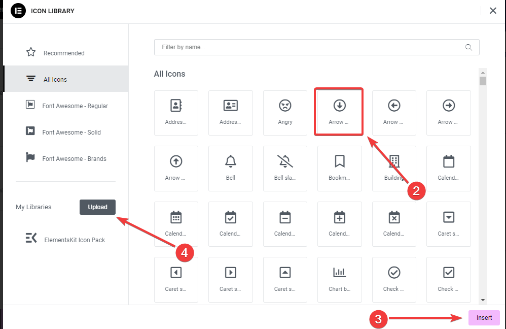
- Click on the icon in the sidebar settings as shown in the above picture.
2. A popup will open up an icon library, click on it.
3. Then, hit the “Insert” button to add an icon.
4. You can also add your icon by clicking the “Upload” button, it will open up the Elementor Custom Icon settings.
- Enable one page?– If you like to display the heading in one(current) page toggle YES, otherwise NO.
- Responsive Breakpoint- Options are Tablet and Mobile.
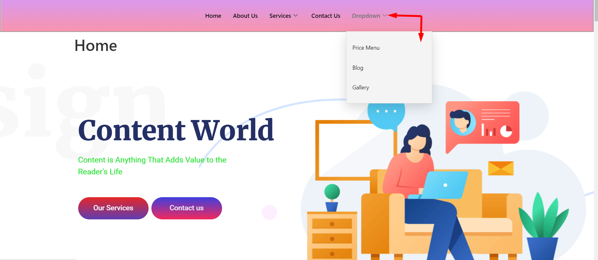
This is how it works if you choose mobile and tablet responsive breakpoint-
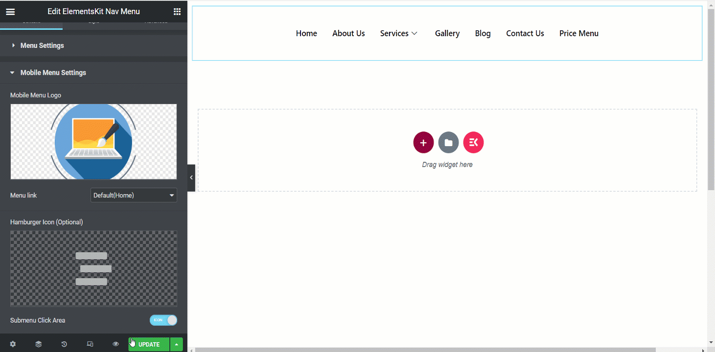
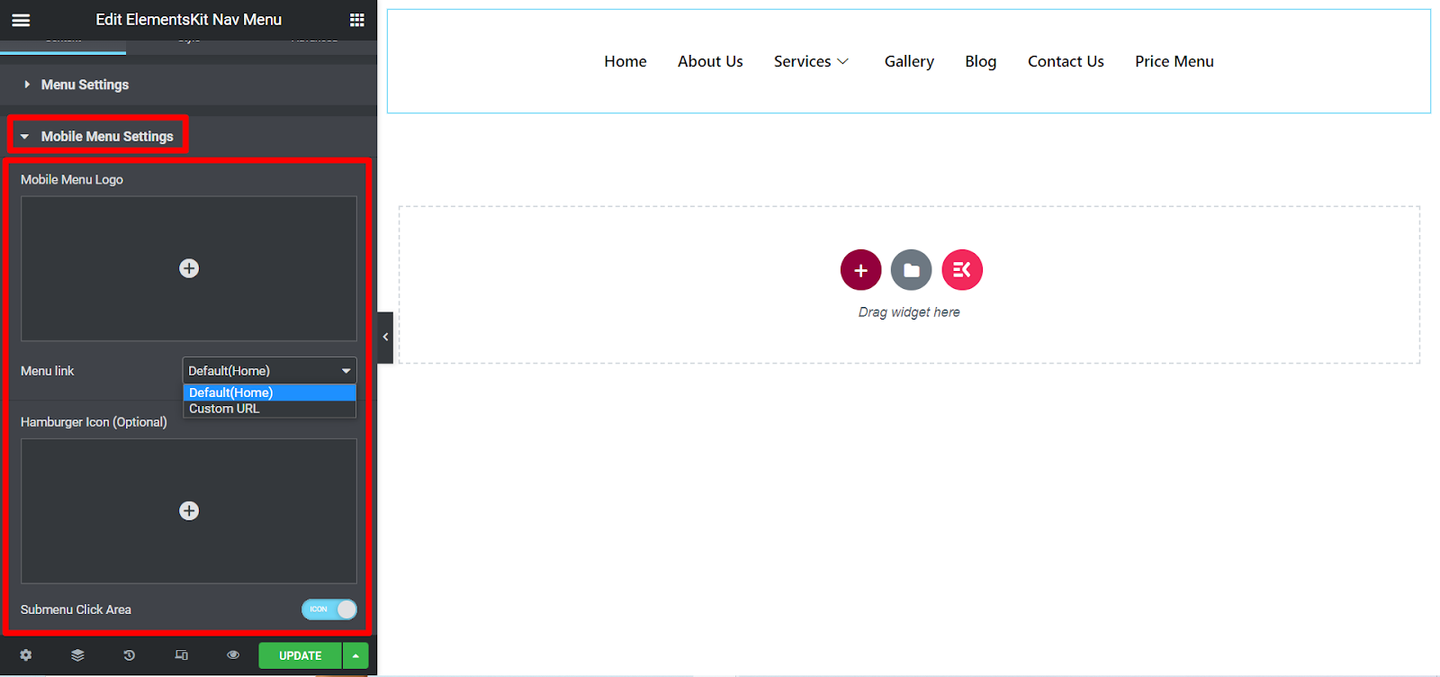
Mobile Menu Settings #
- Mobile Menu Logo- Set a logo for mobile view.
- Menu Link- Keep it default for home or insert any link you want in the Custom URL field. When people click the logo, they will be redirected to that given link.
- Hamburger Icon (Optional)- Choose an icon from the library or upload SVG.
- Submenu Click Area- If the menu has a submenu then you can set Icon for the area.
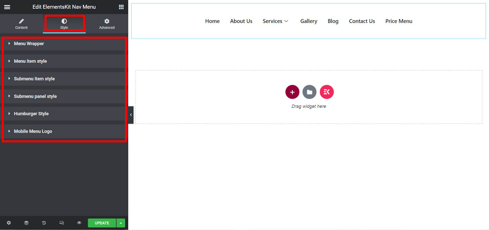
Style #
- Menu Wrapper- This section allows you to adjust menu height, background type, padding, width, menu border-radius, menu icon spacing, etc.
- Menu item style- Menu items can be styled here using background type, color, border-spacing, item margin, etc.
- Submenu item style- Same as the menu items, you can customize submenu items in this section.
- Submenu panel style- Expanding this part will allow you to customize submenu panel with many options.
- Hamburger Style- In this section, you can style the hamburger with different icon colors, sizes, positions, options, and so on.
- Mobile Menu Logo- This part is to customize This part is for customizing the mobile menu logo according to your preferences.
Here we have prepared a nav menu example, it is a desktop view-
Provide your customers with a fantastic system to find their things with the ElementsKit influential nav menu widget. So, use the widget now, make your design appealing, and save time.


