


ElementsKit is an all-in-one addon for Elementor that comes with dozens of advanced widgets and features to enhance the page-building experience with Elementor. This includes a Coupon Code widget that lets you display coupon codes in a stylish way that grabs attention.
Features:
- Provides stylish ways to show coupon codes.
- 5 different layouts to display coupon codes.
- Users can copy code with one click.
- Customize the style of the coupon code section.
Read this documentation to learn how to use the Elementor Coupon Code Ticker widget of ElementsKit.
Step 1: Add Coupon Code on website with ElementsKit #
To add coupon code to your website, first enable the widget from WordPress dashboard, then open the Elementor editor and drag & drop the coupon code widget into the design area.
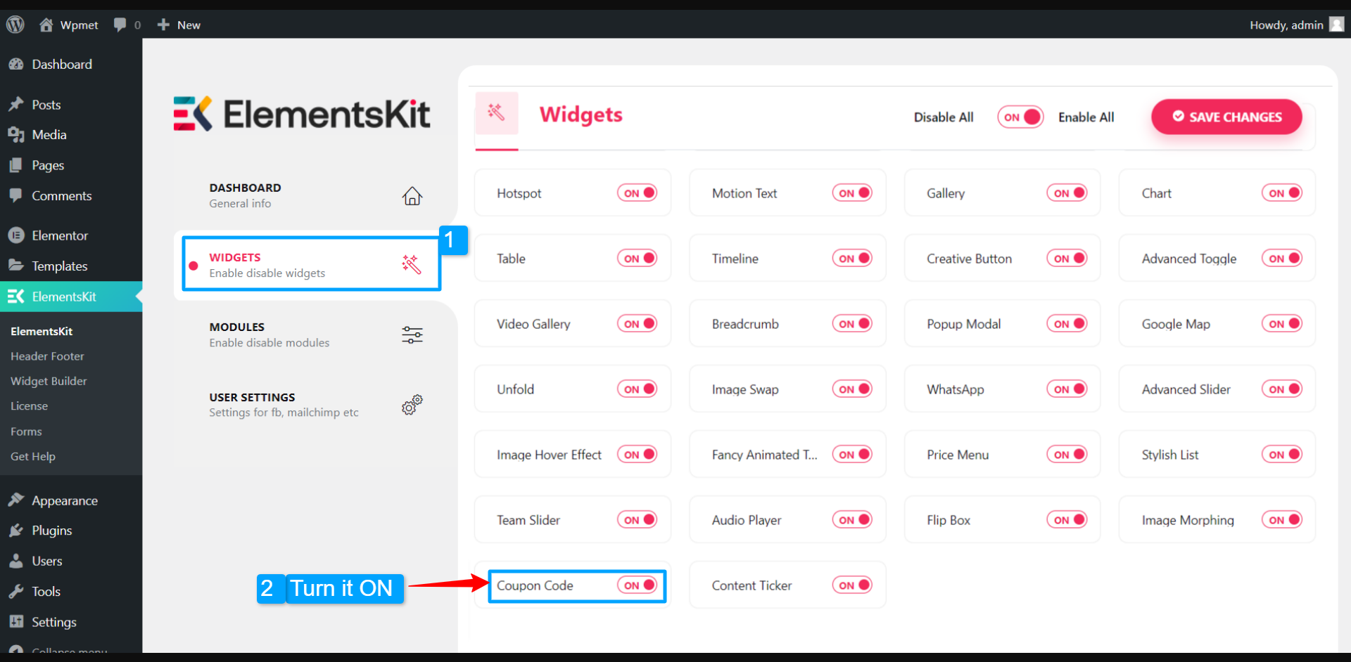
Enable Coupon Code widget #
Firstly, you need to enable the widget from the WordPress dashboard. To enable the Coupon Code widget:
- Navigate to ElementsKit > Widgets.
- Find the Coupon Code and enable the widget.
- Click on the SAVE CHANGES.
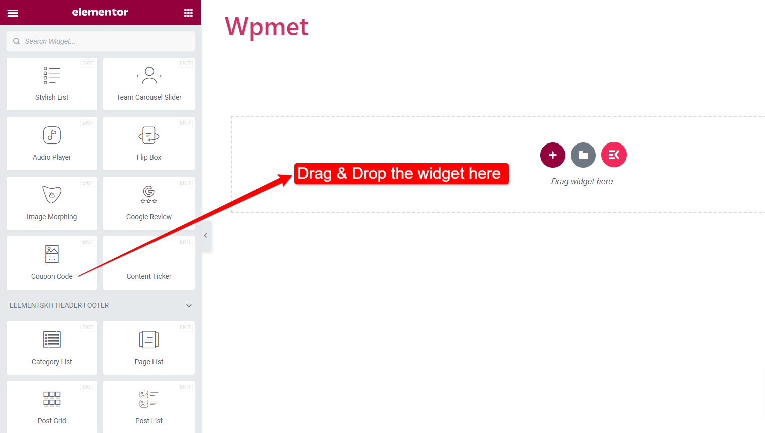
Drag and drop the widget #
After that, drag and drop the ElementsKit Content Ticker widget into the Elementor editor.
Step 2: Configure the Coupon Code and label content #
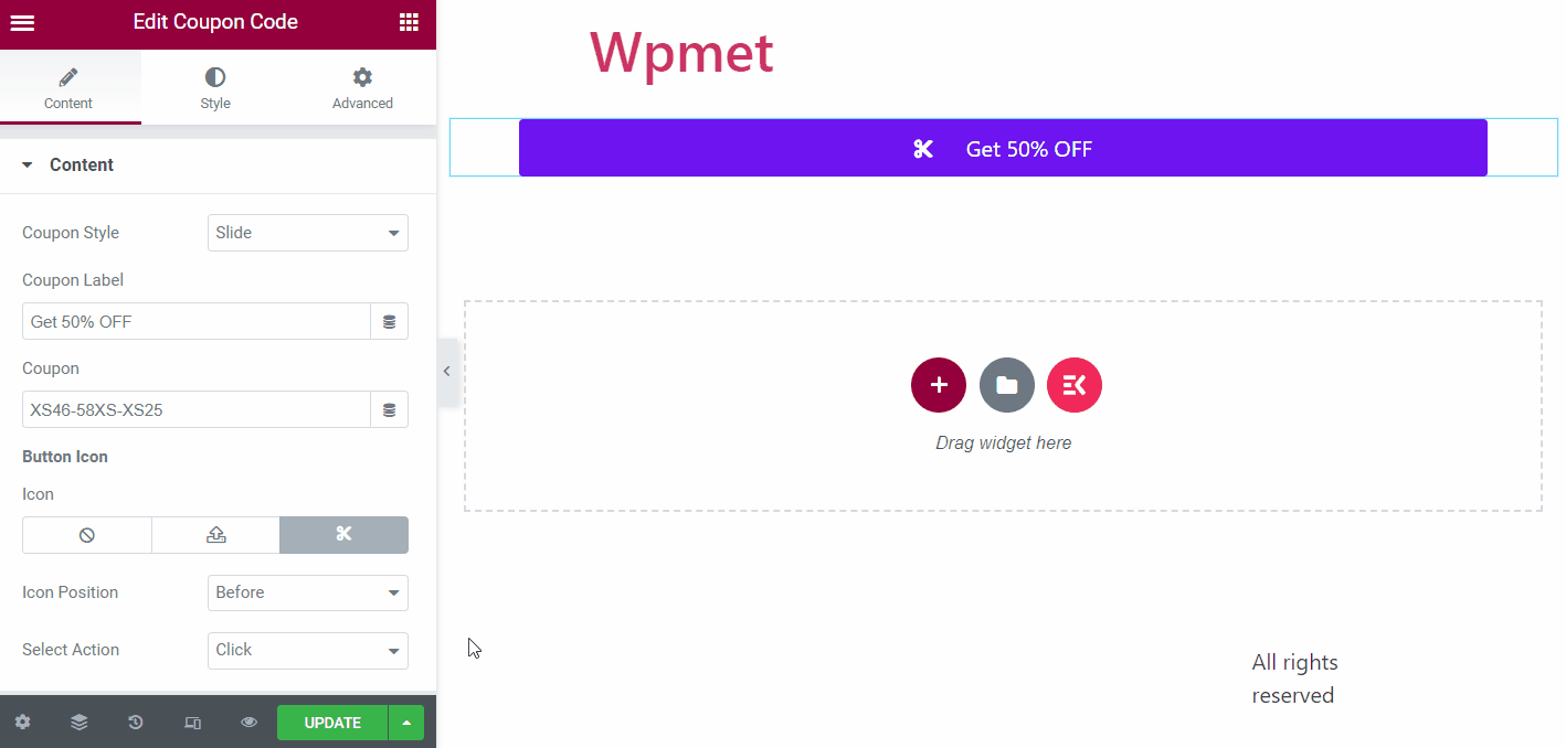
Now you can configure the coupon style, coupon label content, enter coupon code, and customize button styles.
Coupon Styles:
ElementsKit Coupon Code widget comes with 5 different styles of displaying coupons. They are:
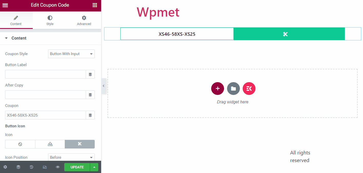
1. Slide, 2. Slide with Curve, 3. Slide Angle, 4. Right Curve, and 5. Button with Input.
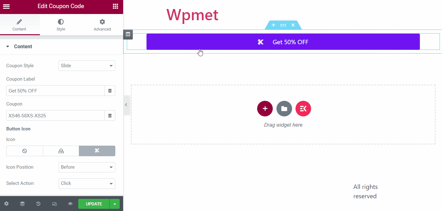
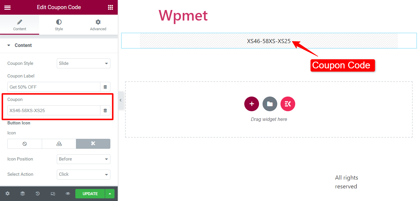
Coupon:
Enter the coupon code under the Coupon field.
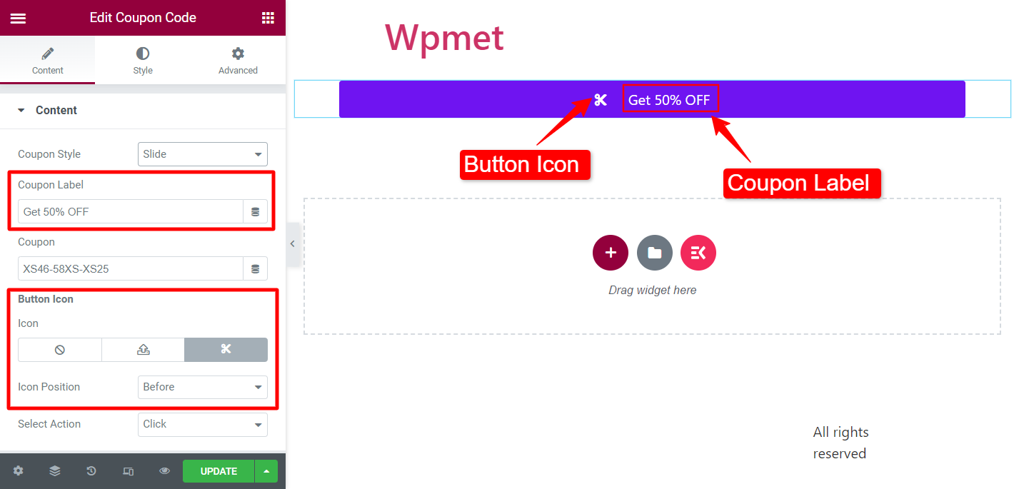
Coupon Label:
(Available for the following Coupon Styles: Slide, Slide with Curve, Slide with Angle, & Right Curve)
Add label content for a button that appears on the cover of the coupon code.
Button Icon:
You can show an Icon alongside a coupon label. Choose an icon from the icon library or upload SVG. Also, set the Icon Position to Before or After the Label.
Select Action:
(Available for the following Coupon Styles: Slide, Slide with Curve, Slide with Angle, & Right Curve)
You can select the action type when users click on the button. There are two options available: Click and Popup.
Button Label:
(Available for Coupon Style: Button with Input)
Add a copy button label where users can copy the coupon with a click.
After Copy:
(Available for Coupon Style: Button with Input)
Enter the text to appear when the coupon code is copied.
Step 3: Customize the Icon, button, and content styles #
You can customize the styles of the coupon code section, buttons, and more.
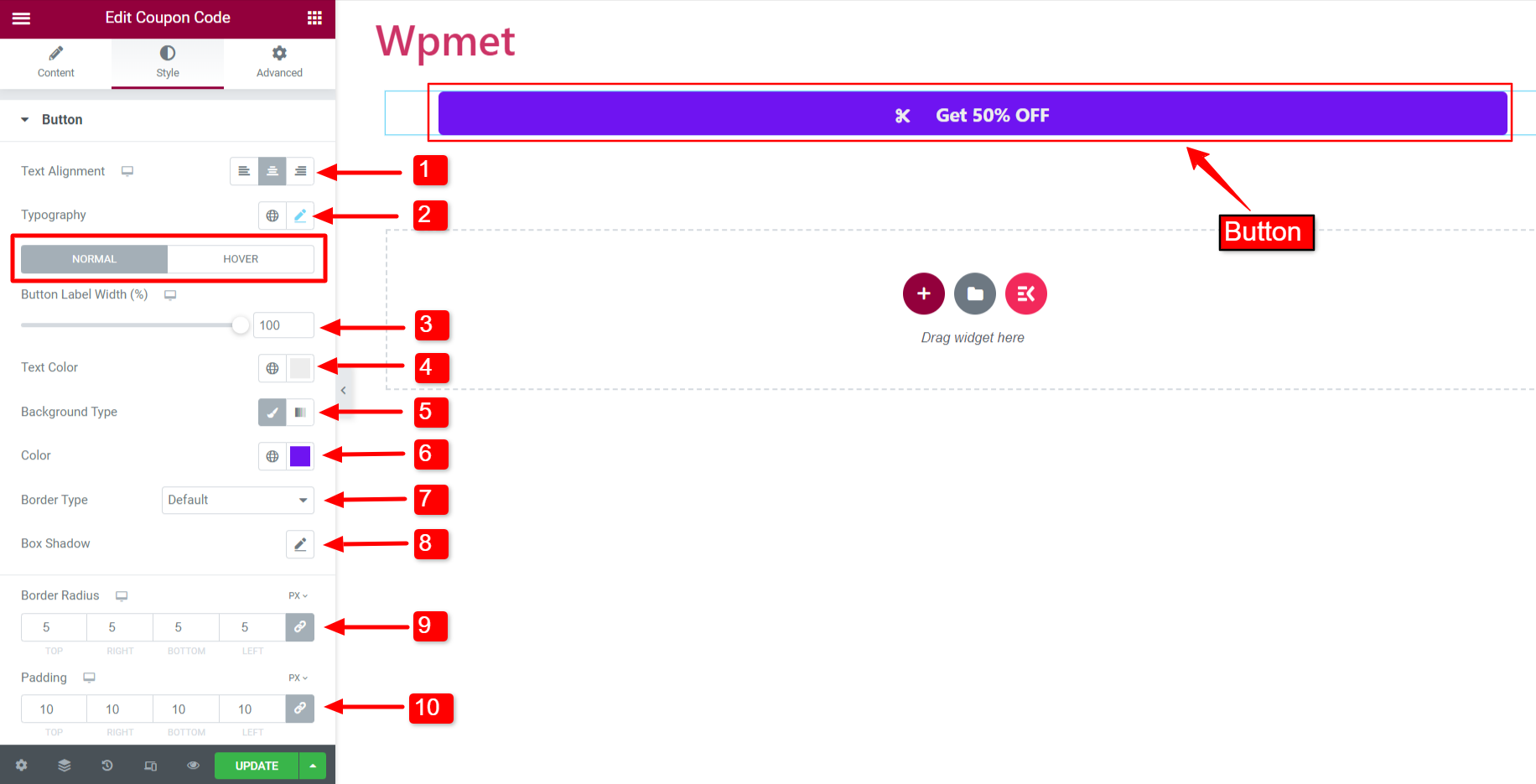
Button #
In the button section, you can customize the following options:
- Text Alignment: Set the alignment of the button text to left, right, or center. (Not available for Coupon Style: Button with Input.)
- Typography: Set the typography for the button text.
- Button Label Width: Adjust the width of the label, that covers the coupon code. (Not available for Coupon Style: Button with Input.)
- Text Color: Choose the color text.
- Background Type: Choose the background color type of the button label.
- Color: Select a background color for the button label.
- Border Type: Choose a border type for the button from the given options.
- Box Shadow: You can set a box shadow if you want.
- Border Radius: Adjust the border radius for the button.
- Padding: Adjust the button padding.
Note: You can choose separate Button Label Width, Text Color, Background Type & Color, Border Type, and Box Shadow for Normal and Hover styles.
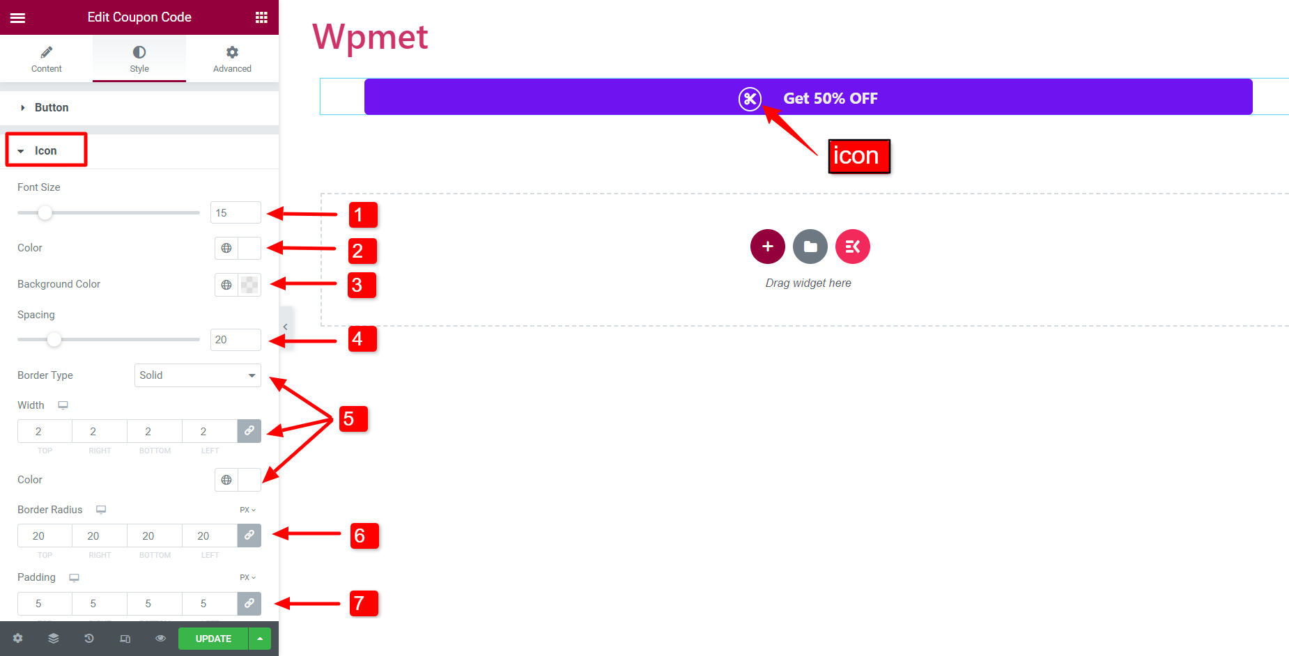
Icon #
You can customize the button icon by changing the following attributes:
- Font Size: Adjust the size of the icon.
- Color: Choose the color of the icon.
- Background Color: Choose an icon background color.
- Spacing: Adjust the space between the icon and button text.
- Border Type, Width, and Color: You can choose a border type, then adjust the border width, and set a border color.
- Border Radius: Adjust the border radius of the icon border.
- Padding: Adjust the padding of the icon.
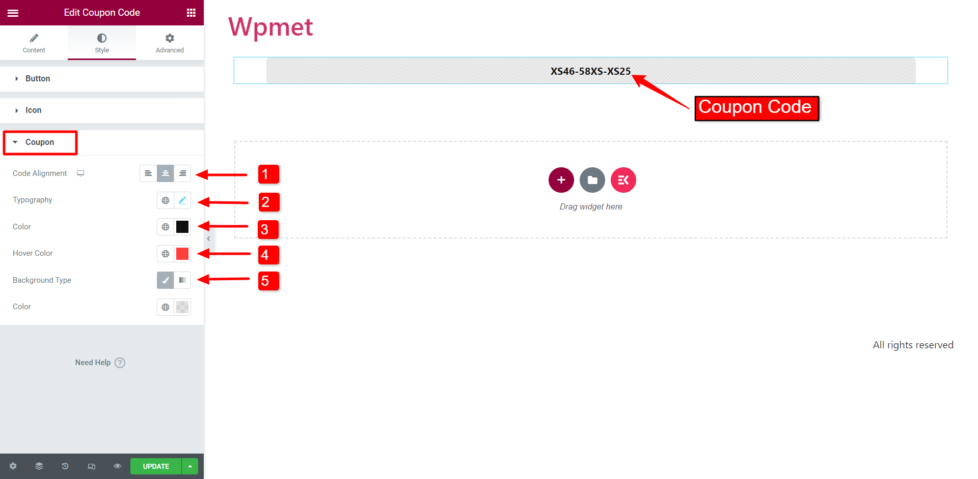
Coupon #
After that, you can aslo customize the appearance of the coupon code.
- Code Alignment: Set the alignment of the coupon code to left, right, or center.
- Typography: Set the typography for the coupon code.
- Color: Choose a text color for the code.
- Hover Color: Choose a color for the code that will appear when hovered.
- Background Type and Color: Choose a background color type for the coupon code and select a background color.
Like the Coupon Code widget, ElementsKit comes with hundreds of advanced elements for Elementor. Get ElementsKit and use those elements to build WordPress websites with full of features.


