


ElementsKit comes with the Contact Form 7 widget that adds up to the functionalities of the form builder plugin. You can customize the styles of Contact form 7 with Elementor by utilizing the page builder’s functionality to the full.
Read this documentation to learn how to create and customize the form using Contact Form 7 with Elementor.
Prerequisite:
You need to have Contact Form 7 Plugin installed on your WordPress site.
Create a form with Contact Form 7 #
Follow the below steps and create your desired form easily.
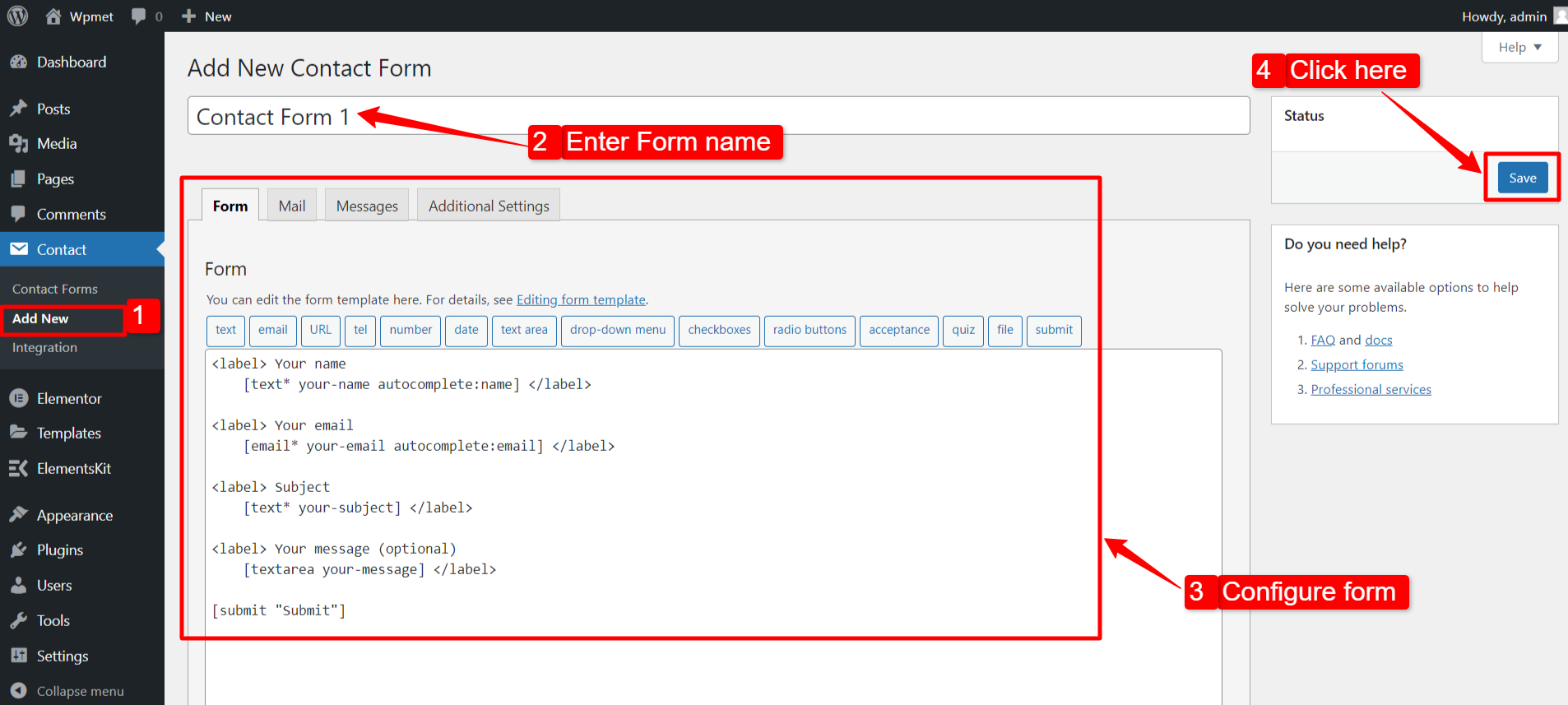
Step 1: Add New Contact Form #
- Go to Contact > Add New.
- Enter a form name.
- Configure the settings and attributes of the form.
- Click on the Save button.
Step-2: Get Contact Form 7 in Elementor #
To get the Contact Form 7 on Elementor, first, enable the ElementsKit Contact Form 7 widget, then open the Elementor editor and drag & drop the widget to the design area.
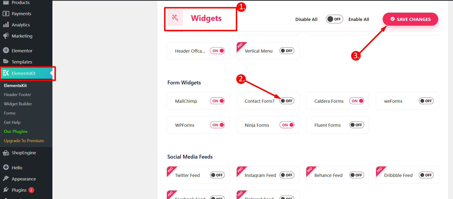
Enable Contact Form 7 widget #
To enable the Content Ticker widget:
- Navigate to ElementsKit > Widgets from the WordPress dashboard.
- Find the Contact Form 7 widget from the list and enable the widget.
- Click on the SAVE CHANGES.
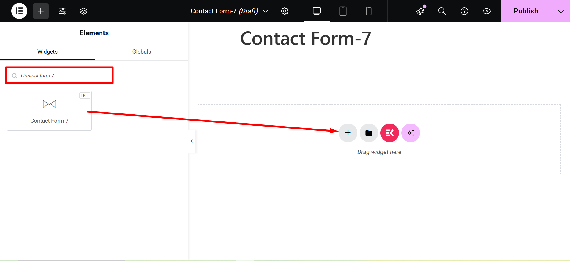
Drag and Drop the widget #
After that, drag and drop the ElementsKit Contact Form 7 widget into the Elementor editor.
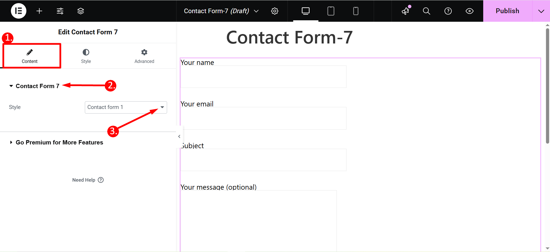
Step 3: Select a form to edit with Elementor #
In this step, you can select which form you want to edit. For that, you can select the form from the drop-down list.
1. Select Content tab
2. Contact Form 7
3. Style: Here, you will find a list of forms created with Contact Form 7. Select a form and proceed to the next step.
Step 4: Customize Contact Form 7 with Elementor #
Now you can customize the styles of the labels, input field, and button of Contact Form 7 with Elementor.
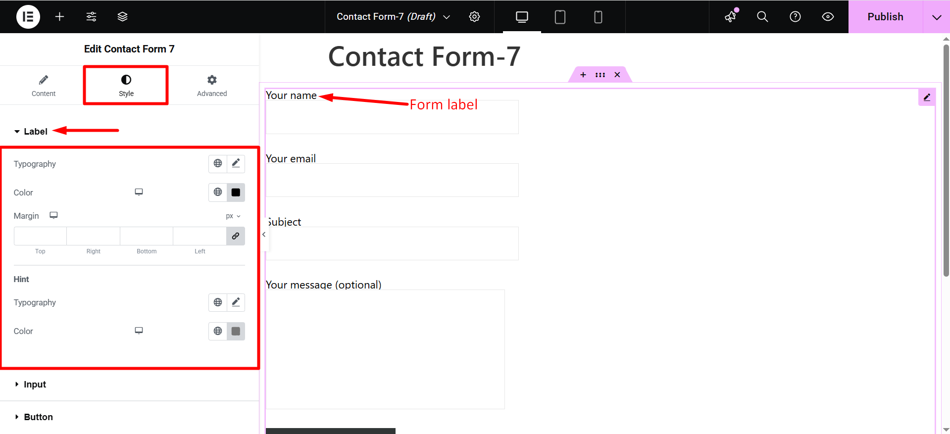
Label #
- Typography: Set the typography for label text.
- Color: Choose a color text for the label text.
- Margin: Adjust the Margin for the form field label.
- Hint: You can change the typography and color of the placeholder as well.
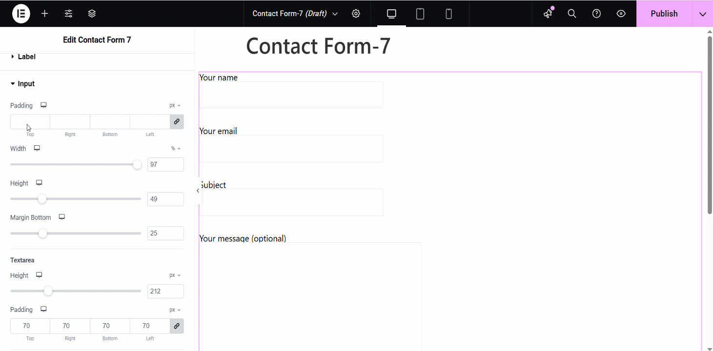
Input #
- Padding: Adjust the padding of the input field.
- Width: You can adjust the width of the input field.
- Height: You can change the input field height.
- Margin Bottom: Change the margin at the bottom of the input field.
- Textarea Height: For the long textarea field, you can change its height.
- Textarea Padding: You can also change the padding of the textarea.
- Background Type: Choose a background color type (classic or gradient color).
- Color: Choose a background color for the input field.
- Border Radius: Set the border radius for the input field.
- Border Type: Select the input field border type.
- Box Shadow: You can set the box shadow for the input field.
You can set these attributes individually for Normal, Hover, and Focus modes.
- Typography: Set the typography for the input text.
- Text Color: Choose a color for the input text.
- Placeholder Font Size: Adjust the font size of the placeholder.
- Placeholder Color: Choose a color for the placeholder text.
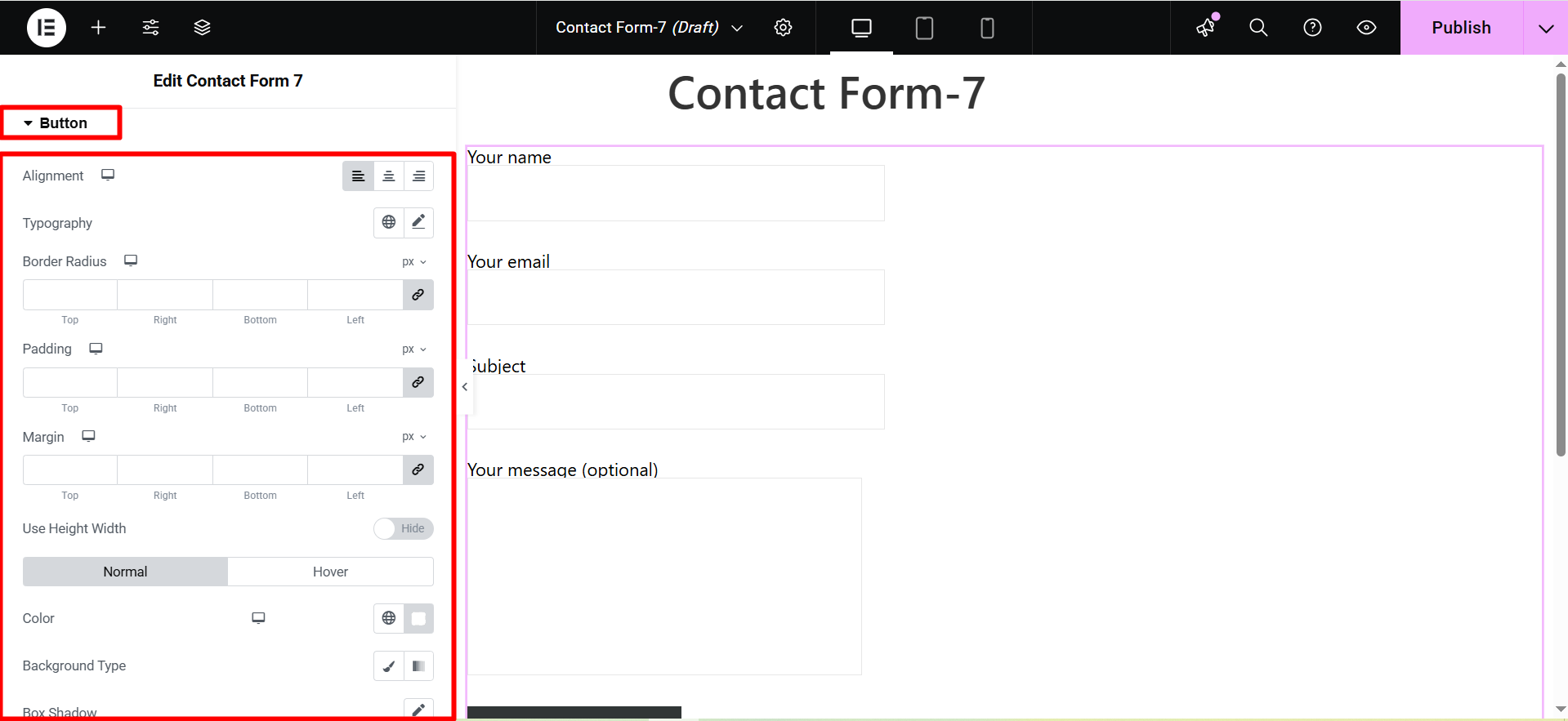
Button #
- Alignment: Adjust the horizontal placement of the button text (left, center, right).
- Typography: Control the font family, size, weight, line height, and letter spacing of the button text.
- Border Radius: Define the roundness of the button corners.
- Padding: Set the internal spacing between the button text and the button border.
- Margin: Control the external spacing around the button, separating it from other elements.
- Use Height Width: Specify fixed dimensions for the button’s height and width.
- Color Background Type: Choose between a solid color, gradient, or image for the button’s background.
- Box Shadow: Add a shadow effect around the button to create depth or emphasis.
- Border Type: Select the style of the button’s border (solid, dashed, dotted, etc.).
- Text Shadow: Apply a shadow effect to the button’s text for visual interest.
Check the advanced features of ElementsKit 👇


