 English
  German
  Spanish
  Italian
  French
  Danish
  Portuguese
  Swedish
  Polish
  Korean
  Japanese
 We have both Free and Pro Input Field for you. Here we’ll discuss the free input field, let’s start.
Free Input Field #
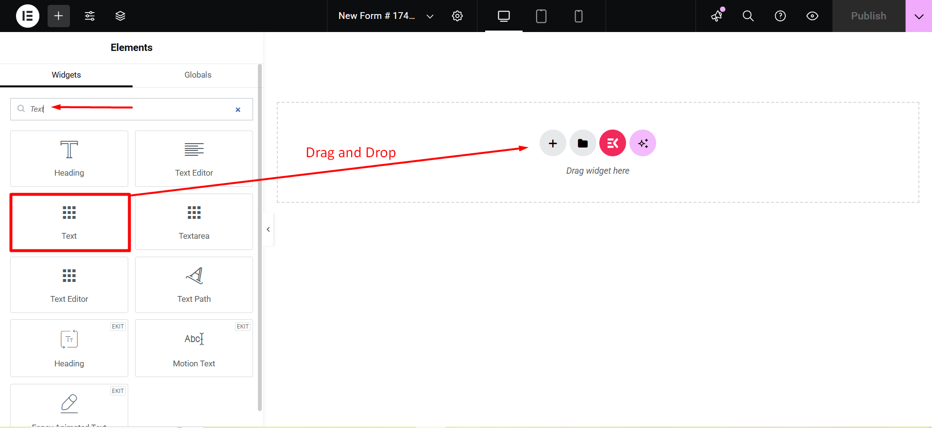
To make any form with Metform’s Free Input Fields open the page/post you want to add the form. After that, start editing with Elementor.
Text #
Add Text field to input Name or any type of text.
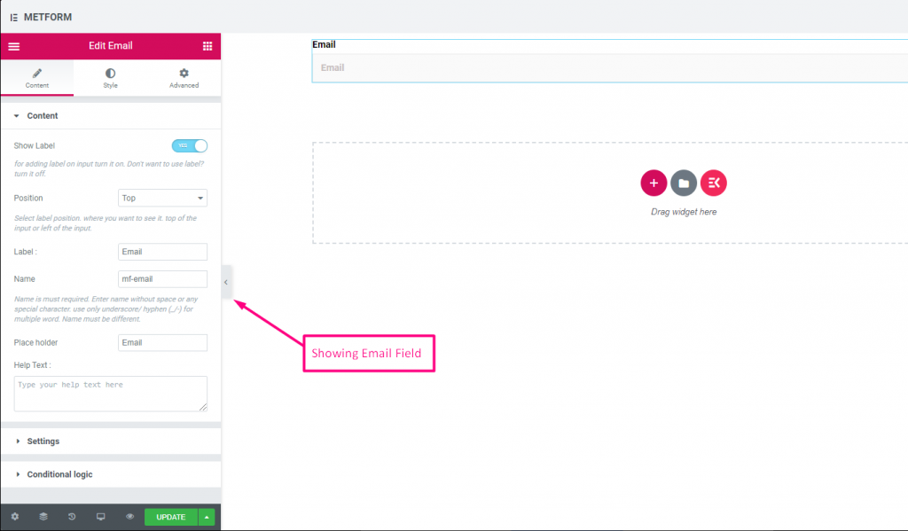
Content Part –
Show Label: You can turn it ON or keep it OFF.
Position: Select the label position where you want to see it, either at the Top or Left of the input.
Label: Type the label text.
Name: A name is required. Enter a name without spaces or special characters—use only an underscore (_) or hyphen (-) for multiple words. The name must be unique.
Placeholder: Use a placeholder to show some dummy text and help users input the correct text.
Help Text: Type the text to show below the widget.
Settings –
Required: Toggle this option to make it required. Users can’t submit the form without filling in the required fields.
Validation Type: Select a validation type from the drop-down.
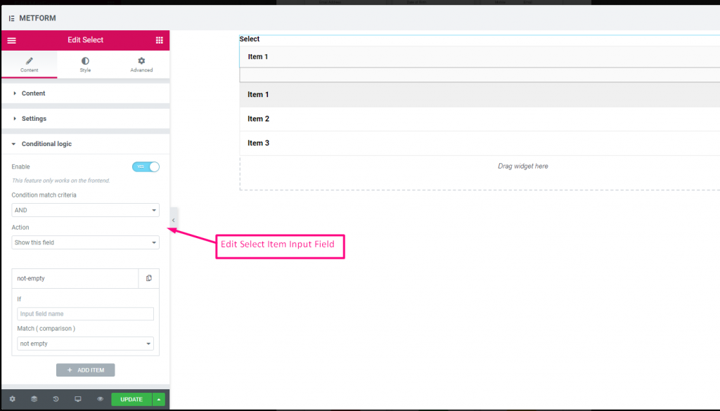
Conditional Logic part –
Enable: Enable or disable this option to control whether the field should be shown or hidden based on certain conditions. This helps in creating dynamic forms where fields appear only when specific criteria are met.

Check out our Live Demo Here.
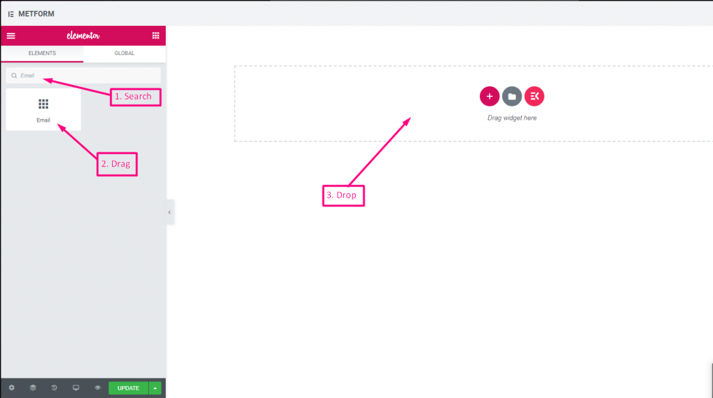
Email #
Make sure that the user enters the valid email address to your Form with Email Input field.
Check out our Live Demo Here
| Options | Description |
|---|---|
| Show Label | Turn on/off Label. |
| Position | Default: Top Select the label position. where you want to see it. top or left of the input. |
| Label | Type the label text. |
| Name | Name is must required. Enter a name without space or any special character. use only underscore/hyphen (_/-) for multiple words. The name must be different. |
| Place Holder | Use place holder to show some dummy text and help user to put correct text. |
| Help Text | Type the text to show below the widget. |
| Required | Default: No Toggle this option to make it required. Users can’t submit the forms without filling the required fields. |
| Validation Type | Select validation type from the drop-down. By Character Length Select By Character Length to Set up minimum and maximum Character length of the text Also provide warning message if input not valid By Word Length Select By Word Length to Set up minimum and maximum Word length of the text Also provide warning message if input not valid By Expression Based Select By Expression Based to Set up validation Expression Based Also provide warning message if input not valid Select it default? (Default: None) Make this option default selected |
| Conditional Logic | Show/Hide this field based on certain criteria. |
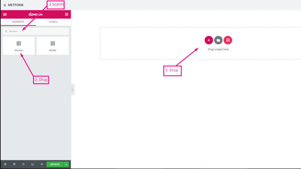
Number #
This Input fields will ensure that users enter a valid Number with numeric input.
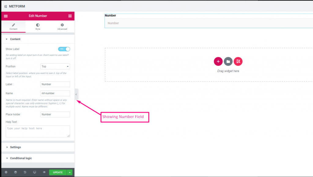
Check out our Live Demo Here
| Options | Description |
|---|---|
| Show Label | Turn on/off Label. |
| Position | Default: Top Select the label position. where you want to see it. top or left of the input. |
| Label | Type the label text. |
| Name | Name is must required. Enter a name without space or any special character. use only underscore/hyphen (_/-) for multiple words. The name must be different. |
| Place Holder | Use place holder to show some dummy text and help user to put correct text. |
| Help Text | Type the text to show below the widget. |
| Required | Default: No Toggle this option to make it required. Users can’t submit the forms without filling the required fields. |
| Validation Type | Select validation type from the drop-down. By Character Length Select By Character Length to Set up minimum and maximum Character length of the text Also provide warning message if input not valid By Word Length Select By Word Length to Set up minimum and maximum Word length of the text Also provide warning message if input not valid By Expression Based Select By Expression Based to Set up validation Expression Based Also provide warning message if input not valid Select it default? (Default: None) Make this option default selected |
| Conditional Logic | Show/Hide this field based on certain criteria. |
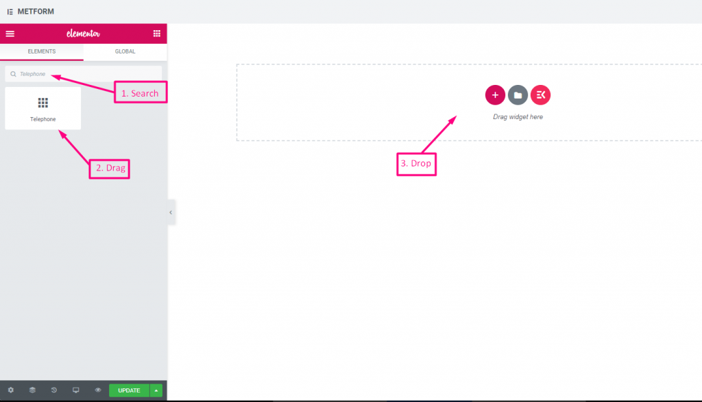
Telephone #
Allow users to give their valid Telephone number to make connections.
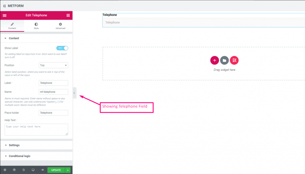
Check out our Live Demo Here
| Options | Description |
|---|---|
| Show Label | Turn on/off Label. |
| Position | Default: Top Select the label position. where you want to see it. top or left of the input. |
| Label | Type the label text. |
| Name | Name is must required. Enter a name without space or any special character. use only underscore/hyphen (_/-) for multiple words. The name must be different. |
| Place Holder | Use place holder to show some dummy text and help user to put correct text. |
| Help Text | Type the text to show below the widget. |
| Required | Default: No Toggle this option to make it required. Users can’t submit the forms without filling the required fields. |
| Validation Type | Select validation type from the drop-down. By Character Length Select By Character Length to Set up minimum and maximum Character length of the text Also provide warning message if input not valid By Word Length Select By Word Length to Set up minimum and maximum Word length of the text Also provide warning message if input not valid By Expression Based Select By Expression Based to Set up validation Expression Based Also provide warning message if input not valid Select it default? (Default: None) Make this option default selected |
| Conditional Logic | Show/Hide this field based on certain criteria. |
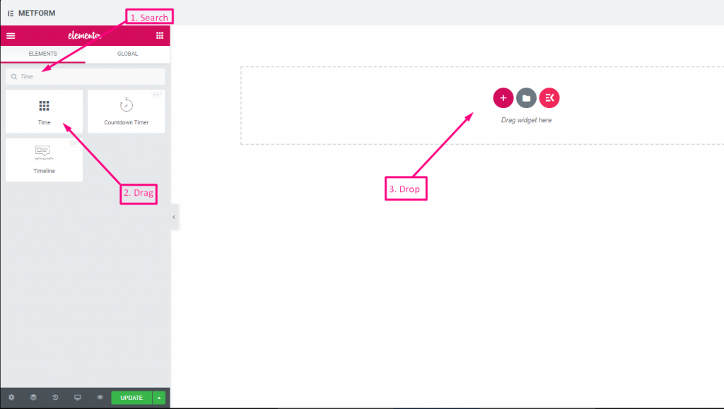
Time #
Helps users to pick up their preferred Time from pop-down timer.
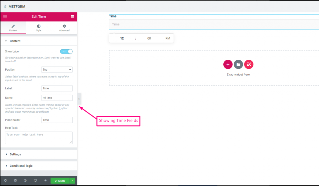
Check out our Live Demo Here.
| Options | Description |
|---|---|
| Show Label | Turn on/off Label. |
| Position | Default: Top Select the label position. where you want to see it. top or left of the input. |
| Label | Type the label text. |
| Name | Name is must required. Enter a name without space or any special character. use only underscore/hyphen (_/-) for multiple words. The name must be different. |
| Place Holder | Use place holder to show some dummy text and help user to put correct text. |
| Help Text | Type the text to show below the widget. |
| Required | Default: No Toggle this option to make it required. Users can’t submit the forms without filling the required fields. |
| Use time 24 H | Enable or disable time 24 hour format |
| Conditional Logic | Show/Hide this field based on certain criteria. |
24H Format #
Check out our Live Demo Here
Date #
Use this Input field to select Date from pop-down calendar to your form to make it more user friendly.
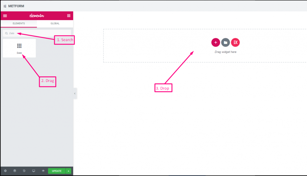
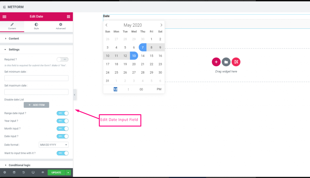
Check out our Live Demo Here
Date Range Input #
Check out our Live Demo Here
Select Date With Time Input #
Check out our Live Demo Here
| Options | Description |
|---|---|
| Show Label | Turn on/off Label. |
| Position | Default: Top Select the label position. where you want to see it. top or left of the input. |
| Label | Type the label text. |
| Name | Name is must required. Enter a name without space or any special character. use only underscore/hyphen (_/-) for multiple words. The name must be different. |
| Place Holder | Use place holder to show some dummy text and help user to put correct text. |
| Help Text | Type the text to show below the widget. |
| Required | Default: No Toggle this option to make it required. Users can’t submit the forms without filling the required fields. |
| Set minimum or maximum date | Provide minimum and maximum date |
| Disable Date | Input your closed date or disable date |
| Range date Input | Enable range Date Input Enable or Disable range date Input , date Input in date wise, or year wise or month wise. Date format : Select Date Format from the Drop-Down. For Example: DD-MM-YYYY |
| Input Time | You can add time with the date. |
| Conditional Logic | Show/Hide this field based on certain criteria. |
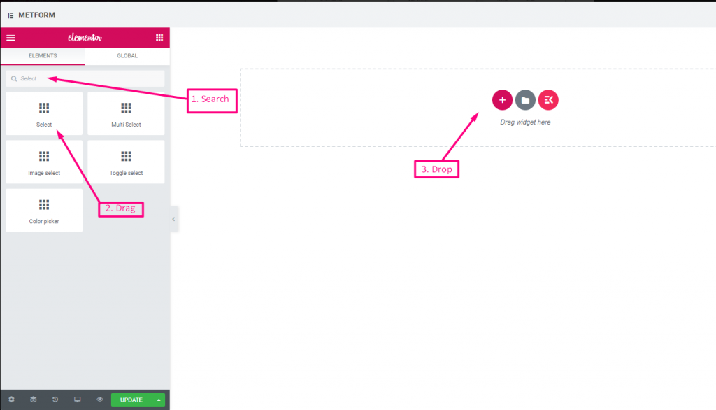
Select #
Add a drop-down list of options for users to choose from, search the widget by it’s name then drag and drop the widget to your desired location.
Check out our Live Demo Here
Search Option As Label #
Check out our Live Demo Here
| Options | Description |
|---|---|
| Show Label | Turn on/off Label. |
| Position | Default: Top Select the label position. where you want to see it. top or left of the input. |
| Label | Type the label text. |
| Name | Name is must required. Enter a name without space or any special character. use only underscore/hyphen (_/-) for multiple words. The name must be different. |
| Help Text | Type the text to show below the widget. |
| Dropdown List | Add/edit/clone/remove options to the dropdown. Input Field Text Select list text that will be show to user. Input Field Value Select list value that will be store/mail to desired person. Status (Default: Enable) Want to make a option? which user can see the option but can’t select it. make it disable. Select it default? (Default: No) Make this option default selected |
| Required | Default: No Toggle this option to make it required. Users can’t submit the forms without filling the required fields. |
| Conditional Logic | Show/Hide this field based on certain criteria. |
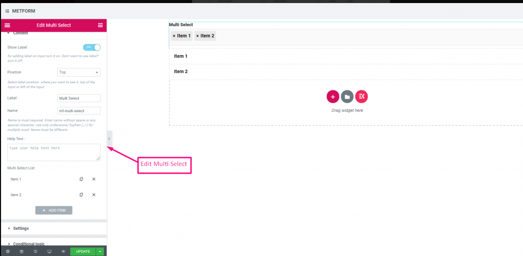
Multi Select #
Select Multiple items from the drop-down at a time.
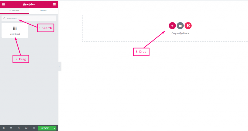
Check out our Live Demo Here
Default Selected Values #
Check out our Live Demo Here
| Options | Description |
|---|---|
| Show Label | Turn on/off Label. |
| Position | Default: Top Select the label position. where you want to see it. top or left of the input. |
| Label | Type the label text. |
| Name | Name is must required. Enter a name without space or any special character. use only underscore/hyphen (_/-) for multiple words. The name must be different. |
| Help Text | Type the text to show below the widget. |
| Dropdown List | Add/edit/clone/remove options to the dropdown. Input Field Text Select list text that will be show to user. Input Field Value Select list value that will be store/mail to desired person. Status (Default: Enable) Want to make a option? which user can see the option but can’t select it. make it disable. Select it default? (Default: No) Make this option default selected |
| Required | Default: No Toggle this option to make it required. Users can’t submit the forms without filling the required fields. |
| Conditional Logic | Show/Hide this field based on certain criteria. |
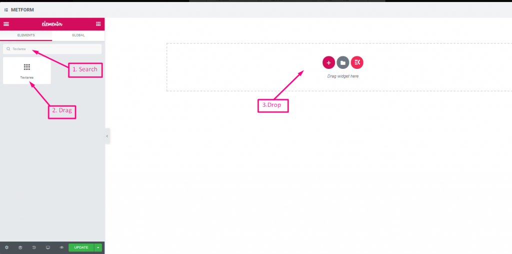
Text-area #
Helps to add a large number of content, review, comment to your form.
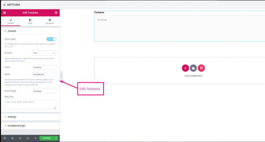
Check out our Live Demo Here
| Options | Description |
|---|---|
| Show Label | Turn on/off Label. |
| Position | Default: Top Select the label position. where you want to see it. top or left of the input. |
| Label | Type the label text. |
| Name | Name is must required. Enter a name without space or any special character. use only underscore/hyphen (_/-) for multiple words. The name must be different. |
| Help Text | Type the text to show below the widget. |
| Dropdown List | Add/edit/clone/remove options to the dropdown. Input Field Text Select list text that will be show to user. Input Field Value Select list value that will be store/mail to desired person. Status (Default: Enable) Want to make a option? which user can see the option but can’t select it. make it disable. Select it default? (Default: No) Make this option default selected |
| Required | Default: No Toggle this option to make it required. Users can’t submit the forms without filling the required fields. |
| Validation Type | Select validation type from the drop-down. By Character Length Select By Character Length to Set up minimum and maximum Character length of the text Also provide warning message if input not valid By Word Length Select By Word Length to Set up minimum and maximum Word length of the text Also provide warning message if input not valid By Expression Based Select By Expression Based to Set up validation Expression Based Also provide warning message if input not valid Select it default? (Default: None) Make this option default selected |
| Conditional Logic | Show/Hide this field based on certain criteria. |
Checkbox #
Permit users to select multiple items to your form at a time with Checkbox.
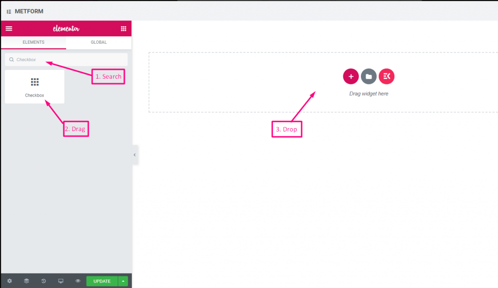
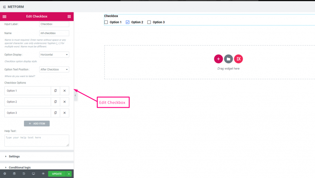
Check out our Live Demo Here
Vertical #
Check out our Live Demo Here
Icon Position After Text #
Check out our Live Demo Here
| Options | Description |
|---|---|
| Show Label | Turn on/off Label. |
| Position | Default: Top Select the label position. where you want to see it. top or left of the input. |
| Label | Type the label text. |
| Name | Name is must required. Enter a name without space or any special character. use only underscore/hyphen (_/-) for multiple words. The name must be different. |
| Help Text | Type the text to show below the widget. |
| Option Display | Display options Horizontally or Vertically |
| Options Text Position | Display Option Text Position: Before Checkbox or After Checkbox |
| Checkbox Options | Add/edit/clone/remove options to the drop-down. Checkbox option Text Select option text that will be show to user. Option Value Select option value that will be store/mail to desired person. Status (Default: Active) Want to make a option? which user can see the option but can’t select it. make it disable. |
| Required | Default: No Toggle this option to make it required. Users can’t submit the forms without filling the required fields. |
| Conditional Logic | Show/Hide this field based on certain criteria. |
Radio #
Allow users to select only one exclusive item from the multiple options.
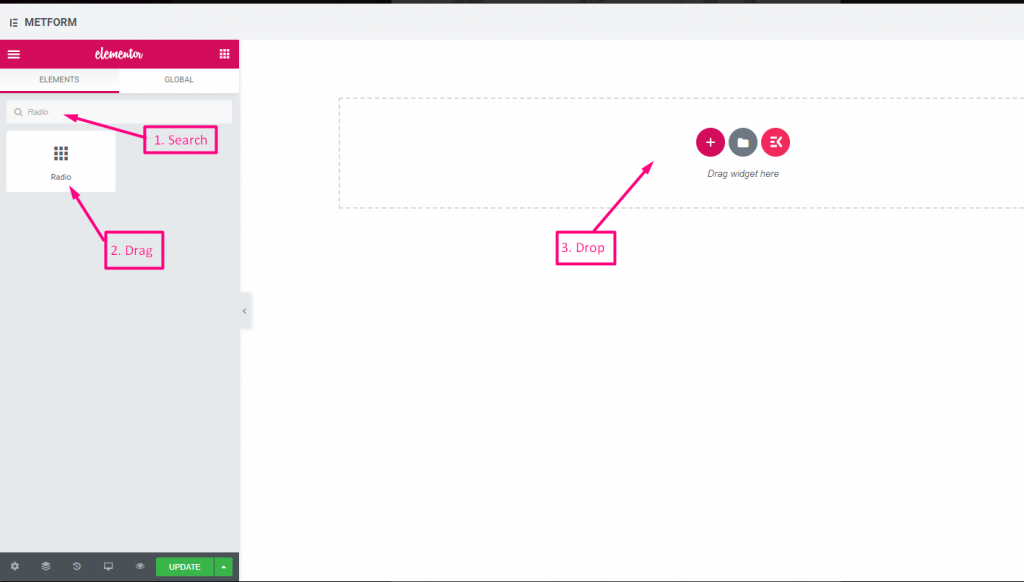
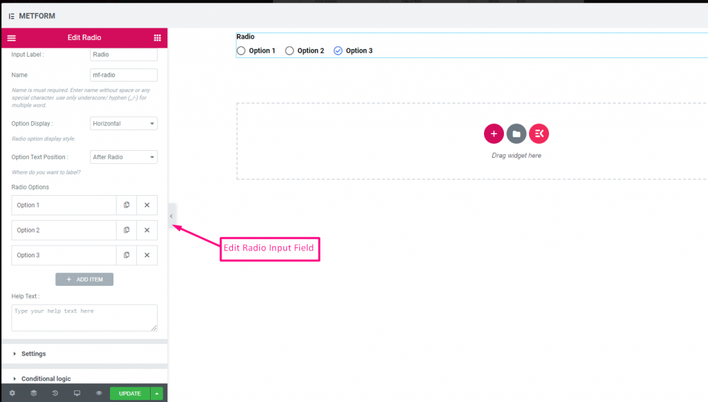
Check out our Live Demo Here
Vertical #
Check out our Live Demo Here
Icon Position After Text #
Check out our Live Demo Here
| Options | Description |
|---|---|
| Show Label | Turn on/off Label. |
| Position | Default: Top Select the label position. where you want to see it. top or left of the input. |
| Label | Type the label text. |
| Name | Name is must required. Enter a name without space or any special character. use only underscore/hyphen (_/-) for multiple words. The name must be different. |
| Help Text | Type the text to show below the widget. |
| Option Display | Display Radio options Horizontally or Vertically |
| Options Text Position | Display Radio Option Text Position: Before Radio or After Radio |
| Radio Options | Add/edit/clone/remove options to the drop-down. Radio option Text Select option text that will be show to user. Radio Value Select option value that will be store/mail to desired person. Status (Default: Active) Want to make a option? which user can see the option but can’t select it. make it disable. |
| Required | Default: No Toggle this option to make it required. Users can’t submit the forms without filling the required fields. |
| Conditional Logic | Show/Hide this field based on certain criteria. |
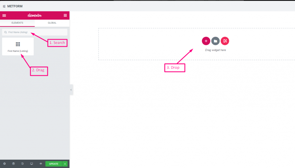
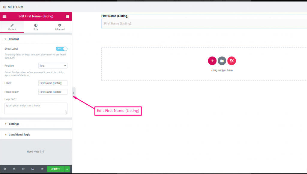
First Name (Listing) #
Allow users to give their FirstName to show them in a listing method on the mailing list. For Example : Mailchimp
| Options | Description |
|---|---|
| Show Label | Turn on/off Label. |
| Position | Default: Top Select the label position. where you want to see it. top or left of the input. |
| Label | Type the label text. |
| Place Holder | Use place holder to show some dummy text and help user to put correct text. |
| Help Text | Type the text to show below the widget. |
| Required | Default: No Toggle this option to make it required. Users can’t submit the forms without filling the required fields. |
| Validation Type | Select validation type from the drop-down. By Character Length Select By Character Length to Set up minimum and maximum Character length of the text Also provide warning message if input not valid By Word Length Select By Word Length to Set up minimum and maximum Word length of the text Also provide warning message if input not valid By Expression Based Select By Expression Based to Set up validation Expression Based Also provide warning message if input not valid Select it default? (Default: None) Make this option default selected |
| Conditional Logic | Show/Hide this field based on certain criteria. |
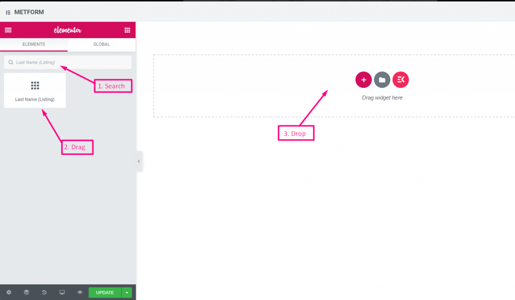
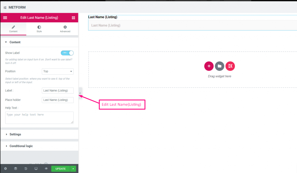
Last Name (Listing) #
Allow users to give their LastName to show them in a listing method on the mailing list. For Example : Mailchimp
| Options | Description |
|---|---|
| Show Label | Turn on/off Label. |
| Position | Default: Top Select the label position. where you want to see it. top or left of the input. |
| Label | Type the label text. |
| Place Holder | Use place holder to show some dummy text and help user to put correct text. |
| Help Text | Type the text to show below the widget. |
| Required | Default: No Toggle this option to make it required. Users can’t submit the forms without filling the required fields. |
| Validation Type | Select validation type from the drop-down. By Character Length Select By Character Length to Set up minimum and maximum Character length of the text Also provide warning message if input not valid By Word Length Select By Word Length to Set up minimum and maximum Word length of the text Also provide warning message if input not valid By Expression Based Select By Expression Based to Set up validation Expression Based Also provide warning message if input not valid Select it default? (Default: None) Make this option default selected |
| Conditional Logic | Show/Hide this field based on certain criteria. |
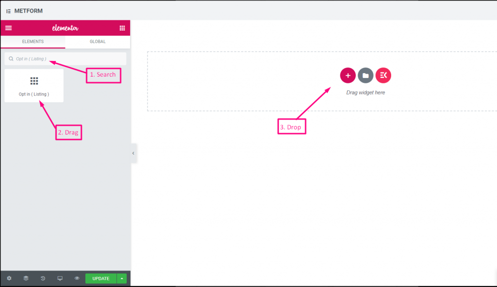
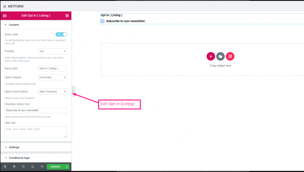
Opt In Listing #
Use opt-in field to your form and make your user as a subscribed mailchimp contact user by clicking the checkbox “Subscribe to our newsletter”.
Check out our Live Demo Here
| Options | Description |
|---|---|
| Show Label | Turn on/off Label. |
| Position | Default: Top Select the label position. where you want to see it. top or left of the input. |
| Input Label | Type the label text. |
| Option Display | Display Opt In listing Option Horizontally or Vertically |
| Options Text Position | Display Opt In listing Option Text Position: Before Checkbox or After Checkbox |
| Checkbox Option Text | Give brief about options that will show to the user. For example: “Subscribe to our newsletter“ |
| Help Text | Type the text to show below the widget. Easily target and deliver messages to the right people with help text |
| Required | Default: No Toggle this option to make it required. Users can’t submit the forms without filling the required fields. |
| Conditional Logic | Show/Hide this field based on certain criteria. |
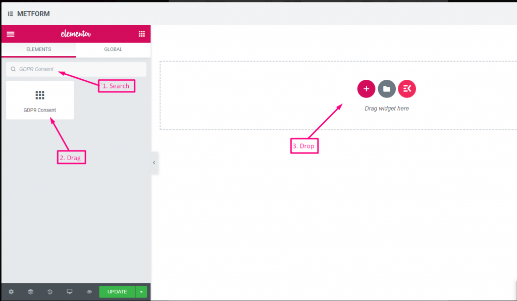
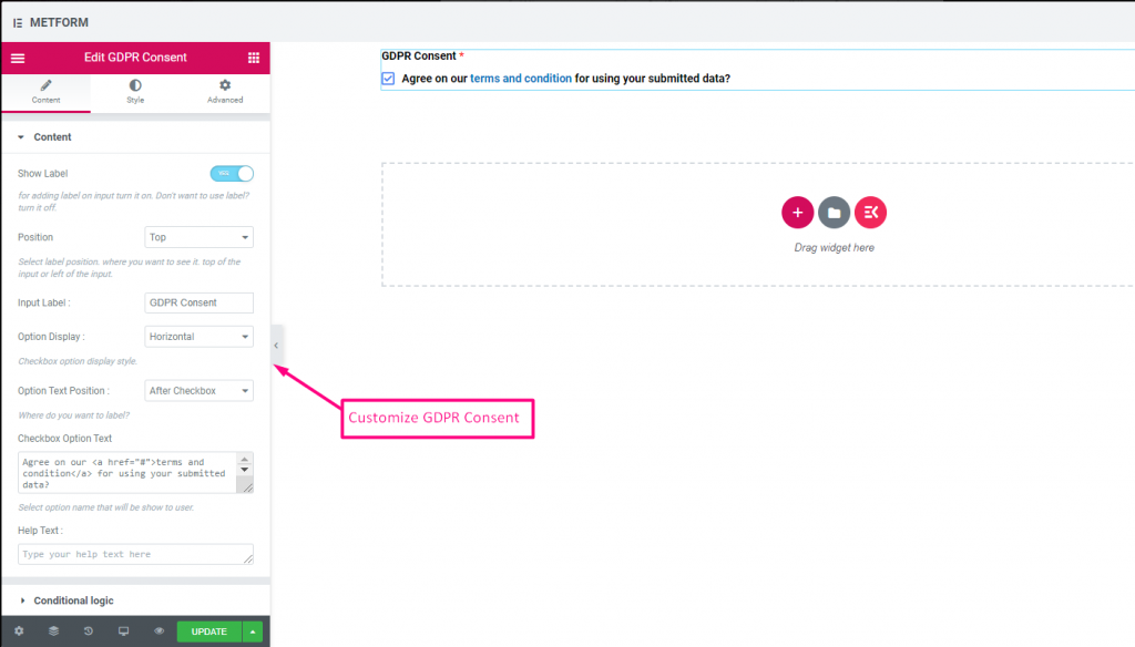
GDPR Consent #
Enable GDPR(General Data Protection Regulation) complaints to your form before collecting user data as it explains how you are usually using the user data to stay safe from action of law.
Check out our Live Demo Here
With Text Link #
Check out our Live Demo Here
| Options | Description |
|---|---|
| Show Label | Turn on/off Label. |
| Position | Default: Top Select the label position. where you want to see it. top or left of the input. |
| Input Label | Type the label text. |
| Option Display | Display GDPR Consent options Horizontally or Vertically |
| Options Text Position | Display GDPR Consent Option Text Position: Before Checkbox or After Checkbox |
| Checkbox Option Text | Give brief about options that will show to the user. For example: “Agree on our terms and condition for using your submitted data?” |
| Help Text | Type the text to show below the widget. Easily target and deliver messages to the right people with help text |
| Conditional Logic | Show/Hide this field based on certain criteria. |
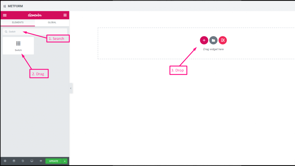
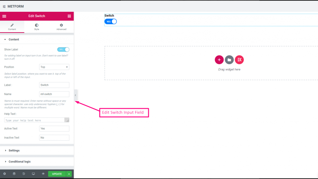
Switch #
Easily control the Yes/No or On/Off toggle Switch checkbox input just like a light switch.
Check out our Live Demo Here
Custom Option Text #
Check out our Live Demo Here
| Options | Description |
|---|---|
| Show Label | Turn on/off Label. |
| Position | Default: Top Select the label position. where you want to see it. top or left of the input. |
| Label | Type the label text. |
| Name | Name is must required. Enter a name without space or any special character. use only underscore/hyphen (_/-) for multiple words. The name must be different. |
| Help Text | Type the text to show below the widget. |
| Active or Inactive Text | Provide Active or Inactive text. For Example: Yes or No |
| Required | Default: No Toggle this option to make it required. Users can’t submit the forms without filling the required fields. |
| Conditional Logic | Show/Hide this field based on certain criteria. |
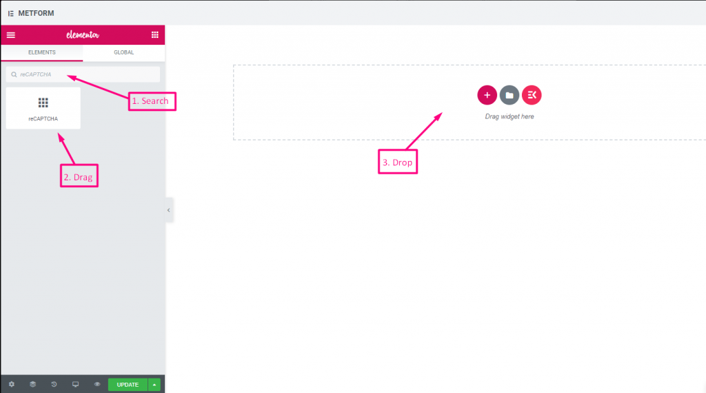
reCAPTCHA #
Allow you to integrate Google reCAPTCHA to keep your site safe from unwanted spam and abusive traffic.
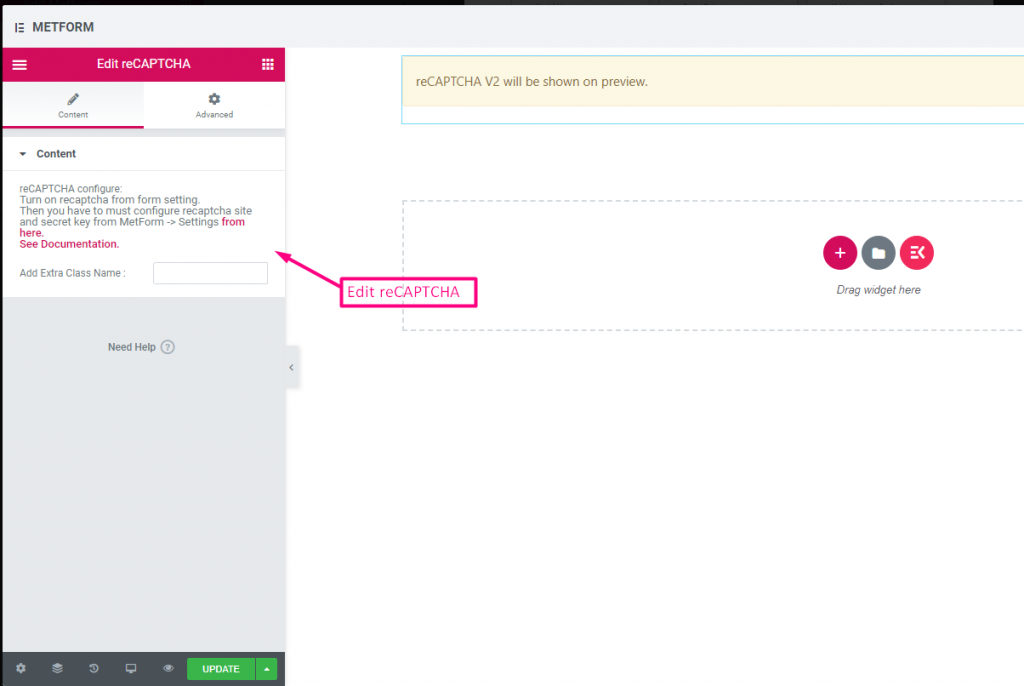
Check out our Live Demo Here
| Options | Description |
|---|---|
| reCAPTCHA confiqure | Turn on reCAPTCHA from the setting. Then you have to must configure reCAPTCHA site and secret key from MetForm -> Settings from here. See Documentation. |
Simple reCAPTCHA #
Protects your site from unwanted bots and spam.
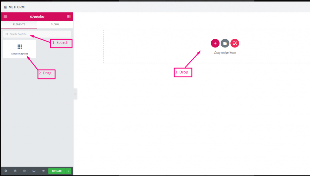
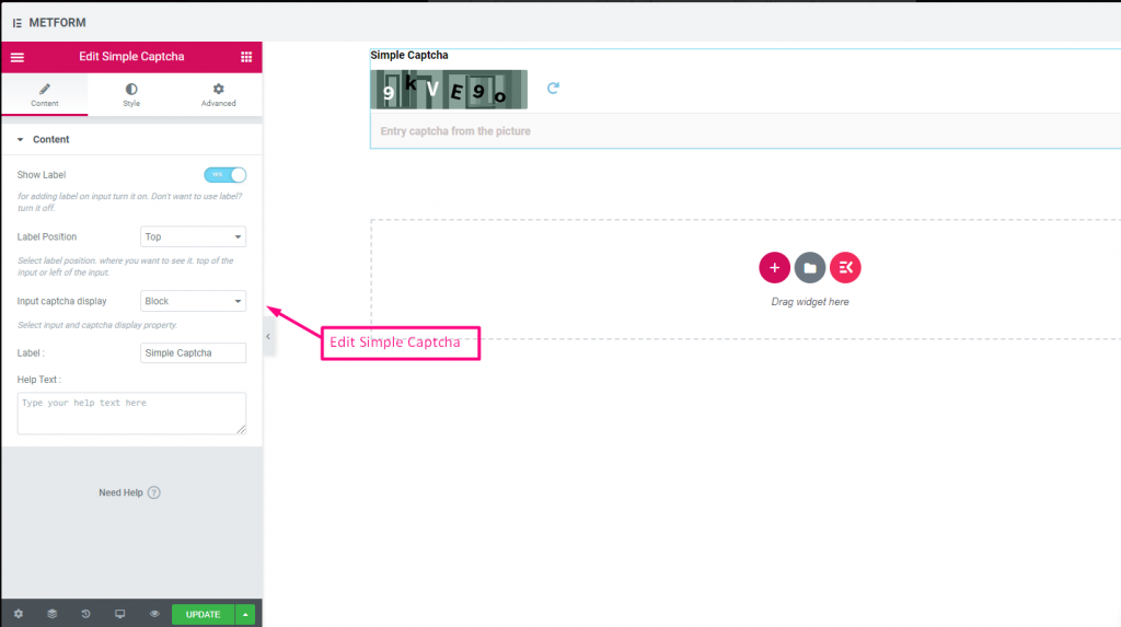
Check out our Live Demo Here
Inline Options #
Check out our Live Demo Here
| Options | Description |
|---|---|
| Show Label | Turn on/off Label. |
| Position | Default: Top Select the label position. where you want to see it. top or left of the input. |
| Input CAPTCHA Display | Input your reCAPTCHA in a block or show the input field in a line. |
| Label | Type the label text. |
| Help Text | Type the text to show below the widget. |
Range Slider #
Set your max or min range value to your form by using super cool Range slider. All you have to do is just drag both ends until your appropriate value comes.

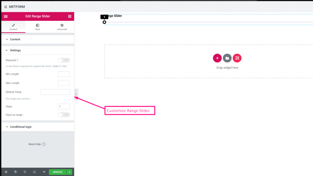
Check out our Live Demo Here
Default Value #
Check out our Live Demo Here
Multi Range Input #
Check out our Live Demo Here
| Options | Description |
|---|---|
| Show Label | Turn on/off Label. |
| Position | Default: Top Select the label position. where you want to see it. top or left of the input. |
| Label | Type the label text. |
| Name | Name is must required. Enter a name without space or any special character. use only underscore/hyphen (_/-) for multiple words. The name must be different. |
| Help Text | Type the text to show below the widget. |
| Required | Default: No Toggle this option to make it required. Users can’t submit the forms without filling the required fields. |
| Min Length | Set the Minimum range value |
| Max Length | Set the Maximum range value |
| Default Value | Set your default value, Use comma to set range value |
| Steps | Add steps value to add range by step after step |
| Input as Range | Toggle this options to set up range required or not |
| Conditional Logic | Show/Hide this field based on certain criteria. |
URL #
Simply add URL to your form using our URL Input Field. It ensures that users Input a valid URL to the form field.

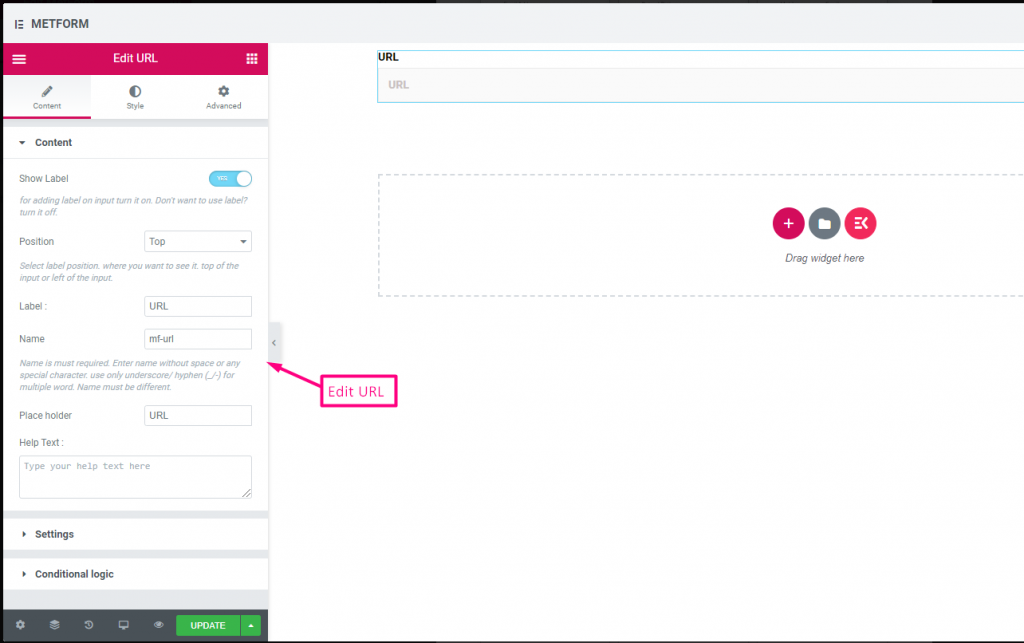
Check out our Live Demo Here
| Options | Description |
|---|---|
| Show Label | Turn on/off Label. |
| Position | Default: Top Select the label position. where you want to see it. top or left of the input. |
| Label | Type the label text. |
| Name | Name is must required. Enter a name without space or any special character. use only underscore/hyphen (_/-) for multiple words. The name must be different. |
| Place Holder | Use place holder to show some dummy text and help user to put correct text. |
| Help Text | Type the text to show below the widget. |
| Required | Default: No Toggle this option to make it required. Users can’t submit the forms without filling the required fields. |
| Conditional Logic | Show/Hide this field based on certain criteria. |
Password #
If you want your user to give a strong password, use our Password Input Field. It makes sure that users get a protected password and can be able to change it when needed.

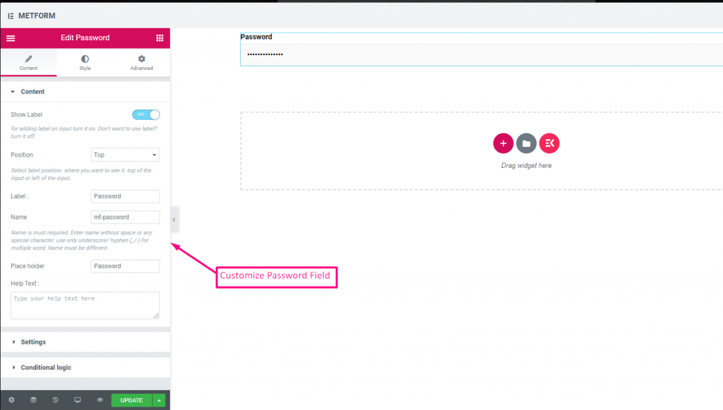
Check out our Live Demo Here
| Options | Description |
|---|---|
| Show Label | Turn on/off Label. |
| Position | Default: Top Select the label position. where you want to see it. top or left of the input. |
| Label | Type the label text. |
| Name | Name is must required. Enter a name without space or any special character. use only underscore/hyphen (_/-) for multiple words. The name must be different. |
| Place Holder | Use place holder to show some dummy text and help user to put correct text. |
| Help Text | Type the text to show below the widget. |
| Required | Default: No Toggle this option to make it required. Users can’t submit the forms without filling the required fields. |
| Validation Type | Select validation type from the drop-down. By Character Length Select By Character Length to Set up minimum and maximum Character length of the text Also provide warning message if input not valid By Word Length Select By Word Length to Set up minimum and maximum Word length of the text Also provide warning message if input not valid By Expression Based Select By Expression Based to Set up validation Expression Based Also provide warning message if input not valid Select it default? (Default: None) Make this option default selected |
| Conditional Logic | Show/Hide this field based on certain criteria. |
Response Message #

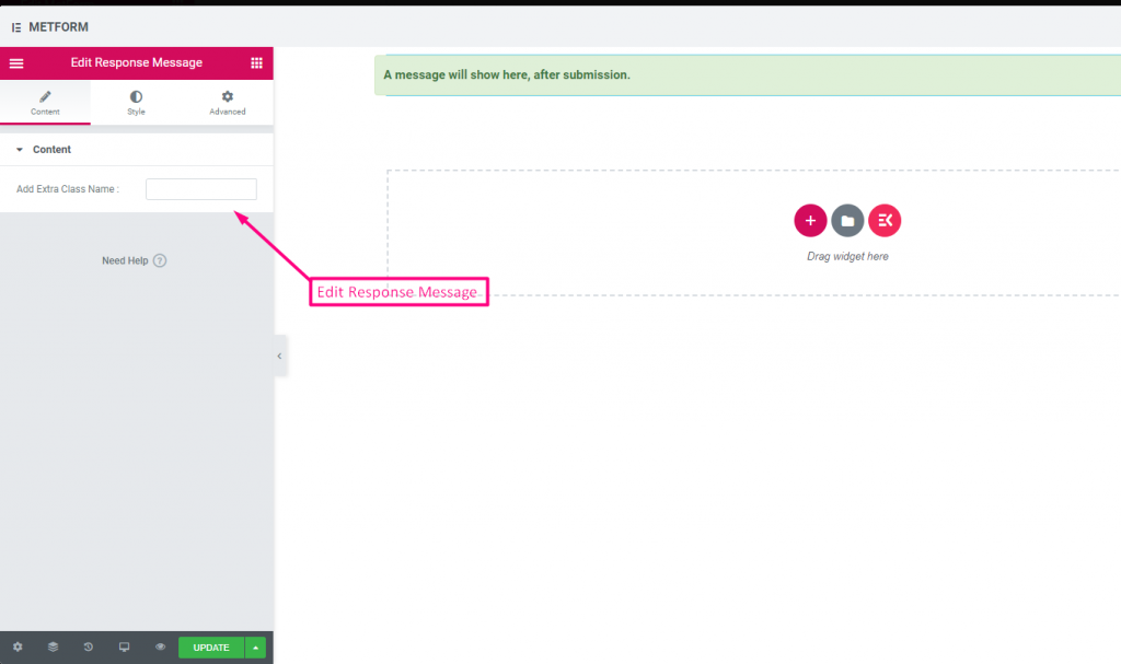
Check out our Live Demo Here:
| Options | Description |
|---|---|
| Add Success Message | Provide e successful message after Form submission |
Rating #
Collect ratings from customers with Rating input field, search the input field by it’s name then drag and drop the input field to your desired location. Helps to get customer review and build up a good bonding between owner and customer.
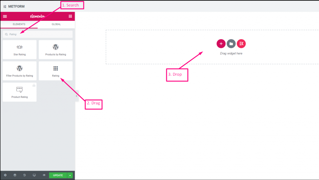
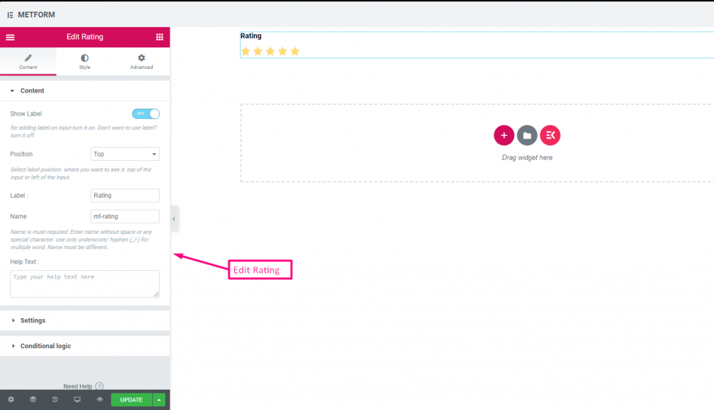
Check out our Live Demo Here:
Any Number of Stars #
Check out our Live Demo Here
| Options | Description |
|---|---|
| Show Label | Turn on/off Label. |
| Position | Default: Top Select the label position. where you want to see it. top or left of the input. |
| Label | Type the label text. |
| Name | Name is must required. Enter a name without space or any special character. use only underscore/hyphen (_/-) for multiple words. The name must be different. |
| Help Text | Type the text to show below the widget. |
| Required | Default: No Toggle this option to make it required. Users can’t submit the forms without filling the required fields. |
| Number of rating star | Customize your rating number. By Default: 3 |
| Conditional Logic | Show/Hide this field based on certain criteria. |
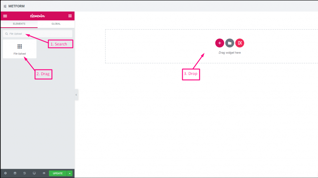
File Upload #
Metform makes it very easy to add File Upload widget to your forms, search the input field by it’s name then drag and drop the input field to your desired location.
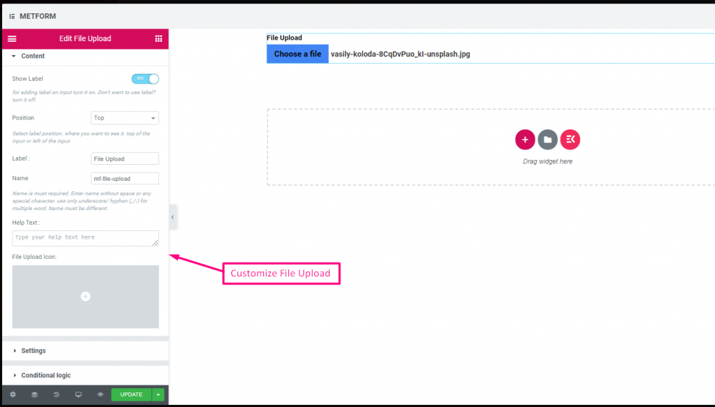
Check out our Live Demo Here
| Options | Description |
|---|---|
| Show Label | Turn on/off Label. |
| Position | Default: Top Select the label position. where you want to see it. top or left of the input. |
| Label | Type the label text. |
| Name | Name is must required. Enter a name without space or any special character. use only underscore/hyphen (_/-) for multiple words. The name must be different. |
| Help Text | Type the text to show below the widget. |
| File Upload Icon | You can upload from our Icon Library or upload SVG |
| Required | Default: No Toggle this option to make it required. Users can’t submit the forms without filling the required fields. |
| File Size Limit | Default: 128KB Add the custom file size for uploading files. |
| File Types | Default: .jpg, .jpeg, .gif, .png Add/Edit the file type that are allowed to upload from the drop-down. |
| Conditional Logic | Show/Hide this field based on certain criteria. |
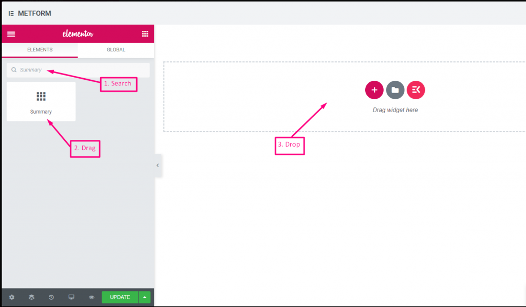
Summary #
Provide summary before subscription to build up a good communication with your customer.
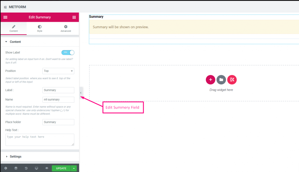
| Options | Description |
|---|---|
| Show Label | Turn on/off Label. |
| Position | Default: Top Select the label position. where you want to see it. top or left of the input. |
| Label | Type the label text. |
| Name | Name is must required. Enter a name without space or any special character. use only underscore/hyphen (_/-) for multiple words. The name must be different. |
| Help Text | Type the text to show below the widget. |
| Required | Default: No Toggle this option to make it required. Users can’t submit the forms without filling the required fields. |
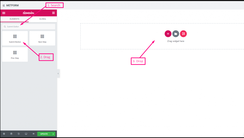
Submit Button #
Submit your form with this field and store data in the back end.
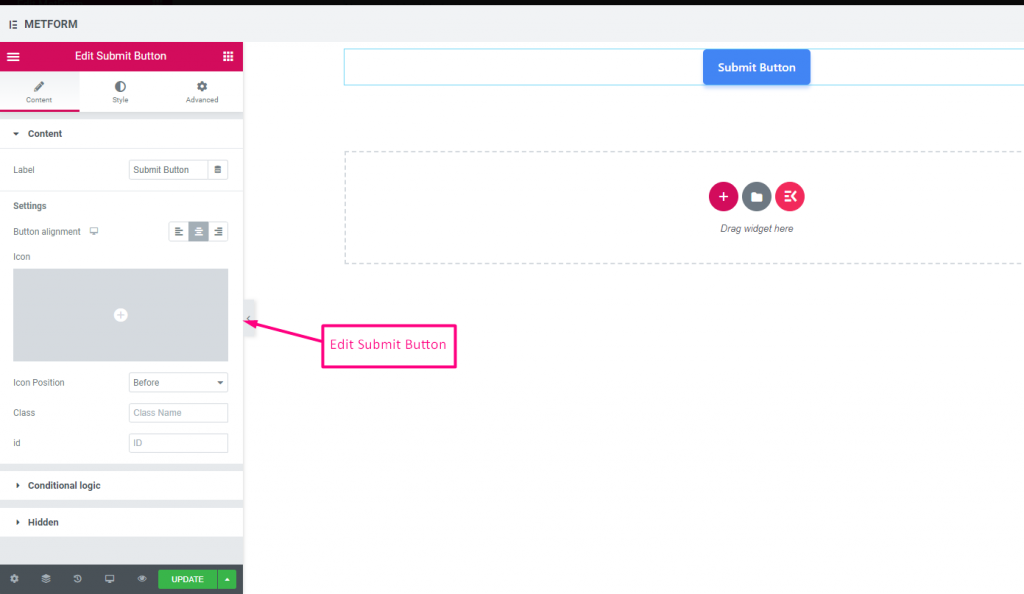
| Options | Description |
|---|---|
| Label | Type the label text. |
| Button Alignment | Select button position. where you want to see it. Left, Center or Right in the form. |
| Icon | You can upload from our Icon Library or upload SVG |
| Icon Position | Select the icon position Before or After |
| Class | Provide Class Name |
| ID | Provide class ID |
| Conditional Logic | Show/Hide this field based on certain criteria. |
| Hidden | Hidden input list will show in the back end. Input Value, Input Name, Input Class |