
 German
  English
  Spanish
  Italian
  French
  Danish
  Portuguese
  Swedish
  Polish
  Korean
  Japanese
 Wir haben beides Frei Und Pro-Eingabefeld for you. Here we’ll discuss the free input field, let’s start.
Kostenloses Eingabefeld #
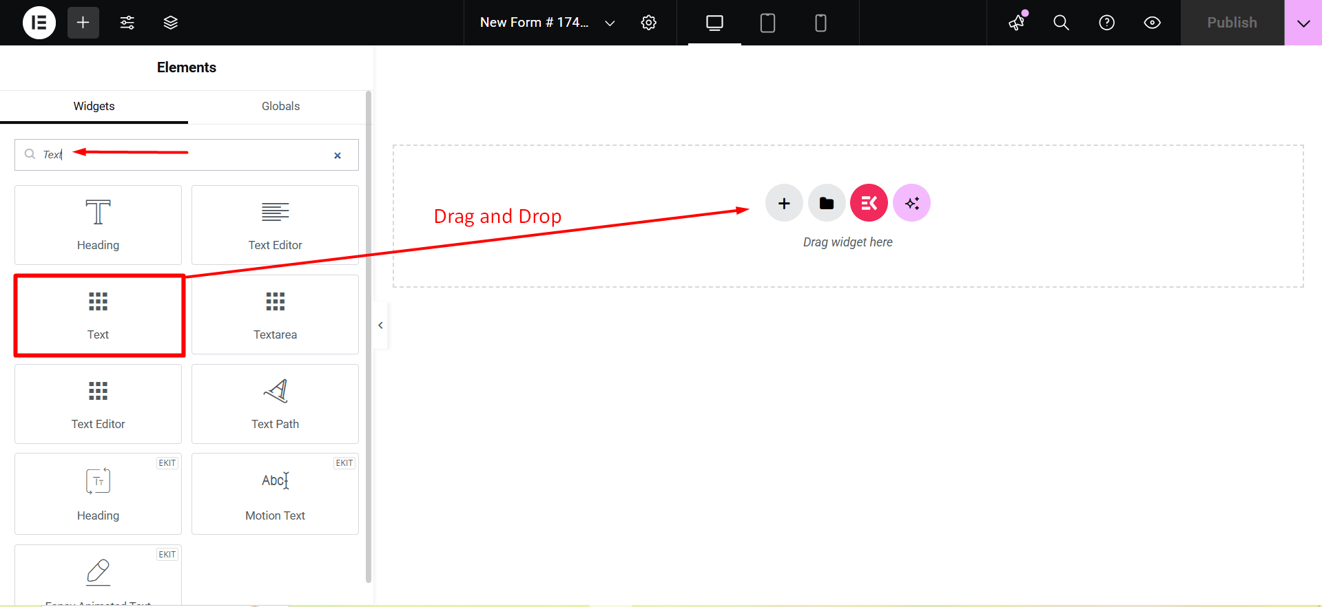
To make any form with Metform’s Free Input Fields open the page/post you want to add the form. After that, start editing with Elementor.
Text #
Add Text field to input Name or any type of text.
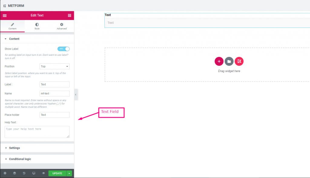
Content Part –
Etikett anzeigen: You can turn it ON or keep it OFF.
Position: Select the label position where you want to see it, either at the Top or Left of the input.
Etikett: Geben Sie den Beschriftungstext ein.
Name: A name is required. Enter a name without spaces or special characters—use only an underscore (_) or hyphen (-) for multiple words. The name must be unique.
Platzhalter: Use a placeholder to show some dummy text and help users input the correct text.
Hilfstext: Geben Sie den Text ein, der unter dem Widget angezeigt werden soll.
Einstellungen -
Erforderlich: Toggle this option to make it required. Users can’t submit the form without filling in the required fields.
Validation Type: Select a validation type from the drop-down.
Bedingte Logik part –
Enable: Enable or disable this option to control whether the field should be shown or hidden based on certain conditions. This helps in creating dynamic forms where fields appear only when specific criteria are met.
Check out our Live-Demo hier.
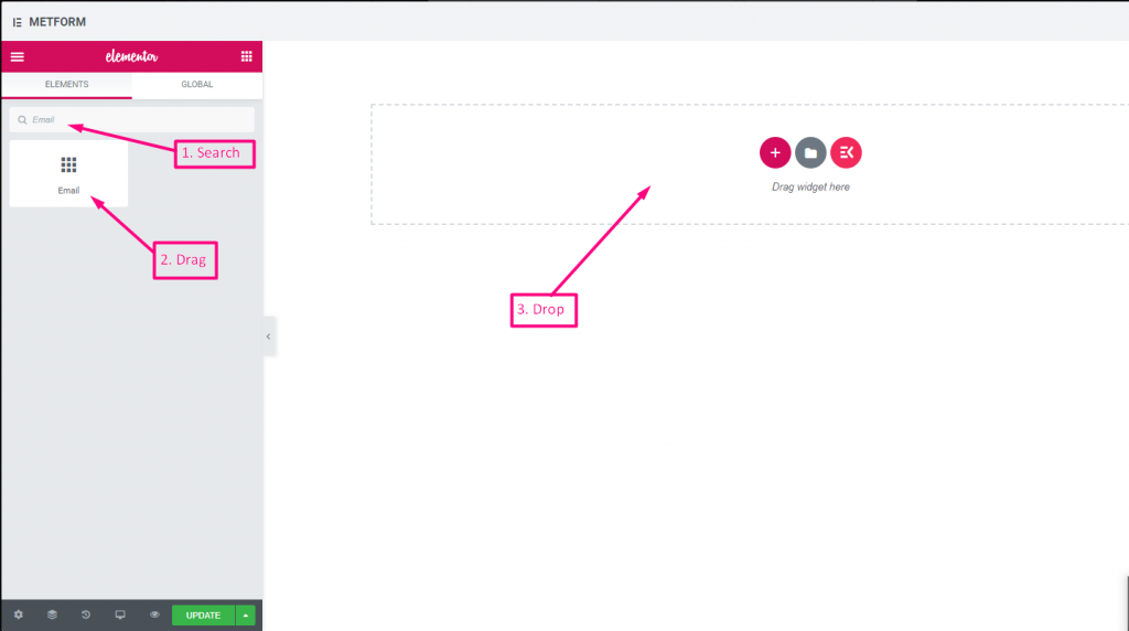
Email #
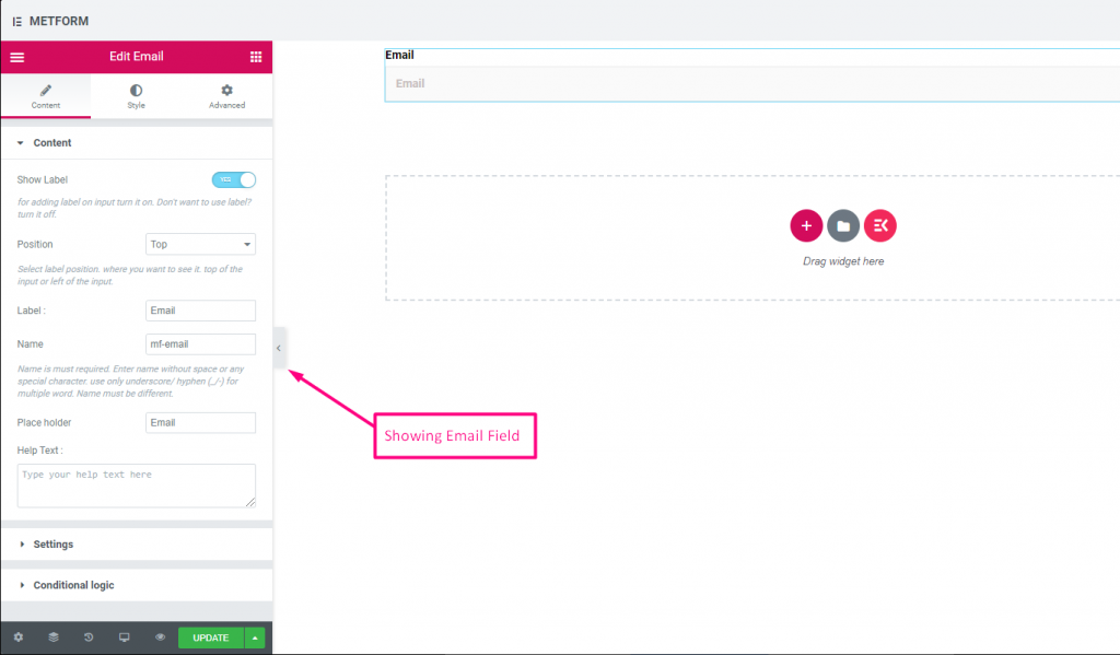
Stellen Sie sicher, dass der Benutzer die gültige E-Mail-Adresse in das Feld „Formular mit E-Mail-Eingabe“ eingibt.
Check out our Live-Demo hier
| Optionen | Beschreibung |
|---|---|
| Etikett anzeigen | Beschriftung ein-/ausschalten. |
| Position | Standard: Spitze Wählen Sie die Etikettenposition aus. wo Sie es sehen möchten. oben oder links vom Eingang. |
| Etikett | Geben Sie den Beschriftungstext ein. |
| Name | Der Name ist ein Muss. Geben Sie einen Namen ohne Leerzeichen oder Sonderzeichen ein. Verwenden Sie für mehrere Wörter nur Unterstrich/Bindestrich (_/-). Der Name muss unterschiedlich sein. |
| Platzhalter | Verwenden Sie einen Platzhalter, um Dummy-Text anzuzeigen und dem Benutzer zu helfen, den richtigen Text einzugeben. |
| Hilfstext | Geben Sie den Text ein, der unter dem Widget angezeigt werden soll. |
| Erforderlich | Standard: NEIN Schalten Sie diese Option um, damit sie erforderlich ist. Benutzer können die Formulare nicht senden, ohne die erforderlichen Felder auszufüllen. |
| Validierungstyp | Wählen Sie den Validierungstyp aus der Dropdown-Liste aus. Nach Zeichenlänge Wählen Sie „Nach Zeichenlänge“, um die minimale und maximale Zeichenlänge des Textes festzulegen Geben Sie auch eine Warnmeldung aus, wenn die Eingabe ungültig ist Nach Wortlänge Wählen Sie „Nach Wortlänge“, um die minimale und maximale Wortlänge des Textes festzulegen. Geben Sie auch eine Warnmeldung an, wenn die Eingabe ungültig ist Nach Ausdrucksbasis Wählen Sie „Nach Ausdruck basierend“ aus, um die ausdrucksbasierte Validierung einzurichten Geben Sie auch eine Warnmeldung aus, wenn die Eingabe ungültig ist Standardmäßig auswählen? (Standard: NEINne) Machen Sie diese Option standardmäßig aktiviert |
| Bedingte Logik | Dieses Feld basierend auf bestimmten Kriterien ein-/ausblenden. |
Nummer #
Diese Eingabefelder stellen sicher, dass Benutzer bei der numerischen Eingabe eine gültige Zahl eingeben.
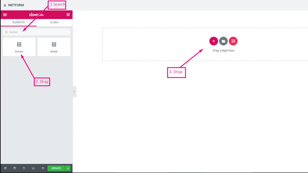
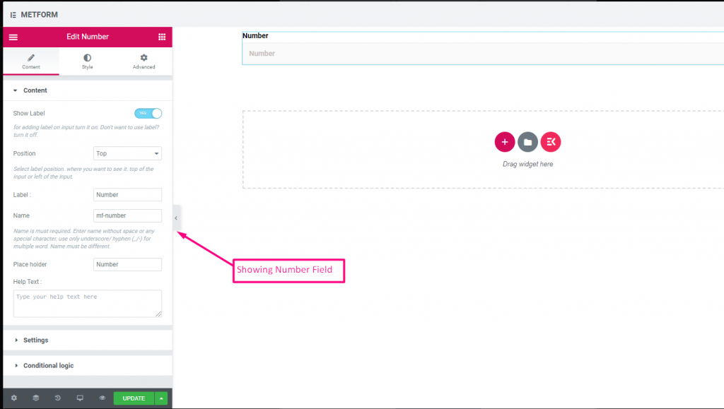
Check out our Live-Demo hier
| Optionen | Beschreibung |
|---|---|
| Etikett anzeigen | Beschriftung ein-/ausschalten. |
| Position | Standard: Spitze Wählen Sie die Etikettenposition aus. wo Sie es sehen möchten. oben oder links vom Eingang. |
| Etikett | Geben Sie den Beschriftungstext ein. |
| Name | Der Name ist ein Muss. Geben Sie einen Namen ohne Leerzeichen oder Sonderzeichen ein. Verwenden Sie für mehrere Wörter nur Unterstrich/Bindestrich (_/-). Der Name muss unterschiedlich sein. |
| Platzhalter | Verwenden Sie einen Platzhalter, um Dummy-Text anzuzeigen und dem Benutzer zu helfen, den richtigen Text einzugeben. |
| Hilfstext | Geben Sie den Text ein, der unter dem Widget angezeigt werden soll. |
| Erforderlich | Standard: NEIN Schalten Sie diese Option um, damit sie erforderlich ist. Benutzer können die Formulare nicht senden, ohne die erforderlichen Felder auszufüllen. |
| Validierungstyp | Wählen Sie den Validierungstyp aus der Dropdown-Liste aus. Nach Zeichenlänge Wählen Sie „Nach Zeichenlänge“, um die minimale und maximale Zeichenlänge des Textes festzulegen Geben Sie auch eine Warnmeldung aus, wenn die Eingabe ungültig ist Nach Wortlänge Wählen Sie „Nach Wortlänge“, um die minimale und maximale Wortlänge des Textes festzulegen. Geben Sie auch eine Warnmeldung an, wenn die Eingabe ungültig ist Nach Ausdrucksbasis Wählen Sie „Nach Ausdruck basierend“ aus, um die ausdrucksbasierte Validierung einzurichten Geben Sie auch eine Warnmeldung aus, wenn die Eingabe ungültig ist Standardmäßig auswählen? (Standard: NEINne) Machen Sie diese Option standardmäßig aktiviert |
| Bedingte Logik | Dieses Feld basierend auf bestimmten Kriterien ein-/ausblenden. |
Telefon #
Erlauben Sie Benutzern, ihre gültige Telefonnummer anzugeben, um Verbindungen herzustellen.
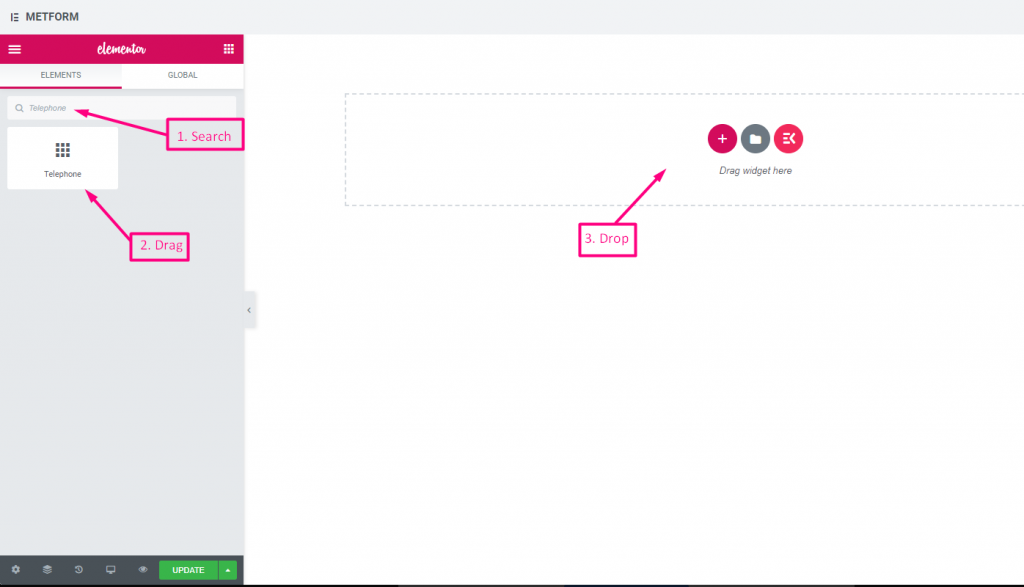
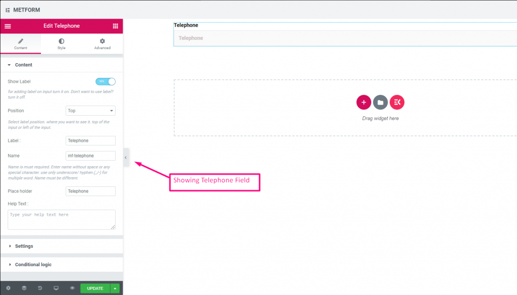
Check out our Live-Demo hier
| Optionen | Beschreibung |
|---|---|
| Etikett anzeigen | Beschriftung ein-/ausschalten. |
| Position | Standard: Spitze Wählen Sie die Etikettenposition aus. wo Sie es sehen möchten. oben oder links vom Eingang. |
| Etikett | Geben Sie den Beschriftungstext ein. |
| Name | Der Name ist ein Muss. Geben Sie einen Namen ohne Leerzeichen oder Sonderzeichen ein. Verwenden Sie für mehrere Wörter nur Unterstrich/Bindestrich (_/-). Der Name muss unterschiedlich sein. |
| Platzhalter | Verwenden Sie einen Platzhalter, um Dummy-Text anzuzeigen und dem Benutzer zu helfen, den richtigen Text einzugeben. |
| Hilfstext | Geben Sie den Text ein, der unter dem Widget angezeigt werden soll. |
| Erforderlich | Standard: NEIN Schalten Sie diese Option um, damit sie erforderlich ist. Benutzer können die Formulare nicht senden, ohne die erforderlichen Felder auszufüllen. |
| Validierungstyp | Wählen Sie den Validierungstyp aus der Dropdown-Liste aus. Nach Zeichenlänge Wählen Sie „Nach Zeichenlänge“, um die minimale und maximale Zeichenlänge des Textes festzulegen Geben Sie auch eine Warnmeldung aus, wenn die Eingabe ungültig ist Nach Wortlänge Wählen Sie „Nach Wortlänge“, um die minimale und maximale Wortlänge des Textes festzulegen. Geben Sie auch eine Warnmeldung an, wenn die Eingabe ungültig ist Nach Ausdrucksbasis Wählen Sie „Nach Ausdruck basierend“ aus, um die ausdrucksbasierte Validierung einzurichten Geben Sie auch eine Warnmeldung aus, wenn die Eingabe ungültig ist Standardmäßig auswählen? (Standard: NEINne) Machen Sie diese Option standardmäßig aktiviert |
| Bedingte Logik | Dieses Feld basierend auf bestimmten Kriterien ein-/ausblenden. |
Zeit #
Hilft Benutzern, ihre bevorzugte Zeit über den Pop-Down-Timer auszuwählen.
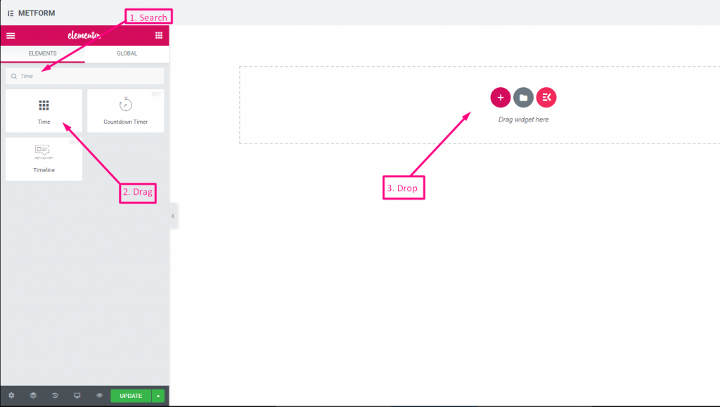
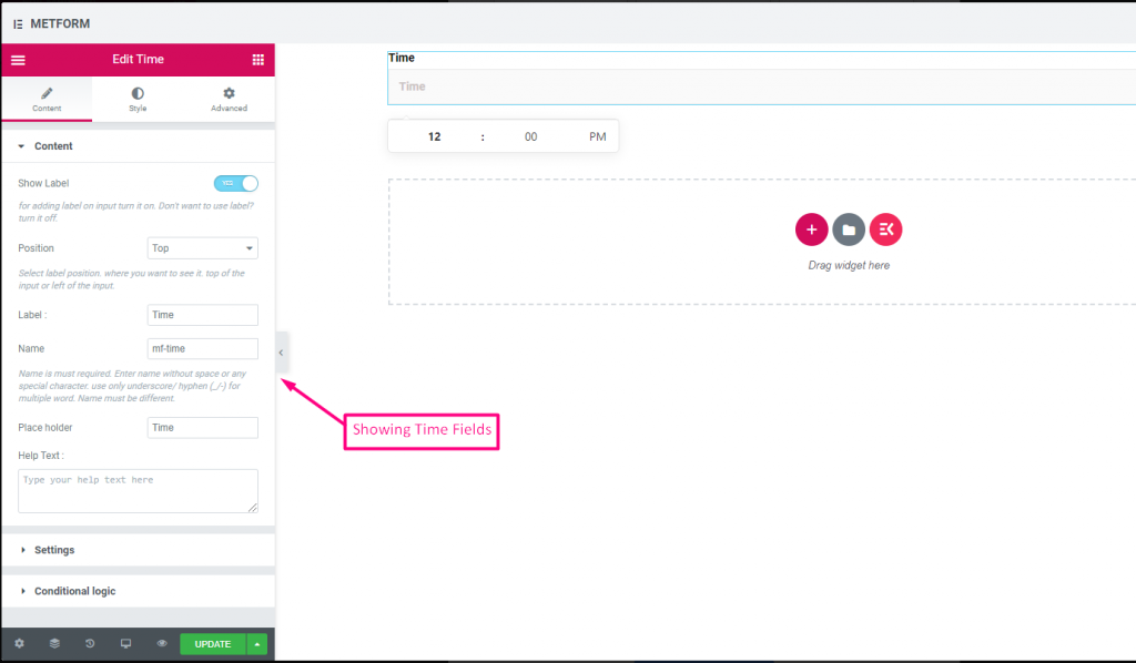
Check out our Live-Demo hier.
| Optionen | Beschreibung |
|---|---|
| Etikett anzeigen | Beschriftung ein-/ausschalten. |
| Position | Standard: Spitze Wählen Sie die Etikettenposition aus. wo Sie es sehen möchten. oben oder links vom Eingang. |
| Etikett | Geben Sie den Beschriftungstext ein. |
| Name | Der Name ist ein Muss. Geben Sie einen Namen ohne Leerzeichen oder Sonderzeichen ein. Verwenden Sie für mehrere Wörter nur Unterstrich/Bindestrich (_/-). Der Name muss unterschiedlich sein. |
| Platzhalter | Verwenden Sie einen Platzhalter, um Dummy-Text anzuzeigen und dem Benutzer zu helfen, den richtigen Text einzugeben. |
| Hilfstext | Geben Sie den Text ein, der unter dem Widget angezeigt werden soll. |
| Erforderlich | Standard: NEIN Schalten Sie diese Option um, damit sie erforderlich ist. Benutzer können die Formulare nicht senden, ohne die erforderlichen Felder auszufüllen. |
| Nutzungsdauer 24 Stunden | Aktivieren oder deaktivieren Sie das 24-Stunden-Format |
| Bedingte Logik | Dieses Feld basierend auf bestimmten Kriterien ein-/ausblenden. |
24-Stunden-Format #
Check out our Live-Demo hier
Datum #
Verwenden Sie dieses Eingabefeld, um das Datum aus dem Pop-down-Kalender für Ihr Formular auszuwählen, um es benutzerfreundlicher zu gestalten.
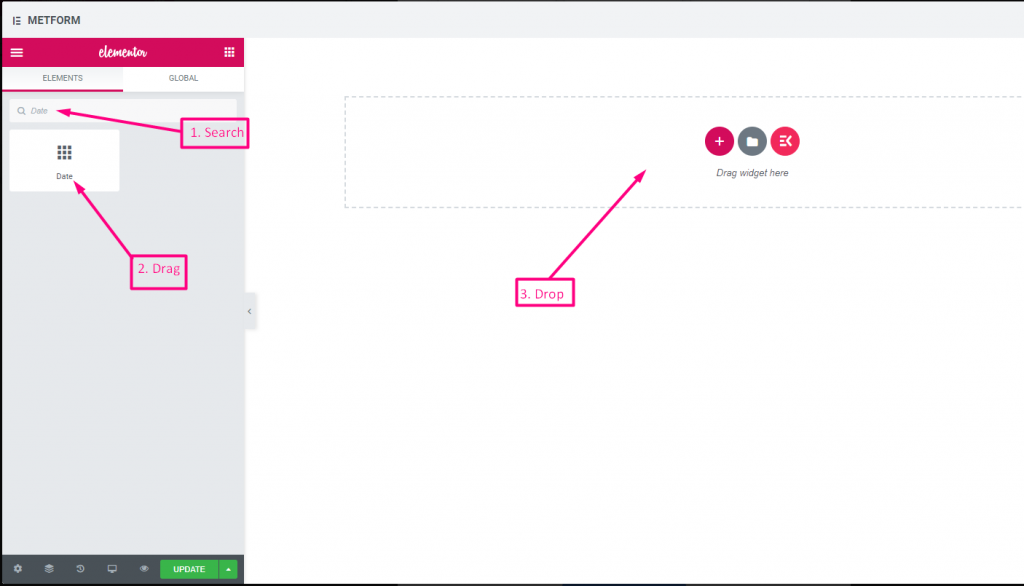
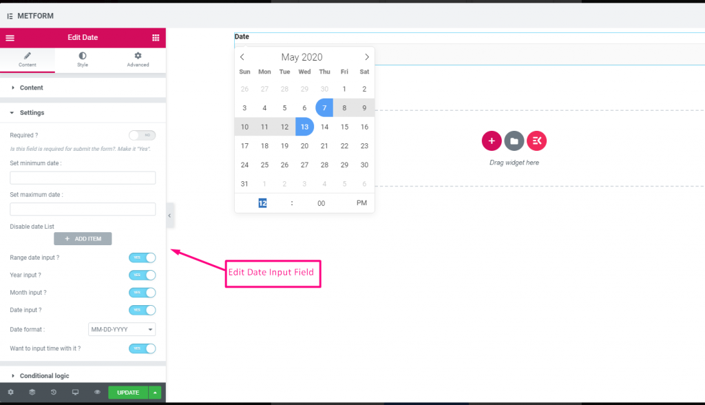
Check out our Live-Demo hier
Eingabe des Datumsbereichs #
Check out our Live-Demo hier
Wählen Sie Datum mit Zeiteingabe #
Check out our Live-Demo hier
| Optionen | Beschreibung |
|---|---|
| Etikett anzeigen | Beschriftung ein-/ausschalten. |
| Position | Standard: Spitze Wählen Sie die Etikettenposition aus. wo Sie es sehen möchten. oben oder links vom Eingang. |
| Etikett | Geben Sie den Beschriftungstext ein. |
| Name | Der Name ist ein Muss. Geben Sie einen Namen ohne Leerzeichen oder Sonderzeichen ein. Verwenden Sie für mehrere Wörter nur Unterstrich/Bindestrich (_/-). Der Name muss unterschiedlich sein. |
| Platzhalter | Verwenden Sie einen Platzhalter, um Dummy-Text anzuzeigen und dem Benutzer zu helfen, den richtigen Text einzugeben. |
| Hilfstext | Geben Sie den Text ein, der unter dem Widget angezeigt werden soll. |
| Erforderlich | Standard: NEIN Schalten Sie diese Option um, damit sie erforderlich ist. Benutzer können die Formulare nicht senden, ohne die erforderlichen Felder auszufüllen. |
| Legen Sie das Mindest- oder Höchstdatum fest | Geben Sie das Mindest- und Höchstdatum an |
| Datum deaktivieren | Geben Sie Ihr Schließdatum oder Deaktivierungsdatum ein |
| Eingabe des Bereichsdatums | Bereich Datumseingabe aktivieren Bereichs-Datumseingabe aktivieren oder deaktivieren, Datumseingabe nach Datum, Jahr oder Monat. Datumsformat: Wählen Sie im Dropdown-Menü das Datumsformat aus. Zum Beispiel: TT-MM-JJJJ |
| Eingabezeit | Sie können die Zeit mit dem Datum hinzufügen. |
| Bedingte Logik | Dieses Feld basierend auf bestimmten Kriterien ein-/ausblenden. |
Wählen #
Fügen Sie eine Dropdown-Liste mit Optionen hinzu, aus denen Benutzer auswählen können, suchen Sie das Widget nach seinem Namen und ziehen Sie es dann per Drag & Drop an die gewünschte Stelle.
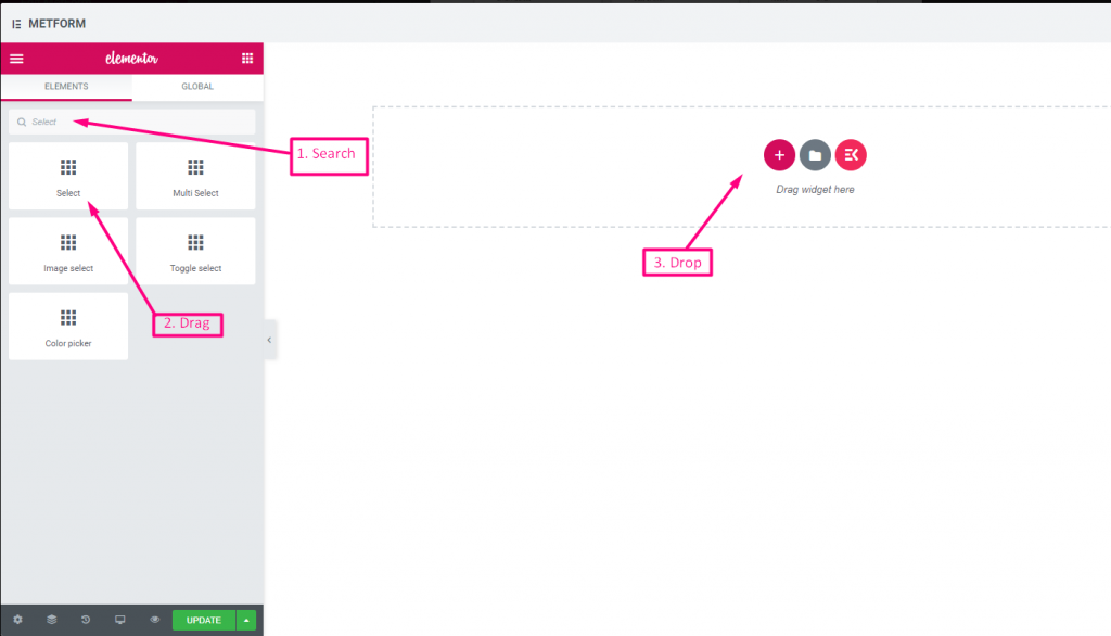
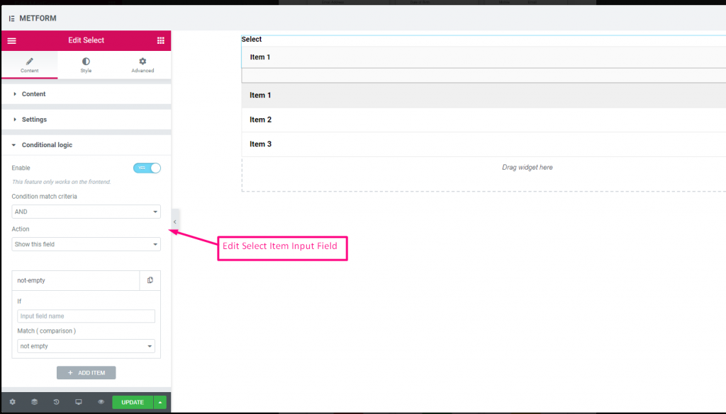
Check out our Live-Demo hier
Suchoption als Bezeichnung #
Check out our Live-Demo hier
| Optionen | Beschreibung |
|---|---|
| Etikett anzeigen | Beschriftung ein-/ausschalten. |
| Position | Standard: Spitze Wählen Sie die Etikettenposition aus. wo Sie es sehen möchten. oben oder links vom Eingang. |
| Etikett | Geben Sie den Beschriftungstext ein. |
| Name | Der Name ist ein Muss. Geben Sie einen Namen ohne Leerzeichen oder Sonderzeichen ein. Verwenden Sie für mehrere Wörter nur Unterstrich/Bindestrich (_/-). Der Name muss unterschiedlich sein. |
| Hilfstext | Geben Sie den Text ein, der unter dem Widget angezeigt werden soll. |
| Dropdown-Liste | Optionen zum Dropdown hinzufügen/bearbeiten/klonen/entfernen. Eingabefeldtext Wählen Sie den Listentext aus, der dem Benutzer angezeigt wird. Eingabefeldwert Wählen Sie den Listenwert aus, der gespeichert/an die gewünschte Person gesendet werden soll. Status (Standard: Aktivieren) Möchten Sie eine Option treffen? welcher Benutzer die Option sehen, aber nicht auswählen kann. Deaktivieren Sie es. Standardmäßig auswählen? (Standard: NEIN) Machen Sie diese Option standardmäßig aktiviert |
| Erforderlich | Standard: NEIN Schalten Sie diese Option um, damit sie erforderlich ist. Benutzer können die Formulare nicht senden, ohne die erforderlichen Felder auszufüllen. |
| Bedingte Logik | Dieses Feld basierend auf bestimmten Kriterien ein-/ausblenden. |
Mehrfachauswahl #
Wählen Sie im Dropdown-Menü „Mehrere Elemente“ gleichzeitig aus.
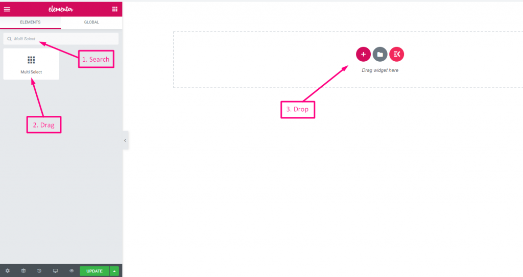
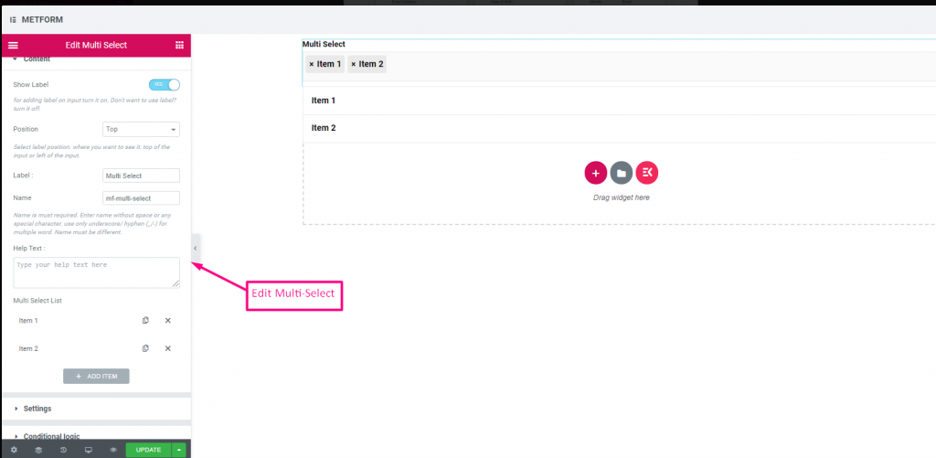
Check out our Live-Demo hier
Ausgewählte Standardwerte #
Check out our Live-Demo hier
| Optionen | Beschreibung |
|---|---|
| Etikett anzeigen | Beschriftung ein-/ausschalten. |
| Position | Standard: Spitze Wählen Sie die Etikettenposition aus. wo Sie es sehen möchten. oben oder links vom Eingang. |
| Etikett | Geben Sie den Beschriftungstext ein. |
| Name | Der Name ist ein Muss. Geben Sie einen Namen ohne Leerzeichen oder Sonderzeichen ein. Verwenden Sie für mehrere Wörter nur Unterstrich/Bindestrich (_/-). Der Name muss unterschiedlich sein. |
| Hilfstext | Geben Sie den Text ein, der unter dem Widget angezeigt werden soll. |
| Dropdown-Liste | Optionen zum Dropdown hinzufügen/bearbeiten/klonen/entfernen. Eingabefeldtext Wählen Sie den Listentext aus, der dem Benutzer angezeigt wird. Eingabefeldwert Wählen Sie den Listenwert aus, der gespeichert/an die gewünschte Person gesendet werden soll. Status (Standard: Aktivieren) Möchten Sie eine Option treffen? welcher Benutzer die Option sehen, aber nicht auswählen kann. Deaktivieren Sie es. Standardmäßig auswählen? (Standard: NEIN) Machen Sie diese Option standardmäßig aktiviert |
| Erforderlich | Standard: NEIN Schalten Sie diese Option um, damit sie erforderlich ist. Benutzer können die Formulare nicht senden, ohne die erforderlichen Felder auszufüllen. |
| Bedingte Logik | Dieses Feld basierend auf bestimmten Kriterien ein-/ausblenden. |
Textbereich #
Hilft beim Hinzufügen einer großen Anzahl von Inhalten, Überprüfungen und Kommentaren zu Ihrem Formular.
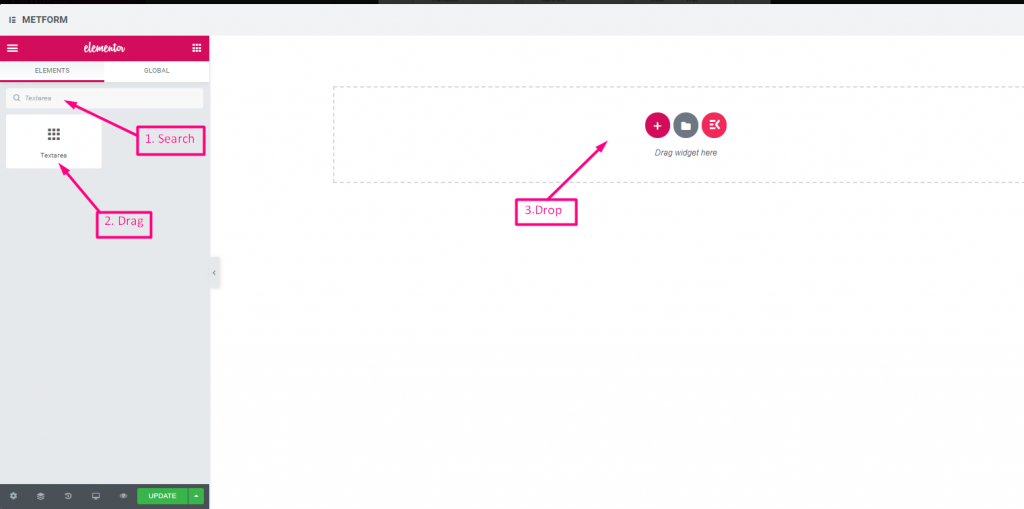
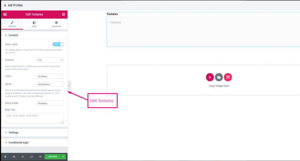
Check out our Live-Demo hier
| Optionen | Beschreibung |
|---|---|
| Etikett anzeigen | Beschriftung ein-/ausschalten. |
| Position | Standard: Spitze Wählen Sie die Etikettenposition aus. wo Sie es sehen möchten. oben oder links vom Eingang. |
| Etikett | Geben Sie den Beschriftungstext ein. |
| Name | Der Name ist ein Muss. Geben Sie einen Namen ohne Leerzeichen oder Sonderzeichen ein. Verwenden Sie für mehrere Wörter nur Unterstrich/Bindestrich (_/-). Der Name muss unterschiedlich sein. |
| Hilfstext | Geben Sie den Text ein, der unter dem Widget angezeigt werden soll. |
| Dropdown-Liste | Optionen zum Dropdown hinzufügen/bearbeiten/klonen/entfernen. Eingabefeldtext Wählen Sie den Listentext aus, der dem Benutzer angezeigt wird. Eingabefeldwert Wählen Sie den Listenwert aus, der gespeichert/an die gewünschte Person gesendet werden soll. Status (Standard: Aktivieren) Möchten Sie eine Option treffen? welcher Benutzer die Option sehen, aber nicht auswählen kann. Deaktivieren Sie es. Standardmäßig auswählen? (Standard: NEIN) Machen Sie diese Option standardmäßig aktiviert |
| Erforderlich | Standard: NEIN Schalten Sie diese Option um, damit sie erforderlich ist. Benutzer können die Formulare nicht senden, ohne die erforderlichen Felder auszufüllen. |
| Validierungstyp | Wählen Sie den Validierungstyp aus der Dropdown-Liste aus. Nach Zeichenlänge Wählen Sie „Nach Zeichenlänge“, um die minimale und maximale Zeichenlänge des Textes festzulegen Geben Sie auch eine Warnmeldung aus, wenn die Eingabe ungültig ist Nach Wortlänge Wählen Sie „Nach Wortlänge“, um die minimale und maximale Wortlänge des Textes festzulegen. Geben Sie auch eine Warnmeldung an, wenn die Eingabe ungültig ist Nach Ausdrucksbasis Wählen Sie „Nach Ausdruck basierend“ aus, um die ausdrucksbasierte Validierung einzurichten Geben Sie auch eine Warnmeldung aus, wenn die Eingabe ungültig ist Standardmäßig auswählen? (Standard: NEINne) Machen Sie diese Option standardmäßig aktiviert |
| Bedingte Logik | Dieses Feld basierend auf bestimmten Kriterien ein-/ausblenden. |
Kontrollkästchen #
Erlauben Sie Benutzern mit dem Kontrollkästchen, mehrere Elemente gleichzeitig für Ihr Formular auszuwählen.
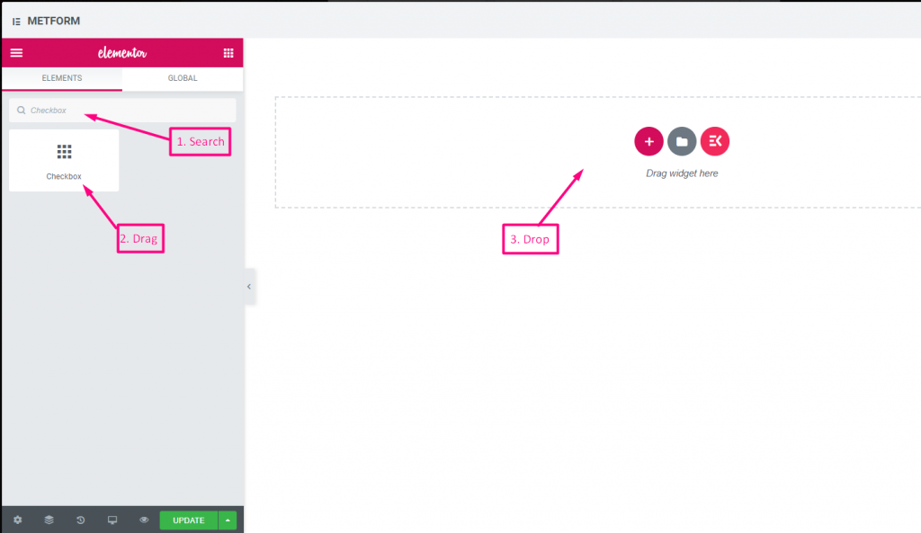
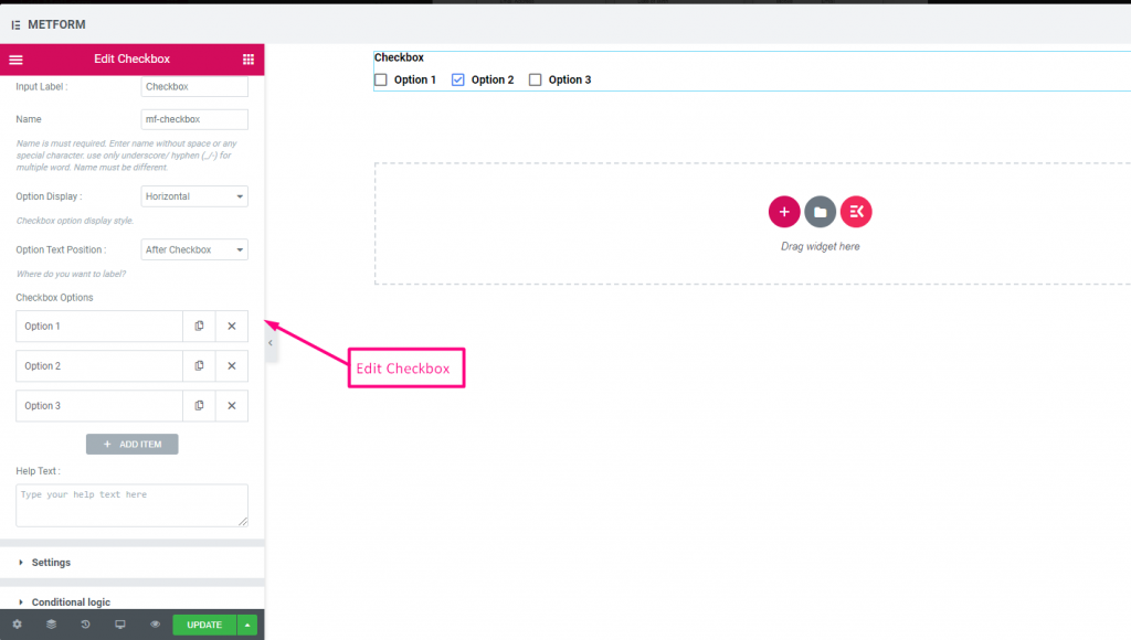
Check out our Live-Demo hier
Vertikal #
Check out our Live-Demo hier
Symbolposition nach Text #
Check out our Live-Demo hier
| Optionen | Beschreibung |
|---|---|
| Etikett anzeigen | Beschriftung ein-/ausschalten. |
| Position | Standard: Spitze Wählen Sie die Etikettenposition aus. wo Sie es sehen möchten. oben oder links vom Eingang. |
| Etikett | Geben Sie den Beschriftungstext ein. |
| Name | Der Name ist ein Muss. Geben Sie einen Namen ohne Leerzeichen oder Sonderzeichen ein. Verwenden Sie für mehrere Wörter nur Unterstrich/Bindestrich (_/-). Der Name muss unterschiedlich sein. |
| Hilfstext | Geben Sie den Text ein, der unter dem Widget angezeigt werden soll. |
| Optionsanzeige | Anzeigeoptionen Horizontal oder Vertikal |
| Optionen Textposition | Textposition der Anzeigeoption: Vorher-Kontrollkästchen oder Nach dem Kontrollkästchen |
| Kontrollkästchenoptionen | Optionen zum Hinzufügen/Bearbeiten/Klonen/Entfernen zum Dropdown-Menü. Kontrollkästchenoption Text Wählen Sie den Optionstext aus, der dem Benutzer angezeigt wird. Optionswert Wählen Sie den Optionswert aus, der gespeichert/an die gewünschte Person gesendet werden soll. Status (Standard: Aktiv) Möchten Sie eine Option treffen? welcher Benutzer die Option sehen, aber nicht auswählen kann. Deaktivieren Sie es. |
| Erforderlich | Standard: NEIN Schalten Sie diese Option um, damit sie erforderlich ist. Benutzer können die Formulare nicht senden, ohne die erforderlichen Felder auszufüllen. |
| Bedingte Logik | Dieses Feld basierend auf bestimmten Kriterien ein-/ausblenden. |
Radio #
Erlauben Sie Benutzern, nur ein exklusives Element aus den mehreren Optionen auszuwählen.
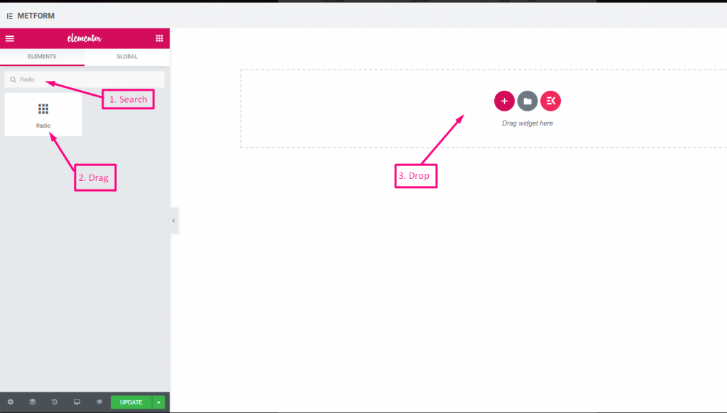
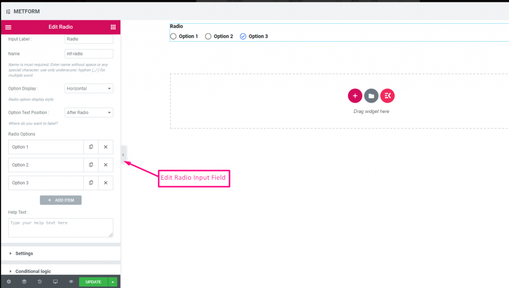
Check out our Live-Demo hier
Vertikal #
Check out our Live-Demo hier
Symbolposition nach Text #
Check out our Live-Demo hier
| Optionen | Beschreibung |
|---|---|
| Etikett anzeigen | Beschriftung ein-/ausschalten. |
| Position | Standard: Spitze Wählen Sie die Etikettenposition aus. wo Sie es sehen möchten. oben oder links vom Eingang. |
| Etikett | Geben Sie den Beschriftungstext ein. |
| Name | Der Name ist ein Muss. Geben Sie einen Namen ohne Leerzeichen oder Sonderzeichen ein. Verwenden Sie für mehrere Wörter nur Unterstrich/Bindestrich (_/-). Der Name muss unterschiedlich sein. |
| Hilfstext | Geben Sie den Text ein, der unter dem Widget angezeigt werden soll. |
| Optionsanzeige | Radiooptionen anzeigen Horizontal oder Vertikal |
| Optionen Textposition | Textposition der Radiooption anzeigen: Vor Radio oder Nach Radio |
| Radiooptionen | Optionen zum Hinzufügen/Bearbeiten/Klonen/Entfernen zum Dropdown-Menü. Radio Option Text Wählen Sie den Optionstext aus, der dem Benutzer angezeigt wird. Radiowert Wählen Sie den Optionswert aus, der gespeichert/an die gewünschte Person gesendet werden soll. Status (Standard: Aktiv) Möchten Sie eine Option treffen? welcher Benutzer die Option sehen, aber nicht auswählen kann. Deaktivieren Sie es. |
| Erforderlich | Standard: NEIN Schalten Sie diese Option um, damit sie erforderlich ist. Benutzer können die Formulare nicht senden, ohne die erforderlichen Felder auszufüllen. |
| Bedingte Logik | Dieses Feld basierend auf bestimmten Kriterien ein-/ausblenden. |
Vorname (Auflistung) #
Erlauben Sie Benutzern, ihren Vornamen anzugeben, um ihn in einer Listungsmethode auf der Mailingliste anzuzeigen. Zum Beispiel: Mailchimp
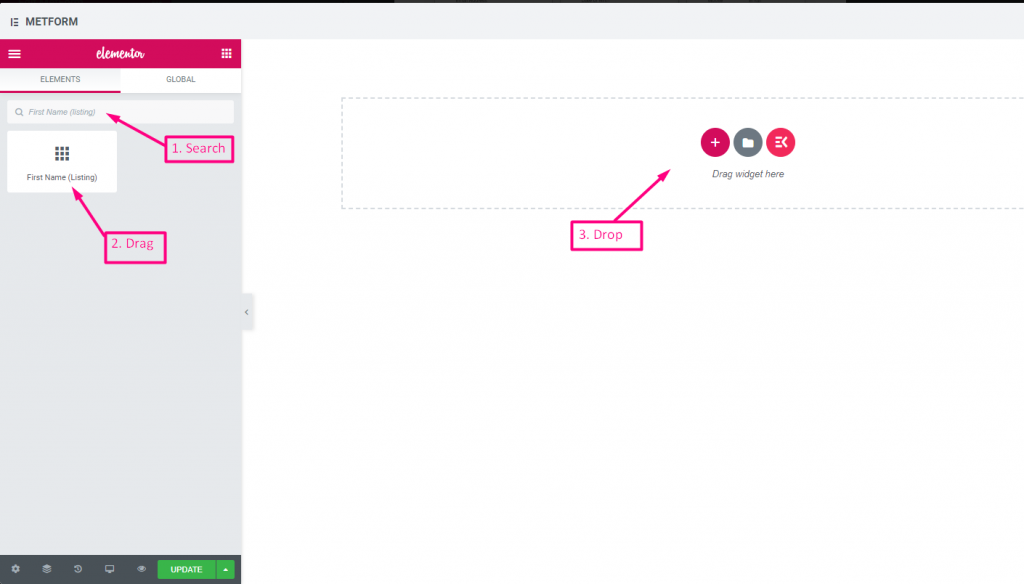
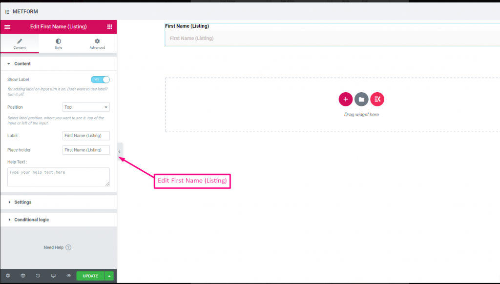
| Optionen | Beschreibung |
|---|---|
| Etikett anzeigen | Beschriftung ein-/ausschalten. |
| Position | Standard: Spitze Wählen Sie die Etikettenposition aus. wo Sie es sehen möchten. oben oder links vom Eingang. |
| Etikett | Geben Sie den Beschriftungstext ein. |
| Platzhalter | Verwenden Sie einen Platzhalter, um Dummy-Text anzuzeigen und dem Benutzer zu helfen, den richtigen Text einzugeben. |
| Hilfstext | Geben Sie den Text ein, der unter dem Widget angezeigt werden soll. |
| Erforderlich | Standard: NEIN Schalten Sie diese Option um, damit sie erforderlich ist. Benutzer können die Formulare nicht senden, ohne die erforderlichen Felder auszufüllen. |
| Validierungstyp | Wählen Sie den Validierungstyp aus der Dropdown-Liste aus. Nach Zeichenlänge Wählen Sie „Nach Zeichenlänge“, um die minimale und maximale Zeichenlänge des Textes festzulegen Geben Sie auch eine Warnmeldung aus, wenn die Eingabe ungültig ist Nach Wortlänge Wählen Sie „Nach Wortlänge“, um die minimale und maximale Wortlänge des Textes festzulegen. Geben Sie auch eine Warnmeldung an, wenn die Eingabe ungültig ist Nach Ausdrucksbasis Wählen Sie „Nach Ausdruck basierend“ aus, um die ausdrucksbasierte Validierung einzurichten Geben Sie auch eine Warnmeldung aus, wenn die Eingabe ungültig ist Standardmäßig auswählen? (Standard: NEINne) Machen Sie diese Option standardmäßig aktiviert |
| Bedingte Logik | Dieses Feld basierend auf bestimmten Kriterien ein-/ausblenden. |
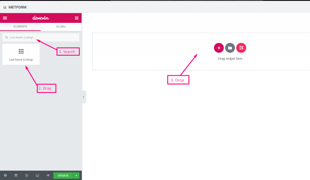
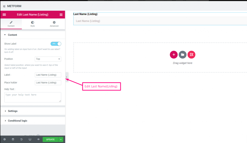
Nachname (Auflistung) #
Erlauben Sie Benutzern, ihren Nachnamen anzugeben, um ihn in einer Listenmethode auf der Mailingliste anzuzeigen. Zum Beispiel: Mailchimp
| Optionen | Beschreibung |
|---|---|
| Etikett anzeigen | Beschriftung ein-/ausschalten. |
| Position | Standard: Spitze Wählen Sie die Etikettenposition aus. wo Sie es sehen möchten. oben oder links vom Eingang. |
| Etikett | Geben Sie den Beschriftungstext ein. |
| Platzhalter | Verwenden Sie einen Platzhalter, um Dummy-Text anzuzeigen und dem Benutzer zu helfen, den richtigen Text einzugeben. |
| Hilfstext | Geben Sie den Text ein, der unter dem Widget angezeigt werden soll. |
| Erforderlich | Standard: NEIN Schalten Sie diese Option um, damit sie erforderlich ist. Benutzer können die Formulare nicht senden, ohne die erforderlichen Felder auszufüllen. |
| Validierungstyp | Wählen Sie den Validierungstyp aus der Dropdown-Liste aus. Nach Zeichenlänge Wählen Sie „Nach Zeichenlänge“, um die minimale und maximale Zeichenlänge des Textes festzulegen Geben Sie auch eine Warnmeldung aus, wenn die Eingabe ungültig ist Nach Wortlänge Wählen Sie „Nach Wortlänge“, um die minimale und maximale Wortlänge des Textes festzulegen. Geben Sie auch eine Warnmeldung an, wenn die Eingabe ungültig ist Nach Ausdrucksbasis Wählen Sie „Nach Ausdruck basierend“ aus, um die ausdrucksbasierte Validierung einzurichten Geben Sie auch eine Warnmeldung aus, wenn die Eingabe ungültig ist Standardmäßig auswählen? (Standard: NEINne) Machen Sie diese Option standardmäßig aktiviert |
| Bedingte Logik | Dieses Feld basierend auf bestimmten Kriterien ein-/ausblenden. |
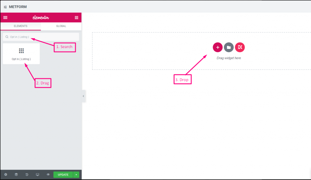
Opt-in-Eintrag #
Verwenden Sie das Opt-in-Feld in Ihrem Formular und machen Sie Ihren Benutzer zu einem abonnierten Mailchimp-Kontaktbenutzer, indem Sie das Kontrollkästchen „Abonnieren Sie unseren Newsletter“ anklicken.
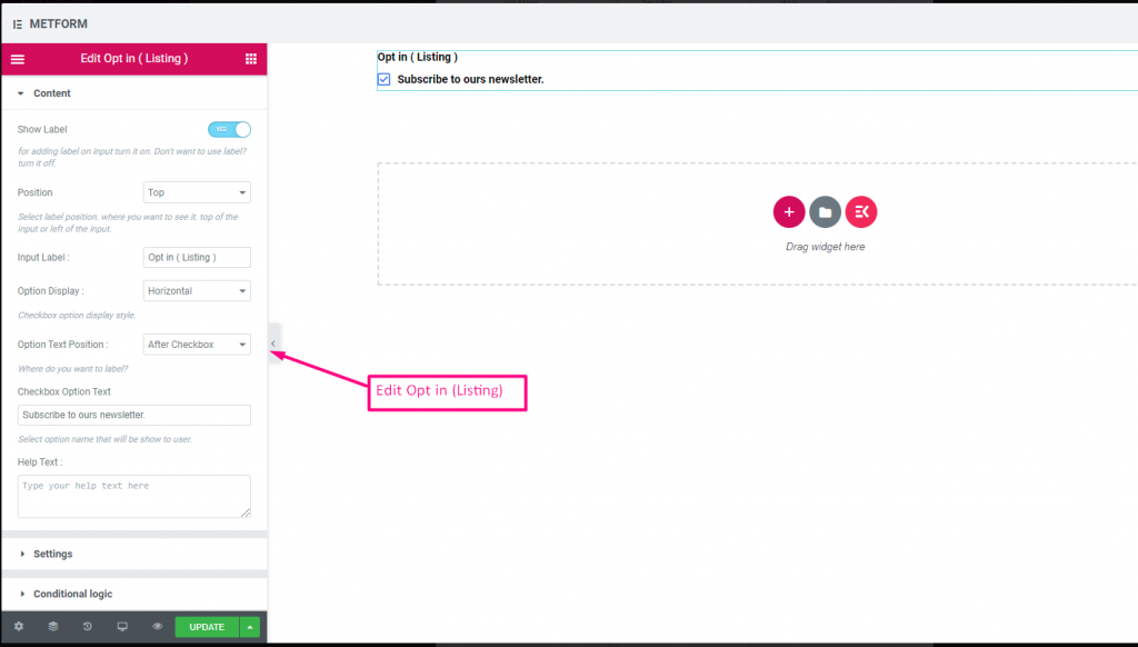
Check out our Live-Demo hier
| Optionen | Beschreibung |
|---|---|
| Etikett anzeigen | Beschriftung ein-/ausschalten. |
| Position | Standard: Spitze Wählen Sie die Etikettenposition aus. wo Sie es sehen möchten. oben oder links vom Eingang. |
| Eingabebezeichnung | Geben Sie den Beschriftungstext ein. |
| Optionsanzeige | Opt-In-Listenoption anzeigen Horizontal oder Vertikal |
| Optionen Textposition | Opt-In-Liste anzeigen Option Textposition: Vor Kontrollkästchen bzw Nach Kontrollkästchen |
| Kontrollkästchen-Optionstext | Machen Sie eine kurze Beschreibung der Optionen, die dem Benutzer angezeigt werden. Zum Beispiel: "Abonniere unseren Newsletter“ |
| Hilfstext | Geben Sie den Text ein, der unter dem Widget angezeigt werden soll. Mithilfe von Hilfetexten können Sie Nachrichten ganz einfach gezielt an die richtigen Personen senden |
| Erforderlich | Standard: NEIN Schalten Sie diese Option um, damit sie erforderlich ist. Benutzer können die Formulare nicht senden, ohne die erforderlichen Felder auszufüllen. |
| Bedingte Logik | Dieses Feld basierend auf bestimmten Kriterien ein-/ausblenden. |
DSGVO-Einwilligung #
Aktivieren Sie DSGVO-Beschwerden (Datenschutz-Grundverordnung) in Ihrem Formular, bevor Sie Benutzerdaten erfassen, da hier erläutert wird, wie Sie die Benutzerdaten normalerweise verwenden, um vor rechtlichen Schritten geschützt zu sein.
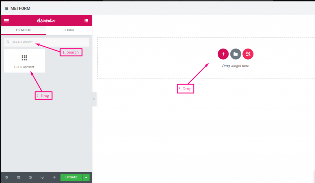
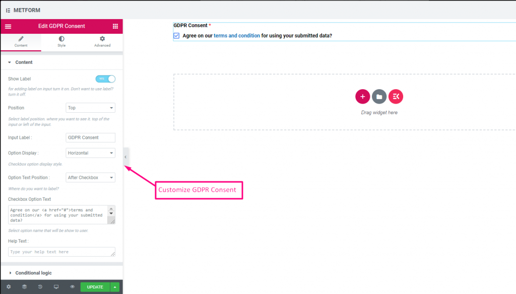
Überprüfen out our Live-Demo hier
Mit Textlink #
Überprüfen out our Live-Demo hier
| Optionen | Beschreibung |
|---|---|
| Etikett anzeigen | Beschriftung ein-/ausschalten. |
| Position | Standard: Spitze Wählen Sie die Etikettenposition aus. wo Sie es sehen möchten. oben oder links vom Eingang. |
| Eingabebezeichnung | Geben Sie den Beschriftungstext ein. |
| Optionsanzeige | DSGVO-Einwilligungsoptionen anzeigen Horizontal oder Vertikal |
| Optionen Textposition | Textposition der DSGVO-Einwilligungsoption anzeigen: Vor Kontrollkästchen bzw Nach Kontrollkästchen |
| Kontrollkästchen-Optionstext | Machen Sie eine kurze Beschreibung der Optionen, die dem Benutzer angezeigt werden. Zum Beispiel: „Einverstanden mit unserem Geschäftsbedingung für die Verwendung Ihrer übermittelten Daten?“ |
| Hilfstext | Geben Sie den Text ein, der unter dem Widget angezeigt werden soll. Mithilfe von Hilfetexten können Sie Nachrichten ganz einfach gezielt an die richtigen Personen senden |
| Bedingte Logik | Dieses Feld basierend auf bestimmten Kriterien ein-/ausblenden. |
Schalten #
Steuern Sie den Kontrollkästcheneingang „Ja/Nein“ oder „Ein/Aus“ einfach wie einen Lichtschalter.
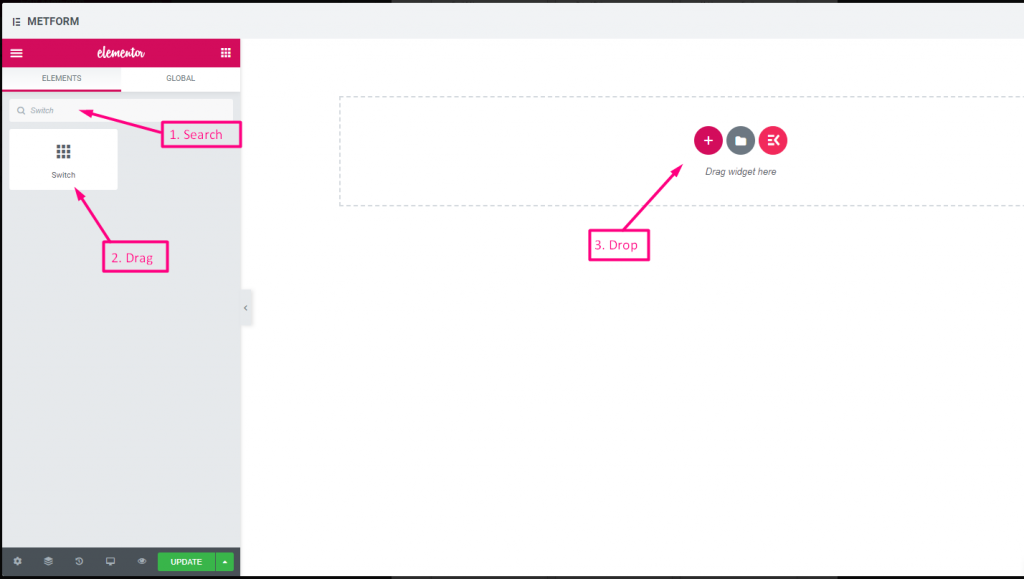
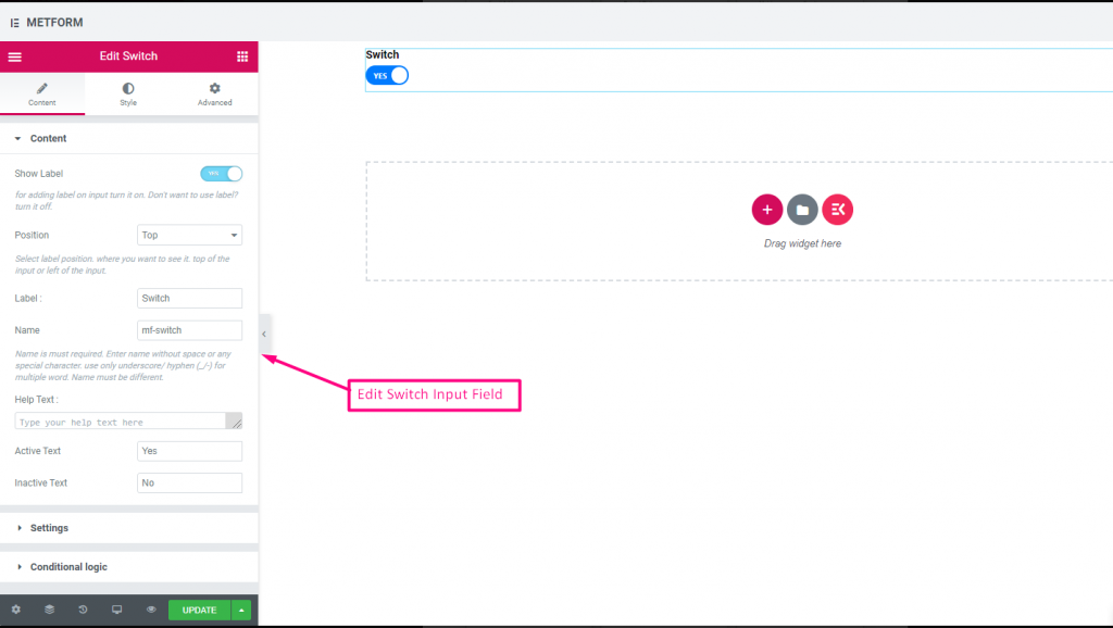
Check out our Live-Demo hier
Benutzerdefinierter Optionstext #
Check out our Live-Demo hier
| Optionen | Beschreibung |
|---|---|
| Etikett anzeigen | Beschriftung ein-/ausschalten. |
| Position | Standard: Spitze Wählen Sie die Etikettenposition aus. wo Sie es sehen möchten. oben oder links vom Eingang. |
| Etikett | Geben Sie den Beschriftungstext ein. |
| Name | Der Name ist ein Muss. Geben Sie einen Namen ohne Leerzeichen oder Sonderzeichen ein. Verwenden Sie für mehrere Wörter nur Unterstrich/Bindestrich (_/-). Der Name muss unterschiedlich sein. |
| Hilfstext | Geben Sie den Text ein, der unter dem Widget angezeigt werden soll. |
| Aktiver oder inaktiver Text | Geben Sie aktiven oder inaktiven Text an. Zum Beispiel: Ja oder Nein |
| Erforderlich | Standard: NEIN Schalten Sie diese Option um, damit sie erforderlich ist. Benutzer können die Formulare nicht senden, ohne die erforderlichen Felder auszufüllen. |
| Bedingte Logik | Dieses Feld basierend auf bestimmten Kriterien ein-/ausblenden. |
reCaptcha #
Ermöglichen Sie die Integration von Google reCAPTCHA, um Ihre Website vor unerwünschtem Spam und missbräuchlichem Datenverkehr zu schützen.
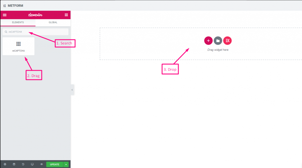
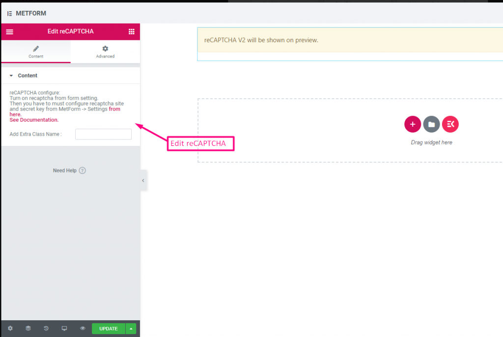
Check out our Live-Demo hier
| Optionen | Beschreibung |
|---|---|
| reCAPTCHA konfigurieren | Aktivieren Sie reCAPTCHA in der Einstellung. Dann müssen Sie die reCAPTCHA-Site und den geheimen Schlüssel über MetForm -> Einstellungen konfigurieren von hier. Siehe Dokumentation. |
Einfaches reCAPTCHA #
Schützt Ihre Website vor unerwünschten Bots und Spam.
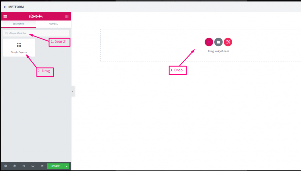
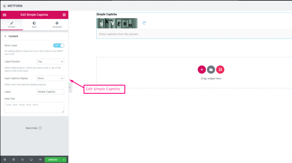
Check out our Live-Demo hier
Inline-Optionen #
Check out our Live-Demo hier
| Optionen | Beschreibung |
|---|---|
| Etikett anzeigen | Beschriftung ein-/ausschalten. |
| Position | Standard: Spitze Wählen Sie die Etikettenposition aus. wo Sie es sehen möchten. oben oder links vom Eingang. |
| Eingabe-CAPTCHA-Anzeige | Geben Sie Ihr reCAPTCHA in einem Block ein oder zeigen Sie das Eingabefeld in einer Zeile an. |
| Etikett | Geben Sie den Beschriftungstext ein. |
| Hilfstext | Geben Sie den Text ein, der unter dem Widget angezeigt werden soll. |
Bereichsschieberegler #
Stellen Sie Ihren maximalen oder minimalen Bereichswert für Ihr Formular ein, indem Sie den supercoolen Bereichsschieberegler verwenden. Sie müssen lediglich beide Enden ziehen, bis der entsprechende Wert erreicht ist.
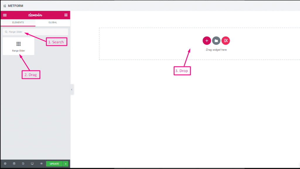
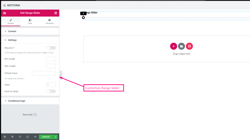
Check out our Live-Demo hier
Standardwert #
Überprüfen out our Live-Demo hier
Mehrbereichseingang #
Überprüfen out our Live-Demo hier
| Optionen | Beschreibung |
|---|---|
| Etikett anzeigen | Beschriftung ein-/ausschalten. |
| Position | Standard: Spitze Wählen Sie die Etikettenposition aus. wo Sie es sehen möchten. oben oder links vom Eingang. |
| Etikett | Geben Sie den Beschriftungstext ein. |
| Name | Der Name ist ein Muss. Geben Sie einen Namen ohne Leerzeichen oder Sonderzeichen ein. Verwenden Sie für mehrere Wörter nur Unterstrich/Bindestrich (_/-). Der Name muss unterschiedlich sein. |
| Hilfstext | Geben Sie den Text ein, der unter dem Widget angezeigt werden soll. |
| Erforderlich | Standard: NEIN Schalten Sie diese Option um, damit sie erforderlich ist. Benutzer können die Formulare nicht senden, ohne die erforderlichen Felder auszufüllen. |
| Minimale Länge | Legen Sie den Mindestbereichswert fest |
| Maximale Länge | Legen Sie den Wert für den maximalen Bereich fest |
| Standardwert | Legen Sie Ihren Standardwert fest. Verwenden Sie Komma, um den Bereichswert festzulegen |
| Schritte | Fügen Sie den Schrittwert hinzu, um den Bereich Schritt für Schritt hinzuzufügen |
| Eingabe als Bereich | Schalten Sie diese Optionen um, um den erforderlichen Bereich einzurichten oder nicht |
| Bedingte Logik | Dieses Feld basierend auf bestimmten Kriterien ein-/ausblenden. |
URL #
Fügen Sie einfach eine URL zu Ihrem Formular hinzu, indem Sie unser URL-Eingabefeld verwenden. Dadurch wird sichergestellt, dass Benutzer eine gültige URL in das Formularfeld eingeben.
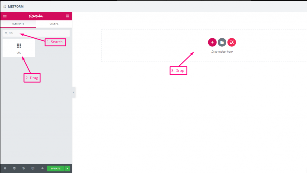
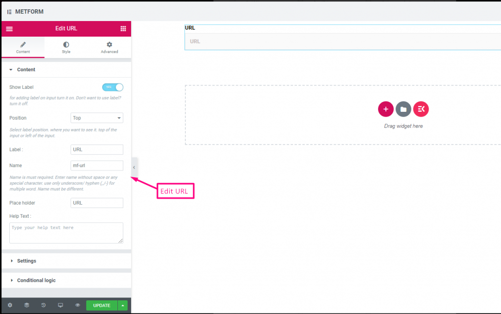
Check out our Live-Demo hier
| Optionen | Beschreibung |
|---|---|
| Etikett anzeigen | Beschriftung ein-/ausschalten. |
| Position | Standard: Spitze Wählen Sie die Etikettenposition aus. wo Sie es sehen möchten. oben oder links vom Eingang. |
| Etikett | Geben Sie den Beschriftungstext ein. |
| Name | Der Name ist ein Muss. Geben Sie einen Namen ohne Leerzeichen oder Sonderzeichen ein. Verwenden Sie für mehrere Wörter nur Unterstrich/Bindestrich (_/-). Der Name muss unterschiedlich sein. |
| Platzhalter | Verwenden Sie einen Platzhalter, um Dummy-Text anzuzeigen und dem Benutzer zu helfen, den richtigen Text einzugeben. |
| Hilfstext | Geben Sie den Text ein, der unter dem Widget angezeigt werden soll. |
| Erforderlich | Standard: NEIN Schalten Sie diese Option um, damit sie erforderlich ist. Benutzer können die Formulare nicht senden, ohne die erforderlichen Felder auszufüllen. |
| Bedingte Logik | Dieses Feld basierend auf bestimmten Kriterien ein-/ausblenden. |
Passwort #
Wenn Sie möchten, dass Ihr Benutzer ein sicheres Passwort angibt, verwenden Sie unser Passwort-Eingabefeld. Es stellt sicher, dass Benutzer ein geschütztes Passwort erhalten und es bei Bedarf ändern können.
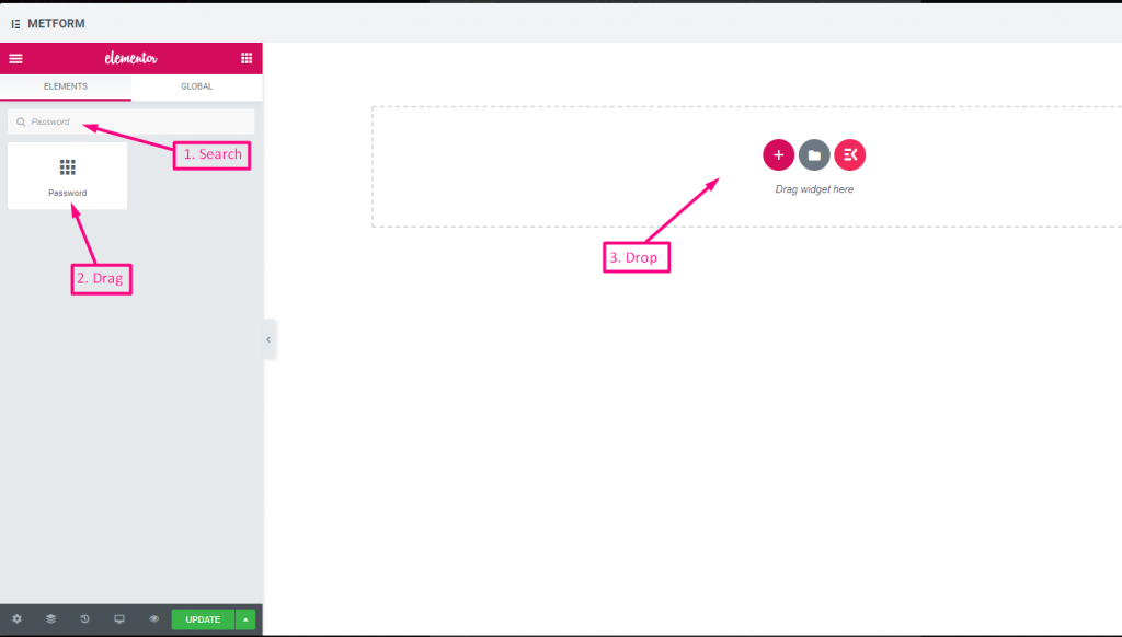
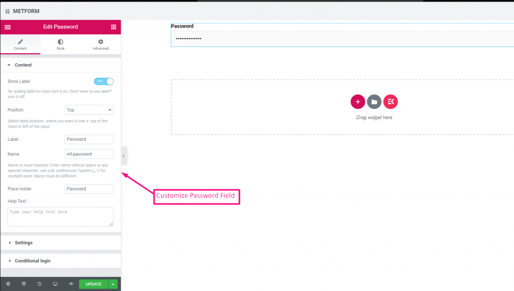
Check out our Live-Demo hier
| Optionen | Beschreibung |
|---|---|
| Etikett anzeigen | Beschriftung ein-/ausschalten. |
| Position | Standard: Spitze Wählen Sie die Etikettenposition aus. wo Sie es sehen möchten. oben oder links vom Eingang. |
| Etikett | Geben Sie den Beschriftungstext ein. |
| Name | Der Name ist ein Muss. Geben Sie einen Namen ohne Leerzeichen oder Sonderzeichen ein. Verwenden Sie für mehrere Wörter nur Unterstrich/Bindestrich (_/-). Der Name muss unterschiedlich sein. |
| Platzhalter | Verwenden Sie einen Platzhalter, um Dummy-Text anzuzeigen und dem Benutzer zu helfen, den richtigen Text einzugeben. |
| Hilfstext | Geben Sie den Text ein, der unter dem Widget angezeigt werden soll. |
| Erforderlich | Standard: NEIN Schalten Sie diese Option um, damit sie erforderlich ist. Benutzer können die Formulare nicht senden, ohne die erforderlichen Felder auszufüllen. |
| Validierungstyp | Wählen Sie den Validierungstyp aus der Dropdown-Liste aus. Nach Zeichenlänge Wählen Sie „Nach Zeichenlänge“, um die minimale und maximale Zeichenlänge des Textes festzulegen Geben Sie auch eine Warnmeldung aus, wenn die Eingabe ungültig ist Nach Wortlänge Wählen Sie „Nach Wortlänge“, um die minimale und maximale Wortlänge des Textes festzulegen. Geben Sie auch eine Warnmeldung an, wenn die Eingabe ungültig ist Nach Ausdrucksbasis Wählen Sie „Nach Ausdruck basierend“ aus, um die ausdrucksbasierte Validierung einzurichten Geben Sie auch eine Warnmeldung aus, wenn die Eingabe ungültig ist Standardmäßig auswählen? (Standard: NEINne) Machen Sie diese Option standardmäßig aktiviert |
| Bedingte Logik | Dieses Feld basierend auf bestimmten Kriterien ein-/ausblenden. |
Antwortnachricht #
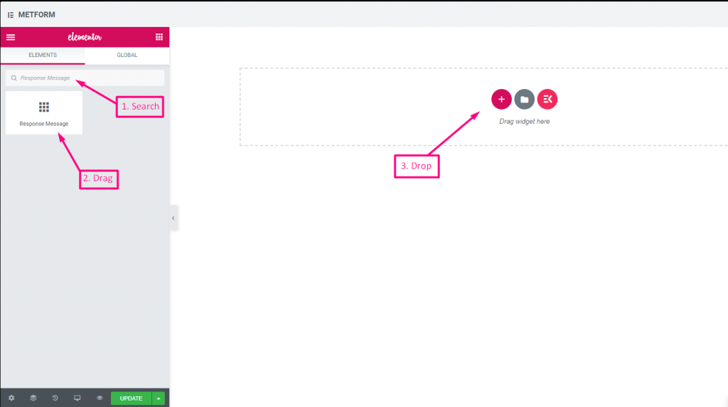
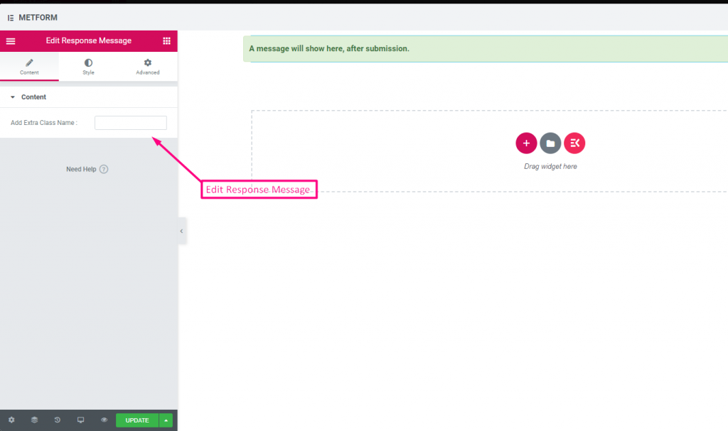
Check out our Live-Demo hier:
| Optionen | Beschreibung |
|---|---|
| Erfolgsmeldung hinzufügen | Geben Sie nach dem Absenden des Formulars eine Erfolgsmeldung ein |
Bewertung #
Sammeln Sie Bewertungen von Kunden mit Bewertung Suchen Sie im Eingabefeld nach dem Namen des Eingabefelds und ziehen Sie es per Drag & Drop an die gewünschte Stelle. Hilft dabei, Kundenbewertungen einzuholen und eine gute Bindung zwischen Eigentümer und Kunde aufzubauen.
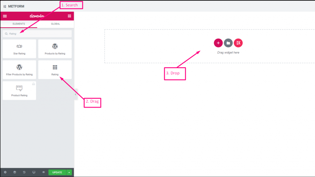
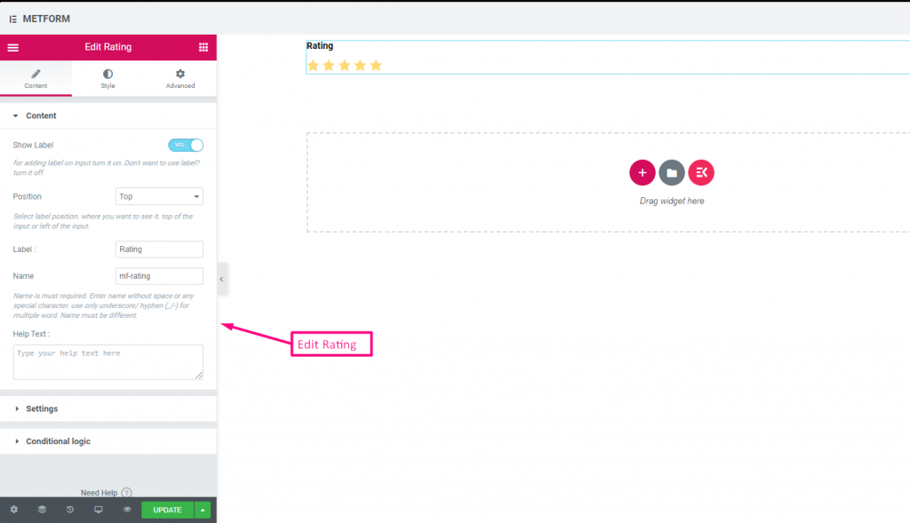
Check out our Live-Demo hier:
Beliebig viele Sterne #
Check out our Live-Demo hier
| Optionen | Beschreibung |
|---|---|
| Etikett anzeigen | Beschriftung ein-/ausschalten. |
| Position | Standard: Spitze Wählen Sie die Etikettenposition aus. wo Sie es sehen möchten. oben oder links vom Eingang. |
| Etikett | Geben Sie den Beschriftungstext ein. |
| Name | Der Name ist ein Muss. Geben Sie einen Namen ohne Leerzeichen oder Sonderzeichen ein. Verwenden Sie für mehrere Wörter nur Unterstrich/Bindestrich (_/-). Der Name muss unterschiedlich sein. |
| Hilfstext | Geben Sie den Text ein, der unter dem Widget angezeigt werden soll. |
| Erforderlich | Standard: NEIN Schalten Sie diese Option um, damit sie erforderlich ist. Benutzer können die Formulare nicht senden, ohne die erforderlichen Felder auszufüllen. |
| Anzahl der Bewertungssterne | Passen Sie Ihre Bewertungsnummer an. Standardmäßig: 3 |
| Bedingte Logik | Dieses Feld basierend auf bestimmten Kriterien ein-/ausblenden. |
Datei-Upload #
Metform macht das Hinzufügen sehr einfach Datei-Upload Fügen Sie das Widget zu Ihren Formularen hinzu, durchsuchen Sie das Eingabefeld nach seinem Namen und ziehen Sie es dann per Drag & Drop an die gewünschte Stelle.
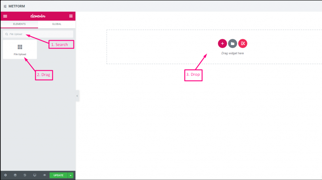
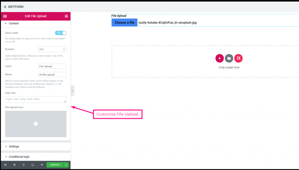
Check out our Live-Demo hier
| Optionen | Beschreibung |
|---|---|
| Etikett anzeigen | Beschriftung ein-/ausschalten. |
| Position | Standard: Spitze Wählen Sie die Etikettenposition aus. wo Sie es sehen möchten. oben oder links vom Eingang. |
| Etikett | Geben Sie den Beschriftungstext ein. |
| Name | Der Name ist ein Muss. Geben Sie einen Namen ohne Leerzeichen oder Sonderzeichen ein. Verwenden Sie für mehrere Wörter nur Unterstrich/Bindestrich (_/-). Der Name muss unterschiedlich sein. |
| Hilfstext | Geben Sie den Text ein, der unter dem Widget angezeigt werden soll. |
| Symbol zum Hochladen von Dateien | Sie können aus unserer Symbolbibliothek hochladen oder SVG hochladen |
| Erforderlich | Standard: NEIN Schalten Sie diese Option um, damit sie erforderlich ist. Benutzer können die Formulare nicht senden, ohne die erforderlichen Felder auszufüllen. |
| Dateigrößenbeschränkung | Standard: 128 KB Fügen Sie die benutzerdefinierte Dateigröße zum Hochladen von Dateien hinzu. |
| Datentypen | Standard: .jpg, .jpeg, .gif, .png Fügen Sie im Dropdown-Menü den Dateityp hinzu bzw. bearbeiten Sie ihn, der hochgeladen werden darf. |
| Bedingte Logik | Dieses Feld basierend auf bestimmten Kriterien ein-/ausblenden. |
Zusammenfassung #
Stellen Sie vor dem Abonnement eine Zusammenfassung bereit, um eine gute Kommunikation mit Ihrem Kunden aufzubauen.
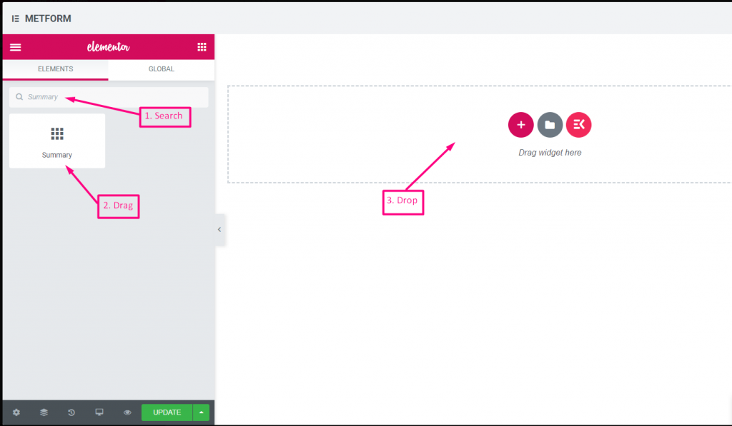
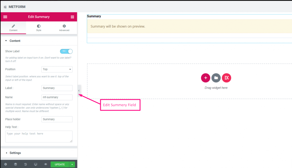
| Optionen | Beschreibung |
|---|---|
| Etikett anzeigen | Beschriftung ein-/ausschalten. |
| Position | Standard: Spitze Wählen Sie die Etikettenposition aus. wo Sie es sehen möchten. oben oder links vom Eingang. |
| Etikett | Geben Sie den Beschriftungstext ein. |
| Name | Der Name ist ein Muss. Geben Sie einen Namen ohne Leerzeichen oder Sonderzeichen ein. Verwenden Sie für mehrere Wörter nur Unterstrich/Bindestrich (_/-). Der Name muss unterschiedlich sein. |
| Hilfstext | Geben Sie den Text ein, der unter dem Widget angezeigt werden soll. |
| Erforderlich | Standard: NEIN Schalten Sie diese Option um, damit sie erforderlich ist. Benutzer können die Formulare nicht senden, ohne die erforderlichen Felder auszufüllen. |
Schaltfläche „Senden“. #
Senden Sie Ihr Formular mit diesem Feld und speichern Sie die Daten im Backend.
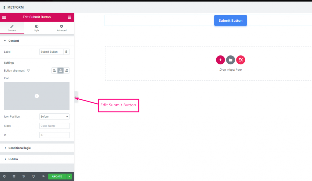
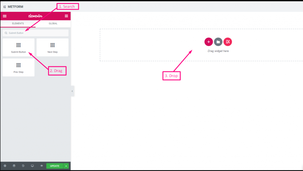
| Optionen | Beschreibung |
|---|---|
| Etikett | Geben Sie den Beschriftungstext ein. |
| Tastenausrichtung | Tastenposition auswählen. wo Sie es sehen möchten. Links, Mitte oder Rechts im Formular. |
| Symbol | Sie können aus unserer Symbolbibliothek hochladen oder SVG hochladen |
| Symbolposition | Wählen Sie die Symbolposition Vorher oder Nachher |
| Klasse | Geben Sie den Klassennamen an |
| AUSWEIS | Geben Sie die Klassen-ID an |
| Bedingte Logik | Dieses Feld basierend auf bestimmten Kriterien ein-/ausblenden. |
| Versteckt | Die ausgeblendete Eingabeliste wird im Backend angezeigt. Eingabewert, Eingabename, Eingabeklasse |



