To make modern forms, Metform offers a range of advanced input fields. Let’s check out the list and how they work.
You can also check the documentation of Free Input Fields.
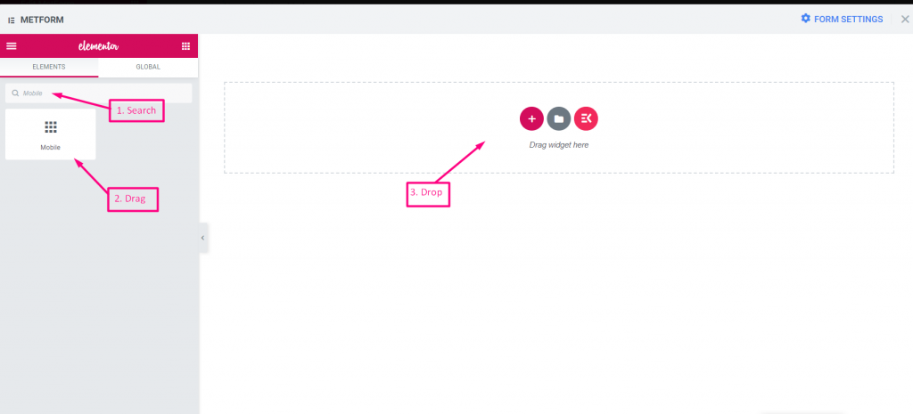
Mobile #
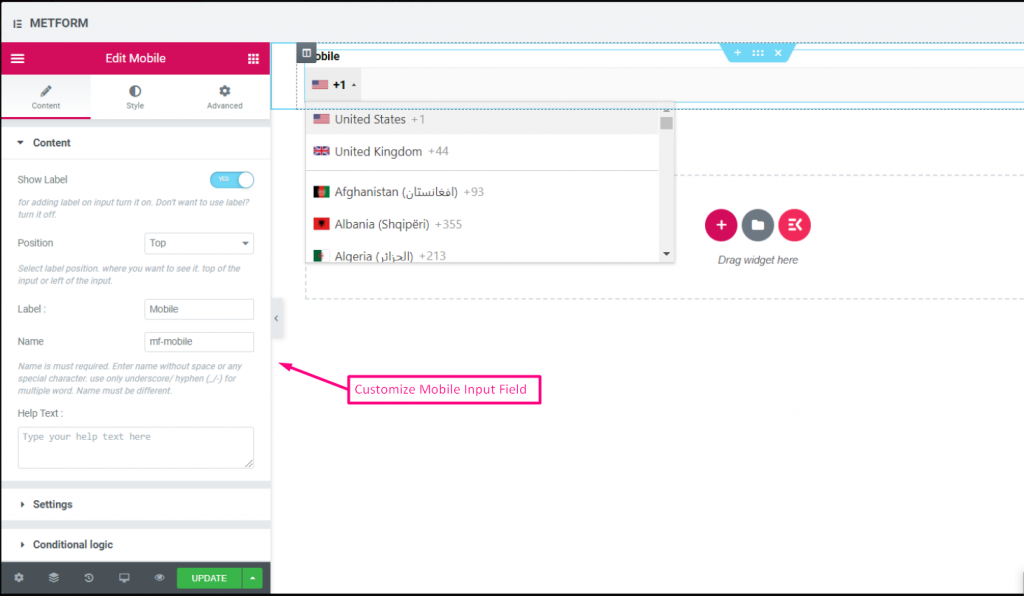
Mobile Field permit user to select prefix country code Phone number from the drop down. You can also select your position,enable or disable the label and change the Mobile number if wanted.


Watch out our Live Demo Here
| Options | Description |
|---|---|
| Show Label | Turn on/off Label. |
| Position | Default: Top Select the label position. where you want to see it. top or left of the input. |
| Label | Type the label text. |
| Name | Name is must required. Enter a name without space or any special character. use only underscore/hyphen (_/-) for multiple words. The name must be different. |
| Help Text | Type the text to show below the widget. |
| Required | Default: No Toggle this option to make it required. Users can’t submit the forms without filling the required fields. |
| Conditional Logic | Show/Hide this field based on certain criteria. |
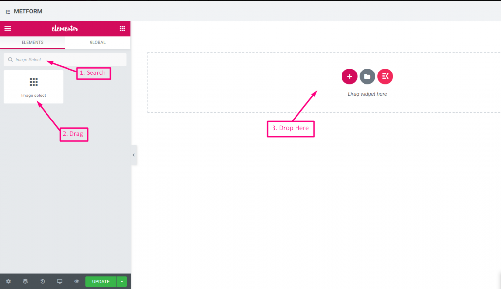
Image Select #
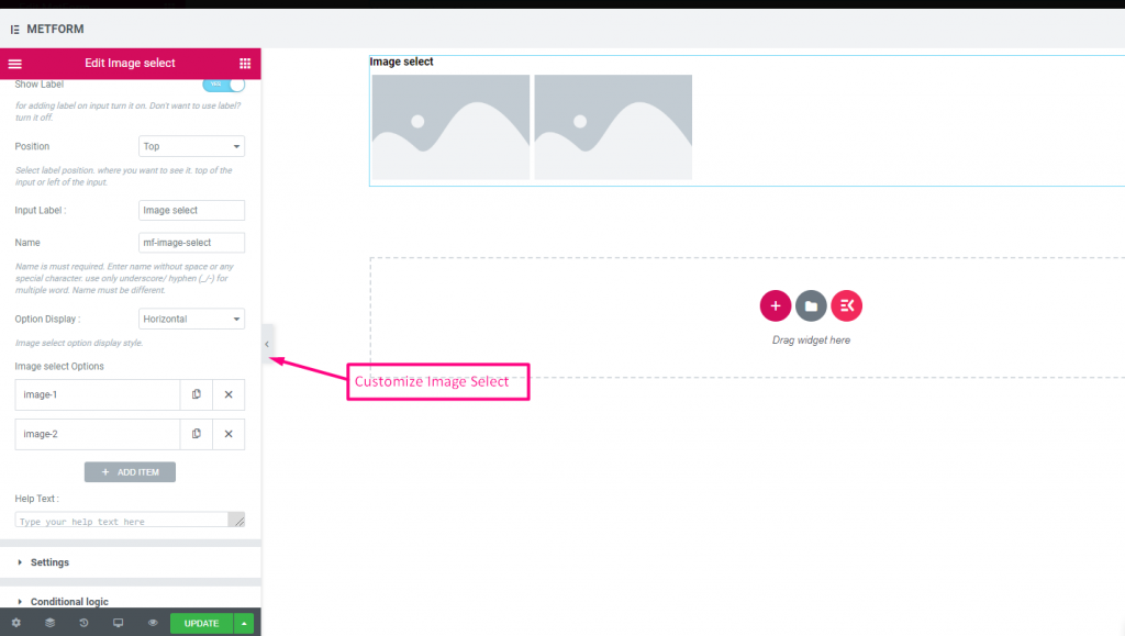
This Input field allowing your form users to make their choices using a series of images. All you need to do is upload your images to a web location, so that your form users can click on the images in response get the desired image.


Watch out our Live Demo Here
With Image Hover #
Watch out our Live Demo Here
Vertical #
Watch out our Live Demo Here
| Options | Description |
|---|---|
| Show Label | Turn on/off Label. |
| Position | Default: Top Select the label position. where you want to see it. top or left of the input. |
| Label | Type the label text. |
| Name | Name is must required. Enter a name without space or any special character. use only underscore/hyphen (_/-) for multiple words. The name must be different. |
| Help Text | Type the text to show below the widget. |
| Option Display | Display Image Select options Horizontally or Vertically |
| Image select Options | Add/edit/remove options. You can add,edit or remove image Title Provide Image title or image details Thumbnail Choose image from media library or upload files Preview (Optional) You can preview image if you want. You can also choose image from library or upload image and this is optional. Option Value Select option value that will be stored/mailed to desired person. Status (Default: Active) Want to make a option? which user can see the option but can’t select it. make it disable. |
| Required | Default: No Toggle this option to make it required. Users can’t submit the forms without filling the required fields. |
| Conditional Logic | Show/Hide this field based on certain criteria. |
Toggle Select #
Toggle Select, you can activate one section from multiple sections at a time.If you select one section active, then another section will automatically get deactivated.
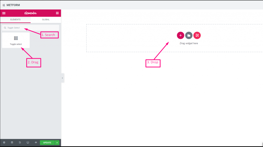

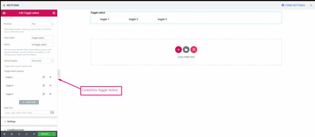

Watch out our Live Demo Here
Vertical #
Watch out our Live Demo Here:
| Options | Description |
|---|---|
| Show Label | Turn on/off Label. |
| Position | Default: Top Select the label position. where you want to see it. top or left of the input. |
| Label | Type the label text. |
| Name | Name is must required. Enter a name without space or any special character. use only underscore/hyphen (_/-) for multiple words. The name must be different. |
| Help Text | Type the text to show below the widget. |
| Option Display | Display Toggle select options Horizontally or Vertically |
| Toggle select Options | Add/edit/remove options. You can add,edit or remove image Toggle for select Provide toggle button name. Option Value Select option value that will be stored/mailed to desired person. Status (Default: Active) Want to make a option? which user can see the option but can’t select it. make it disable. |
| Required | Default: No Toggle this option to make it required. Users can’t submit the forms without filling the required fields. |
| Conditional Logic | Show/Hide this field based on certain criteria. |
Simple Repeater #
Use a group of fields several times, you don’t need to create the field again and again. Just click the “Add” button and the new field will appear automatically.
Watch out the video guide
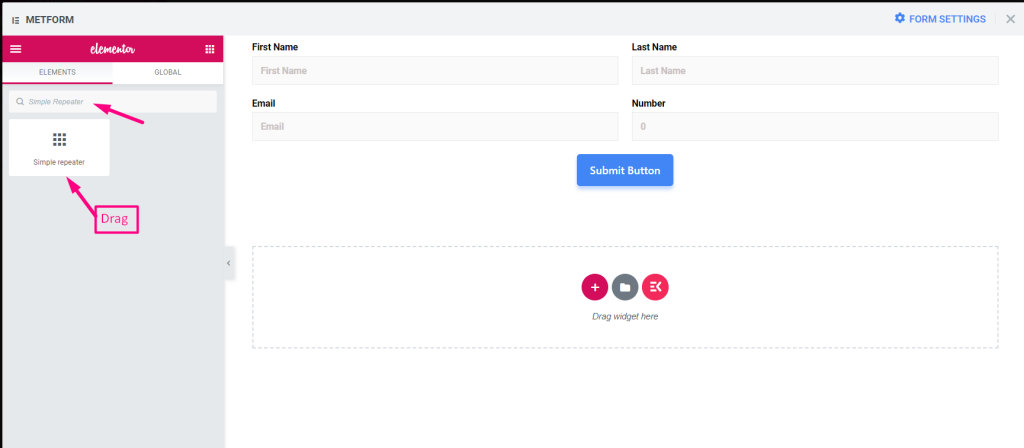
1. Search the Simple Repeater and drag it to the widget placement area.

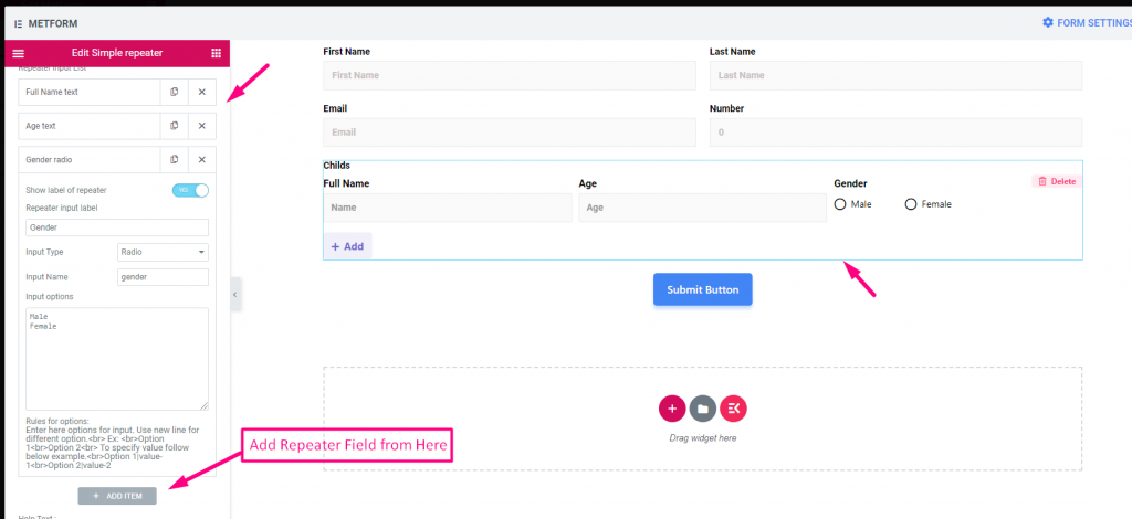
2. Add Simple Repeater Field from “Add Item”

3. Click on “Update”
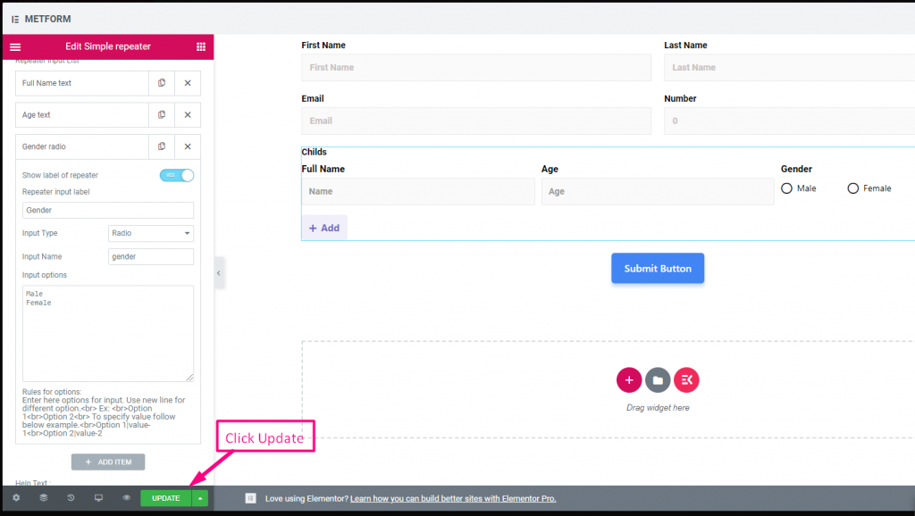

4. Go to Site=> Just Click on Add to add repeated field
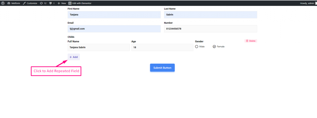

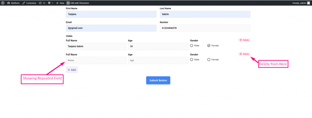
5. Repeated Field Showing Accordingly=> Click Delete to Delete the repeated section

You can watch Out Our Live Demo Here
With Button Icons #
You can watch Out Our Live Demo Here
With Multiple Fields #
You can watch Out Our Live Demo Here
Supports Text, Email, Number, URL, Switch, Range, Checkbox, Radio and Select #
You can watch Out Our Live Demo Here
| Options | Description |
|---|---|
| Show Label | Turn on/off Label. |
| Position | Default: Top Select the label position. where you want to see it. top or left of the input. |
| Layout | Select layout, block or inline to show the input field one after another or in a row |
| Label | Type the label text. |
| Name | Name is must required. Enter a name without space or any special character. use only underscore/hyphen (_/-) for multiple words. The name must be different. |
| Use icon inside button ? | Required or not toggle Add and Remove Button text: Modify add and remove button text Add button Icon: You can upload or delete Add button Icon from our Icon Library or upload SVG Remove button Icon: You can upload or delete Remove button Icon from our Icon Library or upload SVG |
| Repeater Input List | Show label of repeater: Enable or Disable Input Type : Select any type of input from the drop-down Input Name : Provide Input Name from the drop-down Input Placeholder: Use place holder to show some dummy text and help user to put correct text |
| Help Text | Type the text to show below the widget. |
| Required | Default: No Toggle this option to make it required. Users can’t submit the forms without filling the required fields. |
| Min Length | Set the Minimum range value. By default: 8 |
| Max Length | Set the Maximum range value. By default: 30 |
| Conditional Logic | Show/Hide this field based on certain criteria. |
Google Map Location #
Do you want to show your location to the user so they can easily get you? Google Map Location helps you to pinpoint the exact location which displays on your form with customizable content and styles.
Important Note:
** You must have to configure map API from MetForm -> Settings. Configure form here
** You also have to enable the Maps JavaScript API & Places API to connect your Google Map Location
** You must enable Billing on the Google Cloud Project at-> https://console.cloud.google.com/project/_/billing/enable
You can watch out our screenshot below
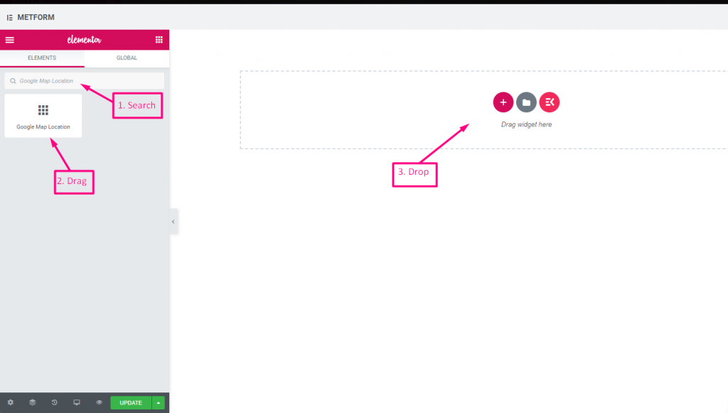

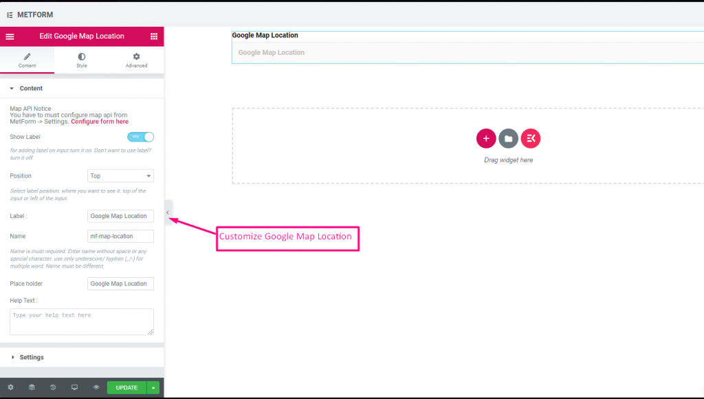

Watch out our Live Demo Here
| Options | Description |
|---|---|
| Show Label | Turn on/off Label. |
| Position | Default: Top Select the label position. where you want to see it. top or left of the input. |
| Label | Type the label text. |
| Name | Name is must required. Enter a name without space or any special character. use only underscore/hyphen (_/-) for multiple words. The name must be different. |
| Place Holder | Use place holder to show some dummy text and help user to put correct text. |
| Help Text | Type the text to show below the widget. |
| Required | Default: No Toggle this option to make it required. Users can’t submit the forms without filling the required fields. |
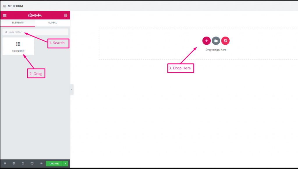
Color Picker #
Easily select any color from drop down color palette to design your form in an eye-catching way. You just have to click on the choosable color and the color will appear accordingly.
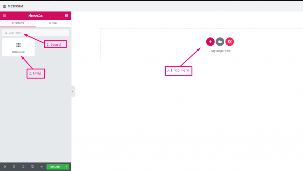

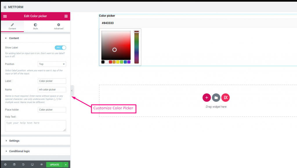

Watch out our Live Demo Here
| Options | Description |
|---|---|
| Show Label | Turn on/off Label. |
| Position | Default: Top Select the label position. where you want to see it. top or left of the input. |
| Label | Type the label text. |
| Name | Name is must required. Enter a name without space or any special character. use only underscore/hyphen (_/-) for multiple words. The name must be different. |
| Place Holder | Use place holder to show some dummy text and help user to put correct text. |
| Help Text | Type the text to show below the widget. |
| Required | Default: No Toggle this option to make it required. Users can’t submit the forms without filling the required fields. |
| Conditional Logic | Show/Hide this field based on certain criteria. |
Calculation #
Perform calculations among Form Fields to display automatic calculated value with Metform. You can perform any kind of calculation using form field.
Watch out the video guide
Or, follow the step by step process below:
Step-> 1 #
Form Creation
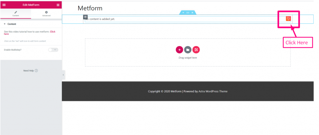
1: Search the Metform widget and drag it to the widget placement area.
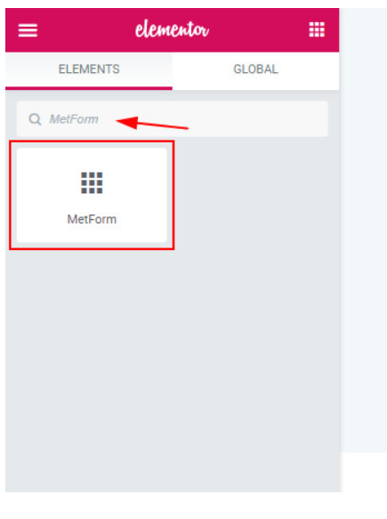

2: Click on the red colored Edit button

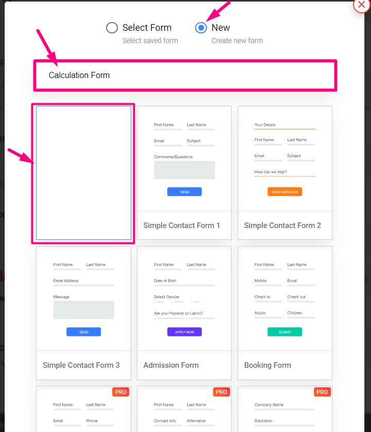
3: Click on New=> Select the Blank form=> Provide Name

Step-> 2 #
Calculation Between Packages & Quantity
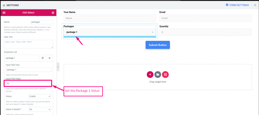
1: Set the Package 1 Value: 50

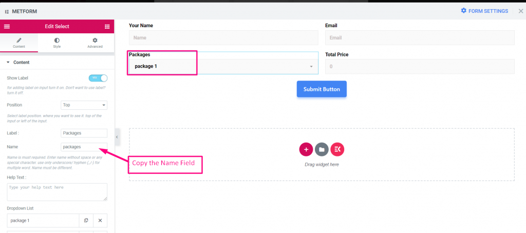
2: Copy the Packages field Name

3: Copy the Quantity field Name
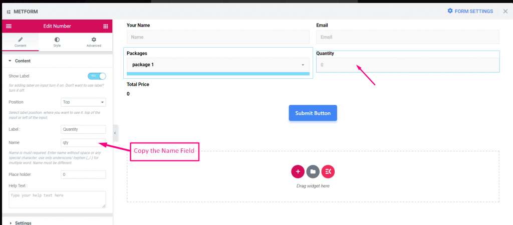

Step-> 3 #
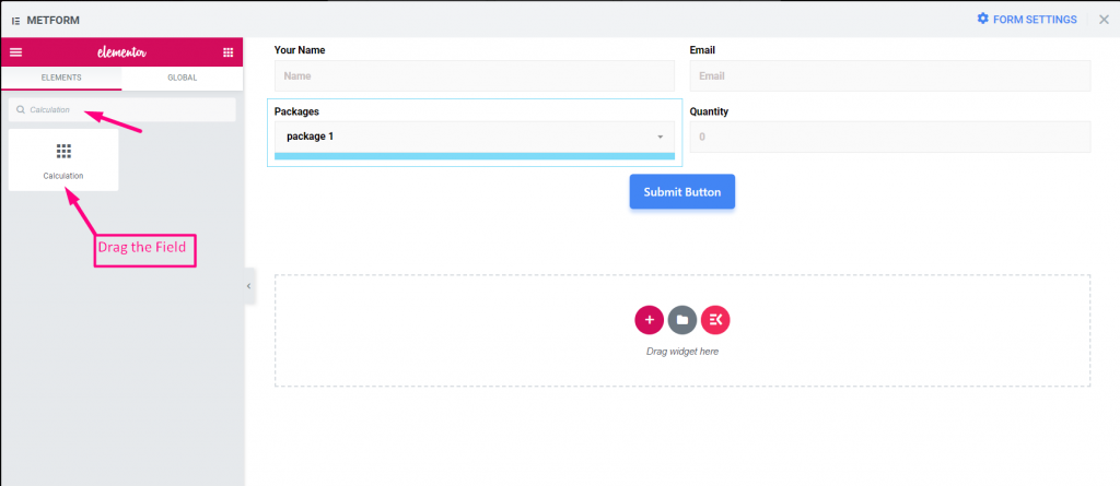
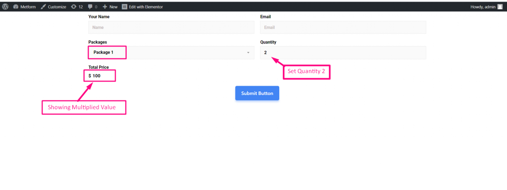
Perform Multiplication: Multiplication is when you take one number and add it together a number of times.
1: Search for Calculation Field=> Drag and Drop Under the Package Field

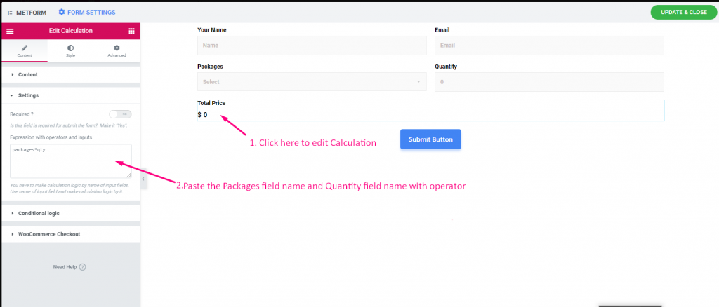
2: Edit Calculation=> Settings=> Provide the Expression
- Paste the Packages Field Name and Quantity field name with operators: packages * qty

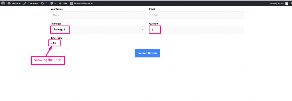
Site View
1: Select Package 1=> Set the Quantity Value: 1
- Showing the price: $50

2: Now set the Quantity Value: 2
- Showing the price: $100

Step-> 4 #
Perform Addition : Addition is a process or action of adding something to something else.
- 1. Edit Calculation=> Settings=> Paste the Packages Field Name and Quantity field name
- 2: Provide Addition expression. For Ex : packages + qty


Site View
1: Select Package 1=> Set the Quantity Value: 3
- Showing the addition price: $53


Step-> 5 #
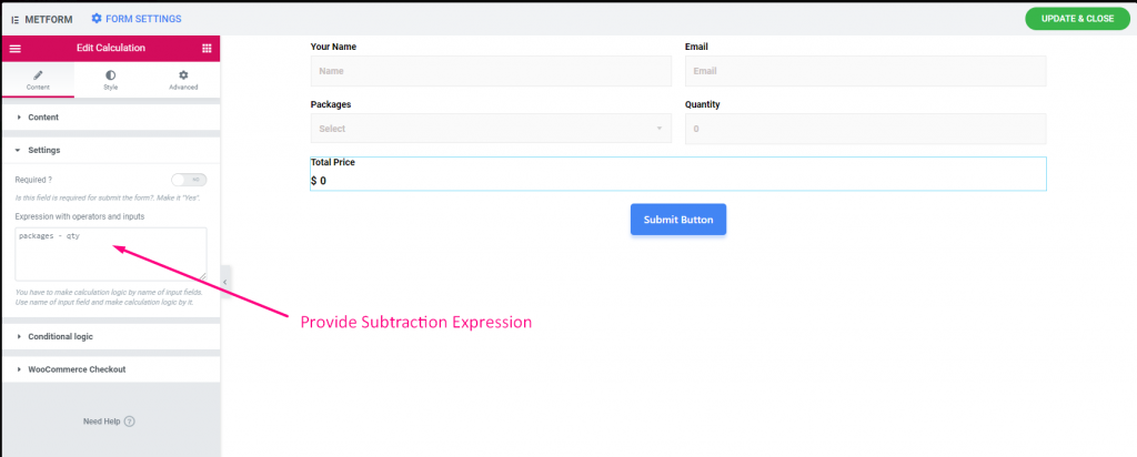
Perform Subtraction: It is the operation of removing objects from a collection signified by the minus sign.
- 1. Edit Calculation=> Settings=> Paste the Packages Field Name and Quantity field name
- 2: Provide Subtraction expression. For Ex : packages – qty

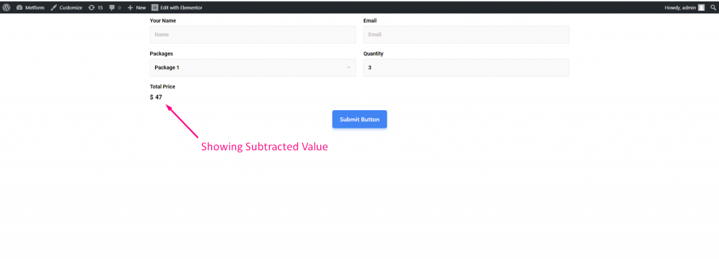
Site View
1: Select Package 1=> Set the Quantity Value: 3
- Showing the Subtracted price: $47

Step-> 6 #
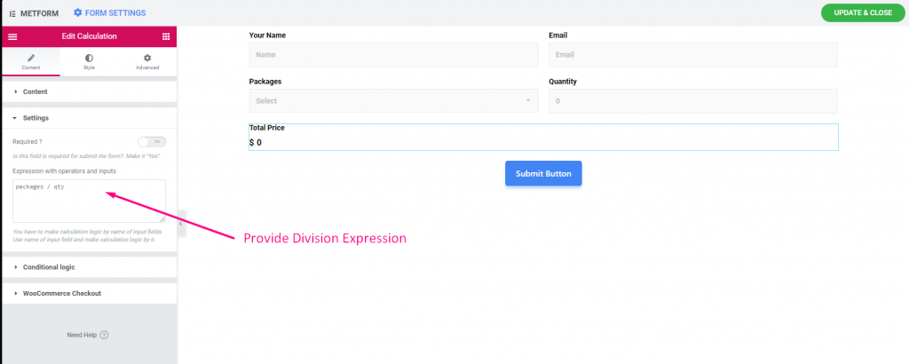
Perform Division: A number that divides another number either completely or with a remainder
- 1. Edit Calculation=> Settings=> Paste the Packages Field Name and Quantity field name
- 2: Provide Division expression. For Ex : packages / qty

Site View
1: Select Package 1=> Set the Quantity Value: 3
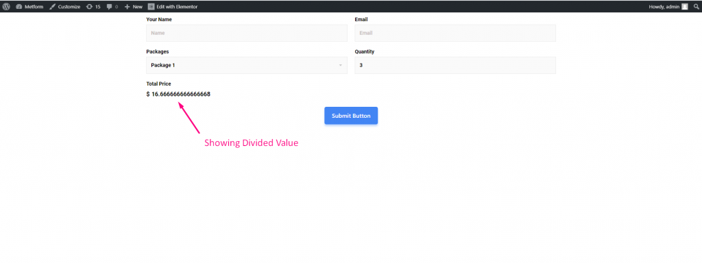
- Showing the Divided price: $16.666666666666668

Step-> 7 #
Show Float Value: A float is a number, that has a decimal place.
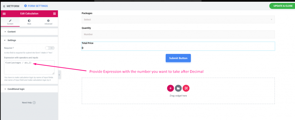
- 1: Edit Calculation=> Settings=>Paste the Packages Field Name and Quantity field name
- 2: Set the number after comma that you want to take after Decimal point.
- 3: Provide the Floating Point Expression. For Ex : float(packages / qty,2). Here you will get 2 decimal places as you have set value 2.

Site View
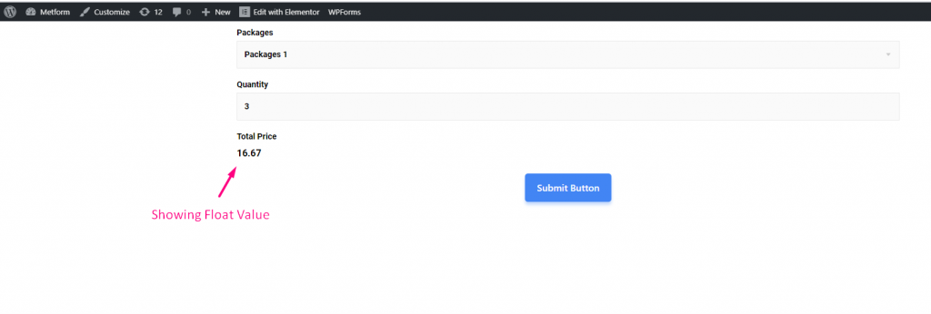
1: Select Package 1=> Set the Quantity Value: 3
- Showing the floating price with 2 number of input after Decimal point : 16.67

Step-> 8 #
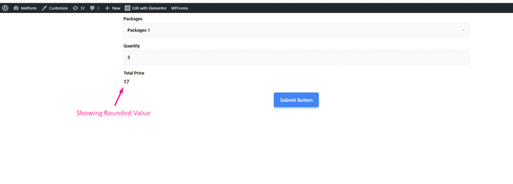
Show Round Value : A number that keeping its value close to what it was.
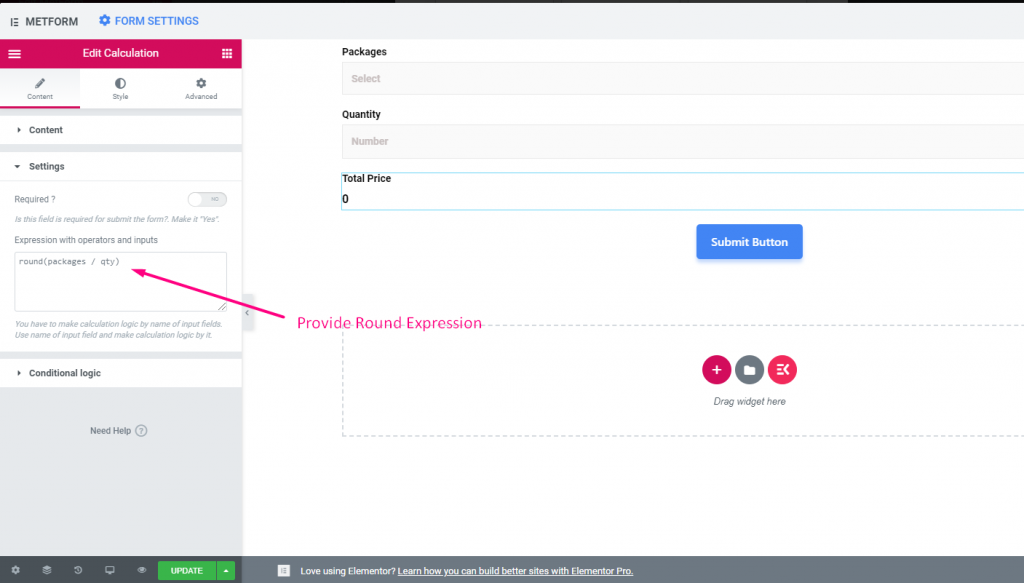
- 1: Edit Calculation=> Settings=> Paste the Packages Field Name and Quantity field name
- 2: Provide round expression. For Ex : round(packages / qty)

Site View
1: Select Package 1=> Set the Quantity Value: 3
- Showing the rounded price: 17

Step-> 9 #
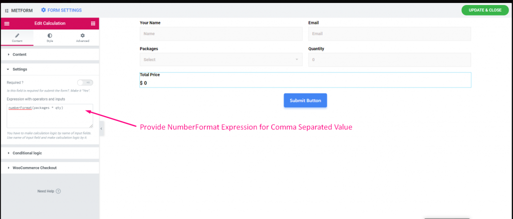
Show NumberFormat Value: NumberFormat allows you to show comma separated value.
- 1: Edit Calculation=> Settings=> Paste the Packages Field Name and Quantity field name
- 2: Provide NumberFormat Expression. For Ex : numberFormat(packages * qty)

Site View
1: Select Package 1=> Now set the Quantity Value : 100000
- Showing the comma separated values : $5,000,000


Step-> 10 #
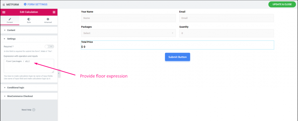
Show Floor Value: Floor values allows you to return the closest integer less than or equal to a given number.
- 1: Edit Calculation=> Settings=> Paste the Packages Field Name and Quantity field name
- 2: Provide Floor Expression. For Ex : floor(packages / qty)

Site View
1: Select Package 1=> Set the Quantity Value: 3
- Showing the floor price: 16


Step-> 11 #
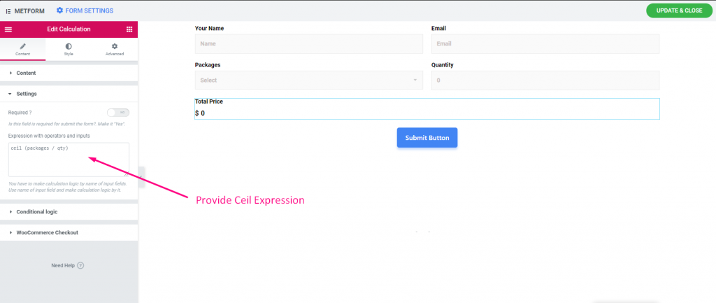
Show Ceil Value: Ceil values allows you to return the closest integer grater than or equal to a given number.
- 1: Edit Calculation=> Settings=> Paste the Packages Field Name and Quantity field name
- 2: Provide Ceil Expression. For Ex : ceil (packages / qty)

Site View
1: Select Package 1=> Set the Quantity Value: 3
- Showing the Ceil price: 17
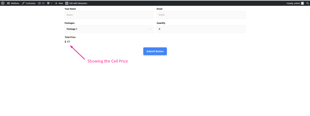

- Here is All the Operation with Expression Example
| Operation | Expression |
|---|---|
| Multiplication | packages * qty |
| Addition | packages + qty |
| Subtraction | packages – qty |
| Division | packages / qty |
| Float | float(packages / qty,2) |
| Round | round(packages / qty) |
| NumberFormat | numberFormat(packages * qty) |
| Floor | floor(packages / qty) |
| Ceil | ceil (packages / qty) |
- Options Description
| Options | Description |
|---|---|
| Show Label | Turn on/off Label. |
| Position | Default: Top Select the label position. where you want to see it. top or left of the input. |
| Label | Type the label text. |
| Name | Name is must required. Enter a name without space or any special character. use only underscore/hyphen (_/-) for multiple words. The name must be different. |
| Help Text | Type the text to show below the widget. |
| Prefix | You can also provide operator in the expression before the operands. Example : *+AB-CD (Infix : (A+B) * (C-D) ) |
| Required | Default: No Toggle this option to make it required. Users can’t submit the forms without filling the required fields. |
| Expression with operators and inputs | You have to make calculation logic by name of input fields. Use name of input field and make calculation logic by it. For example mf-number_2 * mf-number_3. It will show calculated value 6 in the calculation field. |
| Conditional Logic | Show/Hide this field based on certain criteria. |
Payment Method #
Choose your payment gateway like PayPal with Payment Method input field and make users payment policy easy.
Follow the step by step process below on how you can make your Payment:
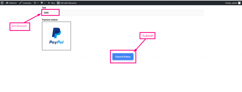
Search for Payment method=> Drop the Input Field
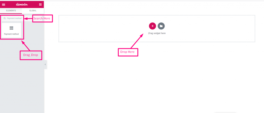

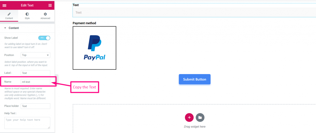
- Drop the Text Field and Submit Button
- Now Copy the Selected Name: Mf-Text

- Select Payment Method
- Paste the Text Name to the Integrated Field
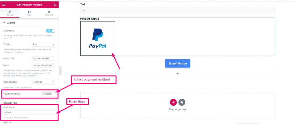

- Set Amount
- Submit

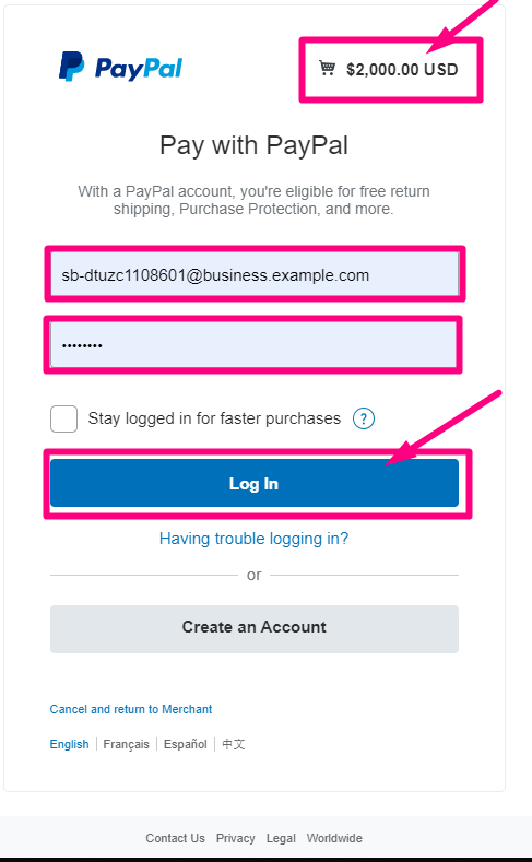
Log In with your PayPal account

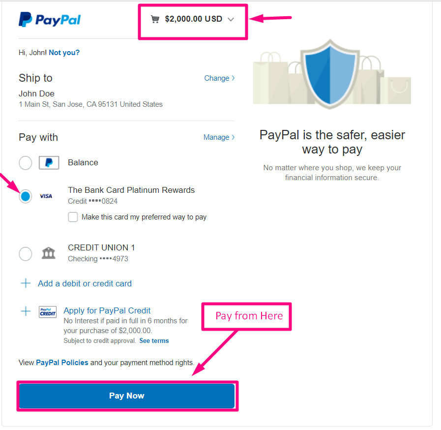
- Select your Payment Type
- Pay Now

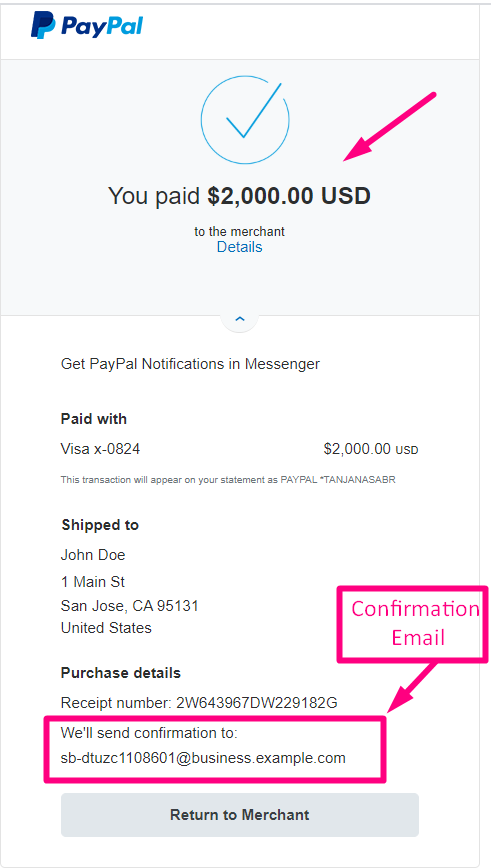
Confirmation send to your Email

You can watch out Live Demo Here
Vertical #
You can watch out Live Demo Here
| Options | Description |
|---|---|
| Show Label | Turn on/off Label. |
| Position | Default: Top Select the label position. where you want to see it. top or left of the input. |
| Input Label | Type the label text. |
| Name | Name is must required. Enter a name without space or any special character. use only underscore/hyphen (_/-) for multiple words. The name must be different. |
| Option Display | Display Toggle select options Horizontally or Vertically |
| Payment Method | Select Payment method from drop-down. For example: PayPal or Stripe |
| Help Text | Type the text to show below the widget. |
| Integrate Filed | Field Name: Set amount field for payment. |
| Required | Default: No Toggle this option to make it required. Users can’t submit the forms without filling the required fields. |
| Conditional Logic | Show/Hide this field based on certain criteria. |
Signature #
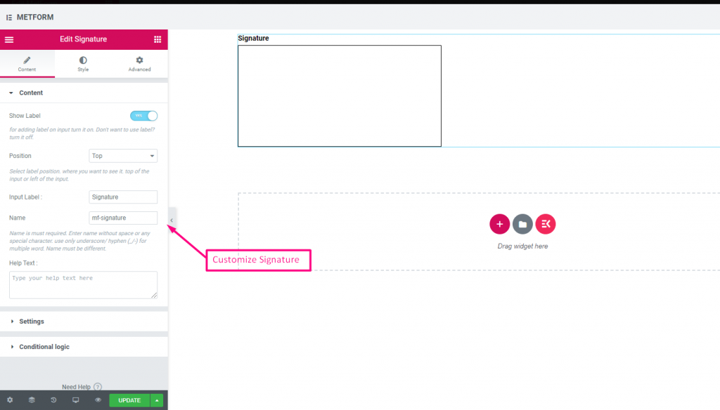
Would you like to get users realistic signature to your form before they hit upon the submit button? Signature Input Field will help you to collect realistic signatures for agreement, low-risk transactions and for other contracts.
You can watch out our screenshot below


Watch out our Live Demo Here
| Options | Description |
|---|---|
| Show Label | Turn on/off Label. |
| Position | Default: Top Select the label position. where you want to see it. top or left of the input. |
| Input Label | Type the label text. |
| Name | Name is must required. Enter a name without space or any special character. use only underscore/hyphen (_/-) for multiple words. The name must be different. |
| Help Text | Type the text to show below the widget. |
| Required | Default: No Toggle this option to make it required. Users can’t submit the forms without filling the required fields. |
| Conditional Logic | Show/Hide this field based on certain criteria. |
Like Dislike #
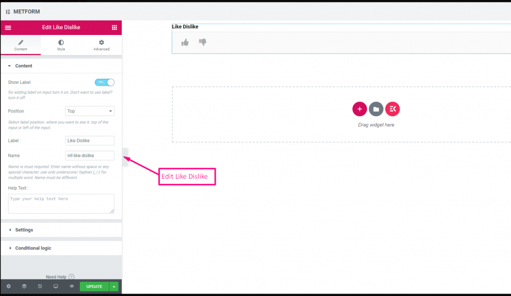
Get feedback from the user for better improvement. Allow users to provide their reaction using like and dislike input fields.
You can watch out our screenshot below



| Options | Description |
|---|---|
| Show Label | Turn on/off Label. |
| Position | Default: Top Select the label position. where you want to see it. top or left of the input. |
| Input Label | Type the label text. |
| Name | Name is must required. Enter a name without space or any special character. use only underscore/hyphen (_/-) for multiple words. The name must be different. |
| Help Text | Type the text to show below the widget. |
| Required | Default: No Toggle this option to make it required. Users can’t submit the forms without filling the required fields. |
| Conditional Logic | Show/Hide this field based on certain criteria. |
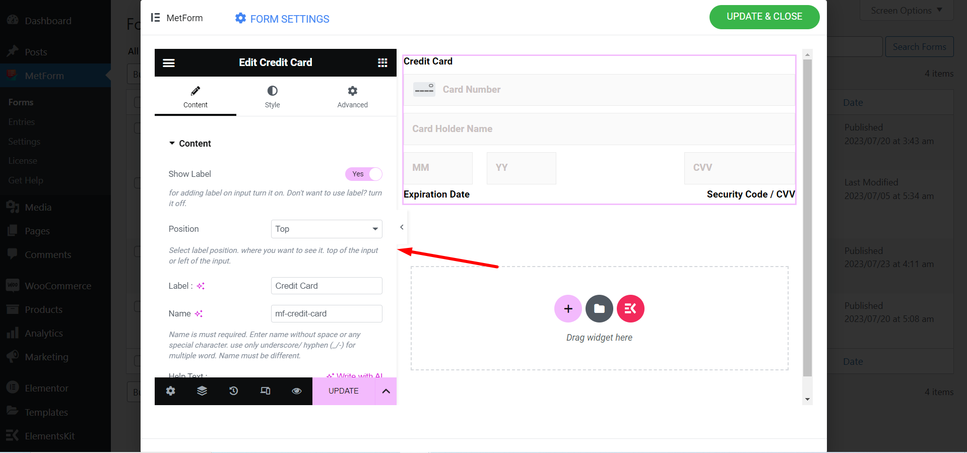
Credit Card #
You have to search the widget in the Elementor search bar and drag and drop it.
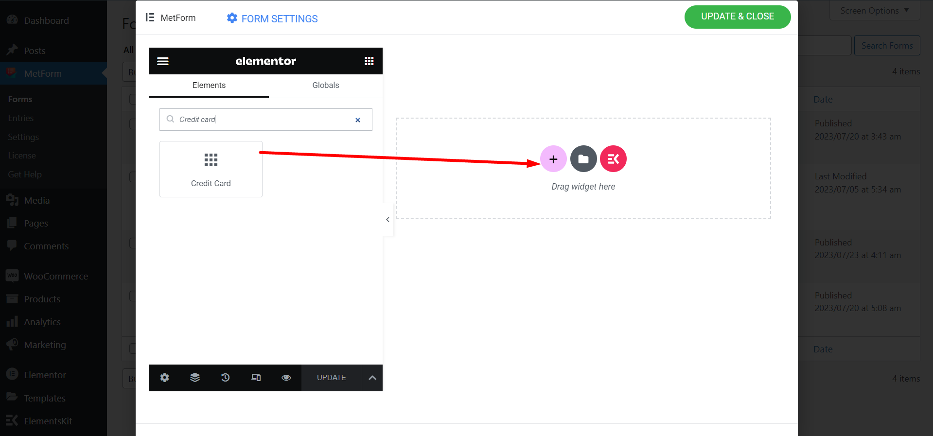

Find the customization fields and set them based on your preferences.

Try Metform now 👇


