The Flip Box block allows you to create interactive flip cards on your website. With the GutenKit Flip Box block you can do it easily and within less time.
Check the documentation and learn to use the GutenKit Flip Box block.
How can you use Flip Box block? #
Access to your WordPress dashboard –
- Find Pages/Posts > Add New Page/Post or start editing an existing page with the block editor.
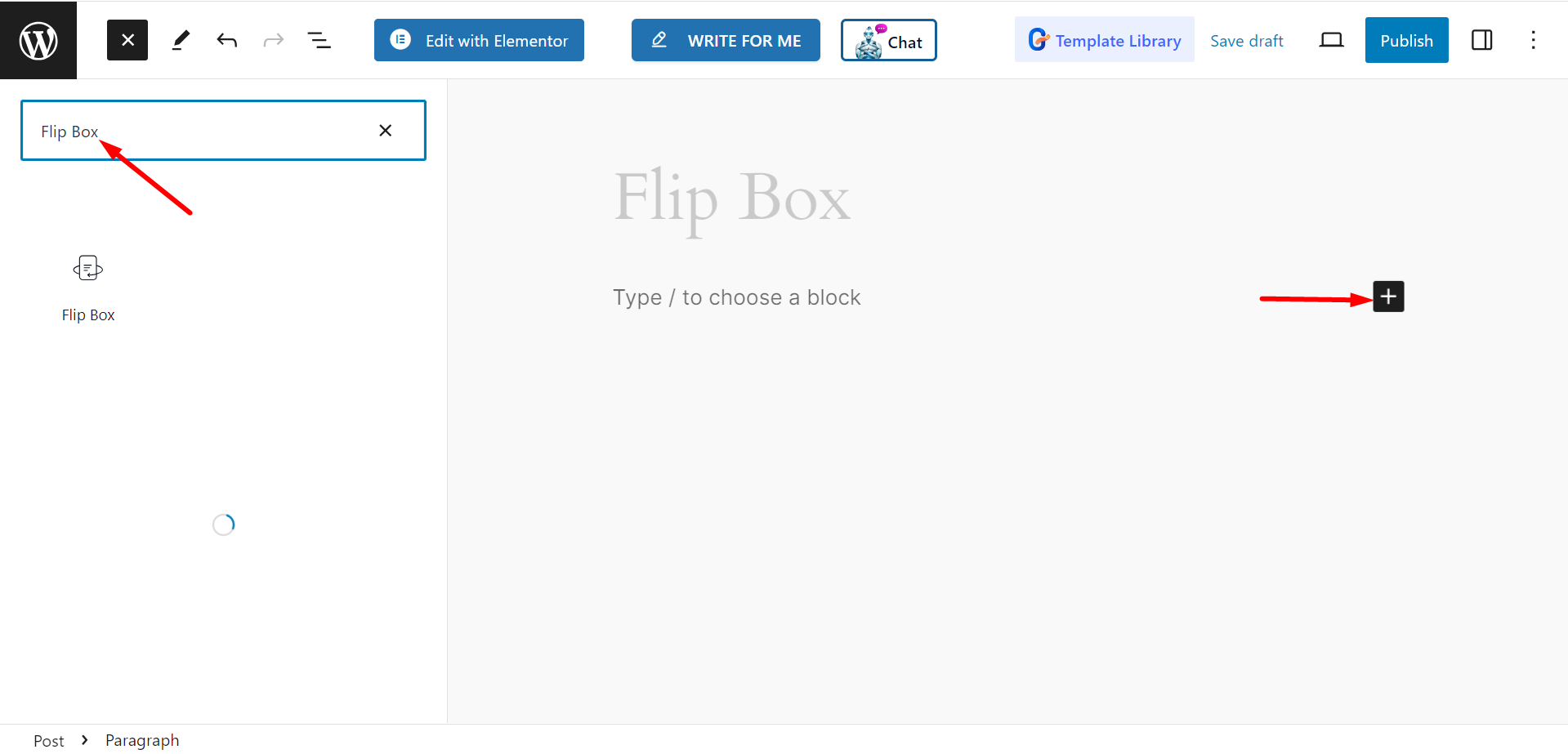
- Look for the “+” icon at the right side or top of the editor screen. Click it.
- A block menu will appear, search for “Flip Box”.
- When you see it, click it or drag & drop it on the block editor screen.

Editing Content Part #
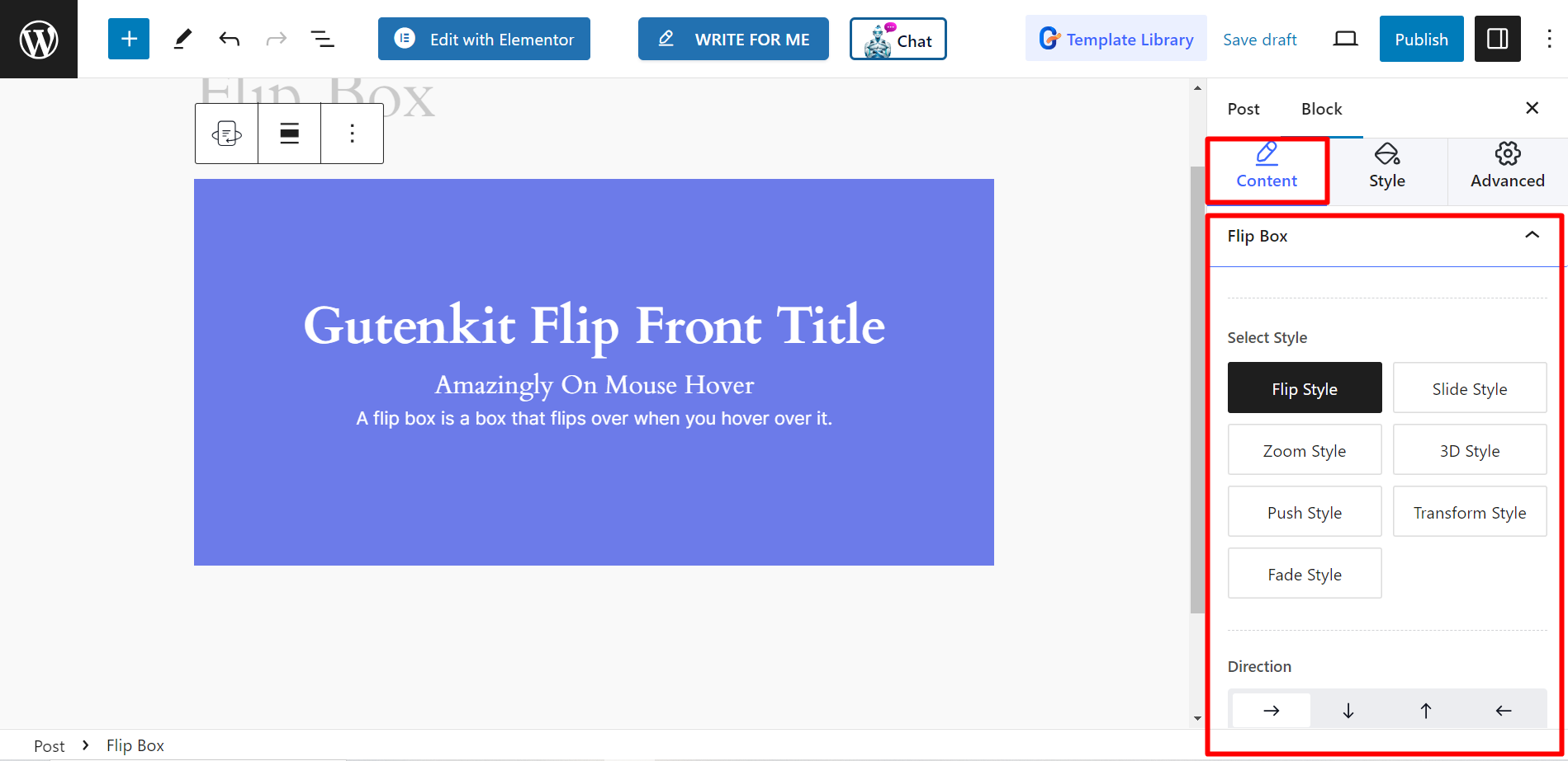
Under the Flip Box section, you will see the following options –
- Select Style: From here, you can pick any style for the flip box. The choices are – Flip Style, Side Style, Zoom Style, 3D Style, Push Style, Transform Style, and Fade Style.
- Direction: The direction of the box can be up, down, right, or left.

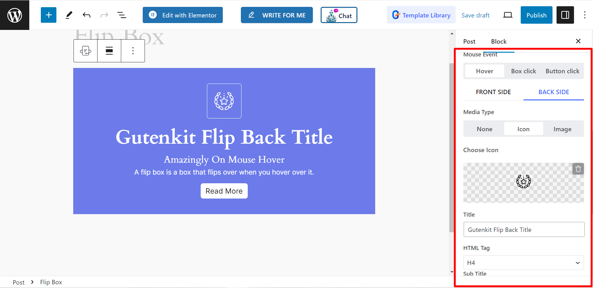
- Mouse Event: You can set mouse for Hover, Box click, or Button click.
- Media Type: If you want to show any media, then you can choose any Image or Icon. Otherwise, you can keep it blank by choosing None.
- Choose Icon/ Image: Depending on the media type you will get option to choose your desired media.
- Title: Write the Title of your flip box here.
- HTML Tag: The HTML tag options are H1, H2, Span, P, etc.
- Sub Title: In this field you have to write the sub title.
- Description: You can write the description content here.
- Duration: Set the flip duration(second) using the bar. The longer time will slower down the flip time and smaller time will increase the speed.

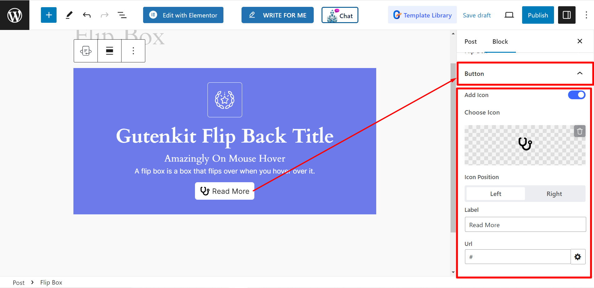
Button: If you set a button for the flip box, you can set an icon for it, adjust the icon position, write a label and insert URL link.

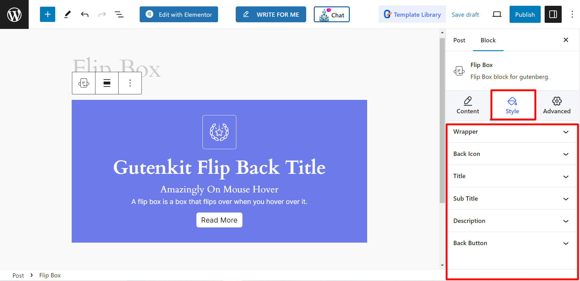
Style #
- Wrapper: Using the option, you can customize flip box height, alignment, background, box shadow, border, border radius, padding, etc.
- Front Icon: It will allow you to adjust icon size, color, background, border, and on.
- Back Icon: For back icon also, you can adjust the icon size, color, background, border, etc.
- Title: Here, you can style the title content by changing typography, color, and margin.
- Sub Title: Similar to title, you can also style the sub title content by changing typography, color, and margin.
- Description: To present the description content differently, you can change the typography, color, and margin from here.
- Back Button: To design the button, you can adjust the icon size, spacing, color, hover color, background, border, etc.

Now, try yourself and allow the website visitors to enjoy interactive content and discover more information.


