

 English
  German
  Spanish
  Italian
  French
  Danish
  Portuguese
  Swedish
  Polish
  Korean
  Japanese
 GutenKit Nav Menu block is a robust solution to easily add and customize menu and submenu items on the Gutenberg editor. Also, it has features to design a mobile menu for your mobile devices.
Go through this doc to learn how to use GutenKit Nav Menu block from your block editor.
How to Use GutenKit Nav Menu Block? #
Get started with installing the GutenKit plugin from your WordPress dashboard. Then, drag & drop the Nav Menu to the block editor screen.
You can follow the video tutorial:
Or, follow the below steps and create your desired Nav Menu with GutenKit.
Step 1: Add GutenKit Nav Menu Block #
The first step of our journey involves installing the GutenKit plugin. Then, do the following things:
- Take a new page or go to the existing one.
- Enable the block editor and find the “+” icon at the top of the editor screen.
- Clicking it will open the block library.
- Search for the GutenKit Nav Menu.
- Once it appears, click or drag & drop the block in the editor screen.
Step 2: Add Navigation Menu Item #
After you add the Nav menu block on the editor screen, it’ll automatically show up with all the published pages as navigation menu items. And, there is a “+” icon to add a new menu item.
Now, if we focus on this block’s settings, it has a few more functions than other GutenKit blocks. Click on a navigation item on the editor screen and its settings control will appear in the right sidebar.
Here you will see:
Content: #
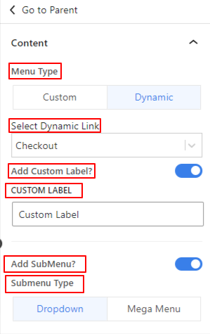
- Menu Type: Choose a menu type between custom and dynamic.
- Select Dynamic Link: Choose the page you want to link with this menu item from the dropdown.
- Add Custom Label: Toggle this button if you want to add a different label for the menu item. Enabling it will reveal a Custom Label field to enter your custom text.
- Add SubMenu: Click this toggle button to enable sub-menu. A “+” icon will appear below the menu item on the editor screen. You will also see a new option named “Submenu Indicator” in the setting area.
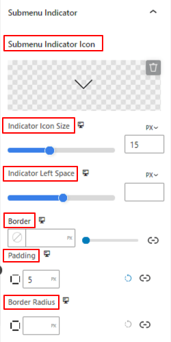
Submenu Indicator: #
- Submenu indicator Icon: Choose an icon from the library or upload your SVG file as the submenu indicator icon.
- Indicator Icon Size: Use the slider to define the size of the submenu indicator icon.
- Indicator Left Space: Adjust the gap between the menu name and icon using this slider.
- Border: Give a border around the icon and select its color, style, and thickness.
- Padding: Add inner space within the icon border.
- Border Radius: Set the roundness of the icon border.
Add Sub-menu Item: #
Similar to the menu item, clicking the sub-menu item will open the settings in the right sidebar.
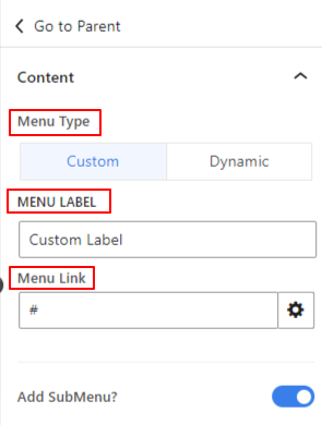
- Menu Type: Choose a menu type between custom and dynamic.
- Menu Label: Enter the name of your menu.
- Menu Link: Insert the link you want to drive visitors
- Add Sub Menu: Enable this option to add another menu item under the submenu. This action will also open the “Submenu Indicator” icon like before.
Next, we’ll move on to the parent settings of a menu or submenu item. To do this, click the “Go to Parent” option from the menu or submenu settings. But, menus and submenus have different functions.
While clicking on the “Go to Parent” option from a Submenu item, you will see different customizing options for a submenu in the Settings & Style tabs.
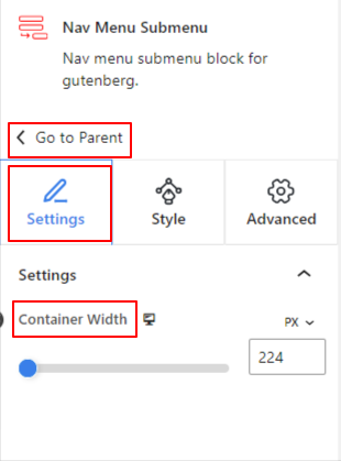
Under the Settings option:
- Container Width: Use this slider to increase the submenu width to the right side.
Now, go to the Style tab:
Under the Submenu Wrapper:
- Alignment: Define the submenu text position within the submenu wrapper.
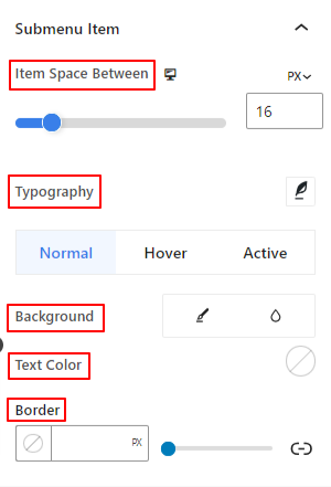
Under the Submenu Item:
- Item Space Between: Use this slider to define the gap between submenu items.
- Typography: Use these settings to change the font family, weight, transform, style, decoration, spacing, etc.
You can apply the following settings individually to the Normal, Hover, and Active modes for the submenu.
- Background: Give a between a solid color or gradient background type.
- Text Color: Select a text color using the color picker.
- Border: Choose a color for the border.
- Padding: Enter a value manually to increase spaces inside the border.
- Border Radius: Use this option to define the roundness of the border.
Selecting the “Go to Parent” option from a Menu item will take you to the global block settings (Content/ Style/ Advanced).
Step 3: Configure Menu Settings #
In this part, we’ll start to function the parent menu settings.
Menu: #
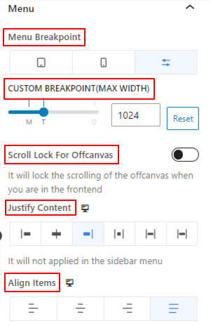
- Menu Breakpoint: Control the responsiveness of the menu by selecting the device type or adding a custom value. This means devices smaller than your given value or selecting type will show a hamburger or mobile menu.
- Scroll Lock For Offcanvas: Disable the scrolling when the menu is open.
- Justify Content: Set the menu item text position based on six different options.
- Align Items: Align the entire nav menu to different positions.
Step 4: Configure Mobile Menu Settings #
Now, we’ll configure the menu for mobile devices.
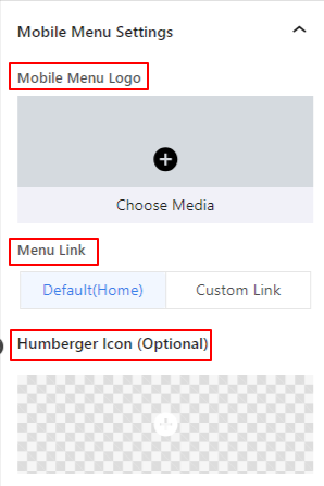
- Mobile Menu Logo: You can add a different logo for the mobile device using this option.
- Menu Link: Include the default home page link or a custom link with the mobile menu logo.
- Hamburger Icon: Choose an icon from the icon library or upload your SVG file to add an icon for the hamburger menu.
Step 5: Style Navigation Menu #
Now, come to the Style Tab. From here, you’ll get all the settings for customizing the navigation menu.
Menu Wrapper: #
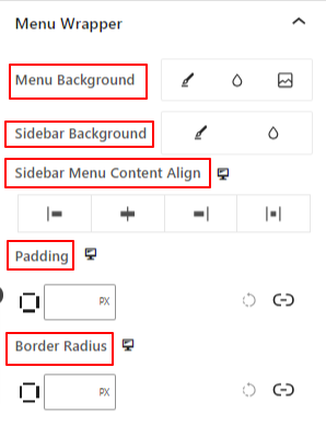
- Menu Background: Add a solid color, gradient, or an image for the menu background.
- Sidebar Background: Choose a background type between solid and gradient.
- Sidebar Menu Content Align: Select the position of the sidebar menu text.
- Padding: Adjust the inner space around the navigational menu.
- Border Radius: Define the roundness of the border.
Menu Items: #
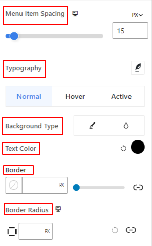
- Menu Item Spacing: Adjust the horizontal gap between menu items.
- Typography: Get all the typography customizations for the menu items.
- Background Type: Use a background type between color and gradient.
- Text Color: Apply a color to the menu text.
- Border: Give a border to the menu item and define its style, color, and thickness.
- Border Radius: Adjust the roundness of the border.
- Padding: Increase the inner spaces within the menu border area.
- Margin: Add a value manually to add spaces between the menu items.
Step 6: Style the Mobile Menu #
The following settings are applied to customize the menu look and feel for mobile devices.
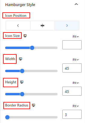
- Icon Position: Select the position for the hamburger icon in the page. (Let/ Right/ Icon)
- Icon Size: Use this slider to determine the hamburger icon size.
- Icon Width: Use this slider to adjust the width of the hamburger icon.
- Height: Define the height of the hamburger icon.
- Border Radius: Determine the roundness of the hamburger icon border.
The remaining options of this settings area are applicable to the both Normal and Hover options.
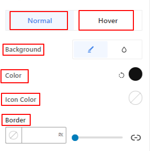
- Background: Add a background color to the hamburger menu.
- Icon Color: Give a color to the hamburger icon.
- Border: Get border settings for the hamburger icon.
Close Button,
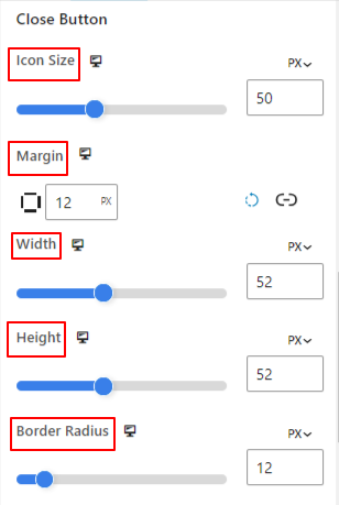
- Icon Size: Use this slider to determine the icon size.
- Margin: Include a value manually to add spaces around the close button.
- Width: Use this option to increase the width of the close button.
- Height: Determine the height of the close button.
- Border Radius: Use the slider to adjust the roundness of the border.

The following three options can applied to both Normal and Hover options.
- Background: Add a background type between solid color and gradient.
- Icon Color: Give color to the close button icon.
- Border: Use this settings area to add and style border around the close button.
This was our tutorial for easily adding a nav menu on the block editor of your WordPress website.


