 English
  German
  Spanish
  Italian
  French
  Danish
  Portuguese
  Swedish
  Polish
  Korean
  Japanese
 The GutenKit Icon Box block comes with many useful options like icons, badges, text, buttons, Watermark icons, etc to effectively display your products, services, customer reviews, and other information.
This multipurpose block has extensive choices for the icon, text, badge, and a range of customization options to style a unique information box in an easily digestible way.
In this guide, we will learn about using the GutenKit Icon Box block in the Gutenberg builder.
How to Use GutenKit Icon Box Block #
Navigate to: WordPress Dashboard > Choose or create a New page or post > Click the “+” icon at the top of the block editor screen > Search GutenKit Icon Box. Now, simply drag and drop it into the editor.
Once the GutenKit Icon Box block is on your editor screen, click on it. The right sidebar will open all the features of this block. These features are structured under three different categories: Content, Style, and Advanced.
Step 1: Add an Icon #
We will start with the Content tab. First, add an icon.
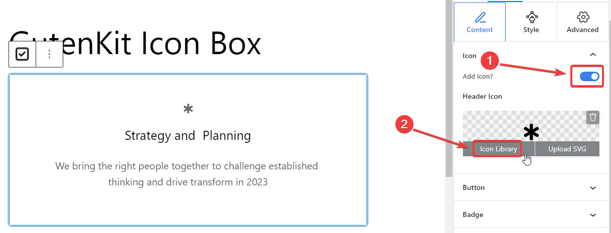
Come under the Content tab,
Icon: #
- Add Icon: Toggle this button to add an icon.
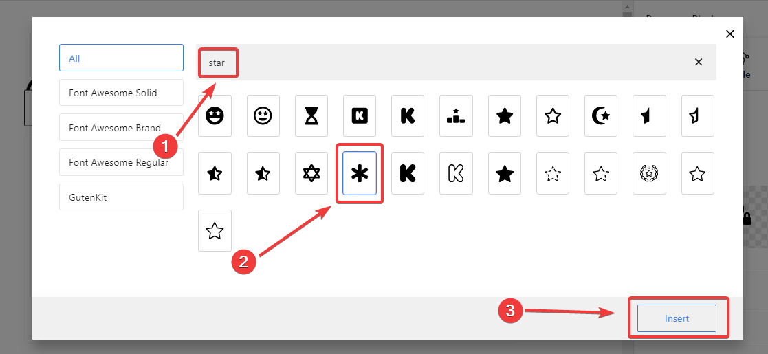
- Header Icon: Click the “Icon Library” button and a popup will reveal extensive icon options. Like the image below.
From here, choose your icon. You can also use the search bar to quickly find your icon. Once you see your preferred icon, click on it. Then hit the “Insert” button at the bottom of the popup.
And the icon is successfully added.
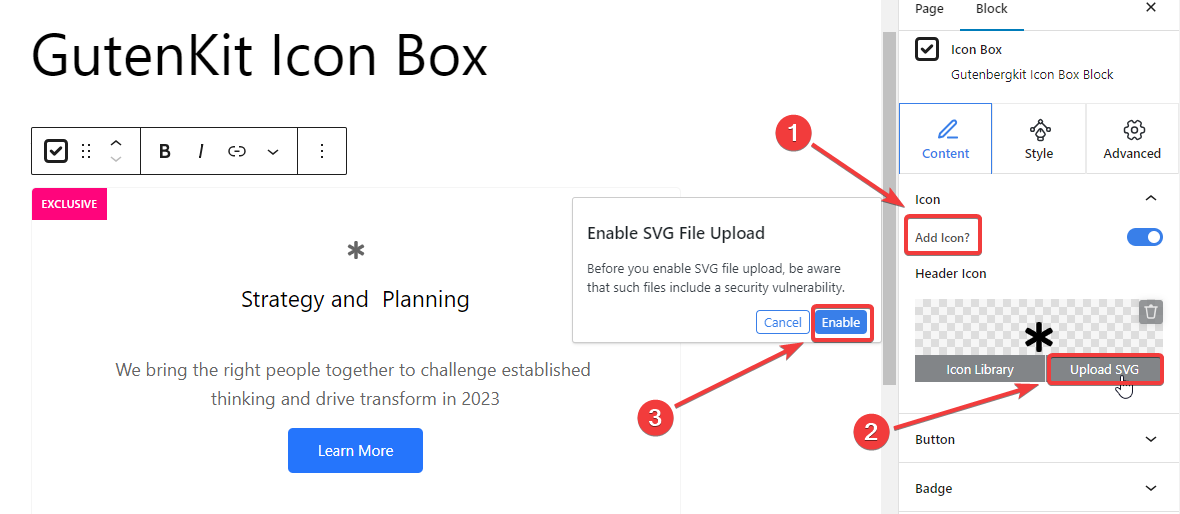
Now if you want to add an SVG icon, enable the Add Icon option like the previous step and it will reveal the Header Icon. Here,
- Click the “Upload SVG” option.
- It will require you to enable SVG file upload support. Simply, select the “Enable” option.
- It will direct you to the upload media file option. Just upload your SVG icon like you add any media files from your device.
Step 2: Add Button & Badge #
Continuing on, we will give our attention to adding a button and badge on the icon box.
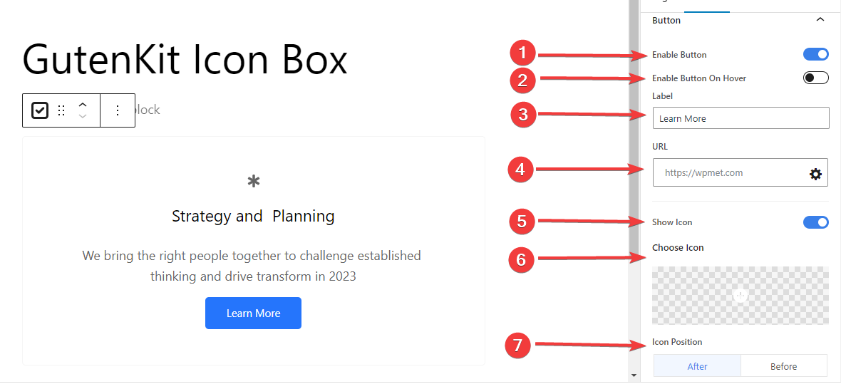
Button: #
- Enable Button: Click this toggle button to add a button in the icon box.
- Enable Button On Hover: Activate this button to show the button on hover.
- Label: Edit your button label.
- URL: Enter the link you want to drive the visitor.
- Show Icon: Enable this button to show an icon with the button.
- Choose Icon: Select your preferred icon.
- Icon Position: Place the icon before or after the button.
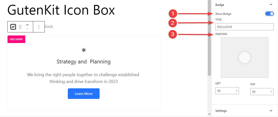
Badge: #
- Show Badge: Click this button to show the badge in the icon box.
- Title: Type the title you want.
- Position: Locate badge position from six different locations. Or, you can enter top & left values for a custom location.
Step 5: Additional Configuration #
Learning the next step will help you add a watermark icon and adjust its placement.
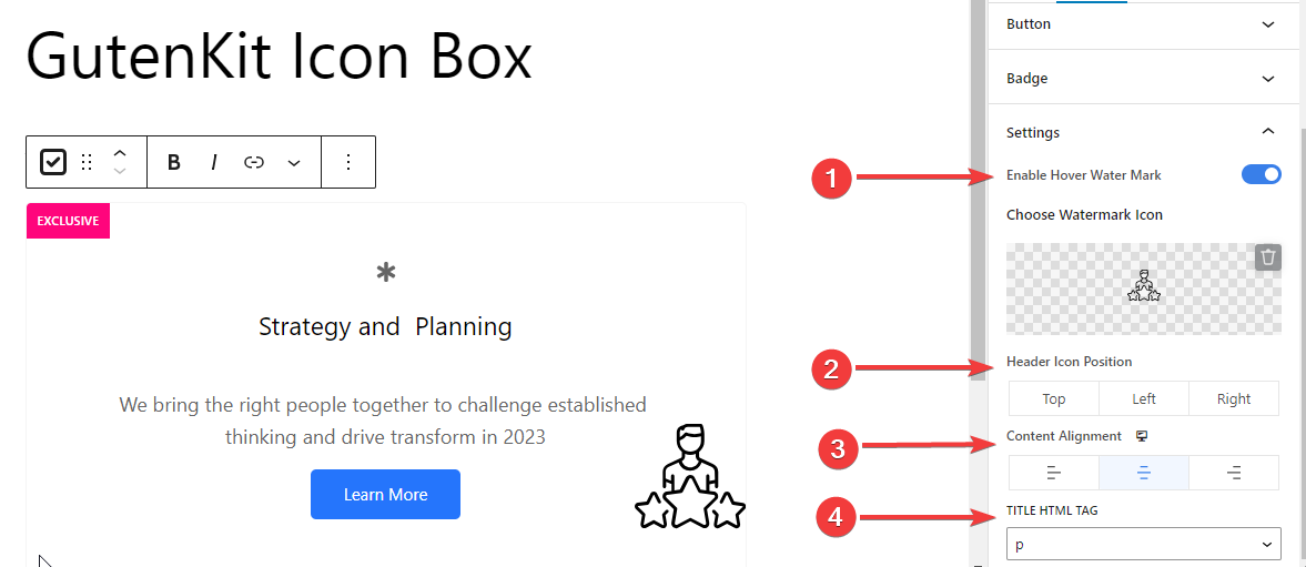
Settings: #
- Enable Hover Watermark: Toggle this button to show an icon on hover.
- Choose Watermark Icon: Select an icon from the library or upload your own one.
- Header Icon Position: Set the header icon position (Top /Left /Right)
- Content Alignment: Select the alignment of your icon box content.
- Title HTML Tag: Select the title HTML tag to H1- H6, Div, Span or P.
Step 5: Icon Box Customization #
Now we will proceed with the customization features for the icon box. Go to the Style tab.
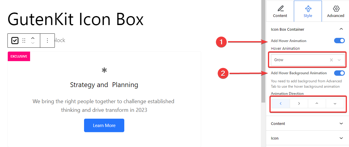
Icon Box Container,
- Add Hover Animation: Toggle this button to add a hover animation effect for the container box.
- Hover Animation: Select an animation type from four different effects.
- Add Hover Background Animation: Activate this button to add a background hover animation effect. (To set a background type, you need to use the Advanced tab.)
- Animation Direction: Set your animation direction. (Left, Right, Top, Bottom)
Step 6: Typography & Watermark Icon Customization #
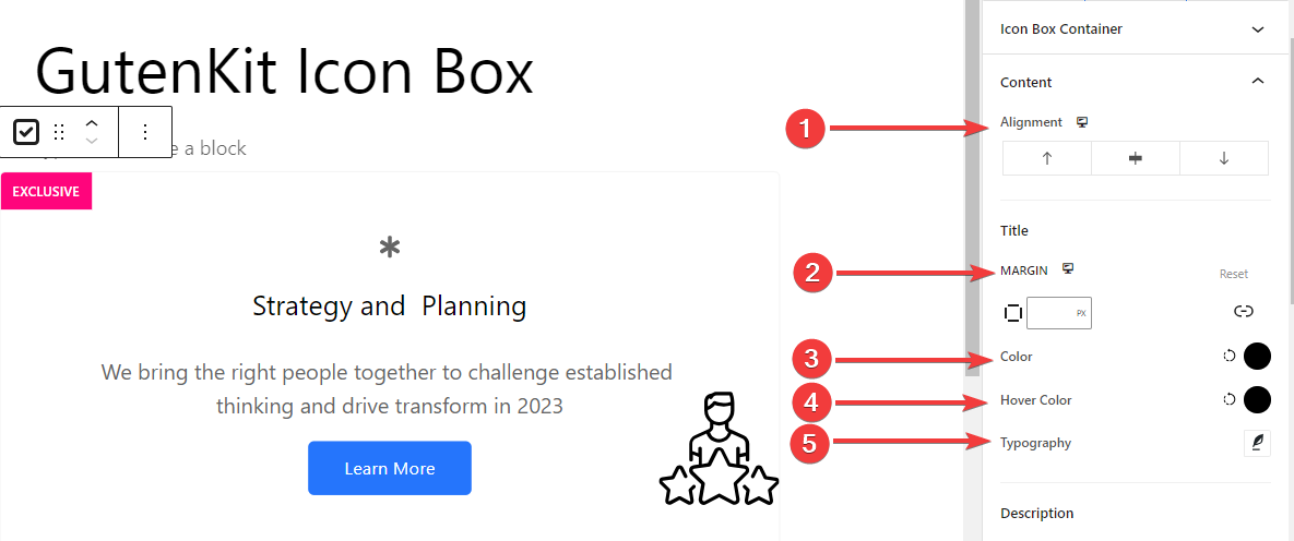
From the Content settings of the Style tab, you will customize the Title and Description text separately.
- Alignment: Align the icon to left, center, or right.
- Margin: Specify the space around the text.
- Color: Pick a color from the color palette.
- Hover Color: Add a color for the hover effects.
- Typography: Set font family, size, weight, transform, style, decoration, line height, letter spacing, and word spacing.
And, there are multiple style settings for the Watermark Icon:
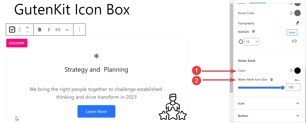
Watermark Color: Pick a color for the Water Makr icon.Watermark Icon Size: Define the size of the watermark icon. Here’s a wide range of features for customizing the icon style. Let’s see the use:
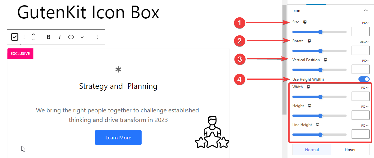
Size: Specify the icon size in pixels.Rotate: Use the bar to rotate the icon or enter the value in degrees.Vertical Position: Set the icon’s vertical position in pixels.Use Height Width: Enable this button to customize the width and height of the icon Width: Set the width of the icon.Height: Determine the gap between text and icon.Line Height: Adjust the height of the icon line.
The remaining features are applied to both normal and hover states.
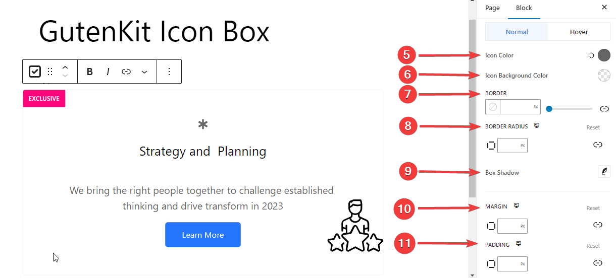
5. Icon Color: Use the color picker tool to assign a color to the icon.
6. Icon Background Color: Give color to the icon background.
7. Border: Use the slider or manually enter a value in pixels for borders.
8. Border Radius: Give a value for the border radius to control the roundness of the border.
9. Box Shadow: Adjust the shadow around the box.
10. Margin: Define the margin around the icon.
11. Padding: Set the padding within the icon.
Step 8: Badge Customization #
The last step includes customizing the badge.
Badge: #
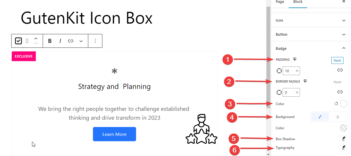
- Padding: Define the spacing around the badge.
- Border Radius: Specify the roundness of the border of the badge.
- Color: Select the color for the badge text.
- Background: Choose the background color of the badge.
- Box Shadow: Set the box shadow’s softness, size, and direction.
- Typography: Change the typography options for the badge.
That’s all! Now you can easily add an icon box to show anything informatively on your website.


