 English
  German
  Spanish
  Italian
  French
  Danish
  Portuguese
  Swedish
  Polish
  Korean
  Japanese
 The GutenKit Image Accordion block focuses on allowing you to display multiple images in a consolidated area of your website. Additionally, you can add a title, button, popup, project, and so on.
In this documentation, you will learn to add an image accordion in the Gutenberg block editor in simple steps.
Required Plugins: GutenKit Plugin
How to add Image Accordion in Gutenberg Websites #
Ready to get started? Follow the steps below.
Step 1: Add GutenKit Image Accordion Block #
Log in to your WordPress dashboard,
- Go to Pages > Add New Page or start editing an existing page with the block editor..
- Look for the “+” icon at the top of the editor screen. Click it.
- A block menu will appear, search for “GutenKit Image Accordion”.
- When you see it, click it or drag & drop it on the block editor screen.
Step 2: Add Accordion Content #
Adding the image accordion block will automatically load three items to your screen. Then, open the block setting and head to the Content tab.
Under the Image Accordions option, you will see:
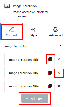
- Each item includes a Clone Item icon to copy a customized item.
- And the ‘X” icon to delete an item.
- Plus, there is a “+ Add Item” button to add a new item.
Now, select any accordion item to open its setting.
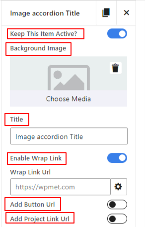
- Keep This Item Active: Enable this toggle button to keep an item active on the visitor’s end.
- Background Image: Here you will insert the image of the accordion item.
- Title: Type the text you want to show as the title.
- Enable Wrapper Link: Activating this option allows adding a link that visitors will follow by clicking anywhere on the accordion item.
- Add Button URL: Enable this option to insert a link in the button of the accordion item.
- Add Project Link Url: Enter the project link URL. Do note that the project link is disabled by default. You can enable it from the next settings.
Step 3: Configure Accordion Settings #
In the previous step, we added content for the image accordion. Now, we’ll set how to showcase them.
Settings: #
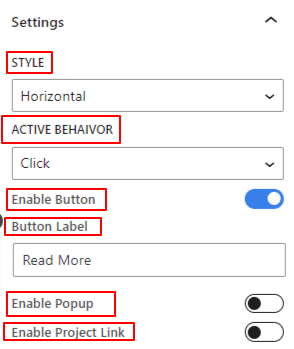
- Style: Choose an accordion style between Horizontal and Vertical.
- Active Behaviour: Select a revealing event of the active accordion item.
- Enable Button: Toggle this button to insert a button in the accordion item.
- Button Label: Enter the text for the button label.
- Enable Popup: Activate this option to show a popup with an accordion item.
- Popup Icon: Choose an icon to indicate the user to reveal the popup.
- Enable Project Link: Enable this toggle button to show a project with the accordion item.
- Enable Project Link Icon: Add an icon from the library or upload your SVG file to display the project.
Step 4: Style Image Accordion #
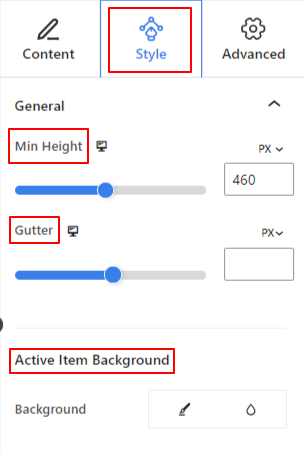
General: #
- Min Height: Use the slider or add a custom value to define the height of the entire accordion section.
- Gutter: Adjust the gap between accordion items.
- Active Item Background: Choose between a solid color or a gradient background.
Title: #
- Margin: Determine the gap between the title and other items. Like
- Color: Select a color for the title from the color picker.
- Typography: Use this setting to set the title font family, text size, weight, line height, style, decoration, etc.
Content: #
- Alignment: Place all the content of the accordion item between left, center, and right.
- Padding: Give a custom value in this field to adjust the space around the accordion content.
- Vertical Position: Defne the vertical placement of the accordion content between top, center, and bottom.
Button: #
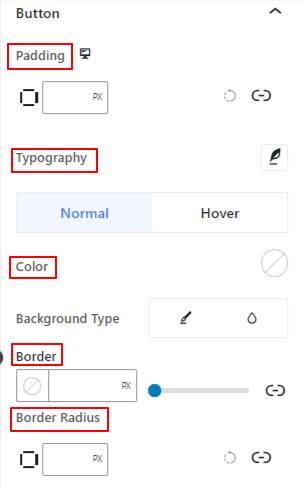
- Padding: Define the inner space around the button text and border.
- Typography: Here you have all the customizing controls to set the typography style.
Now the following border customization options are applicable for both Normal and Hover state. You can separately customize them.
- Color: Choose the text color for the button.
- Background Type: Add a gradient or solid color background for the button.
- Border & Border Radius: These settings are used for giving the border a color and set its style, thickness, & roundness.
Action Icon: #
- Width: Use the slider to define the inner space of the action icon(Popup or Project) and its border.
- Space Between: Use the slider to adjust the gap between action icons.
- Border Width: Determine the thickness of the icon border.
The following styling features are applicable for both Normal and Hover states.
- Popup Icon Color: Select a color for the popup icon.
- Link Icon Color: Use the color picker to choose the project icon color.
- Background Color: Add a background color for both action icons.
Step 5: Advanced Settings #
From the Advanced Settings tab, you can configure the Image Accordion block layout, background, border styles, and control its visibility.
Layout, #
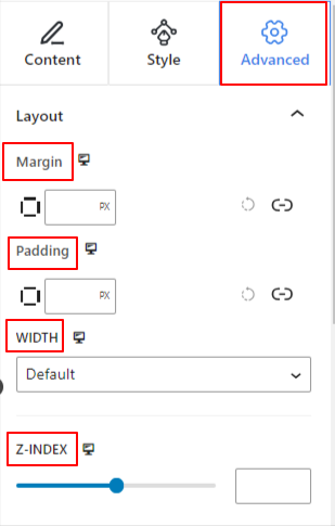
- Margin: Define the space around the block layout. It helps to set gap between another block.
- Padding: Enter a value to set the space around the block within its layout.
- Width: Apart from keeping the default layout width.
- Full Width: Selecting this will make the layout span the full width of the screen.
- Inline (Auto): Applying it will have the same width as the block element.
- Custom: Choosing this option will reveal a slider to define the horizontal space of the block layout.
- Z-Index: Use the slider to specify the stack ordering of the block with other blocks.
Position: #
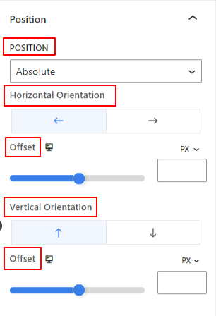
Under the dropdown, you will see three options: Default, Absolute, and Fixed.
- Absolute: Selecting this option will give you an absolute position of the block, meaning elements will fit into their container.
- Fixed: The Fixed position option will let the element fit into the entire viewport or screen.
Both, Absolute and Fixed options have similar settings like the below:
- Horizontal Orientation: Choose the positioning direction between left and right.
- Offset: Use the slider or put a value manually to adjust the horizontal positioning of the block.
- Vertical Orientation: Select the positioning direction between up or down.
- Offset: Use the slider or put a value manually to adjust the vertical positioning of the block.
Background: #
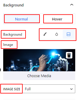
- Background: Choose a background option between solid color, gradient, or image.
Under the Hover option:
- Image: If you choose the image option it will open up the following options:
- Image: Choose an image from the media library or upload your own.
- Image Size: Select image size between Thumbnail, Medium, Large, or Full.
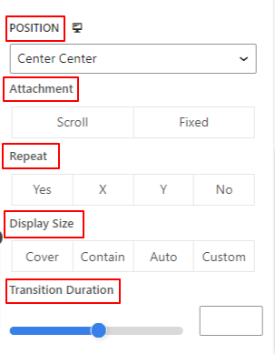
- Position: Select the position of the 10 different options.
- Attachment: Specify the fixed or scroll background image relation with the rest of the browser screen.
- Repeat: Select an option to set sets how background images are repeated.
- Display Size: Select a display size from four different options.
- Transition Duration: Use the slider to adjust the background transition from Normal to hover state.
Border: #
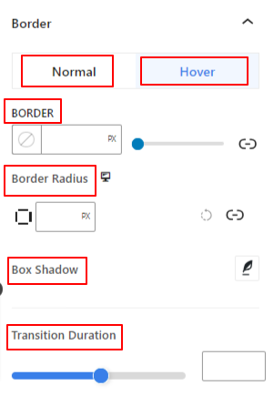
- Border: Under this setting option, you will get border setting options like width, style, and color.
- Border Radius: Set the roundness of the border by entering a value.
- Box Shadow: Get all the settings like color, horizontal/vertical, blur, spread, and more to give shadow effects to the border.
Under the Hover Option:
- Transition Duration: You can add a value manually or use the slider to set the time for changing the border design on the hover state.
Visibility: #
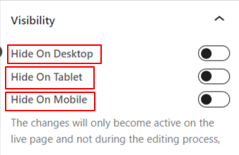
The visibility module allows you to control the display of block designs depending on the device type. There will be three device options (Desktop, Tablet, Mobile) with a toggle button. Turn on the toggle button to hide the block design of that device.
However, you can still see it in the editor view.
Advanced: #
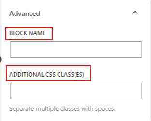
- Block Name: Give a name to identify this block uniquely while linking or scripting to style the block.
- HTML Anchor: Add a URL to link a website page.
- Additional CSS Classes: Assign additional CSS Classes to the block which will let you style the block as you wish with custom CSS.
NB: You can add multiple classes separately with spaces.
Now it’s your turn to add an image accordion layout to your WordPress website using the Gutenberg block editor. You will end up showing multiple images in an appealing and attractive way.


