

 English
  German
  Spanish
  Italian
  French
  Danish
  Portuguese
  Swedish
  Polish
  Korean
  Japanese
 GutenKit Image Box is a handy way to add more than a plain image to the Gutenberg Builder.
Along with Different content area styles, you can add text and buttons to show your images interactively on your website.
Let’s learn about how to use the GutenKit Image Box block to add images informatively in Gutenberg Builder.
How to Use GutenKit Image Box Block? #
To add the GutenKit Image Block, follow this:
- From your WordPress dashboard insert a page or post.
- Click on the “+” icon in the upper-left corner of your block editor.
- Enter “GutenKit Image Box” in the search bar.
- Once you see it, hit on it or just drag and drop on the editor screen.
Now you are set to go. Just follow the following steps.
Step 1: Adding Image to Gutenberg Builder #
First, we will start by including our image. For this, see the settings below:
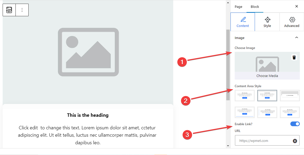
Image: #
- Choose Image: Select an image from the media library or upload it from your device.
- Content Area Style: Choose a preferred style from six different styles for showing text content with the image.
- 1st: Includes an ordinary text section without giving any customization options.
- 2nd: Add a separate curved-shaped box for the text content.
- 3rd: When you move the mouse cursor on the image box block it reveals the description text.
- 4th: A bottom line appears on hover.
- 5th: A side line is displayed on the left of the text content.
- 6th: Shows shadow lines on the right and left side of the text content.
- Enable Link: Toggle this button to enable a link for the image.
- URL: Add URLs that will follow after clicking on the image.
Step 2: Adding Text With Image #
Next, add text to describe the image section.
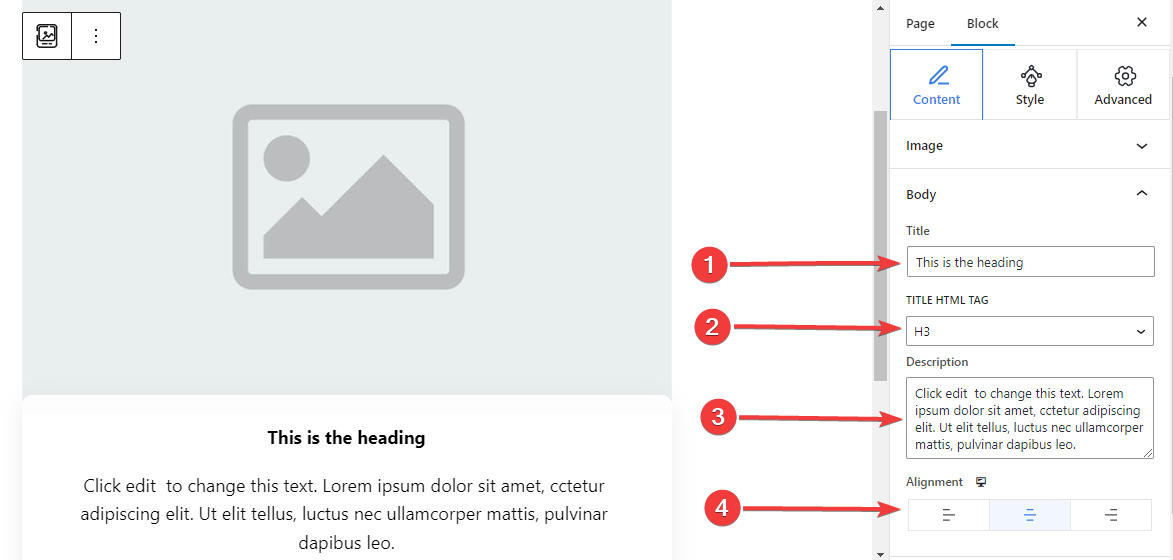
Body,
- Title: Type the title you want to add to the image block.
- Title HTML Tag: Choose an HTML Tag (H1- P) for the title.
- Description: Write the description you want to add to the image.
- Alignment: Locate the text position to match your design (Left/ Center/ Right).
Step 3: Apply Button Action With Image Block #
You can add a button with icon and text to let the user take an action.
Button: #
- Enable Button: Enable this toggle button to add a button navigational action.
- Label: Edit or type the label text for the button.
- URL: Insert the URL to direct the users to your chosen page.
- Add Icon: Activate this button to show an icon with the button.
- Icon: Select an icon from the library or upload yours.
- Icon Position: Choose to show the icon before or after the button text.
Step 4: Customize Content Area Style #
As you already know this block comes with 6 different content area styles. Here, except for the first one, selecting the remaining styles will add a new setting in the Styles tab. Further, the settings differ from each other.
For 2nd Content Area Style: #
Classic Curves:
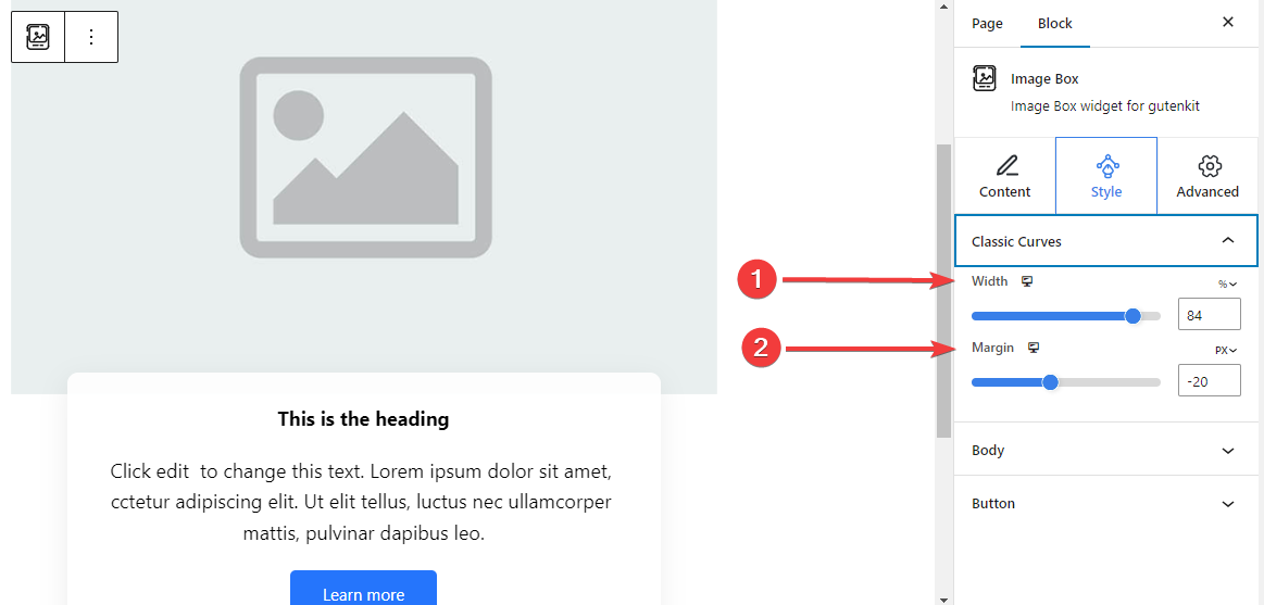
- Width: Determine the width of the text content area.
- Margin: Set spaces between image and content area.
For 3rd Content Area Style: #
Floating Style: #
The following settings are applied for both the Normal and Hover stages.
- Height: Adjust the height of the floating bar.
- Icon Color: Select the color of the icon.
- Icon Font Size: Set the size of the icon.
- Margin Top: Adjust the space between the image and the floating bar.
- Width: Define the width of the floating bar.
- Background Type: Select a color or gradient background for the floating bar.
- Box Shadow: Adjust the box shadow of the floating style.
For 4th Content Area Style: #
Hover Border Bottom: #
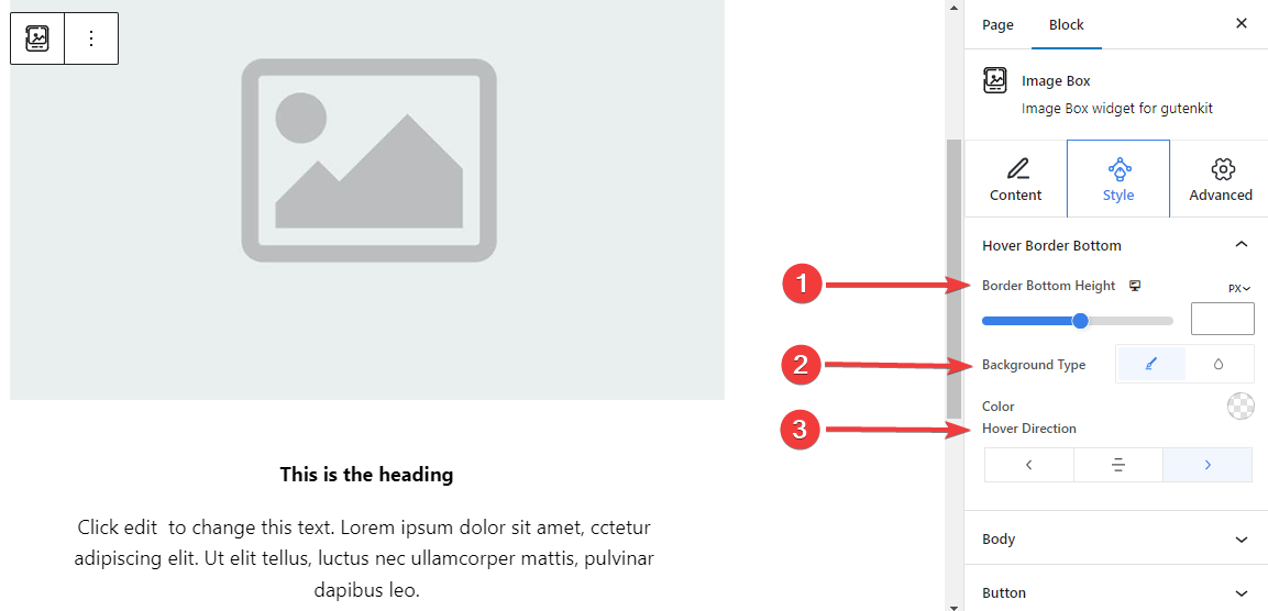
- Border Bottom Height: Adjust the height of the bottom border by using the slider or manually entering a value.
- Background Style: Select between solid color or gradient background type.
- Hover Direction: Set the hover direction for the bottom border. It can be revealed from the left, center, or right.
For 5th Content Area Style:
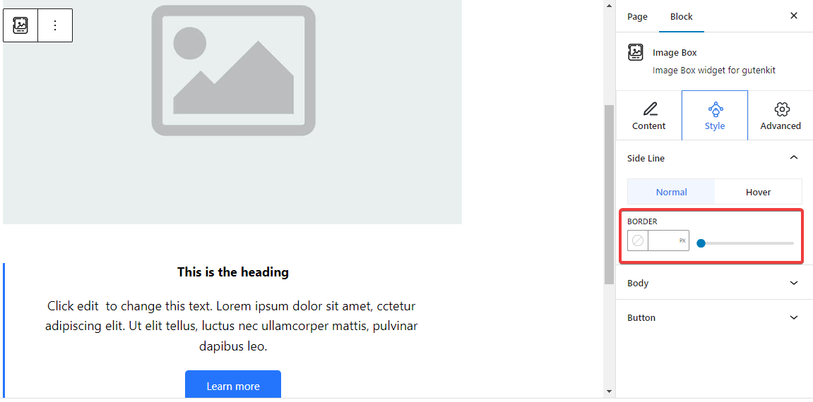
Side Line: From here, adjust the side line border width by inserting a value or using the slider. Also, pick a color and a border style. And, all these customizations also can be applied on hover.
For 6th Content Area Style: #
Shadow Line: #
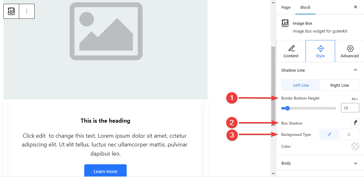
The below settings are separately adjustable for both the left and right lines.
- Border Bottom Height: Adjust the border bottom height using the slider or giving a value in the box.
- Box Shadow: Apply box shadow visual effects with the side line and adjust its settings.
- Background Type: Choose between a solid and gradient background color.
Step 5: Styling the Text #
Let’s introduce all the text styling features of this block.
Body: #
General: #
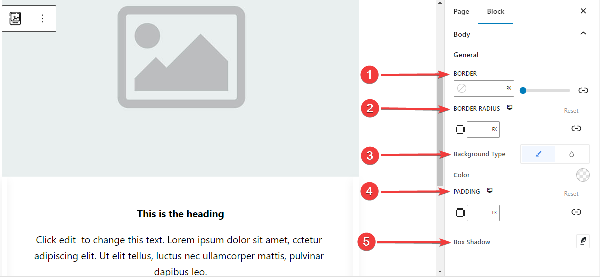
- Border: Add a border around the text, choose a style, and give it a color.
- Border Radius: Determine the roundness of the border.
- Background Type: choose between a classic solid color or a gradient background.
- Padding: Add extra spaces around the text.
- Box Shadow: Add shadow effects to the box and define its color, Horizontal, Vertical, Blur, Spread, and position.
Title: #
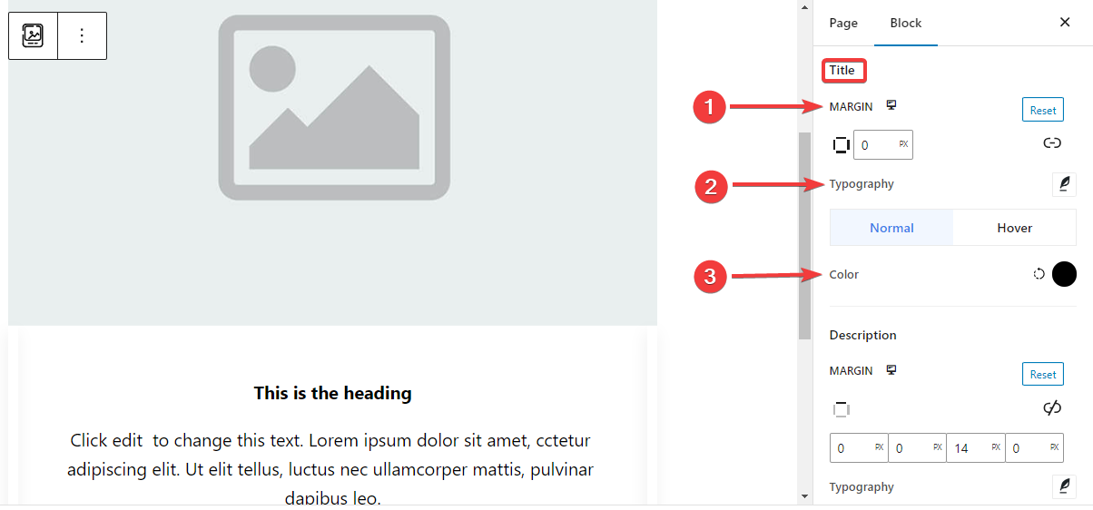
- Margin: Add outer spaces around the Title area.
- Typography: Control all the typography settings like Font Family, Size, Weight, Transform, Style, Decoration, Line Height, etc.
- Color: Select the title text color for both normal and hover stages.
Description: #
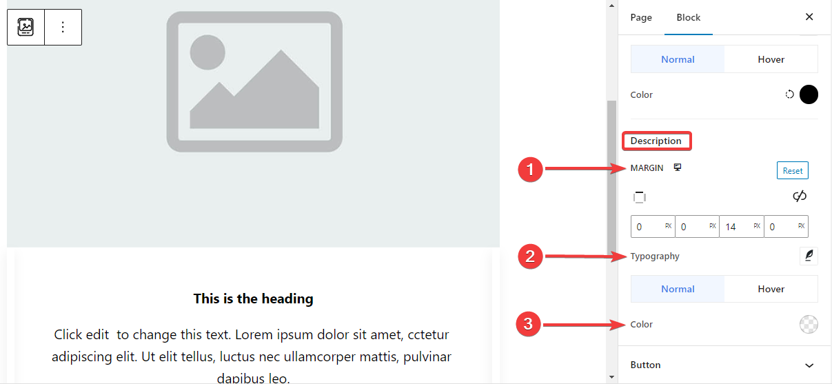
- Margin: Set margin around the description text area.
- Typography: Make all the typography settings from here, including changing Font Family, Size, Weight, Transform, Style, Line Height, Letter Spacing, etc.
- Color: Choose color for both normal and hover stages.
Step 6: Styling The Button #
Here are the settings for the button styling.
Button: #
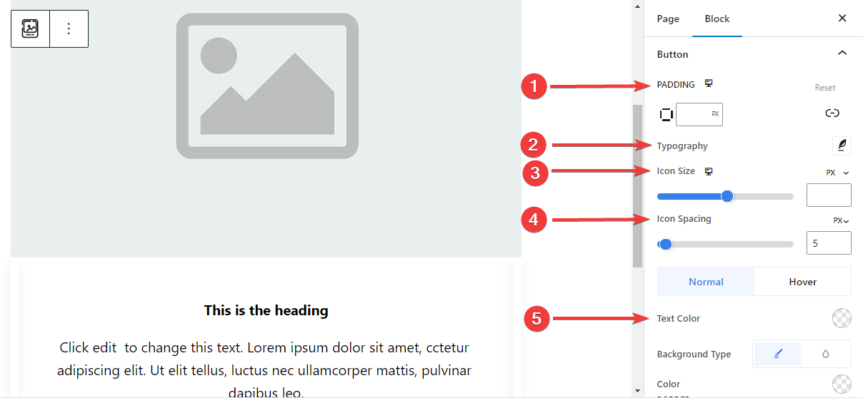
- Padding: Set the padding of the button.
- Typography: Customize the button text.
- Icon Size: Use the slider or enter a custom value for the icon size.
- Icon Spacing: Add space between the icon and text.
- Text Color: Apply button text color for both Normal and Hover stages.
- Background Type: Choose button background type between solid color and background.
- Border: Use the slider or enter a custom value for the button width, pick a color, and, choose a border style.
- Border Radius: Define the roundness of the button border.
- Box Shadow: Get all the control of the box shadow effects like, set its color, Horizontal, Vertical, Blur, Spread, and position.
Step 7: Advanced Settings #
From the Advanced Settings tab, you can configure the Image Box block layout, background, border styles, and control its visibility.
Layout, #
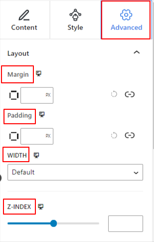
- Margin: Define the space around the block layout. It helps to set gap between another block.
- Padding: Enter a value to set the space around the block within its layout.
- Width: Apart from keeping the default layout width.
- Full Width: Selecting this will make the layout span the full width of the screen.
- Inline (Auto): Applying it will have the same width as the block element.
- Custom: Choosing this option will reveal a slider to define the horizontal space of the block layout.
- Z-Index: Use the slider to specify the stack ordering of the block with other blocks.
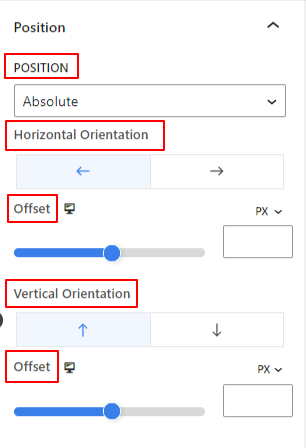
Position: #
Under the dropdown, you will see three options: Default, Absolute, and Fixed.
- Absolute: Selecting this option will give you an absolute position of the block, meaning elements will fit into their container.
- Fixed: The Fixed position option will let the element fit into the entire viewport or screen.
Both, Absolute and Fixed options have similar settings like the below:
- Horizontal Orientation: Choose the positioning direction between left and right.
- Offset: Use the slider or put a value manually to adjust the horizontal positioning of the block.
- Vertical Orientation: Select the positioning direction between up or down.
- Offset: Use the slider or put a value manually to adjust the vertical positioning of the block.
Background: #
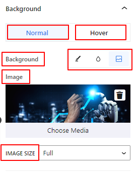
- Background: Choose a background option between solid color, gradient, or image.
Under the Hover option:
- Image: If you choose the image option it will open up the following options:
- Image: Choose an image from the media library or upload your own.
- Image Size: Select image size between Thumbnail, Medium, Large, or Full.
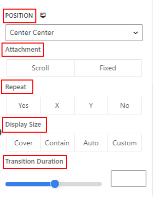
- Position: Select the position of the 10 different options.
- Attachment: Specify the fixed or scroll background image relation with the rest of the browser screen.
- Repeat: Select an option to set sets how background images are repeated.
- Display Size: Select a display size from four different options.
- Transition Duration: Use the slider to adjust the background transition from Normal to hover state.
Border: #
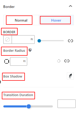
- Border: Under this setting option, you will get border setting options like width, style, and color.
- Border Radius: Set the roundness of the border by entering a value.
- Box Shadow: Get all the settings like color, horizontal/vertical, blur, spread, and more to give shadow effects to the border.
Under the Hover Option:
- Transition Duration: You can add a value manually or use the slider to set the time for changing the border design on the hover state.
Visibility: #
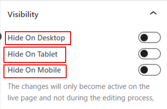
The visibility module allows you to control the display of block designs depending on the device type. There will be three device options (Desktop, Tablet, Mobile) with a toggle button. Turn on the toggle button to hide the block design of that device.
However, you can still see it in the editor view.
Advanced: #
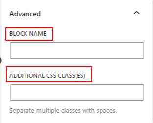
- Block Name: Give a name to identify this block uniquely while linking or scripting to style the block.
- HTML Anchor: Add a URL to link a website page.
- Additional CSS Classes: Assign additional CSS Classes to the block which will let you style the block as you wish with custom CSS.
NB: You can add multiple classes separately with spaces.
Hopefully, you have understood all the settings to insert an image box block into your website.


