


 English
  German
  Spanish
  Italian
  French
  Danish
  Portuguese
  Swedish
  Polish
  Korean
  Japanese
 Take the help of GutenKit Fun Facts Gutenberg Blocks for an intuitive and impressive display of important facts with numbers and icons. It gives you all the customization controls and animation styles to highlight numbers on your WordPress website.
Read this documentation to learn how to create an amazing fun fact counter on the Gutenberg block editor of your website.
How to Add Fun Fact Counter on WordPress Block Editor? #
Before moving to the first step, you need to have the GutenKit plugin installed on your WordPress website.
Step 1: Add GutenKit Fun Fact Block #
From your WordPress dashboard:
- Add a page or post and head to the block editor.
- Click the “+” icon at the top of the editor screen.
- You will see a block library will reveal.
- Use the search bar to find the “Fun Fact” block.
- When it appears, click or drag & drop it to the editor screen.
Step 2: Add Icon and Content #
Now, the first setting area of the block that you will work with is the Content tab. From here, you will add icons and other content like numbers, prefixes, suffixes, etc.
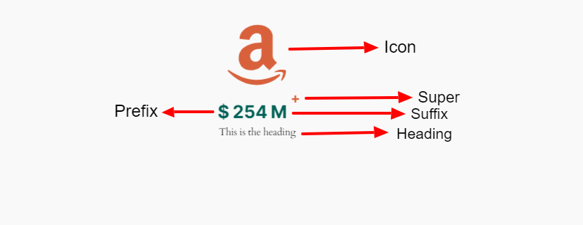
Icon: #
- Add Icon: By default, this toggle button is activated. Disable this, if you don’t want to show an icon. You can change the icon from the library or upload your own SVG icon file.
Content: #
- Number: Put the number you want to show in this field.
- Enable Prefix: Use this toggle button if you want to add something before the number. You can simply type anything on the block editor screen.
- Enable Suffix: Activate this to add and type something after the number.
- Enable Super: Super works as another supporting element of your fun fact info. Enable it and add a text or symbol.
- Enable Heading: Enable this toggle button to show heading or text. Also, define the header HTML tag from the dropdown.
Settings: #
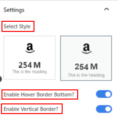
- Select Style: Choose a revealing style for the fact number on the visitor end.
- Duration: Set the duration of the number counting while showing in milliseconds.
- Enable Hover Bottom: Toggle this button to show a bottom line on hover.
- Enable Vertical Border: Activate it to show a vertical border.
Step 2: Style the Icon #
In this part, we will focus on styling the icon and other content elements.
Go to the style tab:
Icon, #
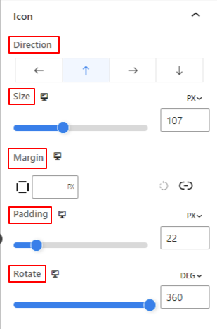
- Direction: Define the placement of the icon (Left/ Top/ Right/ Bottom)
- Size: Use the slider to determine the size of the icon.
- Margin: Enter the custom value of marting to adjust the space around the icon.
- Padding: Define the padding of the icon by using the slider or entering a custom value in the field.
- Rotate: Give a specific value or apply the slider to determine the degree of icon rotation.
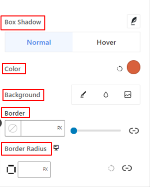
- Box Shadow: Using these controls, you can add shadow effects around the icon.
- Color: Use the color picker to set a color for the icon.
- Background: Add a background type between solid color and gradient.
- Border and Border Radius: Set the thickness, color, and roundness of the icon border.
Step 3: Style the Text Content #
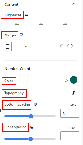
- Alignment: Place the text content to the left, center, or right.
- Margin: Adjust the margin for the text content.
Number Count:
- Color: Select a color for the number.
- Typography: Control all the typography settings like font family, size, weight, style, letter spacing, and many more.
- Bottom Spacing: Define the bottom gap between the number and title content by using the slider or putting a custom value.
- Right Spacing: Define the space or gap between number and suffix content.
Title:
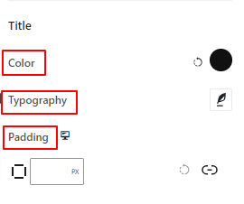
- Color: Give a color to the title text.
- Typography: Get all the typography controls like font family, size, style, line spacing, etc.
- Padding: Enter your desired custom value to add padding around the title.
Step 4: Style Other Elements #
Super: #
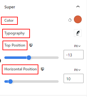
- Color: Select a color for the super text or symbol.
- Typography: Get all the typography settings for super text.
- Top Position: Adjust the vertical positioning of the super content.
- Horizontal Position: Use this slider to define the horizontal position of super content.
The next two options will only be visible in the Style tab when they are enabled from the Content tab.
Hover Border: #
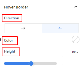
- Direction: Set the revealing direction of the hover border.
- Color: Give a color to the hover border.
- Height: Define the height of the hover border by using the slider or entering a custom value.
Vertical Border: #
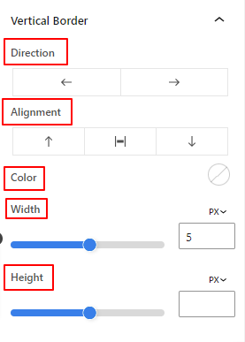
- Direction: Select the left or right direction of the vertical border.
- Alignment: From there, you will set the vertical placement of the vertical border.
- Color: Use the color picker to give a color to the vertical border.
- Width and Height: Adjust the thickness and height of the vertical border.
That’s it. We are done with all the settings. Now, it’s your turn to try all these features to create your fun fact counter on your website.
Step 5: Advanced Settings #
From the Advanced Settings tab, you can configure the Fun Fact block layout, background, border styles, and control its visibility.
Layout, #
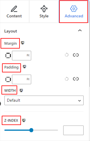
- Margin: Define the space around the block layout. It helps to set gap between another block.
- Padding: Enter a value to set the space around the block within its layout.
- Width: Apart from keeping the default layout width.
- Full Width: Selecting this will make the layout span the full width of the screen.
- Inline (Auto): Applying it will have the same width as the block element.
- Custom: Choosing this option will reveal a slider to define the horizontal space of the block layout.
- Z-Index: Use the slider to specify the stack ordering of the block with other blocks.
Position: #
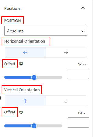
Under the dropdown, you will see three options: Default, Absolute, and Fixed.
- Absolute: Selecting this option will give you an absolute position of the block, meaning elements will fit into their container.
- Fixed: The Fixed position option will let the element fit into the entire viewport or screen.
Both, Absolute and Fixed options have similar settings like the below:
- Horizontal Orientation: Choose the positioning direction between left and right.
- Offset: Use the slider or put a value manually to adjust the horizontal positioning of the block.
- Vertical Orientation: Select the positioning direction between up or down.
- Offset: Use the slider or put a value manually to adjust the vertical positioning of the block.
Background: #
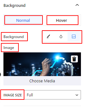
- Background: Choose a background option between solid color, gradient, or image.
Under the Hover option:
- Image: If you choose the image option it will open up the following options:
- Image: Choose an image from the media library or upload your own.
- Image Size: Select image size between Thumbnail, Medium, Large, or Full.
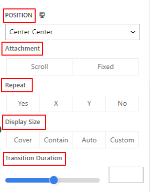
- Position: Select the position of the 10 different options.
- Attachment: Specify the fixed or scroll background image relation with the rest of the browser screen.
- Repeat: Select an option to set sets how background images are repeated.
- Display Size: Select a display size from four different options.
- Transition Duration: Use the slider to adjust the background transition from Normal to hover state.
Border: #
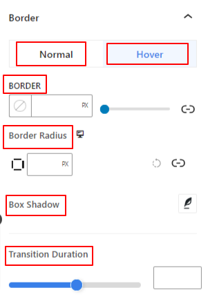
- Border: Under this setting option, you will get border setting options like width, style, and color.
- Border Radius: Set the roundness of the border by entering a value.
- Box Shadow: Get all the settings like color, horizontal/vertical, blur, spread, and more to give shadow effects to the border.
Under Hover Option:
- Transition Duration: You can add a value manually or use the slider to set the time for changing the border design on the hover state.
Visibility: #
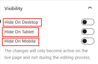
The visibility module allows you to control the display of block designs depending on the device type. There will be three device options (Desktop, Tablet, Mobile) with a toggle button. Turn on the toggle button to hide the block design of that device.
However, you can still see it in the editor view.
Advanced: #
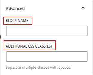
- Block Name: Give a name to identify this block uniquely while linking or scripting to style the block.
- HTML Anchor: Add a URL to link a website page.
- Additional CSS Classes: Assign additional CSS Classes to the block which will let you style the block as you wish with custom CSS.
NB: You can add multiple classes separately with spaces.


