 English
  German
  Spanish
  Italian
  French
  Danish
  Portuguese
  Swedish
  Polish
  Korean
  Japanese
 GutenKit’s Popup Builder is a module that allows users to create and customize various types of pop-ups, such as modal windows, lightboxes, or overlays, for their websites.
Let’s see how the module work.
GutenKit Popup Builder #
It is a Pro module. Don’t forget to get it from here.
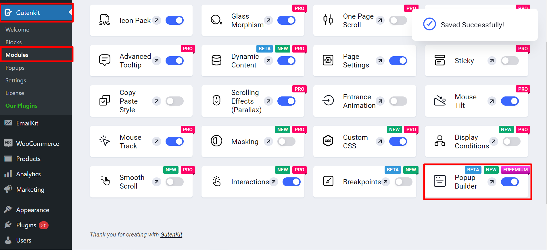
- Access to your WordPress dashboard
- Find GutenKit and go to Modules
- Find Popup Builder and turn it ON
Create New Popup #
Now, you can see Popup Builder under modules, you have to click on it and you can create popup.
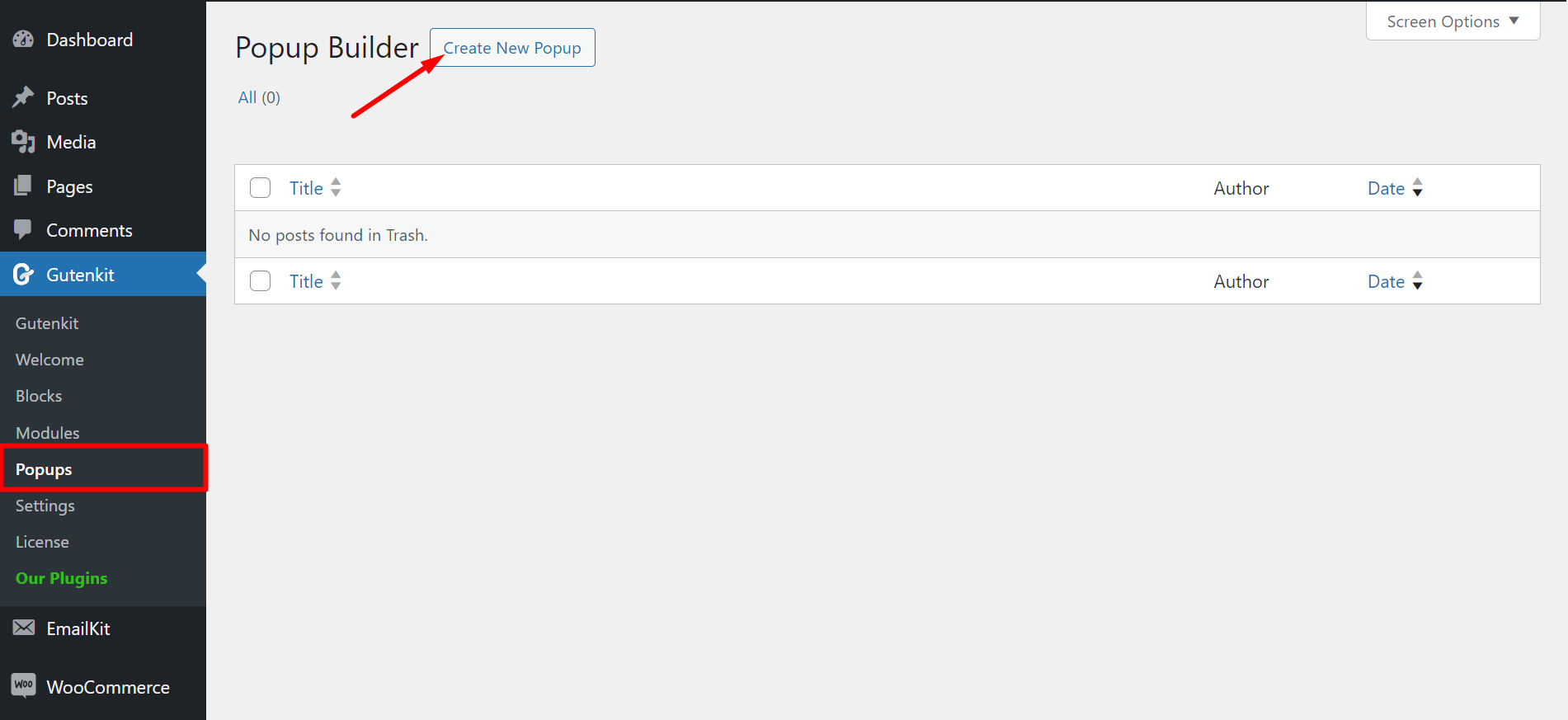
- Click on the plus sign
- You’ll see the Popup Builder, click on it
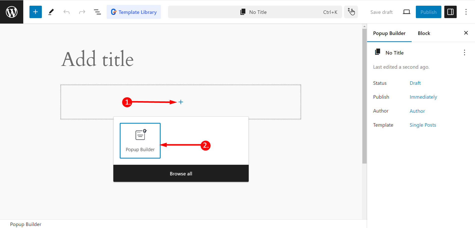
Next, in the popup field, you’ll again see a plus sign and add any block of your choice.
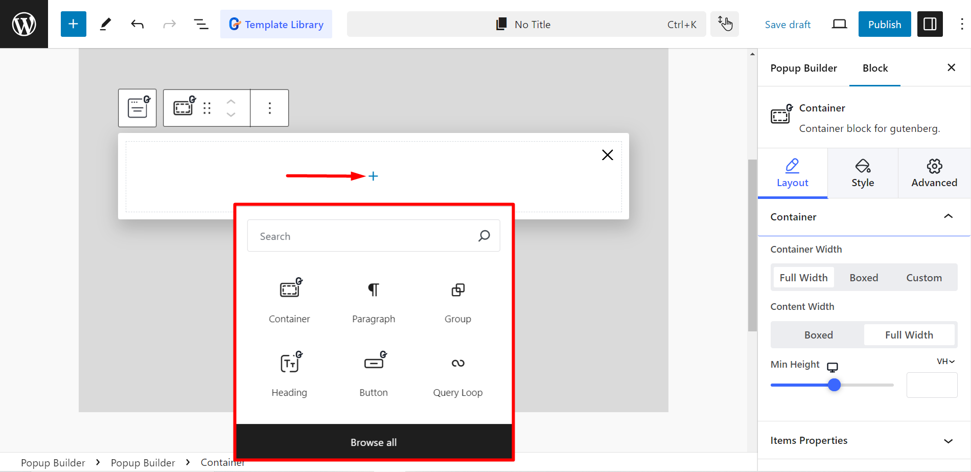
Editing Content Part #
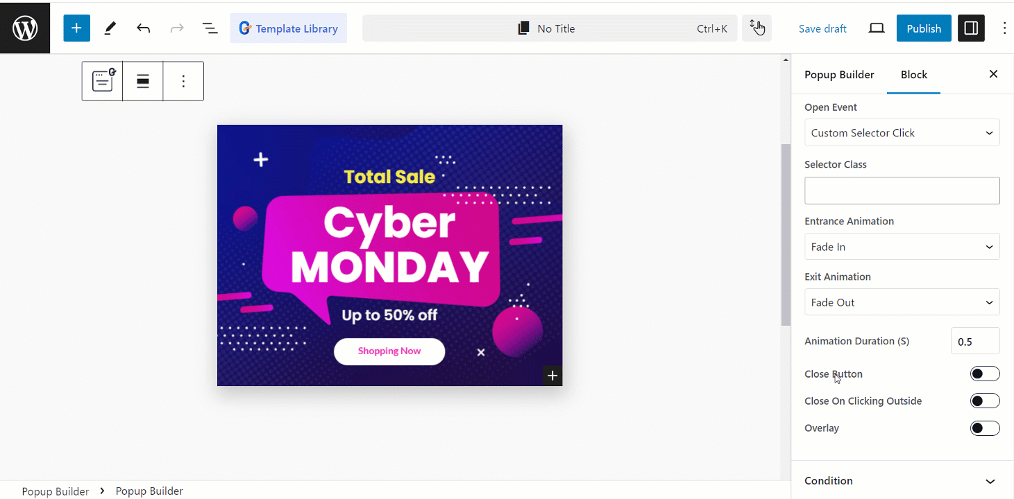
- Open Event: Determines when the popup appears. The options here are –
- On Page Load: Here you can adjust Open Delay (s) time to load the page.
- After Inactivity: It allows you to adjust User Inactivity Time (s).
- Page Scrolled: You have to set Page Scroll Progress (%) here.
- On Page Exit Intent: It triggers a popup when a user is about to leave the page.
- On Date: Here you can adjust Time and Date.
- Custom Selector Click: It has a Selector Class adding option, that specifies an element on the page to trigger the popup.
- Entrance Animation: Here you can choose the popup’s entering style. (e.g., fade, zoom, rotate, roll, etc.).
- Exit Animation: It allows you to choose the popup’s leaving style (e.g., fade, slide).
- Animation Duration: It lets you control the speed of the entrance and exit animations.
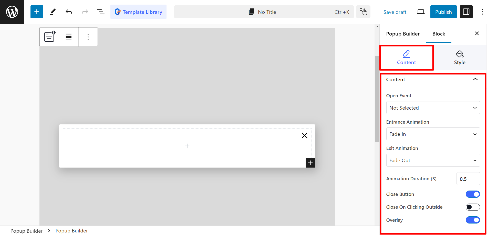
- Close Button: This is a button to manually close the popup.
- Close On Clicking Outside: By enabling the button you can allow the users to close the popup by clicking outside of it.
- Overlay: This is the background behind the popup, which can be customized in appearance.
- Close Button: This is a button to manually close the popup.
- Close On Clicking Outside: By enabling the button you can allow the users to close the popup by clicking outside of it.
- Overlay: This is the background behind the popup, which can be customized in appearance.
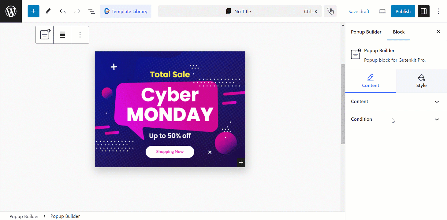
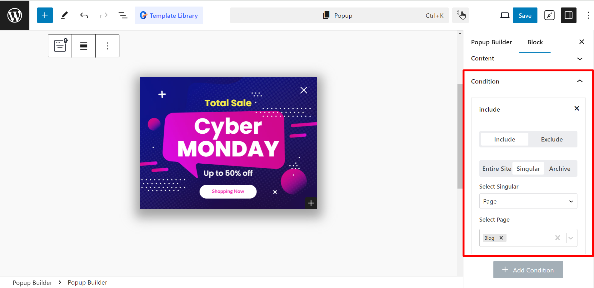
Setting Condition #
Condition: This part allows you to specify under what circumstances the popup should appear or be hidden.
- Include –
- Entire Site: The popup will be shown on all pages of your website.
- Singular: The popup will be shown only on specific individual pages.
- Archive: The popup will be shown only on archive pages (e.g., Author archives, Search results, Post categories, etc.).
- Exclude –
- Entire Site: The popup will be hidden on all pages of your website.
- Singular: The popup will be hidden on specific individual pages.
- Archive: The popup will be hidden on archive pages.
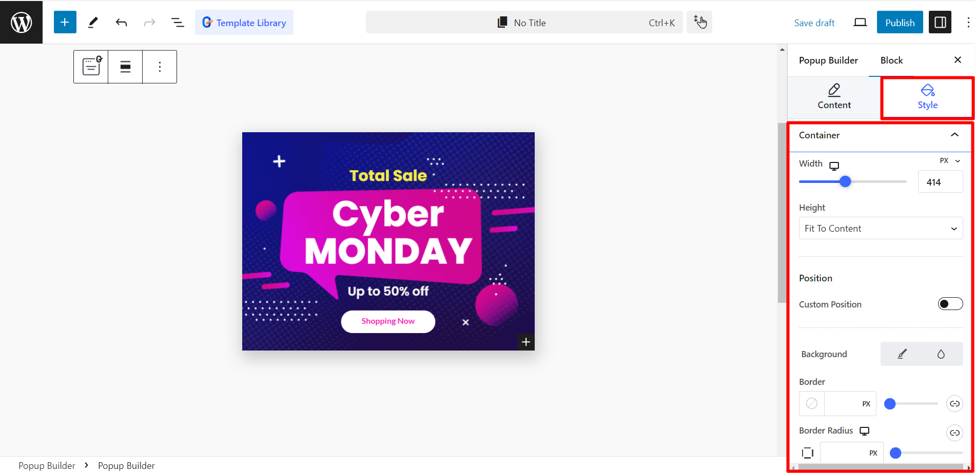
Editing Style #
Like any other GutenKit block and module, you can also style the Popup builder. Here the styling options are – Width, height, position, color, padding, and so on.
How the Popup appears #
You can customize the popup according to your choices. See the example.
Output #
This is how the Popup builder works.