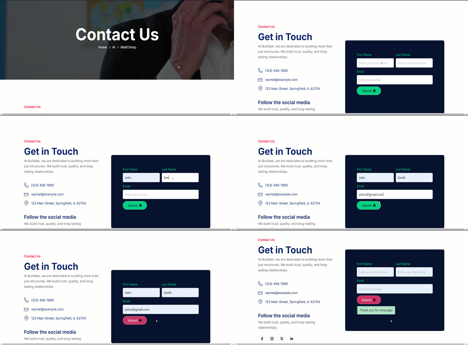
GutenKit Mailchimp is a block that helps you to create easy signup forms for engaging email campaigns. This block lets you include text, images, buttons, and other elements.
Check the documentation and learn to use the GutenKit Mailchimp block.
How can you use Mailchimp #
We’ve shown the process in simple steps.
STEP 1: Enabling the block #
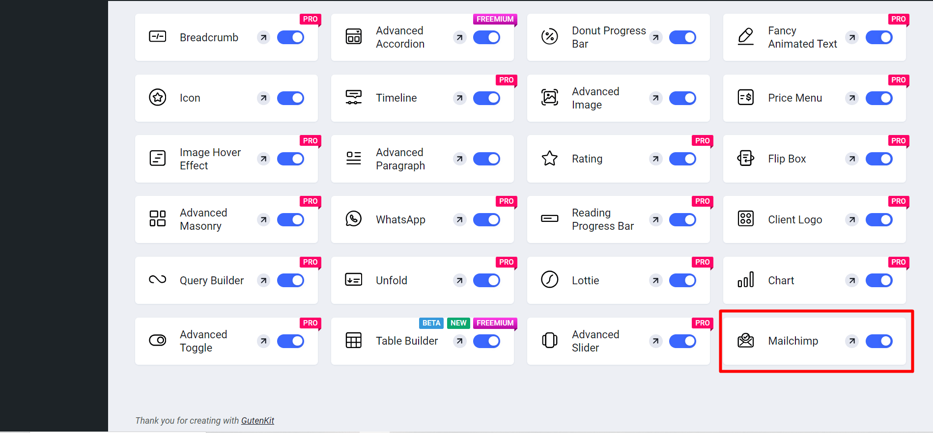
Access to your WordPress dashboard > Go to GutenKit > Modules > Find Mailchimp > Toggle the button to turn it ON

Now,
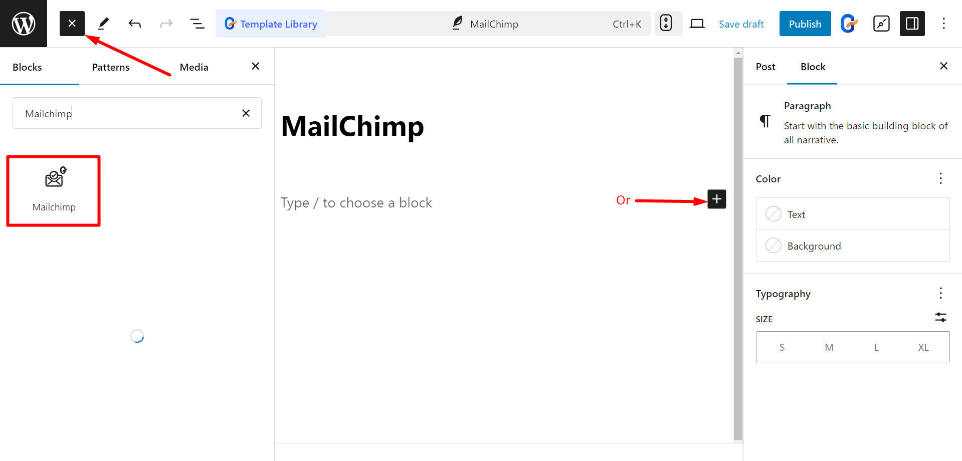
- Find Pages/Posts > Add New Page/Post or start editing an existing page with the block editor.
- Look for the “+” icon at the right side or top of the editor screen. Click it.
- A block menu will appear, search for “Mailchimp”.
- When you see it, click it or drag & drop it on the block editor screen.

Editing Content Part #
Here, you’ll get to edit Form Fields and Button.
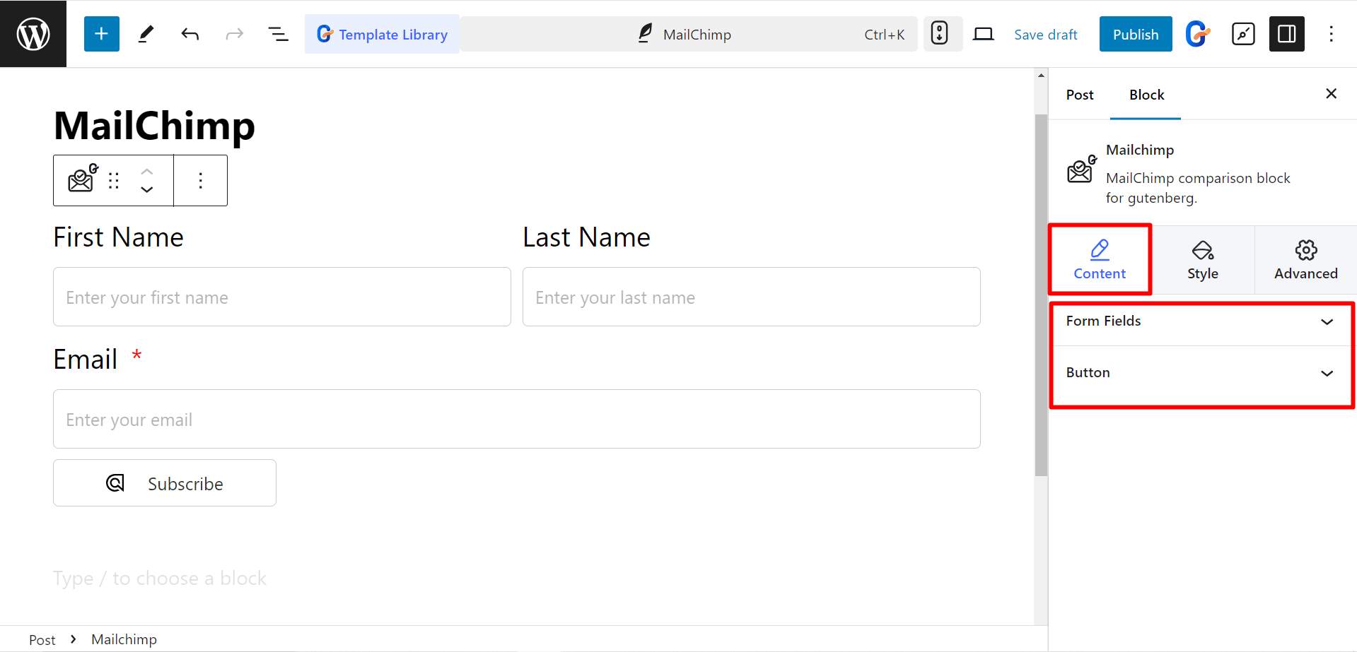

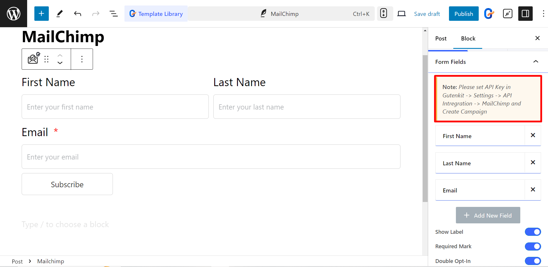
When you expand Form Fields, you’ll notice a note instructing you to add an API key to run your email marketing campaign.

STEP 2: Generate API key #
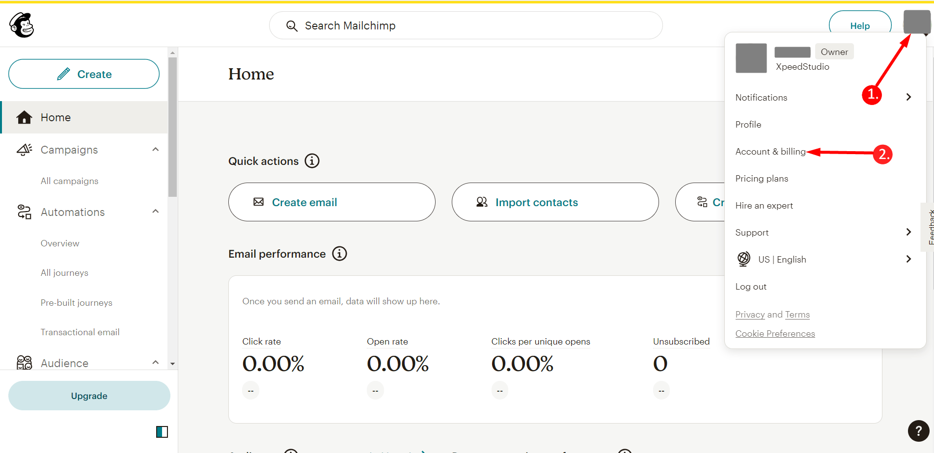
So, visit the Mailchimp site and login to your account. After that,
1. Click on your profile
2. Go to Account & Billing

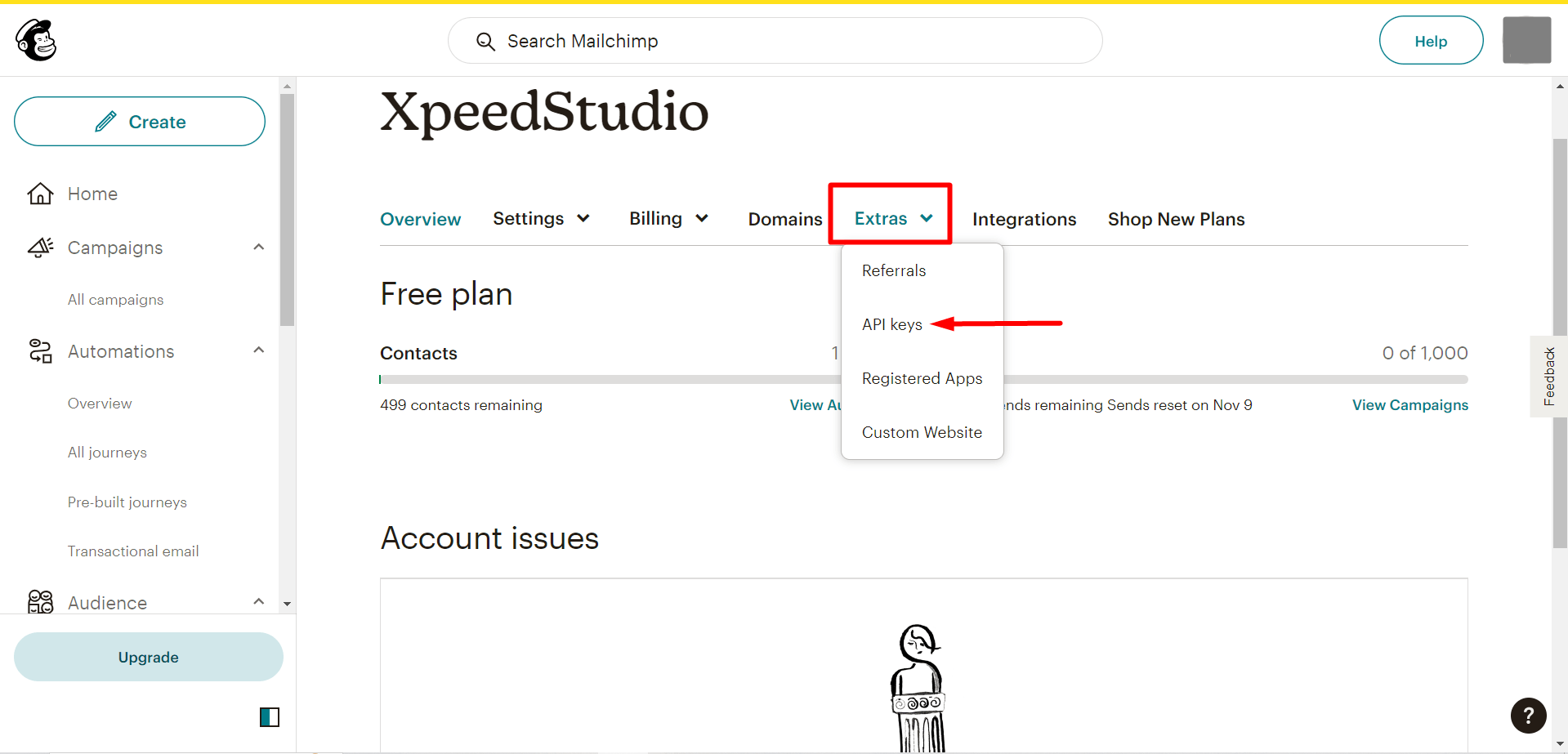
Find Extras and click on the API keys.

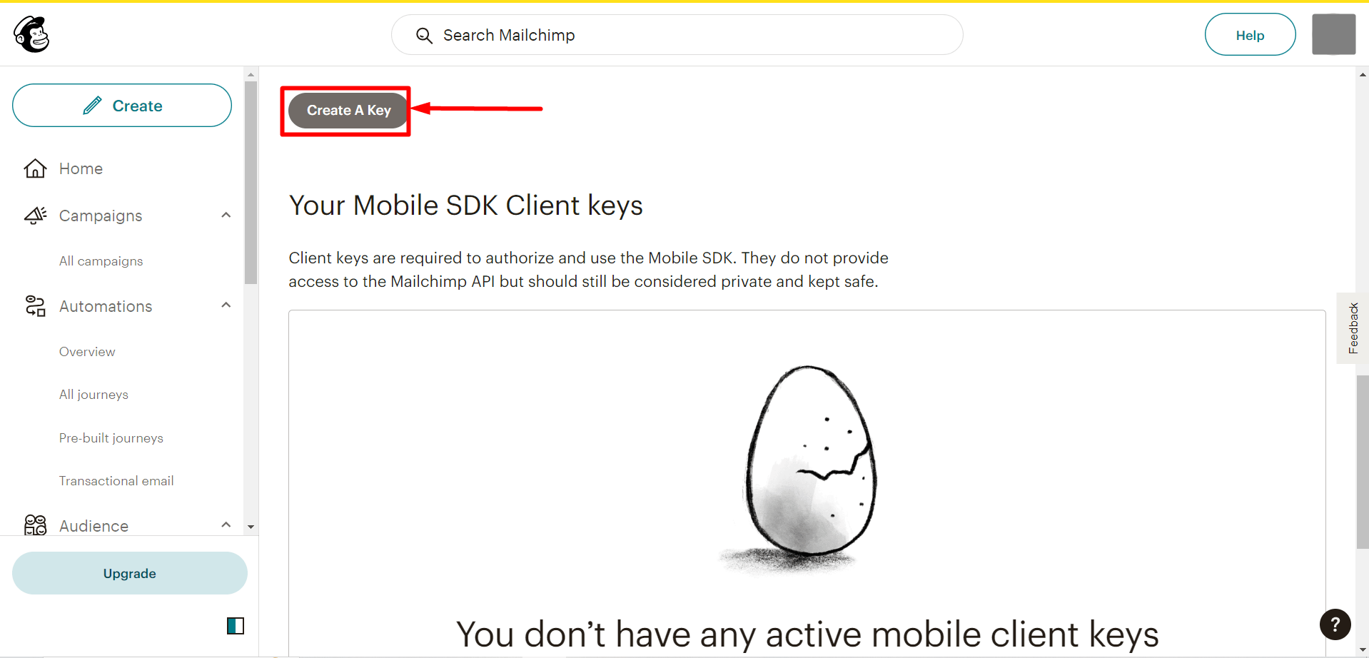
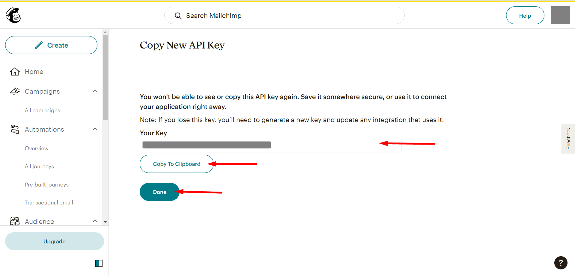
Next, click the Create API Key button to generate the API key.

Copy the generated API key and click on the Done button

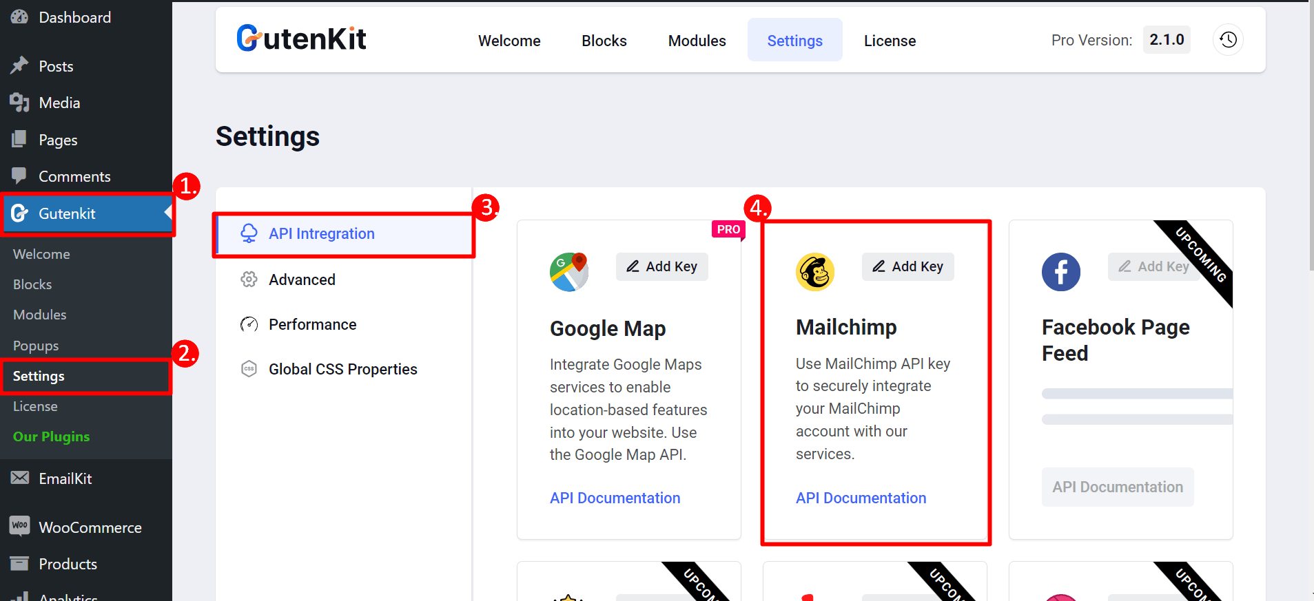
Now, you have to go to your WordPress dashboard:
- Find GutenKit
- Settings
- API Integration
- Find Mailchimp and press the Add key option to paste your copied API key

STEP 3: Go back to the page #
Now, you can select your form from the drop-down menu.
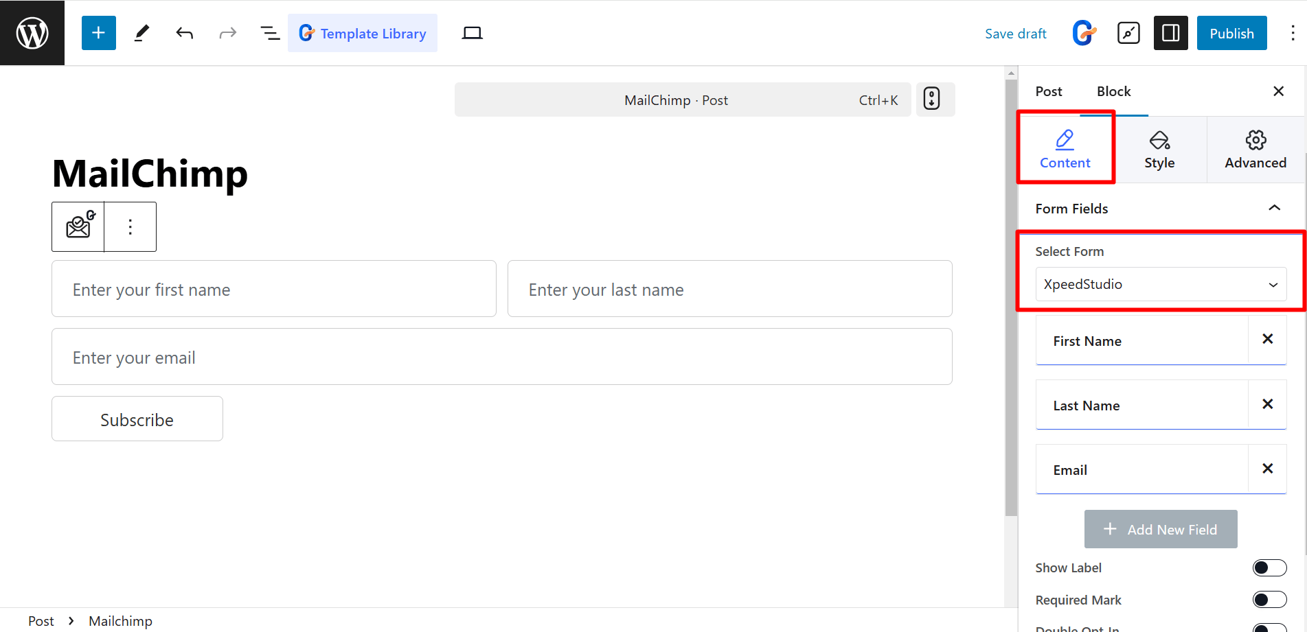

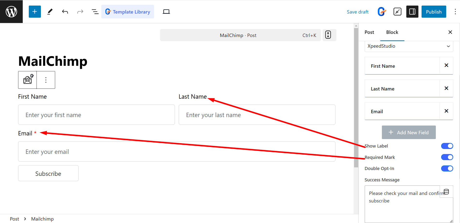
In the content part, the controls in the Form Fields are:
- Items – Add items according to your needs, like First Name, Last Name, Email, etc.
- Show Label – Displays a label name above the input field.
- Required Mark – Indicates a mandatory field.
- Double Opt-In – Requires confirmation email for signup.

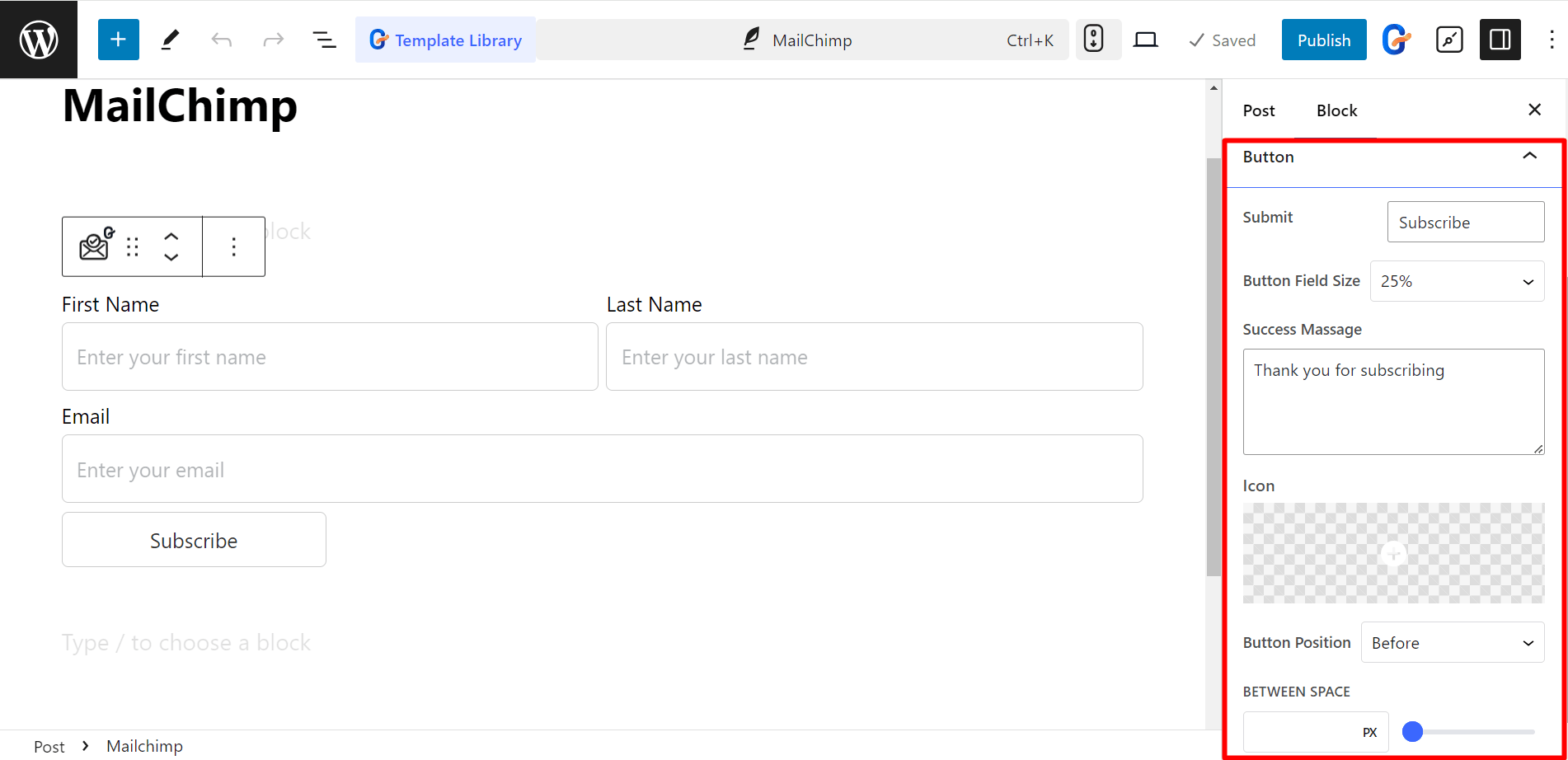
The controls in the Button are:
- Submit: Write anything in the field that triggers form submission.
- Button Field Size: Controls button field size (Default, 20%, 50%, 100%, etc.).
- Success Message: Displays a message upon successful submission.
- Icon: Adds an icon to the button from the library or you can upload SVG.
- Button Position: Determines icon’s placement (Before or After the text).
- Between Space – Adjusts spacing between button text and icon.

Style the Mailchimp Form #
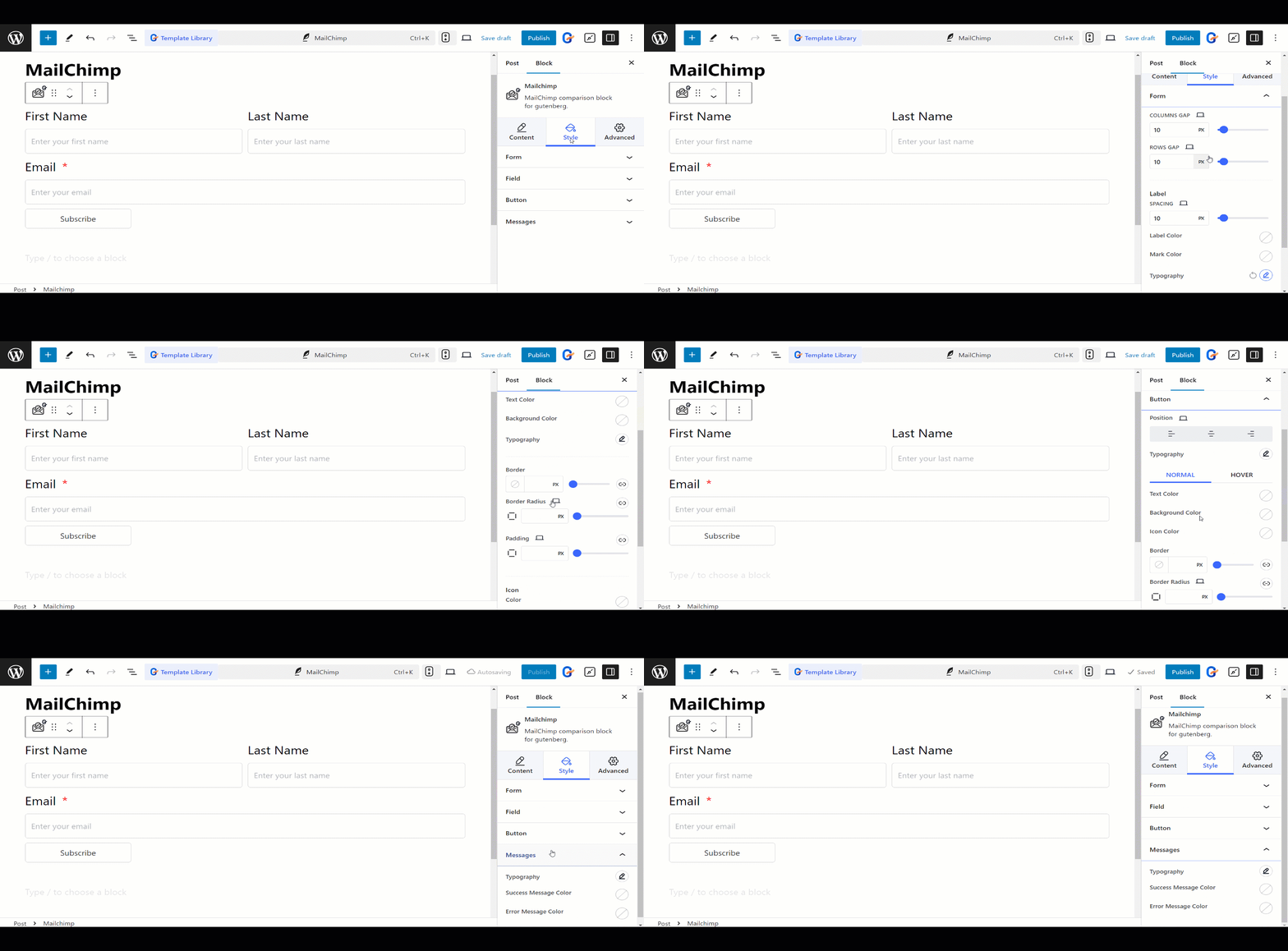
- Form – You can style the form by adjusting the column gap, row gap, labels, colors, etc.
- Field – For fields you can change text and background color, typography, border, padding, etc.
- Button – Here you can set button position, text and background color, icon color, margin, padding, etc.
- Messages – To write the message nicely, you can change typography, success message color, error message color, etc.

This is how the forms will work
