


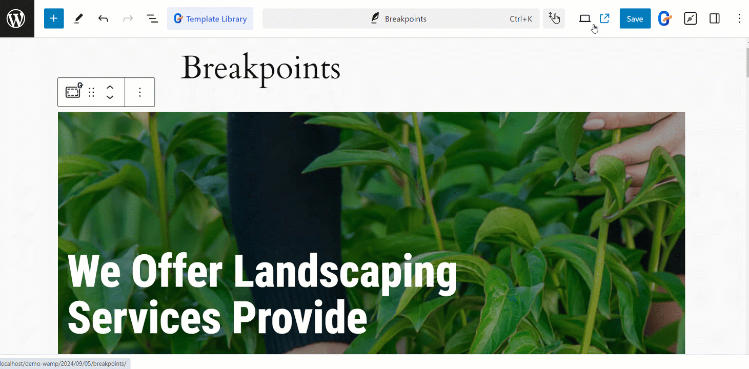
GutenKit Breakpoints module determines how your website looks on different devices. It helps to set the screen sizes where your layout changes to fit smaller or larger screens.
GutenKit Breakpoints module #
It is a Pro module. Don’t forget to get it from here.
- Access to your WordPress dashboard
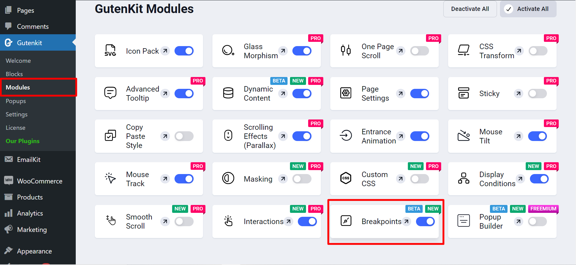
- Find GutenKit and go to Modules
- Find Breakpoints and turn it ON
Breakpoints controls #
Here, you’ll adjust breakpoints of Desktop (Base), Tablet (MAX 1024), and Mobile (MAX 767).
In the settings part, along with Mobile and Tablet‘s width adjusting options you’ll get some more features for –
- Mobile Landscape: To adjust Mobile Landscape Width.
- Tablet Landscape: Here you can adjust Tablet Landscape Width.
- Laptop: To set the adjust Laptop Width, use this option.
- Wide Screen: It lets you adjust the Wide Screen Width.