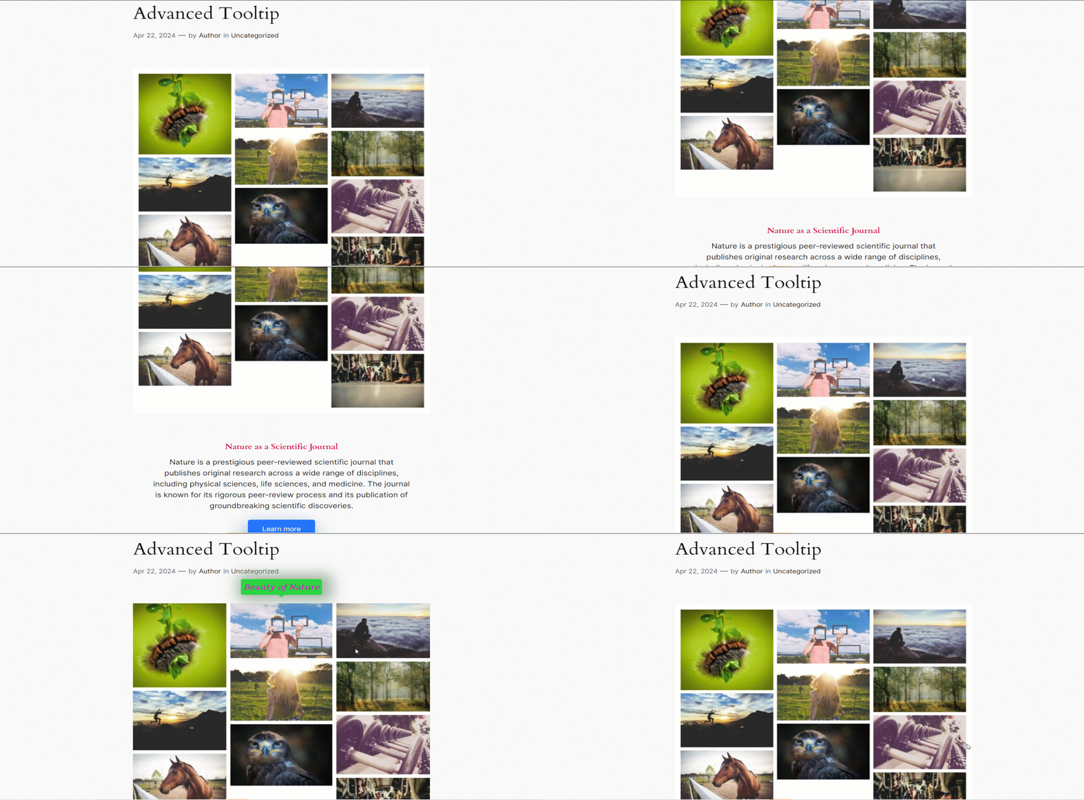
A Tooltip is an informative short message about a website’s element. A user can see it when he hovers over or clicks on the website’s element. GutenKit has brought an Advanced Tooltip module for you to design amazing tooltips.
Let’s learn how the module works.
GutenKit Advanced Tooltip module #
It is a Pro module. Don’t forget to get it from here.
Done? Let’s begin –
- Login to your WordPress dashboard and open your desired page/post.
- Find the element you want to add tooltip with.
- Go to the Advanced tab and under this tab you will see Advanced Tooltip module.
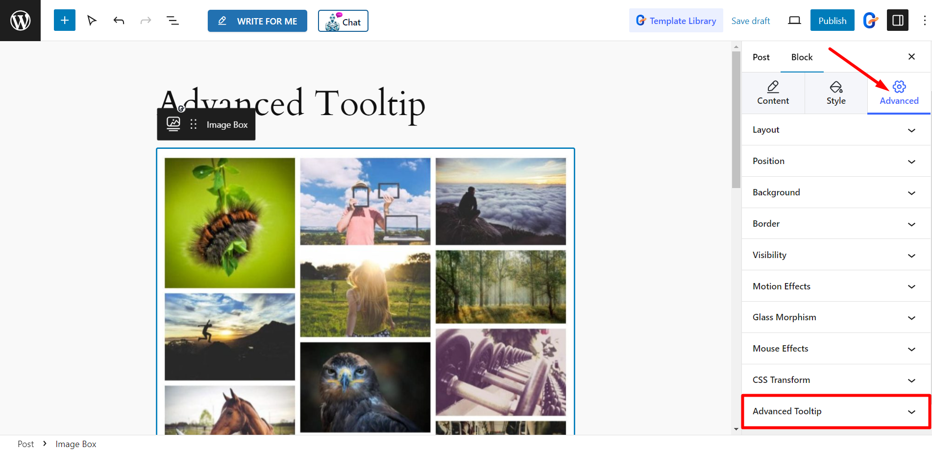

Now, click and expand Advanced Tooltip, then enable the Tooltip button.
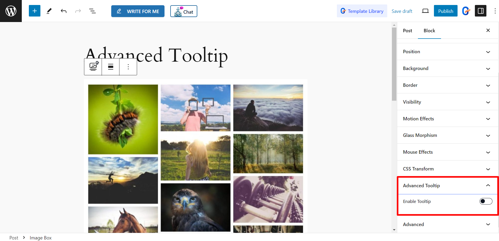

Settings #
Here, you will get –
- Tooltip Content – In is field you can write the tooltip content according to your wish.
- Position – Set the tooltip position from here, it can be at the Top, Bottom, Left, or Right.
- Placement – You can show the tooltip at the Start, Center, and End.
- Trigger – You can set the tooltip at hover or click.
- Offset (Px) – It defines the distance of the tooltip from the image, you can adjust the Offset value here.
- Enable Arrow – You can show a arrow with the tooltip text by enabling this option.
- Animation – There are animation styles like fade, Scale, Perspective etc. to design the tooltip with animation effects.

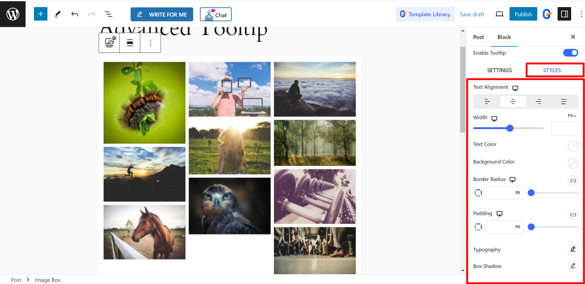
Styles #
- Text Alignment – It lets you adjust the text alignment.
- Width – You can control the tooltip’s width using the bar.
- Text Color – Change the text color from here as you wish.
- Background – You can also change the background color of the tooltip based on your choice.
- Border Radius – It allows you to adjust the border radius of the Tooltip.
- Padding – This option is for setting the padding.
- Typography – If you want to change the typography of the text, you can do it from here.
- Box Shadow – To style the tooltip box, you can add shadow to it.

How it looks #
After customization our tooltip looks like this –
