 English
  German
  Spanish
  Italian
  French
  Danish
  Portuguese
  Swedish
  Polish
  Korean
  Japanese
Have you tried the new Elementor Flexbox Container feature?
Well, the buzz is it’s a great addition to make your website more optimized for all devices and make your site load faster.
How?
Well, the new flex container works in a little different way (both front end and backend) than the previous sections/inner section. And these new and different ways of working are what does the magic.
In this blog, you will learn about the new options Elementor flexbox container brings to the table to build a website and how to use Elementor Flexbox Container in a step-by-step guide.
So keep reading…
What is an Elementor Flexbox Container?
Elementor Flexbox container brings all the CSS Flexbox facilities to your Elementor editor. With the new addition, you can easily create advanced layouts to ensure that web pages look great on all devices irrespective of size.
Note: CSS flexbox container like the name suggests provides you advanced flexibility to create device responsive design. Before the introduction of flexbox, it was rather complicated to create responsive design using multiple layout modes like Block, Inline, Table, and Position. But with flexbox containers, you no longer need multiple layout modes.
And when it comes to the Elementor flexbox container, you won’t have to use sections anymore. You can add widgets within a container without any section. You can also add an infinite number of containers within the container.
Once you add widgets and containers, you can control the distribution of widgets within the container along with the layout for each device. Besides, you get separate customization settings for each container (even containers within a container). This empowers you with the best flexibility to make your design device responsive.
You can also check out Elementor 3.6 Review: New Features and Improvements
Difference Between New Elementor Flex Containers and Sections
You must be wondering what are the differences between containers and sections. Well, there are quite a few differences. These are some key differences :
- You can add widgets to containers with flexbox whereas with sections you need to add columns and then add widgets to it.
- In the flex container, the widget width is inline by default whereas, with column section structure, the widget width is full width by default.
- Earlier, you could add only one inner section inside a section, but with the latest flex containers, you can add as many containers as you want.
- With the column-section structure, you could change the widget direction using column, or inline positioning. Now with the latest flex container, you can change the widget direction using Column, Row, Column Reverse, or Row Reverse.
- In the column section structure, Reverse Column or Duplicate Sections were used to make web pages responsive. In the latest flex container method, you can use a Custom order of widgets or Containers for each device.
- The alignment options in the section/column structure are Left, Center, and Right. On the other hand, with flex containers, you get alignment options such as flex-start, flex-center, and flex-End.
Now, you must be thinking about how these changes can benefit you. To learn more about that, move to the next section.
Advantages of using Elementor Flexbox container
A lot of research is done before a new feature is added to a plugin to ensure the feature is useful to the customers. The same goes with the Elementor flex container. This Elementor feature has been added because it will benefit the users to a great extent.
Here are some of the advantages that you will enjoy if you use the Elementor flexbox container:
- Since section and inner section will be replaced with flex containers, you can build more optimized websites.
- Flexbox will reduce the number of Elementor Flexbox columns and inner sections. As a result, less code will be produced in the backend. And less DOM will result in better speed for your WordPress site.
- Flexbox container settings will empower you to build device-responsive websites with more flexibility than before.
- Now you can hyperlink a complete section. Earlier you could only hyperlink widgets.
- If you were unhappy earlier because you could only add one inner section in a section, then the flex container is for you. With flex container, you can add containers within the container indefinitely.
Note: You will need Elementor 3.6 installed on your system to follow the next steps that show the process of using the Elementor flex container.
You can also checkout our blog How to Add Currency Switcher to WooCommerce Website in 5 Steps
How to Use Elementor Flexbox Container In 6 Steps
Follow the steps below to learn how to use Elementor Flexbox container on your website to get a more optimized look. The process consists of 6 easy steps:
Step 1: Activate Flexbox Container in Elementor Experiments
First, you will require a flexbox container feature to leverage the flexbox container in Elementor. For that, navigate to Elementor ⇒ Settings from the WordPress dashboard. Now move to the Experiments tab and scroll down to find the ‘Flexbox Container’ option.
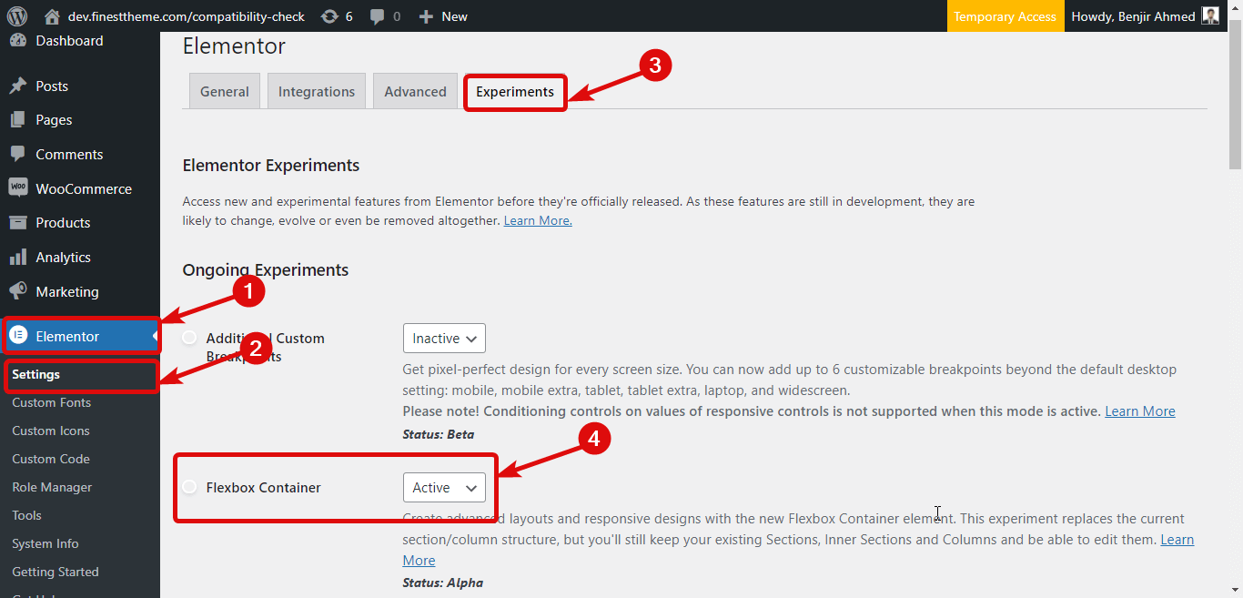
After you find the option choose Active from the dropdown menu to activate Elementor Flexbox Container. Finally, scroll down to the bottom and click on “Save Changes” to save the status.
🤷 Want to add custom CSS to your Elementor website?
Check out different ways to add custom CSS in Elementor in our blog
👉👉 How to add Custom CSS in Elementor: 4 Easy Methods
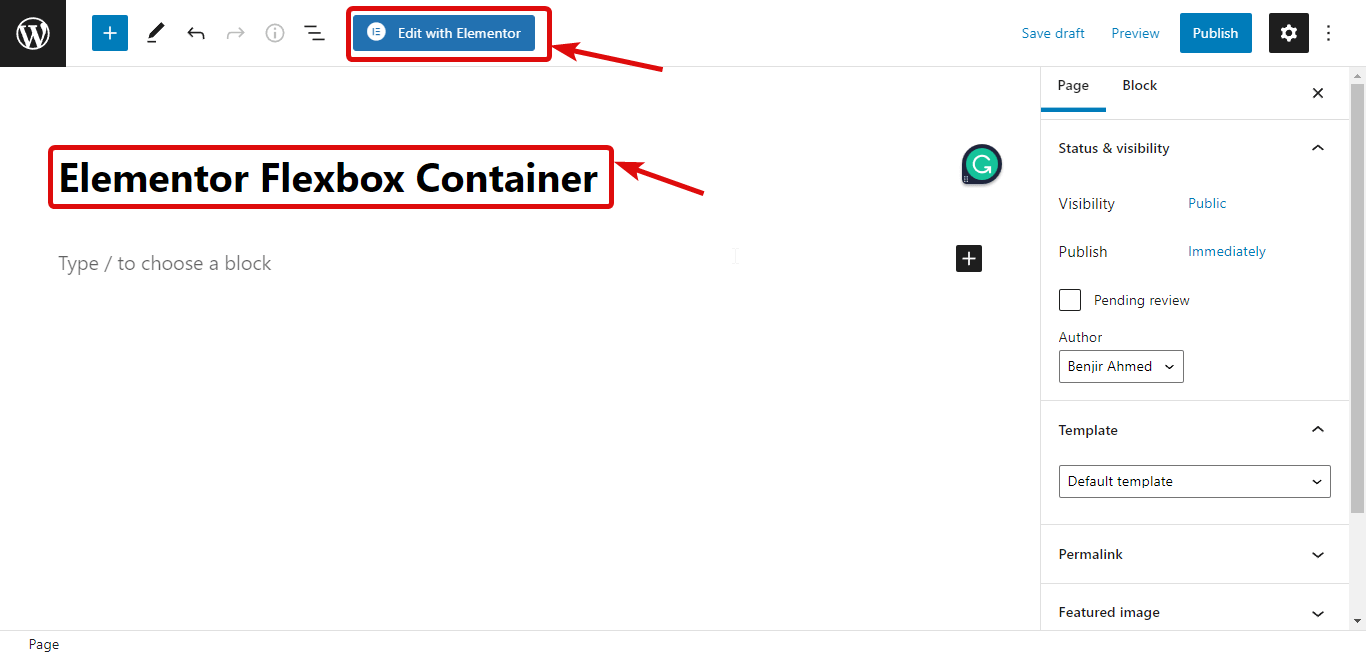
Step 2: Create a new page
After activating the flex container, it’s time to create a new page so you can use this feature. For that, Navigate to Pages ⇒ All Pages and then click on Add New. Now, provide a title, and click on Edit with Elementor
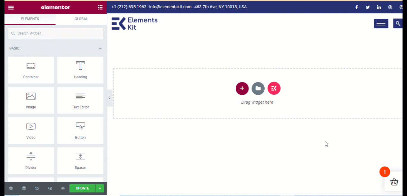
Step 3: Add a container
Now, instead of a section, you need to add a container. For that, click on the + icon, then choose the structure you like.
Note: If you notice the structure in the navigator, you will find that the structure is actually a container that has other containers in it rather than columns. You can also drag and drop a single container from the menu on the left.
You can customize many options for the container such as
- Container width: You can choose container width as Boxed or full width.
- Width: If you choose Boxed as container width, then the width will be 928Px. On the other hand, if you choose Full Width, then container width will be 100% of the viewport width. However, you can change both the width values.
- Overflow: You can choose overflow value as Default, hidden, or auto.
- HTML tag: You can also change the HTML tag of the container. You get options such as div, header, footer, main, article, section, etc. There is a new addition of a tag. This way you can turn an entire container into a link with a tag.
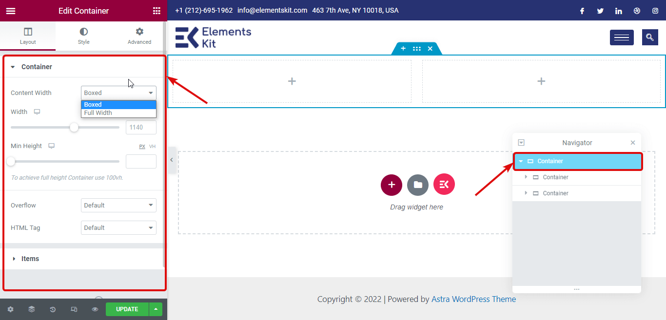
Note: You also get many options under “Items” (more on than later). Moreover, you can customize all the settings above for each inner container as well.
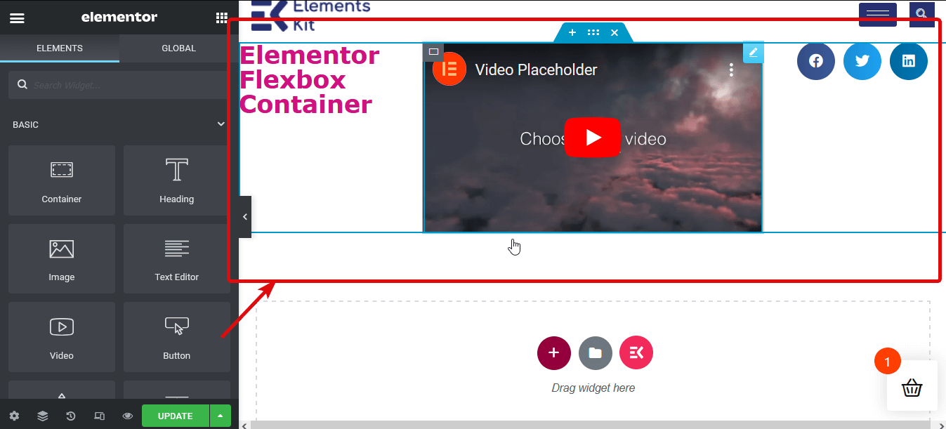
Step 4: Add widgets
The process of adding widgets is the same as the column section structure. You need to search for the widget then drag and drop on the + icon of each container. For example, I am going to add one heading, one video, and one social share icon.
🤷 Ever faced Server Error 400 Bad Request in Elementor?
Check out different ways to solve this server error
👉👉 How to Fix Server Error 400 Bad Request in Elementor
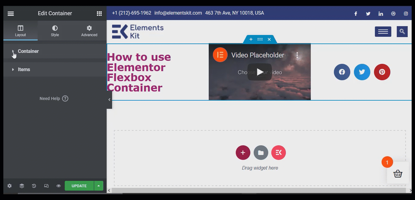
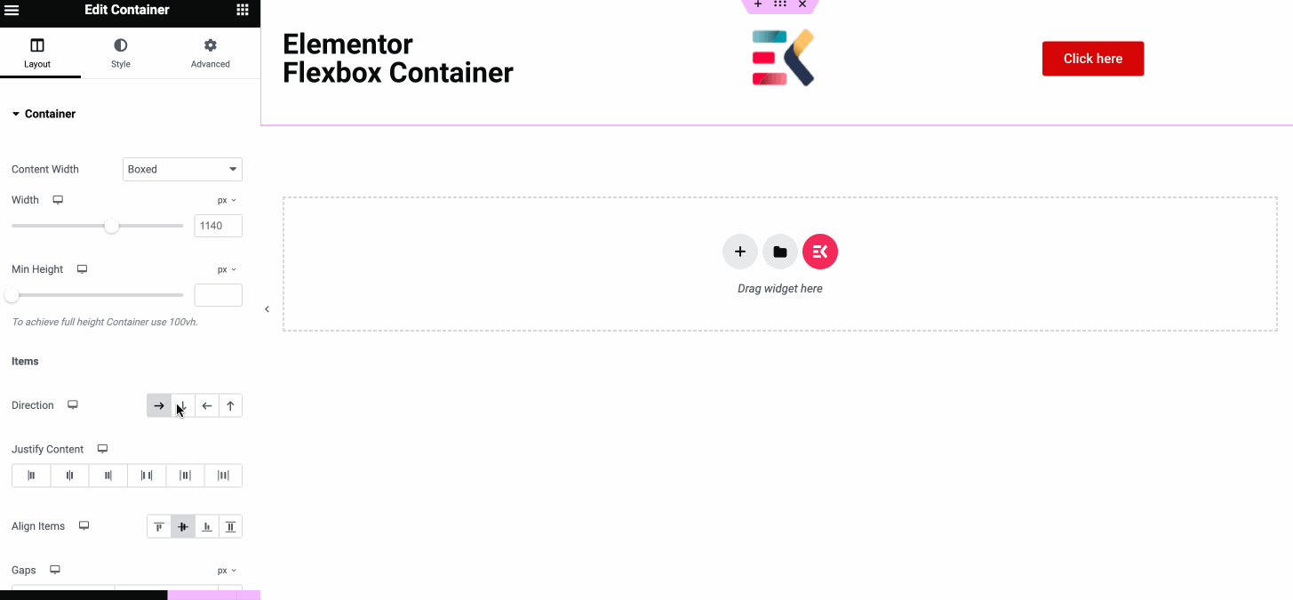
Step 5: Customize container contents
Now it’s time to customize the container widgets. For this, edit the container. Then, go to Layout on the left panel and expand the Items option. Here are the options you get to play with:
- Directions: The default direction is row. However, you get four options such as Row, Column, Reversed Row, and Reversed Column. If you choose the column or reversed column then all the containers within the main container will show up as different Elementor flexbox columns.
Note: If you choose a column then, you need to adjust the width of the inner containers.
- Align Containers: You can set the alignment as Flex Start, center, flex-end, and Scratch. Flex starts place your container element from the start point, and with a Flex center value you can place the items in the center. On the other hand, with Flex end, you can display all the inner containers on the bottom. And with the stretch option, the inner containers will take up any extra space if allocated. All these will be applicable if you choose direction as a row.
On the other hand, if you choose the direction as a column, then the flex-start and center values will work the same as the row. But with the flex-end, the containers will be shifted to the right and with scratch, it will take up any space on the left.
- Justify Content: You get six options to justify content: flex start, center, flex end, space between, space around, and space evenly. Space between will add the same space between each of the items. However, it will not add any space on the top or bottom of the items.
The space around option will add space on both the top and bottom of each container. And the space evenly option will add the same space around all the widgets and inner containers.
- Elements Gap: You can use this option to add space between elements (widgets and inner sections).
- Wrap: Choose No Wrap to put all the items in a single line and Wrap to let the contents flow in multiple lines.
🤔🤔 Have you tried a AI writing assistant tool to create content for your site? AI writing tools can save you lot of time by generating plagarism-free quality content within few moments. Check out our blog on
👉👉 Jasper vs GetGenie : Which is the Better AI Writing Assistant?
Step 6: Publish & Preview
You can repeat step 4 to customize all your container settings. Once you are done with the customization, click on the publish button to publish the page. Then, you can click on the preview button to see your page with the new flex container structure.
You can also checkout How to Build a Mega Menu With Elementor and ElementsKit
How to convert Section based Elementor page to Flexbox Container
Converting section/column based structure to the new Elementor Flex container is super easy. You can do this by following the 4 simple steps shown below:
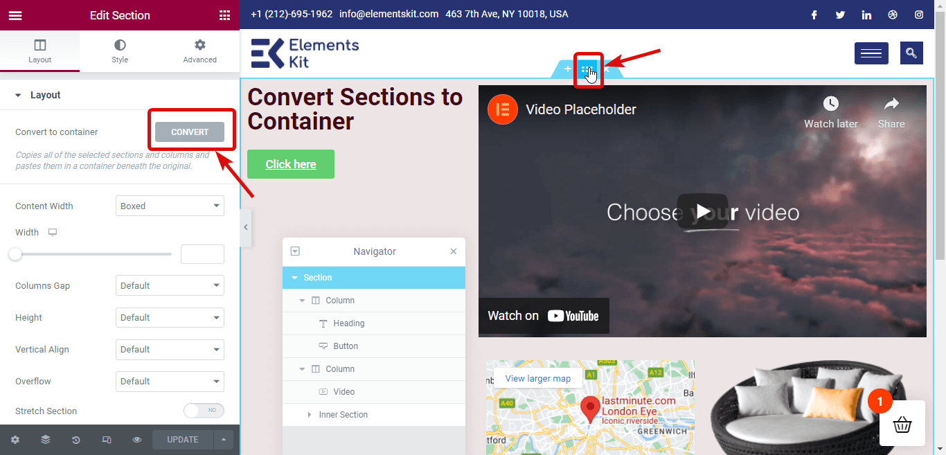
Step 1: Select the section you want to convert
You need to convert each section separately. So, first, select the section you want to convert. You can click on the Six dots to select a section or select a section from the navigator (you can find the option in the bottom-left corner).
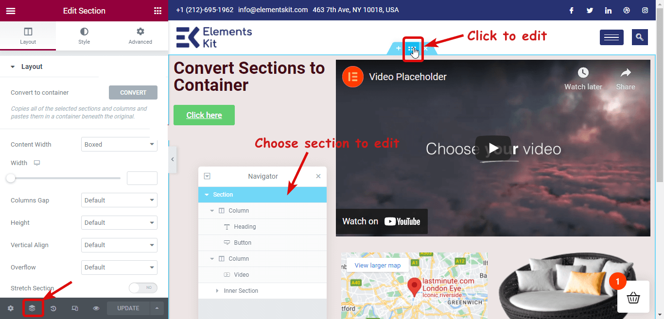
Step 2: Click on Convert to make the conversion
Now to convert, on the left panel, you will find a Convert to Container option under the layout. Click on the CONVERT button.
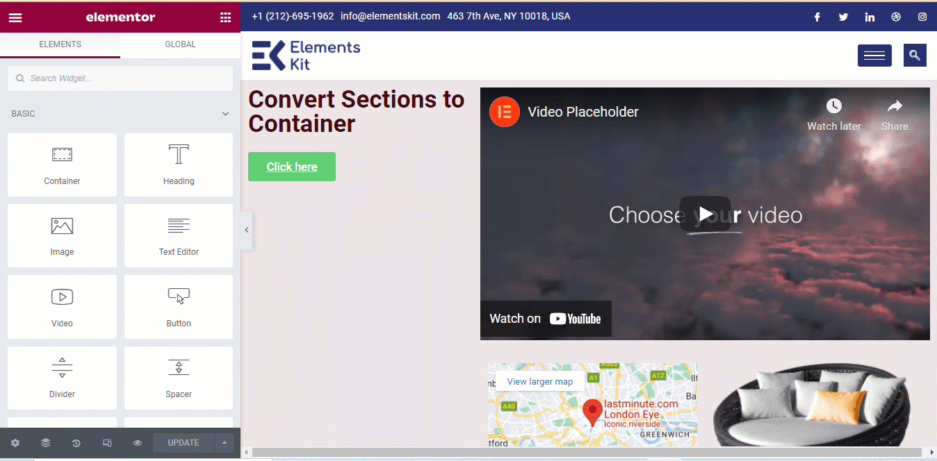
Step 3: Delete the previous section
After the conversion process is complete, you will find two versions of the same section. One is section-based and another one is container-based. The version on the top is section-based. Delete the previous/ Original version.
Step 4: Update and Preview
You can repeat steps 1 to step 3 for all the sections of your page. Once you are done with converting all the sections into Flexbox container layout, click on the update button to save. Now you can click on the preview button to see the same page but with a container layout.
You can also checkout How to Build Elementor Conditional Logic Form in 5 Steps
Can You Create Horizontal and Vertical Flexbox Container in Elementor?
Yes, Elementor supports creating horizontal and vertical flexbox containers in less than a few seconds. Just you need to select the six dots of the Elementor container and select the horizontal or vertical direction from the layout tab. Thus you can make your flexbox container without a hitch.
Can I use Elementor add-on features with the new Flexbox Container?
Yes. You absolutely can.
You can use ElementsKit- the Ultimate Addon for Elementor to add additional widgets and other features to the Elementor page builder. This Elementor addon is 100% compatible with the new Flexbox container of Elementor.
You can use the same process of converting any Elementor section to Container layout (shown in the above section) to convert ElementsKit sections/pages.
ElementsKit comes with 500+ Ready Sections, 35+ Ready Pages, and 85+ Custom Addons features to make your life easy. You can easily create a complete website using the ElementsKit Premade template in just a few minutes.
Here is an example you can see how smoothly ElementsKit premade pages get converted to Elementor Flexbox Container.
Wrap up
I am sure now you realize why there is so much around this new addition of Elementor. Elementor Flex container is truly a blessing to all the WordPress website builders who were looking for ways to make websites more optimized, faster and responsive irrespective of device size.
And the icing on the cake is you can turn your previously created website into a Container-based optimized website in no time. However, the flex container is still in the experimental mode. So, it’s not recommended to use it on a live website till it’s published as an active feature
Till then, feel free to play with the Elementor flex container on your staging site. And do try out ElementsKit to get more flexibility to design an amazing-looking website that holds your customer’s attention and elevates your website’s success.

Leave a Reply