Contact form has been a simple and quick channel of communication between website owners and visitors. And, when you go to create one, you need to follow a series of best practices for designing WordPress contact forms to make sure that the contact form is well-designed, functional, and engaging.
In this article, we’ll dive into 11 best practices for designing WordPress contact forms. Plus, there are some tips to add flexibility and efficiency for users to increase the number of form submissions.
Why it is Important to Design Contact Form in WordPress
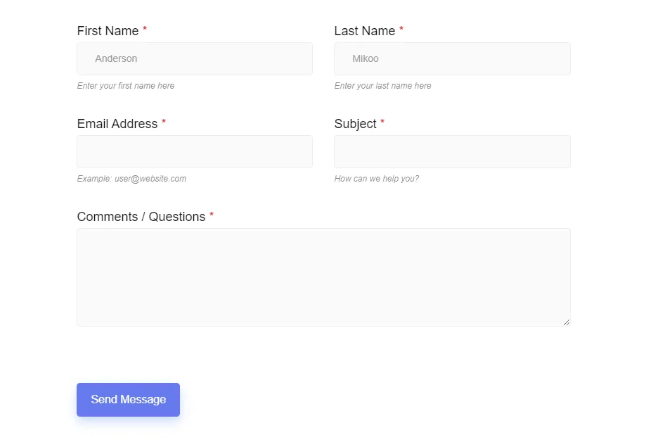

What does a simple contact form look like? In most cases, we see fields for visitors’ names, addresses, and messages. But, you may want to ask for other information that requires you to add more fields and functionalities. Overall, the structure of a contact form depends on the reasons for making it.
Sometimes, you may even need multiple contact forms for different purposes. To make an easier experience, you should proceed with a design with minimum fields to avoid an overcrowded contact form. Here, the multisteps contact form may work best.
Another crucial point is inserting personalized content, which is possible by applying conditional logic for some of the input fields. Further, you can also add relevant visuals to make high-converting contact forms. Actually, there isn’t any exact list of practices for designing WordPress contact forms. However, we are going to focus on some of the best practices for designing WordPress contact forms.
Best Practices for Designing WordPress Contact Forms
There are no textbook guidelines for creating your contact forms. You may need to consider various aspects depending on the type of form you’re creating. But, right now, we’re going to break down 11 best practices for designing WordPress contact forms.
Applying these cutting-edge practices, you can create a suitable WordPress contact form.
1. Work With a Plugin
Mostly, WordPress users look for plugin options when they need any web-related solutions. The plugin lets you design a contact form without any coding hassles. If you pick an effective plugin, you can quickly set up and design a form in no time.
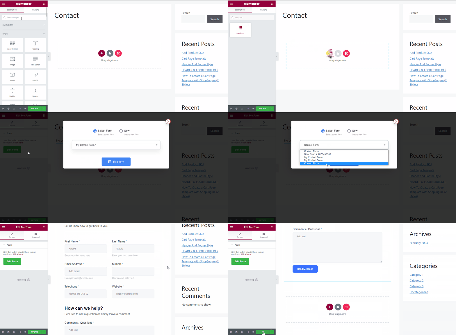

For example, you can take the help of MetForm – a drag-and-drop contact form builder plugin. It has 40+ fields and customizable templates to create a fully functional contact form for your website. You can easily apply a background color using a color picker and customize an appealing submit button. Plus, you have unique solutions like Google reCAPTCHA to secure your form from spam traffic.
Therefore, you will have an enhanced experience with custom code free and saving a great deal of time and effort.
2. Keep Up with the Trendy & Straightforward Design
One thing needs to be clear here, there is nothing wrong with being creative. You can enhance all the creative aspects of the contact form. Visitors shouldn’t feel like they are seeing the ordinary form layouts.
However, it shouldn’t be complicated for the users. All the information of the contact form should be accessible to the users withing a glance. All the field labels should be placed according to the user’s mind. Compile your WordPress contact form design upon a straightforward concept, it will help you to create an optimal user experience for visitors. Observe other websites to understand the current design trend.
3. Apply Conditional Logic for Personalize Content
Maintaining a personalized WordPress contact form requires you to present only the form fields that your visitors want to see. Conditional logic helps you come up with dynamic fields where certain fields only appear based on user actions.
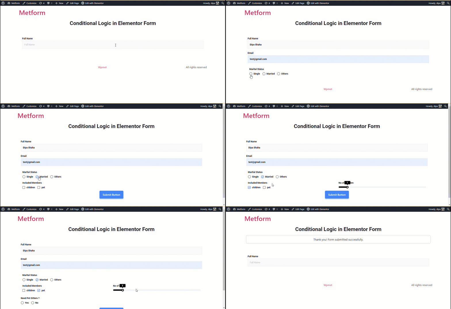

It’s an efficient way to show extra sets of custom text or field values based on your visitors’ actions or answers. Using conditional logic, you can be specific about the user’s gender, interests, personal information, and many more to give them a personalized user experience. As they see more relevant information they will be more motivated to fill out contact forms. All together, you will have a better conversion rate.
Using a plugin like MetForm can let you easily create a conditional form.
4. Establish a Purpose
Don’t just throw a random Contact Us page on your website. Rather, you should try to serve a specific purpose that your visitors will easily resonate with. Find out all the key aspects your target audience will look for. You won’t have any leads from your contact unless the web users are interested.
So optimize the contact form with all these relevant topics that can easily catch the user’s mind. Like they are looking for certain information which you can possibly give them. So they will be interested in a phone call session with you and fill out the forms with their mobile number and email. Or it could be a customer support or product inquiry, anything it can be but you must establish a purpose when you’re going to design the WordPress contact forms.
5. Maintain Consistency with Website
Another thing to swiftly put into practice is to maintain consistency with your website. If your audience suddenly sees something new, it might make them feel a little weird. So, design a smooth transition between the rest of your website content and contact forms.
We generally use a third-party plugin to create and design WordPress contact forms. Here comes the main challenge when one tries to sync the design of the contact form with the entire website. However, choosing a modern contact form builder plugin can help you align the design of the contact form with your website.
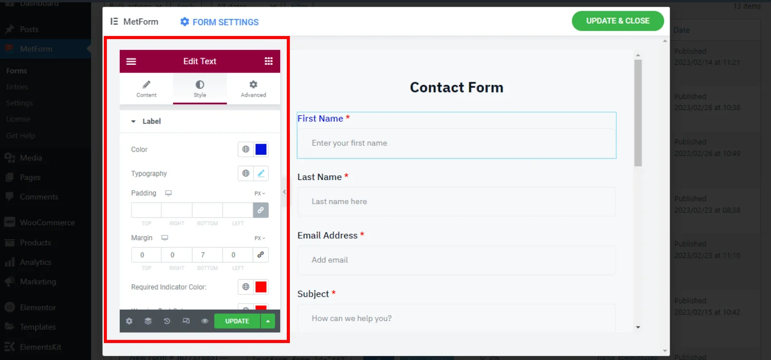

MetForm lets you create WordPress contact forms from scratch and you can customize almost every part of your form to match your brand style.
6. Put CTA Forward
The next thing you should pay attention to when following the best practices for designing WordPress contact forms is how you display your CTA button. Nowadays, users don’t want to scroll down to the web page. Therefore, if you place your contact form at the bottom of your web page, your visitors will probably miss it. Plus, a CTA at the end of a web page means you’re going to convert the users for something else.
So, you should put forward the CTA. And, most importantly customize it to stand out with a different color. Moreover, the days of simple CTA text like “Click here” or “Submit” are already over. Add interactive copy that doesn’t force your visitors to click. Tell users what exactly happens next after clicking the CTA button.
7. No Unnecessary Fields
There is no limit to the number of fields you can use in a contact form. However, we recommend you keep it to a minimum. As you add more of them, it will be more time-consuming for the audience. Therefore, they will be redundant to fill out the form and the abandonment rate of the contact form will increase.
It’s good practice to group similar fields, and you can get a little smarter by inserting different field types, like multiple choices or checkboxes. Don’t ask too personal questions like mobile number or smoking habit.
8. Design Multi-pages Forms (If Needed)
It might seem unnecessary at the moment, but when you need to add more form fields than usual- a multi-page contact form can be a better design practice. It’s good to avoid a long form as users don’t find comfort in filling out a long form.
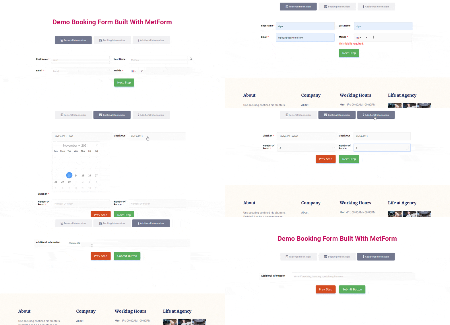

Hence, breaking your WordPress contact form into multiple steps or sections can be effective. But, it is only recommended to use multi-page or multi-step forms when there is an extreme need.
9. Commit to Responsiveness
No matter how attractive your WordPress contact form is, make sure its design is responsive to various screen sizes. This is a common design practice because there are a lot of mobile users who are going to surf your website. And, you can’t miss them out! So, making your WordPress contact form mobile-friendly can bring more potential leads and inquiries.
Building your contact form on an editor dashboard which gives you a preview of all devices can help you to come out with a responsive contact form design in the shortest time.
10. Must Check Before Making the Contact Form Live
For a safe and secure WordPress contact form, you must check that your newly designed contact is working accurately. Check out all added fields, assess the conditional logic, and test all the integrations. The best practice for designing a WordPress contact form is to use it like an end user before publishing the contact form.
Give a test submission of the contact form by yourself and check the plugin’s dashboard to ensure all the entries are saved successfully. By doing this, you’ll be aware of any issues and errors regarding the contact form. Also, adjust any changes to the design, if you won’t see your expected WordPress contact form look.
And, solve if there are any issues and errors regarding your contact form. Then, make it live or visible to the public.
11. Optimize The Thank You Message
The last of the best practices for designing WordPress contact forms is optimizing the thank you page. A standard contact form plugin will let you show a thank you message after the form submission – which may seem ordinary.
Instead, you can make additional customization of this message. Using MetForm, you have styling controls for the text’s color, font, background, etc. So, you can show a confirmation message uniquely to make a long-lasting impression on the audience.
💡 Check how to limit form entries in WordPress.
Common Tips for Designing WordPress Contact Forms
We’ve already outlined 11 best practices for designing WordPress contact forms to reduce the cart abandonment rate. Below are some essential tips to ensure more convenience for visitors, enhance engagement, and increase the number of form submissions.
👉 Help users by adding supporting text while adding uncommon fields.
👉 Show error messages when users give a wrong input.
👉 Add FAQs to answer some common questions.
👉 Insert a field for uploading files in case of a job application form.
👉 Include a field to let users add any type of content.
👉 Insert your social media or any other links to the WordPress contact forms.
👉 Add an alternative way to contact you if there is a problem in submitting the contact form.
👉 Enable the browser autofill option to save the user’s time.
👉 Add photos of your product or team to boost the credibility of the contact form.
👉 Apply a progress bar with a long contact form.
👉 Integrate with a lead generation tool to build your email list.
✅ Check the best Contact Form 7 alternatives to design engaging WP forms ✅
The Best Way to Design Contact Forms in WordPress
Above we’ve discussed best practices and tips for designing a WordPress contact form. Now, let’s see the easiest way to design a contact form. Mostly, you’ll find suggestions for using code to customize the contact form. However, it can be a daunting task to do, especially for someone just starting to set up a WordPress website.
Instead, you can use a plugin for it. You just need to install & activate a plugin for this purpose. We already recommend you work with a plugin as one of the best practices for designing WordPress contact forms. Using the free version of MetForm, beginners can easily set up and customize contact forms for their website.
And, when you need advanced functionalities for your contact form, you can easily upgrade to the pro version. In the meantime, you won’t need to go through any learning curve. It’s an Elementor-based form builder plugin. So, if you are an Elementor user, you can easily sync the contact form with the rest of the website. Here’s a detailed guide on how to design a contact form using MetForm.
Closing Notes
Following all the practices and tips we’ve discussed lays the foundation for a solid design of your WordPress contact form. Then, it is down to your creative competency. And to show this artistic excellence, you should take the help of an all-in-one form builder plugin like MetForm.


Leave a Reply