 English
  German
  Spanish
  Italian
  French
  Danish
  Portuguese
  Swedish
  Polish
  Korean
  Japanese

Forms play a vital role in gathering valuable lead info through websites and apps. This necessitates designing accessible forms, be it for websites or mobile apps.
Designing forms, regardless of type is a snap, but designing accessible or inclusive forms isn’t. But with proper guidance, you can build accessible forms effortlessly for your website or app.
This write-up, however, is all about helping you how to design accessible forms for your website.
What are Accessible Forms?
Accessible forms are forms that are easily usable by everyone, including people with disabilities. These forms are compatible with assistive technologies like screen readers, have clear and simple labels, provide alternative text for images, and offer suitable color contrast for readability.
How to Design Accessible Forms for Your Website?
To make your forms inclusive, you must focus on plenty of factors. The following tips will assist you in knowing about those factors, thus building forms that provide access to everyone.
Not everyone can use the mouse to navigate forms, for example, people with impaired vision and motor function. Besides, some may not be comfy to tap into the mouse for form navigation. So, you have to provide keyboard navigation support to allow your audience to fill out forms.
With this feature, these selected audiences can move to various links, buttons, and form fields using the “Tab” key. This ensures that you don’t miss the data of an important section of your audience who are unable and unwilling to leverage the computer mouse.
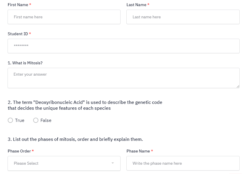
Stress on the Form Label Placement
The positions of your form’s labels are as pivotal as the presence of the labels. While the labels help people figure out what info to place in each input field, the right positions ensure the visibility of the labels.
You can position the labels above, right, or left of the form fields, depending on the form field type. What matters is the visibility of the labels and the aesthetics of the form fields.
Text boxes, dropdowns, and group labels for checkboxes as well as radio buttons, all these elements look cool, catchy, and visible with labels placed on top of the form fields.

However, for text boxes and dropdowns, placing labels on the left can also be accessible. As for checkboxes and radio buttons, you can place them on the right.
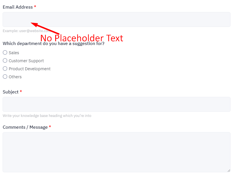
Skipping Placeholder Text is Better
Apparently, a placeholder is useful but it will hurt you more than benefit. The purpose of adding placeholder text or dummy text in forms is to guide users regarding what sort of data they should input in the form fields.
But the twist comes when you imperfectly apply the placeholder text as it can cause a number of issues for users. Here are the important ones –
- Vanishing placeholder text as users move to a particular field can strain short-term memory issue
- Fields with placeholder or example text can distract and sometimes annoy users
- In case of any error message, placeholder text doesn’t guide users on what to do next
Apart from regular users, placeholder text can trouble people with impairment and disability issues as well. The following issues are the major ones –
- The default grey color placeholder text doesn’t contrast well against the field background which causes clarity issues for people with low vision
- The placeholder text may sometimes disappear when users navigate with keyboards to select a particular field, causing annoyance and despair
Based on these issues, it’s better to skip enforcing placeholders for your form fields. Properly positioned labels will rather function well for all types of users.
Be sure to Display Error Message
How to design a form in Access also involves displaying error messages when needed. However, finding an error message isn’t desirable for users, things get even worse when users make an error and don’t know about it. So, you must make sure to show an error message when users input erroneous info.
You can display error messages on any side of a field (top, bottom, left, or right), or even at the top of the form. But to design accessible forms, the best practice is to place all error messages to the right of the field they refer to.
Placing error messages consistently on the right creates a predictable reading experience for screen reader users as most of the common languages follow left-to-right reading orders.
Having said that, working on a smartphone is the exception. For mobile experiences, error messages should show up below fields to slash cognitive load and follow the natural vertical reading order of the page.
Check out below how error messages elsewhere can affect your accessibility:
- Error messages on the left
- Affects the natural reading order for many people
- The leftmost side is usually reserved for the most pivotal elements, which in this case is the form entry field or form label.
- Error messages above fields
- Adding an error message next to the form label can create added complexity in the design, and doesn’t provide each element its own space.
- Putting the error message above the field can create a less logical reading order, whereas placing it to the right will likely follow a more helpful order of form label, the user’s entry into the field, and the error message pinpointing what is wrong.
Split Long Forms into Smaller Sections
Holding attention is a tough task and this is true for almost everyone but specifically for people with AD/HD. So, if your form is a long one, chunk it into smaller parts to keep the bounce rate as low as possible. This also makes long forms less tedious and easier to perceive.
Don’t forget to apply the following principles for multi-step forms:
- Repeat key instructions on every page.
- The forms should be broken into logical groups.
- The forms should notify the person about the progress they are making.
Leverage a Progress Indicator for Multi-step forms
When you deal with forms as a conversation, natural breaks will appear between topics. Progress indicators showcase progress through a sequence by breaking it into multiple logical and numbered steps.
This provides users with clear feedback on how much of the form they’ve completed and how much they are yet to complete. But avoid making steps clear in the progress stepper, unless you are sure how many steps filling the form will take and that there won’t be any deviation.
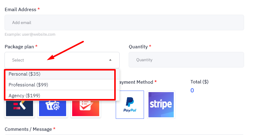
Tap into Single Column Forms where Possible
A study by Baymard Institute revealed that 16% of e-commerce sites use a multi-column layout. A multi-column layout may save space, but the path to completion of the form is less clear.
A user may also miss fields required to complete the form as they may struggle to comprehend the order the form should be filled.
Deploy Correctly Proportioned Form Fields
Be sure to tap into correctly proportioned form fields to align input sizes. The size of the container should be proportional to the prospective user input. This provides users with a better idea of the expected input and makes sure that they’ll be able to see their full entry.
Integrate Multiple Fields Into Single Form Fields, where Possible
Unnecessarily elongating forms isn’t the right way to go. So, minimize users’ interaction time with your form by merging multiple form fields into a single form field. This will save users’ valuable time and dispel the chances of incomplete form fill-ups.
Avail of Input Masking and Auto-formatting
Both input masking and auto-formatting play a key role in helping users where entered data could be in a variety of formats. But confusion arises surrounding these 2 terms.
Auto-formatting means how a field is formatted once data has been entered. An input mask is a defined pattern or string expression to guide the user concerning how the field input should look.
When enforcing input masks, a good practice is to show the input format right up front and not gradually reveal it as people enter information into an input field. This ensures the user has clarity as to what the desired format is up-front.
Streamline the Layout and Appearance
Don’t forget to optimize the layout and appearance of the form elements and the overall form structure. This is salient for usability, readability, aesthetics, and user perception as well as satisfaction.
While improving layout and appearance, keep in mind the number & order of form fields and sections, the size & shape of form fields and buttons, the contrast & color of form elements and text, as well as the font & alignment of text.
Target minimizing the number of form fields & sections, ensure buttons are large enough for easy tapping or clicking, and apply adequate contrast between elements to be legible for those with low vision or color blindness.
Also, use a crisp font compatible with different browsers and devices, and avoid applying center or justified alignment which might create uneven spacing.
📌 Stop scrolling to check the best Fluent Forms alternatives 📌
Group Form Controls Perfectly when Required
Giving MCQs a logical structure helps screen readers clearly explain the form. This is where <fieldset> and <legend> tags come in, especially with questions entailing checkboxes or radio buttons.
The <fieldset> tag informs the form that a group of inputs belongs together, and the <legend> tag acts as a label for the group. If these elements don’t show up in your code, people using screen readers will hear the label for each option but not the question it’s answering.
For example, you have a form label “What type of person is he?” and the choices are Funny, Social, Both, and Neither. With no <legend> tag in your code, a screen reader would only read out the label for a single input and the labels for the remaining ones won’t be read out.
This issue is particularly problematic with “yes or no” questions. After hearing these general answers, visually impaired users would even fail to guess what is being asked.
So, use <fieldset> and <legend> tags in your code to make the questions and possible responses clear to all users.
It’s a Wrap!
All your leads and prospects are unlikely to be physically fit. But that doesn’t mean when they visit your website, you should let them slip off your fingers. Forms are the gateway to collect your target audience’s key info, so you should leave no stone unturned to allow them to fill in forms.
By following the form design best practices, you can not only build fascinating forms with a high access rate but also maximize submissions. Consequently, the chances of conversions will also escalate.
You can check out MetForm templates for various types of forms, including contact forms, multi-step forms, booking forms, signup forms, and subscription forms.

Leave a Reply