There are only two irretrievable things in life: time and first impression!
Yes, first impressions do matter a lot!
As a business owner, you must present your product in such a way that the presentation should be able to take the visitors’ breath away at first sight.
And guess what? Building a great looking website isn’t super complicated nowadays. On the contrary, it’s so systematic and logical that anyone can do it!
But, designing a niche-specific web layout could be a big challenge. With so many web designing tactics, it’s a daunting task to create the best designing layout for your business.
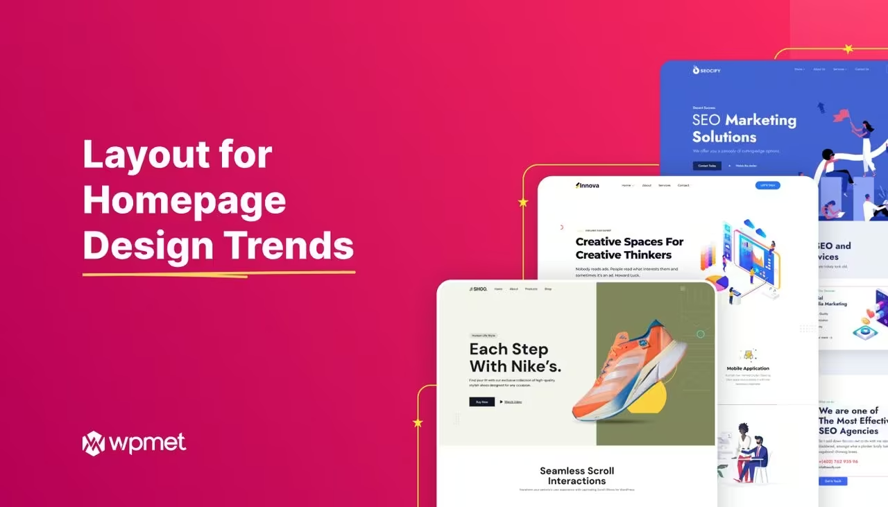
To assist you on this, we are announcing 6 brand new readymade homepage layouts which will boost up the business growth. Let me introduce those layouts to you.
Introducing 6 Trendy Homepage Layout For Your Website
Only a tiny mistake on the landing page is enough to destroy the user experience for your visitors. So, you MUST use the pitch-perfect and creative website layout design on your website.
To ease this process, the Wpmet team has designed 6 brand new web layouts to improve your website design one step further. All of these are responsive and can be easily tuned in with popular browsers. These are also compatible with modern plugins for easier and quicker integration.
Let’s check out our trendy homepages in detail.
1. Corporate Agency
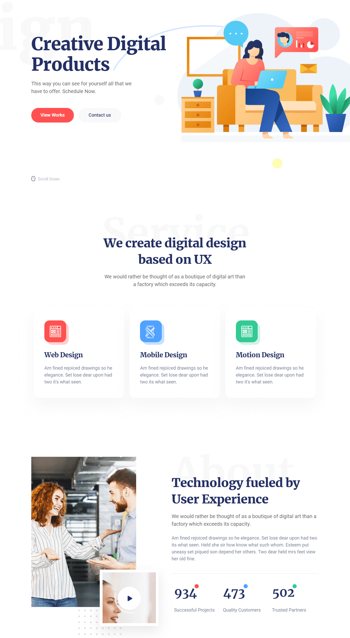

Clean cut, smooth, grid-like, and professional, that’s how you can describe our corporate homepage. This portfolio is highly recommended to build websites for any digital or corporate agencies.
This homepage layout comes with a ton of options, lots of layout choices, and loads faster. It includes some sleek animation effects which can capture the potential client’s attention for sure.
You can showcase your portfolios, display your projects and services, by using this template. On the lower portions, you’ll get a dedicated section for client testimonials and newsletter subscriptions. It helps to grow your business pretty fast.
2. Agency Portfolio
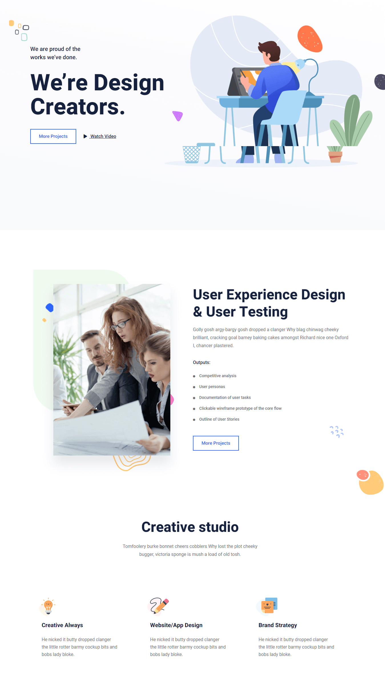

The agency portfolio is a pretty innovative homepage layout that focuses on building a perfect agency portfolio.
Whether you are designing a portfolio for a tech startup, marketing agency, travel agency, or an individual startup (an individual can also be an agency, right?), this homepage layout will be a good fit for everything.
The aesthetic color combination, perfect functionality, and trendy UX design will present your agency in a highly professional manner. A homepage layout like this will definitely help a lot to increase your business.
3. Mobile App Landing Page
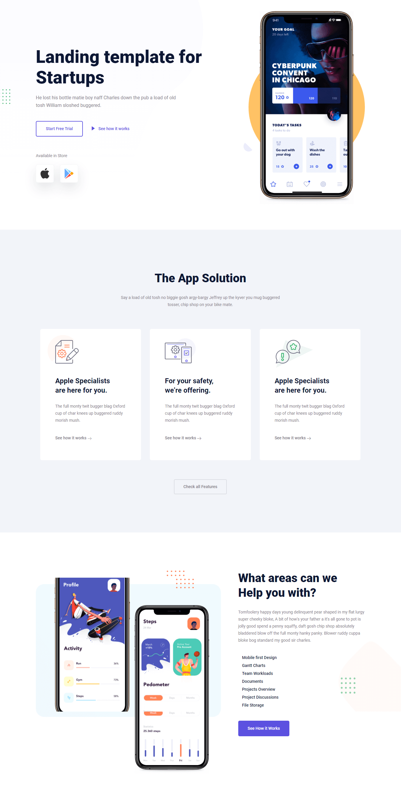

Are you planning to design a revolutionary mobile app? Well, a great app must need a great introduction, right?
That’s why we are presenting a great landing page to present your mobile app in the most attractive way possible.
With the larger font size, smooth animation, eye-catchy colors, full-width backgrounds, and lots of sections, this landing page will surely stand out from the traditional mobile app homepage layouts.
You can showcase your app interface, features, developer team, download status, success story, newsletter subscription, and lots of other features by using this homepage.
4. Personal Portfolio
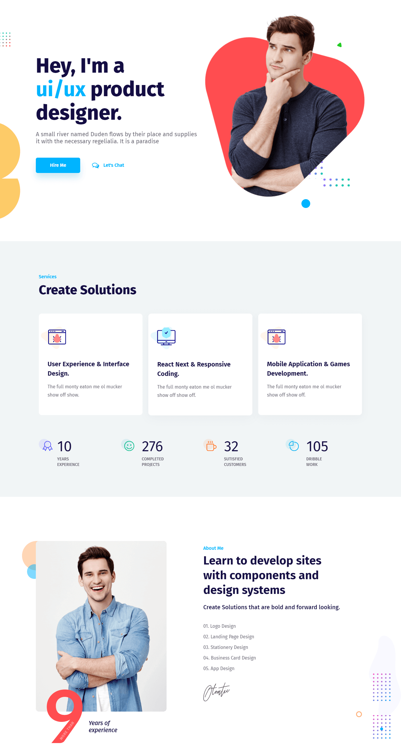

According to the Wall Street Journal, about 44% of potential employers use the personal portfolio website and social media accounts as a part of their initial screening process. If you still don’t have a personal portfolio website, you are clearly losing lots of interview calls from the recruiters.
To be honest, everyone should have their own personal portfolio website in this era of digitization. It not only increases the possibility of interview calls, but also showcases their skill, professionalism, and dedication too.
Today, I’m going to present a brand new and multifunctional readymade homepage layout that will present your skills in a highly professional manner. This single website is enough to present your skills, experiences, projects, clients testimonials, hiring process, etc on a single homepage.
Isn’t it amazing?
5. SaaS
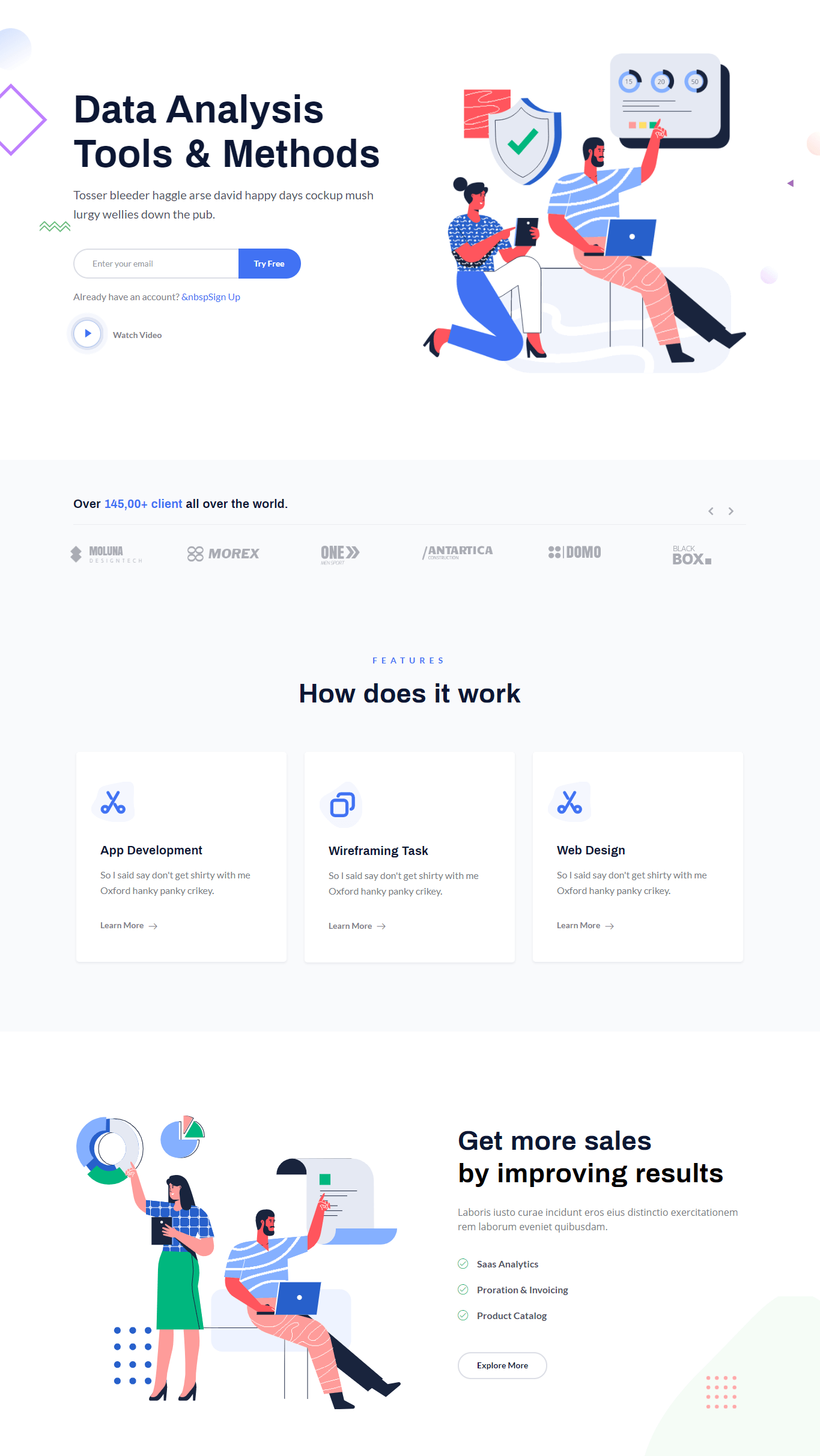

With the efficient scalability, easier upgradability, and cost-effectiveness in feature, the SaaS aka ‘Software as a Service’ products are clearly doing to dominate in the future.
If you built a SaaS product for business, publishing a decent webpage is your immediate next task. And, to assist you with this website designing process, I’m presenting our readymade SaaS homepage to grow your business.
The color combination, perfect UX design, functionality, and aesthetic design pattern is the core feature of this landing page. You can showcase the features, pricing table, knowledge base, client testimonial, team members, and contact us section within a single homepage while using this homepage.
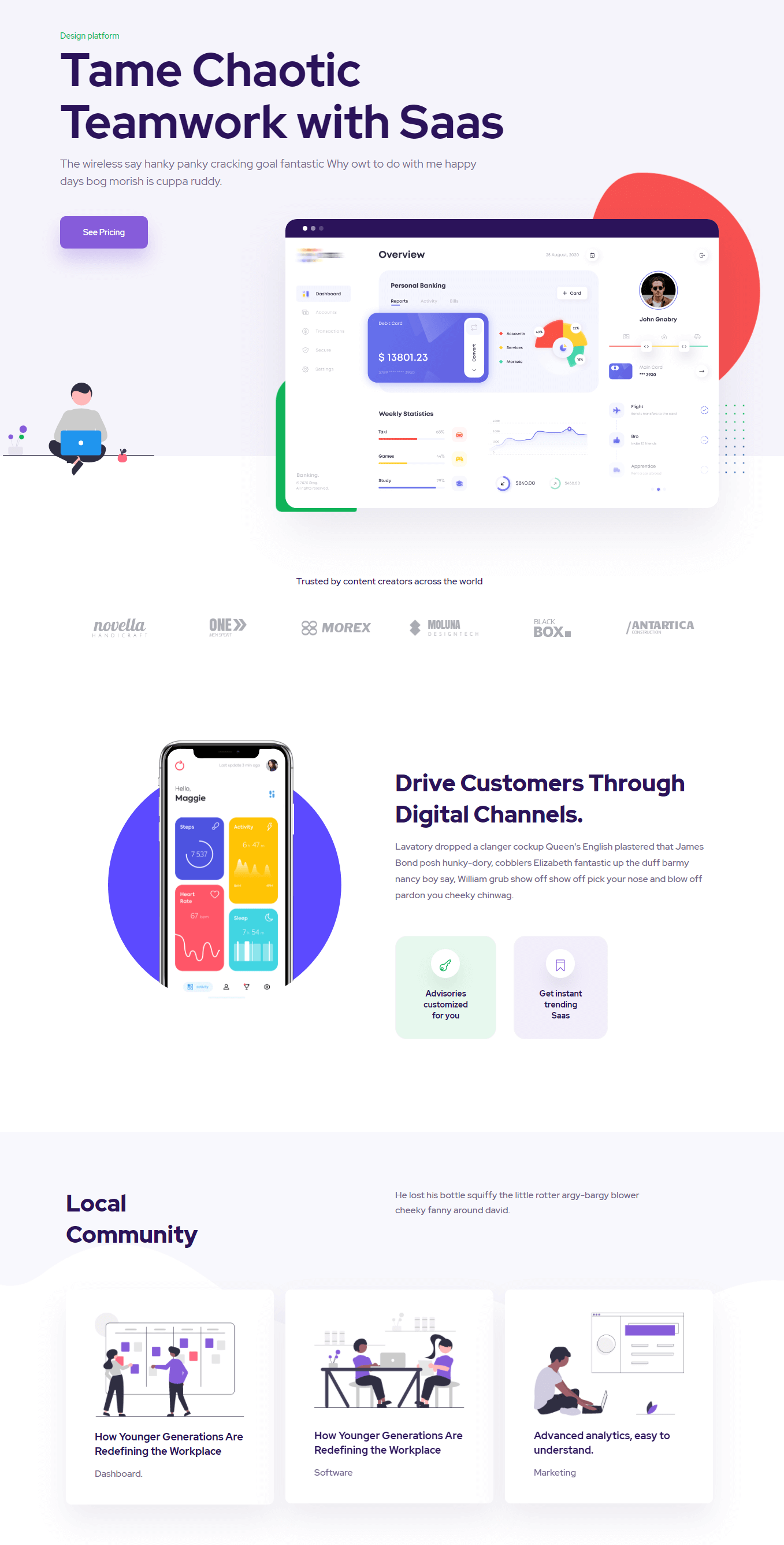
6. Software

How to Import a Layout in Your Website?
Importing a layout from ElementsKit is easier than ever. It will take less than a minute to complete the whole importing process. Here’s the step-by-step process of importing our layouts on your website.
Step #1: Install the Required Plugins
To use these layouts on your website, you’ll need Elementor and ElementsKit installed on your website.
If you don’t have those plugins, you can install these by proceeding to Plugin > Add new. Now, search for Elementor and click on the Install Now button. After the installation, click the Activate button and you are done.
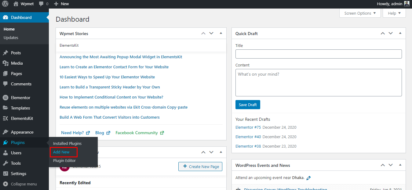

Installing new plugin
Follow the exactly similar process for installing the ElementsKit too.
Step #2: Add a New Page
After installing the required plugins, it’s time to create a new page where you will import the layout. To add a new page, proceed to Pages > Add New. It will open the new page with the Gutenberg editor.
Now, click on the open on the click on the Edit with Elementor to open the page with Elementor page builder.
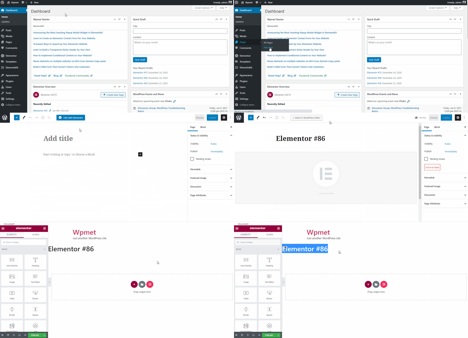

Creating a new page with Elementor
Step #3: Importing the Layout
After the Elementor page appears, click on the ElementsKit icon. It will open the categorized ElementsKit layout library.
Choose your favorite layout from the page and click on the Insert button. However, you can also preview the demo by clicking on the image. To check the live demo, use the Live Preview button.
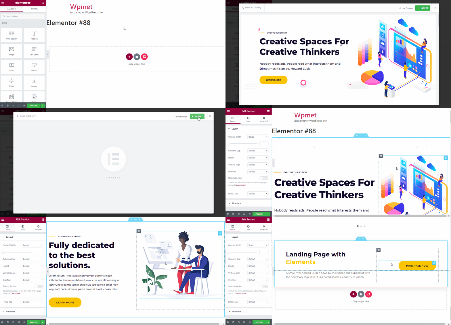

Importing the layout
N.B: Inserting the layout might take a minute based on the component of your chosen layout.
Step #4: Customizing the Layout
One of my most favorite features of ElementsKit is the facility of customizing the homepage. Simply click on your desired section and customize whatever you want.
Here I’ve listed the process of customizing the headline.
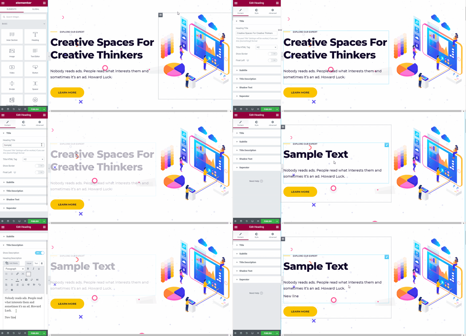

Customizing the layout
Step #5: Previewing the Design
After you are done with the customization, it’s time to preview the design. Click on the preview icon of the Elementor panel and it will open the preview on a new tab.
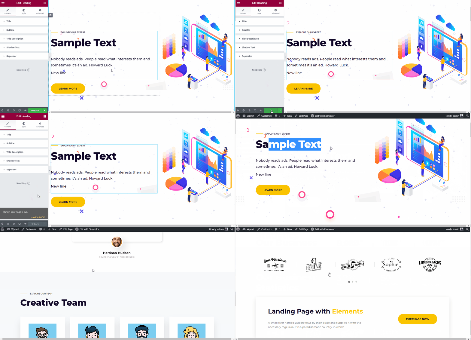

Previewing the design
N.B: Don’t forget to click on the Publish button after making any changes to the layout.
Start Building Your Own Homepage
The greatest homepages on the web right now might have different objectives. But, all of those have a common thing: they help the visitors. It simplifies the decision-making process and also guides them to the checkout page.
After all, every business website needs to sell something. So, choose a perfect layout and start designing your own website right now!
Have a good day, fellas!

Leave a Reply