
🏆
World Cup Final Special

GET THE Wpmet AIO BUNDLE FOR JUST $699

ENDING IN:
00 DAY
:
00 HOUR
:
00 MIN
:
00 SEC
Claim the GOAT Deal Arrow Icon

Comparação de imagens

O Comparação de imagens widget lets you showcase transformation effects with an interactive, side-by-side slider. With Kit de Elementos, you can easily customize the layout and handle styles to create a seamless visual experience.

Image Comparison is a feature that lets you display two images side by side with a draggable slider, so users can easily compare differences (like before vs after).

Quick Steps:


Insert the Image Comparison widget into your page
Add both images (before and after)
Choose the comparison layout (horizontal or vertical)
Customize labels, slider handle, and styling as needed
Preview and publish the page

Exemplo: You can show a before-and-after photo of photo editing, skin retouching, or any of your products, users drag the slider to see the changes clearly.

Takeaway: Image Comparison helps present visual differences in a simple, interactive way, making your content more engaging and easy to understand.

Using ElementsKit Image Comparison #

From your WordPress dashboard, open the page or post where you want to use the ElementsKit Image Comparison.

Get ElementsKit Image Comparison Widget #

Search ElementsKit Image Comparison widget and drag and drop it.

Search ElementsKit Image Comparison widget and drag and drop it

Customize the Content Part #

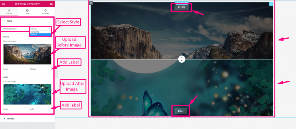
This part allows you to manage individual Unid (Before and After images) and configure the Configurações for the slider’s layout and behavior.

Unid #

  • Container Style: Horizontal ou Vertical
  • Carregar antes da imagem
  • Adicionar ou editar Antes do rótulo da imagem
  • Carregar depois da imagem
  • Adicionar ou editar Rótulo da imagem posterior
Configurações #

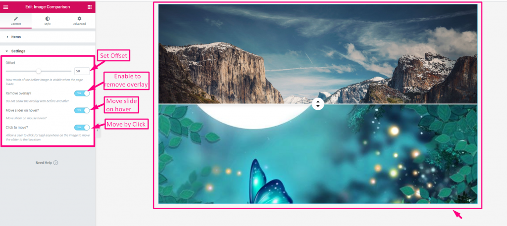
  • Set Offset: Starting position of the slider handle.
  • Enable to Remove Overlay: Hides the “Before/After” labels.
  • Enable Moving on Hover: Slider follows your mouse cursor.
  • Enable to Move by Click: Slider snaps to where you click.
Image comparison settings

Customize the Style Part #

It lets you customize the visual appearance of the widget.

Em geral #

  • Border Type (None/Default): Allows you to adjust only the Raio da Fronteira e Preenchimento for a clean look.
  • Border Type (Solid, Dotted, Dashed, etc.): Unlocks full control over Largura da borda, Cor, Raio, Preenchimento, e Sombra da caixa to fully style the frame.

Handle #

  • Control Width: Adjusts the horizontal size of the handle.
  • Altura: Sets the vertical size of the handle.
  • Tipo de plano de fundo: Choose between a solid color or a gradient for the handle’s base.
  • Cor: Sets the specific background color of the handle.
  • Imagem: Allows you to upload a custom graphic or icon for the handle.
  • Arrow Color: Changes the color of the directional arrows on the slider.
  • Sombra da caixa: Adds a shadow effect around the handle for a 3D look.
  • Margem: Adjusts the spacing around the outer edges of the handle.
  • Raio da borda: Rounds the corners of the handle to make it circular or curved.
  • Handle Divider: Enables or disables the vertical line that splits the two images.
  • Divider Thickness: Controls the width of the vertical divider line.
  • Divider Color: Sets the specific color for the vertical divider line.
Style ElementsKit Image Comparison widget's handle parts

Quais são os seus sentimentos

Updated on Abril 25, 2026