

 English
  German
  Spanish
  Italian
  French
  Danish
  Portuguese
  Swedish
  Polish
  Korean
  Japanese

Elementor widgets help to add page-building elements like a navigation menu, button, image box, FAQ section, and many more. Although several Elementor addons come with Elementor widgets, you are unlikely to get all the required widgets in these addons.
This is where you need custom Elementor widgets to fulfill your needs. ElementsKit has the functionalities to help you build the required widgets in no time.
This post will guide you on how to build a custom Elementor widget without coding in a minimalistic method.
Let’s proceed… now!
What Is a Widget?
Widget refers to a small GUI application that is used for completing a specific task. A widget could be any element of your website such as a button, check box, dialog box, scroll bar, search box, map, clock, visitor counter, etc.
Let’s consider the Elementor page builder as an example. This page builder is equipped with numerous built-in widgets. You can add the best free Elementor widgets to design your webpage.
However, you can also create a custom widget for Elementor if needed. And, the ElementsKit widget builder will help you do so!
Benefits of Using ElementsKit Widget Builder to Build Custom Widgets
We all know that widgets add excellent functionality to websites. But, finding a suitable widget to accomplish your custom task is nearly impossible. In that case, you have no other choice but to build a custom widget.
And, the widget builders make this custom widget-building process easier than ever. Let’s have a look at the key benefits of using a widget builder.
- Build custom widgets without any coding knowledge
- Widgets are completely responsive
- Create the widgets visually by dragging and dropping the elements
- Supports structured content
- Includes standalone code editor
- Support multiple field types etc.
These are the key benefits of the ElementsKit widget builder.
How To Build Custom Elementor Widget With ElementsKit (Free)?
A fully functional widget can supercharge your website-building experience. So, it’s essential to build your custom Elementor widget for your website.
Eager to know how to create custom Elementor widget? Here’s the step-by-step process to build a free custom Elementor widget by using the ElementsKit free widget creator.
Prerequisite
To build an Elementor custom widget, you’ll need the following plugins –
Once these tools are installed and activated on your WordPress website, it’s time to start creating the Elementor custom widget.
Step #1: Turn the Widget Builder On
To start the widget-building process, make sure you’ve turned on the Widget Builder module from the dashboard panel.
To turn it on, proceed to the ElementsKit dashboard panel, then click MODULES. On the modules section, spot the ‘Widget Builder’ module and turn it on.
Here’s the process of checking whether the widget builder is on or off –
Turning on the widget builder
Don’t forget to click on the ‘Save Changes‘ button after turning a module on or off.
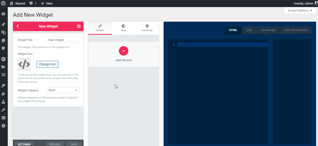
Step #2: Create an Elementor Widget
To create a new widget, proceed to ElementsKit > Widget Builder. On the new page, you’ll notice a new button called “Add New”. Clicking on that button will create a new widget on your Elementor left panel.

Creating a new widget
Now, you can customize the widget title, icon, and category from this page. Put a widget title and icon on your custom widget. You can use any icon from the Font Awesome icon library.
Customizing widget title and icon
While naming your widget, make sure to keep it relevant to your task. And add a relevant icon to your widget.
Step #3: Customizing the New Widget
Elementor widget development is done, now it’s time for customization. You don’t need any in-depth coding knowledge to build a new custom widget for Elementor. The ElementsKit widget builder makes the process smoother than ever.
Simply drag the ElementsKit widget from the left panel and drop it on the middle panel. The dropped widget will automatically create a variable on the right board.
Click on that variable, and it will be automatically included in the code editor. You may add additional HTML, CSS, and JavaScript markup via the code editor if needed.
After building a new widget or making some customization, click on the Save button and you are done.
Here’s the detailed process –
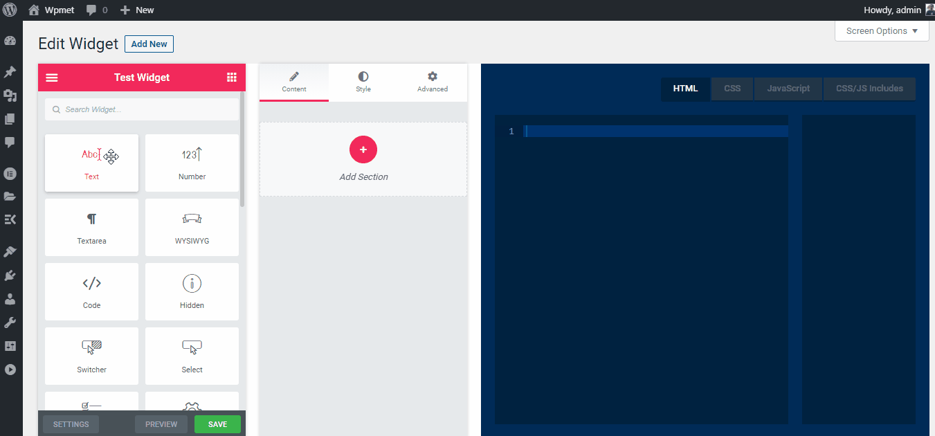
Building a new widget
You can add these controls to the Style or Advanced tab too.
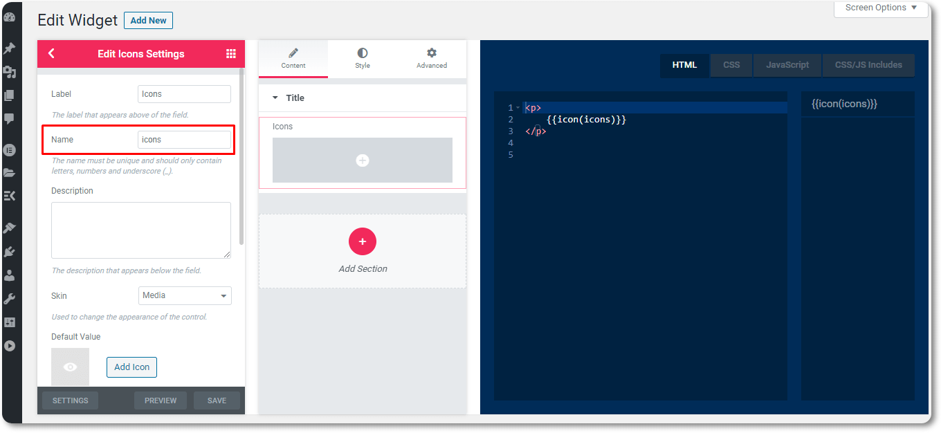
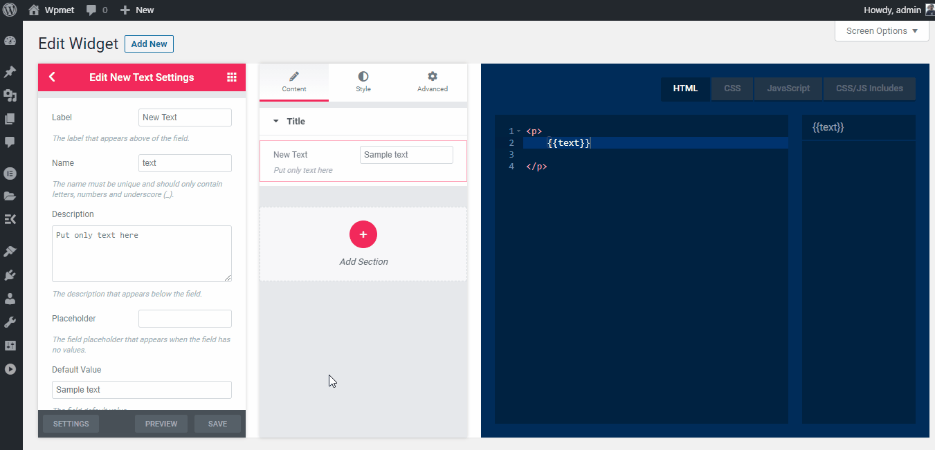
Step #4: Modifying the Widget Fields
While creating the widget, you can customize all of the widget fields or elements. For example, you can customize the label name, placeholder, default value, etc.
However, the customizing options aren’t the same for every panel. Different control panels have different input fields.
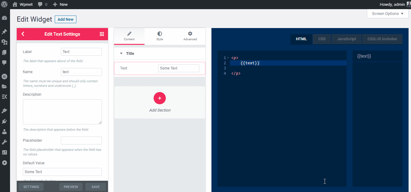
Customizing the widget fields
Pro tips: While adding the same control multiple times, the Name must be unique. Otherwise, it will create a variable conflict.
Step #5: Preview the Newly Built Widget
The newly built widget works utterly similar to the existing Elementor widgets. The freshly built custom widget will be available on the Elementor panel. To check the new widget, open a new webpage and drag and drop the widget on the new webpage.
Checking the new widget
Pro tips: You can add every ElementsKit control to build the Elementor custom widget via the Elementor widget builder. Get the ElementsKit pro version to access more Elementor controls.
Check the video below to learn more about the ElementsKit widget builder.
List of ElementsKit Supported Control fields
ElementKit offers lots of control fields to build a custom widget. Here’s the list of supported control fields –
- Text – The text field is being used to get text input.
- Number – Users can input numbers via the number control field.
- Textarea – The textarea field is used to input numbers, texts, symbols, etc.
- WYSIWYG – It’s the WordPress TinyMCE rich-text editor.
- Code – This control will add a code editor based on the Ace editor.
- Hidden – The hidden input field is used to save data directly in the database without providing an input field in the control panel.
- Switcher – A Switcher is a fancy representation of a checkbox. It is used to show/hide different blocks or elements of a webpage.
- Select – The select option provides multiple options for the users to choose from. It shows the options on a drop-down menu.
- Choose – Choose is used to show a button or a group of buttons with icons and other style or alignment settings.
- Color – It enables a color picker field packed with an Alpha slider.
- Font – The font control provides the users to choose a font from the Google fonts library.
- Date Time – The date-time library uses the Flatpickr library to pick a date and time.
- URL – The URL field provides a link with a button. You can set the button to open the link within the same or new tab as well as make it nofollow.
- Media – Users can choose different media by using this section. It shows the media files from the WordPress media library.
- Icons – The icon control allows the users to add icons from the Font Awesome and ElementsKit lite icon libraries. Users can also upload their custom icon library from the WordPress media library.
- Slider – Slider is a draggable scale that is used to choose between a range of numeric values.
- Dimensions – Dimension control consists of four input panels to set a suitable place for an element. The input panels are top, right, bottom, and left.
- Border – It enables the user to customize the border type, width, and color.
- Background – The background control allows the users to add a background image, video, and color. You can add static or gradient colors to the video.
- Box Shadow – The box shadow offers five different types of shadows around the box. It includes horizontal shadow, vertical shadow, shadow blur, shadow spread, and colorful shadow.
- Text Shadow – Like the box shadow, the text-shadow control also provides four different controls. These are horizontal shadow, vertical shadow, shadow blur, and colorful shadow around the texts.
- Typography – The typography allows the users to customize font family, font size, font weight, font style, line height, text-transform, and letter spacing.
- Image Dimension – Image dimension control consists of image height, width, and an apply button.
- Select2 – It also creates a drop-down menu like select control but with more style and design.
- Hover Animation – This control adds animation on different select boxes based on the Hover.css library.
- Entrance Animation – The entrance animation control allows the user to customize a button’s appearance based on the Animate.css library.
These are the controls of the ElementsKit widget builder that you can use while building a custom Elementor widget.
Final Words
This is how so easily you can build a custom Elementor widget by tapping into ElementsKit. ElementsKit comes with tons of built-in widgets which are likely to minimize your efforts in Elementor page-building.
At the same time, it also offers you a minimalistic method of Elementor custom widget development. Now, it’s your turn to install and pick up ElementsKit and reap the benefits of the addon in building Elementor custom widgets.

Leave a Reply