


ElementsKit Global Badge module allows you to highlight specific products or services with eye-catching labels like New, Sale, or Offer. This document explains every setting available, ensuring you can precisely customize the badge’s appearance and behavior.
How to Use Global Badge Module #
Open the page or post where you want to add a badge.
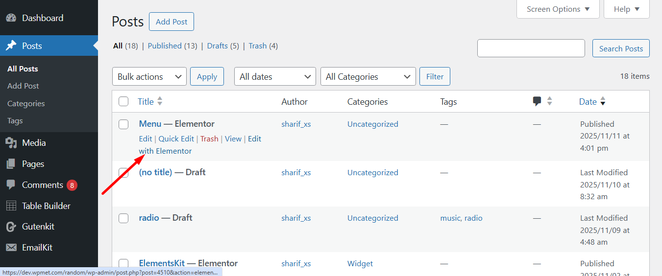
Now, follow the process.
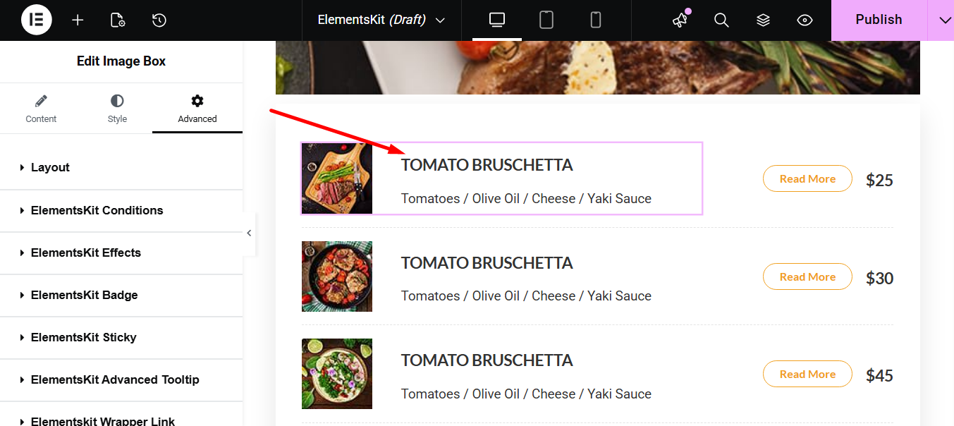
Select the page element where you want to add a badge e.g., a product or service listing.
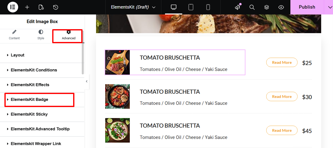
Navegue até o Guia Avançado. Here you’ll find the ElemetsKit Badge.
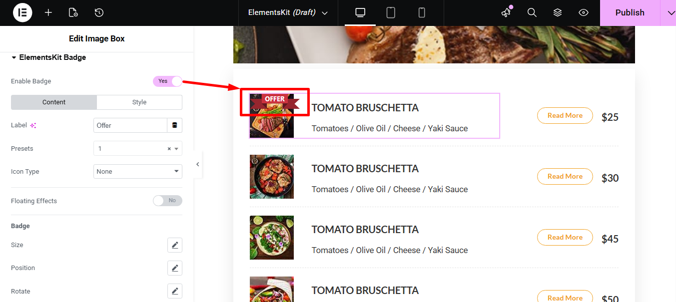
Toggle the button to enable it. A badge will then be added to the desired product.
Guia Conteúdo #
Let’s see what the tab offer to you.
Initial Settings #
- Rótulo: Here you can write the badge content that will be displayed on the element.
- Presets: It lets you select from a selection of pre-configured visual styles that instantly apply a complete look and layout to the element.
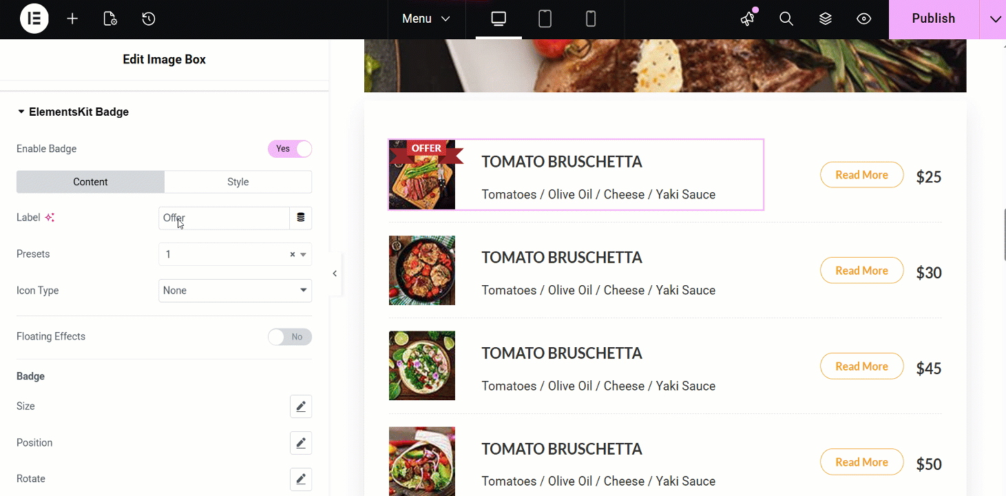
- Tipo de ícone: It offers 3 visual media types that can be used alongside the text, such as –
- Ícone: This option lets you choose a icon/vector graphic from a built-in library and and provides settings to change its direction.
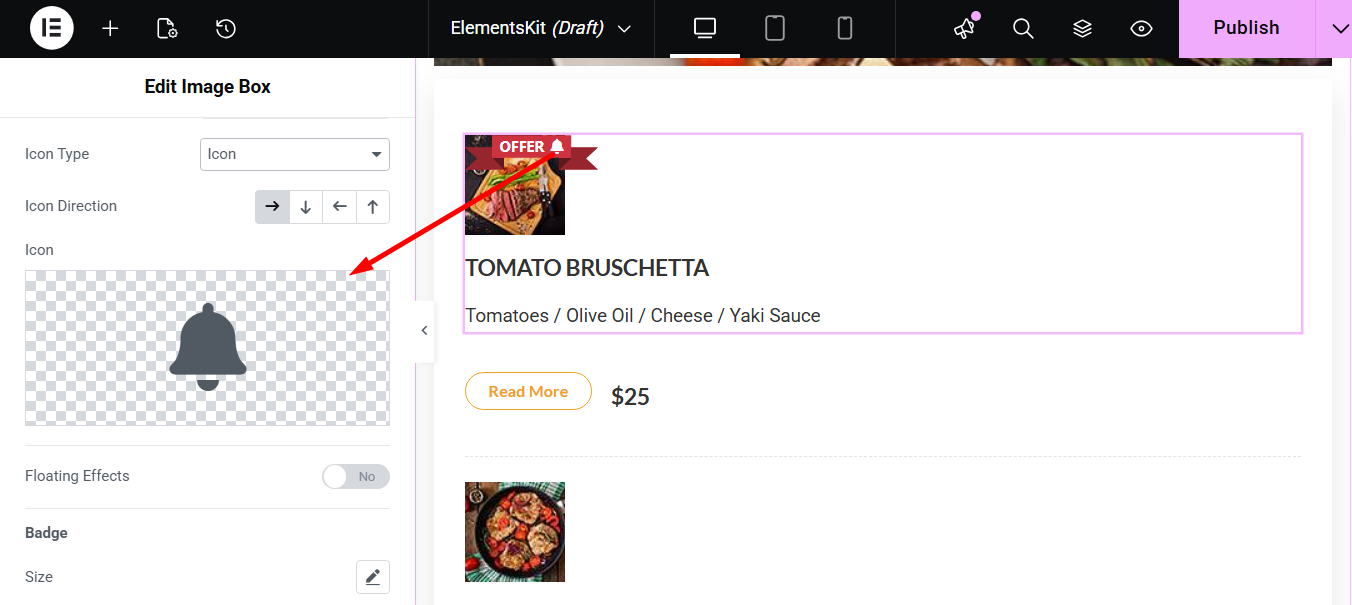
2. Imagem: Here you can upload a custom graphic file and and access settings to change its direction.
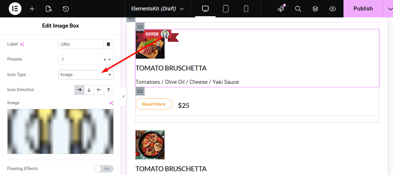
3. Lottie: This option enables the use of a lightweight, scalable Lottie animation file. You’ll also get options to change the animation’s direction and insert the JSON URL.
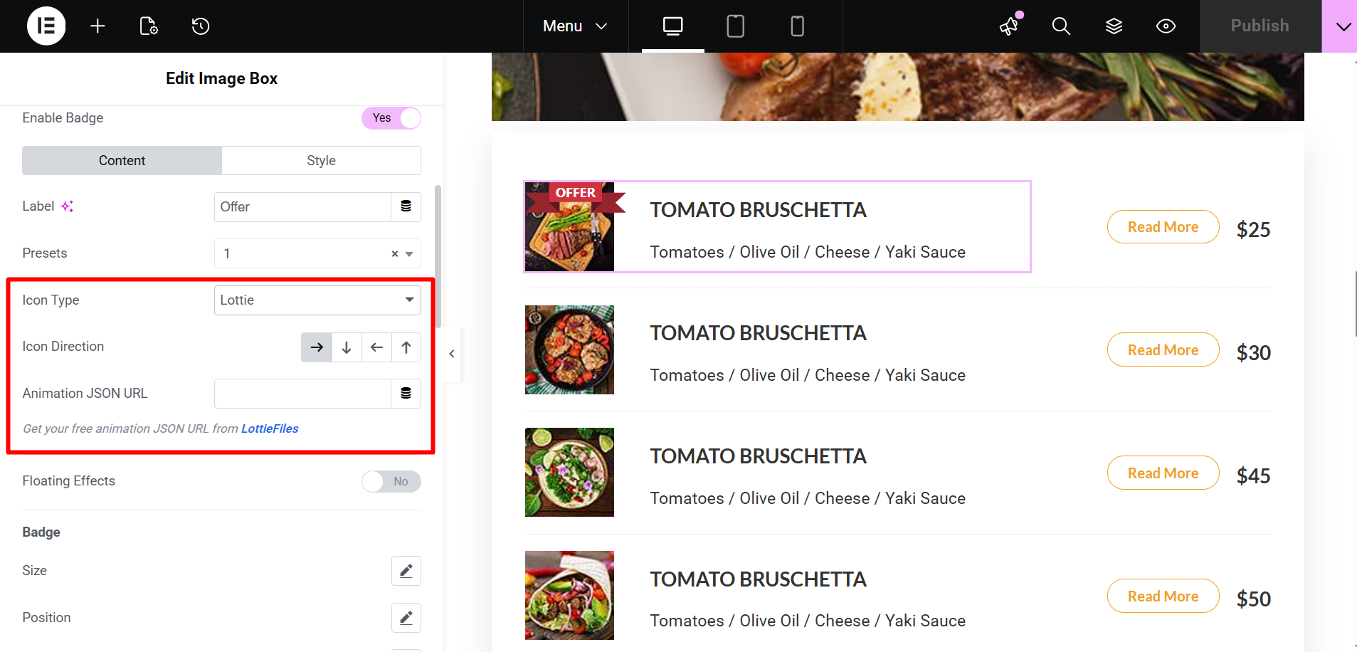
No entanto, você pode also choose Nenhum and show only the text label.
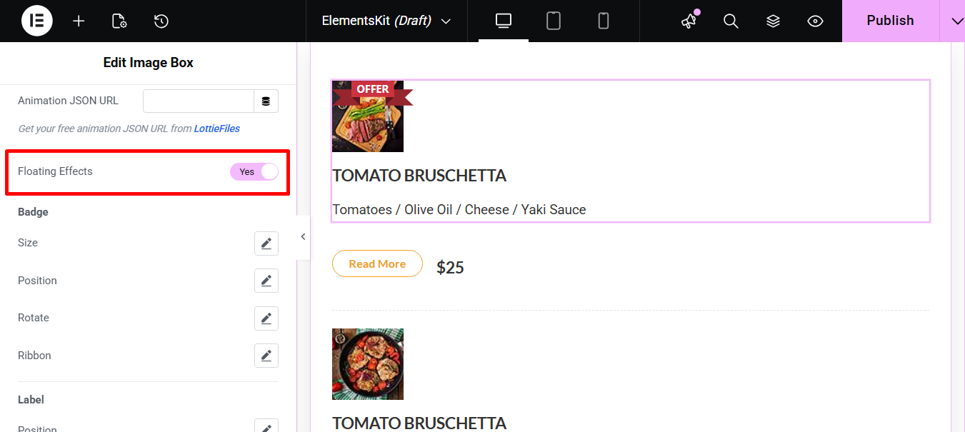
Floating Effects #
If you enable the floating effects button, it’ll add a subtle, continuous motion or animation to the badge to draw attention to it.
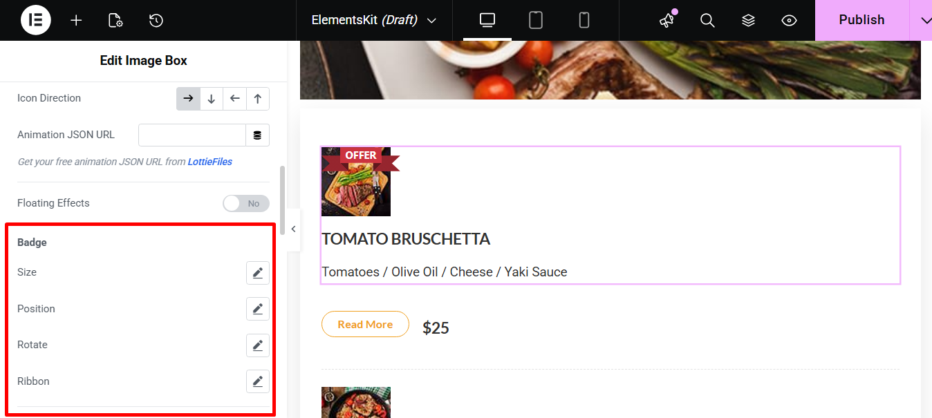
Distintivo #
- Tamanho: You can control the width and height of the badge.
- Posição: Here you can adjust the location of the badge on the element e.g., top-left, bottom-right, or custom offsets.
- Girar: This option allows you to set the angle at which the badge is displayed.
- Ribbon: Finally, you determine the style or shape of the ribbon that the badge may be displayed on.
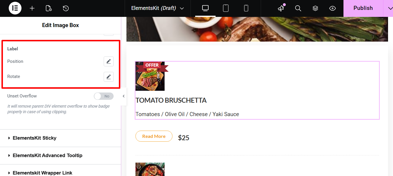
Rótulo #
- Posição: Here you can adjust the precise location of the text label within the badge area.
- Girar: It lets you to set the angle at which the text label is displayed.
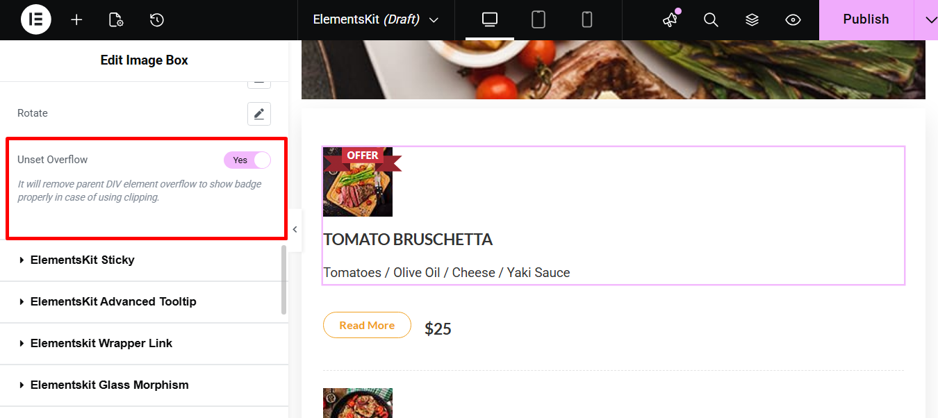
Unset Overflow #
This removes the parent container’s overflow setting. It ensures the entire badge is visible without being clipped.
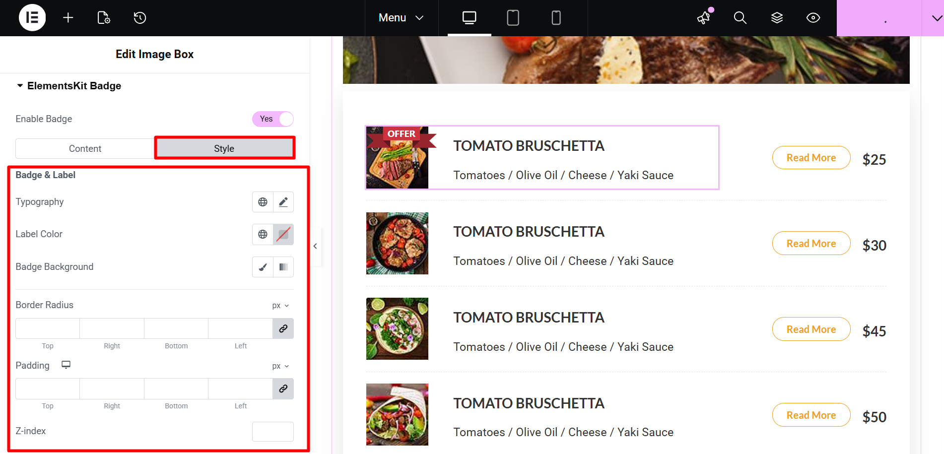
Guia Estilo #
This contains styling controls for the Badge & Label:
- Tipografia: It lets you choose font family, size, weight, transform, style, decoration, and line height for the badge text.
- Cor da etiqueta: You can use it to set the color of the text within the badge.
- Fundo do emblema: The Badge Background feature defines the background color of the badge shape.
- Raio da borda: Modifying Border Radius is essential because it allows you to change the corner curvature, resulting in shapes like squares, subtle rounding, or full circles.
- Preenchimento: Here, you can control the internal space between the badge content and its border.
- Z-index: Z-index allows you to manage the vertical stacking order of the badge relative to other elements on the page.
You have now learned all the features required to create, style, and perfectly position dynamic badges on your website using ElementsKit.


