


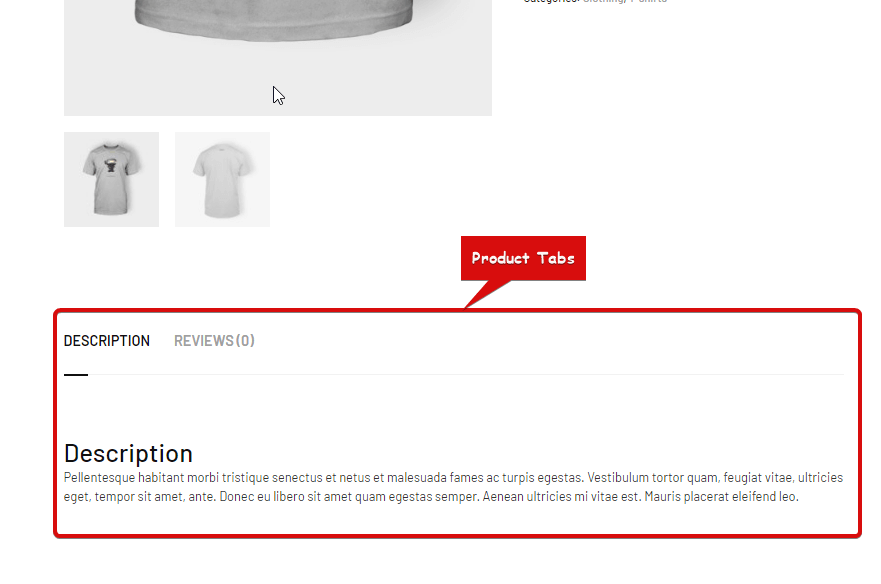
Product Tabs widget is a single-page template widget. This is used to display product descriptions, product reviews and also provides a form to submit a new review.
Let’s learn how you can use Product Tabs Widgets on your wooCommerce site:
Step 1: Enable the Product Tabs Widget #
For at aktivere widgetten,
- Gå til ShopEngine > Widgets > Product Tabs
- Tænde for
- Gemme ændringer
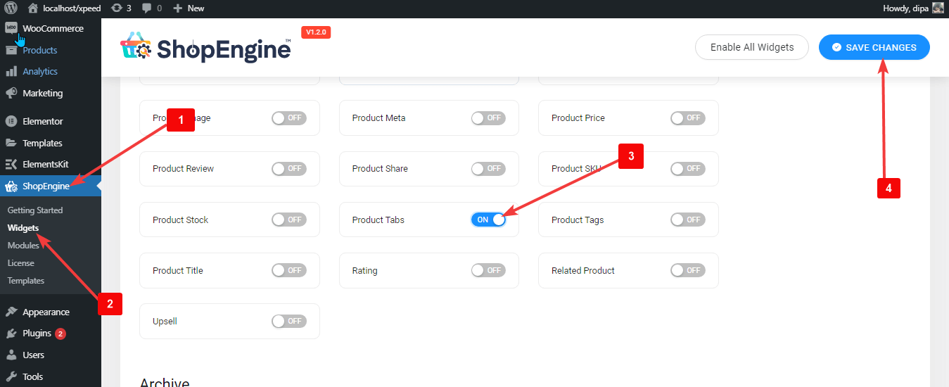
Bemærk: You can also turn on Product Tabs with a global setting that tænder alle widgets i ShopEngine.
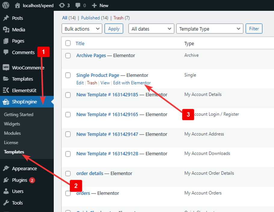
Step 2: Add Product Tabs Widget #
Før du kan tilføje widgetten, skal du først oprette en enkelt produktskabelon. Se dokumentationen på hvordan man opretter en enkelt produktskabelon.
At tilføje Product Tabs:
- Gå til ShopEngine > Templates > Single Page Template
- Klik på Rediger med Elementor
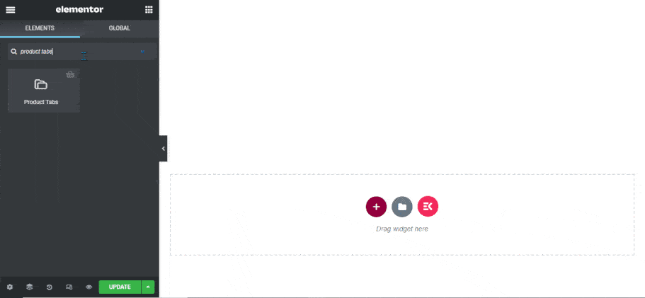
- Søg til Produktfaner på Elements Search mulighed
- Drag and drop the widget
- Klik på Opdatering for at gemme ændringer.
Step 3: Settings of Product Tabs Widget #
You can customize the following settings under the Stil Tab:
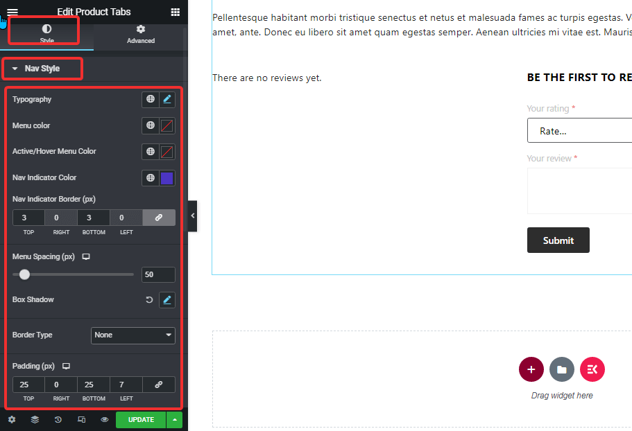
Nav stil: #
- Typografi: You can change the font size for the menu options here.
- Menu Color: Change the menu color.
- Active/Hover Menu Color: Choose a color for the active/hover mode of the selected menu.
- Nav Indicator Color: Select a color for the active menu indicator.
- Nav Indicator Border (px): Choose a top and bottom value for the nav indicator border.
- Menu Spacing (px): Give a spacing between both the menu in pixels.
- Box Shadow: Klik på redigeringsindstillingen for at vælge skyggefarve, vandret, lodret, sløring og spredningsværdi. Du kan også indstille positionen som kontur eller indsat.
- Kanttype: du kan vælge kanttypen til at være solid, prikket, dobbelt stiplet, rille eller ingen.
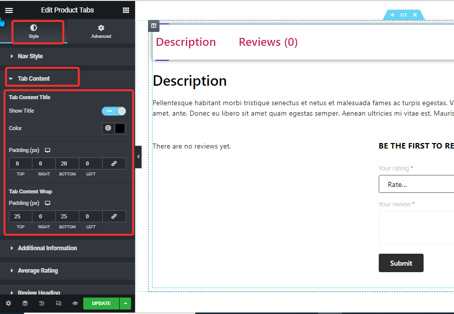
Faneindhold: #
- Tab Content Title
- Vis titel: Turn this option on to show the title in the tab content.
- Farve: Choose the title color for the tab area.
- Polstring: Adjust the top, left, right, and bottom padding around the title.
- Tab Content Wrap
- Polstring (px): Adjust the top, left, right, and bottom padding for the tab content.
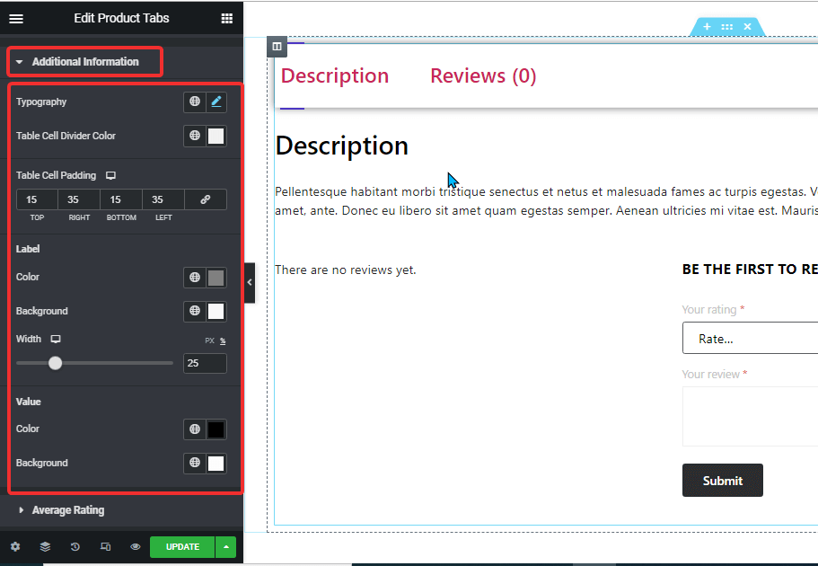
Additional Information: #
- Typografi: You can change the font size for the additional information here.
- Table Cell Divider Color: Choose a color for the table cell divider.
- Table Cell Padding: Juster top-, venstre-, højre- og bundpolstringen.
- Etiket:
- Farve: Vælg en farve til etiketten.
- Baggrund: Choose a background color.
- Bredde: You can choose the width in px or percentage.
- Value:
- Farve: Pick a color for the value
- Baggrund: Choose a background color for the value
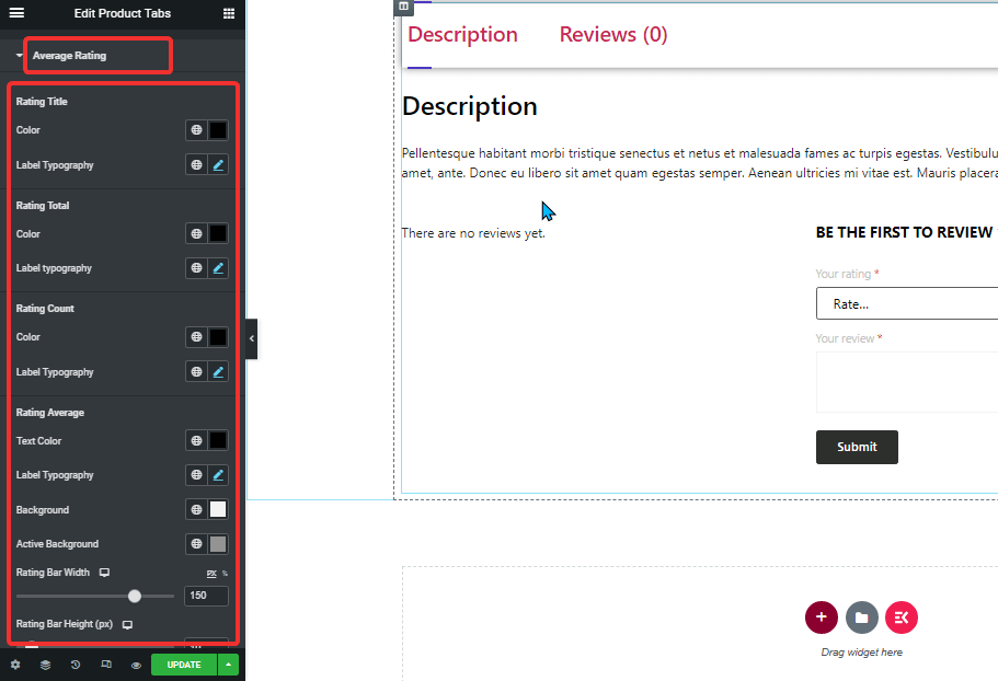
Gennemsnitlig vurdering: #
- Rating Title:
- Farve: Change the color of the rating title.
- Typografi: You can change the font size for the rating title.
- Rating Title:
- Farve: Change the color of the rating title.
- Typografi: You can change the font size for the rating title.
- Rating Title:
- Farve: Change the color of the rating title.
- Typografi: You can change the font size for the rating title.
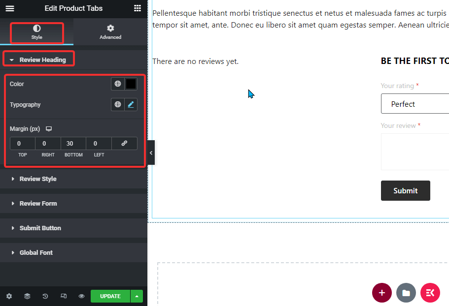
Review Heading: #
- Farve: Change the color of the rating average.
- Typografi: You can change the font size for the rating average.
- Margin: Adjust the top, left, right, and bottom margins.
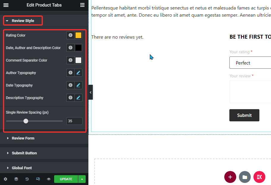
Anmeldelsesstil: #
- Farve: Choose a color for the ratings.
- Date, Author, and Description Color: Here you can pick the color for a date, author, and description.
- Comment Separator Color: Select a color for the comment separator.
- Author Typography: Choose the font size for the author.
- Date Typography: Select the font size for the date.
- Beskrivelse Typografi: You can choose the description font size here.
- Single Review Spacing (px): Select a value for single review spacing.
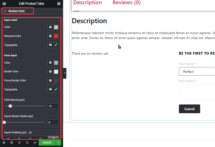
Anmeldelsesformular: #
- Input Label:
- Farve: Pick a color for the input label.
- Required Color: Select a color for the required symbol.
- Typografi: Select font size for the input label
- Form Input:
- Color: Pick a color for the form input.
- Kantfarve: Select a border color.
- Fokuskantfarve: Choose a color for the focus border.
- Typografi: Select font size for the form input.
- Field Spacing (px): Choose how much space you want between the input field.
- Inputs Border Radius (px): Select border-radius value for the input field.
- Inputs Padding (px): Adjust the top, left, right, and bottom padding of the input field.
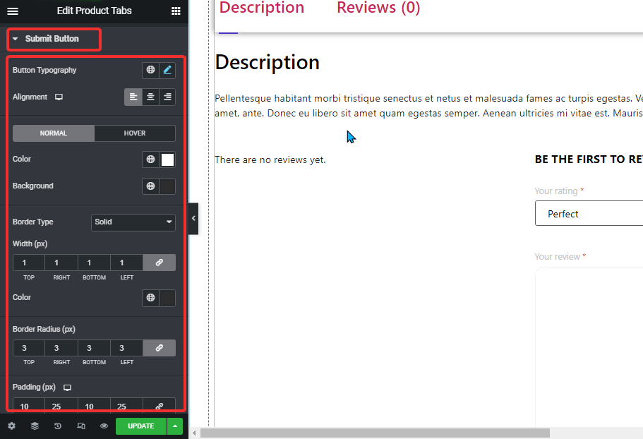
Indsend knap: #
- Button Typography: You can change the font family, font size, font weight, transform, and line height here.
- Justering: Set the alignment as either left, right, or center.
- Normal/Hover: Choose the color and background color for both normal and hover views.
- Kanttype: du kan vælge kanttypen til at være solid, prikket, dobbelt stiplet, rille eller ingen.
- Bredde: Vælg den øverste, venstre, højre og nederste bredde af rammen.
- Farve: Vælg en farve til kanten.
- Grænseradius: Vælg de øverste, venstre, højre og nederste værdier for kantradius.
- Polstring: Juster top-, venstre-, højre- og bundpolstringen.
Global skrifttype: #
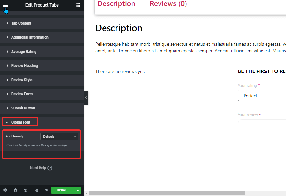
- Skrifttypefamilie: Her kan du ændre skrifttypefamilien for hele widgetten.
Klik på Opdatering button to Gemme all the changes.
Here is a preview of how a Product Tab widget looks like: