

 English
  German
  Spanish
  Italian
  French
  Danish
  Portuguese
  Swedish
  Polish
  Korean
  Japanese
 EmailKit has a diverse collection of useful elements to design comprehensive email templates. You will find them in three different categories:
- General Elements
- WooCommerce Elements
- WordPress Elements
General Elements #
General Elements include various content elements that you can use to build just about any type of email template. Let’s explore them one by one:
Heading #
Using this element, you can add an impressive heading or title to the email template.
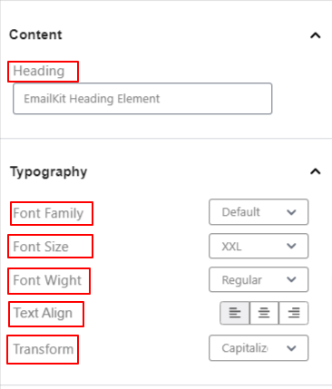
Content:
- Heading: Enter your email heading in this box.
Typography:
- Font Family: Select the preferred font family from the dropdown.
- Font Size: Choose a font size for the heading.
- Font Weight: Set the weight or boldness of the font (Regular, Medium, and Bold).
- Text Align: Adjust the position of your text to left, center, or right.
- Transform: Adjust the capitalization of the text content.
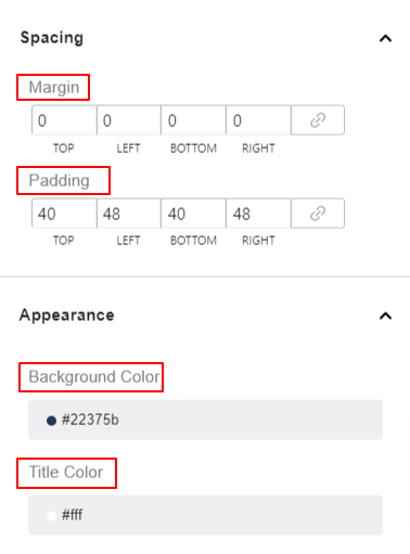
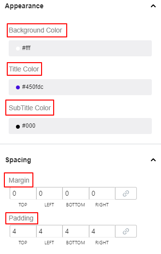
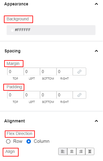
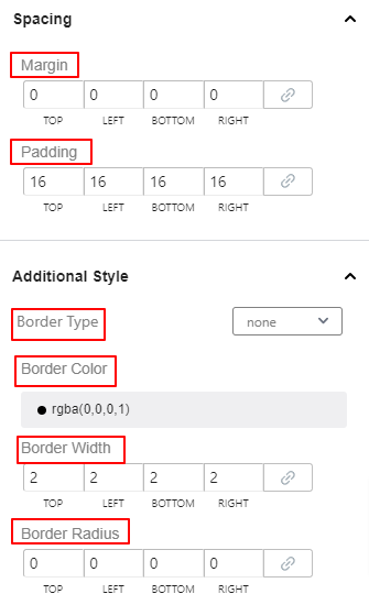
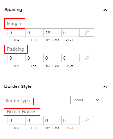
Spacing:
- Margin: Specify the spaces around the heading element.
- Padding: Add spaces around the text of the heading within the box.
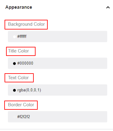
Appearance:
- Background Color: Choose a color for the background of the heading element.
- Title Color: Use the color picker to set the title color.
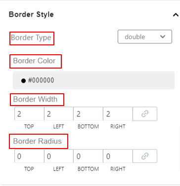
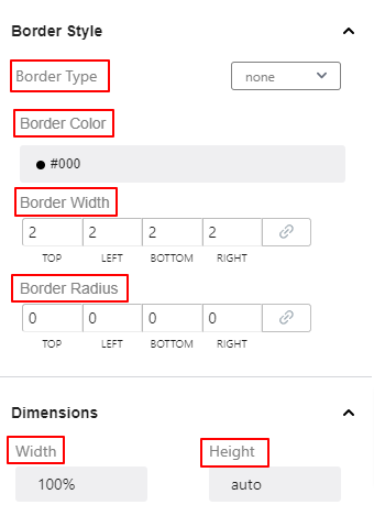
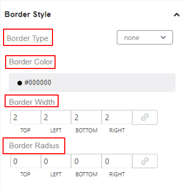
Border Style:
- Border Type: Set the heading border type from 8 different options.
- Border Color: Add a color to the border.
- Border Width: Set the thickness of the border.
- Border Radius: Adjust the roundness of the border.
Subtitle #
Add this element to display more information about the email alongside the title.
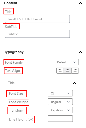
Content:
- Title: Write your title text in this box.
- SubTitle: Enter the text you want to show as the subtitle.
Typography:
- Font Family: Select a font family from the dropdown.
- Text Align: Place the subtitle element to the left, center, or right.
Title & Subtitle Customization #
Under the title and subtitle customization settings, there will be similar features.
- Font Size: Select an option from the dropdown to determine the size of the font.
- Font Weight: Define the thickness or density of the text.
- Transform: Specify the capitalization of the text element.
- Line Height (px): Adjust the top and bottom spacing of the title or subtitle.
Appearance:
- Background Color: Give a background color on the subtitle area using the color picker.
- Title Color: Choose a color for the title text.
- Subtitle Color: Give a color to the subtitle text.
Spacing:
- Margin: Define the gap of the subtitle element with other elements of the email.
- Padding: Add inner space to the subtitle area.
Border Style:
- Border Type: Select a border type for the subtitle from 8 different options.
- Border Color: Add a color to the border.
- Border Width: Adjust the thickness of the border.
- Border Radius: Set the roundness of the border.
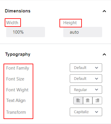
Dimensions:
- Width & Height: Set the horizontal and vertical size of the entire subtitle element.
Text #
Add text anywhere on your email template and customize its look with the text element.
Content,
- Text: Write your text in this box.
Typography:
- Font Family: Choose a font family from the dropdown.
- Font Size: Define the font size of your text.
- Font Weight: Define the thickness or density of the text.
- Text Align: Place the subtitle element to the left, center, or right.
- Transform: Specify the capitalization of the text element.
Appearance:
- Background Color: Pick a background color for the text area.
- Title Color: Choose a color for the text.
Spacing:
- Margin: Define the gap around the text area.
- Padding: Add inner space to the text area.
Border Style:
- Border Type: Select a border type for text from 8 different options.
- Border Color: Add a color to the border.
- Border Width: Adjust the thickness of the border.
- Border Radius: Set the roundness of the border.
Dimensions:
- Width & Height: Set the horizontal and vertical size of the entire text element.
Button #
Lets your email reader take action by showcasing an interactive button.
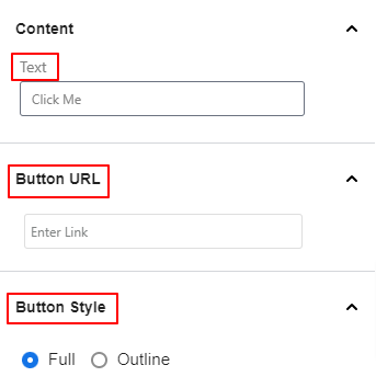
Content: Add the button text in this box.
Button URL: Enter the URL
Button Style: Choose a button style between Full and Outline.
Typography:
- Font Family: Choose a font family from the dropdown.
- Font Size: Define the font size of your text.
- Font Weight: Define the thickness or density of the text.
- Text Align: Place the subtitle element to the left, center, or right.
- Transform: Specify the capitalization of the text element.
Appearance:
- Background: Give a background color on the subtitle area using the color picker.
Text: Choose a color for the title text.
Spacing:
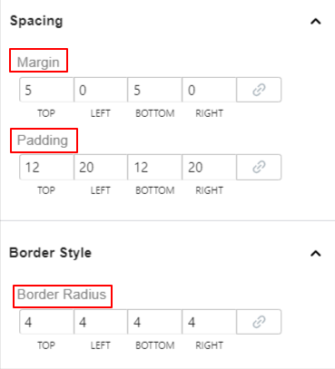
- Margin: Define the gap of the subtitle element with other elements of the email.
- Padding: Add inner space to the subtitle area.
Border Style:
- Border Radius: Set the roundness of the border.
Column Section #
The column section element loads with two columns by default. After adding this element, two sections will appear on the email editor screen. Clicking on any of them will open their individual settings in the left sidebar.
Appearance:
- Background: Give a background color on the subtitle area using the color picker.
Spacing:
- Margin: Define the gap between the subtitle element and other email elements.
- Padding: Add inner space to the subtitle area.
Border Style:
- Border Type: Select a border type for text from 8 different options.
- Border Color: Add a color to the border.
- Border Width: Adjust the thickness of the border.
- Border Radius: Set the roundness of the border.
Video #
Upload from your device or add a link from other sources to show a video to your email template.
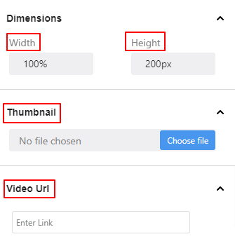
Dimensions:
- Width & Height: Define the horizontal and vertical size of the entire video element.
Thumbnail: Upload the thumbnail image of the video from your device.
Video url: Enter the link of your video.
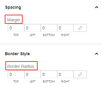
Spacing:
- Margin: Add spaces around the video element.
Border Style:
- Border Radius: Define the roundness of the border of the video border.
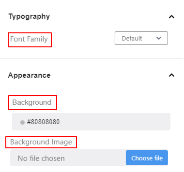
Container #
The container element is like an area block that can hold other elements of EmailKit.
Typography:
- Font Family: Select your desired font family from the dropdown.
Appearance:
- Background: Using the color picker, give a background color to the container.
- Image: Upload an image to use as the background of the container.
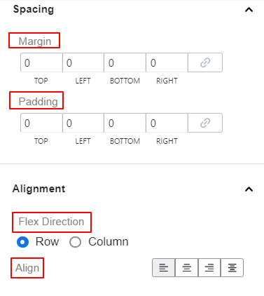
Spacing:
- Margin: Enter values in the boxes to change the space between the container and other elements
- Padding: Increase the inner space of the container area.
- Border Radius: Use this setting to adjust the roundness of the container border.
Border Styles:
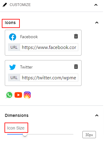
Social Icons #
Add and customize social icons on the email template.
Icons: Click on any icon and insert a link to enable the social media channel on the email. You can also hit the delete button to remove a social icon.
Dimensions:
- Icon Size: Use this slider to set the social media icon size.
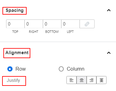
Spacing: Add spaces around the icon and adjust the gap between social icons.
Alignment:
- Row / Column: Choose your preferred layout type between row and column.
- Justify: Set the horizontal placements of social icons.
Upload Image #
Use this element to upload and display an image to your email template.
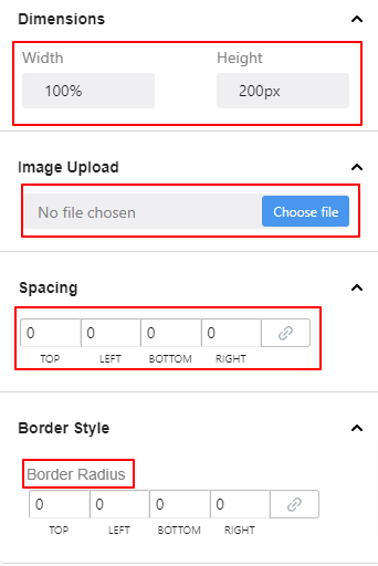
Dimensions:
- Width & Height: Define the horizontal and vertical size of the entire video element.
Thumbnail: Upload the thumbnail image of the video from your device.
Spacing:
- Margin: Add spaces around the video element.
Border Style:
- Border Radius: Define the roundness of the border of the video border.
Divider #
Use the following settings to add a divider between elements.
Dimensions:
- Width: Use this slider to widen the horizontal size of the divider.
- Height: Define the thickness of the divider.
Appearance,
- Background: Select a color for the divider.
Spacing:
- Margin: Enter a positive or negative value to create less or more space around the divider.
Alignment:
- Justify: Use this option to adjust the position of the divider element.
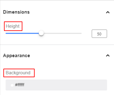
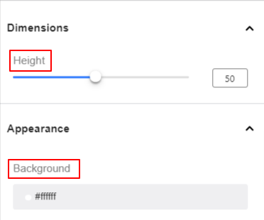
Space #
Use this element to set a gap between elements of your email template.
Dimensions:
- Height: Define the horizontal and vertical size of the entire video element.
Appearance:
- Background: Give a background color on the subtitle area using the color picker.
Image Box #
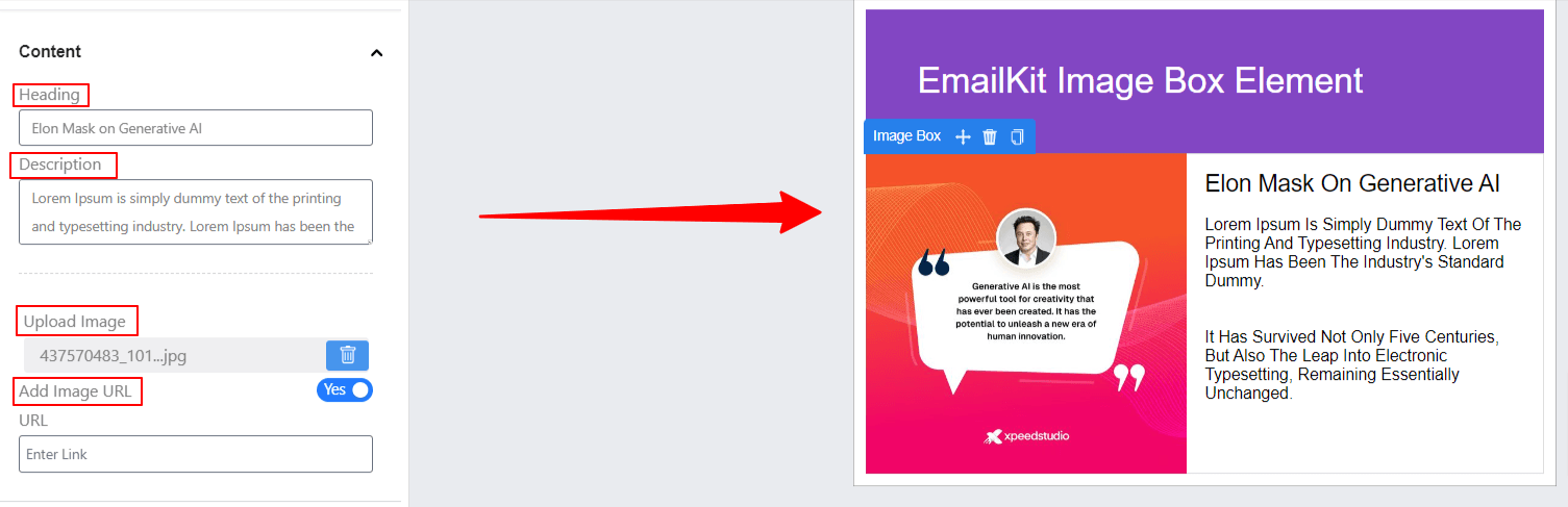
Showcase an image with a heading and description to your email layout for engaging visual content. You can also upload images with a URL.
HTML Code #
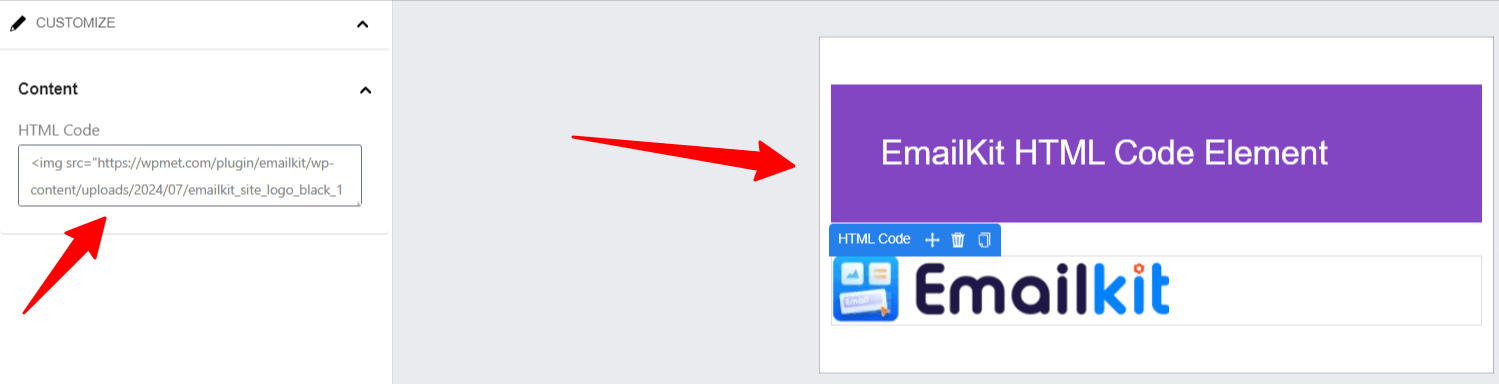
Insert custom HTML code directly into an email template. This feature provides flexibility to add advanced content, such as Custom styling (CSS), Embedded media (videos, iframes), and Interactive elements (buttons, forms).
Footer #
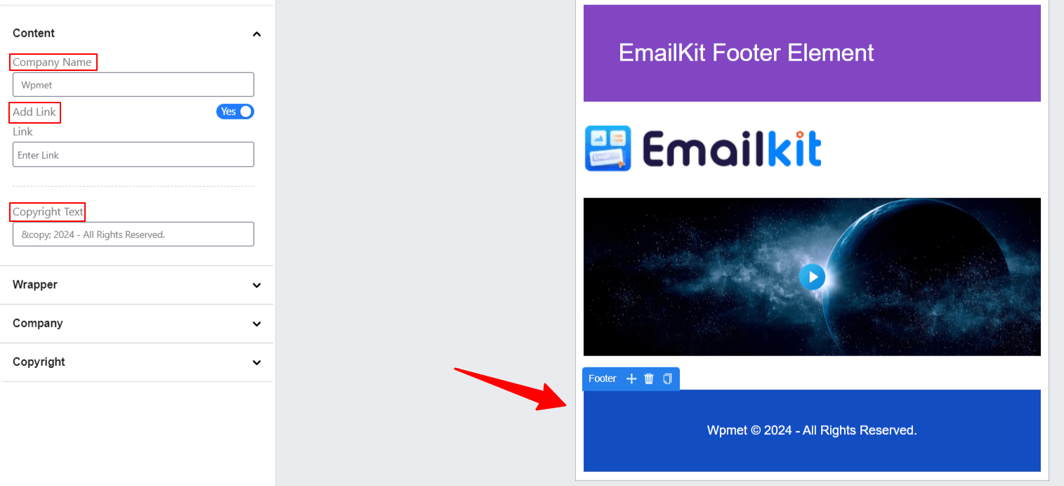
Allows users to customize the bottom section of an email. It typically includes space for: Contact information (address, phone number, email), Social media links, Copyright notices, Unsubscribe links, or disclaimers. The footer is often essential for branding, legal compliance, and providing recipients with necessary information.
WordPress Elements #
The following elements are part of WordPress functions. The “New User Register” element is used for onboarding new users and setting their passwords. And, the “WP Reset Password” helps to create an email template for resetting the password.
New User Register & WP Reset Password #
Both elements come with the same settings as below.
Dimensions:
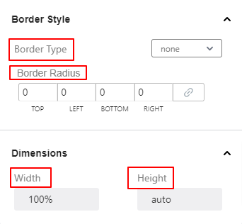
- Width & Height: Define the horizontal and vertical size of the entire content area.
Typography:
The setting options below let you control the typography settings of the entire New User Register form.
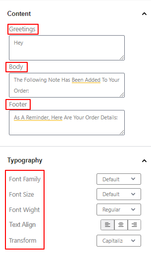
- Font Family: Select a font family type from the dropdown.
- Font Size: Determine the font size of your text.
- Font Weight: Define the thickness or density of the text.
- Text Align: Locate the text content to the left, center, or right.
- Transform: Define the capitalization of the text element.
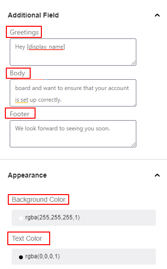
Additional Field:
- Greetings: Type the greetings or beginning statement of the email in this box.
- Body: Use this box to write up the body part of your email.
- What is user email and link.
- Footer: This box allows you to write the bottom section of the email.
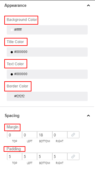
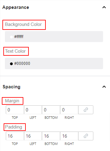
Appearance:
- Background Color: Use this color picker to choose a solid color for the background.
- Text Color: Choose a color for the text.
Spacing:
- Margin: Enter values in the boxes to change the space between the new user registration and other elements
- Padding: Increase the inner space within the new user registration element and its border.
Additional Style:
- Border Type: Choose border style from the dropdown.
- Border Color: Add a color for the border.
- Border Width: Define the thickness of the border.
- Border Radius: Adjust the roundness of the border.
WooCommerce Elements #
With EmailKit WooCommerce elements you can customize and replace the WooCommerce default templates.
Shipping Address, Billing Address, and Billing & Shipping Address #
Add shipping or billing address or both to the email template. All of these three elements appear with the same feature settings:
- Content: Enter your custom title in this box.
- Billing Title: Add a title for the billing address.
- Shipping Title: Add a title for the shipping address.
Typography:
The setting options below let you control the typography settings of the entire Shipping and Billing address element.
- Font Family: Select a font family type from the dropdown.
- Font Size: Determine the font size of your text.
- Font Weight: Define the thickness or density of the text.
- Text Align: Locate the text content to the left, center, or right.
- Transform: Define the capitalization of the text element.
Appearance: Under this setting area, you set the color for the element’s background color and its title, text, and border colors.
Spacing:
- Margin: Use this setting to create space around the elements.
- Padding: Increase space within the element area.
Border Styles:
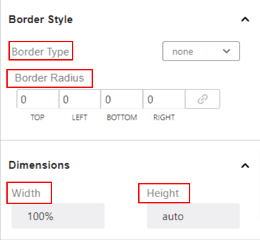
- Border Type: Choose a border type from the dropdown.
- Border Radius: Define the roundness of the element border.
Dimensions: From here, you will change the entire horizontal (Width) and vertical (Height) space of the entire element.
Order Item #
Show all the ordered product details like quantity or price in a table.
Dimensions: From here, you will change the entire horizontal (Width) and vertical (Height) space of the entire element.
Typography:
Using all these settings here, you will set how the order item element’s text looks to the reader.
- Font Family: Select a font family type from the dropdown.
- Font Size: Determine the font size of your text.
- Font Weight: Define the thickness or density of the text.
- Text Align: Locate the text content to the left, center, or right.
- Transform: Define the capitalization of the text element.
Appearance: Under this setting area, you set the color for the element’s background color and its title, text, and border colors.
Spacing:
- Margin: Use this setting to create space around the elements.
- Padding: Increase space within the element area.
Border Styles:
- Border Type: Choose a border type from the dropdown.
- Border Radius: Define the roundness of the element border.
Customer Note, Customer Register, and Password Reset #
Customer Note: Use this element to let your shoppers add order-specific messages on the checkout page.
Customer Register: Customize the new user registration email.
Password Reset: Use this element on your email template to reset the customer password.
These WooCommerce elements have the same feature settings.
Content:
- Greetings: Begin your email by entering the greeting text in this box.
- Body: Write the body part of the email message in this box.
- Footer: Type the ending message of your email.
Typography:
The setting options below let you control how the text will appear on the screen.
- Font Family: Select a font family type from the dropdown.
- Font Size: Determine the font size of your text.
- Font Weight: Define the thickness or density of the text.
- Text Align: Locate the text content to the left, center, or right.
- Transform: Define the capitalization of the text element.
Appearance: Under this setting area, you set the color for the element’s background color and its title, text, and border colors.
Spacing:
- Margin: Use this setting to create space around the elements.
- Padding: Increase space within the element area.
Border Styles:
- Border Type: Choose a border type from the dropdown.
- Border Radius: Define the roundness of the element border.
Dimensions: From here, you will change the entire horizontal (Width) and vertical (Height) space of the entire element.
=


