In any website, navigation menus play a central role in guiding users to important pages and sections. With WordPress, you can create menus easily, but styling them to match your brand and improve user experience requires some extra steps. In this guide, we’ll walk through styling options for WordPress menus, focusing on customization in both the Block Editor (Gutenberg) and Elementor. Whether you’re aiming for a sleek, modern look or a more advanced, dynamic design, this guide will help you achieve the menu style you want.
An effectively styled menu does more than look good—it also enhances navigation, creates a better user experience, and contributes to your website’s overall brand aesthetic. A well-designed menu can increase visitor engagement by making your site easier to navigate and more visually appealing, which in turn improves time-on-page and reduces bounce rates.
Let’s dive into different ways to style your WordPress menu. We’ll start with basic options in the WordPress Block Editor (Gutenberg) before moving on to advanced styling with GutenKit and Elementor.
In Gutenberg, you can do the basic style customized with the default Navigation block. However, with block editor plugins like GutenKit, you can have more styling options to design an advanced navigation menu.
The Gutenberg Navigation Block provides a foundation for building straightforward menus with basic styling options. Here’s how you can use its layout and style settings:
Layout settings
Under the Settings tab, you can adjust your menu layout by choosing orientation, justifications, menu icon buttons, and submenu settings.
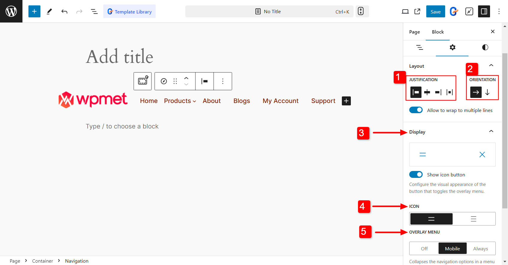

- Justification: Align the menu items to the left, right, or center.
- Orientation: Decide whether to set the menu orientation horizontally or vertically.
- Display: You can configure the appearance of the toggle button for the overlay menu. You can either show icon button or display plain text for the button.
- Icon: Choose the hamburger icon for the overlay menu button from the two given options.
- Overlay Menu: Decide when to turn the menu into an overlay menu. You can keep it off entirely, only for mobile, keep the overlay menu always on show.
- Submenus: For submenus, you can choose how they open—either with a click or by hovering. Just toggle the ‘Open on click’ option to set it the way you prefer.
Style customization
Basic customization options like color, typography, and spacing help you align the look of your menu with your site’s design. You can change font size, text color, background color, and other elements to match your brand.
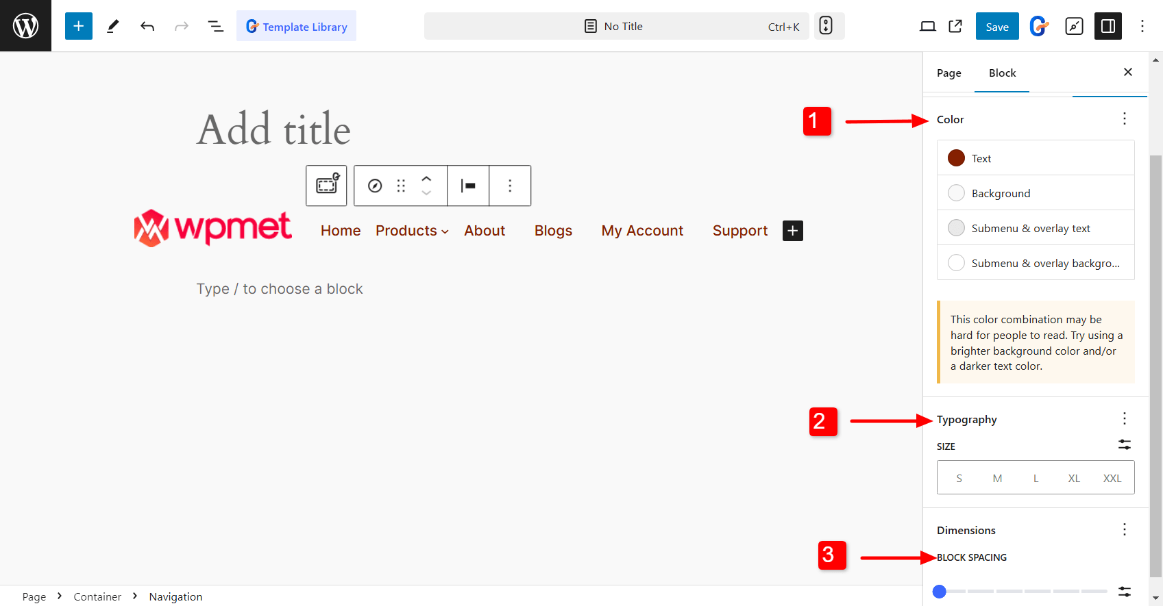

- Color: You can pick the text color, background color, submenu, and overlay text color, and background color of the submenu and overlay.
- Typography: You can change the font size, text font, line height, letter spacing, and so on.
- Block Spacing: Adjust the spacing between the menu items.
For those wanting more than just basic menu styling options, there’s an easy way to level up. Use a block editor plugin for advanced customization.
When it comes to flexibility and control, GutenKit is a great choice. GutenKit is a page builder block for Gutenberg that has 65+ blocks including Nav Menu. With 500+ readymade designs and 18+ modules, it gives you the creative freedom to build and style your site exactly how you want.


Here is how to use the GutenKit Nav Menu block to style the WordPress menu in Gutenberg.
- Install the GutenKit block editor plugin on your WordPress dashboard.
- Enable the Nav menu block. Go to GutenKit > Blocks, and find the Nav Menu in the list. Once you’ve got it, simply toggle it ON and you’re all set.
Now you can create the navigation menu in the Gutenberg editor. You can either use the pre-designed patterns from GutenKit to quickly create professional-looking navigation menus. Or, you can build menus from scratch.
After that, you can customize the navigation menu and the menu items how you want.
Let’s dive into customizing the GutenKit navigation menu in WordPress! First, head over to the Styles tab in the block editor.
Here, you’ll find options to personalize every part of your menu—from the Menu Wrapper and Menu Items to the Hamburger icon and Mobile Menu Logo. It’s all set up for easy customization so you can make the navigation truly your own!
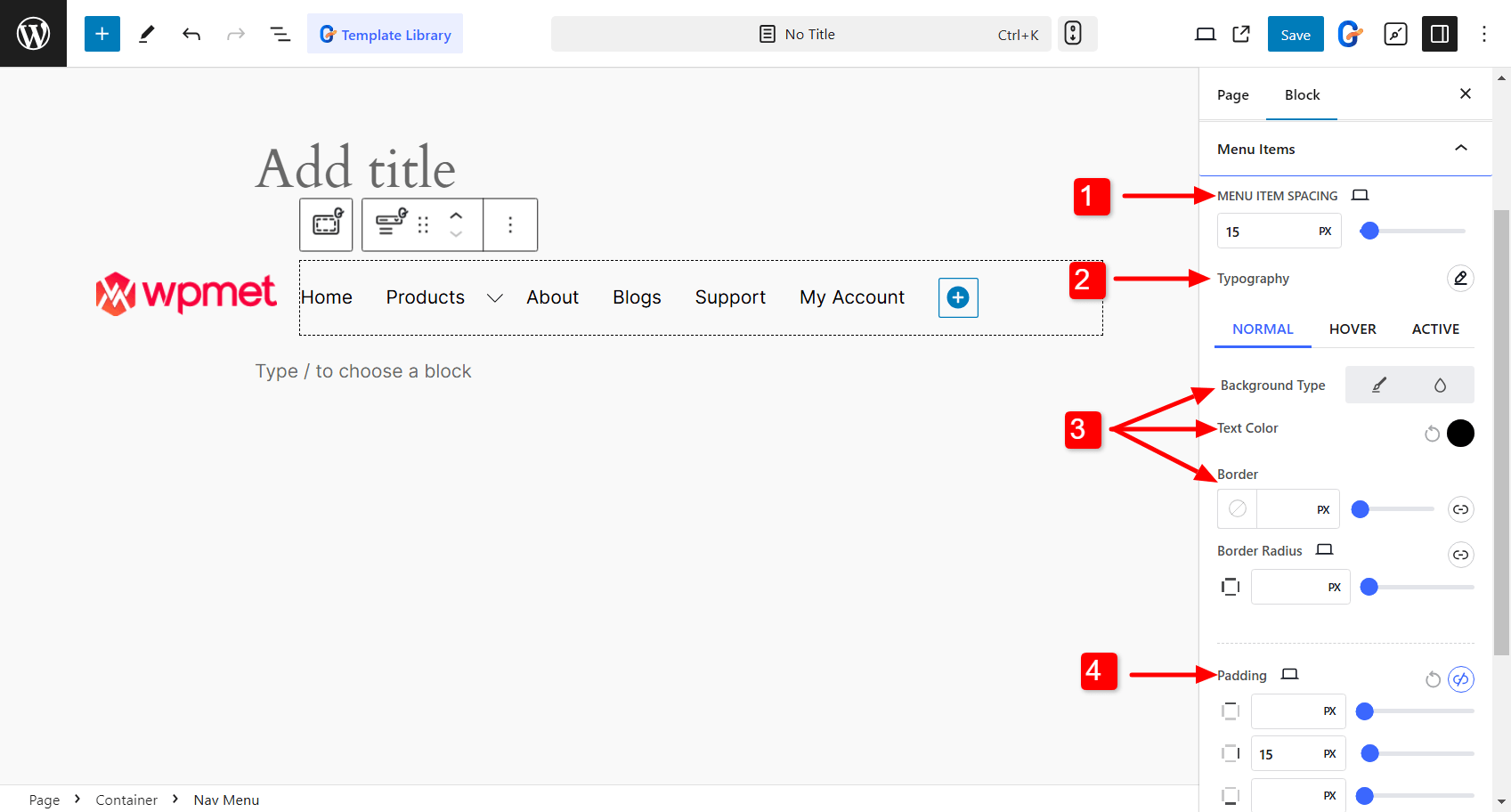
👉 Menu items:
- Menu Item Spacing: Adjust the spacing between the menu items.
- Typography: Choose the font family, text weight, size, line height, letter spacing, and so on.
- Background, text, and border colors: With the Nav Menu block, you can choose individual colors for normal, hover, and activate state of the menu items.
- Padding and margin: You can adjust the padding and margin of the menu items.

👉 Menu Wrapper (menu bar):
- Menu Background: You can set the background color and its type (classic or gradient color) of the Nav menu bar.
- Sidebar: For the vertical menu, you can select the sidebar background color. Also, set the alignment for the sidebar menu content.
- Padding and Border Radius: You can adjust the padding and border-radius nav menu bar.
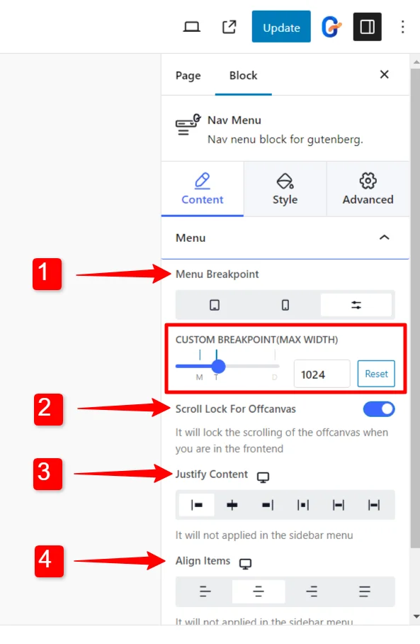
Now take a look at how you can customize the navigation menu for mobile devices. With GutenKit, you have some great options to adjust the menu’s appearance to fit smaller screens perfectly. Here’s what you need to do:
- Menu Breakpoint: you can set a menu breakpoint specifically for tablets, and mobiles, or even add a custom breakpoint if you need a unique setup.
- Scroll Lock For Offcanvas: If you’re using an offcanvas menu, there’s an option to apply a scroll lock. This keeps the main content from scrolling when the menu is open, creating a smoother experience.
- Justify Content: You have options to justify your menu content, whether you want it to start, center, or end across the menu bar.
- Align Items: You can easily set your menu content to align on the right, left, or center.

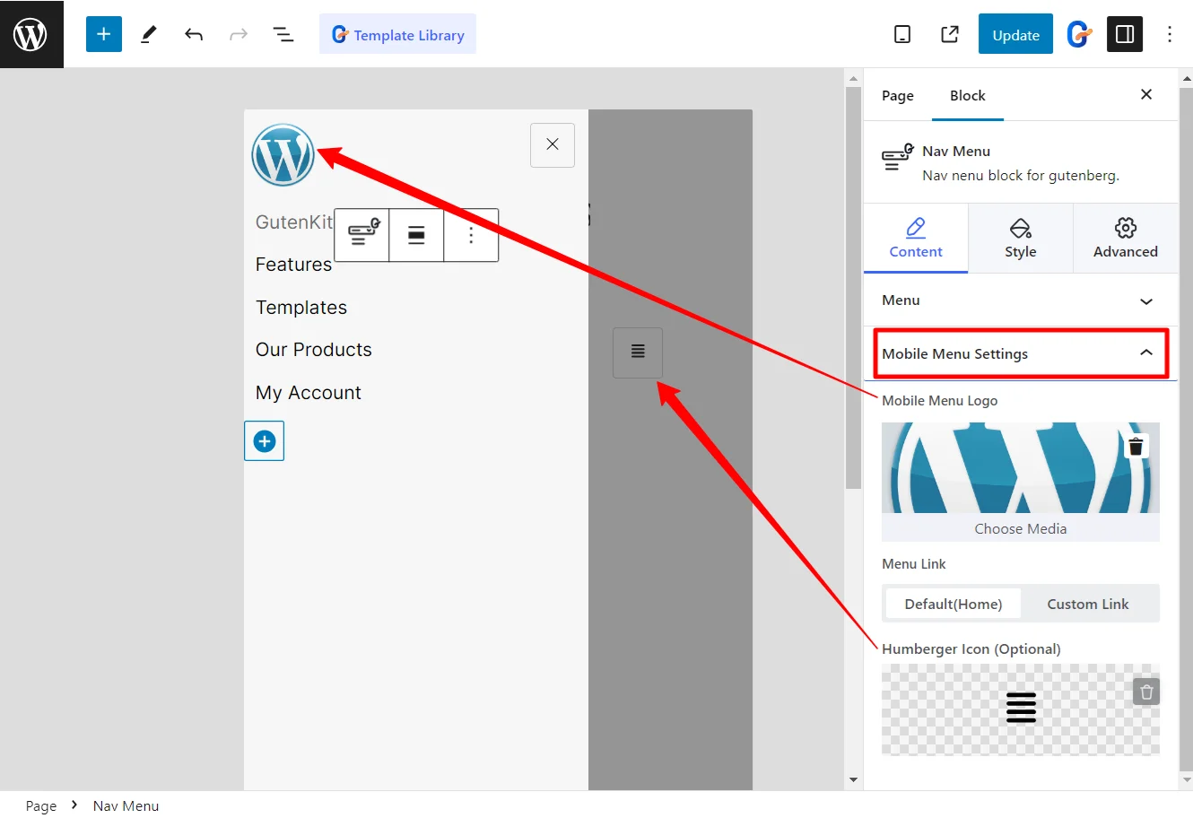
With the GutenKit block editor, you can easily customize how your mobile menu looks. Here are the settings available for the Nav Menu block.
- Mobile Menu Logo
- Menu Link
- Hamburger Icon

If you’re using Elementor, you’ll have access to a different set of menu customization options with the ElementsKit Elementor add-on.
Here’s a breakdown of how you can configure and style your menu with ElementsKit.
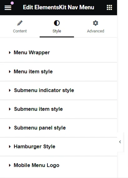
Menu Styles
- Menu Wrapper Customization: adjust key elements like the height, background style, padding, width, border radius, and even icon spacing, giving you full control over your menu’s layout.
- Menu Item Styling: Personalize the look of your menu items, with options to change the background, text color, border spacing, margins, and much more.
- Submenu Item Customization: Customize them just like the main menu items, with a variety of styling options to choose from.
- Submenu Panel Design: Expanding this section unlocks a range of customization features that allow you to design your submenu panel exactly how you want it.
- Hamburger Icon Styling: Adjust colors, sizes, and positions, and even add some extra features to make your icon stand out.
- Mobile Menu Logo Customization: Change the logo appearance to match your style with the available options.

Menu Settings
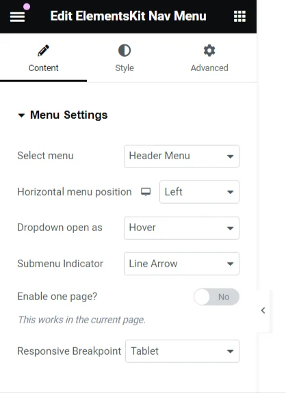
- Menu Selection: When you click on ‘Select Menu,’ you’ll see all the current menu options available for your site.
- Horizontal Menu Alignment: Choose how you’d like your menu to align. Whether it’s to the Left, Center, Right, or fully Justified, it’s all up to you.
- Dropdown Behavior: For your dropdown menus, you can decide how they open—either on hover or with a click.
- Submenu Indicator: Customize the submenu indicator icon. This icon appears next to parent menu items and helps guide visitors to the submenus. If you’re using the pro version of ElementsKit, you’ll see the ‘Dropdown Indicator Icon’ instead of the ‘Submenu Indicator’ option.

Using these controls, you can easily style your WordPress navigation menu in Elementor.
Conclusion
Styling your WordPress menu may seem like a small task, but it can have a big impact on user experience, navigation, and your site’s aesthetic. Whether you use the Block Editor with GutenKit or Elementor, these tips and techniques can help you create a menu that looks great and functions flawlessly on all devices.


Leave a Reply