Recently, our Wpmet team shifted our website (wpmet.com) to the Gutenberg block editor. Previously, we were using a page builder that was feature-rich, but affecting our website’s speed and performance to some extent.
So our team decided to switch to an editor that is part of the WordPress core. But, rebuilding a large and veteran website like wpmet.com is a challenge in itself.
To put it in context, we have a sizable amount of website traffic, thousands of user accounts, over 400 blog posts, and multiple product pages with complex designs.
Therefore, we were concerned about potential issues like broken design, loss of data, or drop in site traffic while rebuilding website in Gutenberg. Any of these could result in severe consequences for our website.
Although the rebuilding process went smoothly without any major issues or errors, we felt the need for many advanced page builder features in Gutenberg. So our team developed the Gutenkit block editor plugin, with all the page builder features required for building such a complex website.
In the end, the results are quite impressive!!
So I thought of sharing our experience and results of rebuilding our website in Gutenberg using GutenKit!
Why did we switch to Gutenberg?
Moving to Gutenberg for our WordPress site has really paid off. It’s helped us improve performance, stay compatible with newer features, and make things easier to manage the website.
Here are the key reasons for this transition:
Part of WordPress Core
Gutenberg is now a fundamental part of WordPress core, making it the default editor for all WordPress installations since version 5.0. This block editor is the present and the future of WordPress. So if there’s one thing you can count on this block editor, it’s stability.
Since Gutenberg is a part of the WordPress core development, you can expect the block editor to be as stable as a WordPress version. There is no issue in integration or compatibility. It ensures greater compatibility with a broad range of themes and plugins, as long as they follow the WordPress Coding Standards.
By switching to Gutenberg, we stay current with WordPress’s ongoing developments, ensuring our site gets the latest features, improvements, and security enhancements.
Performance
One of the primary reasons for switching to Gutenberg is its significant performance improvements. The editor is designed to create a more simplified and faster editing experience.
With its block-based architecture, Gutenberg improves page load times and overall site speed, contributing to better user experiences and potentially higher search engine rankings.
Ease of Use
Gutenberg’s clean, block-based interface simplifies the content creation process. In contrast to some of the page builders Gutenberg takes a more straightforward approach. Users can easily add, arrange, and style different content elements without much coding knowledge.
This ease of use has helped both our development team and marketing team, reducing the learning curve and increasing productivity. The development team could easily implement complex designs on our website, while the writers have found it easy to write and publish engaging content more efficiently.
Keeping the Future in Mind
Adopting Gutenberg aligns with our vision for the future. As WordPress continues to evolve, Gutenberg is set to receive continuous updates and new features, ensuring our site remains cutting-edge.
According to a recent tweet by Co-founder of WordPress, Matt Mullenweg, Gutenberg is the future of WordPress.
Therefore, by adopting this modern editor now, we future-proof our website, making it easier to integrate upcoming advancements and maintain long-term relevance.
Challenges we faced in rebuilding website in Gutenberg
While Gutenberg provides a faster website editing experience in WordPress, it comes with its own unique set of challenges. We encountered several hurdles while shifting our website to the block editor. Here are the primary challenges we faced:
Limitations in customization
One of the most significant issues we faced was the limitations in customization. Gutenberg, while flexible and user-friendly, has constraints when it comes to customizing certain elements of the website.
Although Gutenberg offers a variety of blocks, customizing them beyond their basic settings often requires additional CSS or JavaScript. That, as a result, counteracts the simplicity that Gutenberg aims to provide.
Moreover, achieving a consistent style across the entire website was difficult. Gutenberg’s block-specific styling options are limited, making it hard to enforce a uniform design without resorting to custom coding.
Implementing complex designs
Implementing complex designs was perhaps the most challenging aspect of our rebuild. Gutenberg, while suitable for simple layouts, struggled to handle more complex design requirements.
- Nested blocks and layout issues: Creating multi-layered, nested blocks often led to layout issues. The editor’s visual representation sometimes differed from the actual design, leading to inconsistencies.
- Advanced interactivity: Incorporating advanced interactivity, such as animations and motion effects, was limited within the default Gutenberg framework. We often had to rely on custom JavaScript, complicating the development process.
- Responsiveness: Ensuring that complex designs were responsive across various devices added another layer of complexity. Gutenberg’s built-in tools for responsive design were sometimes rather challenging.
Lack of advanced site-building features
The need for advanced site-building features in Gutenberg posed another significant challenge.
While Gutenberg handles standard posts and pages well, managing custom post types and taxonomies took more work. This limited our ability to create a highly structured and organized site with dynamic content.
Moreover, we identified the necessity for page builder features like sticky content, copy-paste, one-page scroll, and so on.
Inadequate ready templates
Another challenge was the lack of adequate ready templates. While Gutenberg does include some pre-built templates, they were not always suitable for specific needs.
So we had to deploy a dedicated team of designers and front-end developers to build each of our website pages from scratch. That required a significant amount of time and resources from our workforce.
So we felt like, ready templates and patterns are a sector where there is much to add to the existing editor.
Rebuilding our website in Gutenberg was a learning experience with challenges. So we decided to build a solution that will not only make our transition easier but also for the thousands of WordPress users who are planning for a migration to Gutenberg.
So we built GutenKit – ultimate page builder blocks for Gutenberg!
While shifting the website to Gutenberg, we had to create a number of custom blocks and write custom codes to implement the design. So we thought, let’s build a block editor plugin that comes with everything required to build an entire website in Gutenberg.
Thus, GutenKit block editor plugin was created. We labeled it as the Ultimate Page Builder Block for Gutenberg.
GutenKit is:
- Lightweight plugin and helps the website load faster.
- Comes with tons of page builder features.
- All blocks and templates are compatible with Full Site Editor (FSE).
- Has 500+ ready patterns & templates and still counting.
GutenKit brings all the page builder features directly into Gutenberg. Offering a range of features from pre-designed templates to containers and mega menus, it provides everything needed to build a highly flexible and functional website.
First of all, we listed down all of the features we would need to build our website in Gutenberg. Then our plugin team developed all of those features and added them to the GutenKit.
This way, we always knew what is required to build a website with a complex design. So we added the essential features rather than stuffing the plugin with unnecessary codes and functions.
Features of GutenKit:
- Query Loop Builder
- 3D Parallax Effect
- Sticky Content
- Flexible Container
- Mega Menu Builder
- Lottie Animation
- One Page Scroll
- Google Map
- Dynamic Content
- Motion Animations
- Copy Paste Styles
- CSS Trnasformation
…and the list goes on.
Using these features, we have been able to rebuild our website exactly how it was designed previously. And we have achieved incredibly amazing results at the end of it.
Results after rebuilding our website with GutenKit
When we decided to rebuild our website our primary goals were to enhance performance as well as ensure design continuity. After completing the migration, we have observed noticeable positive changes in these key areas.
Let’s see the results and how GutenKit has helped us achieve them.
Performance of our website has improved significantly
After transitioning to GutenKit, our website has shown significant performance improvements.
The clean code and optimized resource management in GutenKit have helped to reduce our page load time. We have tested our website performance on Google’s PageSpeed Insights (aka Lighthouse) tool.
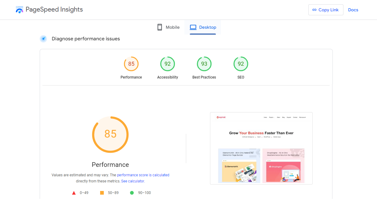
Previously, the overall performance score was 85 on Lighthouse. After the migration, it went up to 99. Moreover, Accessibility and Best Practices have improved as well.
Before shifting to Gutenberg:

After shifting to Gutenberg:
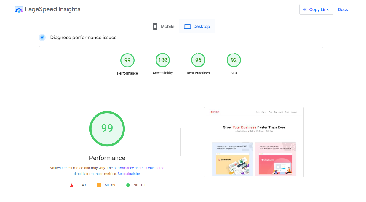

To break down the results, here is the before-after comparison of our website scores.
| Before | After | |
|---|---|---|
| Performance | 85 | 99 |
| Accessibility | 92 | 100 |
| Best Practices | 93 | 96 |
| SEO | 92 | 92 |
Besides the default Gutenberg editor, GutenKit has also helped us with this. Since GutenKit is one plugin with all features, with fewer plugins, our site stability has improved, resulting in reduced downtime and maintenance requirements.
Consistency in design
One of the primary challenges during the rebuild was to maintain the design continuity across our website. Since the page builders we were using had quite a lot of design elements, our concern was if you could replicate those designs in Gutenberg.
This is where GutenKit has helped to a great extent to rebuild our website exactly with the same design we had previously.
Notable design improvements:
- Design elements: Maintained consistency in fonts, colors, and layout throughout the site, reinforcing our brand identity.
- Modern aesthetic: Includes all the modern animations and motion effects like Parallax effects, Scrolling Effects, Glassmorphism, CSS Transformations, Entrance animation, and so on.
- User experience: Improved navigation and accessibility, making it easier for users to find information and engage with our content.
- Responsive design: The website is responsive to different devices, ensuring a seamless experience whether accessed on desktops, tablets, or smartphones.
The transition kept our brand identity and the block design elements provided an easier way to build web pages.
Impact on SEO
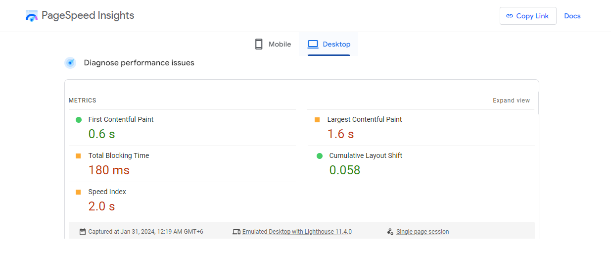
Rebuilding our website with GutenKit positively impacted our SEO score as well as site traffic. The faster loading time and design improvements have helped to be recognized by search engines leading to higher core web vital scores.
Core Web Vital scores:
Before

After:
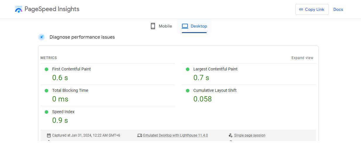

With these improved core web vital scores due to the performance and design improvements contributed to higher rankings for our key pages. That led to higher traffic and engagement.
Overall, the transition to GutenKit has greatly improved our website’s SEO performance, leading to higher ranking, increased engagement, and a stronger online presence.
Conclusion
With GutenKit, we not only replicated our original design but also achieved remarkable improvements in performance, accessibility, and SEO scores. The migration has transformed our website, making it faster, more efficient, and future-proof, aligning with our vision of delivering the best possible user experience.
I have shared the story so that our experience can help and inspire others in their transition to Gutenberg.
If you find this case study useful, please leave a comment to let us know your experience and point of view in building WordPress sites with Gutenberg.


Leave a Reply