


The ElementsKit Advanced Search widget allows you to add a powerful search experience to Elementor websites. You can customize the search box to your preference and display relevant search results in an intuitive live result display.
By implementing this Elementor advanced search addon, you can lead visitors directly to what they are looking for. Let’s see how to quickly introduce a customizable search panel on Elementor websites using the ElementsKit Advanced Search widget.
Before You Start: Le ElementsKit Advanced Search widget is a part of the ElementsKit Pro plan. To use the ElementsKit Pro plugin, you must first have it installed and activated on your Elementor website.
Once you’re done, move to the main part.
How to Add an Advanced Search Box to Elementor Websites? #
Here’s your easiest steps to add a customizable search experience for your visitors.
Step 1: Activate & Add ElementsKit Advanced Search Widget #
Log in to your WordPress dashboard and navigate to ElementsKit > Widgets. Within the ElementskIt widgets panel, look for the Recherche avancée widget and toggle the button next to it. Then, hit the “Save Changes” button at the top right of the page to activate this widget.
After enabling the Advanced Search widget, take a new page or post and start to edit with the Elementor page builder.
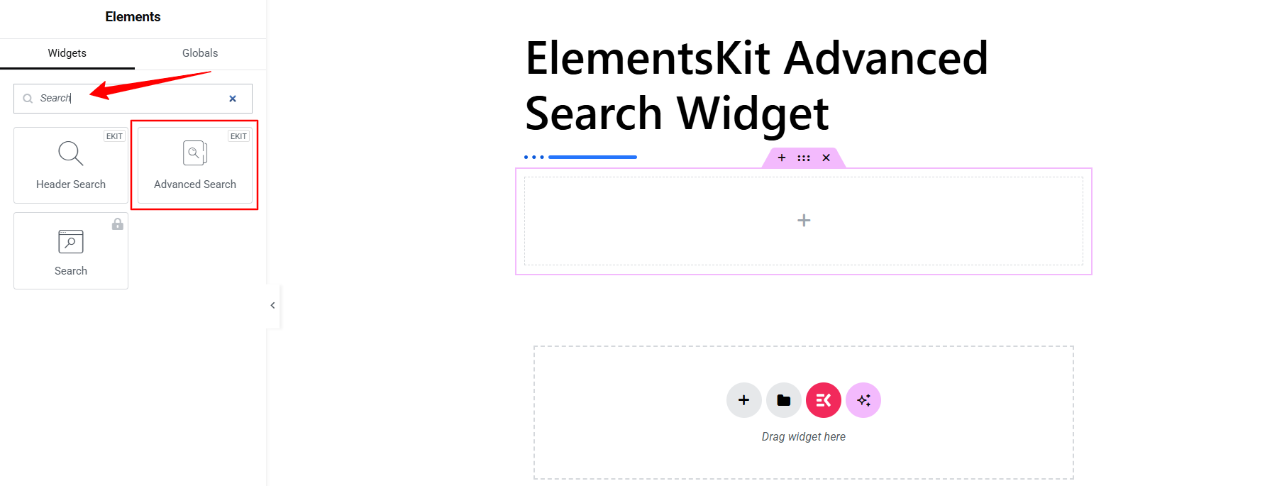
When you’re in the Elementor page builder interface, search for the Recherche avancée widget from the widget library and drag & drop it to the editor area. It will load with a sample search box.
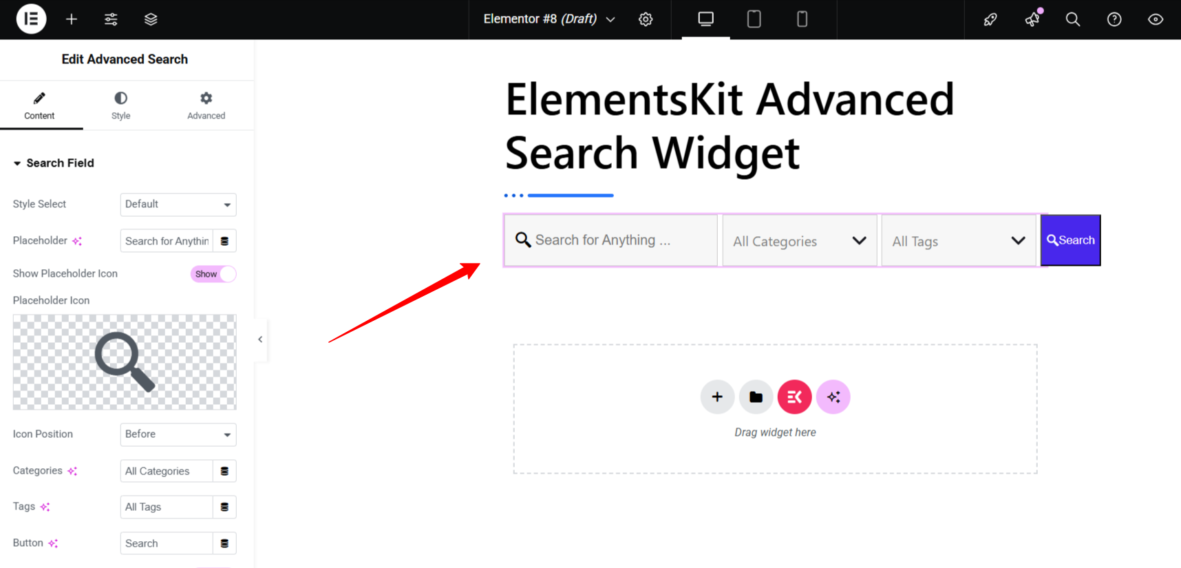
Step 2: Add & Configure Search Box Style #
Within the widget settings, go to the Onglet Contenu and open the Search Field option. Here, you can choose search box style, add placeholder text, change icon, etc. Let’s see the options:
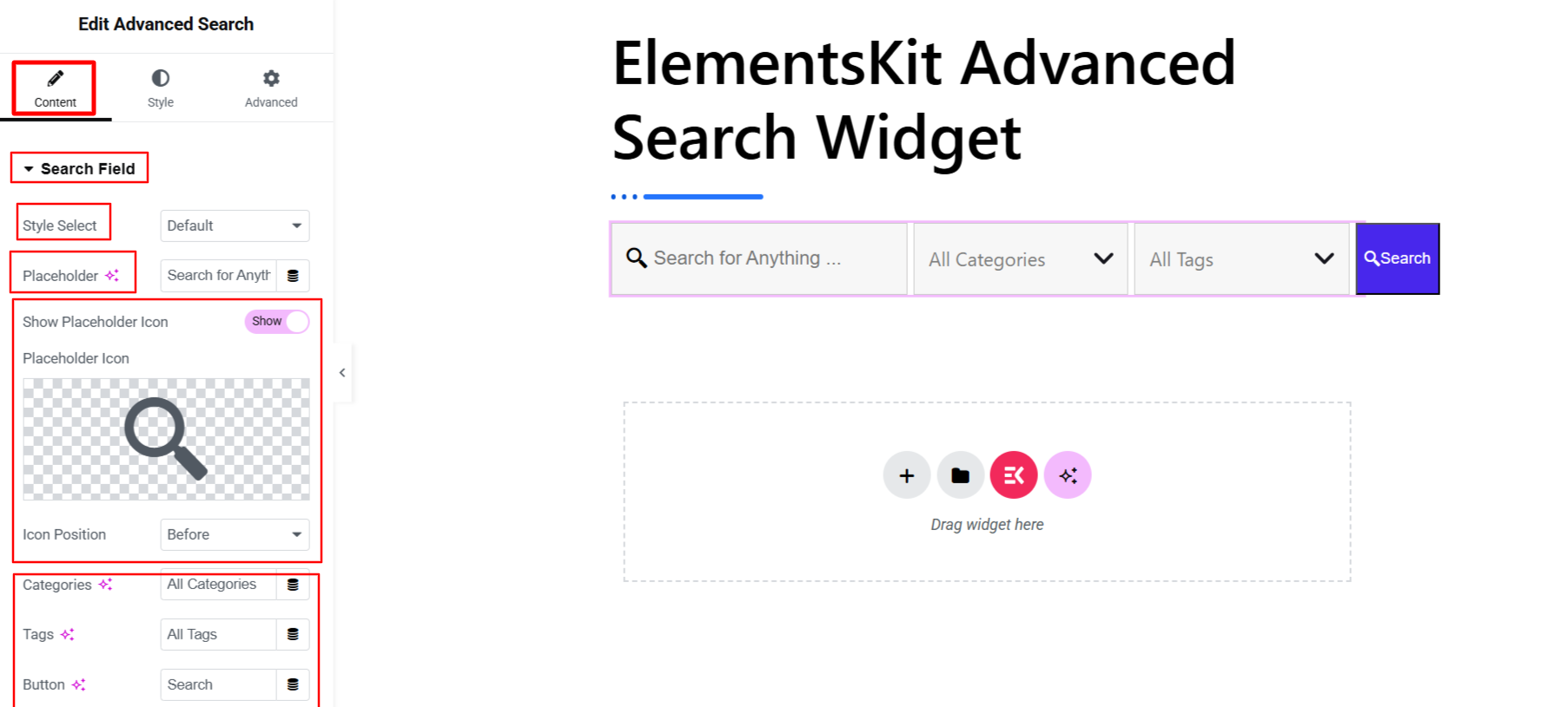
- Sélectionnez le style : Choose a search box style, from options like Default, Modern, & Click Expand.
- Espace réservé : Add placeholder text for the default search box.
- Show Placeholder Icon: Enable this option to show an icon in the placeholder. Also, choose a placeholder icon and select the Icon position between Before & After.
- Placeholder Text (Categories, Tags, & Button): The next three options in this tab allow you to write placeholder text for the Categories, tags, & button of your search box.
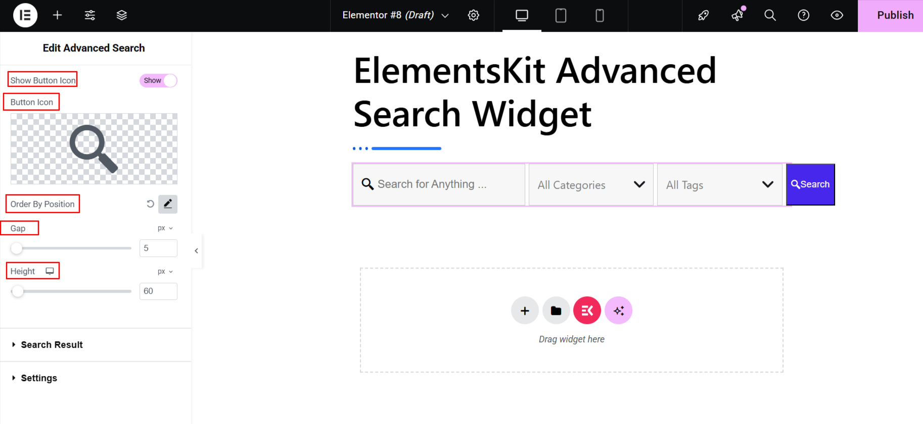
- Show Button Icon: Enabling this option lets you show an icon with button and upload an icon from the default library or your device.
- Order By Position: Using this option, you can set the order of the search box components. Change the number of the box to move a component.
- Gap: Determine the gap between search box components.
- Hauteur: Use this slider to adjust the vertical height of your search box.
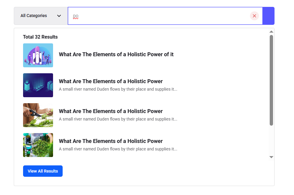
Step 3: Insert & Organize Live Search Panel #
In this step, you will use the ElementsKit features to build your live search result panel. Go to the Résultat de la recherche option, and you will find different options to control the search panel components:
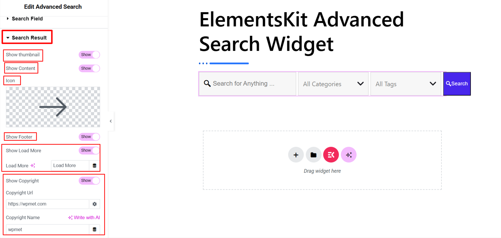
- Show Thumbnail: Activate this toggle button to show a thumbnail in the search panel.
- Montrer le contenu: Display content in the search panel.
- Icône: Insert an icon to indicate that the content appears after visitors search.
- Afficher le pied de page : Enable this option to showcase a footer row in the search result display.
- Show Load More Button: Add a load more button to help searchers get more results on a given query. You can change the label text of the load more button.
- Show Copyright: Get all the copyright functionalities, including name and URL.
Step 4: Filter Search Result #
Now, you can filter what to show or hide from the search results.
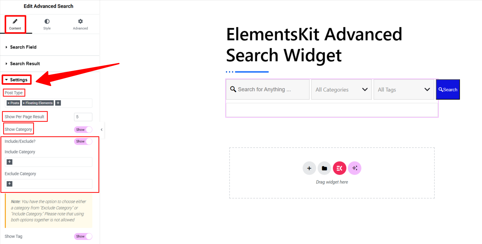
- Type de message : Choose post types as the search source to deliver the most relevant results to your visitors.
- Show Per Page Result: Add a number to define the number of results to display.
- Afficher la catégorie : Enable this button to showcase category with the search box, so the searcher selects a category and the search box smartly presents results within that category.
- Include/Exclude: Use the include and exclude boxes to highlight key categories or hide irrelevant ones.
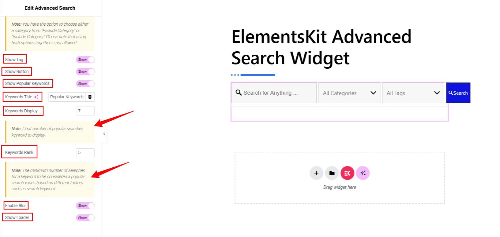
- Afficher la balise : Showing a tag box component in the search box is another way to help visitors optimize the results based on their needs.
- Bouton Afficher : Add a search button to make a better user experience.
- Show Popular Keywords: Display popular search terms below the search box to help visitors. You can also specify how many keywords to display and how to determine a popular keyword. Set the minimum number of searches to be considered as popular keywords.
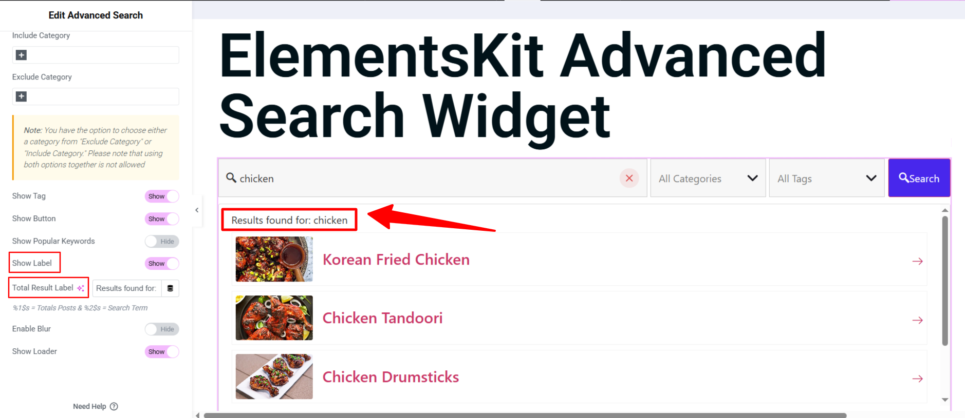
- Afficher l'étiquette : Toggle this option to show a customizable help text about what the search results will help your visitors with when searching. Enabling this option will rebeal the “Total Result Label" option.
- Total Result Label: Enter you custom helpful text in this box.
- Enable Blur: Activating this option will make the entire screen blur while visitors searching for something. Only search box and search result will be shown.
- Show Loader: This option will show an active loading icon while the search function run.
Step 5: Customize Search Box #
Maintenant, viens au Style tab of this widget. From here, you can customize every component of your search box. You can customize the appearance based on Normal, Hover, et Se concentrer states. Here are the customization settings:
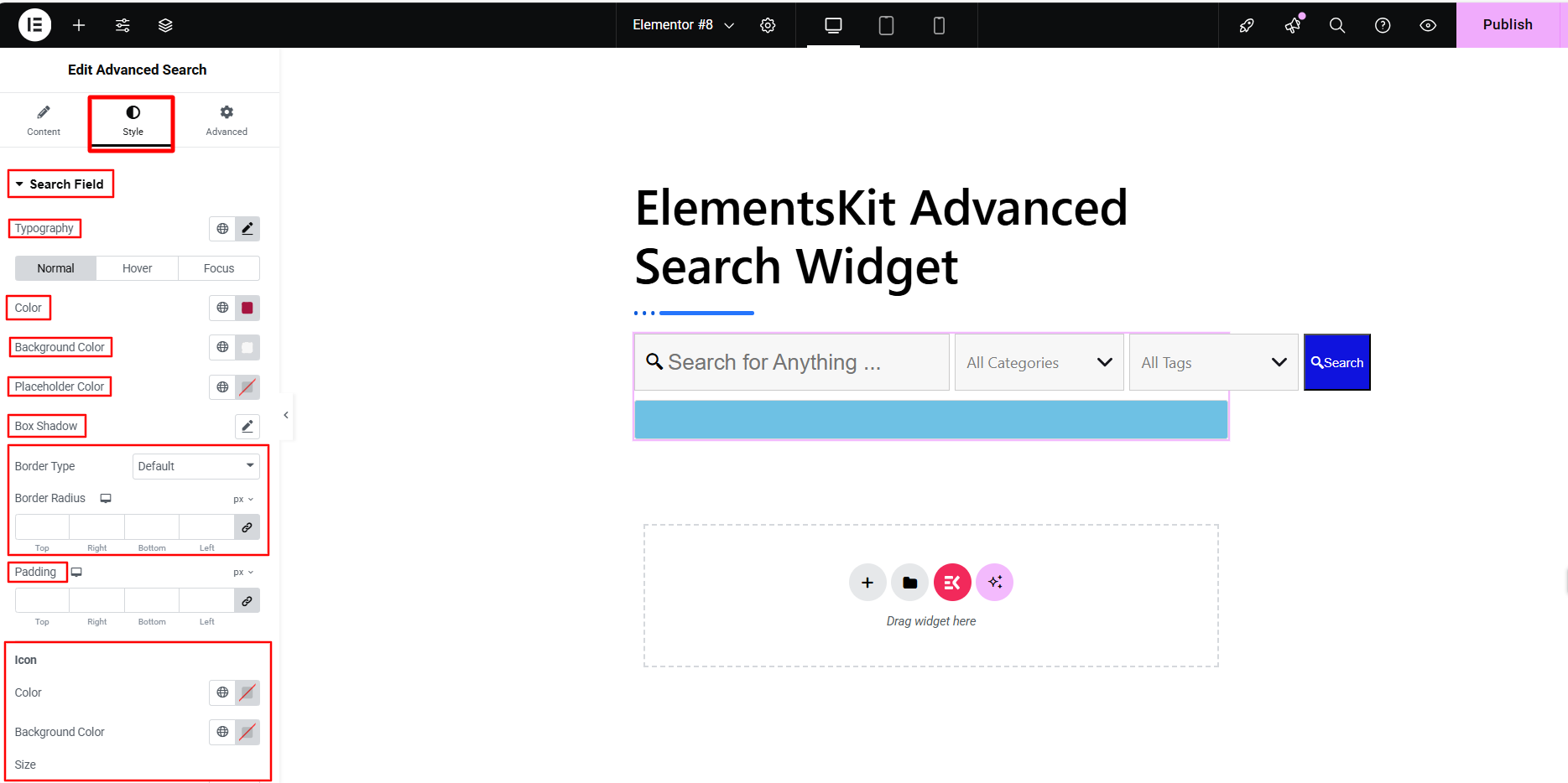
- Search Fields: Customize everything in your search box, including typography, background, placeholder color, box shadow effects, border styles, icon styling, padding, etc.
- Categories & Tags: Do the same customization as stated above for categories and tags.
- Dropdown Options: Basically, using the customization part of this option, you will style the dropdown component of a search box like tag or category. You have access to versatile customization options like background, border, box shadow, hover states, padding, margin, etc.
- Bouton: Here, you have the chance to customize the search button or any other button component you add to the ElementsKit search box.
Step 6: Style the Live Search Panel #
In this step, you’ll customize the live search panel. Start from the Style tab of the ElementsKit Advanced Search widget. First, insert into the Result Wrapper option.
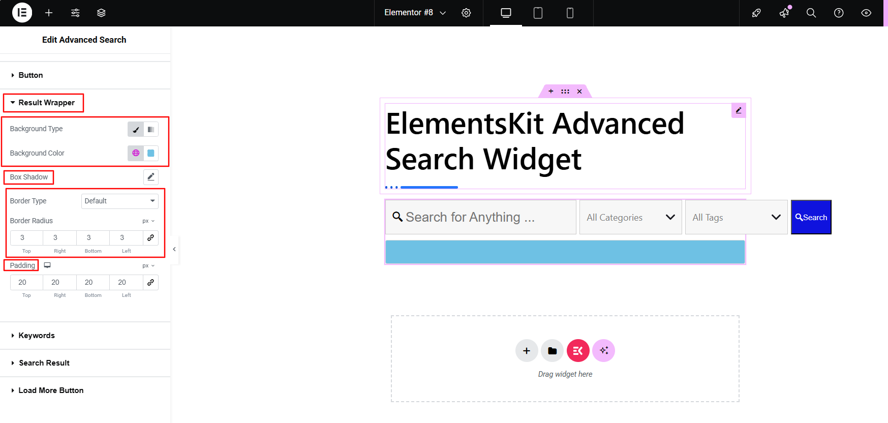
- Result Wrapper: Style the result panel container. Style background, border, padding, etc.
- Keywords: Customize the area, showing popular keywords.
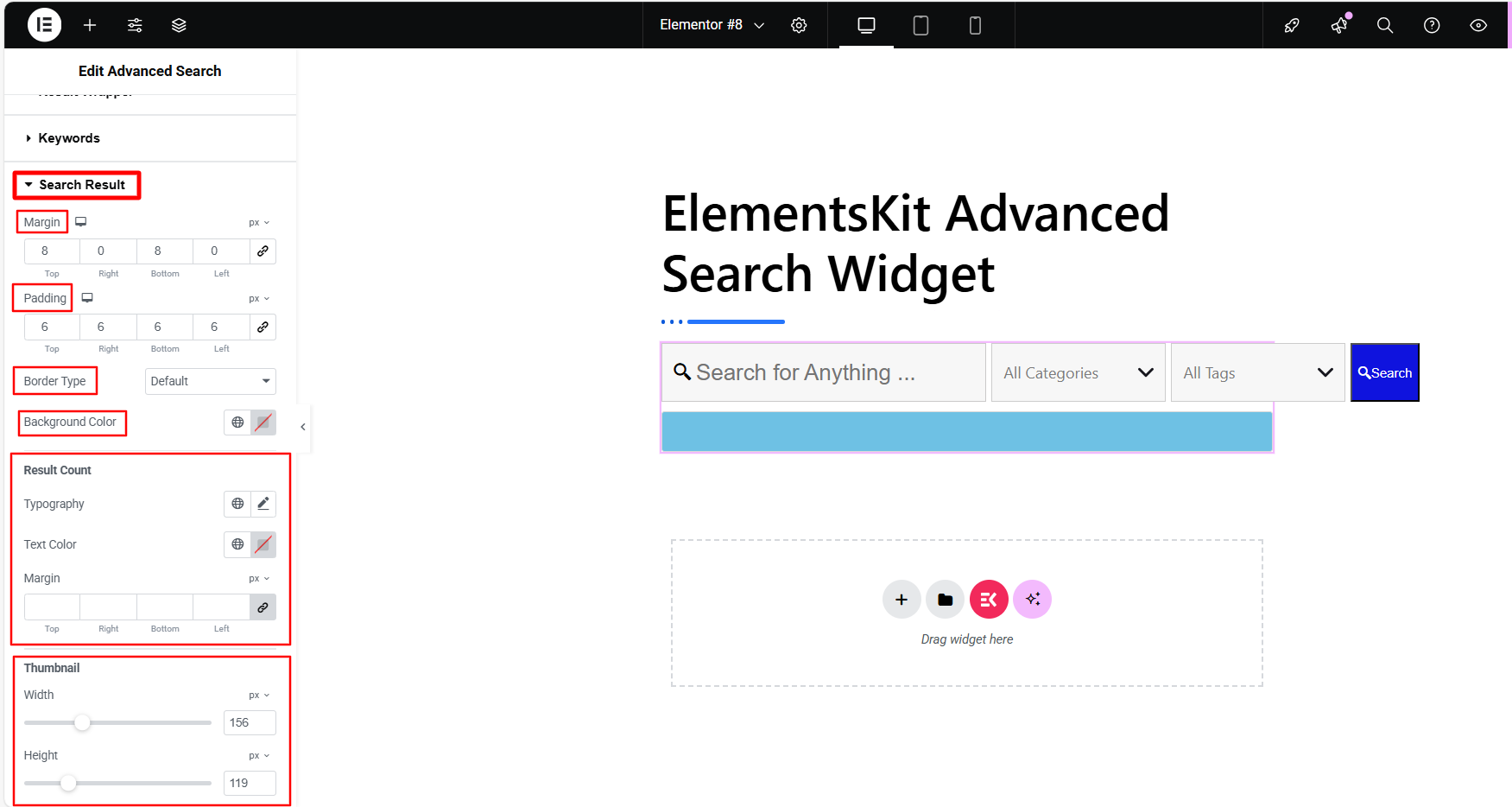
- Search Result: This part lets you customize the search result, you can control the styling of title, description, thumbnail, result counts, icons, etc.
- Load more button: Change the typography, background, border, padding, etc of the load more button.
Step 7: Check & Preview the Search Box #
Once you’ve customized the search box and results panel, don’t forget to preview your design before going live. Most importantly, run a few test searches to ensure the results are accurate and working as expected.
Here’s a preview of your customized search box, built with the ElementsKit Advanced Search widget.
Now, its your turn to design a customizable search experience to your website and give the most relevant search results to your visitors.


