


MetForm offers a comprehensive set of form input fields for creating flexible and interactive WordPress forms. Each field can be customized with labels, placeholders, validation rules, and conditional logic to suit any form requirement.
Input Fields and Their Functions #
- Text Field: Collects single-line textual input from users.
- Email Field: Accepts and validates email addresses.
- Number Field: Allows numeric input with min, max, and step control.
- Telephone Field: Collects phone numbers in a structured format.
- Time Field: Lets users select a time, optionally in 24-hour format.
- Date Field: Enables date selection with optional range or date+time mode.
- Select (Dropdown) Field: Provides a single-choice dropdown menu.
- Multi-Select Field: Allows selection of multiple options from a list.
- Textarea Field: Captures multi-line text input from users.
- Checkbox Field: Lets users select one or more predefined options.
- Radio Field: Allows single-choice selection from multiple options.
- First Name Field: Captures the user’s first name.
- Last Name Field: Captures the user’s last name.
- GDPR Consent Field: Adds a checkbox for compliance with data privacy laws.
- Switch Field: Provides an on/off toggle for binary choices.
- URL Field: Accepts website URLs with validation.
- Password Field: Collects secure password input.
- Response Message: Displays success, error, or custom messages.
- Rating Field: Lets users rate items with stars or similar symbols.
- File Upload Field: Enables uploading of single or multiple files with type and size restrictions.
- Summary Field: Displays a summary of form data before submission.
- 제출 버튼: Finalizes and submits the form.
우리 둘 다 있어요 무료 그리고 Pro 입력 필드 for you. Here we’ll discuss the free input field, let’s start.
자유 입력 필드 #
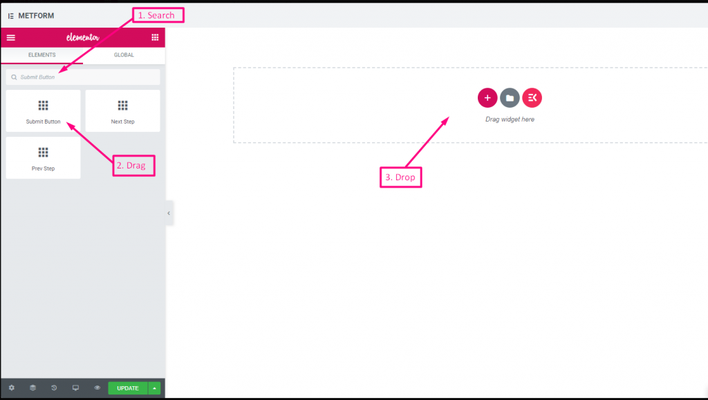
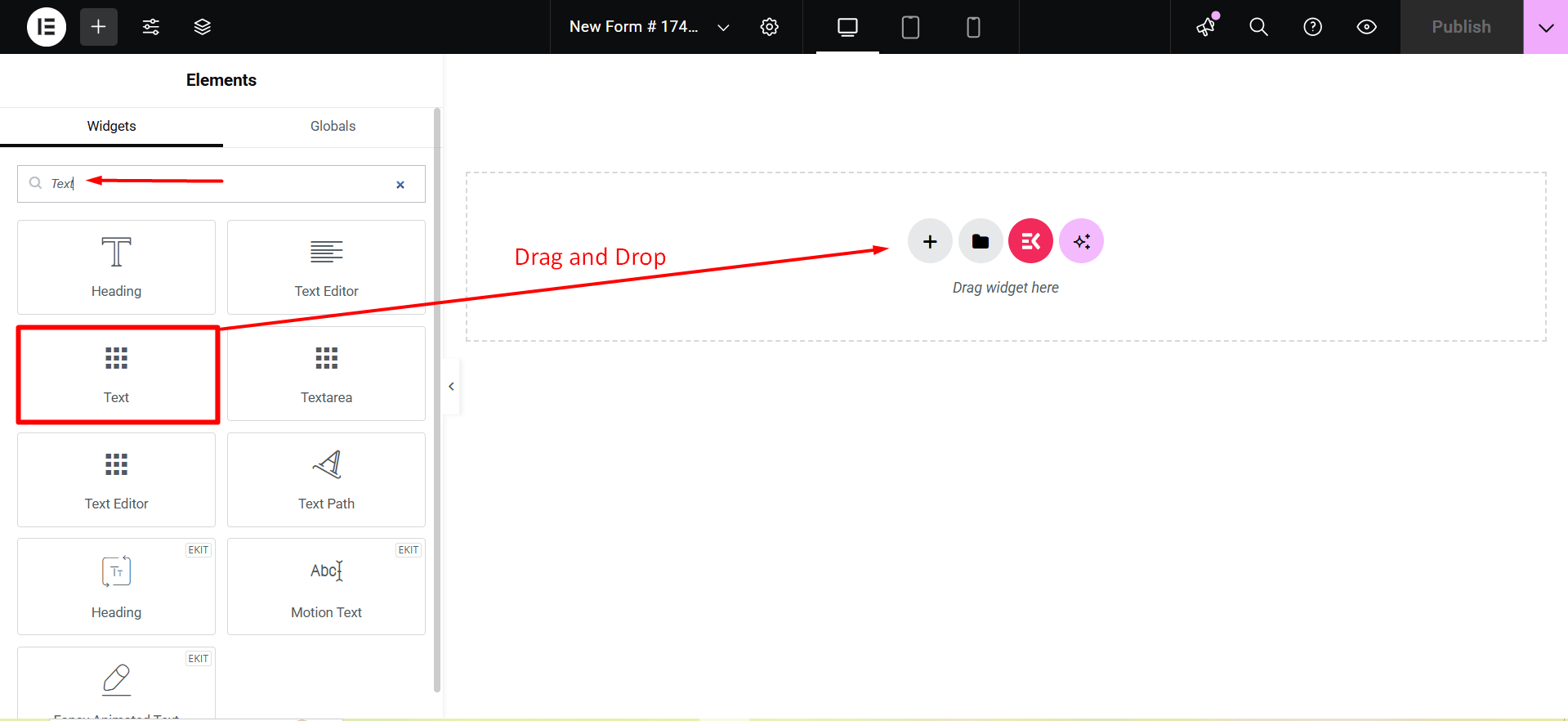
To make any form with Metform’s Free Input Fields, open the page/post you want to add the form. After that, start editing with Elementor.
텍스트 #
Add Text field to input Name or any type of text.
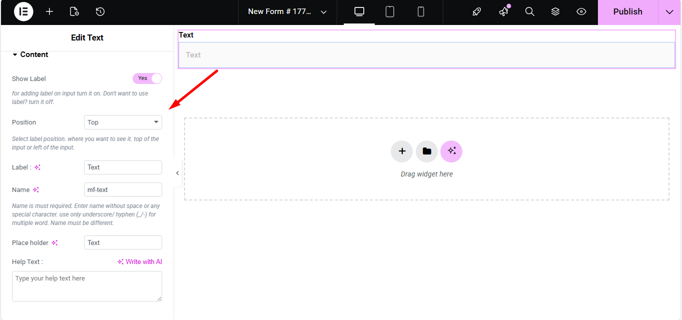
콘텐츠 #
- Show Label (Toggle): Turn the field label on/off.
- Position (Dropdown: Top / Left): Choose label position relative to the input.
- Label (Text Input): Text that appears as the field’s title.
- Name (Text Input – Required): Unique internal identifier without spaces.
- Placeholder (Text Input): Light text inside the field guiding the user.
- Help Text (Textarea): Instruction text displayed below the field.
- Default Value (Text Input): Pre-populates the field with a value.
- Required (Toggle): Makes the field mandatory for form submission.
설정 #
- Field ID (Text Input): Custom HTML ID for styling or scripting.
- Width (Dropdown: 100% / 50% / Custom): Controls how much horizontal space the field uses.
- Read Only (Toggle): Prevents users from editing the text.
- Disabled (Toggle): Completely disables the field interaction.
Validation #
- Validation Type (Dropdown): Choose how the field’s value is validated.
- 문자 길이별: Enforce minimum/maximum characters.
- 단어 길이별: Enforce min/max number of words.
- 표현 기반: Custom regex pattern for validation.
- Required Message (Text Input): Custom message when required rule fails.
조건부 논리 #
- Enable Conditional Logic (Toggle): Enable dynamic show/hide behavior.
- Action (Dropdown: Show / Hide): Whether to show or hide based on conditions.
- Field (Dropdown): Field to compare against.
- Operator (Dropdown): Type of comparison (Equal / Not Equal / Contains / Greater / Less).
- Value (Text Input): Condition value to match.
Check out our 여기 라이브 데모.
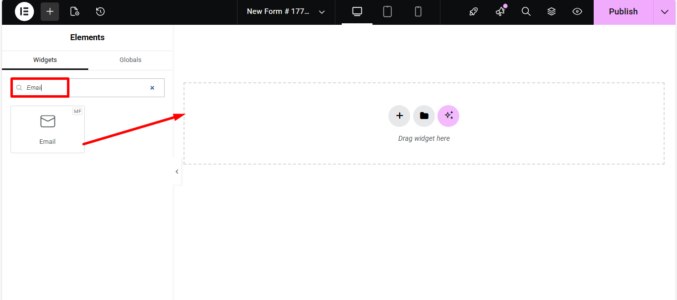
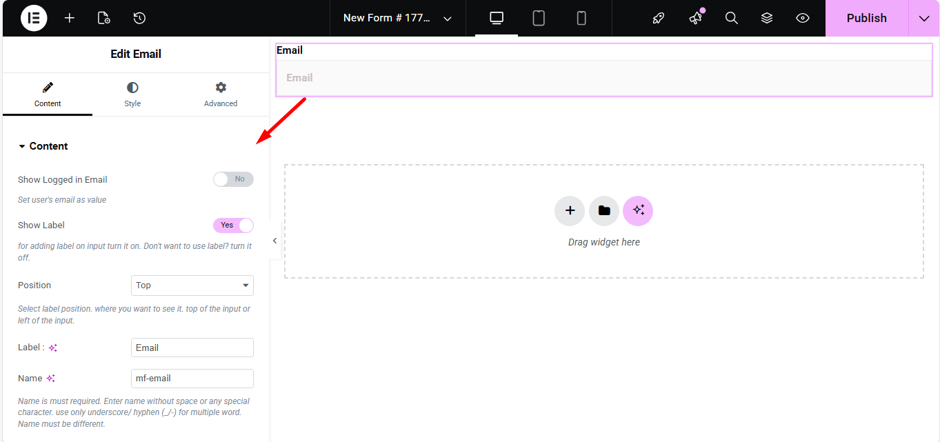
이메일 #
Make sure that the user enters the valid email address to your Form with the Email Input field. Search the Metform email widget and drag and drop.
콘텐츠 #
- Show Label (Toggle): Display label or not.
- Position (Dropdown: Top / Left): Where the label appears.
- Label (Text Input): Field title text.
- Name (Text Input – Required): Unique field identifier.
- Placeholder (Text Input): Hint text inside the field.
- Help Text (Textarea): Instructional text under the field.
- Required (Toggle): Make email required to submit.
설정 #
- Field ID (Text Input): For CSS/JS targeting.
- Width (Dropdown): How wide the field appears visually.
- Read Only (Toggle): Users can’t change the displayed email.
Check out our 여기 라이브 데모
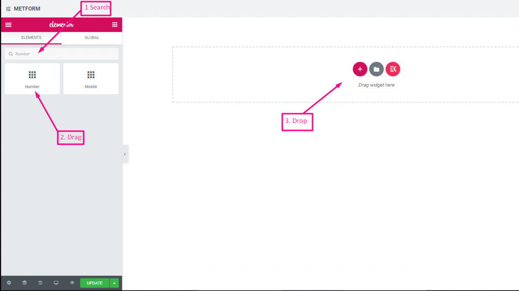
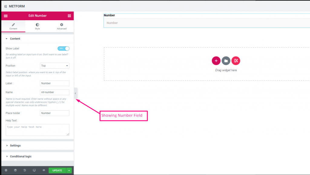
숫자 #
이 입력 필드는 사용자가 숫자 입력으로 유효한 숫자를 입력하도록 보장합니다.
콘텐츠 #
- Show Label (Toggle): Control label visibility.
- Position (Dropdown: Top / Left): Label placement.
- Label (Text Input): Number prompt text.
- Name (Text Input – Required): Unique identifier.
- Placeholder (Text Input): Default hint numeric text.
- Help Text (Textarea): Help text guiding input.
- Default Value (Number Input): Pre-set number in field.
- Required (Toggle): Mandatory numeric input.
설정 #
- Min Value (Number Input): Smallest allowed number.
- Max Value (Number Input): Largest allowed number.
- Step (Number Input): Increment step for arrows/spinners.
- Read Only (Toggle): Prevent editing.
- Disabled (Toggle): Disable the control.
Check out our 여기 라이브 데모
전화 #
사용자가 연결을 위해 유효한 전화번호를 제공하도록 허용합니다.
콘텐츠 #
- Show Label (Toggle): Show/hide phone label.
- Position (Dropdown: Top / Left): Label layout.
- Label (Text Input): Field title text.
- Name (Text Input – Required): Field internal name.
- Placeholder (Text Input): Phone format example text.
- Help Text (Textarea): Additional instructions.
- Required (Toggle): Must be filled to submit.
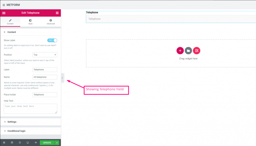
Check out our 여기 라이브 데모
시간 #
사용자가 팝다운 타이머에서 원하는 시간을 선택할 수 있도록 도와줍니다.
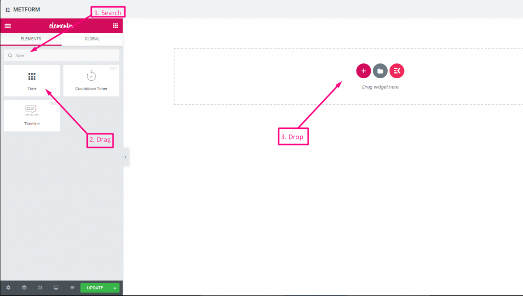
콘텐츠 #
- Show Label (Toggle): Enable/disable label.
- Position (Dropdown): Top/Left label position.
- Label (Text Input): Prompt for time.
- Name (Text Input): Internal time field name.
- Placeholder (Text Input): Time format hint.
- Help Text (Textarea): Extra instruction text.
- Required (Toggle): Mandatory time.
- Use 24H Format (Toggle): Option to use 24-hour instead of AM/PM.
Check out our 여기 라이브 데모.
24시간 형식 #
Check out our 여기 라이브 데모
날짜 #
이 입력 필드를 사용하여 팝업 달력에서 날짜를 선택하여 양식을 더욱 사용자 친화적으로 만드세요.
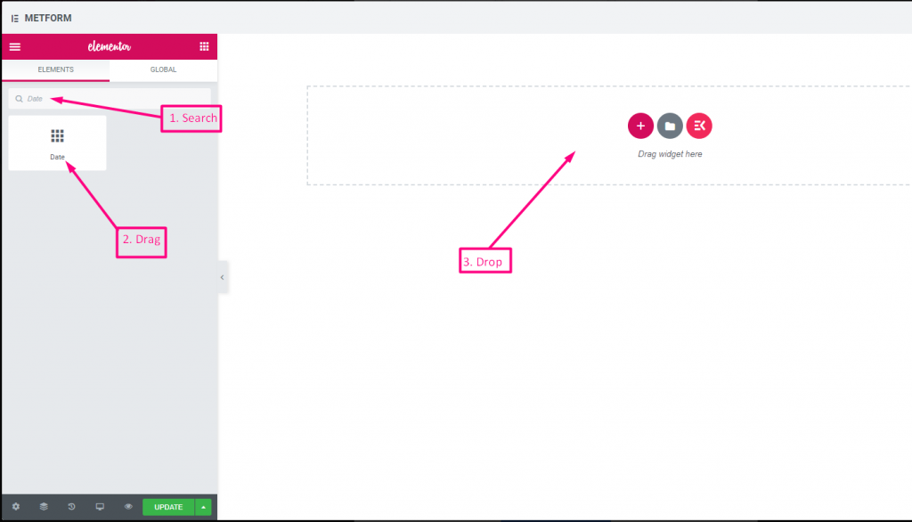
콘텐츠 #
Required (Toggle): Must select a date/time.
Show Label (Toggle): Toggle field label display.
Position (Dropdown): Choose label position.
Label (Text Input): Text shown as a title.
Name (Text Input): Unique field key.
Help Text (Textarea): Extra instructions.
설정 #
- Range Date Input (Toggle): Enable two dates (start/end) instead of single.
- Min/Max Date (Date Picker): Earliest and latest selectable dates.
- Disable Dates (Date Picker): Block specific dates.
- Date Format (Dropdown): Choose format such as DD-MM-YYYY.
- Input Time (Toggle): Add time selection with date.
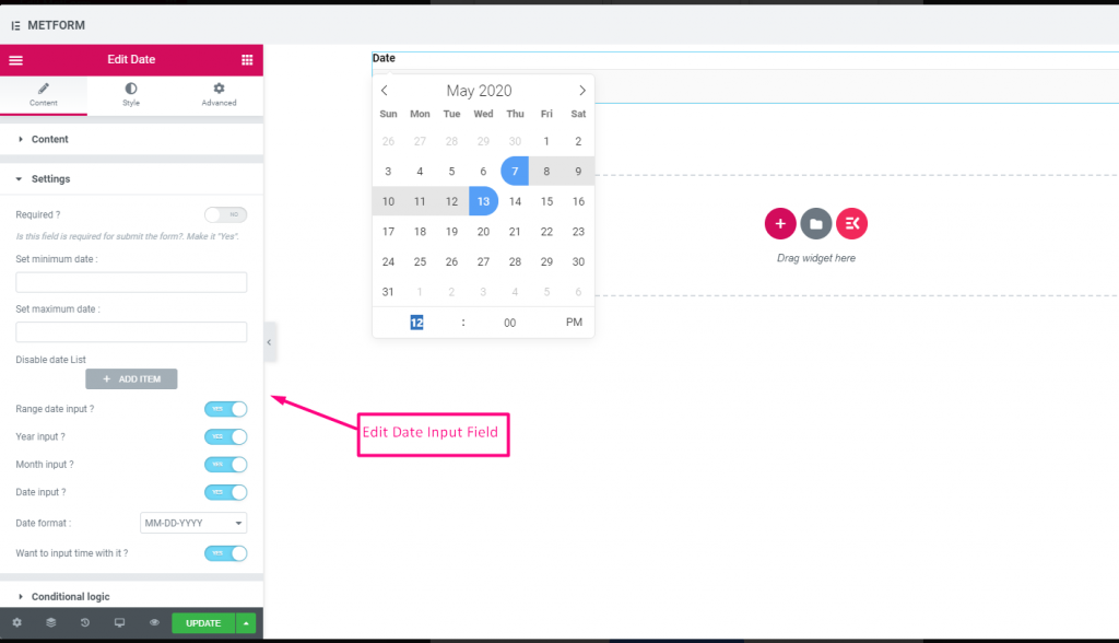
Check out our 여기 라이브 데모
기간 입력 #
Check out our 여기 라이브 데모
시간 입력으로 날짜 선택 #
Check out our 여기 라이브 데모
| 옵션 | 설명 |
|---|---|
| 라벨 표시 | 라벨을 켜거나 끕니다. |
| 위치 | 기본: 맨 위 라벨 위치를 선택하세요. 보고 싶은 곳. 입력의 상단 또는 왼쪽. |
| 상표 | 레이블 텍스트를 입력합니다. |
| 이름 | 이름은 필수 항목입니다. 공백이나 특수문자 없이 이름을 입력하세요. 여러 단어에는 밑줄/하이픈(_/-)만 사용하세요. 이름은 달라야 합니다. |
| 자리 표시자 | 자리 표시자를 사용하여 더미 텍스트를 표시하고 사용자가 올바른 텍스트를 입력할 수 있도록 돕습니다. |
| 도움말 텍스트 | 위젯 아래에 표시할 텍스트를 입력하세요. |
| 필수의 | 기본: 아니요 이 옵션을 전환하여 필수로 설정하세요. 사용자는 필수 필드를 작성하지 않고 양식을 제출할 수 없습니다. |
| 최소 또는 최대 날짜 설정 | 최소 및 최대 날짜 제공 |
| 비활성화 날짜 | 폐쇄일 또는 비활성화 날짜를 입력하세요. |
| 범위 날짜 입력 | 범위 날짜 입력 활성화 범위 날짜 입력을 활성화 또는 비활성화합니다. 날짜를 날짜 단위, 연도 단위 또는 월 단위로 입력합니다. 날짜 형식 : 드롭다운에서 날짜 형식을 선택합니다. 예: DD-MM-YYYY |
| 입력 시간 | 날짜에 시간을 추가할 수 있습니다. |
| 조건부 논리 | 특정 기준에 따라 이 필드를 표시하거나 숨깁니다. |
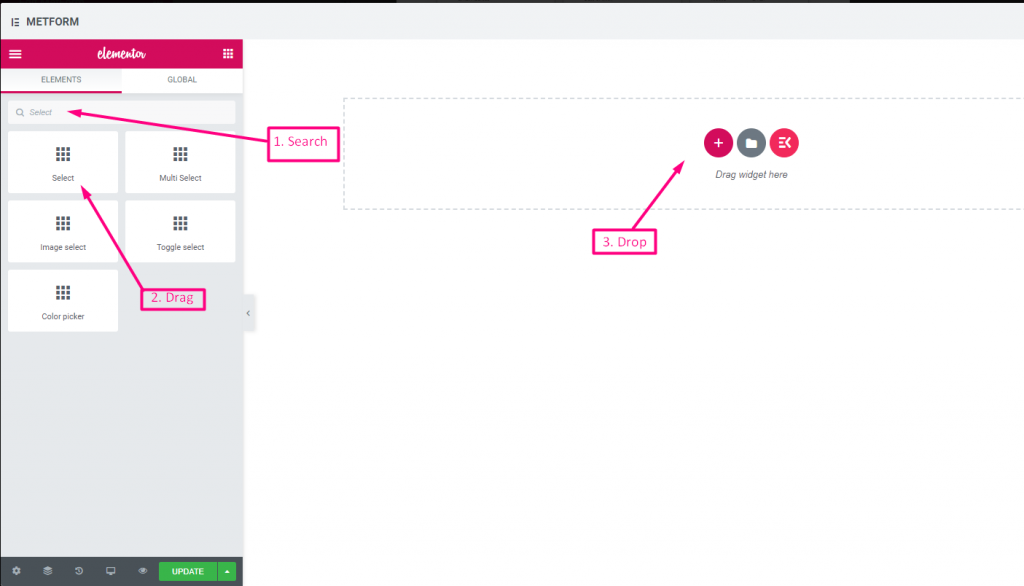
선택하다 #
사용자가 선택할 수 있는 옵션 드롭다운 목록을 추가하고 이름으로 위젯을 검색한 다음 위젯을 원하는 위치로 끌어다 놓습니다.
콘텐츠 #
- Required (Toggle): Must pick an option.
- Show Label (Toggle): Display the label.
- Position (Dropdown): Position of label.
- Label (Text Input): Dropdown title.
- Name (Text Input – Required): Internal field name.
- Help Text (Textarea): Supporting info text.
- Dropdown List (Repeater):
- Option Text: User sees this option.
- Option Value: Value sent/stored after submit.
- Status (Dropdown: Enable/Disable): Options can be disabled.
- Default Selected (Toggle): Make this option selected by default.
Check out our 여기 라이브 데모
검색 옵션을 레이블로 #
Check out our 여기 라이브 데모
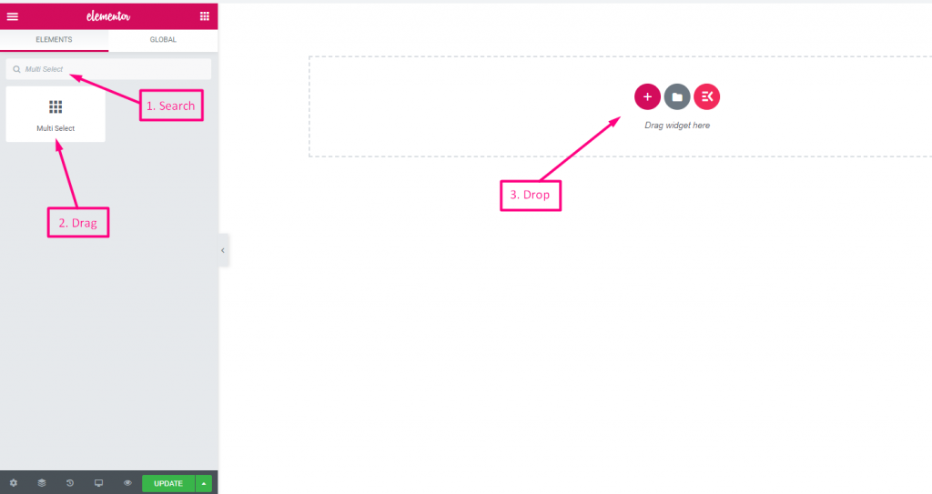
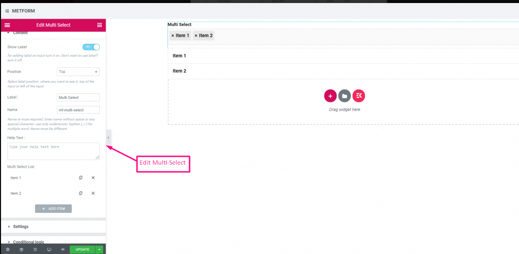
다중 선택 #
드롭다운에서 한 번에 여러 항목을 선택합니다.
(Same as Select, but allows selecting multiple options from the list.)
Multiple Selection (Toggle): Allow multiple items to be chosen.
Check out our 여기 라이브 데모
기본 선택 값 #
Check out our 여기 라이브 데모
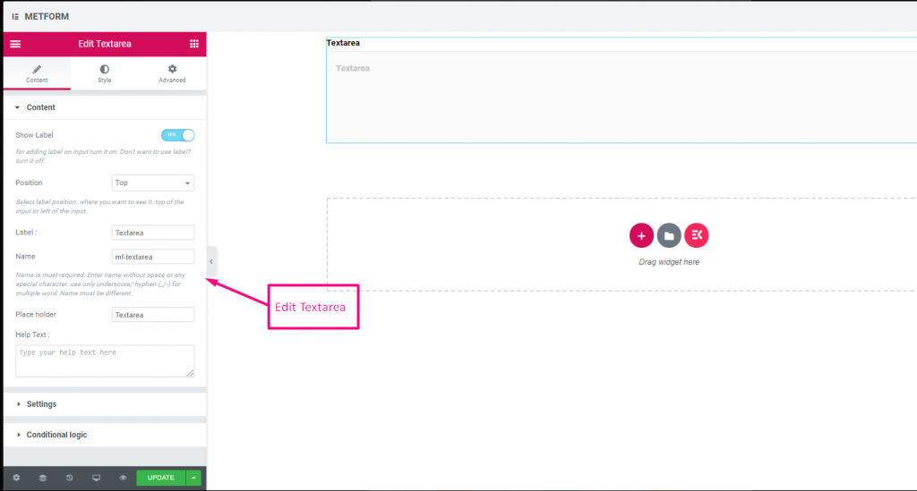
텍스트 영역 #
양식에 많은 콘텐츠, 검토, 의견을 추가하는 데 도움이 됩니다.
(Much like Text, but supports multiple lines.)
콘텐츠 #
- Rows (Number Input): Controls visible height of textarea.
- Show Label, Position, Label, Name, Help Text, Required: Same as text.
Check out our 여기 라이브 데모
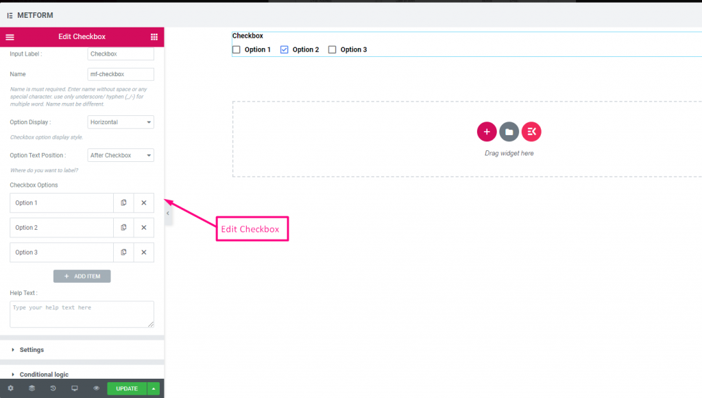
체크박스 #
사용자가 확인란을 사용하여 양식에서 한 번에 여러 항목을 선택할 수 있도록 허용합니다.
콘텐츠 #
- Show Label (Toggle), Position (Dropdown), Label, Name: Standard label controls.
- Checkbox Options (Repeater):
- Option Text: Text shown next to checkbox.
- Option Value: Stored when submitted.
- Status (Dropdown: Enable / Disable): Active or disabled option.
- Required (Toggle): Must check at least one.
표시하다 #
Layout (Dropdown: Vertical / Inline): Arrange options layout.
Check out our 여기 라이브 데모
수직의 #
Check out our 여기 라이브 데모
텍스트 뒤의 아이콘 위치 #
Check out our 여기 라이브 데모
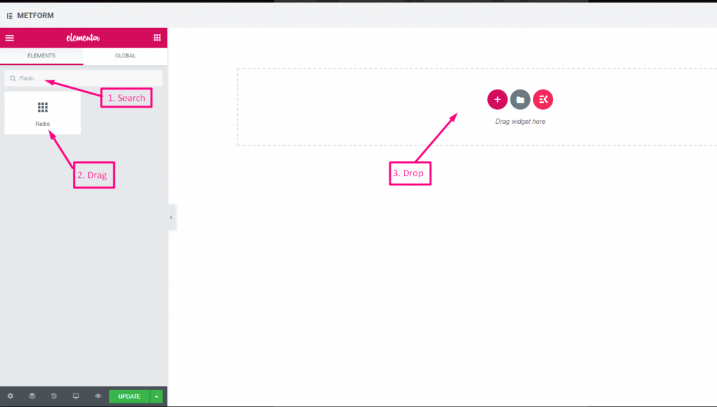
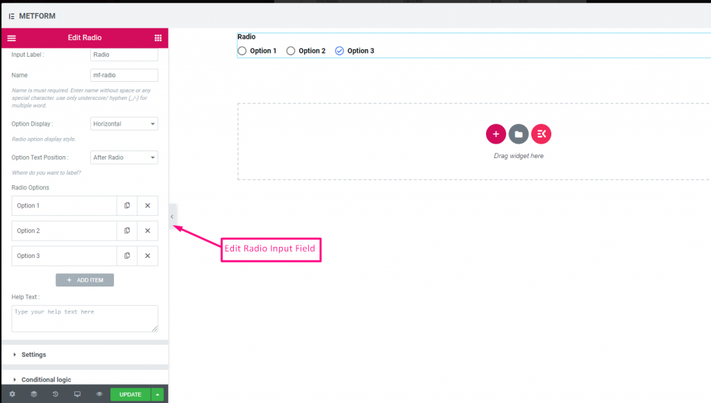
라디오 #
사용자가 여러 옵션 중에서 하나의 독점 항목만 선택할 수 있도록 허용합니다.
콘텐츠 #
- Required (Toggle): Must choose an option.
- Show Label, Position, Label, Name: Label settings.
- Option Display (Dropdown: Vertical / Horizontal): Choose orientation.
- Options Text Position (Dropdown: Before / After): Where the label sits relative to the circle.
- Radio Options (Repeater):
- Radio Option Text: Label shown to user.
- Radio Value: Value saved upon submit.
- Status (Dropdown): Active/disabled option.
Check out our 여기 라이브 데모
수직의 #
Check out our 여기 라이브 데모
텍스트 뒤의 아이콘 위치 #
Check out our 여기 라이브 데모
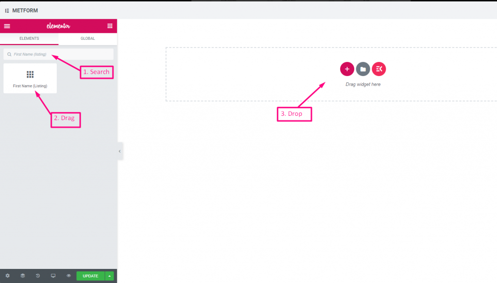
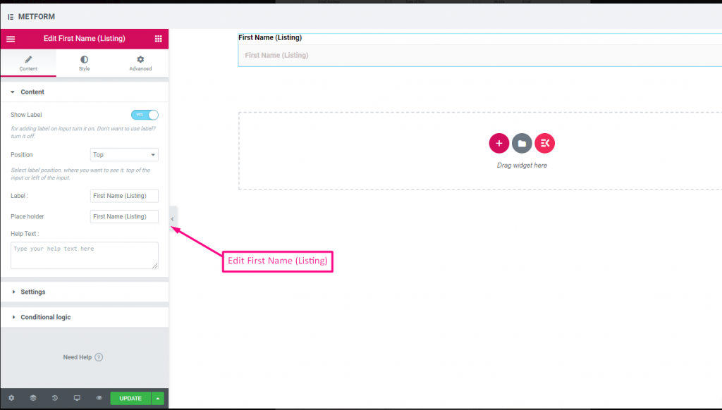
이름(목록) #
Allow users to give their First Name to show them in a listing method on the mailing list. For Example : Mailchimp
콘텐츠 #
- Validation Type (Dropdown): Min/max or expression validation for names.
- Show Label (Toggle), Position (Dropdown), Label: As standard.
- Placeholder (Text Input): Name hint.
- 도움말 텍스트: Additional instructions.
- Required (Toggle): Must fill.
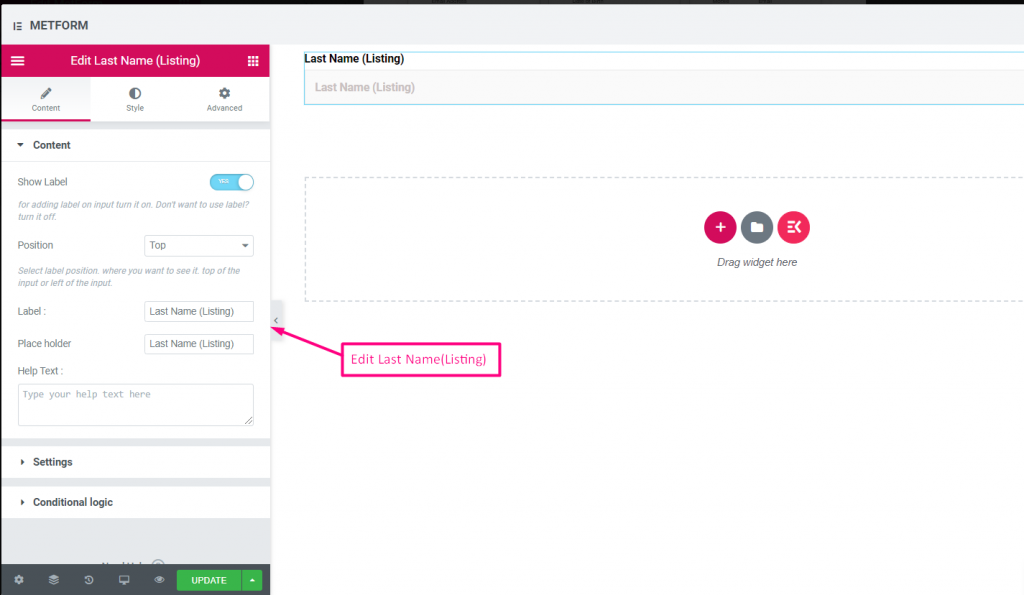
성(목록) #
Allow users to give their LastName to show them in a listing method on the mailing list. For Example : Mailchimp
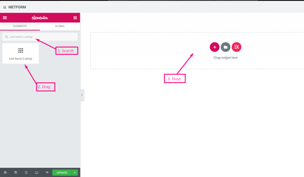
Same controls as First Name.
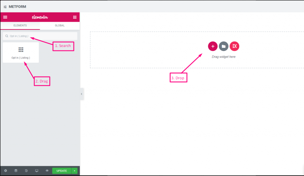
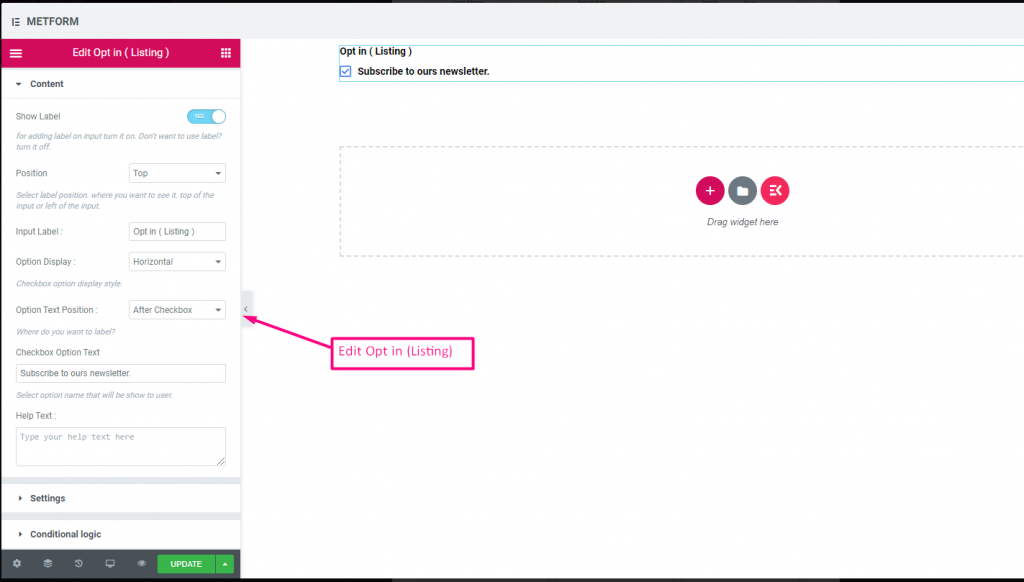
옵트인 목록 #
양식에 옵트인 필드를 사용하고 "뉴스레터 구독" 확인란을 클릭하여 사용자를 구독된 mailchimp 연락처 사용자로 만듭니다.
Check out our 여기 라이브 데모
| 옵션 | 설명 |
|---|---|
| 라벨 표시 | 라벨을 켜거나 끕니다. |
| 위치 | 기본: 맨 위 라벨 위치를 선택하세요. 보고 싶은 곳. 입력의 상단 또는 왼쪽. |
| 입력 라벨 | 레이블 텍스트를 입력합니다. |
| 옵션 표시 | 표시 선택 목록 옵션 수평으로 또는 수직으로 |
| 옵션 텍스트 위치 | 표시 선택 목록 옵션 텍스트 위치: 전에 체크박스 또는 후에 체크박스 |
| 체크박스 옵션 텍스트 | 사용자에게 표시될 옵션에 대해 간략히 설명하세요. 예를 들어: "뉴스레터를 구독하세요“ |
| 도움말 텍스트 | 위젯 아래에 표시할 텍스트를 입력하세요. 도움말 텍스트를 통해 적절한 사람에게 쉽게 메시지를 타겟팅하고 전달합니다. |
| 필수의 | 기본: 아니요 이 옵션을 전환하여 필수로 설정하세요. 사용자는 필수 필드를 작성하지 않고 양식을 제출할 수 없습니다. |
| 조건부 논리 | 특정 기준에 따라 이 필드를 표시하거나 숨깁니다. |
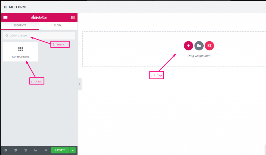
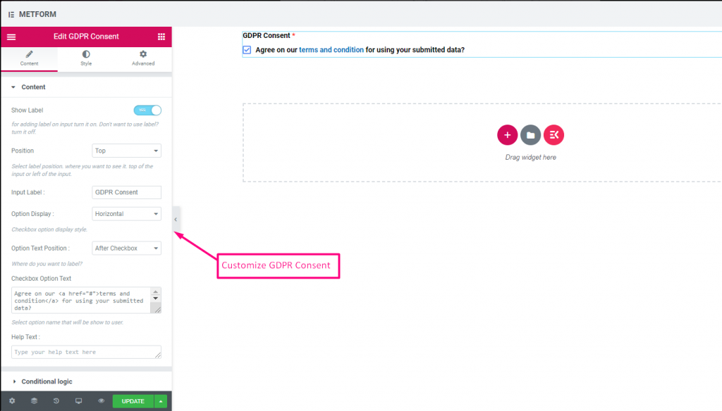
GDPR 동의 #
법의 조치로부터 안전하게 보호하기 위해 일반적으로 사용자 데이터를 사용하는 방법을 설명하므로 사용자 데이터를 수집하기 전에 양식에 GDPR(일반 데이터 보호 규정) 불만 사항을 활성화하세요.
콘텐츠 #
- Help Text (Textarea): Further explanation.
- Show Label (Toggle): Display consent block title.
- Position (Dropdown): Label placement.
- Input Label (Text Input): Consent prompt text.
- Option Display (Dropdown): Horizontal/vertical layout.
- Options Text Position (Dropdown): Label before/after checkbox.
- Checkbox Option Text (Textarea): Consent statement text.
확인하다 out our 여기 라이브 데모
텍스트 링크 포함 #
확인하다 out our 여기 라이브 데모
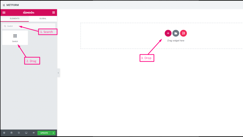
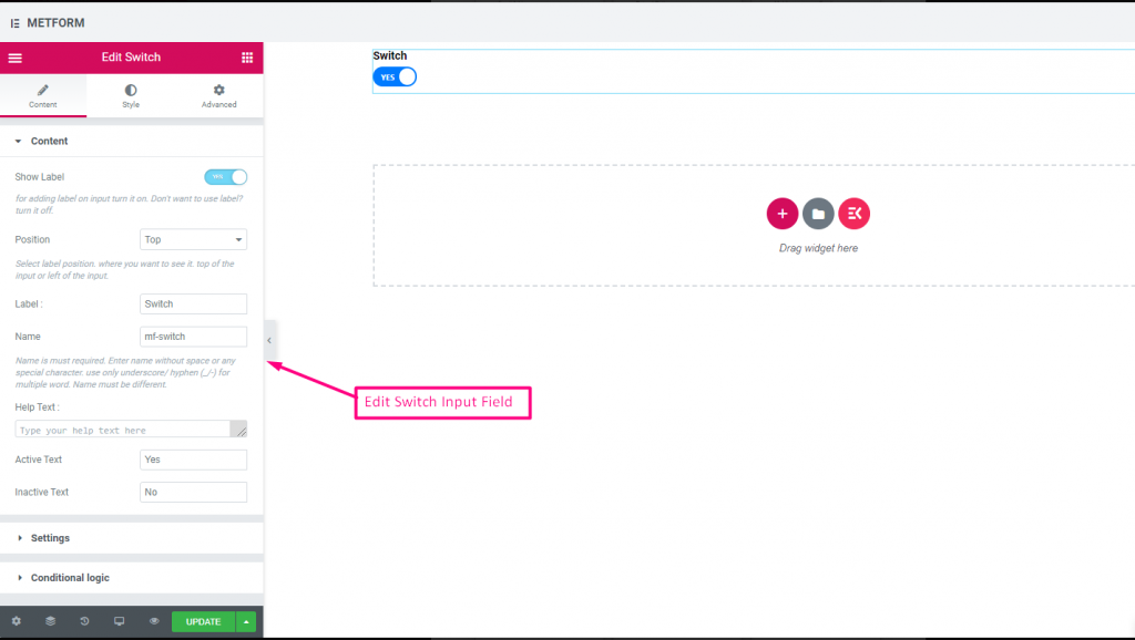
스위치 #
전등 스위치처럼 예/아니요 또는 켜기/끄기 토글 스위치 확인란 입력을 쉽게 제어할 수 있습니다.
콘텐츠 #
- Required (Toggle): Must select a state.
- Show Label (Toggle), Position (Dropdown), Label, Name: Standard label controls.
- Help Text (Textarea): Description below switch.
- Active/Inactive Text (Text Inputs): Custom labels for on/off states.
Check out our 여기 라이브 데모
사용자 정의 옵션 텍스트 #
Check out our 여기 라이브 데모
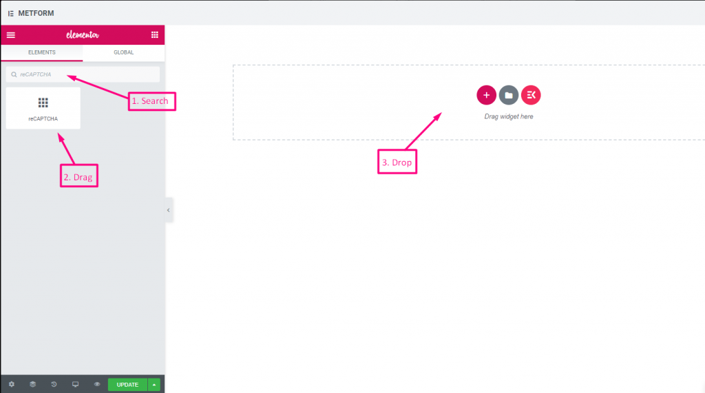
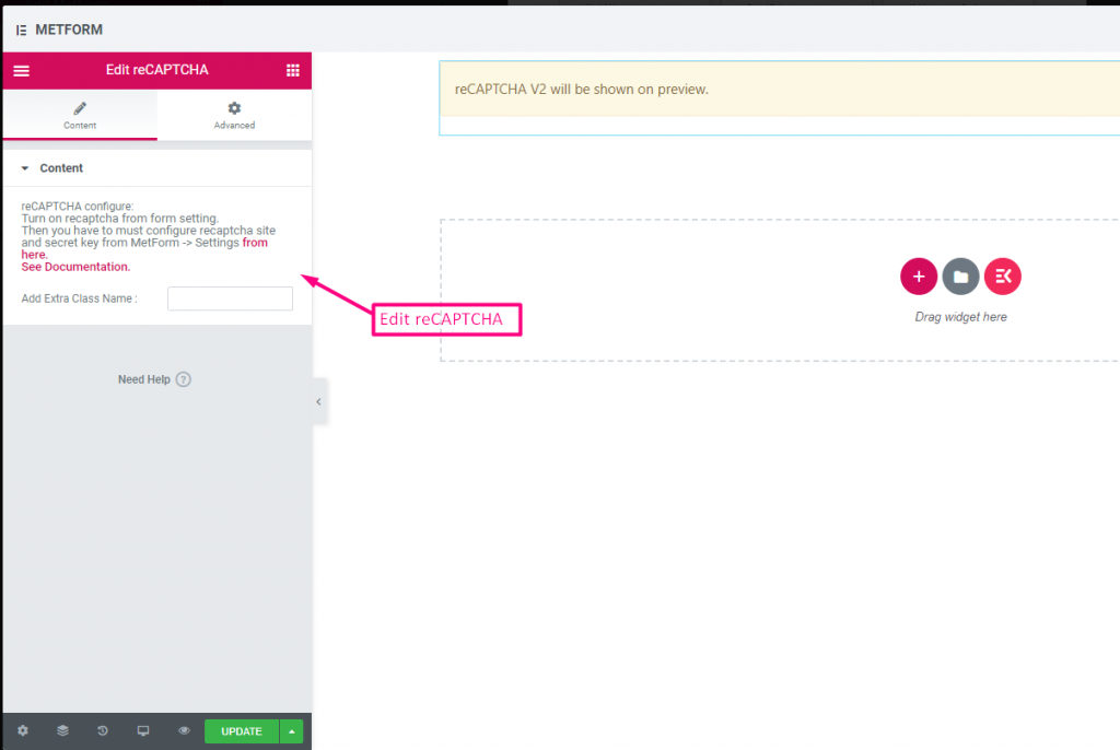
리캡차 #
Google reCAPTCHA를 통합하여 원치 않는 스팸 및 악의적인 트래픽으로부터 사이트를 안전하게 보호할 수 있습니다.
Check out our 여기 라이브 데모
| 옵션 | 설명 |
|---|---|
| reCAPTCHA 구성 | 설정에서 reCAPTCHA를 활성화하세요. 그런 다음 MetForm -> 설정에서 reCAPTCHA 사이트와 비밀 키를 구성해야 합니다. 여기에서. 문서를 참조하세요. |
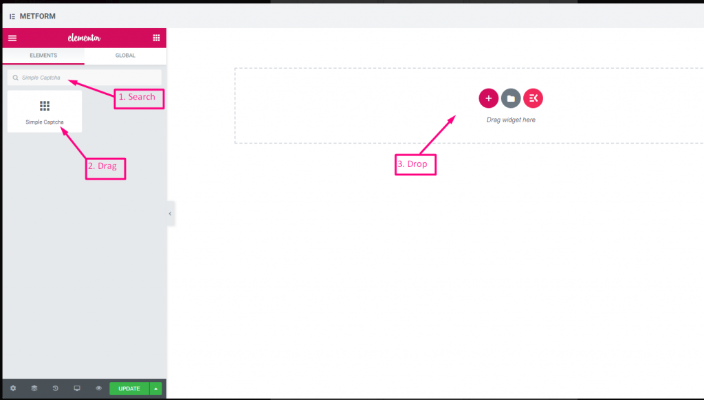
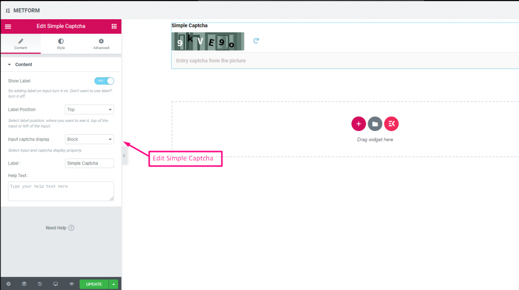
간단한 reCAPTCHA #
원치 않는 봇과 스팸으로부터 사이트를 보호합니다.
Check out our 여기 라이브 데모
인라인 옵션 #
Check out our 여기 라이브 데모
| 옵션 | 설명 |
|---|---|
| 라벨 표시 | 라벨을 켜거나 끕니다. |
| 위치 | 기본: 맨 위 라벨 위치를 선택하세요. 보고 싶은 곳. 입력의 상단 또는 왼쪽. |
| CAPTCHA 표시 입력 | 블록에 reCAPTCHA를 입력하거나 입력 필드를 한 줄로 표시하세요. |
| 상표 | 레이블 텍스트를 입력합니다. |
| 도움말 텍스트 | 위젯 아래에 표시할 텍스트를 입력하세요. |
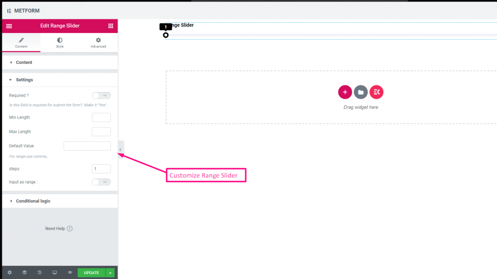
범위 슬라이더 #
매우 멋진 범위 슬라이더를 사용하여 양식에 최대 또는 최소 범위 값을 설정하세요. 적절한 값이 나올 때까지 양쪽 끝을 드래그하기만 하면 됩니다.

Check out our 여기 라이브 데모
기본값 #
확인하다 out our 여기 라이브 데모
다중 범위 입력 #
확인하다 out our 여기 라이브 데모
| 옵션 | 설명 |
|---|---|
| 라벨 표시 | 라벨을 켜거나 끕니다. |
| 위치 | 기본: 맨 위 라벨 위치를 선택하세요. 보고 싶은 곳. 입력의 상단 또는 왼쪽. |
| 상표 | 레이블 텍스트를 입력합니다. |
| 이름 | 이름은 필수 항목입니다. 공백이나 특수문자 없이 이름을 입력하세요. 여러 단어에는 밑줄/하이픈(_/-)만 사용하세요. 이름은 달라야 합니다. |
| 도움말 텍스트 | 위젯 아래에 표시할 텍스트를 입력하세요. |
| 필수의 | 기본: 아니요 이 옵션을 전환하여 필수로 설정하세요. 사용자는 필수 필드를 작성하지 않고 양식을 제출할 수 없습니다. |
| 최소 길이 | 최소 범위 값 설정 |
| 최대 길이 | 최대 범위 값 설정 |
| 기본값 | 기본값을 설정하고, 쉼표를 사용하여 범위 값을 설정하세요. |
| 단계 | 단계별로 범위를 추가하려면 단계 값을 추가하세요. |
| 범위로 입력 | 이 옵션을 전환하여 필요한 범위를 설정하세요. |
| 조건부 논리 | 특정 기준에 따라 이 필드를 표시하거나 숨깁니다. |
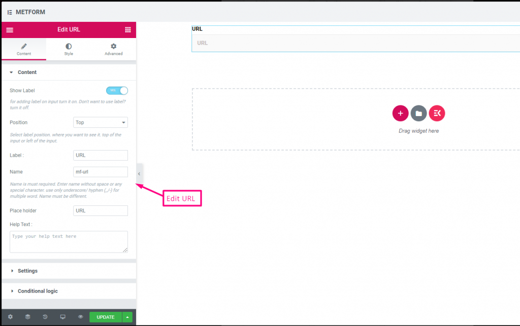
URL #
URL 입력 필드를 사용하여 양식에 URL을 추가하기만 하면 됩니다. 사용자가 양식 필드에 유효한 URL을 입력했는지 확인합니다.

콘텐츠 #
- Show Label, Position, Label, Name: Standard label controls.
- Placeholder (Text): Sample URL hint.
- 도움말 텍스트: Extra instructions.
- Required (Toggle): Must enter a valid URL.
Validation #
URL Validation: Ensures submission is a valid link.
Check out our 여기 라이브 데모
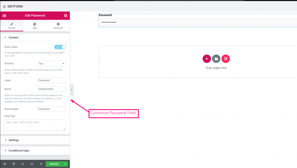
비밀번호 #
사용자에게 강력한 비밀번호를 제공하려면 비밀번호 입력 필드를 사용하세요. 이를 통해 사용자는 보호된 비밀번호를 얻고 필요할 때 변경할 수 있습니다.

콘텐츠 #
- Show Label, Position, Label, Name: Standard label controls.
- 자리표시자: Password hint text.
- 도움말 텍스트: Instruction text below field.
- Required (Toggle): Must enter password.
Validation #
Validation Type (Dropdown): Enforce strength via characters/words/regex.
Check out our 여기 라이브 데모
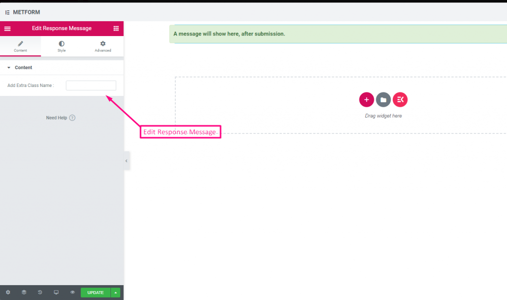
응답 메시지 #

콘텐츠 #
- Add Success Message (Textarea): Text shown after successful submission.
Check out our 여기 라이브 데모:
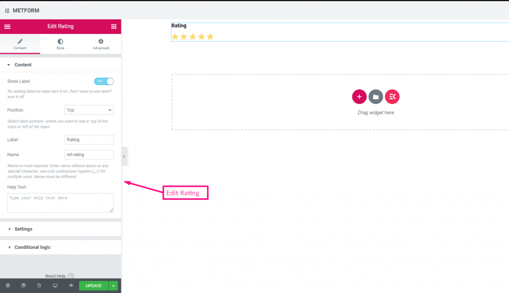
평가 #
고객으로부터 평가를 수집 평가 입력 필드의 경우 이름으로 입력 필드를 검색한 다음 입력 필드를 원하는 위치로 끌어서 놓습니다. 고객 리뷰를 얻고 소유자와 고객 간의 좋은 유대 관계를 구축하는 데 도움이 됩니다.
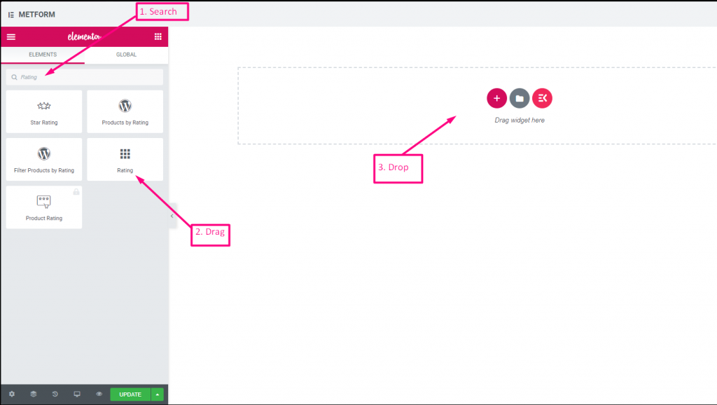
콘텐츠 #
- Number of Rating Stars (Number Input): Custom number of stars to display.
- Show Label (Toggle), Position (Dropdown), Label, Name: Standard.
- 도움말 텍스트: Rating instruction beneath stars.
- Required (Toggle): Must choose a rating.
Check out our 여기 라이브 데모:
별 개수 #
Check out our 여기 라이브 데모
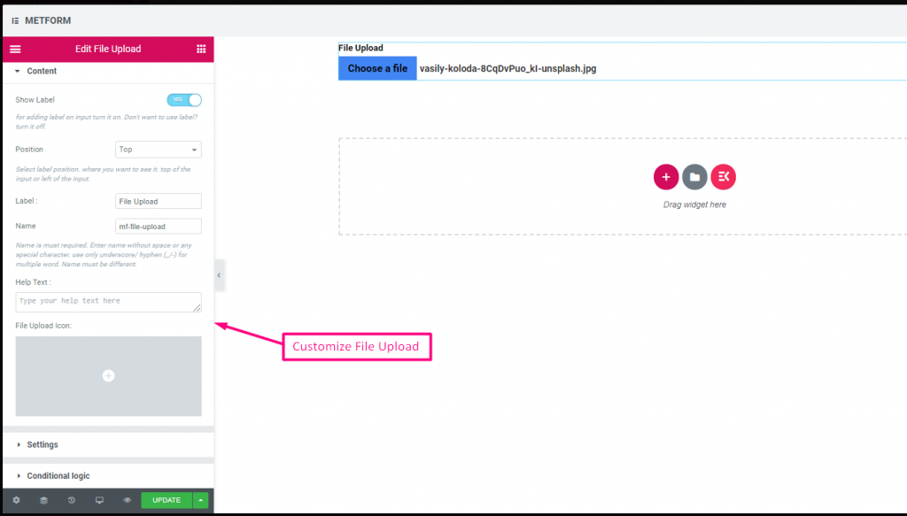
파일 업로드 #
Metform을 사용하면 추가가 매우 쉽습니다 파일 업로드 위젯을 양식에 추가하고 이름으로 입력 필드를 검색한 다음 입력 필드를 원하는 위치로 끌어다 놓습니다.
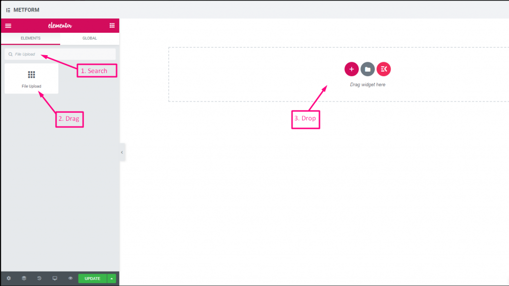
콘텐츠 #
- Multiple Upload (Toggle): Allow uploading more than one file.
- Show Label (Toggle), Position (Dropdown), Label, Name: Label settings.
- 도움말 텍스트: Guidance under uploader.
- Required (Toggle): Must upload.
- Allowed File Types (Text Input/List): Specify extensions such as
.jpg, .png. - Max File Size (Number Input): Maximum allowed file size.
Check out our 여기 라이브 데모
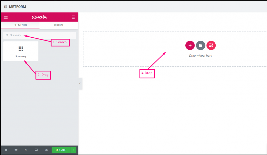
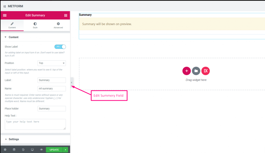
요약 #
고객과 원활한 의사소통을 구축하려면 구독하기 전에 요약을 제공하세요.
콘텐츠 #
- Required (Toggle): Must review before submit.
- Show Label (Toggle), Position (Dropdown), Label, Name: Standard.
- 도움말 텍스트: Explanation under summary.
조건부 논리 #
- Enable Conditional Logic (Toggle): Enable show/hide rules.
- Action (Dropdown: Show / Hide): Visibility setting.
- Field (Dropdown: Select Field): Field controlling summary visibility.
- Operator (Dropdown: Equal / Not Equal / Contains): Comparison type.
- Value (Text Input / Option Selector): Value triggering summary display.
제출 버튼 #
이 필드를 사용하여 양식을 제출하고 백엔드에 데이터를 저장하세요.
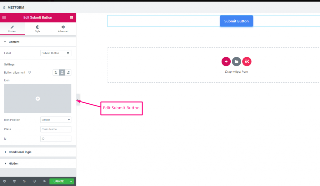
콘텐츠 #
- Label (Text Input): Text shown on Submit button.
- Button Alignment (Dropdown: Left / Center / Right): Position submit button in form.
- Icon (Icon Picker): Choose an icon to accompany the text.
- Icon Position (Dropdown: Before / After): Place icon relative to text.
- Class (Text Input): Add a CSS class for styling.
- ID (Text Input): Add a CSS ID for scripting.
설정 #
Hidden (Toggle): Hidden input not visible but stored for backend.
조건부 논리 #
- Enable Conditional Logic (Toggle): Activate dynamic display.
- Action (Dropdown: Show / Hide): Decide if submit button appears.
- Field (Dropdown: Select Field): Field controlling submit button visibility.
- Operator (Dropdown: Equal / Not Equal / Contains / Not Contains): Comparison type.
- Value (Text Input / Option Selector): Value triggering the button display.