
 Korean
  English
  German
  Spanish
  Italian
  French
  Danish
  Portuguese
  Swedish
  Polish
  Japanese
 우리 둘 다 있어요 무료 그리고 Pro 입력 필드 for you. Here we’ll discuss the free input field, let’s start.
자유 입력 필드 #
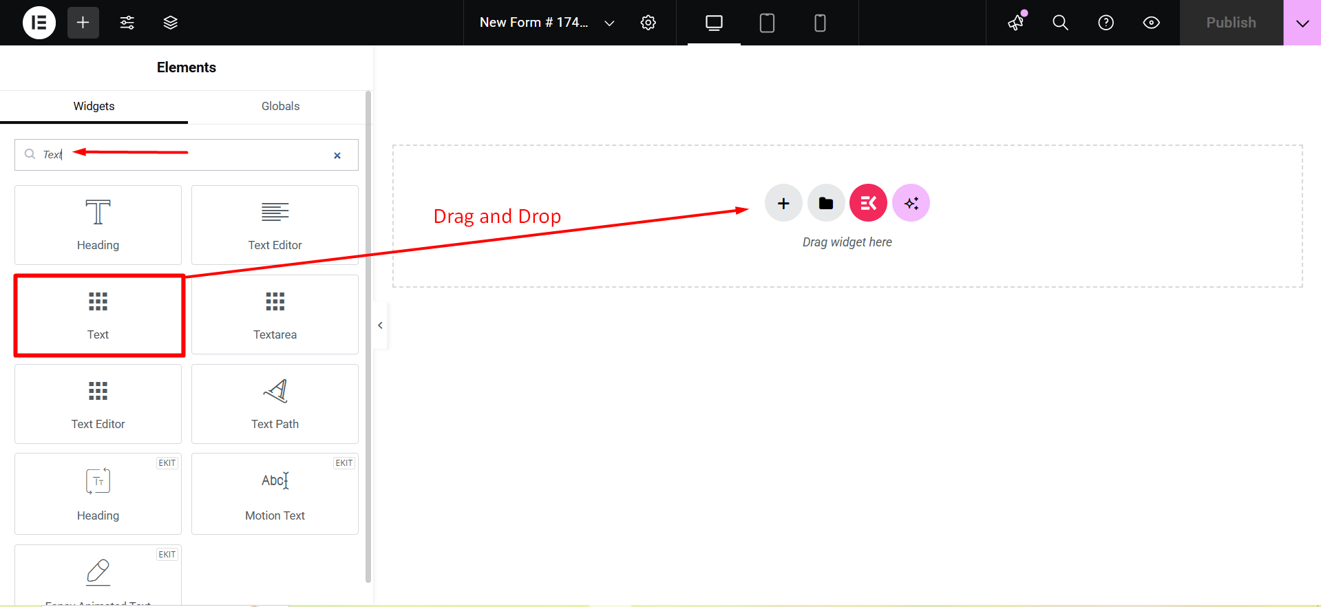
To make any form with Metform’s Free Input Fields open the page/post you want to add the form. After that, start editing with Elementor.
텍스트 #
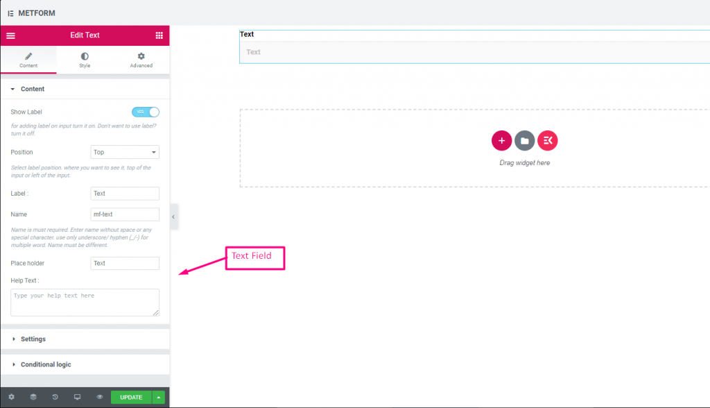
Add Text field to input Name or any type of text.
Content Part –
라벨 표시: You can turn it ON or keep it OFF.
위치: Select the label position where you want to see it, either at the Top or Left of the input.
상표: 레이블 텍스트를 입력합니다.
이름: A name is required. Enter a name without spaces or special characters—use only an underscore (_) or hyphen (-) for multiple words. The name must be unique.
자리표시자: Use a placeholder to show some dummy text and help users input the correct text.
도움말 텍스트: 위젯 아래에 표시할 텍스트를 입력하세요.
설정 -
필수의: Toggle this option to make it required. Users can’t submit the form without filling in the required fields.
Validation Type: Select a validation type from the drop-down.
조건부 논리 part –
Enable: Enable or disable this option to control whether the field should be shown or hidden based on certain conditions. This helps in creating dynamic forms where fields appear only when specific criteria are met.
Check out our 여기 라이브 데모.
이메일 #
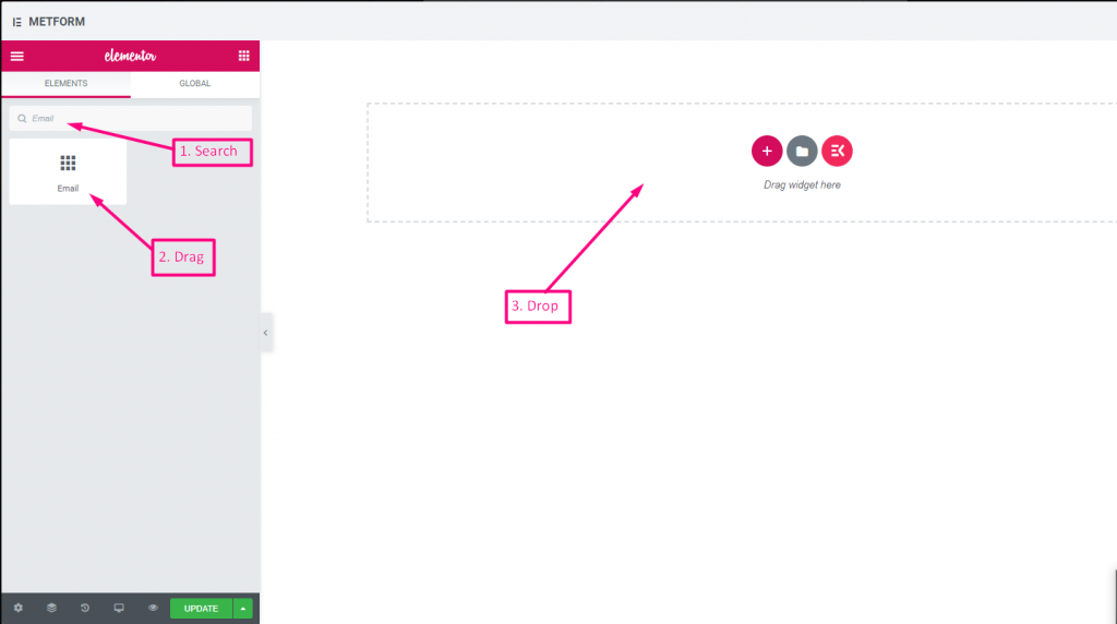
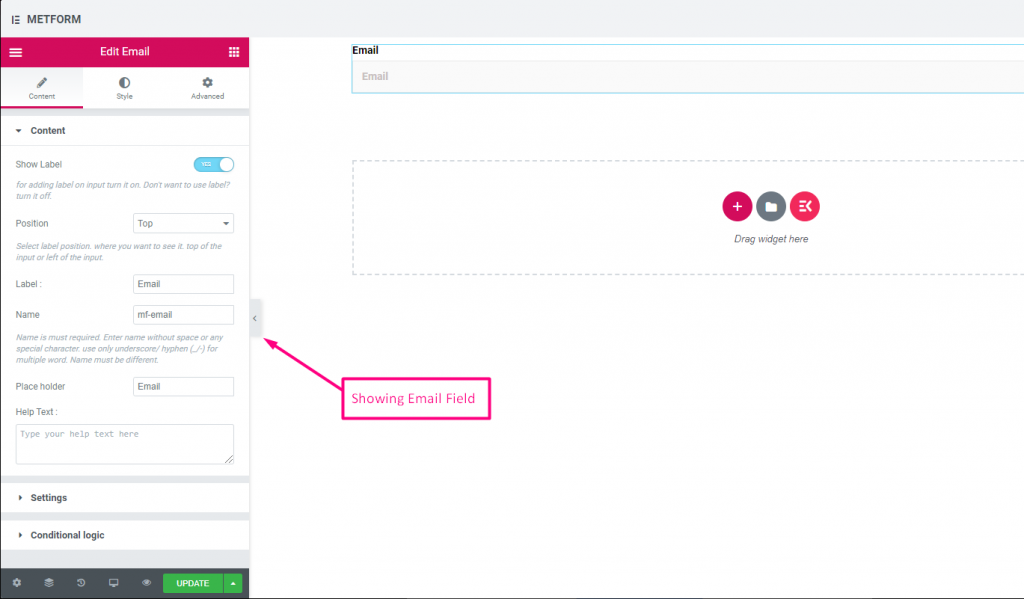
사용자가 이메일 입력 필드가 있는 양식에 유효한 이메일 주소를 입력했는지 확인하세요.
Check out our 여기 라이브 데모
| 옵션 | 설명 |
|---|---|
| 라벨 표시 | 라벨을 켜거나 끕니다. |
| 위치 | 기본: 맨 위 라벨 위치를 선택하세요. 보고 싶은 곳. 입력의 상단 또는 왼쪽. |
| 상표 | 레이블 텍스트를 입력합니다. |
| 이름 | 이름은 필수 항목입니다. 공백이나 특수문자 없이 이름을 입력하세요. 여러 단어에는 밑줄/하이픈(_/-)만 사용하세요. 이름은 달라야 합니다. |
| 자리 표시자 | 자리 표시자를 사용하여 더미 텍스트를 표시하고 사용자가 올바른 텍스트를 입력할 수 있도록 돕습니다. |
| 도움말 텍스트 | 위젯 아래에 표시할 텍스트를 입력하세요. |
| 필수의 | 기본: 아니요 이 옵션을 전환하여 필수로 설정하세요. 사용자는 필수 필드를 작성하지 않고 양식을 제출할 수 없습니다. |
| 검증 유형 | 드롭다운에서 유효성 검사 유형을 선택합니다. 문자 길이별 텍스트의 최소 및 최대 문자 길이를 설정하려면 문자 길이별을 선택하세요. 입력이 유효하지 않은 경우 경고 메시지도 제공 단어 길이별 단어 길이별을 선택하여 텍스트의 최소 및 최대 단어 길이를 설정합니다. 또한 입력이 유효하지 않은 경우 경고 메시지를 제공합니다. 표현식 기반 검증 표현식 기반을 설정하려면 표현식 기반으로 선택하세요. 입력이 유효하지 않은 경우 경고 메시지도 제공 기본값을 선택하시겠습니까? (기본: 아니요네) 이 옵션을 기본 선택으로 설정 |
| 조건부 논리 | 특정 기준에 따라 이 필드를 표시하거나 숨깁니다. |
숫자 #
이 입력 필드는 사용자가 숫자 입력으로 유효한 숫자를 입력하도록 보장합니다.
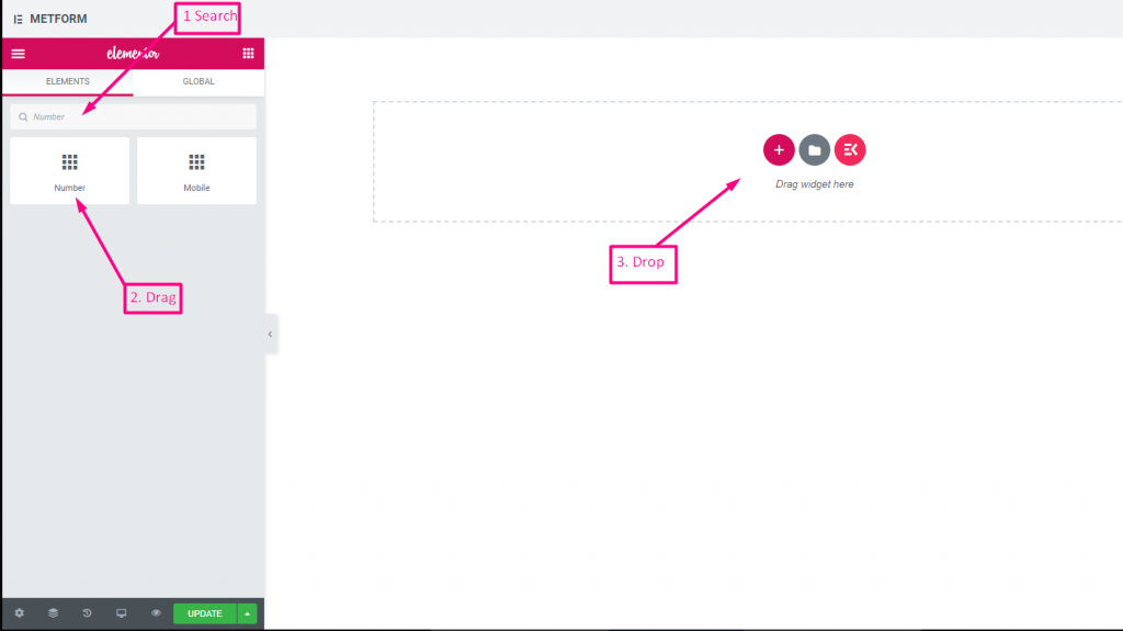
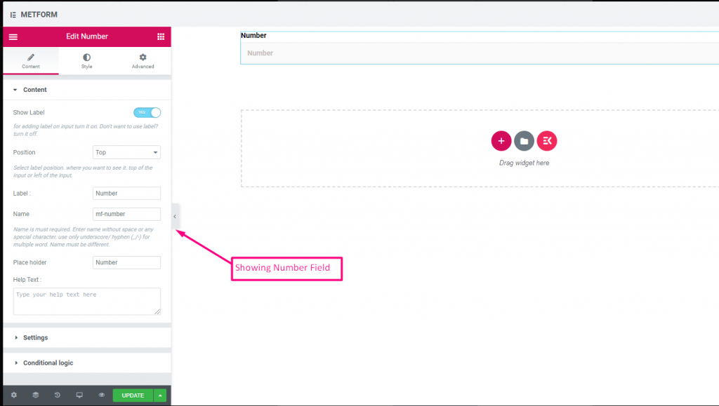
Check out our 여기 라이브 데모
| 옵션 | 설명 |
|---|---|
| 라벨 표시 | 라벨을 켜거나 끕니다. |
| 위치 | 기본: 맨 위 라벨 위치를 선택하세요. 보고 싶은 곳. 입력의 상단 또는 왼쪽. |
| 상표 | 레이블 텍스트를 입력합니다. |
| 이름 | 이름은 필수 항목입니다. 공백이나 특수문자 없이 이름을 입력하세요. 여러 단어에는 밑줄/하이픈(_/-)만 사용하세요. 이름은 달라야 합니다. |
| 자리 표시자 | 자리 표시자를 사용하여 더미 텍스트를 표시하고 사용자가 올바른 텍스트를 입력할 수 있도록 돕습니다. |
| 도움말 텍스트 | 위젯 아래에 표시할 텍스트를 입력하세요. |
| 필수의 | 기본: 아니요 이 옵션을 전환하여 필수로 설정하세요. 사용자는 필수 필드를 작성하지 않고 양식을 제출할 수 없습니다. |
| 검증 유형 | 드롭다운에서 유효성 검사 유형을 선택합니다. 문자 길이별 텍스트의 최소 및 최대 문자 길이를 설정하려면 문자 길이별을 선택하세요. 입력이 유효하지 않은 경우 경고 메시지도 제공 단어 길이별 단어 길이별을 선택하여 텍스트의 최소 및 최대 단어 길이를 설정합니다. 또한 입력이 유효하지 않은 경우 경고 메시지를 제공합니다. 표현식 기반 검증 표현식 기반을 설정하려면 표현식 기반으로 선택하세요. 입력이 유효하지 않은 경우 경고 메시지도 제공 기본값을 선택하시겠습니까? (기본: 아니요네) 이 옵션을 기본 선택으로 설정 |
| 조건부 논리 | 특정 기준에 따라 이 필드를 표시하거나 숨깁니다. |
전화 #
사용자가 연결을 위해 유효한 전화번호를 제공하도록 허용합니다.
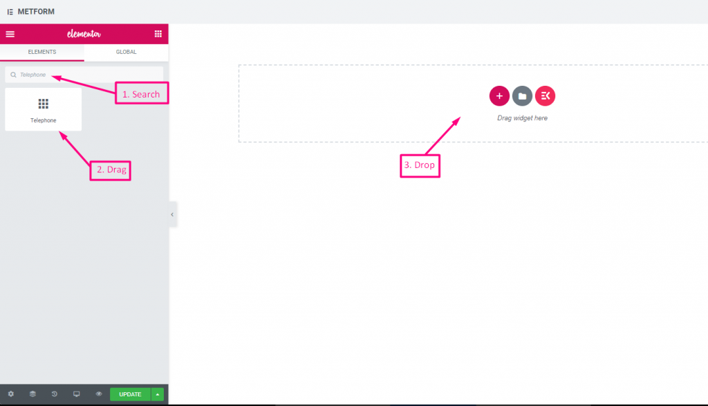
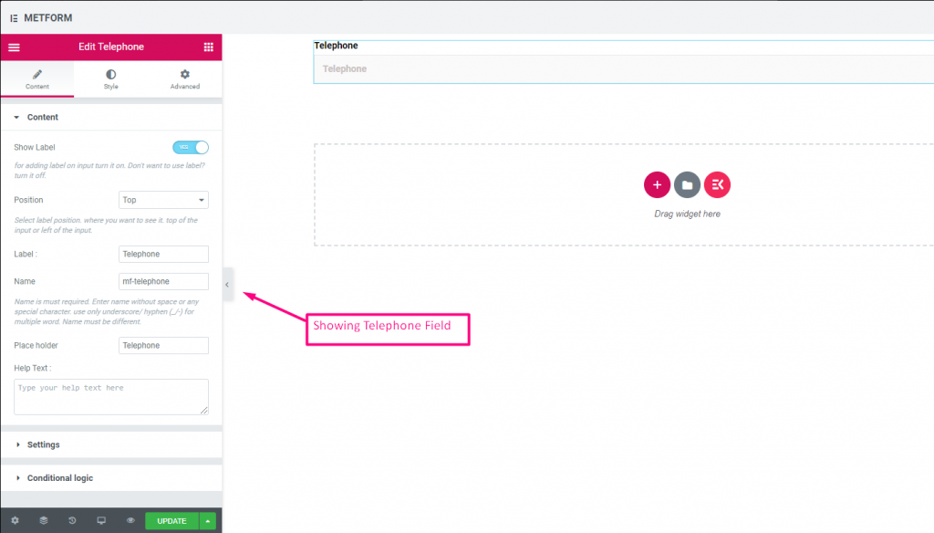
Check out our 여기 라이브 데모
| 옵션 | 설명 |
|---|---|
| 라벨 표시 | 라벨을 켜거나 끕니다. |
| 위치 | 기본: 맨 위 라벨 위치를 선택하세요. 보고 싶은 곳. 입력의 상단 또는 왼쪽. |
| 상표 | 레이블 텍스트를 입력합니다. |
| 이름 | 이름은 필수 항목입니다. 공백이나 특수문자 없이 이름을 입력하세요. 여러 단어에는 밑줄/하이픈(_/-)만 사용하세요. 이름은 달라야 합니다. |
| 자리 표시자 | 자리 표시자를 사용하여 더미 텍스트를 표시하고 사용자가 올바른 텍스트를 입력할 수 있도록 돕습니다. |
| 도움말 텍스트 | 위젯 아래에 표시할 텍스트를 입력하세요. |
| 필수의 | 기본: 아니요 이 옵션을 전환하여 필수로 설정하세요. 사용자는 필수 필드를 작성하지 않고 양식을 제출할 수 없습니다. |
| 검증 유형 | 드롭다운에서 유효성 검사 유형을 선택합니다. 문자 길이별 텍스트의 최소 및 최대 문자 길이를 설정하려면 문자 길이별을 선택하세요. 입력이 유효하지 않은 경우 경고 메시지도 제공 단어 길이별 단어 길이별을 선택하여 텍스트의 최소 및 최대 단어 길이를 설정합니다. 또한 입력이 유효하지 않은 경우 경고 메시지를 제공합니다. 표현식 기반 검증 표현식 기반을 설정하려면 표현식 기반으로 선택하세요. 입력이 유효하지 않은 경우 경고 메시지도 제공 기본값을 선택하시겠습니까? (기본: 아니요네) 이 옵션을 기본 선택으로 설정 |
| 조건부 논리 | 특정 기준에 따라 이 필드를 표시하거나 숨깁니다. |
시간 #
사용자가 팝다운 타이머에서 원하는 시간을 선택할 수 있도록 도와줍니다.
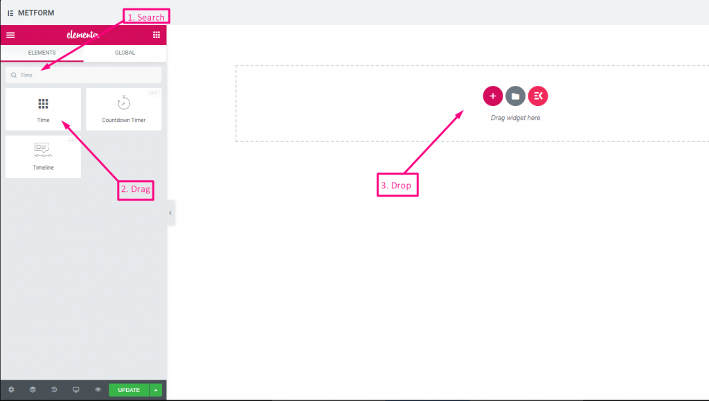
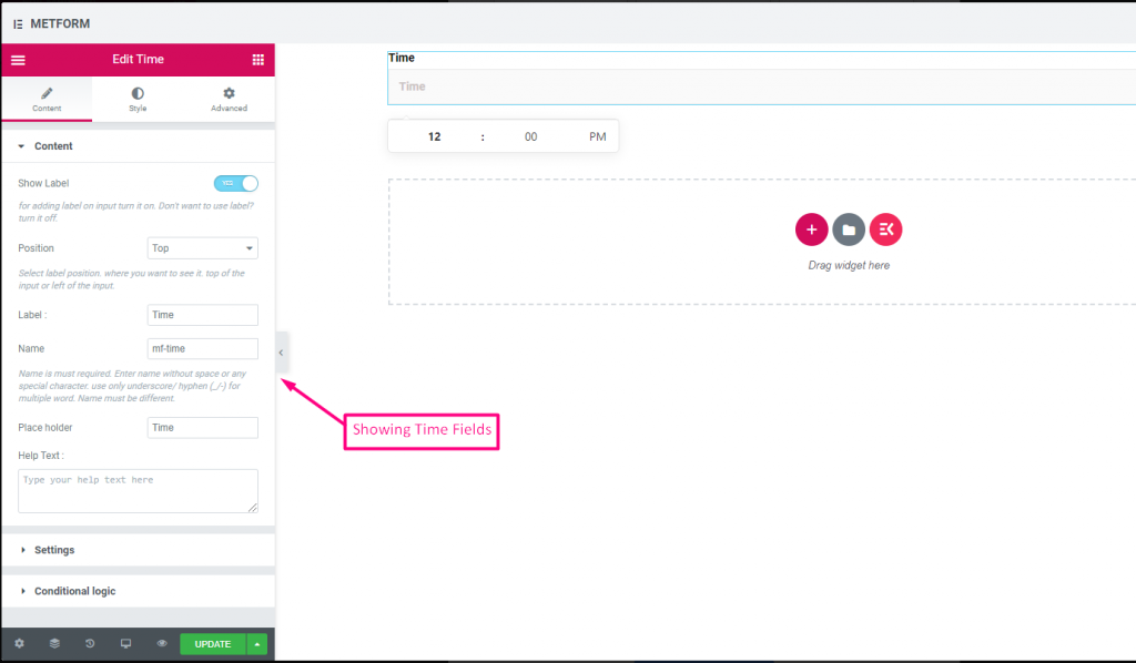
Check out our 여기 라이브 데모.
| 옵션 | 설명 |
|---|---|
| 라벨 표시 | 라벨을 켜거나 끕니다. |
| 위치 | 기본: 맨 위 라벨 위치를 선택하세요. 보고 싶은 곳. 입력의 상단 또는 왼쪽. |
| 상표 | 레이블 텍스트를 입력합니다. |
| 이름 | 이름은 필수 항목입니다. 공백이나 특수문자 없이 이름을 입력하세요. 여러 단어에는 밑줄/하이픈(_/-)만 사용하세요. 이름은 달라야 합니다. |
| 자리 표시자 | 자리 표시자를 사용하여 더미 텍스트를 표시하고 사용자가 올바른 텍스트를 입력할 수 있도록 돕습니다. |
| 도움말 텍스트 | 위젯 아래에 표시할 텍스트를 입력하세요. |
| 필수의 | 기본: 아니요 이 옵션을 전환하여 필수로 설정하세요. 사용자는 필수 필드를 작성하지 않고 양식을 제출할 수 없습니다. |
| 사용시간 24시간 | 시간 24시간 형식 활성화 또는 비활성화 |
| 조건부 논리 | 특정 기준에 따라 이 필드를 표시하거나 숨깁니다. |
24시간 형식 #
Check out our 여기 라이브 데모
날짜 #
이 입력 필드를 사용하여 팝업 달력에서 날짜를 선택하여 양식을 더욱 사용자 친화적으로 만드세요.
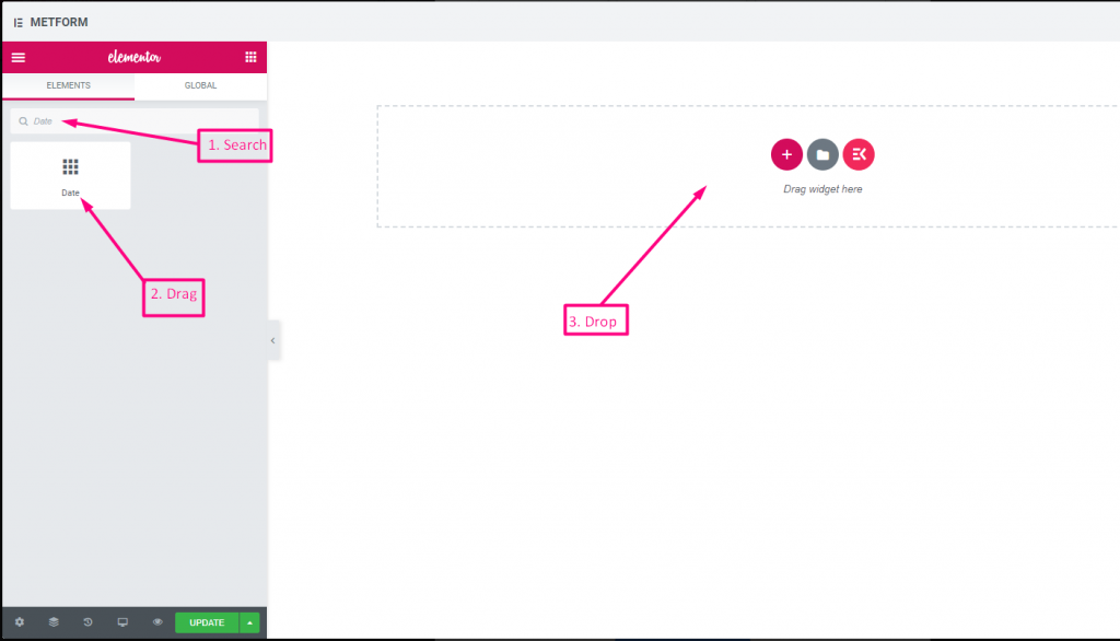
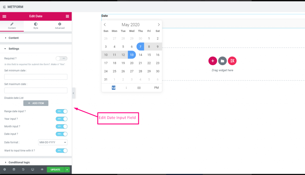
Check out our 여기 라이브 데모
기간 입력 #
Check out our 여기 라이브 데모
시간 입력으로 날짜 선택 #
Check out our 여기 라이브 데모
| 옵션 | 설명 |
|---|---|
| 라벨 표시 | 라벨을 켜거나 끕니다. |
| 위치 | 기본: 맨 위 라벨 위치를 선택하세요. 보고 싶은 곳. 입력의 상단 또는 왼쪽. |
| 상표 | 레이블 텍스트를 입력합니다. |
| 이름 | 이름은 필수 항목입니다. 공백이나 특수문자 없이 이름을 입력하세요. 여러 단어에는 밑줄/하이픈(_/-)만 사용하세요. 이름은 달라야 합니다. |
| 자리 표시자 | 자리 표시자를 사용하여 더미 텍스트를 표시하고 사용자가 올바른 텍스트를 입력할 수 있도록 돕습니다. |
| 도움말 텍스트 | 위젯 아래에 표시할 텍스트를 입력하세요. |
| 필수의 | 기본: 아니요 이 옵션을 전환하여 필수로 설정하세요. 사용자는 필수 필드를 작성하지 않고 양식을 제출할 수 없습니다. |
| 최소 또는 최대 날짜 설정 | 최소 및 최대 날짜 제공 |
| 비활성화 날짜 | 폐쇄일 또는 비활성화 날짜를 입력하세요. |
| 범위 날짜 입력 | 범위 날짜 입력 활성화 범위 날짜 입력을 활성화 또는 비활성화합니다. 날짜를 날짜 단위, 연도 단위 또는 월 단위로 입력합니다. 날짜 형식 : 드롭다운에서 날짜 형식을 선택합니다. 예: DD-MM-YYYY |
| 입력 시간 | 날짜에 시간을 추가할 수 있습니다. |
| 조건부 논리 | 특정 기준에 따라 이 필드를 표시하거나 숨깁니다. |
선택하다 #
사용자가 선택할 수 있는 옵션 드롭다운 목록을 추가하고 이름으로 위젯을 검색한 다음 위젯을 원하는 위치로 끌어다 놓습니다.
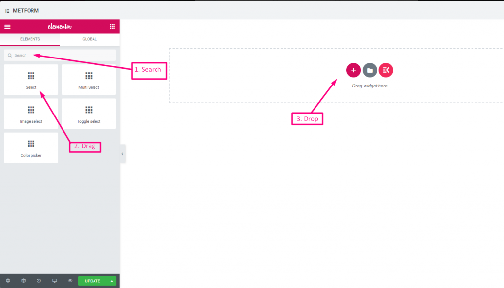
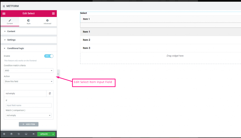
Check out our 여기 라이브 데모
검색 옵션을 레이블로 #
Check out our 여기 라이브 데모
| 옵션 | 설명 |
|---|---|
| 라벨 표시 | 라벨을 켜거나 끕니다. |
| 위치 | 기본: 맨 위 라벨 위치를 선택하세요. 보고 싶은 곳. 입력의 상단 또는 왼쪽. |
| 상표 | 레이블 텍스트를 입력합니다. |
| 이름 | 이름은 필수 항목입니다. 공백이나 특수문자 없이 이름을 입력하세요. 여러 단어에는 밑줄/하이픈(_/-)만 사용하세요. 이름은 달라야 합니다. |
| 도움말 텍스트 | 위젯 아래에 표시할 텍스트를 입력하세요. |
| 드롭 다운 목록 | 드롭다운에 옵션을 추가/편집/복제/제거합니다. 입력 필드 텍스트 사용자에게 표시할 목록 텍스트를 선택합니다. 입력 필드 값 원하는 사람에게 저장/메일로 보낼 목록 값을 선택하세요. 상태 (기본: 할 수 있게 하다) 옵션을 만들고 싶나요? 어떤 사용자가 옵션을 볼 수 있지만 선택할 수는 없습니다. 비활성화하도록 하세요. 기본값을 선택하시겠습니까? (기본: 아니요) 이 옵션을 기본 선택으로 설정 |
| 필수의 | 기본: 아니요 이 옵션을 전환하여 필수로 설정하세요. 사용자는 필수 필드를 작성하지 않고 양식을 제출할 수 없습니다. |
| 조건부 논리 | 특정 기준에 따라 이 필드를 표시하거나 숨깁니다. |
다중 선택 #
드롭다운에서 한 번에 여러 항목을 선택합니다.
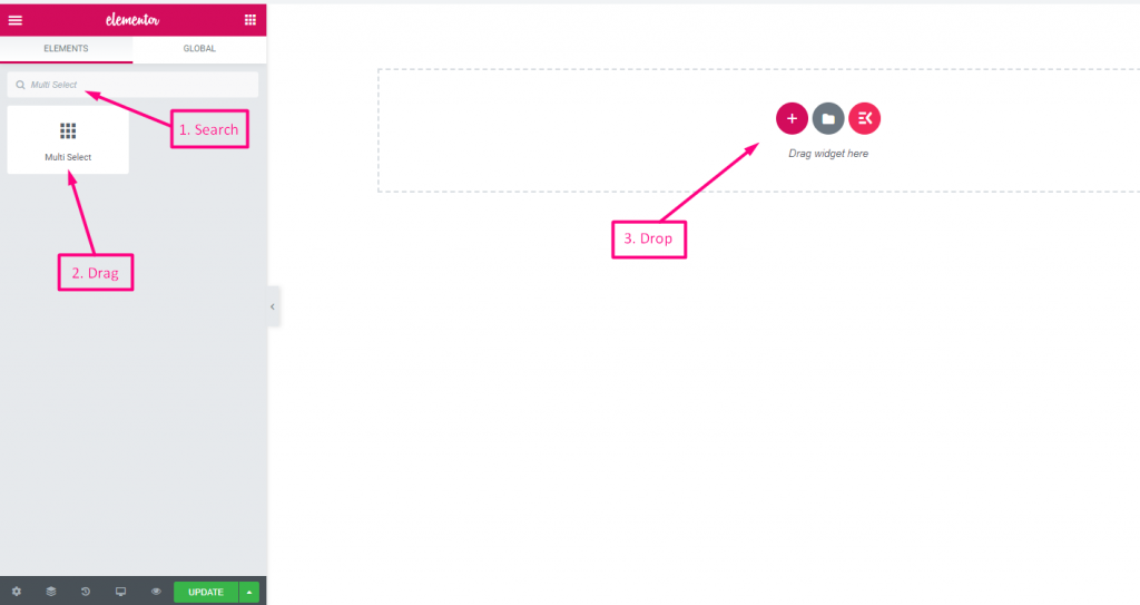
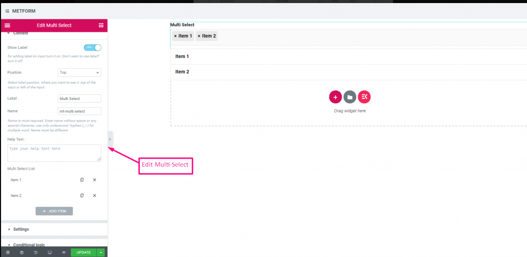
Check out our 여기 라이브 데모
기본 선택 값 #
Check out our 여기 라이브 데모
| 옵션 | 설명 |
|---|---|
| 라벨 표시 | 라벨을 켜거나 끕니다. |
| 위치 | 기본: 맨 위 라벨 위치를 선택하세요. 보고 싶은 곳. 입력의 상단 또는 왼쪽. |
| 상표 | 레이블 텍스트를 입력합니다. |
| 이름 | 이름은 필수 항목입니다. 공백이나 특수문자 없이 이름을 입력하세요. 여러 단어에는 밑줄/하이픈(_/-)만 사용하세요. 이름은 달라야 합니다. |
| 도움말 텍스트 | 위젯 아래에 표시할 텍스트를 입력하세요. |
| 드롭 다운 목록 | 드롭다운에 옵션을 추가/편집/복제/제거합니다. 입력 필드 텍스트 사용자에게 표시할 목록 텍스트를 선택합니다. 입력 필드 값 원하는 사람에게 저장/메일로 보낼 목록 값을 선택하세요. 상태 (기본: 할 수 있게 하다) 옵션을 만들고 싶나요? 어떤 사용자가 옵션을 볼 수 있지만 선택할 수는 없습니다. 비활성화하도록 하세요. 기본값을 선택하시겠습니까? (기본: 아니요) 이 옵션을 기본 선택으로 설정 |
| 필수의 | 기본: 아니요 이 옵션을 전환하여 필수로 설정하세요. 사용자는 필수 필드를 작성하지 않고 양식을 제출할 수 없습니다. |
| 조건부 논리 | 특정 기준에 따라 이 필드를 표시하거나 숨깁니다. |
텍스트 영역 #
양식에 많은 콘텐츠, 검토, 의견을 추가하는 데 도움이 됩니다.
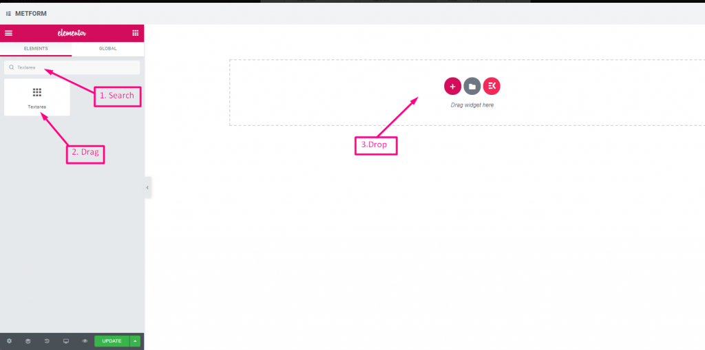
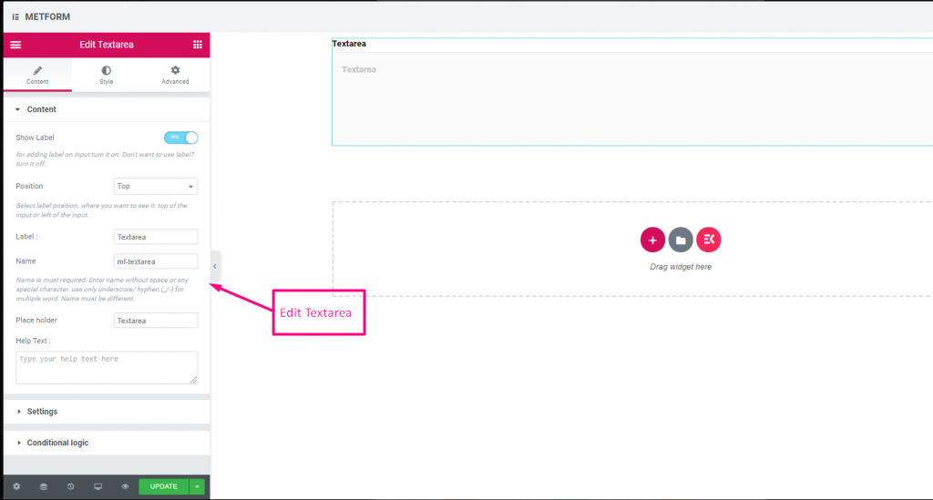
Check out our 여기 라이브 데모
| 옵션 | 설명 |
|---|---|
| 라벨 표시 | 라벨을 켜거나 끕니다. |
| 위치 | 기본: 맨 위 라벨 위치를 선택하세요. 보고 싶은 곳. 입력의 상단 또는 왼쪽. |
| 상표 | 레이블 텍스트를 입력합니다. |
| 이름 | 이름은 필수 항목입니다. 공백이나 특수문자 없이 이름을 입력하세요. 여러 단어에는 밑줄/하이픈(_/-)만 사용하세요. 이름은 달라야 합니다. |
| 도움말 텍스트 | 위젯 아래에 표시할 텍스트를 입력하세요. |
| 드롭 다운 목록 | 드롭다운에 옵션을 추가/편집/복제/제거합니다. 입력 필드 텍스트 사용자에게 표시할 목록 텍스트를 선택합니다. 입력 필드 값 원하는 사람에게 저장/메일로 보낼 목록 값을 선택하세요. 상태 (기본: 할 수 있게 하다) 옵션을 만들고 싶나요? 어떤 사용자가 옵션을 볼 수 있지만 선택할 수는 없습니다. 비활성화하도록 하세요. 기본값을 선택하시겠습니까? (기본: 아니요) 이 옵션을 기본 선택으로 설정 |
| 필수의 | 기본: 아니요 이 옵션을 전환하여 필수로 설정하세요. 사용자는 필수 필드를 작성하지 않고 양식을 제출할 수 없습니다. |
| 검증 유형 | 드롭다운에서 유효성 검사 유형을 선택합니다. 문자 길이별 텍스트의 최소 및 최대 문자 길이를 설정하려면 문자 길이별을 선택하세요. 입력이 유효하지 않은 경우 경고 메시지도 제공 단어 길이별 단어 길이별을 선택하여 텍스트의 최소 및 최대 단어 길이를 설정합니다. 또한 입력이 유효하지 않은 경우 경고 메시지를 제공합니다. 표현식 기반 검증 표현식 기반을 설정하려면 표현식 기반으로 선택하세요. 입력이 유효하지 않은 경우 경고 메시지도 제공 기본값을 선택하시겠습니까? (기본: 아니요네) 이 옵션을 기본 선택으로 설정 |
| 조건부 논리 | 특정 기준에 따라 이 필드를 표시하거나 숨깁니다. |
체크박스 #
사용자가 확인란을 사용하여 양식에서 한 번에 여러 항목을 선택할 수 있도록 허용합니다.
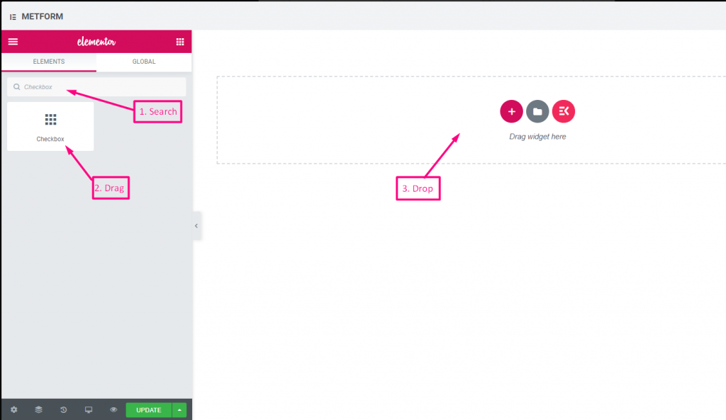
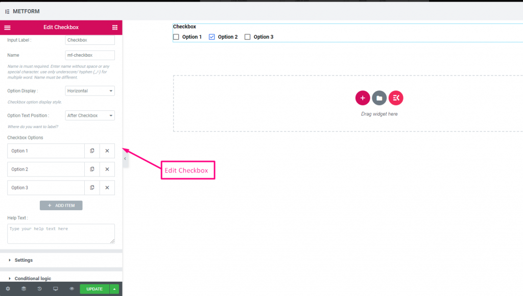
Check out our 여기 라이브 데모
수직의 #
Check out our 여기 라이브 데모
텍스트 뒤의 아이콘 위치 #
Check out our 여기 라이브 데모
| 옵션 | 설명 |
|---|---|
| 라벨 표시 | 라벨을 켜거나 끕니다. |
| 위치 | 기본: 맨 위 라벨 위치를 선택하세요. 보고 싶은 곳. 입력의 상단 또는 왼쪽. |
| 상표 | 레이블 텍스트를 입력합니다. |
| 이름 | 이름은 필수 항목입니다. 공백이나 특수문자 없이 이름을 입력하세요. 여러 단어에는 밑줄/하이픈(_/-)만 사용하세요. 이름은 달라야 합니다. |
| 도움말 텍스트 | 위젯 아래에 표시할 텍스트를 입력하세요. |
| 옵션 표시 | 디스플레이 옵션 수평으로 또는 수직으로 |
| 옵션 텍스트 위치 | 표시 옵션 텍스트 위치: 체크박스 전 또는 체크박스 이후 |
| 체크박스 옵션 | 드롭다운에 옵션을 추가/편집/복제/제거합니다. 확인란 옵션 텍스트 사용자에게 표시할 옵션 텍스트를 선택합니다. 옵션값 원하는 사람에게 저장/메일 발송할 옵션 값을 선택하세요. 상태 (기본: 활동적인) 옵션을 만들고 싶나요? 어떤 사용자가 옵션을 볼 수 있지만 선택할 수는 없습니다. 비활성화하도록 하세요. |
| 필수의 | 기본: 아니요 이 옵션을 전환하여 필수로 설정하세요. 사용자는 필수 필드를 작성하지 않고 양식을 제출할 수 없습니다. |
| 조건부 논리 | 특정 기준에 따라 이 필드를 표시하거나 숨깁니다. |
라디오 #
사용자가 여러 옵션 중에서 하나의 독점 항목만 선택할 수 있도록 허용합니다.
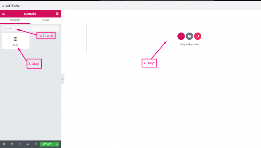
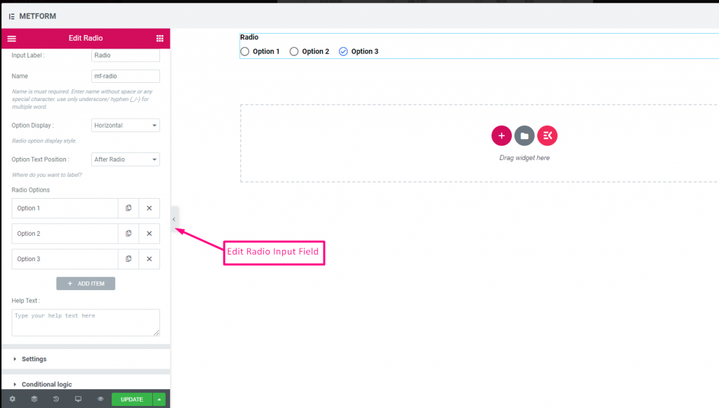
Check out our 여기 라이브 데모
수직의 #
Check out our 여기 라이브 데모
텍스트 뒤의 아이콘 위치 #
Check out our 여기 라이브 데모
| 옵션 | 설명 |
|---|---|
| 라벨 표시 | 라벨을 켜거나 끕니다. |
| 위치 | 기본: 맨 위 라벨 위치를 선택하세요. 보고 싶은 곳. 입력의 상단 또는 왼쪽. |
| 상표 | 레이블 텍스트를 입력합니다. |
| 이름 | 이름은 필수 항목입니다. 공백이나 특수문자 없이 이름을 입력하세요. 여러 단어에는 밑줄/하이픈(_/-)만 사용하세요. 이름은 달라야 합니다. |
| 도움말 텍스트 | 위젯 아래에 표시할 텍스트를 입력하세요. |
| 옵션 표시 | 라디오 옵션 표시 수평으로 또는 수직으로 |
| 옵션 텍스트 위치 | 라디오 옵션 텍스트 위치 표시: 전에 라디오 또는 후에 라디오 |
| 라디오 옵션 | 드롭다운에 옵션을 추가/편집/복제/제거합니다. 라디오 옵션 텍스트 사용자에게 표시할 옵션 텍스트를 선택합니다. 라디오 가치 원하는 사람에게 저장/메일 발송할 옵션 값을 선택하세요. 상태 (기본: 활동적인) 옵션을 만들고 싶나요? 어떤 사용자가 옵션을 볼 수 있지만 선택할 수는 없습니다. 비활성화하도록 하세요. |
| 필수의 | 기본: 아니요 이 옵션을 전환하여 필수로 설정하세요. 사용자는 필수 필드를 작성하지 않고 양식을 제출할 수 없습니다. |
| 조건부 논리 | 특정 기준에 따라 이 필드를 표시하거나 숨깁니다. |
이름(목록) #
사용자가 FirstName을 제공하여 메일링 리스트의 목록 방법에 표시되도록 허용합니다. 예: 메일침프
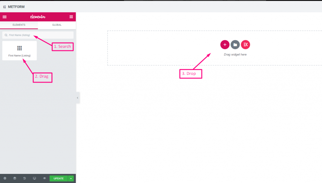
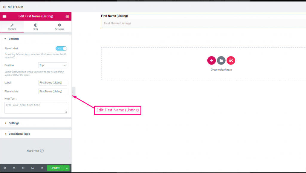
| 옵션 | 설명 |
|---|---|
| 라벨 표시 | 라벨을 켜거나 끕니다. |
| 위치 | 기본: 맨 위 라벨 위치를 선택하세요. 보고 싶은 곳. 입력의 상단 또는 왼쪽. |
| 상표 | 레이블 텍스트를 입력합니다. |
| 자리 표시자 | 자리 표시자를 사용하여 더미 텍스트를 표시하고 사용자가 올바른 텍스트를 입력할 수 있도록 돕습니다. |
| 도움말 텍스트 | 위젯 아래에 표시할 텍스트를 입력하세요. |
| 필수의 | 기본: 아니요 이 옵션을 전환하여 필수로 설정하세요. 사용자는 필수 필드를 작성하지 않고 양식을 제출할 수 없습니다. |
| 검증 유형 | 드롭다운에서 유효성 검사 유형을 선택합니다. 문자 길이별 텍스트의 최소 및 최대 문자 길이를 설정하려면 문자 길이별을 선택하세요. 입력이 유효하지 않은 경우 경고 메시지도 제공 단어 길이별 단어 길이별을 선택하여 텍스트의 최소 및 최대 단어 길이를 설정합니다. 또한 입력이 유효하지 않은 경우 경고 메시지를 제공합니다. 표현식 기반 검증 표현식 기반을 설정하려면 표현식 기반으로 선택하세요. 입력이 유효하지 않은 경우 경고 메시지도 제공 기본값을 선택하시겠습니까? (기본: 아니요네) 이 옵션을 기본 선택으로 설정 |
| 조건부 논리 | 특정 기준에 따라 이 필드를 표시하거나 숨깁니다. |
성(목록) #
사용자가 성(LastName)을 제공하여 메일링 리스트의 목록 방법에 표시되도록 허용합니다. 예: 메일침프
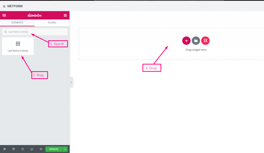
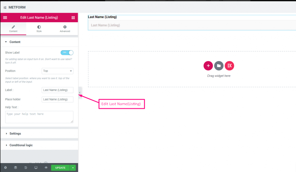
| 옵션 | 설명 |
|---|---|
| 라벨 표시 | 라벨을 켜거나 끕니다. |
| 위치 | 기본: 맨 위 라벨 위치를 선택하세요. 보고 싶은 곳. 입력의 상단 또는 왼쪽. |
| 상표 | 레이블 텍스트를 입력합니다. |
| 자리 표시자 | 자리 표시자를 사용하여 더미 텍스트를 표시하고 사용자가 올바른 텍스트를 입력할 수 있도록 돕습니다. |
| 도움말 텍스트 | 위젯 아래에 표시할 텍스트를 입력하세요. |
| 필수의 | 기본: 아니요 이 옵션을 전환하여 필수로 설정하세요. 사용자는 필수 필드를 작성하지 않고 양식을 제출할 수 없습니다. |
| 검증 유형 | 드롭다운에서 유효성 검사 유형을 선택합니다. 문자 길이별 텍스트의 최소 및 최대 문자 길이를 설정하려면 문자 길이별을 선택하세요. 입력이 유효하지 않은 경우 경고 메시지도 제공 단어 길이별 단어 길이별을 선택하여 텍스트의 최소 및 최대 단어 길이를 설정합니다. 또한 입력이 유효하지 않은 경우 경고 메시지를 제공합니다. 표현식 기반 검증 표현식 기반을 설정하려면 표현식 기반으로 선택하세요. 입력이 유효하지 않은 경우 경고 메시지도 제공 기본값을 선택하시겠습니까? (기본: 아니요네) 이 옵션을 기본 선택으로 설정 |
| 조건부 논리 | 특정 기준에 따라 이 필드를 표시하거나 숨깁니다. |
옵트인 목록 #
양식에 옵트인 필드를 사용하고 "뉴스레터 구독" 확인란을 클릭하여 사용자를 구독된 mailchimp 연락처 사용자로 만듭니다.
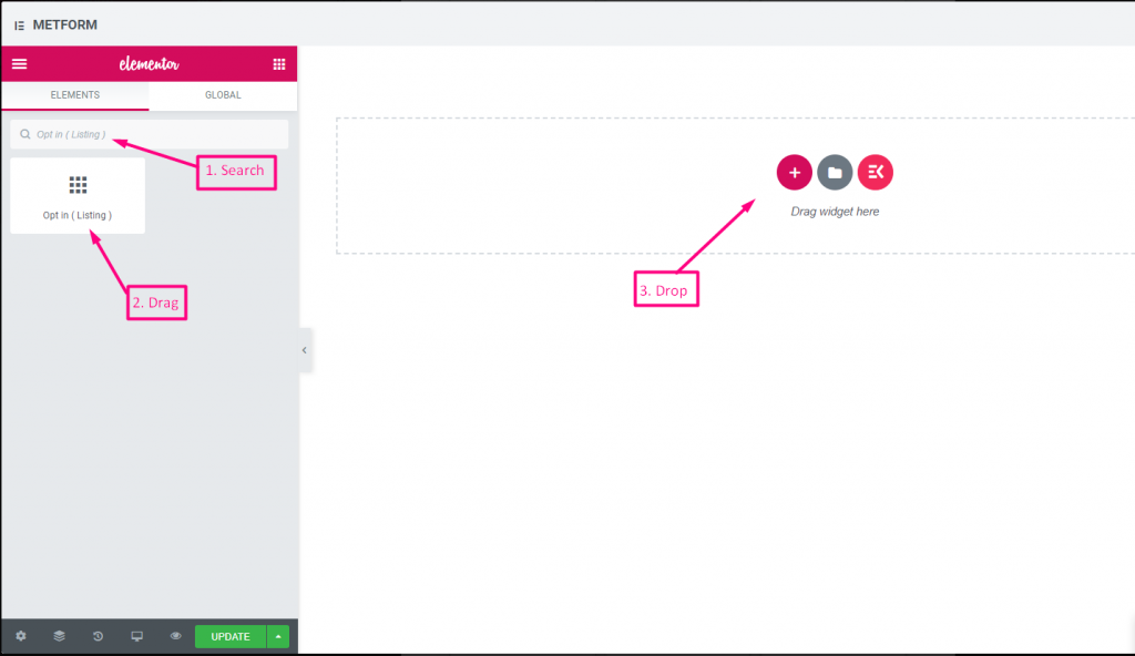
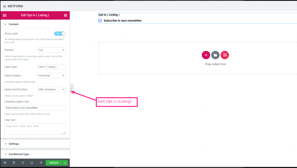
Check out our 여기 라이브 데모
| 옵션 | 설명 |
|---|---|
| 라벨 표시 | 라벨을 켜거나 끕니다. |
| 위치 | 기본: 맨 위 라벨 위치를 선택하세요. 보고 싶은 곳. 입력의 상단 또는 왼쪽. |
| 입력 라벨 | 레이블 텍스트를 입력합니다. |
| 옵션 표시 | 표시 선택 목록 옵션 수평으로 또는 수직으로 |
| 옵션 텍스트 위치 | 표시 선택 목록 옵션 텍스트 위치: 전에 체크박스 또는 후에 체크박스 |
| 체크박스 옵션 텍스트 | 사용자에게 표시될 옵션에 대해 간략히 설명하세요. 예를 들어: "뉴스레터를 구독하세요“ |
| 도움말 텍스트 | 위젯 아래에 표시할 텍스트를 입력하세요. 도움말 텍스트를 통해 적절한 사람에게 쉽게 메시지를 타겟팅하고 전달합니다. |
| 필수의 | 기본: 아니요 이 옵션을 전환하여 필수로 설정하세요. 사용자는 필수 필드를 작성하지 않고 양식을 제출할 수 없습니다. |
| 조건부 논리 | 특정 기준에 따라 이 필드를 표시하거나 숨깁니다. |
GDPR 동의 #
법의 조치로부터 안전하게 보호하기 위해 일반적으로 사용자 데이터를 사용하는 방법을 설명하므로 사용자 데이터를 수집하기 전에 양식에 GDPR(일반 데이터 보호 규정) 불만 사항을 활성화하세요.
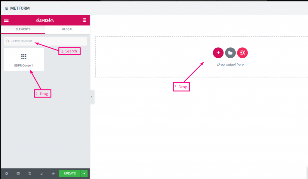
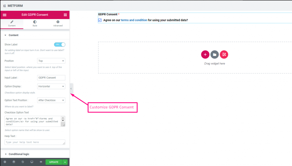
확인하다 out our 여기 라이브 데모
텍스트 링크 포함 #
확인하다 out our 여기 라이브 데모
| 옵션 | 설명 |
|---|---|
| 라벨 표시 | 라벨을 켜거나 끕니다. |
| 위치 | 기본: 맨 위 라벨 위치를 선택하세요. 보고 싶은 곳. 입력의 상단 또는 왼쪽. |
| 입력 라벨 | 레이블 텍스트를 입력합니다. |
| 옵션 표시 | GDPR 동의 옵션 표시 수평으로 또는 수직으로 |
| 옵션 텍스트 위치 | GDPR 동의 옵션 텍스트 위치 표시: 전에 체크박스 또는 후에 체크박스 |
| 체크박스 옵션 텍스트 | 사용자에게 표시될 옵션에 대해 간략히 설명하세요. 예를 들면 다음과 같습니다. “우리의 의견에 동의합니다. 이용 약관 제출된 데이터를 사용하기 위해?” |
| 도움말 텍스트 | 위젯 아래에 표시할 텍스트를 입력하세요. 도움말 텍스트를 통해 적절한 사람에게 쉽게 메시지를 타겟팅하고 전달합니다. |
| 조건부 논리 | 특정 기준에 따라 이 필드를 표시하거나 숨깁니다. |
스위치 #
전등 스위치처럼 예/아니요 또는 켜기/끄기 토글 스위치 확인란 입력을 쉽게 제어할 수 있습니다.
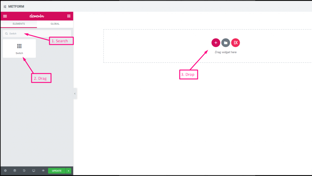
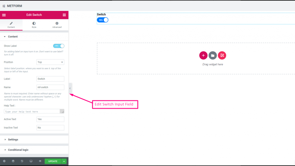
Check out our 여기 라이브 데모
사용자 정의 옵션 텍스트 #
Check out our 여기 라이브 데모
| 옵션 | 설명 |
|---|---|
| 라벨 표시 | 라벨을 켜거나 끕니다. |
| 위치 | 기본: 맨 위 라벨 위치를 선택하세요. 보고 싶은 곳. 입력의 상단 또는 왼쪽. |
| 상표 | 레이블 텍스트를 입력합니다. |
| 이름 | 이름은 필수 항목입니다. 공백이나 특수문자 없이 이름을 입력하세요. 여러 단어에는 밑줄/하이픈(_/-)만 사용하세요. 이름은 달라야 합니다. |
| 도움말 텍스트 | 위젯 아래에 표시할 텍스트를 입력하세요. |
| 활성 또는 비활성 텍스트 | 활성 또는 비활성 텍스트를 제공하십시오. 예: 예 또는 아니요 |
| 필수의 | 기본: 아니요 이 옵션을 전환하여 필수로 설정하세요. 사용자는 필수 필드를 작성하지 않고 양식을 제출할 수 없습니다. |
| 조건부 논리 | 특정 기준에 따라 이 필드를 표시하거나 숨깁니다. |
리캡차 #
Google reCAPTCHA를 통합하여 원치 않는 스팸 및 악의적인 트래픽으로부터 사이트를 안전하게 보호할 수 있습니다.
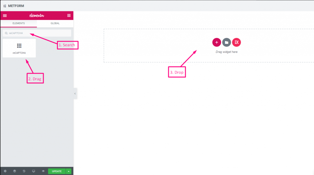
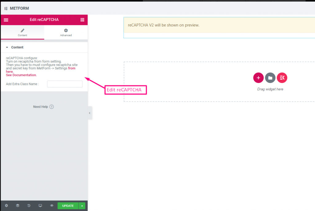
Check out our 여기 라이브 데모
| 옵션 | 설명 |
|---|---|
| reCAPTCHA 구성 | 설정에서 reCAPTCHA를 활성화하세요. 그런 다음 MetForm -> 설정에서 reCAPTCHA 사이트와 비밀 키를 구성해야 합니다. 여기에서. 문서를 참조하세요. |
간단한 reCAPTCHA #
원치 않는 봇과 스팸으로부터 사이트를 보호합니다.
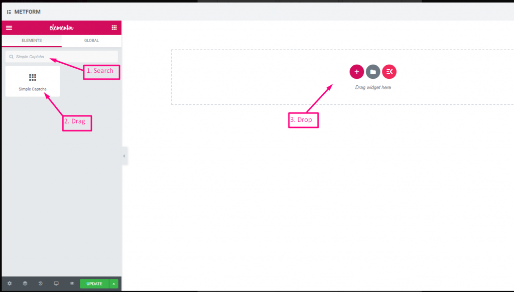
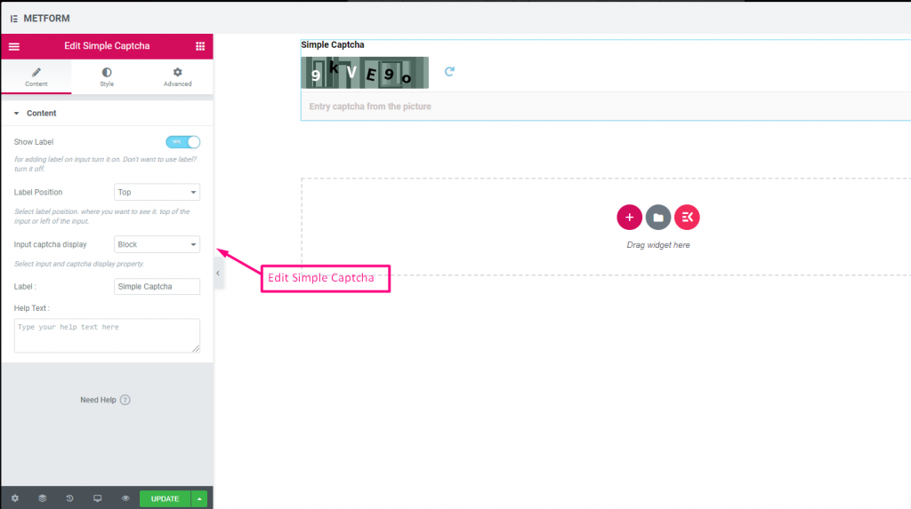
Check out our 여기 라이브 데모
인라인 옵션 #
Check out our 여기 라이브 데모
| 옵션 | 설명 |
|---|---|
| 라벨 표시 | 라벨을 켜거나 끕니다. |
| 위치 | 기본: 맨 위 라벨 위치를 선택하세요. 보고 싶은 곳. 입력의 상단 또는 왼쪽. |
| CAPTCHA 표시 입력 | 블록에 reCAPTCHA를 입력하거나 입력 필드를 한 줄로 표시하세요. |
| 상표 | 레이블 텍스트를 입력합니다. |
| 도움말 텍스트 | 위젯 아래에 표시할 텍스트를 입력하세요. |
범위 슬라이더 #
매우 멋진 범위 슬라이더를 사용하여 양식에 최대 또는 최소 범위 값을 설정하세요. 적절한 값이 나올 때까지 양쪽 끝을 드래그하기만 하면 됩니다.
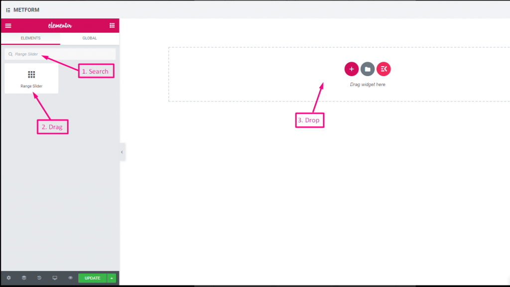
Check out our 여기 라이브 데모
기본값 #
확인하다 out our 여기 라이브 데모
다중 범위 입력 #
확인하다 out our 여기 라이브 데모
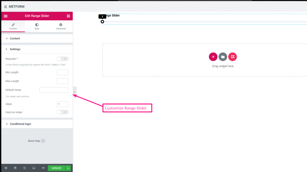
| 옵션 | 설명 |
|---|---|
| 라벨 표시 | 라벨을 켜거나 끕니다. |
| 위치 | 기본: 맨 위 라벨 위치를 선택하세요. 보고 싶은 곳. 입력의 상단 또는 왼쪽. |
| 상표 | 레이블 텍스트를 입력합니다. |
| 이름 | 이름은 필수 항목입니다. 공백이나 특수문자 없이 이름을 입력하세요. 여러 단어에는 밑줄/하이픈(_/-)만 사용하세요. 이름은 달라야 합니다. |
| 도움말 텍스트 | 위젯 아래에 표시할 텍스트를 입력하세요. |
| 필수의 | 기본: 아니요 이 옵션을 전환하여 필수로 설정하세요. 사용자는 필수 필드를 작성하지 않고 양식을 제출할 수 없습니다. |
| 최소 길이 | 최소 범위 값 설정 |
| 최대 길이 | 최대 범위 값 설정 |
| 기본값 | 기본값을 설정하고, 쉼표를 사용하여 범위 값을 설정하세요. |
| 단계 | 단계별로 범위를 추가하려면 단계 값을 추가하세요. |
| 범위로 입력 | 이 옵션을 전환하여 필요한 범위를 설정하세요. |
| 조건부 논리 | 특정 기준에 따라 이 필드를 표시하거나 숨깁니다. |
URL #
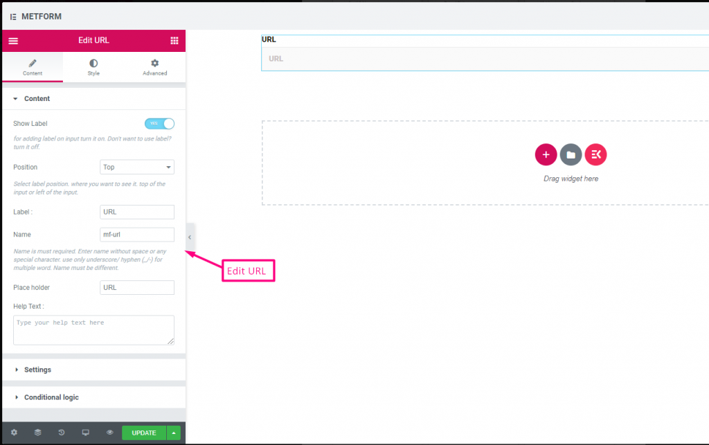
URL 입력 필드를 사용하여 양식에 URL을 추가하기만 하면 됩니다. 사용자가 양식 필드에 유효한 URL을 입력했는지 확인합니다.
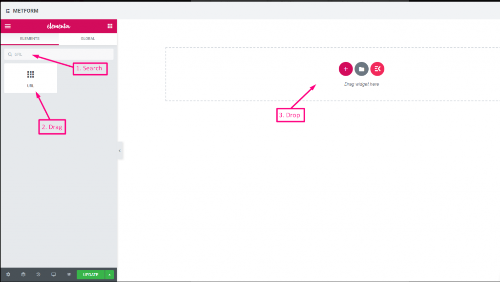
Check out our 여기 라이브 데모
| 옵션 | 설명 |
|---|---|
| 라벨 표시 | 라벨을 켜거나 끕니다. |
| 위치 | 기본: 맨 위 라벨 위치를 선택하세요. 보고 싶은 곳. 입력의 상단 또는 왼쪽. |
| 상표 | 레이블 텍스트를 입력합니다. |
| 이름 | 이름은 필수 항목입니다. 공백이나 특수문자 없이 이름을 입력하세요. 여러 단어에는 밑줄/하이픈(_/-)만 사용하세요. 이름은 달라야 합니다. |
| 자리 표시자 | 자리 표시자를 사용하여 더미 텍스트를 표시하고 사용자가 올바른 텍스트를 입력할 수 있도록 돕습니다. |
| 도움말 텍스트 | 위젯 아래에 표시할 텍스트를 입력하세요. |
| 필수의 | 기본: 아니요 이 옵션을 전환하여 필수로 설정하세요. 사용자는 필수 필드를 작성하지 않고 양식을 제출할 수 없습니다. |
| 조건부 논리 | 특정 기준에 따라 이 필드를 표시하거나 숨깁니다. |
비밀번호 #
사용자에게 강력한 비밀번호를 제공하려면 비밀번호 입력 필드를 사용하세요. 이를 통해 사용자는 보호된 비밀번호를 얻고 필요할 때 변경할 수 있습니다.
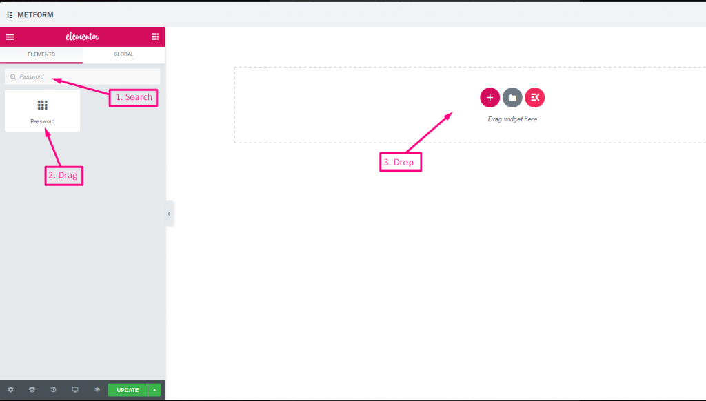
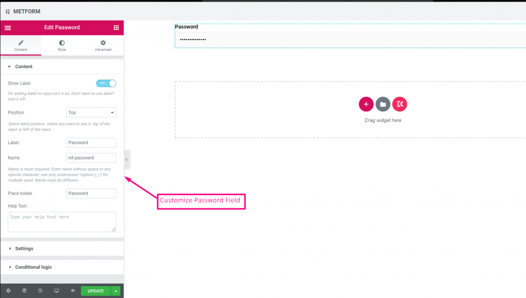
Check out our 여기 라이브 데모
| 옵션 | 설명 |
|---|---|
| 라벨 표시 | 라벨을 켜거나 끕니다. |
| 위치 | 기본: 맨 위 라벨 위치를 선택하세요. 보고 싶은 곳. 입력의 상단 또는 왼쪽. |
| 상표 | 레이블 텍스트를 입력합니다. |
| 이름 | 이름은 필수 항목입니다. 공백이나 특수문자 없이 이름을 입력하세요. 여러 단어에는 밑줄/하이픈(_/-)만 사용하세요. 이름은 달라야 합니다. |
| 자리 표시자 | 자리 표시자를 사용하여 더미 텍스트를 표시하고 사용자가 올바른 텍스트를 입력할 수 있도록 돕습니다. |
| 도움말 텍스트 | 위젯 아래에 표시할 텍스트를 입력하세요. |
| 필수의 | 기본: 아니요 이 옵션을 전환하여 필수로 설정하세요. 사용자는 필수 필드를 작성하지 않고 양식을 제출할 수 없습니다. |
| 검증 유형 | 드롭다운에서 유효성 검사 유형을 선택합니다. 문자 길이별 텍스트의 최소 및 최대 문자 길이를 설정하려면 문자 길이별을 선택하세요. 입력이 유효하지 않은 경우 경고 메시지도 제공 단어 길이별 단어 길이별을 선택하여 텍스트의 최소 및 최대 단어 길이를 설정합니다. 또한 입력이 유효하지 않은 경우 경고 메시지를 제공합니다. 표현식 기반 검증 표현식 기반을 설정하려면 표현식 기반으로 선택하세요. 입력이 유효하지 않은 경우 경고 메시지도 제공 기본값을 선택하시겠습니까? (기본: 아니요네) 이 옵션을 기본 선택으로 설정 |
| 조건부 논리 | 특정 기준에 따라 이 필드를 표시하거나 숨깁니다. |
응답 메시지 #
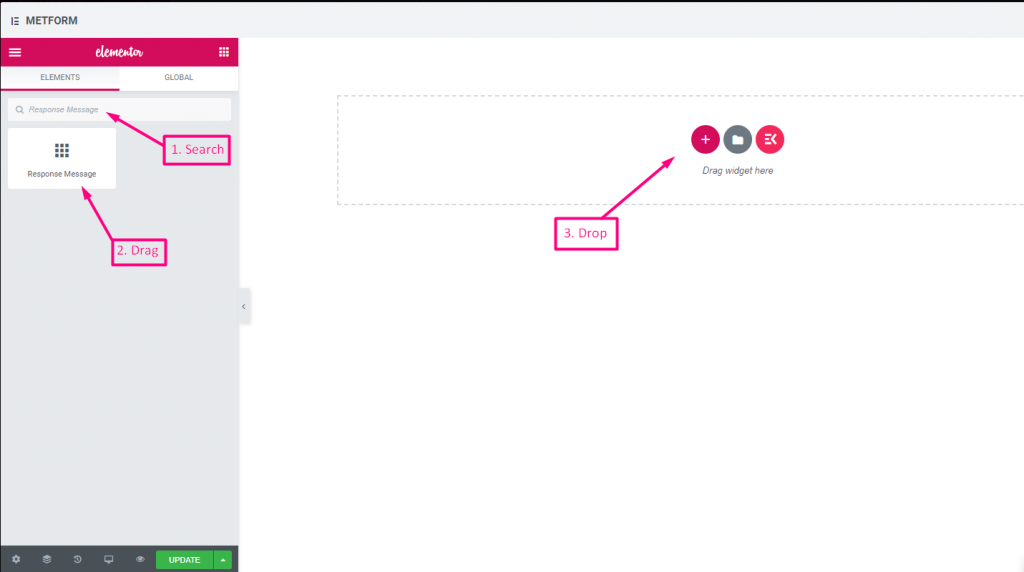
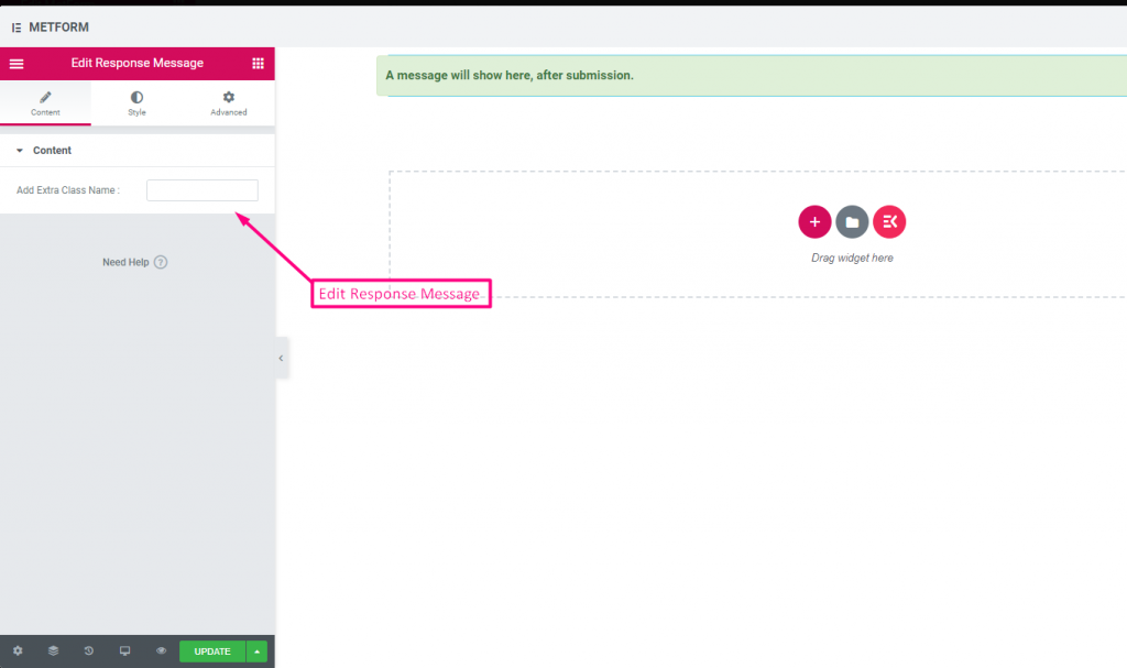
Check out our 여기 라이브 데모:
| 옵션 | 설명 |
|---|---|
| 성공 메시지 추가 | 양식 제출 후 성공 메시지 제공 |
평가 #
고객으로부터 평가를 수집 평가 입력 필드의 경우 이름으로 입력 필드를 검색한 다음 입력 필드를 원하는 위치로 끌어서 놓습니다. 고객 리뷰를 얻고 소유자와 고객 간의 좋은 유대 관계를 구축하는 데 도움이 됩니다.
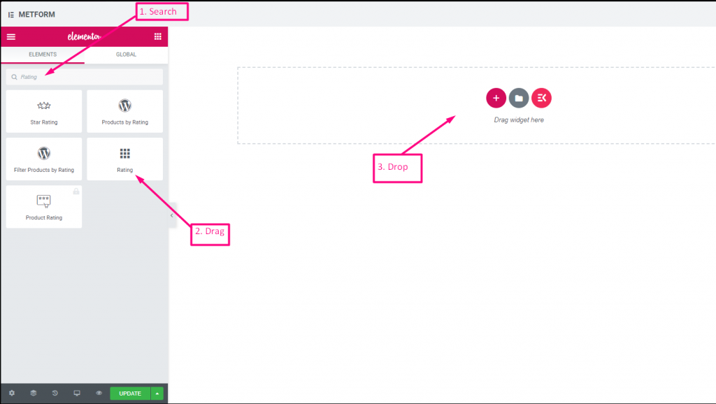
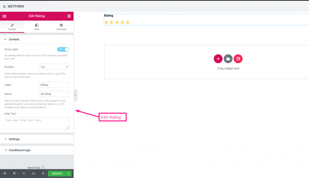
Check out our 여기 라이브 데모:
별 개수 #
Check out our 여기 라이브 데모
| 옵션 | 설명 |
|---|---|
| 라벨 표시 | 라벨을 켜거나 끕니다. |
| 위치 | 기본: 맨 위 라벨 위치를 선택하세요. 보고 싶은 곳. 입력의 상단 또는 왼쪽. |
| 상표 | 레이블 텍스트를 입력합니다. |
| 이름 | 이름은 필수 항목입니다. 공백이나 특수문자 없이 이름을 입력하세요. 여러 단어에는 밑줄/하이픈(_/-)만 사용하세요. 이름은 달라야 합니다. |
| 도움말 텍스트 | 위젯 아래에 표시할 텍스트를 입력하세요. |
| 필수의 | 기본: 아니요 이 옵션을 전환하여 필수로 설정하세요. 사용자는 필수 필드를 작성하지 않고 양식을 제출할 수 없습니다. |
| 별점 수 | 평가 번호를 맞춤설정하세요. 기본적으로: 3 |
| 조건부 논리 | 특정 기준에 따라 이 필드를 표시하거나 숨깁니다. |
파일 업로드 #
Metform을 사용하면 추가가 매우 쉽습니다 파일 업로드 위젯을 양식에 추가하고 이름으로 입력 필드를 검색한 다음 입력 필드를 원하는 위치로 끌어다 놓습니다.
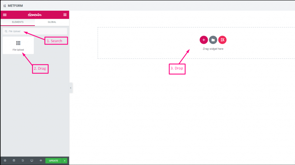
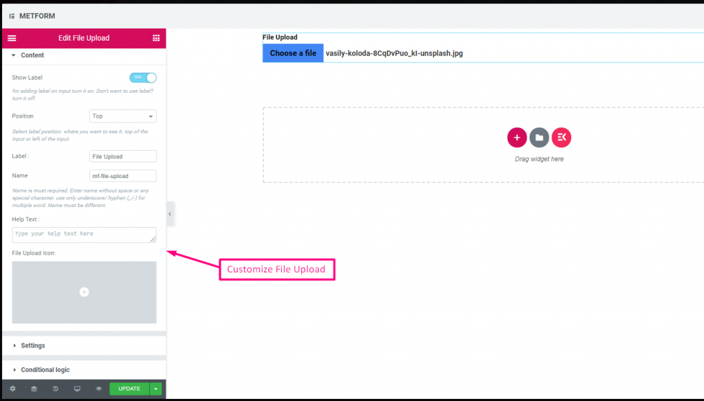
Check out our 여기 라이브 데모
| 옵션 | 설명 |
|---|---|
| 라벨 표시 | 라벨을 켜거나 끕니다. |
| 위치 | 기본: 맨 위 라벨 위치를 선택하세요. 보고 싶은 곳. 입력의 상단 또는 왼쪽. |
| 상표 | 레이블 텍스트를 입력합니다. |
| 이름 | 이름은 필수 항목입니다. 공백이나 특수문자 없이 이름을 입력하세요. 여러 단어에는 밑줄/하이픈(_/-)만 사용하세요. 이름은 달라야 합니다. |
| 도움말 텍스트 | 위젯 아래에 표시할 텍스트를 입력하세요. |
| 파일 업로드 아이콘 | 아이콘 라이브러리에서 업로드하거나 SVG를 업로드할 수 있습니다. |
| 필수의 | 기본: 아니요 이 옵션을 전환하여 필수로 설정하세요. 사용자는 필수 필드를 작성하지 않고 양식을 제출할 수 없습니다. |
| 파일 크기 제한 | 기본: 128KB 파일 업로드를 위한 사용자 정의 파일 크기를 추가합니다. |
| 파일 유형 | 기본: .jpg, .jpeg, .gif, .png 드롭다운에서 업로드가 허용된 파일 형식을 추가/편집합니다. |
| 조건부 논리 | 특정 기준에 따라 이 필드를 표시하거나 숨깁니다. |
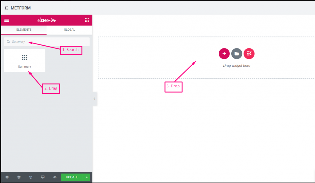
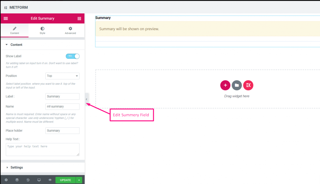
요약 #
고객과 원활한 의사소통을 구축하려면 구독하기 전에 요약을 제공하세요.
| 옵션 | 설명 |
|---|---|
| 라벨 표시 | 라벨을 켜거나 끕니다. |
| 위치 | 기본: 맨 위 라벨 위치를 선택하세요. 보고 싶은 곳. 입력의 상단 또는 왼쪽. |
| 상표 | 레이블 텍스트를 입력합니다. |
| 이름 | 이름은 필수 항목입니다. 공백이나 특수문자 없이 이름을 입력하세요. 여러 단어에는 밑줄/하이픈(_/-)만 사용하세요. 이름은 달라야 합니다. |
| 도움말 텍스트 | 위젯 아래에 표시할 텍스트를 입력하세요. |
| 필수의 | 기본: 아니요 이 옵션을 전환하여 필수로 설정하세요. 사용자는 필수 필드를 작성하지 않고 양식을 제출할 수 없습니다. |
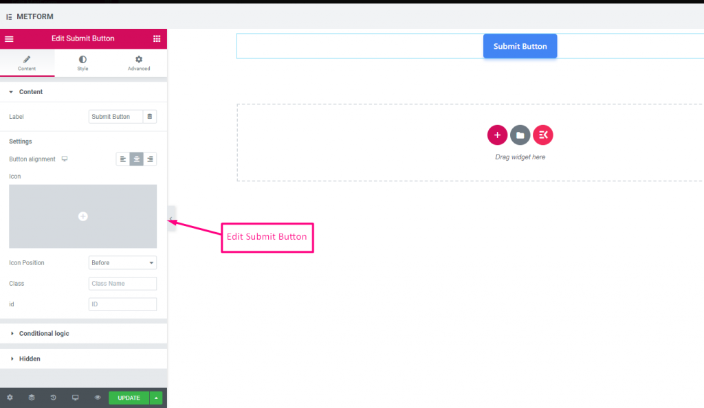
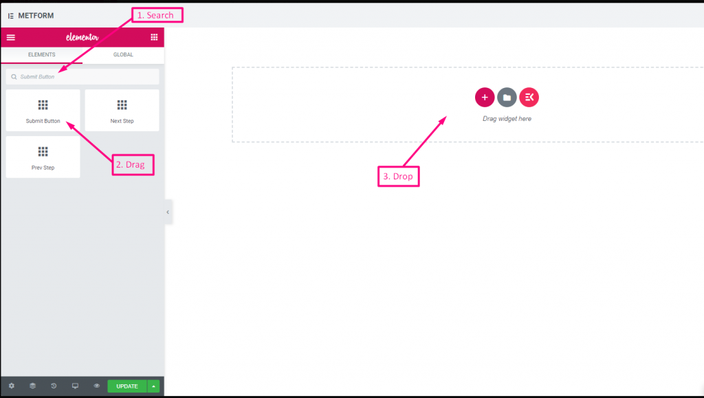
제출 버튼 #
이 필드를 사용하여 양식을 제출하고 백엔드에 데이터를 저장하세요.
| 옵션 | 설명 |
|---|---|
| 상표 | 레이블 텍스트를 입력합니다. |
| 버튼 정렬 | 버튼 위치를 선택하세요. 보고 싶은 곳. 양식의 왼쪽, 가운데 또는 오른쪽. |
| 상 | 아이콘 라이브러리에서 업로드하거나 SVG를 업로드할 수 있습니다. |
| 아이콘 위치 | 아이콘 위치를 이전 또는 이후 선택하세요. |
| 수업 | 클래스 이름 제공 |
| ID | 수업 ID 제공 |
| 조건부 논리 | 특정 기준에 따라 이 필드를 표시하거나 숨깁니다. |
| 숨겨진 | 숨겨진 입력 목록이 백엔드에 표시됩니다. 입력 값, 입력 이름, 입력 클래스 |



