


MetForm offers a comprehensive set of form input fields for creating flexible and interactive WordPress forms. Each field can be customized with labels, placeholders, validation rules, and conditional logic to suit any form requirement.
Input Fields and Their Functions #
- Text Field: Collects single-line textual input from users.
- Email Field: Accepts and validates email addresses.
- Number Field: Allows numeric input with min, max, and step control.
- Telephone Field: Collects phone numbers in a structured format.
- Time Field: Lets users select a time, optionally in 24-hour format.
- Date Field: Enables date selection with optional range or date+time mode.
- Select (Dropdown) Field: Provides a single-choice dropdown menu.
- Multi-Select Field: Allows selection of multiple options from a list.
- Textarea Field: Captures multi-line text input from users.
- Checkbox Field: Lets users select one or more predefined options.
- Radio Field: Allows single-choice selection from multiple options.
- First Name Field: Captures the user’s first name.
- Last Name Field: Captures the user’s last name.
- GDPR Consent Field: Adds a checkbox for compliance with data privacy laws.
- Switch Field: Provides an on/off toggle for binary choices.
- URL Field: Accepts website URLs with validation.
- Password Field: Collects secure password input.
- Response Message: Displays success, error, or custom messages.
- Rating Field: Lets users rate items with stars or similar symbols.
- File Upload Field: Enables uploading of single or multiple files with type and size restrictions.
- Summary Field: Displays a summary of form data before submission.
- 送信ボタン: Finalizes and submits the form.
両方あります 無料 そして プロ入力フィールド for you. Here we’ll discuss the free input field, let’s start.
自由入力フィールド #
To make any form with Metform’s Free Input Fields, open the page/post you want to add the form. After that, start editing with Elementor.
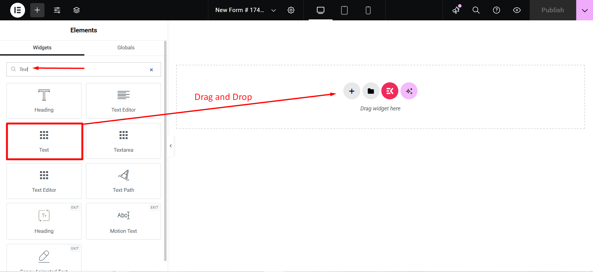
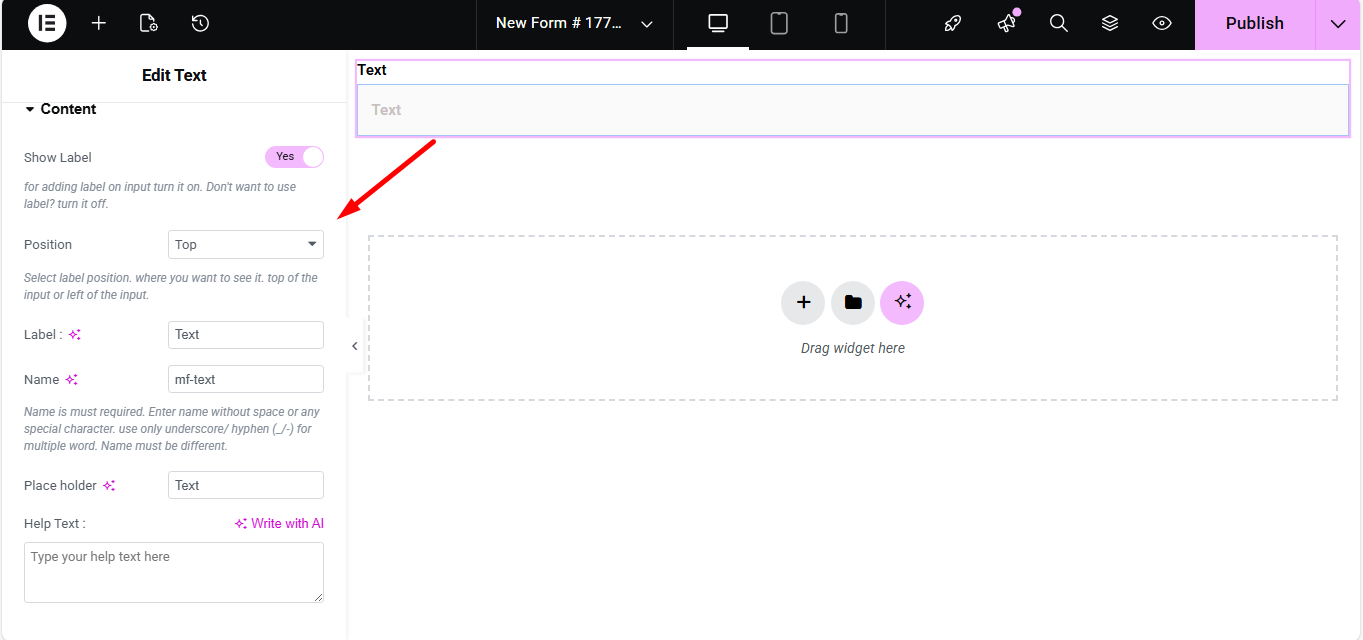
文章 #
Add Text field to input Name or any type of text.
コンテンツ #
- Show Label (Toggle): Turn the field label on/off.
- Position (Dropdown: Top / Left): Choose label position relative to the input.
- Label (Text Input): Text that appears as the field’s title.
- Name (Text Input – Required): Unique internal identifier without spaces.
- Placeholder (Text Input): Light text inside the field guiding the user.
- Help Text (Textarea): Instruction text displayed below the field.
- Default Value (Text Input): Pre-populates the field with a value.
- Required (Toggle): Makes the field mandatory for form submission.
設定 #
- Field ID (Text Input): Custom HTML ID for styling or scripting.
- Width (Dropdown: 100% / 50% / Custom): Controls how much horizontal space the field uses.
- Read Only (Toggle): Prevents users from editing the text.
- Disabled (Toggle): Completely disables the field interaction.
Validation #
- Validation Type (Dropdown): Choose how the field’s value is validated.
- 文字の長さ別: Enforce minimum/maximum characters.
- 単語の長さ別: Enforce min/max number of words.
- 表現ベース別: Custom regex pattern for validation.
- Required Message (Text Input): Custom message when required rule fails.
条件付きロジック #
- Enable Conditional Logic (Toggle): Enable dynamic show/hide behavior.
- Action (Dropdown: Show / Hide): Whether to show or hide based on conditions.
- Field (Dropdown): Field to compare against.
- Operator (Dropdown): Type of comparison (Equal / Not Equal / Contains / Greater / Less).
- Value (Text Input): Condition value to match.
Check out our ライブデモはこちら.
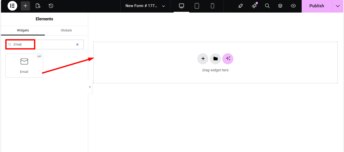
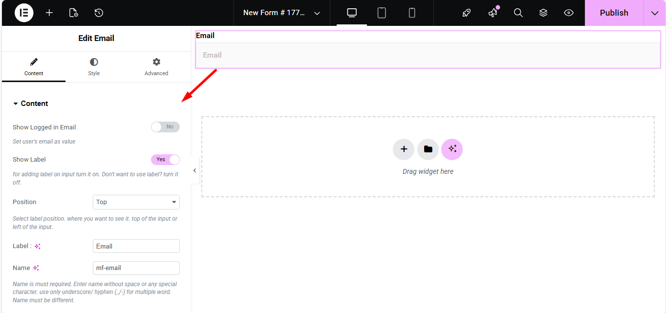
Eメール #
Make sure that the user enters the valid email address to your Form with the Email Input field. Search the Metform email widget and drag and drop.
コンテンツ #
- Show Label (Toggle): Display label or not.
- Position (Dropdown: Top / Left): Where the label appears.
- Label (Text Input): Field title text.
- Name (Text Input – Required): Unique field identifier.
- Placeholder (Text Input): Hint text inside the field.
- Help Text (Textarea): Instructional text under the field.
- Required (Toggle): Make email required to submit.
設定 #
- Field ID (Text Input): For CSS/JS targeting.
- Width (Dropdown): How wide the field appears visually.
- Read Only (Toggle): Users can’t change the displayed email.
Check out our ライブデモはこちら
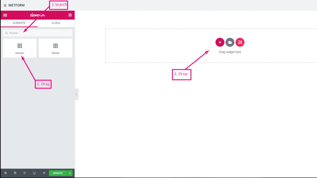
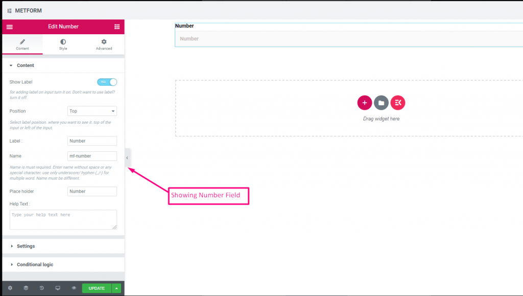
番号 #
この入力フィールドにより、ユーザーは数値入力で有効な数値を入力できるようになります。
コンテンツ #
- Show Label (Toggle): Control label visibility.
- Position (Dropdown: Top / Left): Label placement.
- Label (Text Input): Number prompt text.
- Name (Text Input – Required): Unique identifier.
- Placeholder (Text Input): Default hint numeric text.
- Help Text (Textarea): Help text guiding input.
- Default Value (Number Input): Pre-set number in field.
- Required (Toggle): Mandatory numeric input.
設定 #
- Min Value (Number Input): Smallest allowed number.
- Max Value (Number Input): Largest allowed number.
- Step (Number Input): Increment step for arrows/spinners.
- Read Only (Toggle): Prevent editing.
- Disabled (Toggle): Disable the control.
Check out our ライブデモはこちら
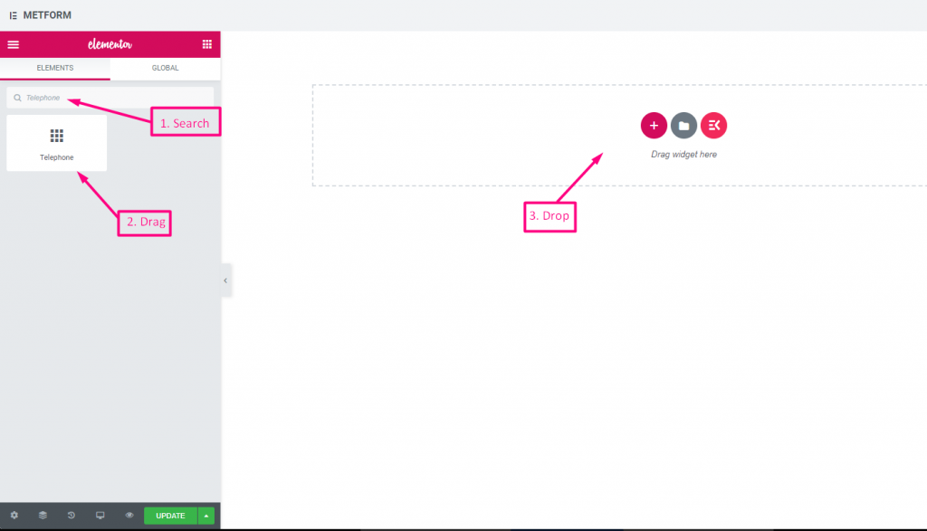
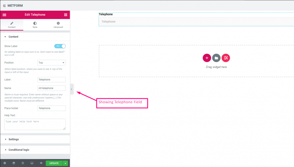
電話 #
ユーザーが有効な電話番号を入力して接続できるようにします。
コンテンツ #
- Show Label (Toggle): Show/hide phone label.
- Position (Dropdown: Top / Left): Label layout.
- Label (Text Input): Field title text.
- Name (Text Input – Required): Field internal name.
- Placeholder (Text Input): Phone format example text.
- Help Text (Textarea): Additional instructions.
- Required (Toggle): Must be filled to submit.
Check out our ライブデモはこちら
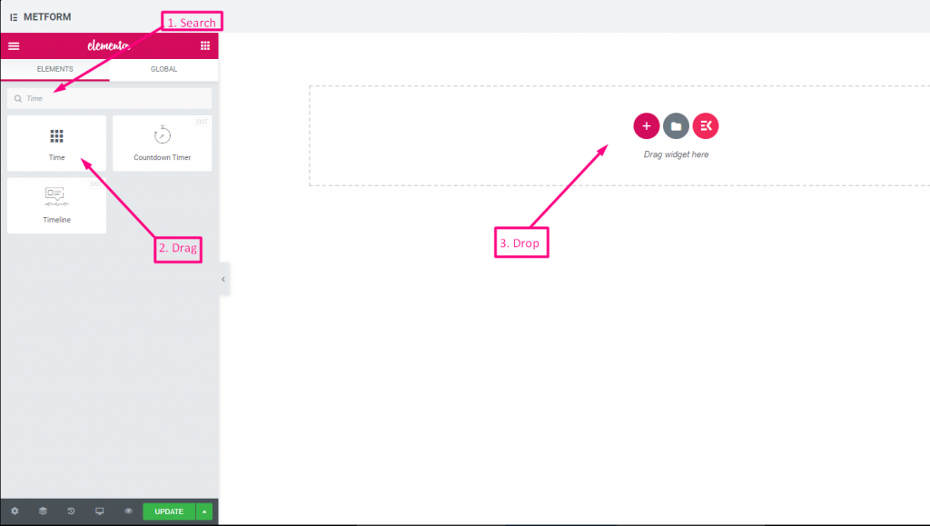
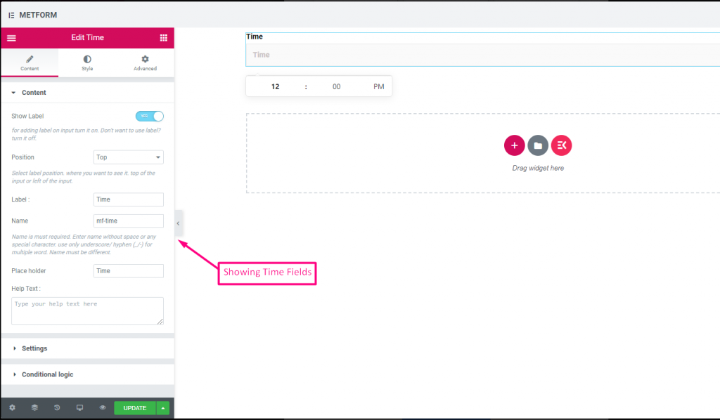
時間 #
ユーザーがポップダウン タイマーから希望の時間を選択できるようにします。
コンテンツ #
- Show Label (Toggle): Enable/disable label.
- Position (Dropdown): Top/Left label position.
- Label (Text Input): Prompt for time.
- Name (Text Input): Internal time field name.
- Placeholder (Text Input): Time format hint.
- Help Text (Textarea): Extra instruction text.
- Required (Toggle): Mandatory time.
- Use 24H Format (Toggle): Option to use 24-hour instead of AM/PM.
Check out our ライブデモはこちら.
24時間形式 #
Check out our ライブデモはこちら
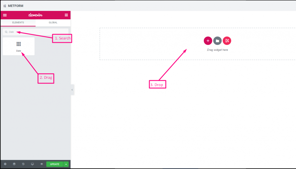
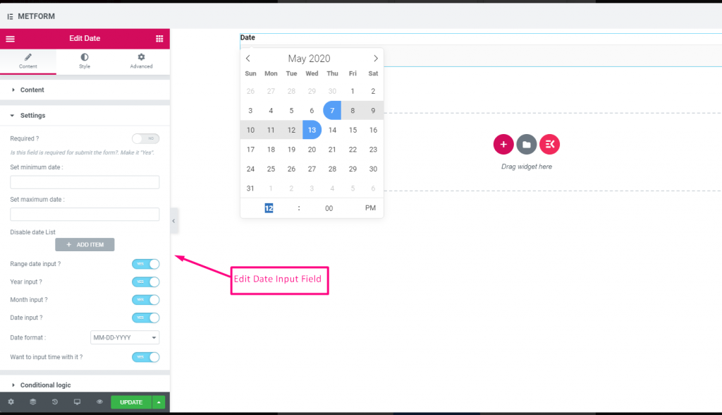
日付 #
この入力フィールドを使用して、ポップダウン カレンダーからフォームの日付を選択し、ユーザー フレンドリなフォームにします。
コンテンツ #
Required (Toggle): Must select a date/time.
Show Label (Toggle): Toggle field label display.
Position (Dropdown): Choose label position.
Label (Text Input): Text shown as a title.
Name (Text Input): Unique field key.
Help Text (Textarea): Extra instructions.
設定 #
- Range Date Input (Toggle): Enable two dates (start/end) instead of single.
- Min/Max Date (Date Picker): Earliest and latest selectable dates.
- Disable Dates (Date Picker): Block specific dates.
- Date Format (Dropdown): Choose format such as DD-MM-YYYY.
- Input Time (Toggle): Add time selection with date.
Check out our ライブデモはこちら
日付範囲の入力 #
Check out our ライブデモはこちら
時刻入力で日付を選択 #
Check out our ライブデモはこちら
| オプション | 説明 |
|---|---|
| ラベルを表示 | ラベルをオン/オフにします。 |
| 位置 | デフォルト: 上 ラベルの位置を選択します。見たい場所に。入力の上部または左。 |
| ラベル | ラベルのテキストを入力します。 |
| 名前 | 名前は必須です。スペースや特殊文字を含まない名前を入力します。複数の単語にはアンダースコア/ハイフン (_/-) のみを使用します。名前は違うはずです。 |
| プレースホルダー | プレースホルダーを使用してダミーテキストを表示し、ユーザーが正しいテキストを入力できるようにします。 |
| ヘルプテキスト | ウィジェットの下に表示するテキストを入力します。 |
| 必須 | デフォルト: いいえ このオプションを必須にするには、このオプションを切り替えます。ユーザーは必須フィールドに入力しないとフォームを送信できません。 |
| 最小または最大の日付を設定する | 最小日付と最大日付を入力してください |
| 無効化日 | 休業日または無効日を入力してください |
| 範囲日付入力 | 範囲の日付入力を有効にする 日付範囲の入力、日付単位、年単位、月単位での日付入力を有効または無効にします。 日付形式: ドロップダウンから日付形式を選択します。例: DD-MM-YYYY |
| 入力時間 | 日付とともに時間を追加できます。 |
| 条件付きロジック | 特定の基準に基づいてこのフィールドを表示/非表示にします。 |
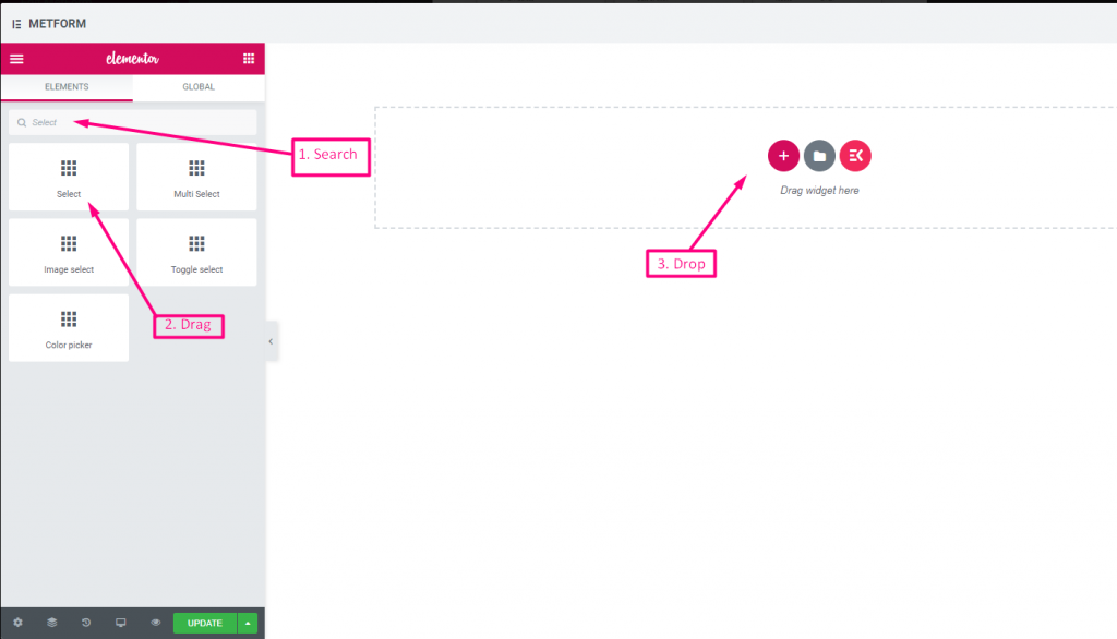
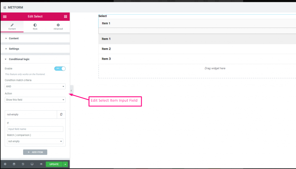
選択する #
ユーザーが選択できるオプションのドロップダウン リストを追加し、ウィジェットを名前で検索して、ウィジェットを目的の場所にドラッグ アンド ドロップします。
コンテンツ #
- Required (Toggle): Must pick an option.
- Show Label (Toggle): Display the label.
- Position (Dropdown): Position of label.
- Label (Text Input): Dropdown title.
- Name (Text Input – Required): Internal field name.
- Help Text (Textarea): Supporting info text.
- Dropdown List (Repeater):
- Option Text: User sees this option.
- Option Value: Value sent/stored after submit.
- Status (Dropdown: Enable/Disable): Options can be disabled.
- Default Selected (Toggle): Make this option selected by default.
Check out our ライブデモはこちら
ラベルとしての検索オプション #
Check out our ライブデモはこちら
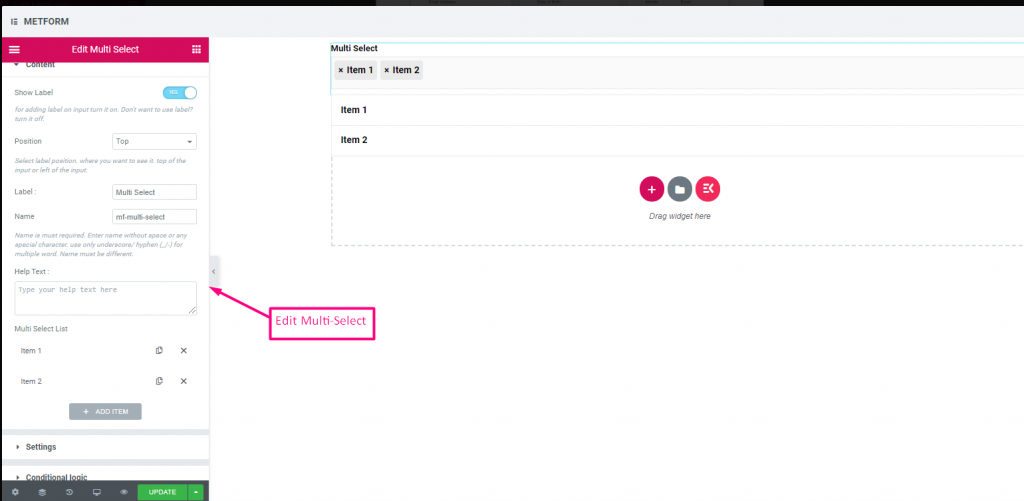
複数選択 #
ドロップダウンから一度に複数の項目を選択します。
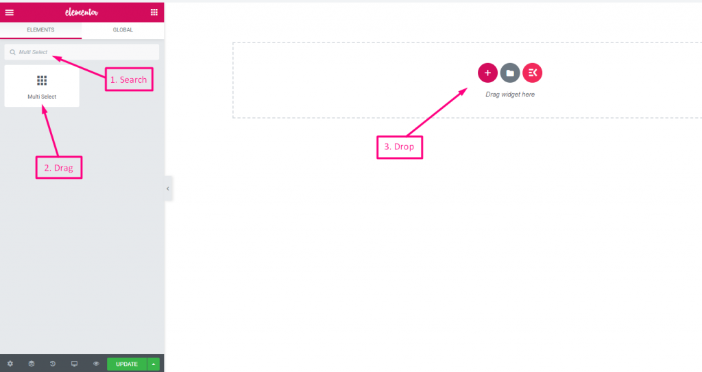
(Same as Select, but allows selecting multiple options from the list.)
Multiple Selection (Toggle): Allow multiple items to be chosen.
Check out our ライブデモはこちら
デフォルトで選択された値 #
Check out our ライブデモはこちら
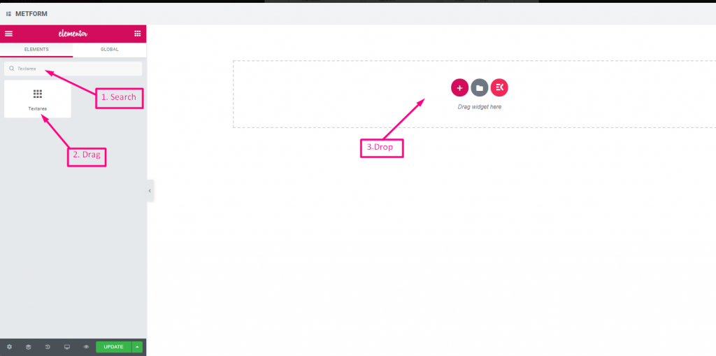
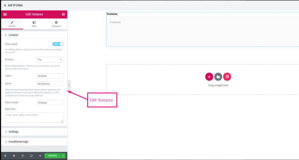
テキストエリア #
フォームに大量のコンテンツ、レビュー、コメントを追加するのに役立ちます。
(Much like Text, but supports multiple lines.)
コンテンツ #
- Rows (Number Input): Controls visible height of textarea.
- Show Label, Position, Label, Name, Help Text, Required: Same as text.
Check out our ライブデモはこちら
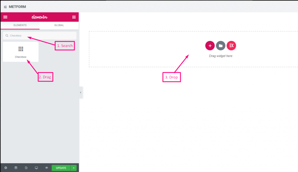
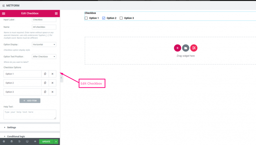
チェックボックス #
チェックボックスを使用して、ユーザーがフォームで一度に複数の項目を選択できるようにします。
コンテンツ #
- Show Label (Toggle), Position (Dropdown), Label, Name: Standard label controls.
- Checkbox Options (Repeater):
- Option Text: Text shown next to checkbox.
- Option Value: Stored when submitted.
- Status (Dropdown: Enable / Disable): Active or disabled option.
- Required (Toggle): Must check at least one.
画面 #
Layout (Dropdown: Vertical / Inline): Arrange options layout.
Check out our ライブデモはこちら
垂直 #
Check out our ライブデモはこちら
テキストの後のアイコンの位置 #
Check out our ライブデモはこちら
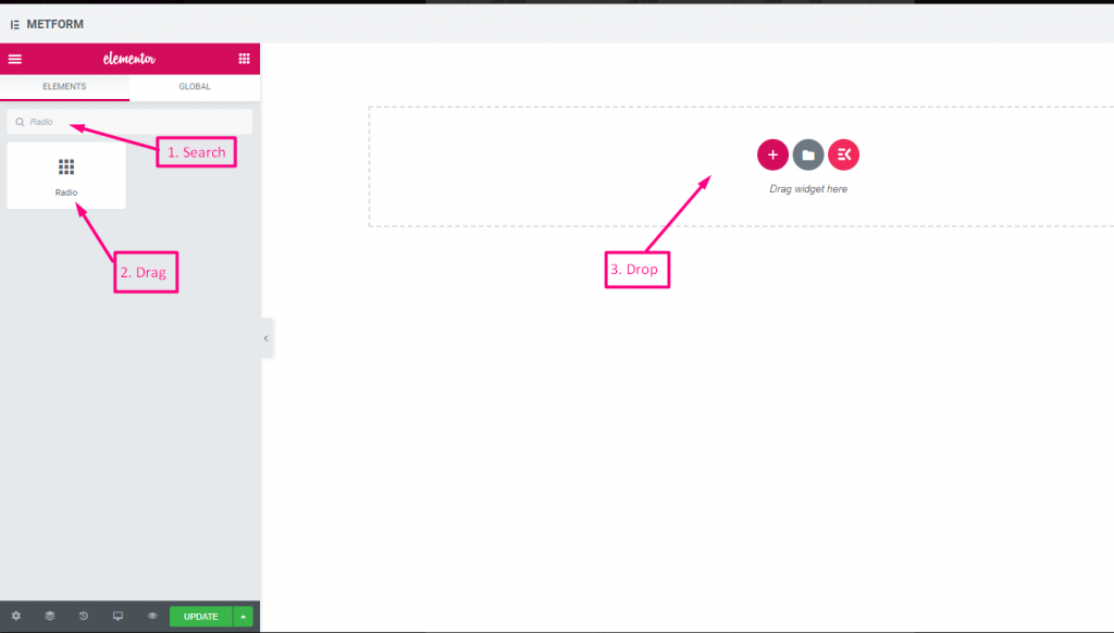
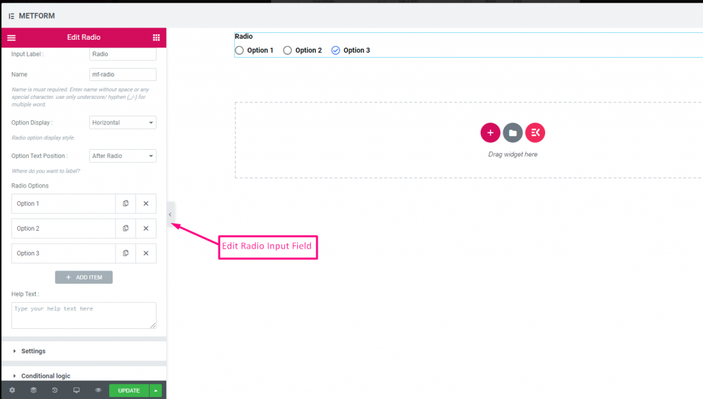
無線 #
ユーザーが複数のオプションから 1 つの排他的なアイテムのみを選択できるようにします。
コンテンツ #
- Required (Toggle): Must choose an option.
- Show Label, Position, Label, Name: Label settings.
- Option Display (Dropdown: Vertical / Horizontal): Choose orientation.
- Options Text Position (Dropdown: Before / After): Where the label sits relative to the circle.
- Radio Options (Repeater):
- Radio Option Text: Label shown to user.
- Radio Value: Value saved upon submit.
- Status (Dropdown): Active/disabled option.
Check out our ライブデモはこちら
垂直 #
Check out our ライブデモはこちら
テキストの後のアイコンの位置 #
Check out our ライブデモはこちら
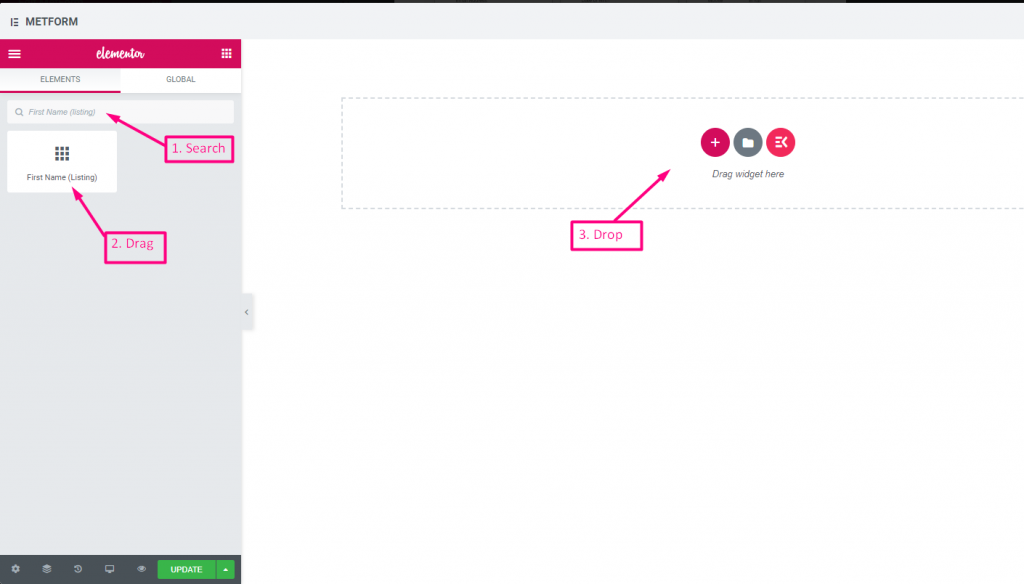
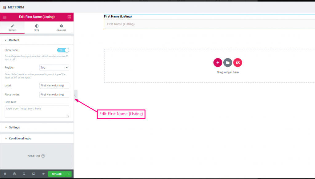
名 (リスト) #
Allow users to give their First Name to show them in a listing method on the mailing list. For Example : Mailchimp
コンテンツ #
- Validation Type (Dropdown): Min/max or expression validation for names.
- Show Label (Toggle), Position (Dropdown), Label: As standard.
- Placeholder (Text Input): Name hint.
- ヘルプテキスト: Additional instructions.
- Required (Toggle): Must fill.
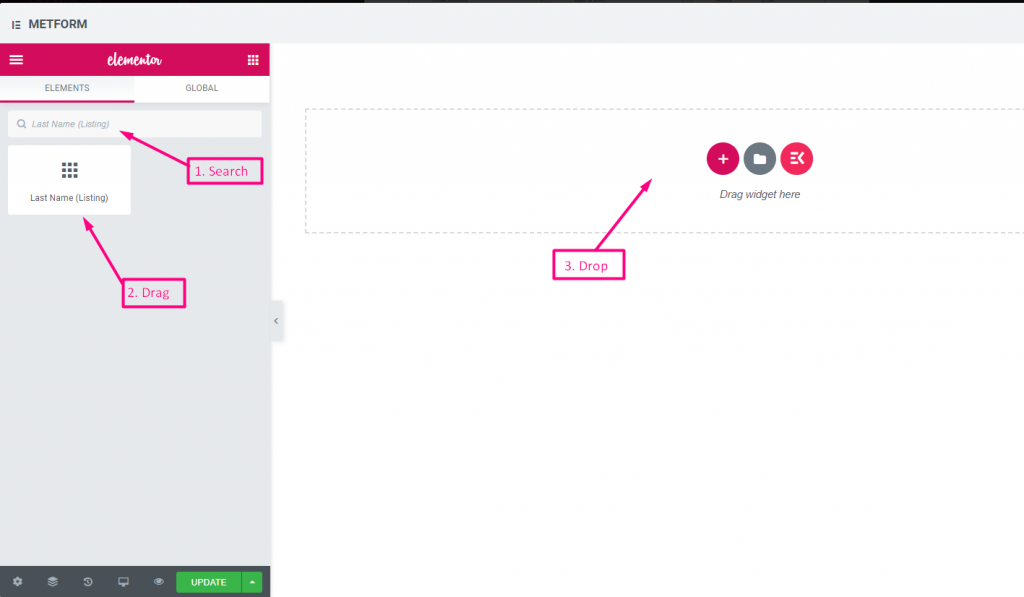
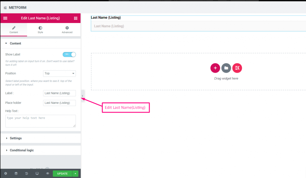
姓(リスト) #
Allow users to give their LastName to show them in a listing method on the mailing list. For Example : Mailchimp
Same controls as First Name.
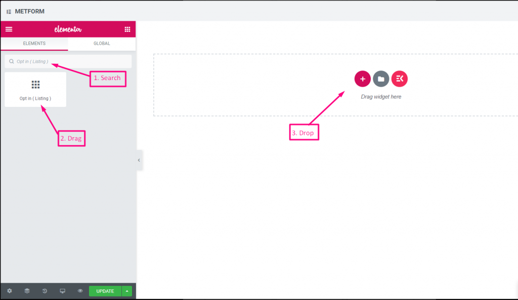
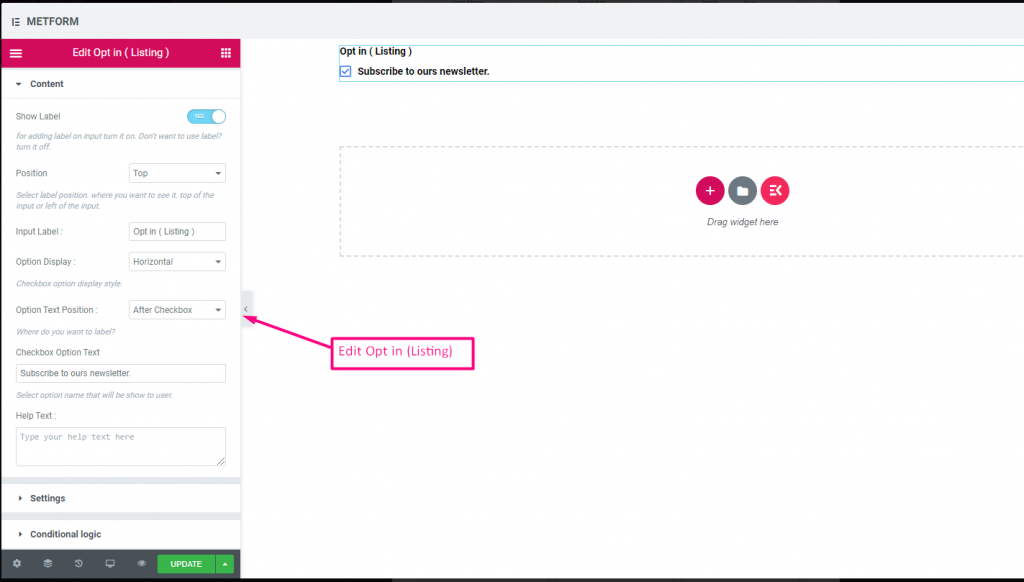
オプトインリスト #
フォームにオプトイン フィールドを使用し、「ニュースレターを購読する」チェックボックスをクリックして、ユーザーを購読済みの Mailchimp 連絡先ユーザーとして設定します。
Check out our ライブデモはこちら
| オプション | 説明 |
|---|---|
| ラベルを表示 | ラベルをオン/オフにします。 |
| 位置 | デフォルト: 上 ラベルの位置を選択します。見たい場所に。入力の上部または左。 |
| 入力ラベル | ラベルのテキストを入力します。 |
| オプション表示 | オプトインリストオプションの表示 水平方向 または 垂直方向 |
| オプションテキストの位置 | オプトインリストオプションテキストの位置を表示: 前に チェックボックスまたは 後 チェックボックス |
| チェックボックスオプションテキスト | ユーザーに表示されるオプションについて簡単に説明します。例:「ニュースレターを購読する“ |
| ヘルプテキスト | ウィジェットの下に表示するテキストを入力します。ヘルプテキストを使用して、適切な相手にメッセージを簡単にターゲットにして配信できます。 |
| 必須 | デフォルト: いいえ このオプションを必須にするには、このオプションを切り替えます。ユーザーは必須フィールドに入力しないとフォームを送信できません。 |
| 条件付きロジック | 特定の基準に基づいてこのフィールドを表示/非表示にします。 |
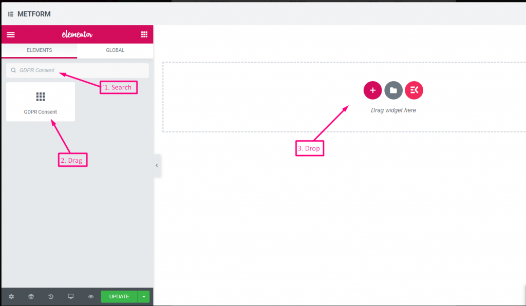
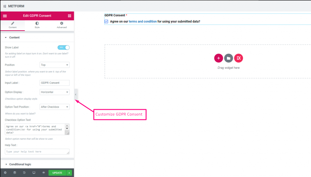
GDPR への同意 #
ユーザーデータを収集する前に、フォームで GDPR (一般データ保護規則) の苦情を有効にしてください。これにより、法律の措置から安全を保つために通常ユーザーデータをどのように使用しているかが説明されます。
コンテンツ #
- Help Text (Textarea): Further explanation.
- Show Label (Toggle): Display consent block title.
- Position (Dropdown): Label placement.
- Input Label (Text Input): Consent prompt text.
- Option Display (Dropdown): Horizontal/vertical layout.
- Options Text Position (Dropdown): Label before/after checkbox.
- Checkbox Option Text (Textarea): Consent statement text.
チェック out our ライブデモはこちら
テキストリンク付き #
チェック out our ライブデモはこちら
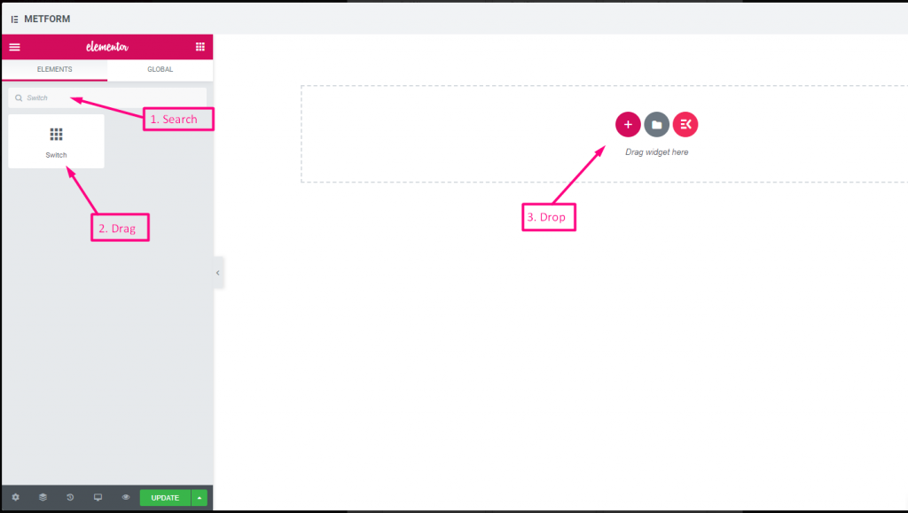
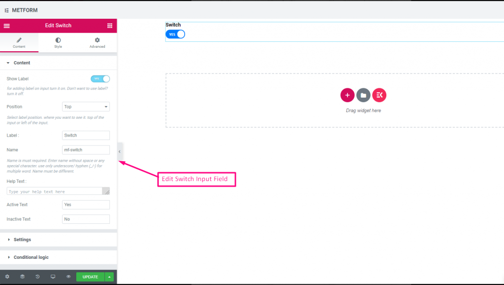
スイッチ #
ライトスイッチと同じように、はい/いいえまたはオン/オフの切り替えスイッチチェックボックス入力を簡単に制御できます。
コンテンツ #
- Required (Toggle): Must select a state.
- Show Label (Toggle), Position (Dropdown), Label, Name: Standard label controls.
- Help Text (Textarea): Description below switch.
- Active/Inactive Text (Text Inputs): Custom labels for on/off states.
Check out our ライブデモはこちら
カスタムオプションテキスト #
Check out our ライブデモはこちら
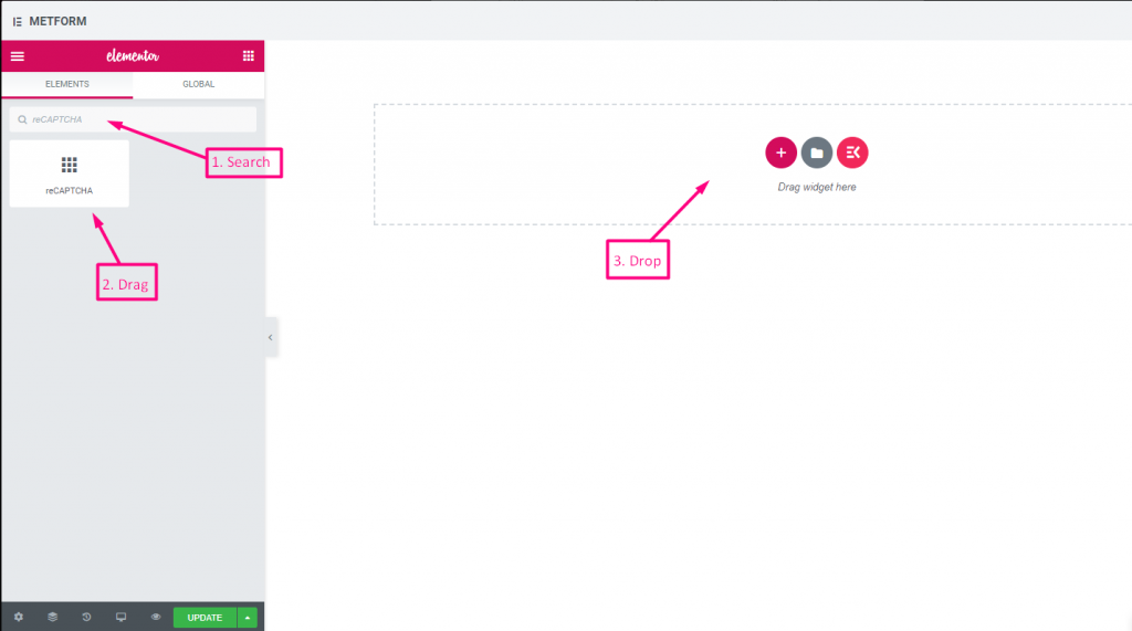
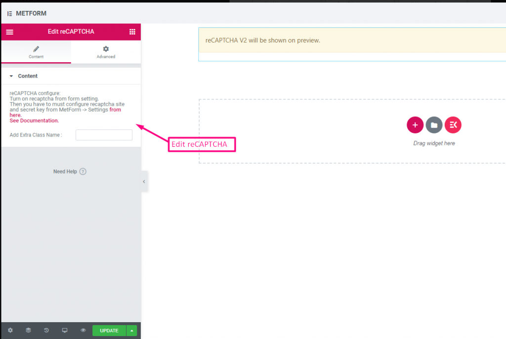
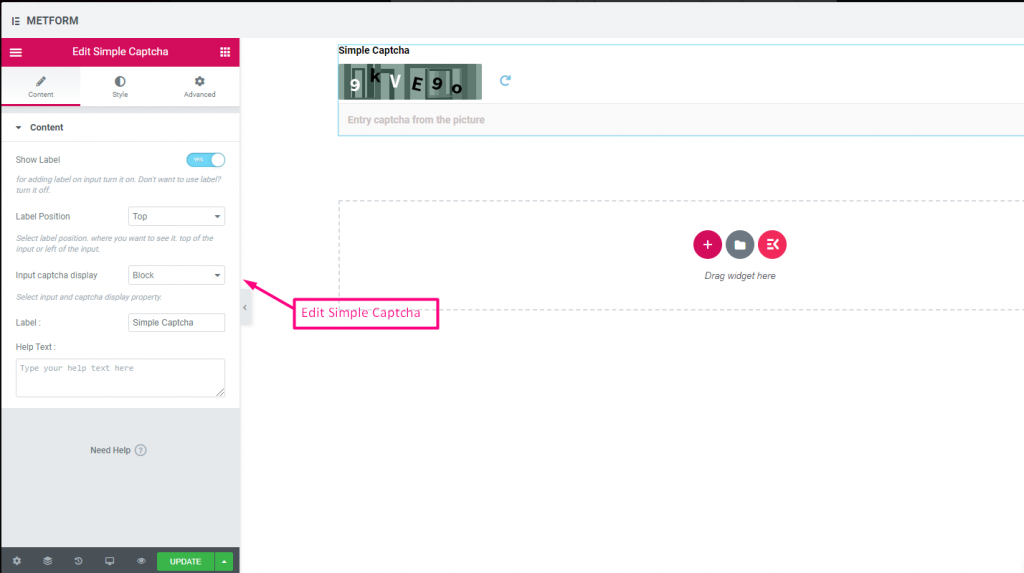
再キャプチャ #
Google reCAPTCHA を統合して、不要なスパムや不正なトラフィックからサイトを保護できます。
Check out our ライブデモはこちら
| オプション | 説明 |
|---|---|
| reCAPTCHAの設定 | 設定からreCAPTCHAをオンにします。その後、MetForm -> 設定からreCAPTCHAサイトと秘密キーを設定する必要があります。 ここから。 ドキュメントを参照してください。 |
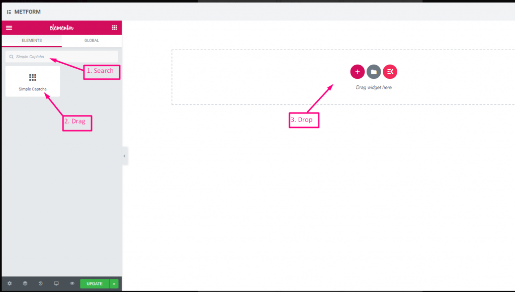
シンプルな reCAPTCHA #
不要なボットやスパムからサイトを保護します。
Check out our ライブデモはこちら
インラインオプション #
Check out our ライブデモはこちら
| オプション | 説明 |
|---|---|
| ラベルを表示 | ラベルをオン/オフにします。 |
| 位置 | デフォルト: 上 ラベルの位置を選択します。見たい場所に。入力の上部または左。 |
| CAPTCHA入力表示 | reCAPTCHA をブロックで入力するか、入力フィールドを行で表示します。 |
| ラベル | ラベルのテキストを入力します。 |
| ヘルプテキスト | ウィジェットの下に表示するテキストを入力します。 |
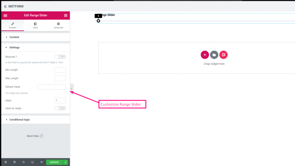
レンジスライダー #
非常に優れた範囲スライダーを使用して、フォームに最大または最小の範囲値を設定します。適切な値になるまで両端をドラッグするだけです。

Check out our ライブデモはこちら
デフォルト値 #
チェック out our ライブデモはこちら
マルチレンジ入力 #
チェック out our ライブデモはこちら
| オプション | 説明 |
|---|---|
| ラベルを表示 | ラベルをオン/オフにします。 |
| 位置 | デフォルト: 上 ラベルの位置を選択します。見たい場所に。入力の上部または左。 |
| ラベル | ラベルのテキストを入力します。 |
| 名前 | 名前は必須です。スペースや特殊文字を含まない名前を入力します。複数の単語にはアンダースコア/ハイフン (_/-) のみを使用します。名前は違うはずです。 |
| ヘルプテキスト | ウィジェットの下に表示するテキストを入力します。 |
| 必須 | デフォルト: いいえ このオプションを必須にするには、このオプションを切り替えます。ユーザーは必須フィールドに入力しないとフォームを送信できません。 |
| 最小長さ | 最小範囲値を設定する |
| 最大長さ | 最大範囲の値を設定する |
| デフォルト値 | デフォルト値を設定します。範囲値を設定するにはコンマを使用します。 |
| ステップ | ステップごとに範囲を追加するには、ステップ値を追加します。 |
| 範囲として入力 | このオプションを切り替えて範囲の設定が必要かどうかを設定します |
| 条件付きロジック | 特定の基準に基づいてこのフィールドを表示/非表示にします。 |
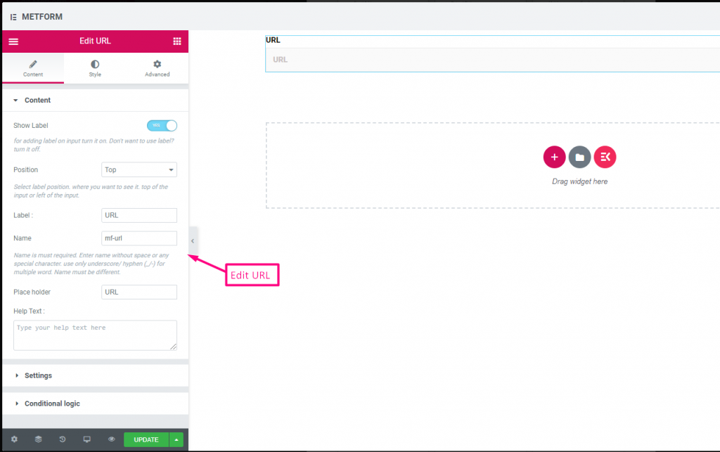
URL #
URL 入力フィールドを使用して、フォームに URL を追加するだけです。これにより、ユーザーはフォーム フィールドに有効な URL を入力できるようになります。

コンテンツ #
- Show Label, Position, Label, Name: Standard label controls.
- Placeholder (Text): Sample URL hint.
- ヘルプテキスト: Extra instructions.
- Required (Toggle): Must enter a valid URL.
Validation #
URL Validation: Ensures submission is a valid link.
Check out our ライブデモはこちら
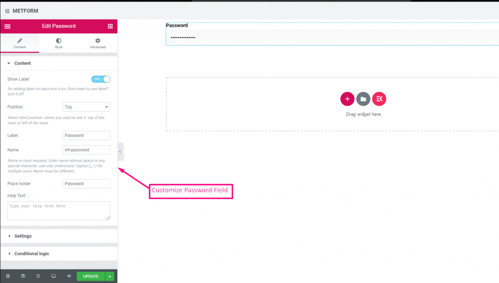
パスワード #
ユーザーに強力なパスワードを設定させたい場合は、パスワード入力フィールドを使用してください。これにより、ユーザーは保護されたパスワードを取得し、必要に応じてパスワードを変更できるようになります。

コンテンツ #
- Show Label, Position, Label, Name: Standard label controls.
- プレースホルダー: Password hint text.
- ヘルプテキスト: Instruction text below field.
- Required (Toggle): Must enter password.
Validation #
Validation Type (Dropdown): Enforce strength via characters/words/regex.
Check out our ライブデモはこちら
応答メッセージ #

コンテンツ #
- Add Success Message (Textarea): Text shown after successful submission.
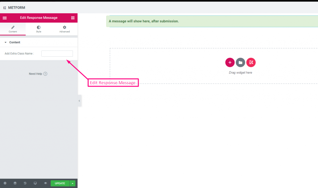
Check out our ライブデモはこちら:
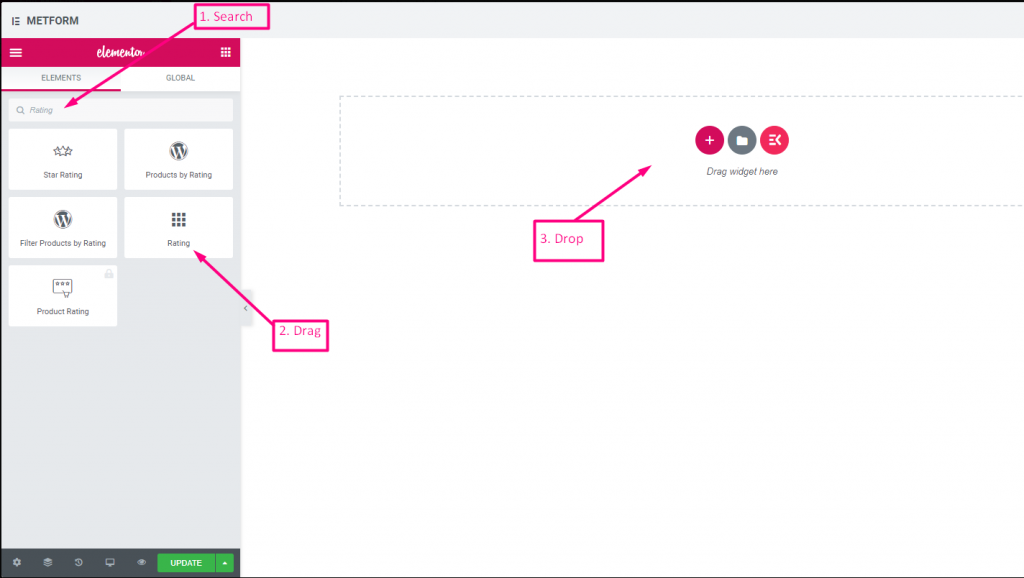
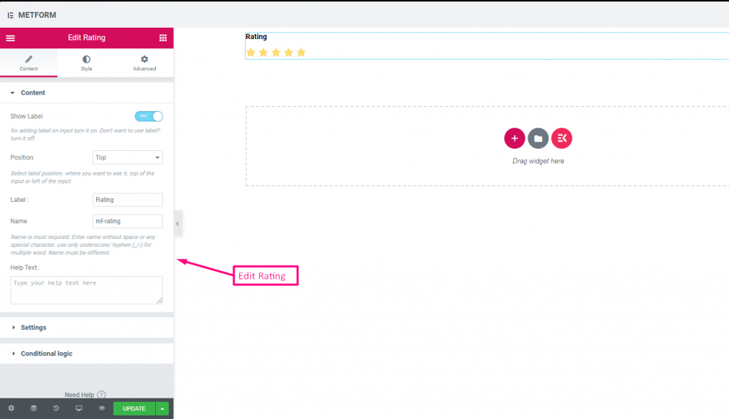
評価 #
顧客からの評価を集める 評価 入力フィールドの場合は、入力フィールドを名前で検索し、入力フィールドを目的の場所にドラッグ アンド ドロップします。顧客のレビューを取得し、所有者と顧客の間に良好な関係を構築するのに役立ちます。
コンテンツ #
- Number of Rating Stars (Number Input): Custom number of stars to display.
- Show Label (Toggle), Position (Dropdown), Label, Name: Standard.
- ヘルプテキスト: Rating instruction beneath stars.
- Required (Toggle): Must choose a rating.
Check out our ライブデモはこちら:
星の数は何個でも #
Check out our ライブデモはこちら
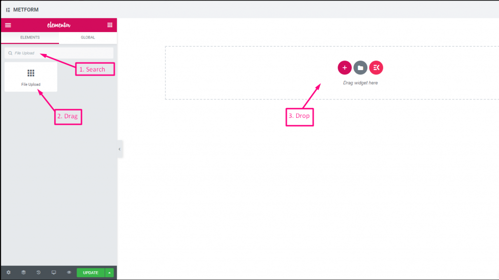
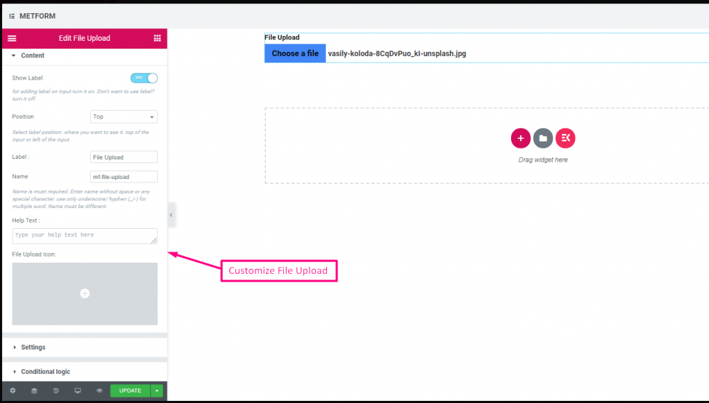
ファイルのアップロード #
メットフォームなら簡単に追加できる ファイルのアップロード ウィジェットをフォームに追加するには、入力フィールドを名前で検索し、入力フィールドを目的の場所にドラッグ アンド ドロップします。
コンテンツ #
- Multiple Upload (Toggle): Allow uploading more than one file.
- Show Label (Toggle), Position (Dropdown), Label, Name: Label settings.
- ヘルプテキスト: Guidance under uploader.
- Required (Toggle): Must upload.
- Allowed File Types (Text Input/List): Specify extensions such as
.jpg, .png. - Max File Size (Number Input): Maximum allowed file size.
Check out our ライブデモはこちら
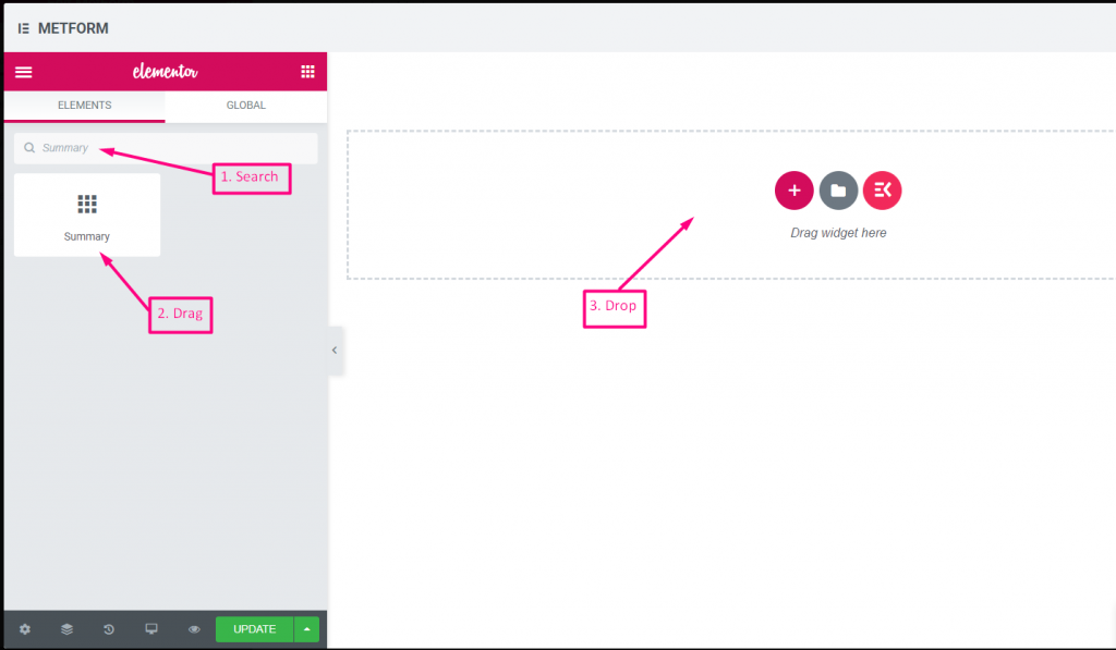
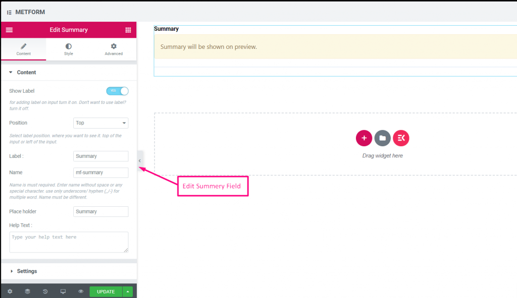
まとめ #
顧客との良好なコミュニケーションを構築するために、サブスクリプション前に概要を提供します。
コンテンツ #
- Required (Toggle): Must review before submit.
- Show Label (Toggle), Position (Dropdown), Label, Name: Standard.
- ヘルプテキスト: Explanation under summary.
条件付きロジック #
- Enable Conditional Logic (Toggle): Enable show/hide rules.
- Action (Dropdown: Show / Hide): Visibility setting.
- Field (Dropdown: Select Field): Field controlling summary visibility.
- Operator (Dropdown: Equal / Not Equal / Contains): Comparison type.
- Value (Text Input / Option Selector): Value triggering summary display.
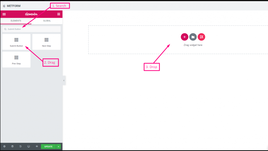
送信ボタン #
このフィールドを使用してフォームを送信し、バックエンドにデータを保存します。
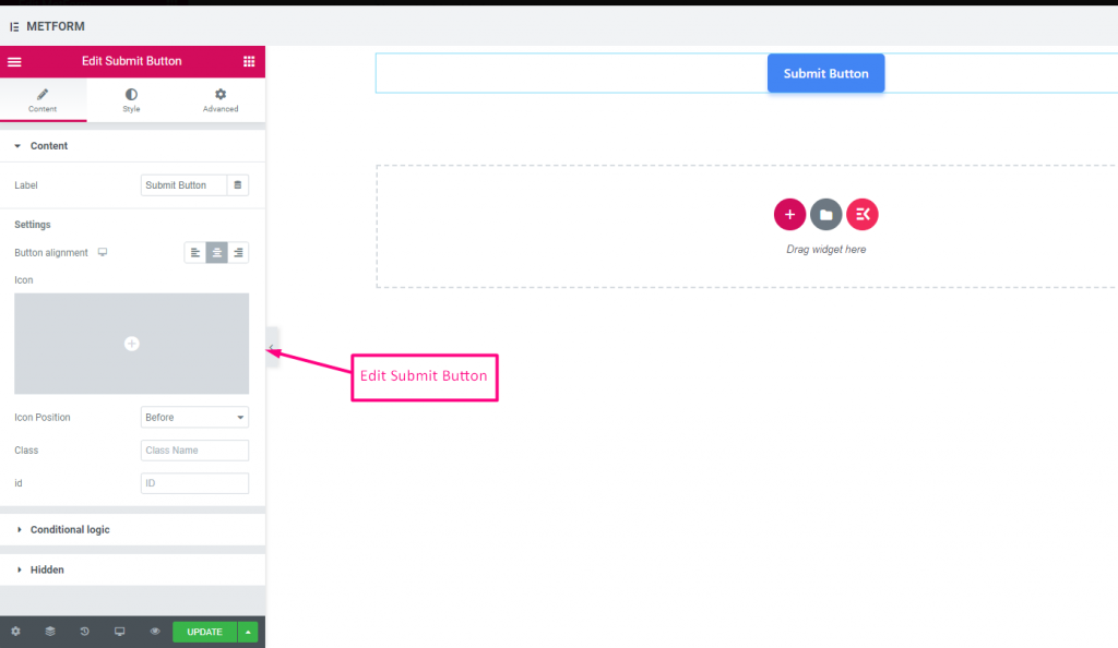
コンテンツ #
- Label (Text Input): Text shown on Submit button.
- Button Alignment (Dropdown: Left / Center / Right): Position submit button in form.
- Icon (Icon Picker): Choose an icon to accompany the text.
- Icon Position (Dropdown: Before / After): Place icon relative to text.
- Class (Text Input): Add a CSS class for styling.
- ID (Text Input): Add a CSS ID for scripting.
設定 #
Hidden (Toggle): Hidden input not visible but stored for backend.
条件付きロジック #
- Enable Conditional Logic (Toggle): Activate dynamic display.
- Action (Dropdown: Show / Hide): Decide if submit button appears.
- Field (Dropdown: Select Field): Field controlling submit button visibility.
- Operator (Dropdown: Equal / Not Equal / Contains / Not Contains): Comparison type.
- Value (Text Input / Option Selector): Value triggering the button display.