の 画像比較 widget lets you showcase transformation effects with an interactive, side-by-side slider. With ElementsKit, you can easily customize the layout and handle styles to create a seamless visual experience.
Image Comparison is a feature that lets you display two images side by side with a draggable slider, so users can easily compare differences (like before vs after).
Quick Steps:
✅ Insert the Image Comparison widget into your page
✅ Add both images (before and after)
✅ Choose the comparison layout (horizontal or vertical)
✅ Customize labels, slider handle, and styling as needed
✅ Preview and publish the page
例: You can show a before-and-after photo of photo editing, skin retouching, or any of your products, users drag the slider to see the changes clearly.
Takeaway: Image Comparison helps present visual differences in a simple, interactive way, making your content more engaging and easy to understand.
Using ElementsKit Image Comparison #
From your WordPress dashboard, open the page or post where you want to use the ElementsKit Image Comparison.
Get ElementsKit Image Comparison Widget #
Search ElementsKit Image Comparison widget and drag and drop it.

Customize the Content Part #
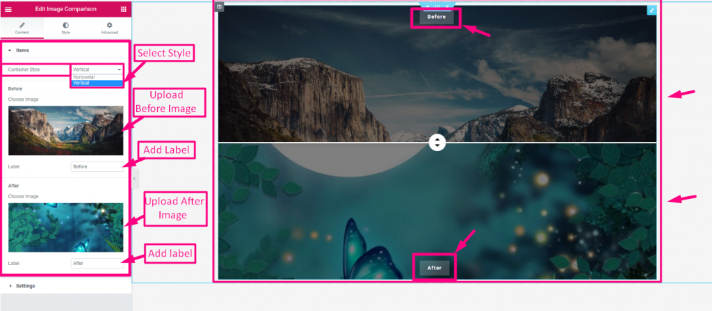
This part allows you to manage individual アイテム (Before and After images) and configure the 設定 for the slider’s layout and behavior.
アイテム #
- Container Style: 水平または垂直
- 以前の画像をアップロード
- 追加または編集 以前の画像ラベル
- アフターイメージをアップロード
- 追加または編集 アフターイメージラベル

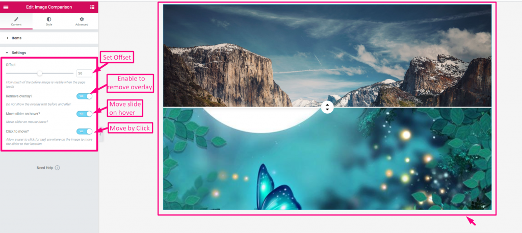
設定 #
- Set Offset: Starting position of the slider handle.
- Enable to Remove Overlay: Hides the “Before/After” labels.
- Enable Moving on Hover: Slider follows your mouse cursor.
- Enable to Move by Click: Slider snaps to where you click.

Customize the Style Part #
It lets you customize the visual appearance of the widget.
一般的な #
- Border Type (None/Default): Allows you to adjust only the 境界半径 そして パディング for a clean look.
- Border Type (Solid, Dotted, Dashed, etc.): Unlocks full control over 枠線の幅, 色, Radius, パディング、 そして ボックスシャドウ to fully style the frame.

Handle #
- Control Width: Adjusts the horizontal size of the handle.
- 身長: Sets the vertical size of the handle.
- 背景の種類: Choose between a solid color or a gradient for the handle’s base.
- 色: Sets the specific background color of the handle.
- 画像: Allows you to upload a custom graphic or icon for the handle.
- Arrow Color: Changes the color of the directional arrows on the slider.
- ボックスシャドウ: Adds a shadow effect around the handle for a 3D look.
- マージン: Adjusts the spacing around the outer edges of the handle.
- 境界線の半径: Rounds the corners of the handle to make it circular or curved.
- Handle Divider: Enables or disables the vertical line that splits the two images.
- Divider Thickness: Controls the width of the vertical divider line.
- Divider Color: Sets the specific color for the vertical divider line.