


Deal Productsは、ShopEngineの一般的なウィジェットで、どのwooCommerceテンプレートでも使用できます。このウィジェットは、 セール開始と終了のスケジュール付きで販売中、入手可能な製品、販売されたアイテムの合計数、その他多くのオプションがあります。
注記: このウィジェットには、 スケジュール付き販売スケジュールのないセール商品はこのウィジェットには表示されません。
WooCommerce サイトで Deal Products Widgets を使用する方法を学びましょう。
ステップ1: 取引商品ウィジェットを有効にする #
ウィジェットを有効にするには、
- に行く ShopEngine > ウィジェット > お買い得商品
- オンにする 一般セクションの取引商品
- 保存 変化
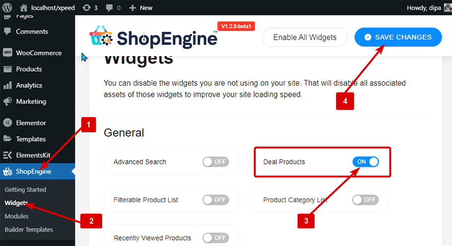
注記: グローバル設定で取引商品をオンにすることもできます。 ShopEngine のすべてのウィジェットをオンにします.
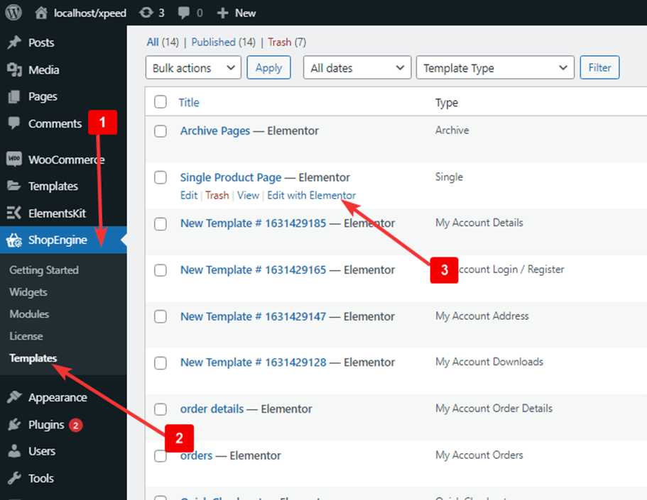
ステップ2: 取引商品を追加する #
ウィジェットを追加する前に、まずShopEngine WooCommerceテンプレートを作成する必要があります。 テンプレートの作成方法.
取引商品を追加するには:
- に行く ShopEngine > テンプレート > 任意の ShopEngine テンプレート
- クリック Elementorで編集する
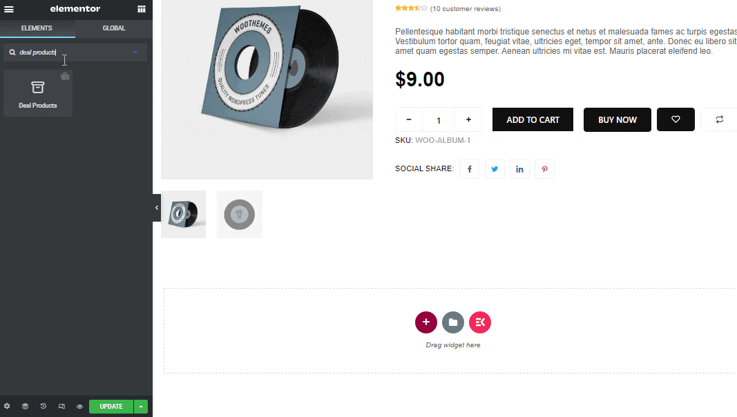
- 検索 要素検索オプションの取引商品
- ドラッグアンドドロップ ウィジェット
- クリック アップデート をクリックして変更を保存します。
ステップ3: 取引商品のコンテンツ設定 #
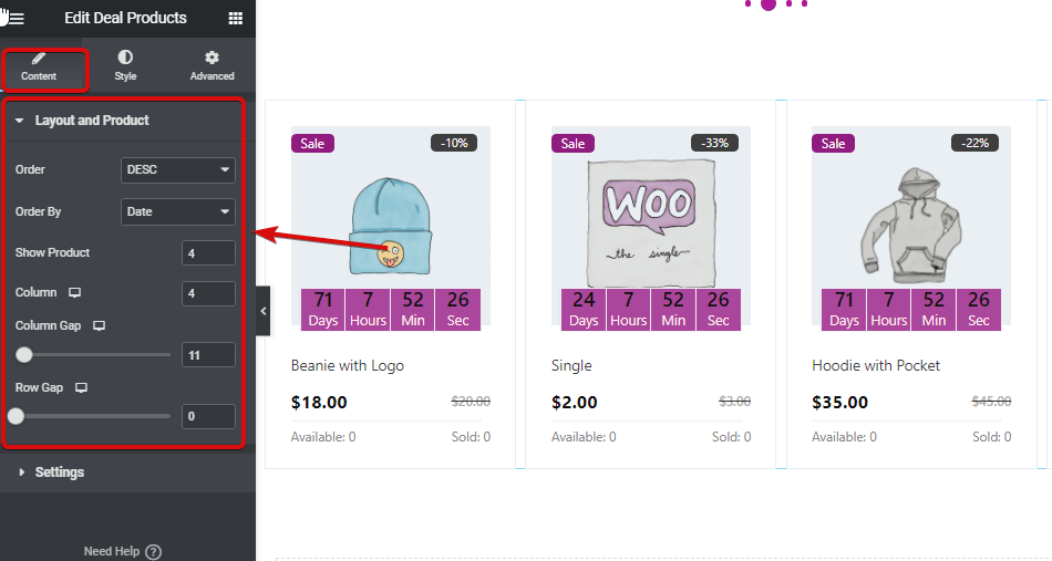
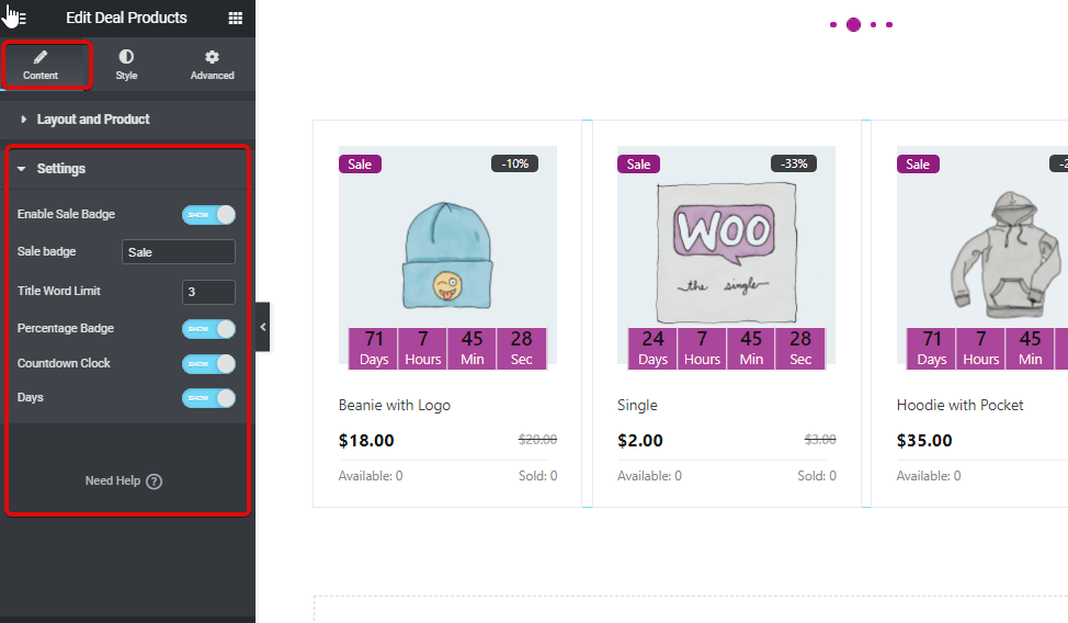
編集アイコンをクリックして、 コンテンツ タブをクリックして、次の設定をカスタマイズします。
拡大する レイアウトと製品 編集オプション:
- 注文: 順序を昇順または降順に設定できます。
- 注文方法: ID、タイトル、名前、日付、人気度などの並べ替えオプションから選択します。
- 製品を表示: このお得な商品ウィジェットに表示する商品の数を設定します。
- カラム: 列ごとに表示する製品の数を選択します。
- 列のギャップ: 列間の必要な間隔を選択します。
- 行ギャップ: ここで各列間の間隔を選択できます。
を展開します。 設定 編集オプション:
- セールバッジを有効にする: セールバッジを表示するか非表示にするかを選択できます。
- タイトルの文字数制限: セールバッジのタイトルをカスタマイズします。
- パーセンテージバッジ: このオプションをオンにすると、売上率を表示できます。
- カウントダウンクロック: カウントダウン クロックを表示するには、このオプションをオンにします。
- 日々: 1 日未満の期間を設定する場合は、このオプションを使用して、カウントダウン クロックから日付オプションを非表示にすることができます。
ステップ4: 取引商品のスタイル設定 #
に行きます スタイル タブをクリックして、次のスタイル設定をカスタマイズします。
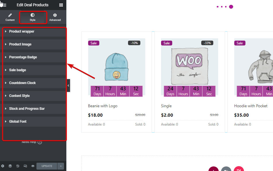
- 商品の包装
- パディング: 上、右、下、左のパディングを調整します。
- 背景色: ウィジェットの背景色を変更します。
- 境界線の幅: 各製品セクションの周囲に必要な境界線の幅を選択します。
- ボーダの色: 境界線の色を選択します。
- 製品イメージ
- 身長: ウィジェットの商品画像の高さを選択します。
- サイズ: 画像サイズはコンテンツまたはカバーとして選択できます。
- 位置: カバーを選択する場合は、位置を選択する別のオプションが表示されます。ここで、位置を上、中央、または下から選択できます。
- パーセンテージバッジ:
- パディング: 上、右、下、左のパディングを調整します。
- 境界線の半径: 境界線の半径の上、右、下、左の値を選択します。
- 左の位置: ここで、パーセンテージ バッジの水平位置を調整できます。
- ポジショントップ: パーセンテージバッジの垂直位置を調整します。
- 色: パーセンテージテキストの色を選択します。
- 背景: パーセンテージ バッジの背景色を選択します。
- タイポグラフィ: フォントの色と太さを選択するには、タイポグラフィの編集をクリックします。
- セールバッジ:
- パディング: 上、右、下、左のパディングを調整します。
- 境界線の半径: 境界半径の上、右、下、左の値を選択します。
- 左の位置: ここでセールバッジの水平位置を調整できます.
- ポジショントップ: セールバッジの垂直位置を調整する.
- 色: セールテキストの色を選択します。
- 背景: セールバッジの背景色を選択します。
- タイポグラフィ: フォントの色と太さを選択するには、タイポグラフィの編集をクリックします。
- カウントダウンクロック:
- 数字の色: カウントダウン クロックの数字の色を選択します。
- 数字の書体: ここで、フォントのサイズ、太さ、変換スタイルを選択できます。
- ラベルの色: ラベルの日、時間、分、秒の色を選択します。
- ラベルのタイポグラフィ: ここで、ラベルのフォント サイズ、太さ、変換スタイル、行の高さを選択できます。
- 背景: ラベルの背景色を変更します。
- ボーダの色: 境界線の色を選択します。
- 枠線の幅: 境界線の幅のサイズを選択します。
- パディング: 上、右、下、左のパディングを調整する
- スペース下部: ここで下部のスペースを選択できます。
- カウントダウンラッパーの幅: カウントダウンセクション全体の幅を選択します。
- コンテンツスタイル:
- タイトルカラー: 商品のタイトルの色を変更します。
- タイトルホバーの色: タイトルのホバーカラーを選択します。
- タイトルのタイポグラフィ: ここで、タイトルのフォント サイズ、太さ、変換、行の高さを変更できます。
- タイトル余白: タイトルの上、右、下、左の余白を選択します。
- 価格行の余白: 価格行の上、右、下、左の余白を選択します。
- 通常価格カラー: 通常価格でカラーをお選びください。
- 通常価格の表記: ここではフォントサイズ、太さを選択し、通常価格で変換できます。
- セール価格カラー: セール価格に合わせて色をお選びください。
- セール価格の表記: ここでフォントサイズ、太さを選択し、販売価格に合わせて変換できます。
- ストックと進捗バー
- テキストの色: 入手可能なオプションと販売済みのオプションの色を変更します。
- テキストのタイポグラフィ: ここでは、使用可能および販売済みのオプションのフォント サイズ、太さ、変換、行の高さを選択できます。
- ラインキャップスタイル: 丸型キャップのスタイルは丸型または四角型から選択できます。
- 法線の色: 各ストックセクションの境界線の色を選択します。
- 通常の行の高さ: 行の高さを選択します。
- アクティブラインの色: ここでアクティブな線の色を変更します。
- アクティブな行の高さ: ここでアクティブな行の高さを選択できます。
- グローバルフォント
- フォントファミリー: ここで、ウィジェット全体のフォント ファミリーを変更できます。
すべての変更が完了したらクリックします アップデート 保存します。これで、Deal Products がすべてのカスタマイズとスタイル設定とともにストアフロントに表示されるようになります。
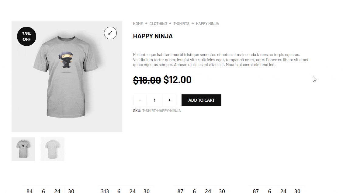
取引商品ウィジェットのプレビューはこちらです