


MetForm offers a comprehensive set of form input fields for creating flexible and interactive WordPress forms. Each field can be customized with labels, placeholders, validation rules, and conditional logic to suit any form requirement.
Input Fields and Their Functions #
- Text Field: Collects single-line textual input from users.
- Email Field: Accepts and validates email addresses.
- Number Field: Allows numeric input with min, max, and step control.
- Telephone Field: Collects phone numbers in a structured format.
- Time Field: Lets users select a time, optionally in 24-hour format.
- Date Field: Enables date selection with optional range or date+time mode.
- Select (Dropdown) Field: Provides a single-choice dropdown menu.
- Multi-Select Field: Allows selection of multiple options from a list.
- Textarea Field: Captures multi-line text input from users.
- Checkbox Field: Lets users select one or more predefined options.
- Radio Field: Allows single-choice selection from multiple options.
- First Name Field: Captures the user’s first name.
- Last Name Field: Captures the user’s last name.
- GDPR Consent Field: Adds a checkbox for compliance with data privacy laws.
- Switch Field: Provides an on/off toggle for binary choices.
- URL Field: Accepts website URLs with validation.
- Password Field: Collects secure password input.
- Response Message: Displays success, error, or custom messages.
- Rating Field: Lets users rate items with stars or similar symbols.
- File Upload Field: Enables uploading of single or multiple files with type and size restrictions.
- Summary Field: Displays a summary of form data before submission.
- Botón de enviar: Finalizes and submits the form.
tenemos ambos Gratis y Campo de entrada profesional for you. Here we’ll discuss the free input field, let’s start.
Campo de entrada libre #
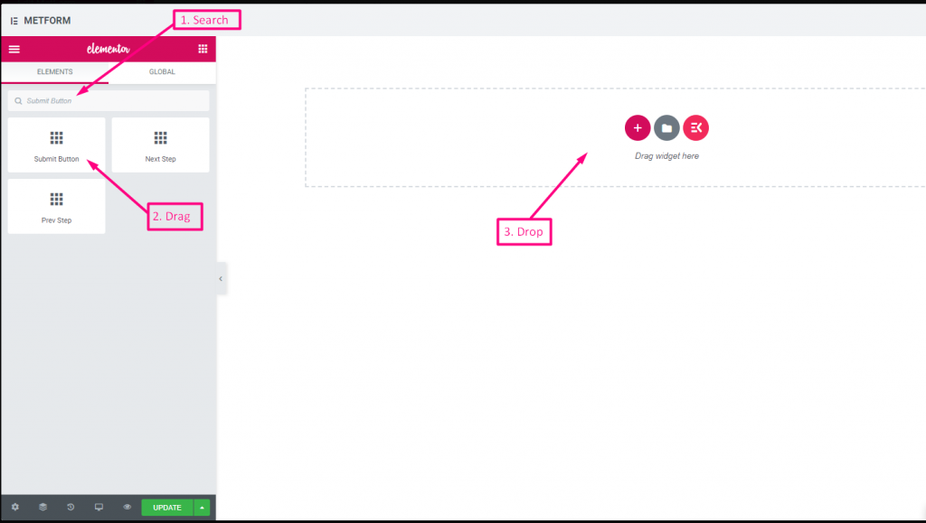
To make any form with Metform’s Free Input Fields, open the page/post you want to add the form. After that, start editing with Elementor.
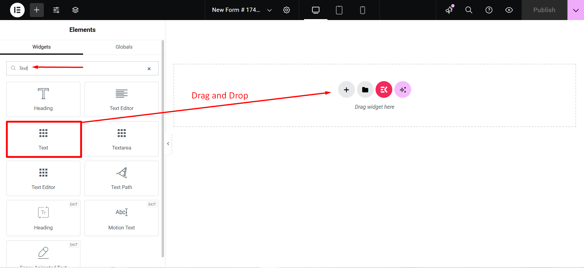
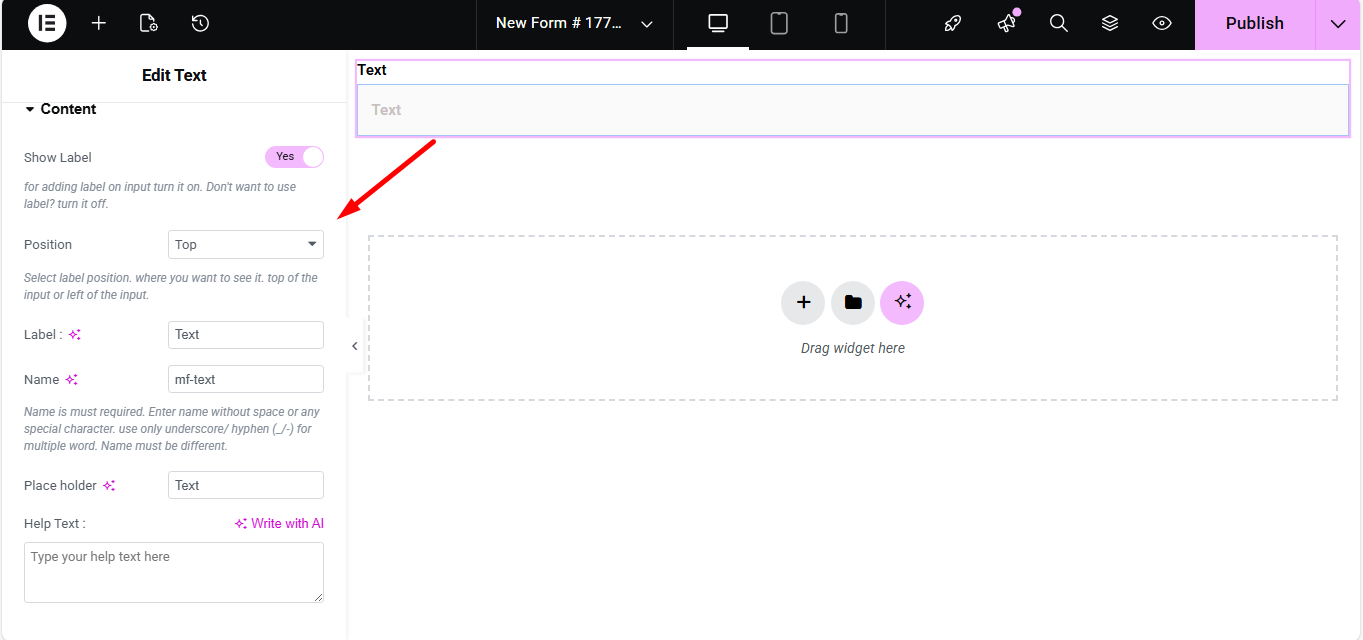
Texto #
Add Text field to input Name or any type of text.
Contenido #
- Show Label (Toggle): Turn the field label on/off.
- Position (Dropdown: Top / Left): Choose label position relative to the input.
- Label (Text Input): Text that appears as the field’s title.
- Name (Text Input – Required): Unique internal identifier without spaces.
- Placeholder (Text Input): Light text inside the field guiding the user.
- Help Text (Textarea): Instruction text displayed below the field.
- Default Value (Text Input): Pre-populates the field with a value.
- Required (Toggle): Makes the field mandatory for form submission.
Ajustes #
- Field ID (Text Input): Custom HTML ID for styling or scripting.
- Width (Dropdown: 100% / 50% / Custom): Controls how much horizontal space the field uses.
- Read Only (Toggle): Prevents users from editing the text.
- Disabled (Toggle): Completely disables the field interaction.
Validation #
- Validation Type (Dropdown): Choose how the field’s value is validated.
- Por longitud de carácter: Enforce minimum/maximum characters.
- Por longitud de palabra: Enforce min/max number of words.
- Basado en la expresión: Custom regex pattern for validation.
- Required Message (Text Input): Custom message when required rule fails.
Lógica condicional #
- Enable Conditional Logic (Toggle): Enable dynamic show/hide behavior.
- Action (Dropdown: Show / Hide): Whether to show or hide based on conditions.
- Field (Dropdown): Field to compare against.
- Operator (Dropdown): Type of comparison (Equal / Not Equal / Contains / Greater / Less).
- Value (Text Input): Condition value to match.
Check out our Demostración en vivo aquí.
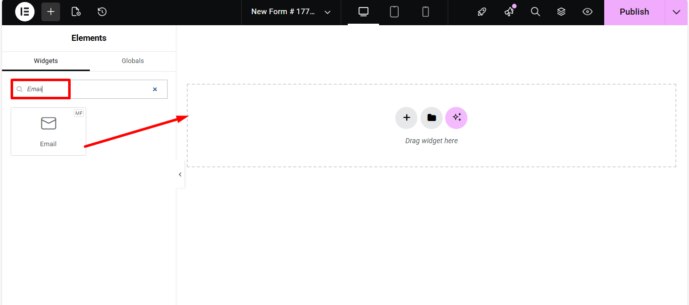
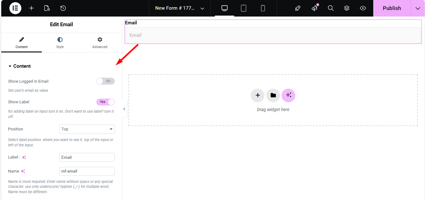
Correo electrónico #
Make sure that the user enters the valid email address to your Form with the Email Input field. Search the Metform email widget and drag and drop.
Contenido #
- Show Label (Toggle): Display label or not.
- Position (Dropdown: Top / Left): Where the label appears.
- Label (Text Input): Field title text.
- Name (Text Input – Required): Unique field identifier.
- Placeholder (Text Input): Hint text inside the field.
- Help Text (Textarea): Instructional text under the field.
- Required (Toggle): Make email required to submit.
Ajustes #
- Field ID (Text Input): For CSS/JS targeting.
- Width (Dropdown): How wide the field appears visually.
- Read Only (Toggle): Users can’t change the displayed email.
Check out our Demostración en vivo aquí
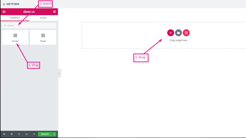
Número #
Estos campos de entrada garantizarán que los usuarios ingresen un número válido con entrada numérica.
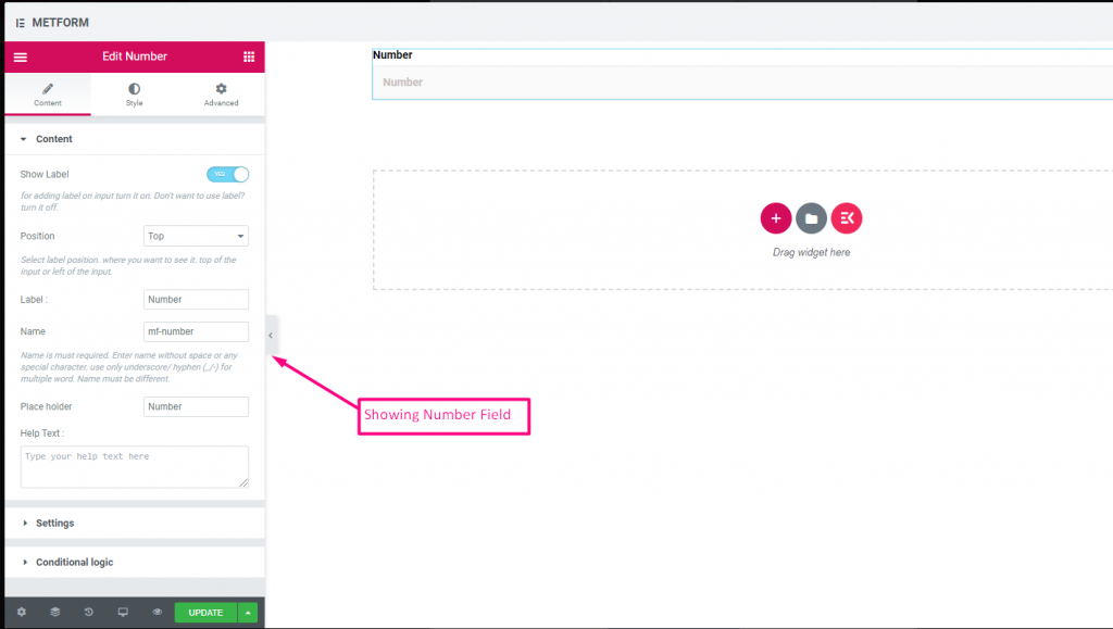
Contenido #
- Show Label (Toggle): Control label visibility.
- Position (Dropdown: Top / Left): Label placement.
- Label (Text Input): Number prompt text.
- Name (Text Input – Required): Unique identifier.
- Placeholder (Text Input): Default hint numeric text.
- Help Text (Textarea): Help text guiding input.
- Default Value (Number Input): Pre-set number in field.
- Required (Toggle): Mandatory numeric input.
Ajustes #
- Min Value (Number Input): Smallest allowed number.
- Max Value (Number Input): Largest allowed number.
- Step (Number Input): Increment step for arrows/spinners.
- Read Only (Toggle): Prevent editing.
- Disabled (Toggle): Disable the control.
Check out our Demostración en vivo aquí
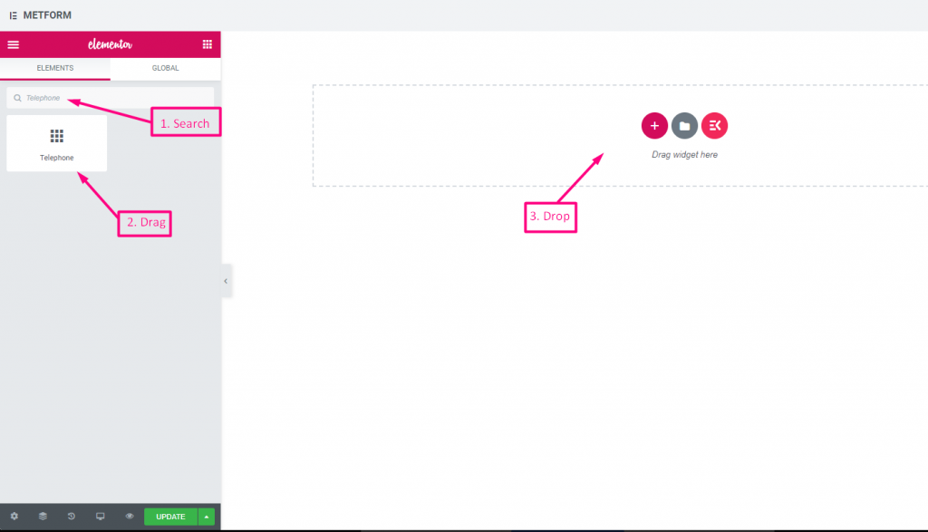
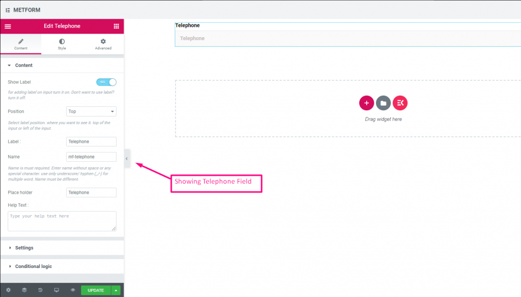
Teléfono #
Permitir a los usuarios dar su número de teléfono válido para realizar conexiones.
Contenido #
- Show Label (Toggle): Show/hide phone label.
- Position (Dropdown: Top / Left): Label layout.
- Label (Text Input): Field title text.
- Name (Text Input – Required): Field internal name.
- Placeholder (Text Input): Phone format example text.
- Help Text (Textarea): Additional instructions.
- Required (Toggle): Must be filled to submit.
Check out our Demostración en vivo aquí
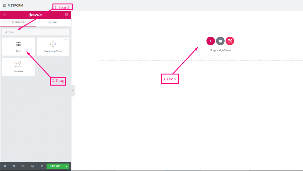
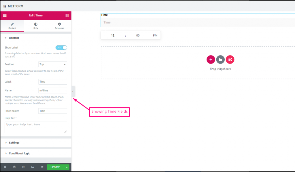
Tiempo #
Ayuda a los usuarios a seleccionar su hora preferida en el temporizador emergente.
Contenido #
- Show Label (Toggle): Enable/disable label.
- Position (Dropdown): Top/Left label position.
- Label (Text Input): Prompt for time.
- Name (Text Input): Internal time field name.
- Placeholder (Text Input): Time format hint.
- Help Text (Textarea): Extra instruction text.
- Required (Toggle): Mandatory time.
- Use 24H Format (Toggle): Option to use 24-hour instead of AM/PM.
Check out our Demostración en vivo aquí.
Formato 24H #
Check out our Demostración en vivo aquí
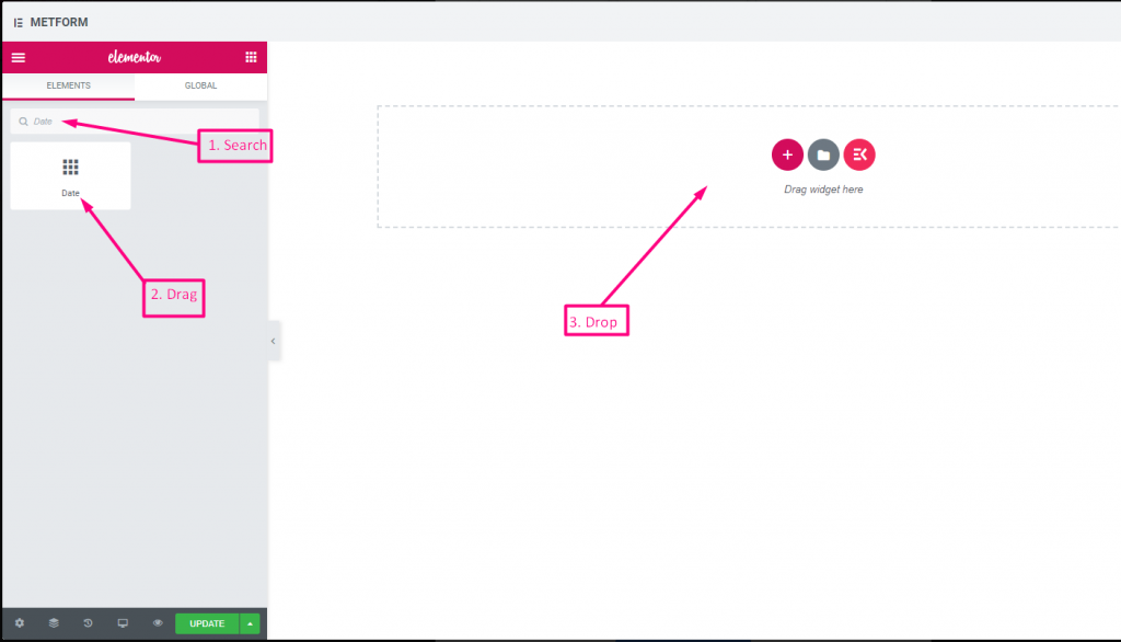
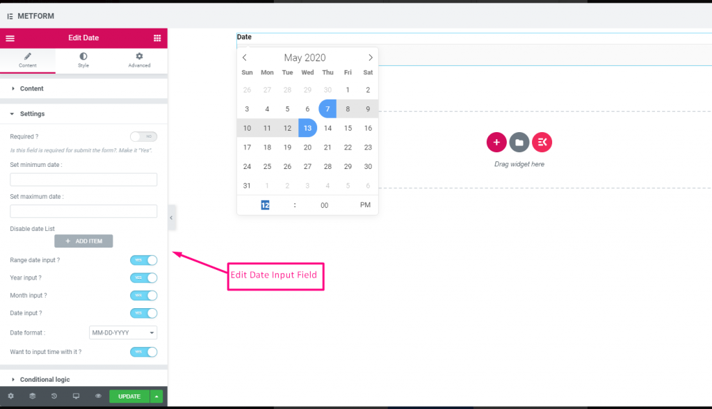
Fecha #
Utilice este campo de entrada para seleccionar Fecha del calendario emergente en su formulario para hacerlo más fácil de usar.
Contenido #
Required (Toggle): Must select a date/time.
Show Label (Toggle): Toggle field label display.
Position (Dropdown): Choose label position.
Label (Text Input): Text shown as a title.
Name (Text Input): Unique field key.
Help Text (Textarea): Extra instructions.
Ajustes #
- Range Date Input (Toggle): Enable two dates (start/end) instead of single.
- Min/Max Date (Date Picker): Earliest and latest selectable dates.
- Disable Dates (Date Picker): Block specific dates.
- Date Format (Dropdown): Choose format such as DD-MM-YYYY.
- Input Time (Toggle): Add time selection with date.
Check out our Demostración en vivo aquí
Entrada de rango de fechas #
Check out our Demostración en vivo aquí
Seleccionar fecha con entrada de hora #
Check out our Demostración en vivo aquí
| Opciones | Descripción |
|---|---|
| Mostrar etiqueta | Activar/desactivar Etiqueta. |
| Posición | Por defecto: Arriba Seleccione la posición de la etiqueta. donde quieras verlo. arriba o a la izquierda de la entrada. |
| Etiqueta | Escriba el texto de la etiqueta. |
| Nombre | El nombre es obligatorio. Ingrese un nombre sin espacios ni ningún carácter especial. utilice únicamente guión bajo/guión (_/-) para varias palabras. El nombre debe ser diferente. |
| Marcador de posición | Utilice un marcador de posición para mostrar texto ficticio y ayudar al usuario a colocar el texto correcto. |
| texto de ayuda | Escriba el texto que se mostrará debajo del widget. |
| Requerido | Por defecto: No Cambie esta opción para que sea obligatoria. Los usuarios no pueden enviar los formularios sin completar los campos obligatorios. |
| Establecer fecha mínima o máxima | Proporcionar fecha mínima y máxima. |
| Desactivar fecha | Ingrese su fecha de cierre o fecha de desactivación |
| Entrada de fecha de rango | Habilitar rango Entrada de fecha Habilitar o deshabilitar la entrada de fecha de rango, la entrada de fecha por fecha, por año o por mes. Formato de fecha: seleccione Formato de fecha en el menú desplegable. Por ejemplo: DD-MM-AAAA |
| Hora de entrada | Puedes agregar hora con la fecha. |
| Lógica condicional | Mostrar/Ocultar este campo según ciertos criterios. |
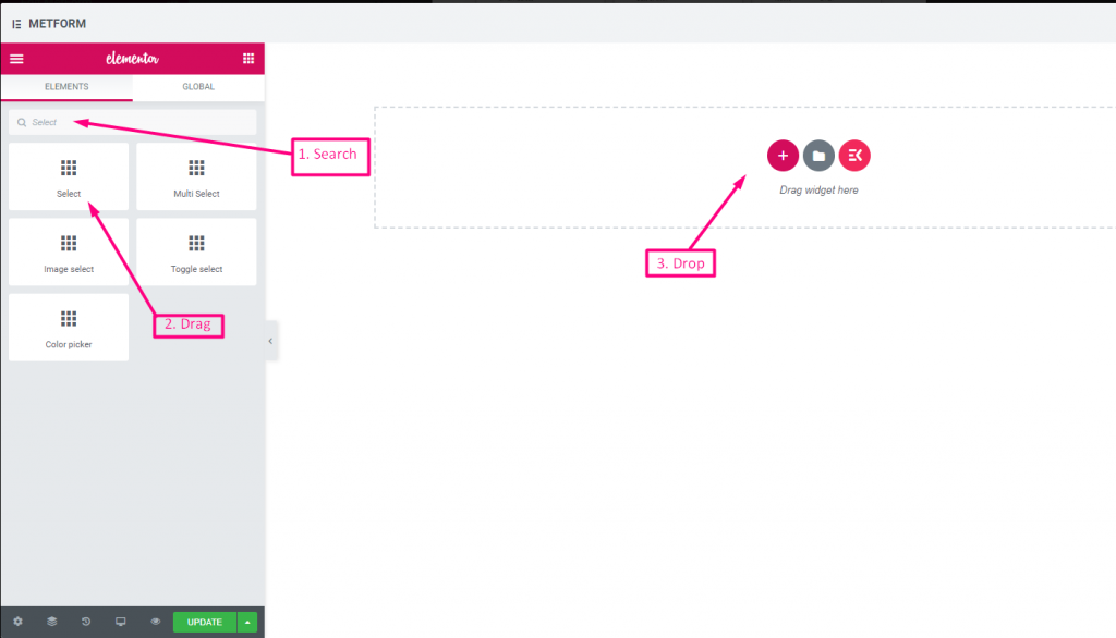
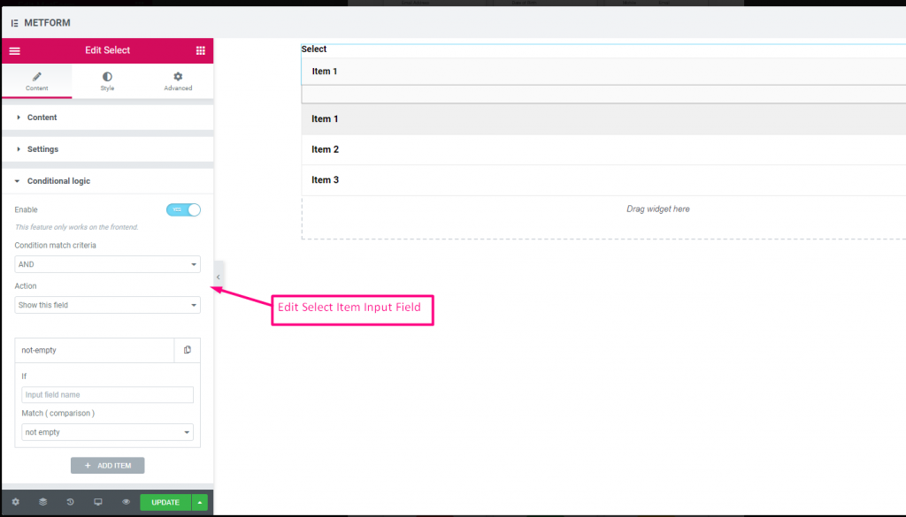
Seleccionar #
Agregue una lista desplegable de opciones para que los usuarios elijan, busque el widget por su nombre y luego arrastre y suelte el widget en la ubicación deseada.
Contenido #
- Required (Toggle): Must pick an option.
- Show Label (Toggle): Display the label.
- Position (Dropdown): Position of label.
- Label (Text Input): Dropdown title.
- Name (Text Input – Required): Internal field name.
- Help Text (Textarea): Supporting info text.
- Dropdown List (Repeater):
- Option Text: User sees this option.
- Option Value: Value sent/stored after submit.
- Status (Dropdown: Enable/Disable): Options can be disabled.
- Default Selected (Toggle): Make this option selected by default.
Check out our Demostración en vivo aquí
Opción de búsqueda como etiqueta #
Check out our Demostración en vivo aquí
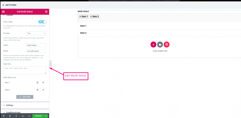
Selección múltiple #
Seleccione Varios elementos del menú desplegable a la vez.
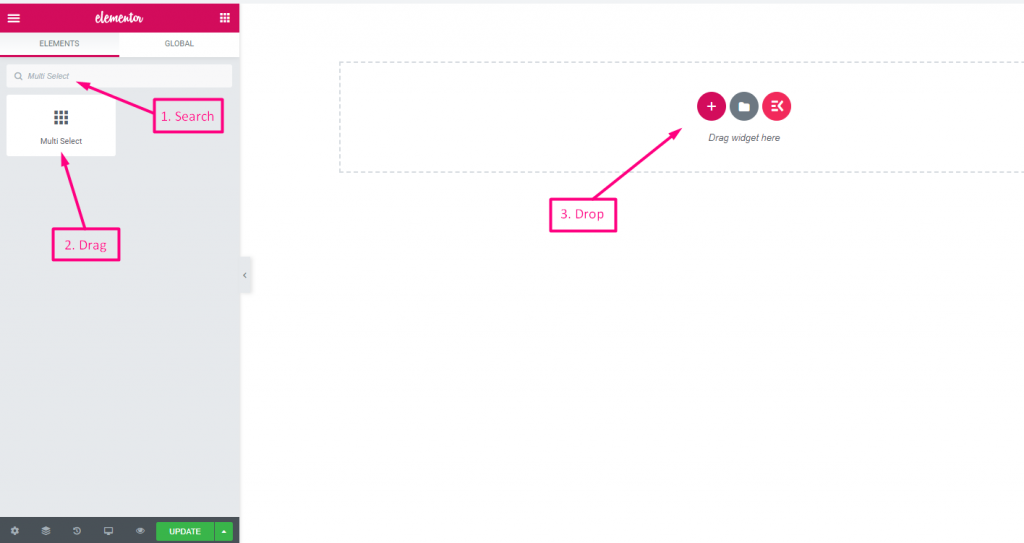
(Same as Select, but allows selecting multiple options from the list.)
Multiple Selection (Toggle): Allow multiple items to be chosen.
Check out our Demostración en vivo aquí
Valores seleccionados predeterminados #
Check out our Demostración en vivo aquí
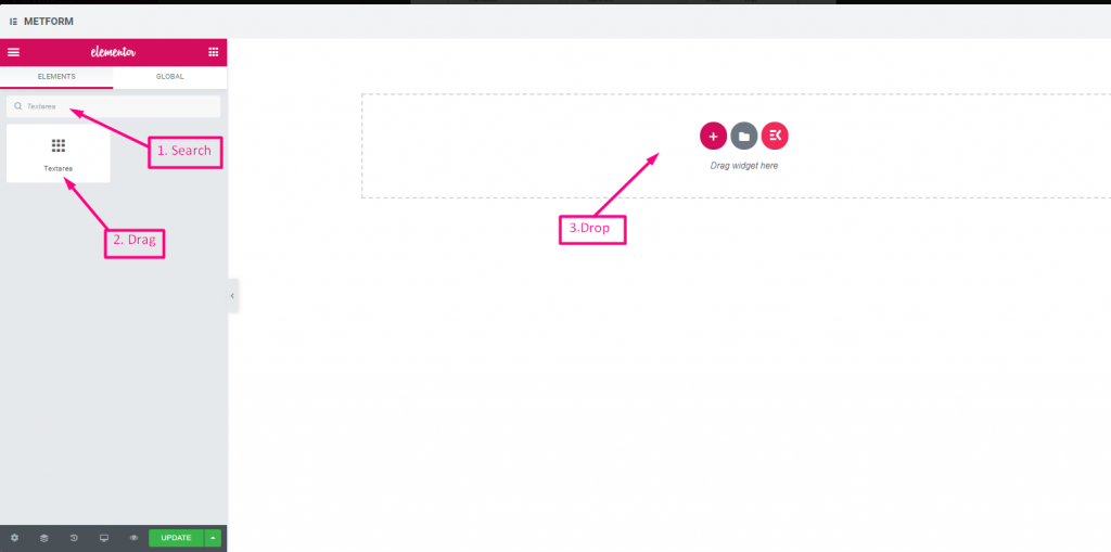
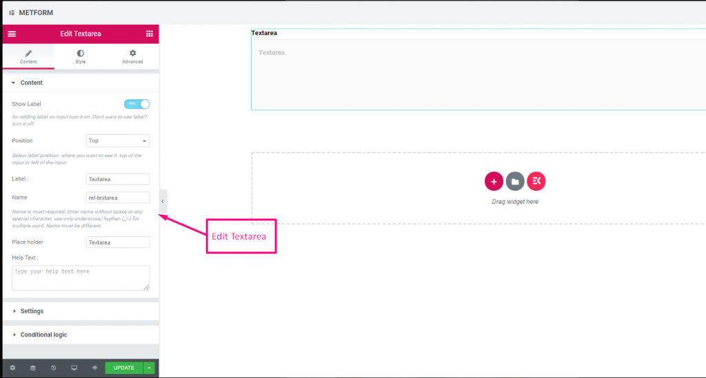
Área de texto #
Ayuda a agregar una gran cantidad de contenido, revisar y comentar a su formulario.
(Much like Text, but supports multiple lines.)
Contenido #
- Rows (Number Input): Controls visible height of textarea.
- Show Label, Position, Label, Name, Help Text, Required: Same as text.
Check out our Demostración en vivo aquí
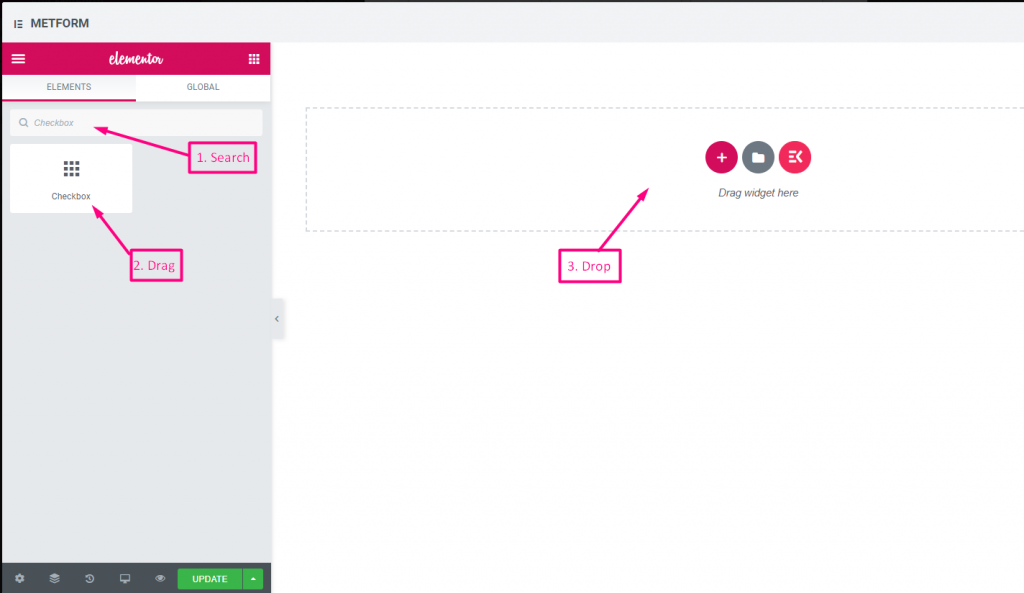
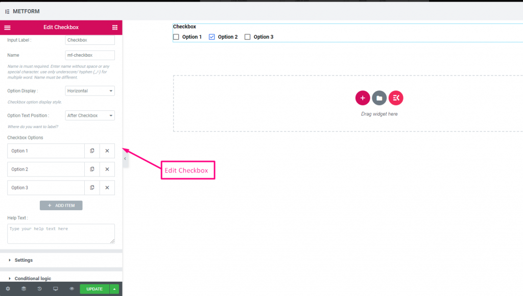
Caja #
Permita a los usuarios seleccionar varios elementos de su formulario a la vez con Checkbox.
Contenido #
- Show Label (Toggle), Position (Dropdown), Label, Name: Standard label controls.
- Checkbox Options (Repeater):
- Option Text: Text shown next to checkbox.
- Option Value: Stored when submitted.
- Status (Dropdown: Enable / Disable): Active or disabled option.
- Required (Toggle): Must check at least one.
Mostrar #
Layout (Dropdown: Vertical / Inline): Arrange options layout.
Check out our Demostración en vivo aquí
Vertical #
Check out our Demostración en vivo aquí
Posición del icono después del texto #
Check out our Demostración en vivo aquí
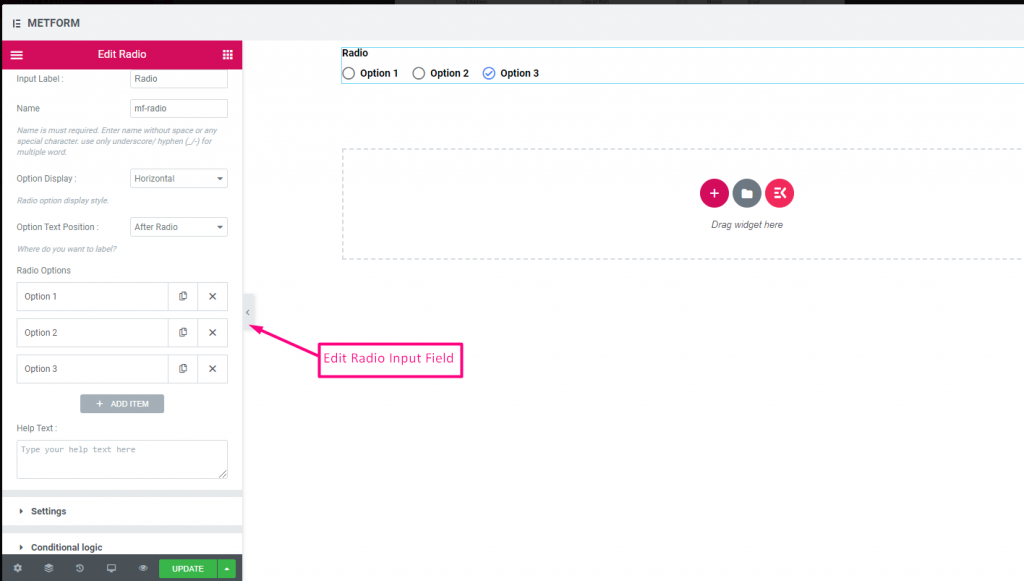
Radio #
Permita a los usuarios seleccionar solo un artículo exclusivo entre las múltiples opciones.
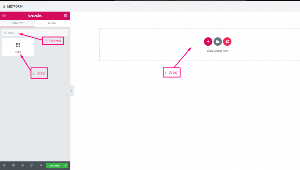
Contenido #
- Required (Toggle): Must choose an option.
- Show Label, Position, Label, Name: Label settings.
- Option Display (Dropdown: Vertical / Horizontal): Choose orientation.
- Options Text Position (Dropdown: Before / After): Where the label sits relative to the circle.
- Radio Options (Repeater):
- Radio Option Text: Label shown to user.
- Radio Value: Value saved upon submit.
- Status (Dropdown): Active/disabled option.
Check out our Demostración en vivo aquí
Vertical #
Check out our Demostración en vivo aquí
Posición del icono después del texto #
Check out our Demostración en vivo aquí
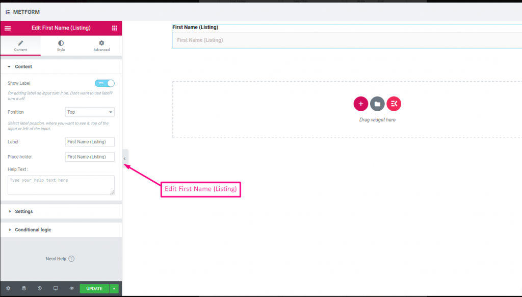
Nombre (Listado) #
Allow users to give their First Name to show them in a listing method on the mailing list. For Example : Mailchimp
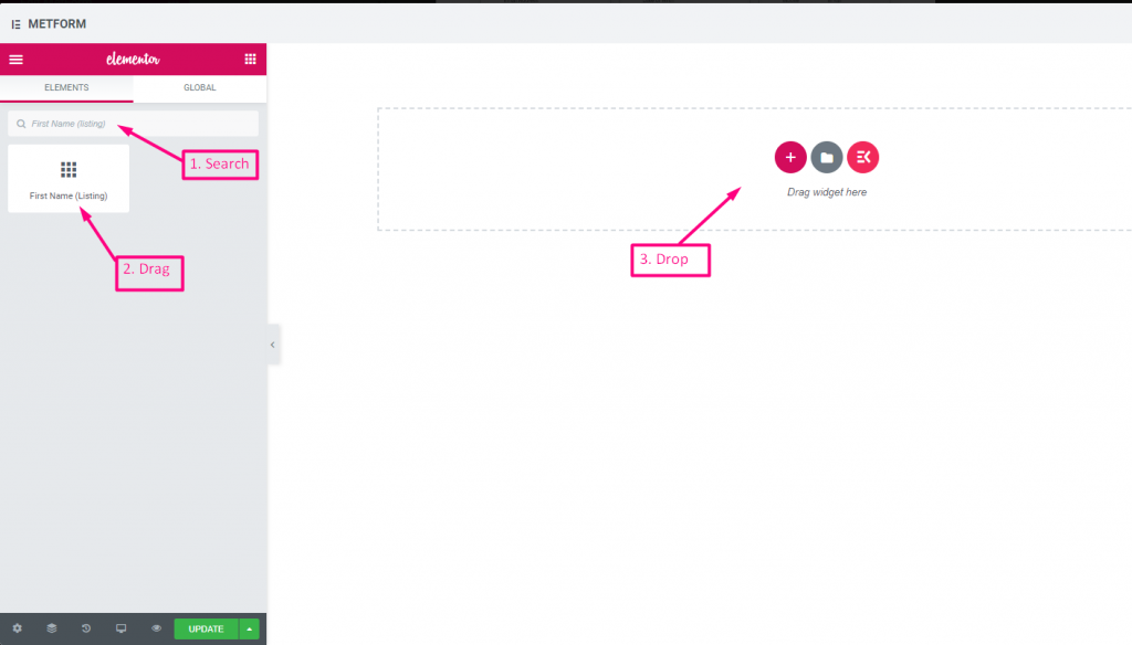
Contenido #
- Validation Type (Dropdown): Min/max or expression validation for names.
- Show Label (Toggle), Position (Dropdown), Label: As standard.
- Placeholder (Text Input): Name hint.
- Texto de ayuda: Additional instructions.
- Required (Toggle): Must fill.
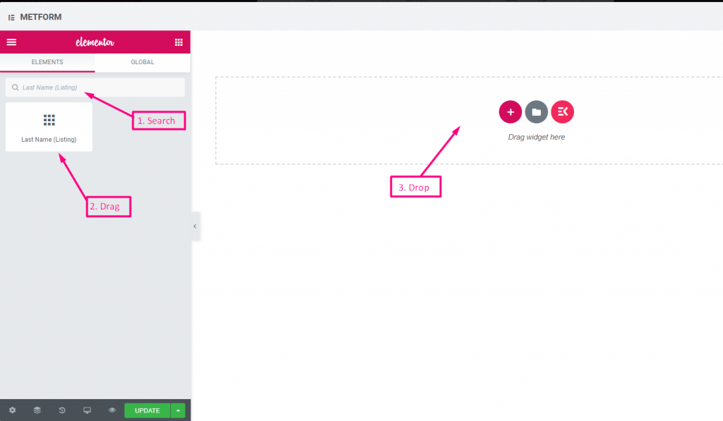
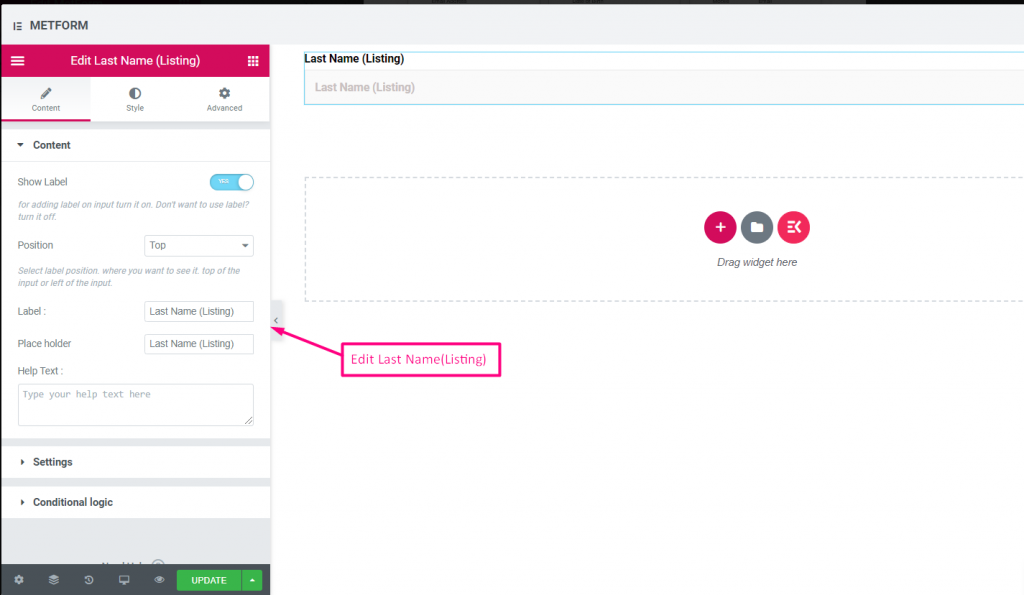
Apellido (Listado) #
Allow users to give their LastName to show them in a listing method on the mailing list. For Example : Mailchimp
Same controls as First Name.
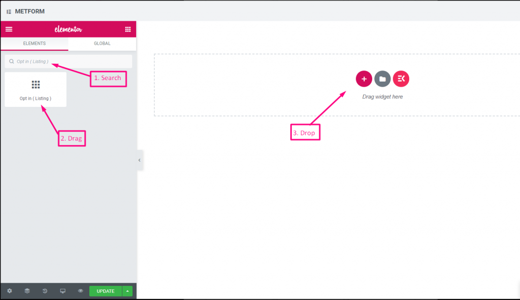
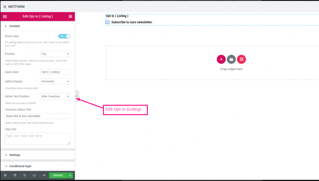
Optar por el listado #
Utilice el campo de suscripción en su formulario y convierta a su usuario en un usuario de contacto suscrito de Mailchimp haciendo clic en la casilla de verificación "Suscribirse a nuestro boletín".
Check out our Demostración en vivo aquí
| Opciones | Descripción |
|---|---|
| Mostrar etiqueta | Activar/desactivar Etiqueta. |
| Posición | Por defecto: Arriba Seleccione la posición de la etiqueta. donde quieras verlo. arriba o a la izquierda de la entrada. |
| Etiqueta de entrada | Escriba el texto de la etiqueta. |
| Visualización de opciones | Mostrar opción de inclusión en el listado Horizontalmente o verticalmente |
| Opciones Posición del texto | Mostrar opción de inclusión en la lista Posición del texto de la opción: Antes Casilla de verificación o Después Caja |
| Texto de opción de casilla de verificación | Brinde información breve sobre las opciones que se mostrarán al usuario. Por ejemplo: "Suscríbete a nuestro boletín“ |
| texto de ayuda | Escriba el texto que se mostrará debajo del widget. Dirija y entregue mensajes fácilmente a las personas adecuadas con texto de ayuda |
| Requerido | Por defecto: No Cambie esta opción para que sea obligatoria. Los usuarios no pueden enviar los formularios sin completar los campos obligatorios. |
| Lógica condicional | Mostrar/Ocultar este campo según ciertos criterios. |
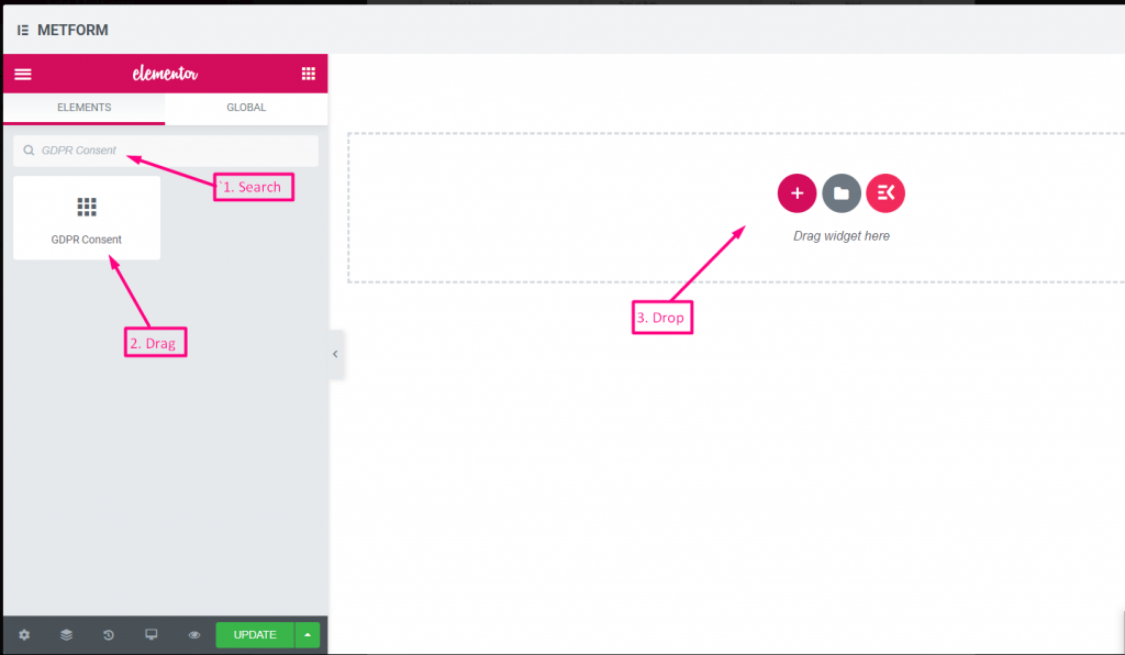
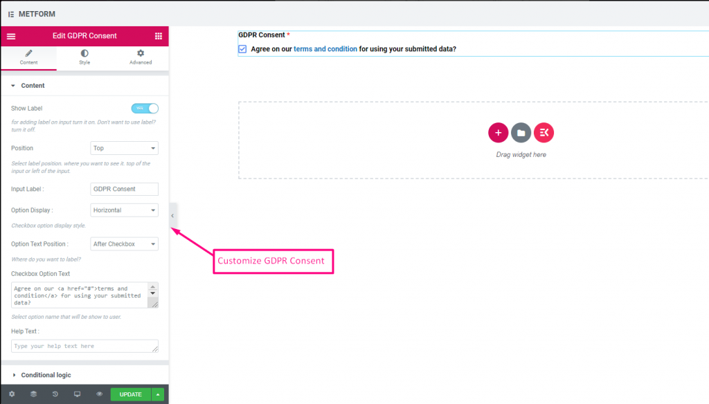
Consentimiento RGPD #
Habilite las quejas del RGPD (Reglamento general de protección de datos) en su formulario antes de recopilar datos del usuario, ya que explica cómo utiliza habitualmente los datos del usuario para mantenerse a salvo de acciones legales.
Contenido #
- Help Text (Textarea): Further explanation.
- Show Label (Toggle): Display consent block title.
- Position (Dropdown): Label placement.
- Input Label (Text Input): Consent prompt text.
- Option Display (Dropdown): Horizontal/vertical layout.
- Options Text Position (Dropdown): Label before/after checkbox.
- Checkbox Option Text (Textarea): Consent statement text.
Controlar out our Demostración en vivo aquí
Con enlace de texto #
Controlar out our Demostración en vivo aquí
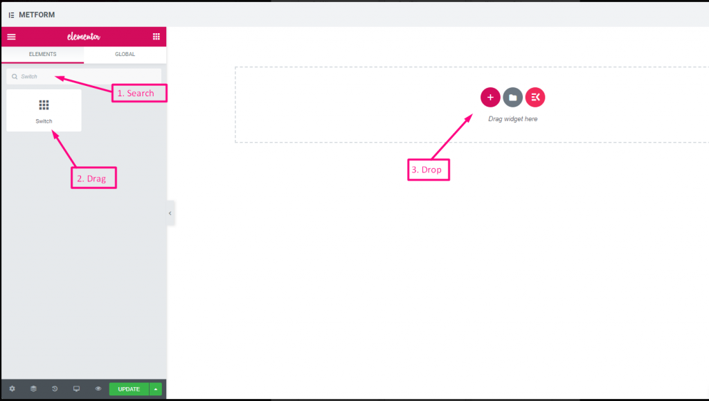
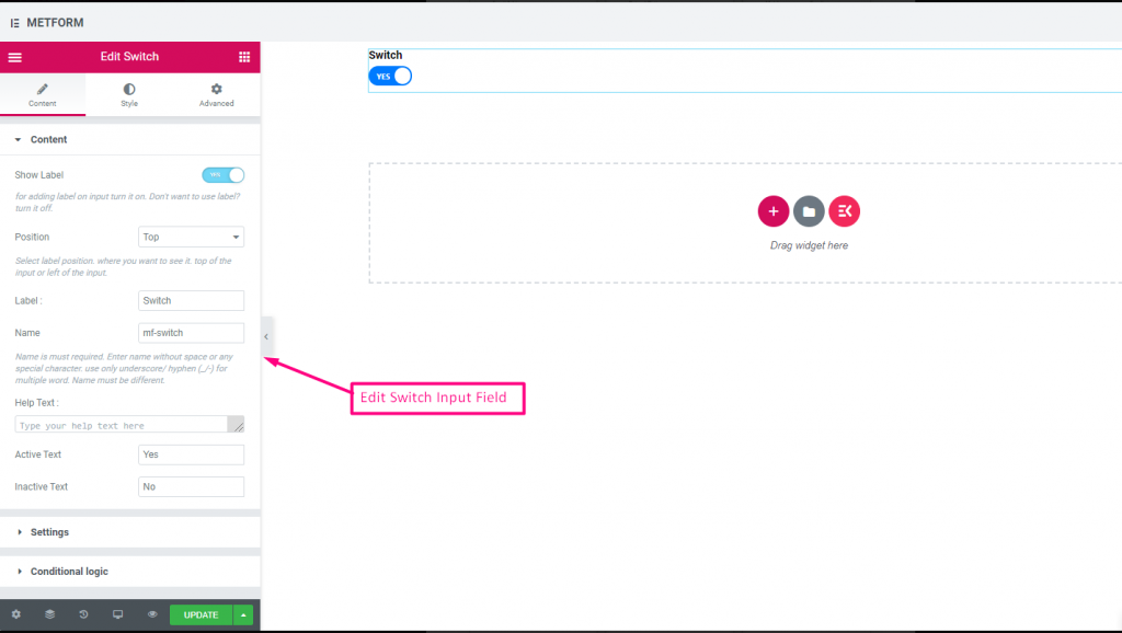
Cambiar #
Controle fácilmente la entrada de la casilla de verificación Sí/No o Encendido/Apagado como un interruptor de luz.
Contenido #
- Required (Toggle): Must select a state.
- Show Label (Toggle), Position (Dropdown), Label, Name: Standard label controls.
- Help Text (Textarea): Description below switch.
- Active/Inactive Text (Text Inputs): Custom labels for on/off states.
Check out our Demostración en vivo aquí
Texto de opción personalizada #
Check out our Demostración en vivo aquí
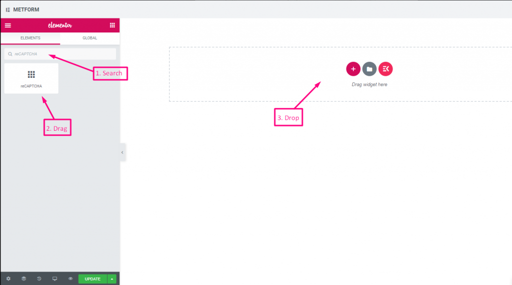
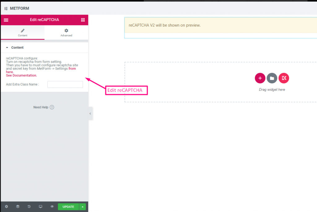
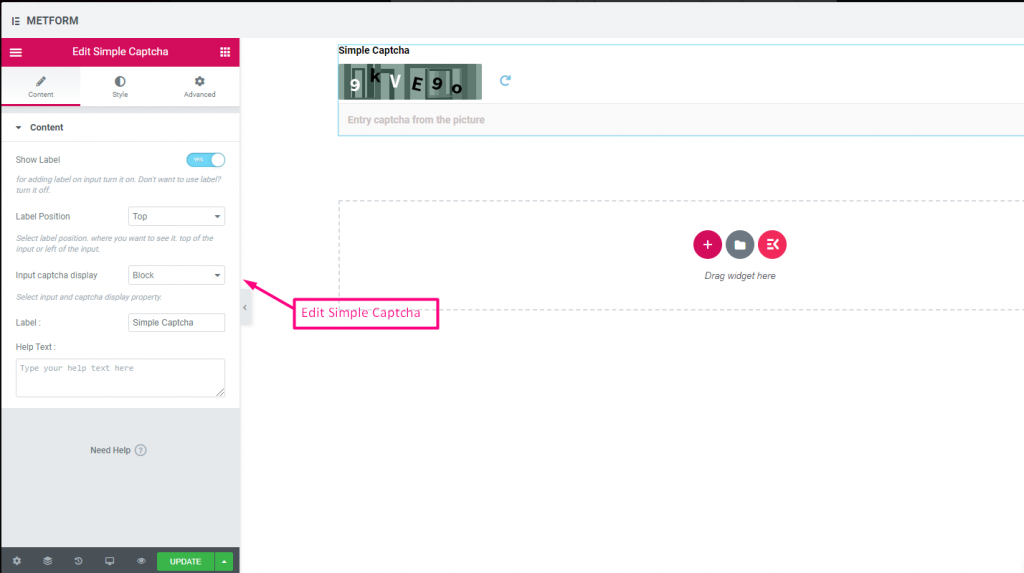
reCAPTCHA #
Le permite integrar Google reCAPTCHA para mantener su sitio a salvo del spam no deseado y el tráfico abusivo.
Check out our Demostración en vivo aquí
| Opciones | Descripción |
|---|---|
| reCAPTCHA confiqure | Active reCAPTCHA desde la configuración. Luego debe configurar el sitio reCAPTCHA y la clave secreta desde MetForm -> Configuración de aquí. Ver Documentación. |
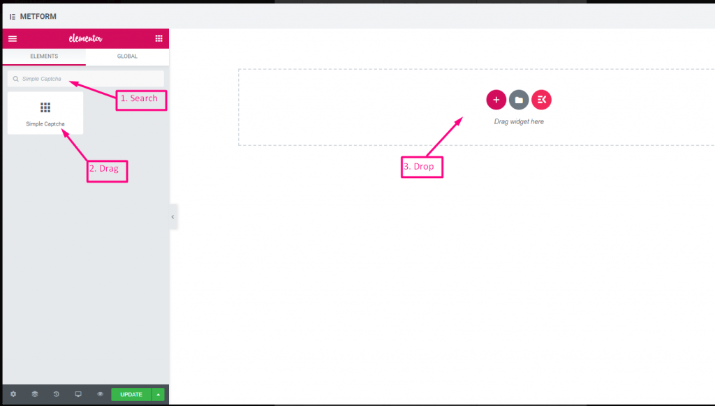
reCAPTCHA simple #
Protege su sitio de spam y bots no deseados.
Check out our Demostración en vivo aquí
Opciones en línea #
Check out our Demostración en vivo aquí
| Opciones | Descripción |
|---|---|
| Mostrar etiqueta | Activar/desactivar Etiqueta. |
| Posición | Por defecto: Arriba Seleccione la posición de la etiqueta. donde quieras verlo. arriba o a la izquierda de la entrada. |
| Entrada CAPTCHA Pantalla | Ingrese su reCAPTCHA en un bloque o muestre el campo de entrada en una línea. |
| Etiqueta | Escriba el texto de la etiqueta. |
| texto de ayuda | Escriba el texto que se mostrará debajo del widget. |
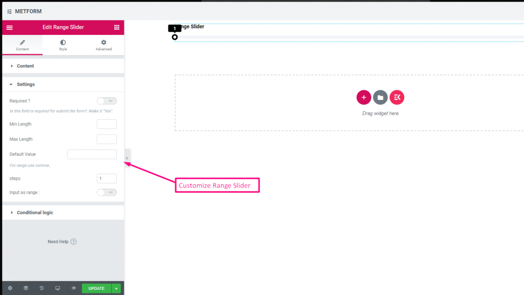
Control deslizante de rango #
Establezca su valor de rango máximo o mínimo en su formulario usando el control deslizante de Rango súper genial. Todo lo que tienes que hacer es arrastrar ambos extremos hasta que llegue el valor apropiado.

Check out our Demostración en vivo aquí
Valor por defecto #
Controlar out our Demostración en vivo aquí
Entrada de rango múltiple #
Controlar out our Demostración en vivo aquí
| Opciones | Descripción |
|---|---|
| Mostrar etiqueta | Activar/desactivar Etiqueta. |
| Posición | Por defecto: Arriba Seleccione la posición de la etiqueta. donde quieras verlo. arriba o a la izquierda de la entrada. |
| Etiqueta | Escriba el texto de la etiqueta. |
| Nombre | El nombre es obligatorio. Ingrese un nombre sin espacios ni ningún carácter especial. utilice únicamente guión bajo/guión (_/-) para varias palabras. El nombre debe ser diferente. |
| texto de ayuda | Escriba el texto que se mostrará debajo del widget. |
| Requerido | Por defecto: No Cambie esta opción para que sea obligatoria. Los usuarios no pueden enviar los formularios sin completar los campos obligatorios. |
| Longitud mínima | Establecer el valor del rango mínimo |
| Longitud máxima | Establecer el valor de rango máximo |
| Valor por defecto | Establezca su valor predeterminado, use coma para establecer el valor del rango |
| Pasos | Agregue valor de pasos para agregar rango paso tras paso |
| Entrada como rango | Cambie estas opciones para configurar el rango requerido o no |
| Lógica condicional | Mostrar/Ocultar este campo según ciertos criterios. |
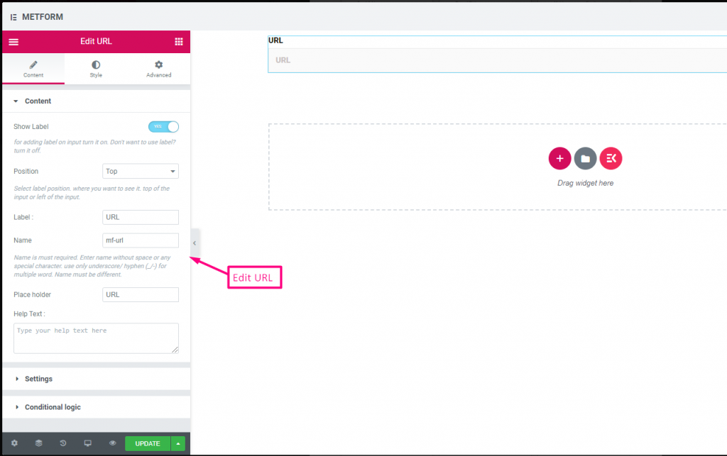
URL #
Simplemente agregue una URL a su formulario usando nuestro campo de entrada de URL. Garantiza que los usuarios ingresen una URL válida en el campo del formulario.

Contenido #
- Show Label, Position, Label, Name: Standard label controls.
- Placeholder (Text): Sample URL hint.
- Texto de ayuda: Extra instructions.
- Required (Toggle): Must enter a valid URL.
Validation #
URL Validation: Ensures submission is a valid link.
Check out our Demostración en vivo aquí
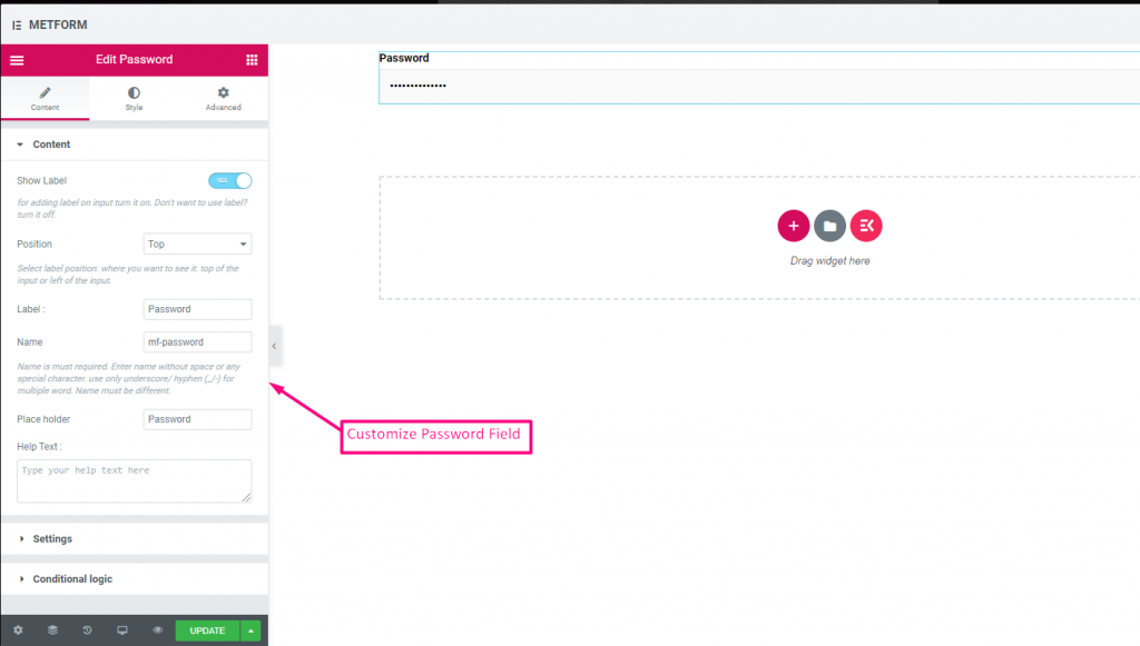
Contraseña #
Si desea que su usuario proporcione una contraseña segura, utilice nuestro campo de entrada de contraseña. Garantiza que los usuarios obtengan una contraseña protegida y puedan cambiarla cuando sea necesario.

Contenido #
- Show Label, Position, Label, Name: Standard label controls.
- Marcador de posición: Password hint text.
- Texto de ayuda: Instruction text below field.
- Required (Toggle): Must enter password.
Validation #
Validation Type (Dropdown): Enforce strength via characters/words/regex.
Check out our Demostración en vivo aquí
Mensaje de respuesta #

Contenido #
- Add Success Message (Textarea): Text shown after successful submission.
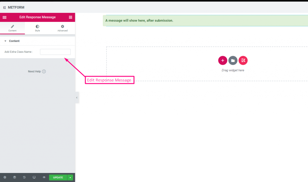
Check out our Demostración en vivo aquí:
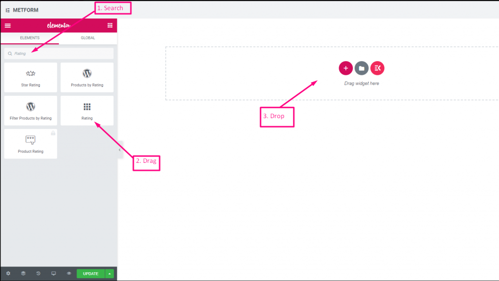
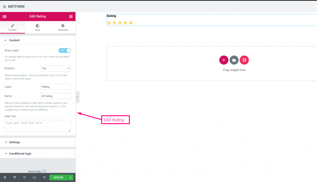
Clasificación #
Recopile calificaciones de clientes con Clasificación campo de entrada, busque el campo de entrada por su nombre y luego arrastre y suelte el campo de entrada en la ubicación deseada. Ayuda a obtener opiniones de los clientes y a establecer un buen vínculo entre el propietario y el cliente.
Contenido #
- Number of Rating Stars (Number Input): Custom number of stars to display.
- Show Label (Toggle), Position (Dropdown), Label, Name: Standard.
- Texto de ayuda: Rating instruction beneath stars.
- Required (Toggle): Must choose a rating.
Check out our Demostración en vivo aquí:
Cualquier número de estrellas #
Check out our Demostración en vivo aquí
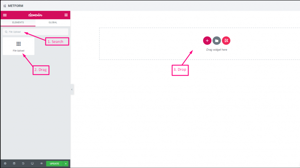
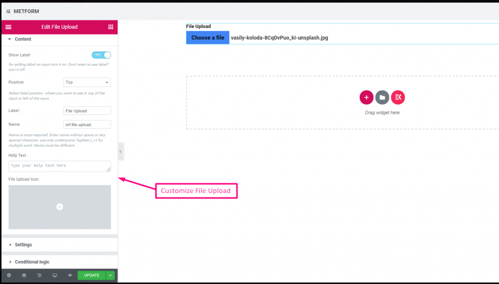
Subir archivo #
Metform hace que sea muy fácil agregar Subir archivo widget a sus formularios, busque el campo de entrada por su nombre, luego arrastre y suelte el campo de entrada en la ubicación deseada.
Contenido #
- Multiple Upload (Toggle): Allow uploading more than one file.
- Show Label (Toggle), Position (Dropdown), Label, Name: Label settings.
- Texto de ayuda: Guidance under uploader.
- Required (Toggle): Must upload.
- Allowed File Types (Text Input/List): Specify extensions such as
.jpg, .png. - Max File Size (Number Input): Maximum allowed file size.
Check out our Demostración en vivo aquí
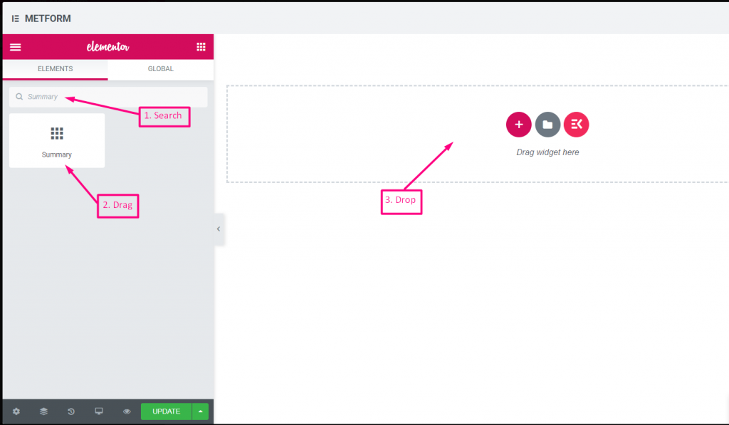
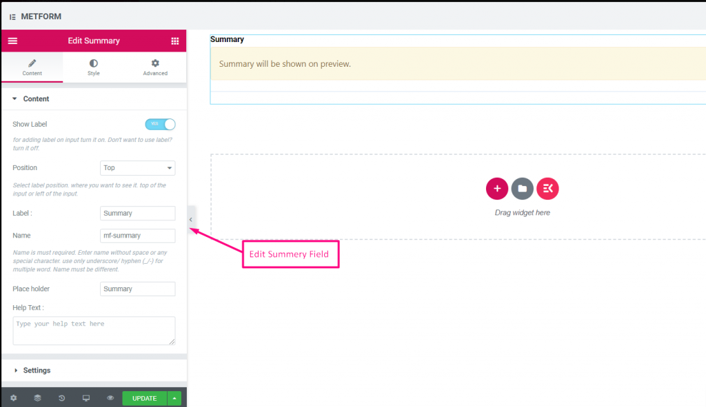
Resumen #
Proporcione un resumen antes de la suscripción para establecer una buena comunicación con su cliente.
Contenido #
- Required (Toggle): Must review before submit.
- Show Label (Toggle), Position (Dropdown), Label, Name: Standard.
- Texto de ayuda: Explanation under summary.
Lógica condicional #
- Enable Conditional Logic (Toggle): Enable show/hide rules.
- Action (Dropdown: Show / Hide): Visibility setting.
- Field (Dropdown: Select Field): Field controlling summary visibility.
- Operator (Dropdown: Equal / Not Equal / Contains): Comparison type.
- Value (Text Input / Option Selector): Value triggering summary display.
Botón de enviar #
Envíe su formulario con este campo y almacene los datos en el back-end.
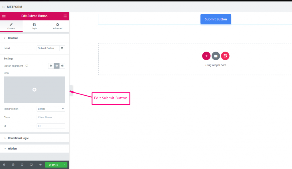
Contenido #
- Label (Text Input): Text shown on Submit button.
- Button Alignment (Dropdown: Left / Center / Right): Position submit button in form.
- Icon (Icon Picker): Choose an icon to accompany the text.
- Icon Position (Dropdown: Before / After): Place icon relative to text.
- Class (Text Input): Add a CSS class for styling.
- ID (Text Input): Add a CSS ID for scripting.
Ajustes #
Hidden (Toggle): Hidden input not visible but stored for backend.
Lógica condicional #
- Enable Conditional Logic (Toggle): Activate dynamic display.
- Action (Dropdown: Show / Hide): Decide if submit button appears.
- Field (Dropdown: Select Field): Field controlling submit button visibility.
- Operator (Dropdown: Equal / Not Equal / Contains / Not Contains): Comparison type.
- Value (Text Input / Option Selector): Value triggering the button display.