


Masonry layout is a modern and effective way to arrange images of different aspect ratios. You can make full use of your website space while maintaining a visually appealing layout.
For your block Gutenberg block editor website, the GutenKit Advanced Masonry block supports all the necessary features and functions. Therefore, you can come up with a Pinterest-like or brick wall-like layout design on your WordPress website.
Siga este documento para aprender como adicionar um layout de alvenaria ao site do editor de blocos.
Como usar o bloco de alvenaria avançado GutenKit #
Before going to the main part, the GutenKit Advanced Masonry block is a pro feature of the GutenKit block editor addon. So, you must have the GutenKit pro installed & activated on your Gutenberg website.
Vamos examinar diferentes partes do bloco GutenKit Advanced Masonry.
Step 1: Add Masonry Block #
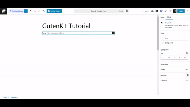
From your WordPress dashboard, insert to an existing page or add a new one. Click the “+” icon at the top left of the editor interface. And, search for the GutenKit Advanced Masonry block from the library. Once, you see it, drag and drop it to the editor area.
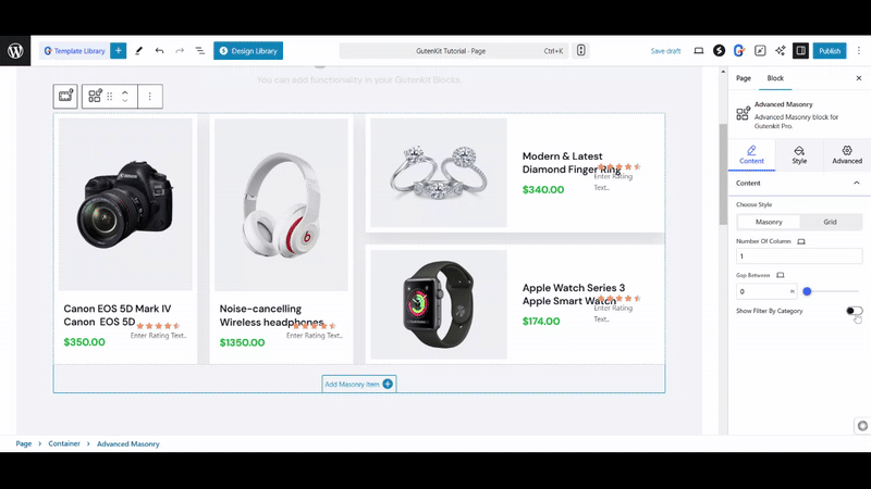
Step 2: Add Masonry Items #
Generally, the GutenKit Advanced Masonry Block loads with three masonry items, you can add as many as you want by clicking the “Add Masonry Item” botão.
You have complete freedom to insert any block within a masonry item. So, whether it’s images, videos, or other visual elements, you can showcase them effortlessly in a masonry layout. Plus, you get full access to all block customization settings for complete design control.
Step 3: Configure Masonry Block #
Now, open the block settings and start from the Guia Conteúdo. Come under the Contente option and set up the following settings.
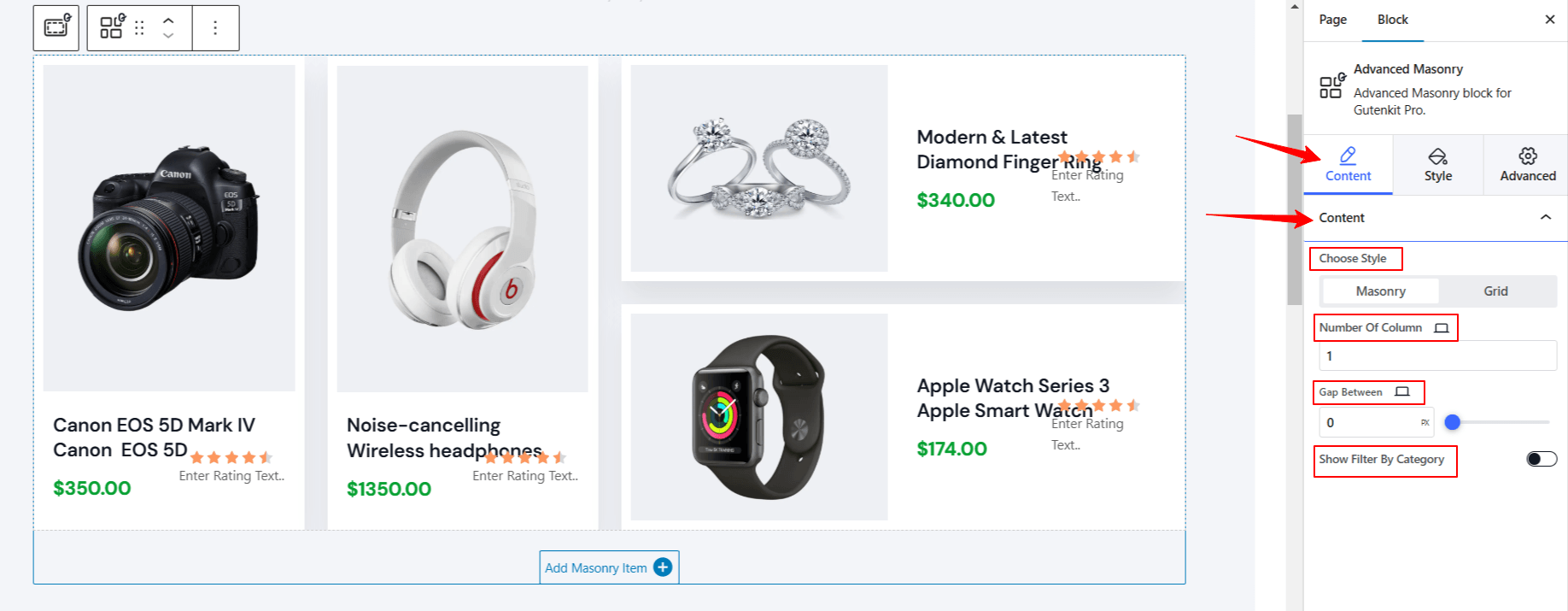
- Escolha o estilo: Select a style between Alvenaria e Grade.
- Number of Column: Define the number of columns.
- Gap Between: Adjust the gap between columns.
- Show Filter By Category: Enable this toggle button to show the category name. Doing this will reveal another option called: Tab Settings. Open it to configure settings below:
- Tab Name (All): You can give a custom name to entire masonry tab.
- Tab Direction: Define tab direction to left, right, top, & bottom.
- Espaço entre: Adjust the gap between tab & masonry items.
Step 4: Customize Masonry Layout #
De Guia Estilo, we’ll focus on the customization part of the masonry items and filter items. Start from the “Item” opção:
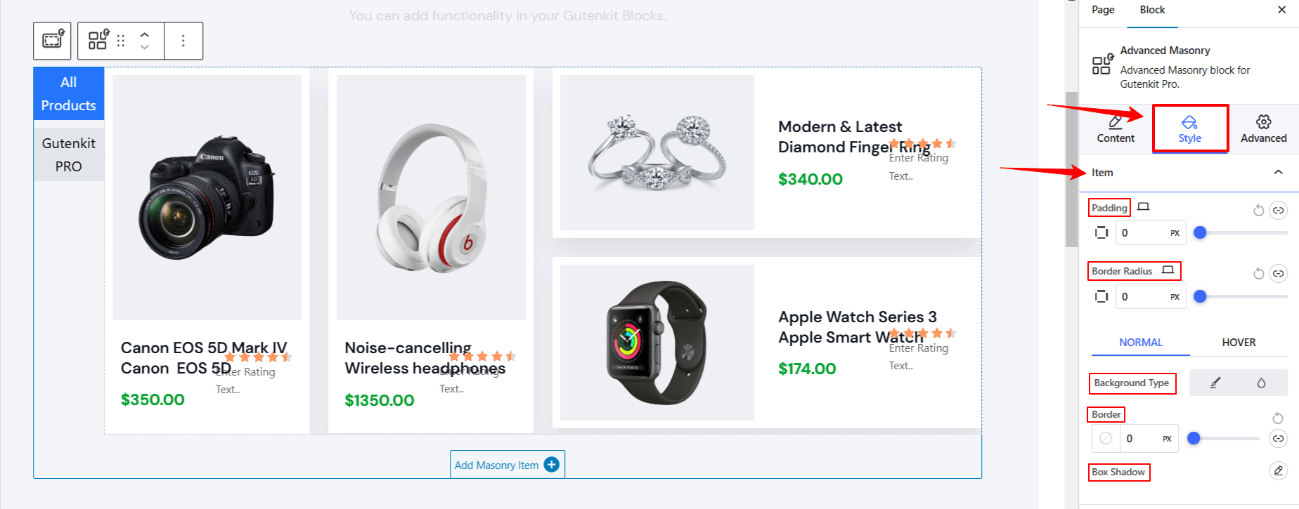
- Preenchimento: Increase the space inside the masonry items.
- Raio da borda: Adjust the roundness of the masonry item border.
The following settings are applied both on normal and hover state. Click one to custoimze its appearance.
- Tipo de plano de fundo: Choose a background type between solid color and gradient.
- Fronteira: Pick a color for the border, and change its style and thickness.
- Sombra da caixa: Click the edit icon to get all the box shadow settings.
If you don’t enable the Mostrar filtro por categoria option in the Content Tab, your masonry item customization ends here. However, activating Mostrar filtro por categoria option will provide customizing features to style the filter items. You will see two options in the Guia Estilo named as Filtrar item e Filter Wrappers.
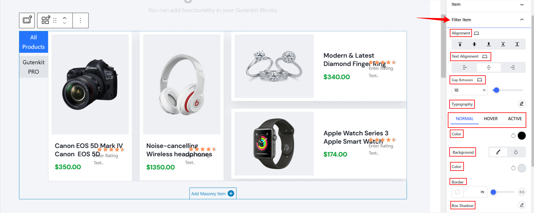
Debaixo de Filter Item,
- Alinhamento: Adjust the placement of filter category items to left, center, & right.
- Gap Between: Define the gap between filter category items.
- Tipografia: Get all the typography customization settings for the filter category name.
The following features can be adjusted for Normal, Hover, e Ativo modes. Here,the active mode refers to the currently displayed masonry section on your screen or the one you select by clicking on it.
- Cor: altere a cor da fonte da categoria de filtro.
- Fundo: Choose a background style between solid color and gradient.
- Fronteira: Get border settings like color, thickness, & style.
- Sombra da caixa: Give a shadow effect to the caterer border.
- Preenchimento: Adjust the spaces between the
- Raio da Fronteira: define a redondeza da borda da categoria de filtro.
Now, move to the Filter Wrapper option in the same Estilo aba.
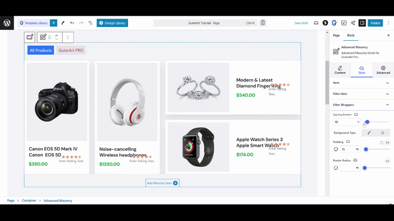
- Spacing Bottom: Make room between masonry content.
- Tipo de plano de fundo: Escolha um tipo de plano de fundo entre cor sólida e gradiente.
- Preenchimento: Crie espaço ao redor da categoria de filtro.
- Raio da borda: Ajuste a redondeza da borda.
That’s it! Now, you know how to use all the settings of the GutenKit Advanced Masonry Block. Hopefully, you will end up designing a stunning and responsive masonry design on your block editor website.
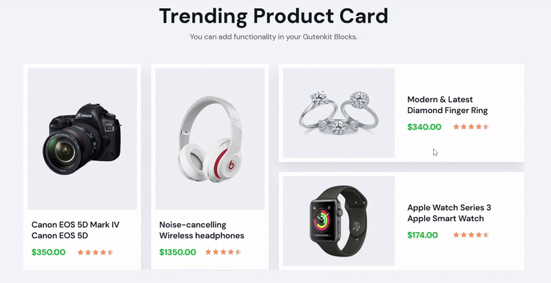
Here’s the preview of our masonry design for a Gutenberg website.
For any queires, reach to our equipe de suporte.